

Rss Bot
-
Content Count
19,477 -
Joined
-
Last visited
Never -
Feedback
N/A
Posts posted by Rss Bot
-
-
-
-
Big savings on rugged and luxury bluetooth speakers – but all deals end Monday 19 April!
-
Widely deployed platforms from Citrix, Fortinet, Pulse Secure, Synacor and VMware are all in the crosshairs of APT29, bent on stealing credentials and more.
-
Most people use either Google or Amazon, but if you’re wondering how their cloud storage options stand up, read our Google Photos vs Amazon Photos comparison.
-
-
-
-
Matt Bromiley, senior principal consultant with Mandiant, offers checklists for how small- and medium-sized businesses (SMBs) can identify and clear ProxyLogon Microsoft Exchange infections.
-
This post is originally published on Designmodo: A Beginner’s Guide to the Latest Bootstrap 5 Utilities
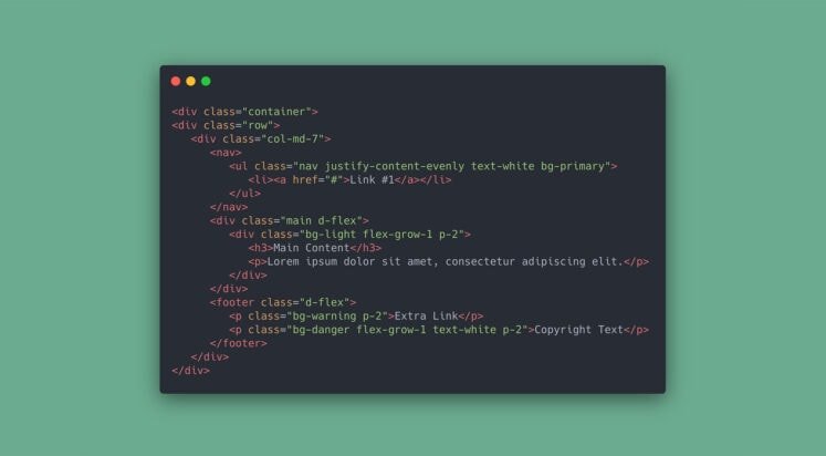
Bootstrap has been one of the widely used web frontend frameworks for responsive development with cross-browser compatibility features. It allows you to quickly build a prototype without spending a large time commitment to build layout designs of your choice and …
For more information please contact Designmodo
-
-
The zero-day flaw research group has revised its disclosure of the technical details of vulnerabilities in the hopes of speeding up the release and adoption of fixes.
-
-
-
UK and US deals on MacBook Air and the MacBook Pro are sure to disappear soon.
-
-
The IoT-targeted malware has also added new exploits for initial compromise, for Huawei, Realtek and Dasan GPON devices.
-
-
-
Threat actors targeted compromised Exchange servers to host malicious Monero cryptominer in an “unusual attack,” Sophos researchers discovered.
-
-
-
-
Apple Spring Loaded event: what to expect tomorrow
in Ειδήσεις από τον χώρο του Design και Hosting
Posted · Report reply
New iPads, AirPods, Macs and more.
View the full article