

Rss Bot
-
Content Count
21,437 -
Joined
-
Last visited
Never -
Feedback
N/A
Posts posted by Rss Bot
-
-
WordPress powers some of the web’s biggest and most impressive sites. Now it can host yours as well. Pick up the skills and tools you need to get your site online with the Wpbasin Ultimate WordPress Bundle, on sale now with 98% off the retail price!
There's no web hosting platform more malleable than WordPress – you just need the right tools to make the most of it. You'll find everything you need in the Wpbasin Ultimate WordPress Bundle. You'll score tons of HTML templates to design your site, themes to make it look great, and plugins to give it all the functionality you require. You'll even get a full year of hosting to get your site online as soon as it's ready.
The Wpbasin Ultimate WordPress Bundle is valued at $3,655, but you can get it now for 98% off the retail price. You won’t find a better deal on such an incredible bundle, so grab it today!
-
Writing better CSS doesn't have to be a painstaking ordeal. A few minor adjustments to how you work within your CSS code file can have a big impact. In this article, we'll take a look at eight simple ways you can improve your CSS skills and write cleaner, more efficient, and better CSS code.
01. Start with a CSS Reset
CSS Reset gives you a clean base to work with
Some might argue that using a CSS Reset is unnecessary. However, a CSS Reset allows you to start with a clean base, making it easier to style your website, with more predictable outcomes across the board.
A CSS Reset resets or overrides the default styles of the browser. You may write your own, use one of the many resets available online, or use a combination of the two.
02. Know when to use CSS shorthand
Shorthand should reduce your file size and help speed up load times
CSS shorthand enables you to set multiple properties of an element in a single line. Using shorthand saves space and takes less time to load. However, you shouldn't use it for everything.
Sometimes longhand provides much-needed clarity. But more importantly, when you only need to set one or two properties – or you simply need to override something – longhand may actually be better.
Something else to remember: when you're using shorthand, the ignored properties will reset, which could have an undesirable effect.
03. Keep it DRY
Don't repeat yourself
Quite possibly the best advice for writing better CSS code is to follow the DRY methodology. DRY means 'don't repeat yourself' – essentially, don't use the same bits of code over and over again.
One way to keep things DRY in CSS is to group things together. Let's look at an example.
Original CSS
Refactored and DRY
As you can see, not only will this reduce the overall size of your CSS file – which creates faster load times – but you'll also benefit in the area of maintenance too. If the color property needs updating, you're only updating it one spot.
You can also use CSS custom properties to help stay DRY. Custom properties are created like so:
And then can be used anywhere within your CSS code, as often as you'd like:
04. Stop over-using !important
There are very few occasions where you need to use !important. It's one of the most – if not the most – misunderstood and over-used declarations.
Don't get me wrong, !important does have its place, but generally web developers use it in desperation when things don't look right. So to fix things, they give their rule a little more weight by adding the !important declaration to it.
The problem is, this starts to create a domino effect that rapidly turns into a maintenance nightmare, as more and more things are declared !important. Only use !important when it's absolutely necessary.
05. Keep consistent
Regardless of how you write your CSS, and in which order you add the properties, keep it consistent. Some people order their properties alphabetically, while others use more of a logical approach – for example, organising things by line length or type. I opt for the former, but it's entirely up to you. The bottom line is whatever you choose, stick with it so it's easy to find things later.
06. Name things intelligently
Use a standard naming convention for your selectors
This seems like a no-brainer, but when naming your selectors, don't get overly complicated. Be succinct and stick with a standard naming convention.
Some things to consider when coming up with your selector names:
- Avoid presentation words: These are the ones that involve colour and display location (for example, green-text or top-menu-bar)
- Only use lowercase: CSS is case-sensitive, so don't create names like, MeNuBaR. It should be noted, however, that camel case (menuBar) is an acceptable practice, just not preferred in some cases
- Separate multiple words using a dash: For example, main-menu. You may also use camel case (mainMenu), but again, this is often not preferred
- Don't be too specific: You'll end up using multiple selectors for the same type of element. For instance, list-one and list-two can be combined, creating a single list-items
07. Add comments when appropriate
While it's true that good code doesn't need comments, it's also true that adding comments to code is necessary in some cases. The rule of thumb here is that if the source code will benefit from the comment, then add it; otherwise, don't.
If you're wondering when comments might be necessary, here are a few examples:
- Commented code: If you comment out a specific portion of code, for a particular reason, leave a comment explaining that reason. If you don't, you may not remember why you commented it out in the first place
- Hot fixes: If you add a 'hot fix', it might be a good idea to add a comment explaining it too
- Reminders: You're likely working on more than one project at any given moment. If your attention is pulled before you have a chance to complete something, you can use comments as a reminder for what you still have left to do
- Explanations: If a section of code is unclear, and you feel an explanation would help clear it up, then add a comment – it's that simple
08. Explore Flexbox
Flexbox is the latest game-changer in web design
When it comes to aligning elements on the page, the Flexible Box Layout module (or Flexbox) gives you complete control. Using flex containers and flex items you're able to precisely define how things look. Flexbox also enables you to arrange items vertically on a page, which wasn't possible with floats.
It's a little tricky to get your head around, but well worth it. Start by reading our Web designer's guide to Flexbox.
Read more:
-
No matter your final use, most scenes centred on a man-made structure will benefit from a touch of the organic. The contrast in colour, texture and form can really help add interest to the final render, as well as bring life and interest into a piece.
Though there are ready-made options, it's best to know how to efficiently create your own pretty easily. To do this, you can make good use of Cinema 4D's MoGraph tools, with a very low polygon proxy object used as a placeholder.
The process is simple but effective and is easily adaptable to different needs. Files are available below, but try creating your own in order to get a better understanding of how it all comes together in practice.
Download the files and accompanying video for this tutorial.
01. Create leaves
Use the supplied leaf section or build your own
First off we need our leaf section. You can use the one supplied or create your own. The key is to use a format such as .png that allows for alpha channels and add a normal map as well, to help sell the details. Once you have that, apply it to a simple plane, bent in the middle to add a little life. Try to keep to around six to ten polygons.
02. Make low-poly object
Use a simple low-poly object as the base for your plant
Now create a quick low-poly object to act as the growth base. Remember that modelling to scale will help. Make any shape you like and add any other details you need such as stems or trunks. Then, move your leaf axis point to the start of the stem, pointing along its length.
03. Add a cloner
As you clone more leaves your plant will look more organic
Add a Cloner to the scene, with the leaf as its child. At first there will only be a clone at each vertex of the underlying mesh, so change the Distribution setting to Surface and increase the count. If you have a flat underside, it might look a bit odd, in which case delete the bottom poly of the growth base object. As you go on it will begin to look more organic.
04. Add a random effector
Finish off by adding some variation to your foliage
To finish up, add some variation by adding a Random Effector. Experiment with the settings to suit your needs but try to keep any scaling changes uniform, otherwise your leaves will stretch. Rotation and positional changes along all three axes can work well. If you find the faces of the leaves are too random, try changing the Up vector to +Y in the Cloner. Add more clones if you need to, until you are happy with the result.
This article originally appeared in 3D World issue 223; buy it here!
Related articles:
-
Corel Painter 2018's range of Thick Paint brushes enable you to mimic the look and feel of thick paint in your digital artworks. Right now you can take advantage of a free, fully functional 30-day trial of Corel Painter 2018, so you can try them out for yourself. Sign up for a trial here.
Since its launch, Corel Painter has brought artists the freedom to create exactly what they have in their minds. It has gained praise especially for bringing classic art practices and time-honoured techniques into the digital realm.
The most recent addition to Corel Painter's range of traditional art tools is its Thick Brushes, which use state-of the art Natural Media technology to simulate thick paint effect with startling realism.
Building texture
The range includes all the tools you'd find in an art supply store: different sized bristle brushes and palette knives carefully crafted to mimic their real-world counterparts. You can use them to blend, build up, push, pull and scrape paint using the pressure, tilt, and rotation of your stylus. You can also adjust the transparency of your brushstrokes and control how the paint interacts with the texture of the paper, opening up a world of creative possibilities.
To really give your paintings depth, use the brushes to create a traditional impasto effect, complete with ridges of paint. Adjust the shadows in the canyons and the ambient lighting and watch your digital artworks come to life.
Intuitive UI
Corel Painter 2018 is set up to deliver versatile, precise control over brush loading: tap the property bar shortcut and drag to load the brush, with a handy cursor that displays the exact amount and colour of paint you've loaded.
Download your free Corel Painter trial now
The Thick Paint property bar offers a range of presets, as well as quick access to settings that allow you to do things like ensure the brush never runs out of paint and control how your new brushstrokes blend with existing ones. All this means you can spend more time focusing on your work and less fiddling around with the UI.
Sign up for your free 30-day Corel Painter trial now to start experimenting with the Thick Brush range.
-
When it comes to 3D portfolios, there are many good reasons to have a dedicated portfolio website. It looks a darn sight more professional than using someone else’s platform, like Behance or ArtStation, and means that clients and other people in the industry are much more likely to check you out.
Whether you're freelance or a studio, having visual examples of your work all in one place is much more convincing than a website with just a basic description and contact details.
In this post, we look at five new or redesigned 3D portfolio sites that have hit the web in 2017. And while most of these sites won’t win any web design awards, they still offer a decent showcase for some great 3D work.
01. Goodbye Kansas
Goodbye Kansas’ portfolio site showcases its work across a wide variety of media
Goodbye Kansas is a fast-growing Swedish studio offering VFX, CGI, motion capture and animations for games, films, TV series and commercials. And it had a very good reason to refresh its website in 2017.
“This year we merged four of the studios in the Goodbye Kansas Group, when Fido, Bläck Studios, Pixel Grinder and Imagination Studios became Goodbye Kansas Studios,” explains Nils Lagergren. “This also included new logo and branding, so a new united site was an absolute necessity, and a great chance to show our unique width and scope of services.”
Designed in close collaboration with OneMotion, it aims to present the company’s work to both new and returning clients, as well as artists looking for employment, he adds. “We're always looking for talented artists, and you can apply for work directly on the site.”
Selecting the work to include in the portfolio was a challenge, Lagergren continues. “We don't limit ourselves to just doing VFX but supply a wide range of services... And it's always difficult to show all of that at a glance.”
Its solution was to choose to feature its best work in the intro reel and showcase nine of its most important projects on the landing page, making sure it covers all of the main business areas from VFX to creature design, and mediums from games to movies.
"We also use tags to help visitors browse around our extensive archive of projects.”
02. Adam Benton
Benton specialises in conceptual design and photoreal visualisation
Adam Benton, aka Kromekat, is an award-winning artist focusing on conceptual design and photoreal visualisation of concepts, science fiction illustration, visual tutorial creation and CG lighting.
“It’s important to me to have a bespoke portfolio website,” he says. “It’s both a way of attracting potential clients (design agencies, studios etc) and the place to which I direct all incoming artwork queries, from people who may have found me via other means.”
This year he decided his website, which he built using a WordPress theme, was due for a refresh. “Apart from not having properly populated the site, I was already tired of its look,” he says.
“So I found and purchased a new template I really liked the functionality of (good gallery and blog layout options, as well as being fully responsive and with social media connections). I finally grabbed some time to customise the new template to suit my desired look, and made sure I put in the time to populate it fully this time.
“It’s a fairly big undertaking to set up a new site,” he notes. “So I really took the time to look at how the template and site worked, and made the best use of its in-built shortcodes, and image/movie displaying options... Finally having everything integrated has totally altered the way I work with my site, and makes me want to keep it up-to-date.”
Curating his work is still a tough challenge, though. “In previous incarnations of my sites, I’d upload almost everything, feeling the need for a complete overview, or archive of my work,” he says. “But, from a professional point of view, you really need to shave it down to the best, or most relevant work.”
03. Videarium
Arch-viz studio wanted its work to sit front and centre on its portfolio site
Videarium is an architectural visualisation studio based in Madrid with global clients, including architects, real estate developers and marketing managers, interior designers and industrial designers. And with its new portfolio site, it wanted its work to sit front and centre.
“Our goal was to get an elegant and minimalist style where, at a glance, attention was directed exclusively to the images,” explains 3D architectural visualiser and architect, Güido Pilo.
“This is one of the reasons we chose a white background. We think that giving this kind of elegant and minimalist look, as well as being an expression of our personal taste, helps us to attract our target audience.”
Videarium designed the site in-house, and explains that “curating the portfolio is about striking the balance between the best quality images and the need to convey wide ranging types and styles of case studies to potential clients.”
04. Husni Qamhiyeh
Spanish artist Qamhiyeh recommends WordPress to other 3D artists
Husni Qamhiyeh is a character modeller and texturister/ 3D architectural visualiser living and working in Granada, Spain. He launched his website in June, and is using it to showcase his professional work to recruiters and potential clients, such as animation and videogame studios.
That means careful curation of projects is of the utmost importance. “This industry judges an artist by the quality of his work,” he says, “so it’s important that the site show only the best, professional-quality assets.”
Qamhiyeh built the site himself in WordPress and he’d certainly recommend the platform to other artists, he adds. “There are many templates that satisfy the needs of a 3D artist's portfolio – it’s easy to use, and isn't expensive,” he enthuses.
Check out our list of top-quality WordPress portfolio themes, some of them costing as little as $9.
05. Etienne Godiard
Godiard’s site showcases one project representing each of his multiple skillsets
Etienne Godiard is a French art director working for brands including La Française des Jeux, Daler Rowney and Total. And his simple yet stylish portfolio site, which he built himself, shows off his 3D, motion and branding work to great effect.
So much so, that it’s surprising to hear that he’s relatively new to digital design. “Redesigning my website was a personal challenge. I used to focus on print when I finished my studies, last year. Then I realised that digital was so important and also so extraordinary to experiment with that I've learned 3D, motion, and also WordPress.
“I was trying to blend all those skills in this website,” he adds. “It took me three months to build, with a combination of customised plug-ins, some skills in HTML/CSS and a lot of motivation.”
His biggest challenges were to make the site responsive, he says, and to decide which projects to include in the portfolio. “Choosing what to include is always hard, which is why I've tried to represent the different kinds of media I'm working on, with one project for each.”
-
Recently, I was asked by French designer Fabien Barral of Mr Cup Studio to contribute to his beautiful Letterpress Calendar project. As part of this crowd-funded project, 13 designers were each given an inspirational phrase to incorporate into their design. My phrase was: If everything has already been done, try doing it even better.

This was the perfect opportunity to show what I could do in Affinity Designer, the Apple Award-winning vector graphics editor from Serif. I discovered Affinity Designer simply by chance online, and snapped it up when it was first released. I played about with it a few times, but I only really started to use it when my subscription to Adobe had ended. From there I decided to switch to Affinity full-time.

The first thing that really grabbed me about Affinity Designer was the sheer speed of the software and how intuitive and fun it was to use. There are so many features I love – especially the Symbols tool, which I will go into a little more depth about below. This software is a great option for professional designers and, given the price, there’s no excuse not to own it, even if you’re just using it as a backup.
For the Letterpress calendar, I was given free rein – the only requirement was that the piece included my given phrase. It was an opportunity I couldn’t pass up! Here’s a step-by-step guide to how I created by piece, with some tips for making the most of Affinity Designer.
01. Set up your project
Click the icon in the top right to enlarge the image
In my work I almost always use a grid, because this allows me to quickly and accurately check the spacing of my lines and keep things contained. With the calendar piece I needed to fit a lot of detail into a small frame, so had to make sure my design was accurate and symmetrical from the start.
02. Try the snapping feature

One feature I love using is the ability to snap your lines to the grid. This makes precise linework very straightforward and helps streamline and speed up the design process, leaving you time to experiment.
I almost always work in mono-line and aim for utmost precision, as this can make or break a piece of work. You don’t want to let down a great concept with sloppy execution. Affinity Designer easily matches any other software for its precision, with the ability to zoom in over 100 million per cent.
03. Build your basic frame

At this stage you want to build a basic frame that all your detailing will fit inside. This saves a lot of headaches, as you can be sure all the work you’re doing is in the right place. I usually go for a square or circle and build into it, adding smaller frames and filling the inners with hatching.
04. Add hatching in the gaps
Creating hatching in Affinity Designer is easy. Create a vertical or diagonal line using the Pen tool and simply hold cmd/ctrl and drag in the direction you wish the hatching to run in, then press cmd/ctrl+J repeatedly to duplicate the line as many times as you need.
You don’t just have to use hatching, you could use a small repeated pattern – just be careful you don’t make your design too complicated, or it may be lost in print.
05. Add detail with the Rotate and Duplicate tools

In my design I wanted to repeat the dots that appear around my vine motif. To do this, firstly make a circle to acts as a base to rotate around (this will later become part of my vine motif). Create a smaller circle above the base circle. Then with the smaller circle selected, use the Show Rotation Center tool from the top bar, and drag the crosshair symbol into the centre of the base circle.
Holding down shift+cmd, drag the smaller circle around the circumference of the base circle until you reach the angle of your choosing, and release. From there press cmd+J to duplicate the smaller circle around the base. It takes a little playing about to get things spot on and a little time to ensure your pattern is evenly spaced around the base.
06. Use the Symbol tool for pattern work

The Symbol tool in Affinity Designer is a genius feature that speeds my workflow up massively. With it, I’m able to create an object and mirror it in real-time. I can repeat the design as many times as I wish, anywhere on my artboard.
This enables me to create patterns incredibly quickly, and see whether a concept will work as I’m designing it. This feature makes me work in a completely different way – I’ve come up with visuals I would have had difficulty dreaming up without it.
07. Prepare your work for print

When preparing this illustration for print, I had made sure to group up specific segments of the piece (as pictured in the GIF above). This helped me hugely when it came to export this piece, as there were a whopping 4,578 separate objects.
From there I was able to easily expand the strokes and use the Pathfinder tool to join up all my overlapping objects. The aim is to end up with as few objects as possible, in order to minimise the chance of any details or information being lost in the printing process.

Get 20% off the official Affinity Designer Workbook
Affinity Designer, winner of an Apple Design Award, is available now for Mac and Windows, with an iPad version in advanced development. You can learn how to do similar projects to this with the help of the official Affinity Designer Workbook, which is currently available with 20 per cent off. It’s full of information ranging from core skills, design tips and tricks, to advanced techniques. The book takes you through the whole journey using enjoyable, easy to follow projects. Buy your copy now.
-
You're reading Design Stereotypes: Masculine and Feminine Design Techniques, originally posted on Designmodo. If you've enjoyed this post, be sure to follow on Twitter, Facebook, Google+!

A user’s first impression of your site can be a lasting one. In the first few seconds, a person decides to stick with your content or move on. They will also make decisions about whether your site fits their needs. And that first impression has a lot to do with sex. Male and female users […]
-
Criminals used a typo-squatting technique and uploaded rogue JavaScript libraries to a popular code repository npm.
-
ICS-CERT published advisories this week warning users of Siemens molecular imaging products of publicly exploits for Windows 7 versions of those devices.
-
Card-based website layouts have taken over the web. Made popular by Pinterest, Twitter, Facebook and Google, cards have become a go-to design pattern for many different use cases.
It’s not hard to see why. Cards work perfectly within responsive web design. As self-contained units, they can be moved, shuffled and mixed with different content types. They also respond easily on different screen sizes, from single columns on mobile devices to multi-column on larger devices.
The ZURB team has used card-based layouts in its design work for years. Its frontend framework, Foundation, has always sought to equip web designers with the tools they need to quickly design and build responsive websites by including a wide range of modular and flexible components. Version 6.3 added to this collection of building blocks brings a brand new off-canvas implementation, responsive accordions/tabs, and a powerful new card component.
In this tutorial we’ll be learning how to create a responsive card-based UI that takes advantage of Foundation’s Flexbox-based grid to open up a whole slew of possibilities.
01. Set up a development environment
The first step is to set up a development environment. For this tutorial, we’ll be using a node-based development environment, so you need to install Node.js. The details to do this depend on your environment, so check here to find out what to do.
Once you have Node installed, install the Foundation CLI using npm install -g foundation-cli, which will make it easy to set up a new Foundation project.
02. Start a new project
Let’s create a new project based on the ZURB template. Run the command foundation new net-magazine-tutorial, select ‘A website (Foundation for Sites)’, ‘net-magazine-tutorial’ and then ZURB Template. This will set up a project template based on Foundation, complete with build system and development server.
The template comes with a sample page in src/pages/index.html. For simplicity, we’ll remove that sample and replace it with an empty <header> </header> to start from scratch building out our card-based UI. Run npm start from the command line to run the development server, and you should see a bare HTML page ready for cards.
03. Create a card
Now it’s time to create our first card. For now, let’s just put it straight inside a section with the class .cards-container. When creating a card using Foundation, there are three core classes to be aware of: .card, .card-section and .card-divider. For more advanced users, each of these corresponds to a SCSS mixin (card-container, card-section and card-divider).
A simple card with the Foundation Yeti on it, header and footer created using the card-divider class
But, for this tutorial we will use the default classes for simplicity. The .card class is the container; every card will live within a .card. This defines things like borders, shadows, and default colouring.
The .card-section class defines an expandable content block, where you might put content, while the .card-divider class defines a non-expanding block, such as a footer, header or divider. Let’s use all of these classes to create our first, basic card.
04. Add component styles
If we just do this, our card will be huge, expanding to fill the entire screen. We’re going to deal with overall sizing shortly, but for now let’s use this as an excuse to learn how to add component styles in the ZURB template.
Add a file _card.scss to src/assets/scss/components/ specifying a max-width: 300px for .card and include the file in our main CSS by adding @import components/card; to src/assets/scss/app.scss.
05. Make your cards reusable
In order to create a repeatable layout with multiple cards, we’re going to want our cards to be reusable components that we can plug in over and over again. The ZURB template that we’re using for this tutorial uses a templating language called Handlebars, which includes the ability to create partials, or reusable blocks of code.
To move our card implementation into a partial, simply cut and paste the .card component we built into a file in src/partials, say src/partials/basic-card.html. You can then include that content by simply adding the line {{> basic-card}} in your index file.
06. Start building your layout
We’ll cover different card types in a little bit, but first let’s use our reusable basic-card to start creating a larger, responsive layout for our cards. To do so, we’re going to use a concept from Foundation called the block grid.
Foundation contains a few different types of grids, but they all start from the concept of rows and columns. A row creates a horizontal block which can contain multiple vertical columns. These basic building blocks make up the core of almost all layouts.
With a simple block grid, we already have a beautiful, scalable layout for as many cards as we want to include
Block grids are a shorthand way to create equally-sized columns and to allow yourself the flexibility and freedom to add an indefinite amount of content and have it lay out nicely in equal columns. You simply add a class to the row and then add as many column components as you like. Foundation will lay them out for you neatly and cleanly.
Since we expect to have a very large and changing number of cards, this is ideal for our purposes. Let’s set this up quickly in a four-column grid and add a few dozen cards. For now we’ll only worry about large screens, so we’ll simply apply the .large-up-4 class to the row.
07. Make it responsive
Next, let’s consider what we want to happen on different screen sizes. Foundation comes with small, medium, and large breakpoints built in, so we can simply apply a different block-grid class for each breakpoint to shift things around.
Let’s put one card per row on mobile screens, and three per row on tablet, by adding the classes .small-up-1 and .medium-up-3 on the row. If we do this, and remove the stopgap max-width property we put _card.scss. We already have a beautifully responsive layout that looks good on all screen sizes.
08. Try some new card types
Combine different styles of card to build your layout
Now let’s diversify our set of cards, another type is a pure edge-to-edge photo. Card sections and card dividers contain padding by default, but to have edge-to-edge content we can simply put the image directly inside of the card. Let’s add this as a photo-card.html partial in src/partials.
09. Introduce Flexbox
There are hundreds of possible ways we can put together cards – for some inspiration, you can check out the Foundation cardpack repository. But let’s move on to how we manage layout when we have different-sized cards. If you insert the photo-card partial into the layout alternating with the basic-card as we did before, we end up with a bit of a jagged experience because our heights are different. This may be fine, or we may want to adjust our layout to compensate.
The Foundation card pack gives you a great set of pre-built Flexbox cards to level up your card game
For this tutorial, we’ll compensate by using our favourite new CSS layout technique – Flexbox. Foundation comes with a Flexbox mode for its grid. To enable it, you simply need to open src/assets/scss/app.scss, comment out @include foundation-grid; and @include foundation-float-classes; and uncomment @include foundation-flex-grid; and @include foundation-flex-classes;.
10. Make your cards the same height
With the Flexbox classes enabled, it’s simple to get our cards to be the same height. First, we can make our columns flex parents by adding the .flex-container class. This is a prototyping shortcut for adding the display: flex; property to them. Once we do this, all of the cards will become the same height, but since flex child elements shrink by default, some of our cards get kind of narrow.
We can fix this issue by simply telling those elements to grow. This is done by either targeting them with CSS and giving them flex-grow: 1; or for simplicity while prototyping, just by adding the class .flex-child-grow. Once all of this has been done all of our cards fill the columns and will be nicely the same height.
This article was originally featured in net magazine issue 293. Buy it here or subscribe to net here.
Liked this? Try these...
-
When designing a website layout there are some common mistakes that often pop up, especially with interns and new designers. In this list of steps to the perfect website layout, we cover what every new website builder working within a digital agency should know and do before starting a new project, and what they should pay attention to during the process to avoid making these mistakes.
These principles cover not only design aspects but also general workflow tips that will get the job done nicely. Follow them and you'll soon be on your way to creating professional website layouts.
01. Define what success means
Talk to your clients to find out what the goals are
Before starting the work you need to know what is it you are designing for. Besides the description of the site, you need to know what the expectations are for it. Take a news site for example, what’s the goal? Is it to make make as many ad impressions as possible or is it to provide the best reading experience? How are those goals going to be measured?
Good redesigns are not necessarily the most flashy ones but the ones that improve performance over time. Talking to your clients before starting your design is key to define all of this. You need to learn what their concerns and goals beyond the written SOW (statement of work) are.
02. Put your thoughts on paper first
Very early sketches of an illustration series about cities around the world (click the top-right icon to enlarge the image)
This seems very obvious but I've found too often that designers jump straight into their work before giving any thought to the problem they are trying to solve. Design is about solving problems, and those problems can't be resolved through gradients or shadows but rather through a good layout and a clear hierarchy.
Think about the content, the layout and the functionality before starting to drop shadows. Make sure those thoughts are in line with your client’s goals and feel free to share them. No client ever has complained to me about over-communicating ideas.
03. Start sketching a top-level framework
Sketching a basic wireframe will help you structure the layout (click the top-right icon to enlarge the image)
When I'm asked to create a look and feel for a project, the first thing I do is to come up with a top-level framework that solves all the design problems. The framework is the UI that surrounds the content and helps the user perform actions and navigate through it. It includes the navigation and components like sidebars and bottom bars.
If you approach your design from this perspective, you will have a clear understanding of what your layout needs will be when designing sections beyond the homepage.
04. Add a grid
An example of a 978 grid with a 10px baseline
It's as simple as it sounds. Before starting to design anything you need a proper grid. There are no valid excuses for starting without a grid – and if you don't, I can assure you, the design won't look as good. A grid will help you to structure the layout of the different sections; it will guide you through the specific screen size requirements, and help you to create responsive templates, so you're consistent in terms of spacing as well as many other design issues.
To find out how to do this, take a look at this guide to creating a grid that adapts to all screen sizes.
05. Choose your typography
A general rule of thumb is to use no more than two different typefaces in a website layout
Exploring different typefaces and colours is part of the discovery phase of a project. I would recommend not using more than two different typefaces in a website, but it really depends on its nature. Overall, choose a font that is easy to read for big chunks of text, and be more playful with titles and calls to action. Don't be afraid of using big fonts and be creative and consistent when using typography.
06. Select your colour theme
Tools like Color Hunt are designed to help you pick a palette
During the process of choosing a set of typefaces, you should start exploring what colours you will use in the UI, backgrounds and text. I recommend using a limited set of colours and tones for the general user interface.
It's important to apply those consistently across the UI depending on the element's functionality. Think about the layout of sites like Facebook, Twitter, Quora and Vimeo. Besides the UI there shouldn't be any colour restriction for illustrations or graphic details, as long as they don't interfere with the functionality of the components.
If you get stuck, take a look at our list of free apps for picking a colour scheme.
07. Divide the layout
Simple layouts tend to be easier to navigate
The simpler the structure of the site, the easier it is for users to navigate. Each section in your site needs to tell a story; it needs a reason and a final outcome for the user. The layout should help the content to highlight what are the most important pieces in that story.
In reality there shouldn't be too many calls to action on a page – everything should drive to that final 'What can I do here?' Think about the most simple layout you can imagine for a simple purpose and start adding components that are necessary. In the end you'll be surprised how hard is to keep it simple.
08. Rethink the established
Search buttons are becoming obsolete
Do we really need a search button any more? In most cases the answer is no. As designers we shape the way users browse the internet, it's up to us to decide how many steps a simple action will take and how efficient our site will be.
Some conventions are there because they work, but some are there because no one spent enough time evaluating them. It's important to rethink the established interactive patterns of all components to see how we can improve them.
09. Think in motion
Motion is essential when designing interactive experiences
Motion is essential when designing interactive experiences. No design can be judged on its own or as a static comp any more; every component is defined by its relationship with the system, and that relationship needs motion to be conveyed properly. Motion can illustrate dynamic effects on content or interactive states within your layout. For that second purpose I recommend taking your designs a bit further into prototyping.
10. Prototype, prototype, prototype
Prototyping is the best way to test interactions
Prototyping is the best way to test interactions and technology. There are lots of prototyping tools that make it easy nowadays, and you don’t need to be a coding guru to create effective prototypes. This is yet another way you can get your client excited and on board with concepts and ideas that would otherwise need a lot of explanation.
11. Challenge yourself
I encourage every designer out there to challenge themselves on every project. Innovation isn't always a requirement for the project, so it's up to us to come up with something fresh. Examples of different challenges could include using a new grid system, creating a new component, or even minor challenges like avoiding blend modes or using a specific colour.
12. Pay attention to the details
Work in progress: detail view
This statement has been overused lately but it's not always visible in the final product. Depending on the concept behind the project, that 'attention to detail' can mean different things.
It could be a small interaction, an unexpected animation or an aesthetic touch like a little gradient in a button or a subtle stroke around a box in the background. But overall this touch is essential – and it will come naturally if you really enjoy what you do.
Next page: 11 more steps to the perfect website layout
13. Refine every component
Treat each component as if it were for a design contest
Treat every component as if it could be presented to a design contest. If you pay attention to every component, the whole will be more than the sum of its parts. I have to admit that this piece of advice is not mine. I heard it in the past at a previous agency and I was shocked by how clear and true this statement was.
Each component needs to be designed as it could stand alone as the best component ever. Sometimes designers leave certain parts of a site until last on their to-do list, and end up not showing them much respect.
14. Sharpen your work
Set the right contrast between strokes and background
To avoid blurry pixels, try to set the right contrast between strokes and background or background colours. Besides any aesthetic considerations, there are some common things that have to be avoided in order to create a clean and correct piece of work.
Some things you should be on the lookout for when trying to sharpen your work include gradients banding, blurry edges, font rendering options (some fonts, depending on their size are best viewed, on a specific render mode), and strokes that merge badly with the background.
These are just a few basic examples of issues to look for, but in reality the list is endless. Always look at your design as a whole to see if everything works well and then analyse each component individually more carefully.
15. Tidy up your design files
This (along with the use of a grid) is one of the most important pieces of advice, no matter what design tool you are using. Regardless of the size of the project and the number of designers working on it, you need to keep your files clean. This will make it easier to export different sections, to speed up the design process and to work collaboratively with other designers.
16. Design the best case; prepare for the worst
Bear in mind how your layout will work on different devices and screen sizes
Bear in mind how your layout will work across different devices and screen sizes. As designers our job is to solve problems through different constraints. With web design, the constraints range from conceptual and technical problems to content-related issues.
We need to build a site that can work not only in the ideal scenario, but also in the worst-case scenario. For instance, a user could be using a really small screen and check the site when there is barely any content on it so it looks broken.
However for the purpose of presenting our work I always strongly recommend building the best case scenario for it. Therefore we are going to display the ideal amount of text and we are going to show the site inside the ideal browser size that should be the most common scenario for most users using it.
17. Obsess over the design until you hate it
If you are passionate about design I'm sure this is something you are already doing. Whenever I finish a comp I feel proud of, I tend to make that comp a part of my life. I take screenshots of it, check it out it different devices, make wallpapers of it and even print it and hang it on the wall.
As a result of this process, I get to a point where I finally end up hating my design. I start seeing everything that's wrong with it and eventually I change it. Disliking your previous work is sign of maturity, and it means that you are finally learning from your own mistakes.
18. Share designs with clients early on
When proposing an interactive concept or a design 'look and feel', you need to ensure that you and the client are both on the same page as soon as possible. Avoid spending too much time on a concept before sharing it with the client.
Once the initial concept is approved you can relax a little bit and start production. But after presenting the first concept, if the client doesn't fall in love with it, you should gather enough feedback to bring a second more appropriate concept to the table.
19. Be your developer's best friend
Developers are creative people and they love their jobs as much as you do. But they are not always included in a project from the very beginning, and often only get involved when the concept is decided and their creative role has been overridden.
This process is wrong; some of the best ideas come from the development team, so make sure you team up with them from the very beginning of the project. Sharing your concepts and excitement with them will lead to better ideas and a better execution in the end.
20. Present things as clearly as possible
It's just as important to produce great work as it is to present it. Your best design can be ignored or thrown away if you don't present it properly. When it comes to presentations, you want to explain your work like you're showing it to a four-year-old. Always keep in mind that what is totally clear to you might not be that clear to somebody seeing your design for the first time.
21. Don't get too attached to your ideas
There is a thin line between knowing when to advocate for your ideas and learning to recognise when your team or client doesn't see them as 'the one'. As a designer you need to firmly believe in what you do, but you should also be open to quickly turning over any of your ideas and coming up with something else. Don't forget that there is more than one solution.
22. Follow your design into development
If you work inside an agency you'll probably know how easy it is to find yourself struggling with the design of a new project when the previous one is being developed. Contrary to general belief, your work on a project doesn't end when the PSD and style sheet are delivered.
If you really care about your designs and interaction ideas being well executed, check in on your old best friends the developers from time to time, and help them as much as they need to ensure every little pixel is perfect.
23. Show your work in progress
Share your style sheets and work in progress components with the community
As part of a community of designers, we all love to see not just the final results but also the work in progress. Sometimes the best part of a project is left out for several reasons and gets lost in your Archive folder.
Once the project is done and you get the approval from the client/producer promote it, and if possible create a case study with the work in progress and designs that didn't make it to the final release. You will be helping by contributing to the community's knowledge and you will get valuable feedback in return.
Like this? Read these...
-
Does the thought of standing up in front of people and delivering a presentation cause you to break out into a cold sweat? If so don't worry, you're not alone. In fact, 75% of people around the world suffer from a fear of public speaking.
To help people overcome stage fright, executive communication coach Malcolm Andrews has put together this useful infographic on how to deliver a world class presentation.
As well as covering practical tips to help you approach presentations in a positive way, this infographic also contains some useful statistics to help reassure you that your fear of presentations isn't so irrational after all. Check it out below.
Click the arrows icon in the top-right to enlarge the infographic
You can read more about giving presentations on Andrews' website.
Related articles:
-
Hey Studio is an attitude, not just a particular style of design or illustration. The studio's work transmits positivity that runs like a thread throughout its eye-catching portfolio.
Specialising in brand identity, editorial design and illustration, its output is defined by clever use of geometry, together with clean typography and a lively colour palette, summed up by studio founder Verònica Fuerte as 'works that transform ideas into communicative graphics'.
Fuerte set up the studio in 2007 after several years spent as a post-graduate working for a variety of design studios in Barcelona. Within a year she was joined by fellow Elisava graduate and Hey Studio partner Ricardo Jorge, and together they built Hey into the multi-disciplinary studio that it is today.
Here we bring you this interview with Fuerte, from the archives...
Every year, Hey Studio uses a different handmade technique to represent award scheme ArtFad's 'A' as part of its graphic identity
Complementing Fuerte's extensive design skills with Jorge's illustrative flair, the pair quickly established a foothold in the Spanish design industry, creating work for Gandules, ArtFad contemporary arts and crafts awards and Monocle magazine.
"We were only two for a very long time," says Fuerte. "Initially we only had a few clients – most of them were friends. We worked a lot together to have a big portfolio and develop Hey's style. International clients also came and over time we started to have a lot more projects."
Since then the studio has added designer and typographer Mikel Romero, Eva Vesikansa, who joined as a student in 2013, and creative manager Paula Sánchez.
Situated in the historical neighbourhood of Barrio Gótico in Barcelona, Hey works out of a shared workspace. "Our location is very inspirational," continues Fuerte. "Before arriving to the studio we pass through theatres, shops, galleries, institutional buildings and so on, and see people and daily scenes that give us ideas for projects."
Hey Studio's five-strong design team works out of shared space in Barcelona's Barrio Gótico neighbourhood
The size of the team, and close-knit working environment, naturally leads to high-energy conversations and brain storming sessions where they can each bounce ideas off each other; producing consistently impressive, bold and colourful designs for clients like Apple, Monocle, Nokia, Microsoft, The Wall Street Journal and more. In 2014, Hey was also chosen as one of the 17 'up-and-coming' artists for Pick Me Up London.
When a new brief comes in, the process is always the same. "We research, observe, work things up in a group and then settle on ideas," says Fuerte, who actively encourages a collaborative approach, with little hierarchy. "We are four designers – each of us can resolve an idea in an aesthetically different way. It's good for the client to see a multitude of solutions."
Their marked styles mean that the formal process is faster, though this varies for illustration commissions due to the often tight deadlines. "We don't have time to create different solutions in these cases," says Fuerte. "The first idea needs to be a good one."
A new graphic frontier
Every year, Hey handles the design of the CCCB's open-air cinema season Gandules in Barcelona. Each season there is a different topic, and the team works collaboratively to produce a design or illustration which can be applied to the Gandules progammes.
For its 2010 identity, Hey illustrated a new dawn to represent the cinema season theme of 'Action!' and how crisis generates new approaches and possibilities. More recently the theme of 'Away from Home' was chosen for 2014, with the studio creating a series of bold geometric illustrations that depict a flag and the sea, which Fuerte describes as "a frontier between countries and cultures."
Hey's 2014 identity for Gandules represents a flag and the sea as a frontier between countries and cultures
When questioned about what has been Hey's most experimental work to date, Fuerte references the studio's brand identity for the Film Commission Chile; an organisation set up to promote Chile as a movie production destination and assist production teams on choosing destinations.
"It was quite ambitious and they got in touch with us directly," Fuerte says. The team grabbed the opportunity to apply its own signature style to the branding project, taking inspiration from duct/gaffer tape.
"The tape is omnipresent in the world of movie production. Tapes unite, join, mark, hold, point, remind and help to work," explains Fuerte. Illustrations of the tape resemble the classic movie celluloid film, and as a concept the tape serves to speak about the linking missions of the FCCh.
Hey Studio was inspired by duct/gaffer tape during the creation of FCCh's visual identity
"The image is drawn up in different directions with variations in the colour palette created to represent the diversity of landscapes we can find in the Chilean territory." Together all elements combine to compose a unique image, with a well-defined personality.
Almost all of Hey Studio's client base is international. The studio made an appearance at BCN/MCR in 2013, as one of the most innovative and cutting-edge, Barcelona–based design agencies, alongside Lamosca, Lo Siento, Mayúscula and Mucho, curated by Manchester-based freelance designer Dave Sedgwick as a culture exchange between the two cities.
Colour brings clients
Following on from numerous speaker engagements, G F Smith together with It's Nice That invited Hey Studio to take part in their 'Colour in Context' event in Edinburgh, alongside photographer Jess Bonman and art director Sarah May. Fuerte took the stage to discuss how Hey uses colour, referencing an early project for the Spanish Laus Design Awards in 2010.
"It was a real challenge for us to design something that was for designers – all the eyes would be on the execution." Creating an abstract campaign that reflects the passing of time, the 'L' – standing for Laus – was represented in different colour paper sheets in the shape of a die. It was a launchpad for a collaboration with ArtFad that still endures today.
Monocle: Marunouchi - an illustration created as part of Hey's long-standing relationship with Monocle
Perhaps one of the studio's most high-profile projects to date has been its work with Monocle magazine, which covers global affairs, business, culture, design and more. Hey's initial commission from the client back in 2010 was to design an illustrated cover on the subject of re-imagining the working day.
This was in fact one of the studio's first forays into character design, however it has since led to a lasting working relationship with the London-based publication. "Monocle magazine is known worldwide and the publication has an extensive network of designers and collaborators, so the first time they contacted us was an amazing moment," says Fuerte.
Complementing Hey Studio's creative output, self-initiated projects provide further opportunity for creative exploration, described by Fuerte as vital to the studio "in order to explore, innovate, and move forward."
When Hey Studio was approached by San Miguel and Athletic Bilbao football club, it provided the ideal platform to play with character
Hey's 2013 solo exhibition at London's Kemistry Gallery prompted a further exploration of character design – a cheeky reimagining of ancient Greek gods – each with their own powers, weaknesses and back story. For Hey, it's clear that personal projects are almost as important as its commercial works.
"We always try to make our work reach a wide audience and be simple to understand," says Fuerte. "Playing around with this synthesis, you come upon solutions that are quite basic and obvious, and which many people usually like."
Hey Instagram
Riding the wave of its newfound interest in character design, the studio conceived 'EveryHey' – a project that exploded on Instagram. Illustrating an icon from pop culture and posting it every day, the dedicated account has amassed over 44,000 followers since its inception, becoming the studio's most well-known personal project – not bad for something that simply began as a bit of fun.
"Side projects give us the space to push our creative boundaries and develop a passion that is then injected into clients' work." The project also inspired the production of the limited edition Hey Characters: A Book for Friends, which the studio sent out to clients and friends in order to showcase "literary characters, designed the way we like."
Three illustrated characters from the studio's popular personal project, EveryHey
Fuelled by a need to share its passion for typography, illustration and bold graphics, the studio has now branched out into online retail, on the back of a successful pop-up at OFFF Festival in Barcelona.
It's natural to wonder if this entrepreneurial behaviour led to more client work, or if selling work became a goal in itself. Fuerte answers: "Selling work is definitely something we aspire to do. Our shop is truly what Hey is. So the high purchases are synonymous of our success as designers and creators. We are very glad people like what we do."
Profitable character design
As the studio grows, character design continues to enrich its creative output; from cover illustration for quarterly design publication Process Journal, to a recent Studio DBD and TwentyTwentyTwo gallery collaboration further evidencing the studio's versatility.
Hey illustrated a book titled Gol! featuring characters of individual star players from all 32 different teams. In addition to this, Hey also designed two stamps for the June issue of Vanity Fair referencing a few characters from a very famous film.
Keep an eye on Hey Studio, one of Barcelona's most inspiring design studios
Arguably one of the most innovative Barcelona-based design agencies, Hey Studio is clearly one to watch. Nurturing close relationships with many of its clients on an international level, yet retaining a balance between commercial work and experimental projects, it enjoys a level of freedom many can only dream of.
"It doesn't matter if the project is large or small, prestigious or frivolous," concludes Fuerte. "When both sides trust each other you can take things up a level and do something really exciting."
The full version of this article first appeared inside issue 241 (June 2015) of Computer Arts. As it was so popular back then, we thought we'd resurface it for 2017.
Liked this? Try these...
-
Crank handle pasta makers have found a whole new lease of life thanks to imaginative artists. Instead of using them to make delicious dishes, creatives have discovered that pasta makers are prefect miniature printing presses.
We stumbled across the technique after artist Leslie Watts Tweeted about her first attempt of using a pasta maker to create a drypoint field mouse. On her blog Watts explains how the drypoint process works.
"Instead of working on a traditional metal etching plate, I've scratched a piece of plastic with the tip of a scalpel to create the image," she reveals. "When intaglio ink is spread onto the plate and rubbed away with a piece of tissue paper, the scratches retain the ink."
Leslie's drypoint field mouse in all its glory
Drypoint is an intaglio technique, a printmaking technique where an image is produced by etching into a printing plate, traditionally made of copper. When ink is applied and then wiped off the plate, some ink remains caught in the incisions, creating the image when pressed firmly onto paper.
Watts turned to her pasta maker because she didn't have a proper printing press of her own. "I've used a pasta maker to roll a damp piece of Stonehenge printmaking paper against the plastic," she adds. "The rollers provide enough pressure to transfer the inked image onto the paper."
Sadly she didn't film the process, but a quick search of YouTube revealed that plenty of other artists have turned to pasta makers to help them print pictures. They're even nice enough to explain the process. So if you're bored of just cooking with your pasta maker, check out the videos below to see how you can use it as a printing press.
It seems to be the week of weird printing techniques, with Tech Insider posting a popular video of a handheld printer this week as well.
Related articles:
-
Superhero logos are surely a dream brief for any designer: create a badge to be emblazoned large on the chest of a courageous crime-fighter. Dream up a brand to truly strike fear into the heart of villainous wrong-doers. And design a marque to spruce up any secret hideout to make it the envy of fellow superheroes the world over.
Unfortunately, it’s not the kind of brief that comes along too often in real life, so most of us must be content with cladding fictional superheroes from page and screen.
But even fictional superheroes can teach us a thing or two about great branding. Read on to discover the art, craft and history behind seven of the most iconic, memorable superhero logos sported by the world’s greatest crime-fighters – and what branding and logo tips you can learn from them...
01. Superman
Superman was the first superhero logo to be officially trademarked
The original superhero, DC Comics’ Superman made his debut comic appearance in 1938, sporting a distinctive ’S’ logo created by Jerry Siegel and Joe Shuster. At that point it resembled a simple red-and-yellow police badge, or shield, but after various iterations the creators settled on a large ’S’ inside an inverted pentagon.
Its primary red and yellow palette is bright, strong and confident, but the colours can also be seen to represent the character’s backstory: Roa, the sun of Superman’s home planet Krypton, is red; while Earth’s yellow sun gives him his power.
The logo’s bold, masculine ‘diamond’ form – especially when emblazoned across a muscular torso – also conveys courage, strength and durability. In 1945 it was the first superhero logo to be officially trademarked, kicking off a lucrative market for merchandising and licensing – notably T-shirts. This trend was later followed by Batman, Wonder Woman, Green Lantern, Spider-Man and more.
Superman: The Movie elaborated the ’S’ into a coat of arms, or family crest - and according to 2013’s Man of Steel, it is not in fact a letter at all, but the Kryptonian symbol for ‘hope’.
02. Captain America
Captain America's iconic shield was originally triangular
Captain America may be an enhanced supersoldier, but unlike Superman, he is very much from Earth. And his unconditional love of his country of origin makes the colour palette of his logo, and associated costume, something of a no-brainer.
His iconic vibranium shield was originally triangular, but after complaints from rival comic book publisher MLJ about the character’s similarity to its own creation The Shield, it evolved into its current distinctive circular form.
The red, white and blue concentric circles that adorn it symbolise infinity, power and energy, while the central star gives the all-American hero a patriotic flourish; a nod to the star-spangled banner, while maintaining its own identity.
While his own emblem stands alone, ‘Cap’ also has the honour of leading The Avengers, which – rather like fellow Marvel superhero team the X-Men – also sports its own stylish logo. The idea to blend the ‘A’ with a dynamic arrow symbol originally came from Marvel letterer Gaspar Saladino, and was first seen in 1972.
03. Wonder Woman
Prolific designer Milton Glaser turned his hand to Wonder Woman's superhero logo
When Wonder Woman made her comic book debut in 1941, her associated emblem was an eagle, while her name was only crudely sketched in open script on the cover. It was only in the 1980s, when DC invested heavily in its superhero trio of Superman, Batman and Wonder Woman, that the Amazonian warrior acquired a distinctive superhero logo of her own.
As a fairly generic symbol of the USA, the eagle wasn’t easily trademarked and licensed in the way that Superman and Batman could be. Given that the character hailed from the mythological island of Themyscira, the US associations – so fitting for Captain America – were also rather confusing by comparison.
Having also worked on a revised Superman logo, legendary designer Milton Glaser was drafted in by DC to help solve both of these issues, combining the two Ws with a stylised wing motif that celebrates the heroine’s ability to fly, with a subtle nod to the original eagle emblem.
04. Batman
Click on the arrows icon in the top-right to see a larger version of the evolution of Batman's logo
As with fellow DC superhero stablemate Superman, Batman’s logo emphasises his muscular physique, the oval form stretched across his chest. But his emblem also has a practical function: as a silhouette on a giant searchlight, the bat signal can summon him from any corner of Gotham. It also features in many of his tools and weapons, such as the Batarang and Batbelt.
While the distinctive bat has always been the central focus, the shape and form of Batman’s logo has undergone significant changes over the decades. It has shifted personalities from its comic book origins in the 1940s, through the lycra-clad camp of the 1960s TV series, to Frank Miller’s dark 1980s graphic novels – and latterly a canon of major movies, which have ranged from gritty psychological thrillers to wise-cracking action romps.
Ultimately, successful branding is about understanding your target market. Unlike Superman’s powerful and uplifting logo, which inspires awe, hope and pride in the general public, Batman’s symbol is often presented as dark, moody, mysterious and threatening – designed to strike fear into the hearts of criminals.
05. The Punisher
This superhero logo has gained real-world notoriety that far transcends the comic book character
When it comes to antiheroes, it doesn’t get much darker than Marvel’s The Punisher. His menacing white skull logo, looming out of the darkness, is the last thing his enemies tend to see before being blown to pieces by the violent vigilante.
Besides the intimidation factor, The Punisher’s logo also has a practical function: to draw fire away from his vulnerable areas and towards his heavily armoured chest. In terms of his backstory, the skull harks back to the Vietnam war, where the character uses it to taunt his capturers. Comic artist John Romita Sr later developed it into a more prominent symbol.
In more recent years, the skull has attracted cult appeal in certain parts of the US Armed Forces, particularly the Navy SEALs and 24th Infantry. It featured on unofficial unit patches and was spray painted onto buildings, vehicles and equipment in Iraq and Afghanistan – gaining real-world notoriety that far transcends the comic book character himself.
06. Spider-Man
Like many great logos, Spiderman's logo has evolved over time
One of Marvel’s most-loved creations, Spider-Man – like Batman – has a superhero logo that’s evolved significantly over the decades, without losing its crucial association with the creature that inspired his name (and in Spider-Man’s case, gave him his powers).
When the character first appeared in the Amazing Fantasy comic, his spider badge had a round, cartoony body, echoed by the relatively handmade-looking costume. The size and shape of the symbol has changed dramatically since, developing longer legs and a sleeker, edgier body.
Some of these logo evolutions have been storyline-based, such as when Peter Parker bonds with the Symbiote to create the distinctive black version of his suit. This versatility, particularly when it comes to movie adaptations, helps keep the character fresh and relevant.
07. The Green Lantern
The Green Lantern logo shows that simple is memorable
Technically, DC’s Green Lantern Corps constitute a whole army of galactic peacekeepers, rather than a single superhero – bound together not just by their ability to weaponise their incredible willpower, but by a shared brand identity and colour scheme.
One of the simplest superhero symbols in this list, the Green Lantern logo is not only a stylised version of the lantern itself, but can also be seen as a graphic representation of that all-important willpower quality – the central circle, symbolising the superhero’s ‘power ring’, looks to be forcing two rigid lines apart.
The Green Lantern logo is also joined by six other Lantern Corps symbols covering the rest of the colour spectrum, representing Greed, Rage, Fear, Compassion, Love and Hope, as well as black and white to represent Life and Death, respectively.
The seven lanterns are violet/love, indigo/compassion, blue/hope, green/willpower, yellow/fear, orange/avarice and red/rage
It’s a complex branding hierarchy that only more committed comic fans will fully appreciate, but the original Green Lantern superhero logo proves that it’s often the simplest forms that are the most memorable.
You might like these related articles:
-
Knowing how to code can be an incredibly valuable skill. This is your opportunity to learn how. Take a hands-on crash course in the art of code with the Complete Web Developer Course, on sale now for just $14.99 (approx £11)!
When you understand how to work with coding languages, you can create just about anything. It’s time to expand your opportunities and improve your resume with the Complete Web Development Course. Work your way through the fundamentals of web development by building 14 websites from scratch. You'll learn how to make the most of programming languages like HTML, CSS, JavaScript and jQuery along the way.
The Complete Web Developer Course usually retails for $199, but you can save 92% off that price right now. That means you pay just $14.99 (approx £11) for a course that could launch your next career, so grab it today!
-
However experienced and knowledgeable you get, you never stop learning – and great tutorials can teach you how to take advantage of new technologies, features, tools and techniques. You don’t want to end up missing out on a new trick that could save you time and energy, and help improve your design work.
Here we round up the best graphic design tutorials to hit the web this year so far. We've split the list up into Illustrator tutorials, Photoshop tutorials, InDesign tutorials and tutorials for other software, to help you find what you're looking for. Enjoy!
First up, it's the Illustrator tutorials. Despite the increasing rivalry from apps like Affinity Designer and Sketch, Adobe Illustrator continues to be the standard tool of choice for graphic designers and studios everywhere. Here are six of the best Illustrator tutorials we’ve spotted this year so far.
01. How to create a geometric pattern
Learn to create a geometric pattern with this step-by-step guide
In this concise but incisive tutorial, Chris Spooner of Spoon Graphics demonstrates how to create a vector geometric pattern. You can either follow his step-by-step guide to create the same pattern, or remix the artwork to create your own.
02. Master dynamic gradients
This 16-step tutorial demonstrates how simple shapes can be combined to create something magical
Soft gradients are a great way to build depth and beauty into your vector graphics. In this 16-step tutorial, Russian artist Alexandra Zutto walks you through the creation of a stunning owl image, which she creates through a slow and careful process of layering and building up small segments.
03. How to optimise and export SVGs
Ensure your images work well on the web by following this SVG tutorial
In today’s multimedia world, when you create an SVG image in Illustrator, even if it’s intended for print, it’s important to make sure that it’s optimised for use on the web as well. In this Illustrator tutorial, Ivaylo Gerchev explains how to build fundamental SVG optimisation concepts into your creation process.
04. How to create digital particle waves
Use Illustrator’s Blend tool to create this stunning effect
Adobe Illustrator is commonly used to create abstract wave graphics, but here Chris Spooner explains how to use the Blend tool to create sci-fi-inspired digital particle waves. He uses Illustrator for the initial effect, then shows you how to move your pattern to Photoshop to add some extra colour enhancements.
05. How to design graphic figures
Learn the fundamentals of designing graphic figures from expert Ben O’Brien
In this 10-step tutorial, illustrator Ben O’Brien walks you through the process of designing graphic figures that can fit into a scene effortlessly, paying close attention to body language, physical proportions and positioning different parts of the body.
06. How to create an editable retro text style
Create editable yet attractive text using Illustrator’s Appearance panel
Here Chris Spooner shows you how to use fills and strokes within Illustrator’s Appearance panel to create permanently set graphic text that is editable. The result is a set of trendy, retro-style letters with a faux 3D appearance.
Next page: Great new Photoshop tutorials
Adobe’s Photoshop has become so ubiquitous that in recent years it’s become a verb as well as a noun, and is now synonymous in the public consciousness with any form of image editing. It’s still the go-to software for design professionals, so here are six of the latest and greatest Photoshop tutorials to hit the web.
07. How to make quick selections
Luke O’Neill explains three ways to make selections in Photoshop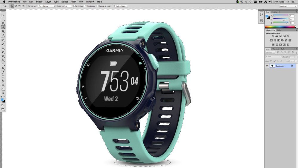
A lot of the day-to-day work of a design studio focuses around cut-outs and masks, so it’s a skill that every designer must master. In this tutorial, Luke O’Neill outlines three basic techniques for creating selections, and also investigates the layer mask options and how you can use them to create cool effects.
08. How to make an animated GIF
Monika Zagrobelna walks you through the creation of a GIF
Creating an animated GIF in Photoshop is surprisingly straightforward. In this beginner-level Photoshop tutorial, Monika Zagrobelna teaches you everything you need to know, as she walks you through the creation of a GIF based on a wolf with glowing eyes.
09. How to create a repeating pattern
Learn to construct a repeating pattern in Photoshop
This tutorial by Christopher Phin explains how to create a single 'tile' in Photoshop and then use it to build up a repeating pattern, which can use to fill as big or as small an area as you like. He uses the example of a black and yellow 'warning' pattern to demonstrate the technique.
10. How to create a quick and easy duotone text effect
Create a duotone text effect in this short, step-based tutorial
Duotone text is one of the big design trends of the moment. In this tutorial, you’ll learn how to use a texture image, a gradient map, some adjustment layers and filters to create a duotone text effect in five short steps.
11. How to create an endless picture within a picture illusion
Capture people’s attention by learning this eye-catching technique
The ‘picture within a picture’ concept is an optical illusion that can’t help but catch the viewer’s eye. This tutorial by Melody Nieves explains how to use simple photo manipulation techniques to create the effect.
12. How to create a vintage film title text effect
Using Photoshop’s 3D capabilities to create a cool text effect
This tutorial by Chris Spooner demonstrates how to use the film title styles of old black-and-white movies from the 30s and 40s to inspire your retro text designs. It makes use of the 3D feature in Photoshop CS6 and Photoshop CC to provide sophisticated lighting and shading to the letterforms.
Next page: Great tutorials for InDesign, Affinity Designer, After Effects and other software
InDesign tutorials
Among Adobe’s tools, Photoshop and Illustrator get most of the glory, but the old desktop publishing warhorse that is InDesign remains key to a lot of design tasks. Here are four great InDesign tutorials that have surfaced in 2017 so far.
13. How to design a book cover with InDesign
Laura Hawk explains how to create a book cover in this 11-step tutorial
Here, Laura Hawk explains 11 steps you need to follow to ensure a perfect book cover in Adobe InDesign. This comprehensive tutorial covers everything from setting up your template, setting up the bleed and arranging the cover panels to adding the barcode and flowing in the copy.
14. Create mixed inks with InDesign
Expand your ink options with this tutorial from Jo Gulliver
In this tutorial Jo Gulliver, senior art editor on our sister magazines, explains how to create ink swatches and groups in Adobe InDesign. This will enable you to create the maximum number of colours with a limited number of inks, without increasing the separations used for printing.
15. How to design a typographical poster using InDesign
Learn to create a type-based poster with this InDesign tutorial
Want to design an impactful event poster in InDesign? Then follow this tutorial from Jo Gulliver, which walks you through the process of creating a typographical poster, showing you how to apply a document grid, and how to create and edit typography.
16. Create special print finishes in InDesign
If you really want to transform your print project, you need to investigate special print finishes. In this guide, Jo Gulliver explains the processes she uses when creating artwork in InDesign for special finishes such as varnishes, foil blocking, embossing and die cutting.
17. How to add video to interactive PDFs in InDesign
Yes, you can add videos to PDFs; here’s how
Everyone knows about PDFs, but you may not be aware how far the format has advanced in recent years. It’s now possible to embed videos in PDFs, and this tutorial by Pariah Burke explains exactly how to go about it.
Tutorials for other software
Here are three other top tutorials that don’t involve Photoshop, Illustrator or InDesign but nonetheless offer a great grounding in their respective subjects. We hope you find them as rewarding as we did.
18. How to create a retro logo with Affinity Designer
Learn how to make a logo using this popular Illustrator alternative
Subscription-free and with some powerful capabilities, Affinity Designer is an increasingly popular alternative to Adobe Illustrator. In this Affinity tutorial, Simon Middleweek explains how to use its gradients and layer effects to create an 80s-style logotype.
19. How to create your own font
Discover how to design a font, from start to finish
In this intermediate level tutorial, Yulia Sokolova explains the process of creating her first font, Bananito, from start to finish. This covers everything from drawing the initial design, transferring the drawing to the computer, and turning it into a font using software such as FontLab or Glyphs.
20. Mock up AR graphics with After Effects
Create AR-style graphics in AE by following this tutorial
As a graphic designer, creating augmented reality (AR) experiences may be a little outside your technical competence. But you may well be asked to, for example, design a pitch video to show what an app with AR capabilities could look like. After Effects has some powerful tools to help you create these kinds of graphics, and in this tutorial, Laura Hawk explains how to use them.
-
You're reading How to Move a WordPress Website from HTTP to HTTPS/SSL, originally posted on Designmodo. If you've enjoyed this post, be sure to follow on Twitter, Facebook, Google+!

Google announced that it has started using HTTPS as a ranking signal. And that has implications for your site and whether it uses an HTTP or HTTPS protocol. For now, it’s only a very lightweight signal affecting fewer than 1 percent of global search queries, and carrying less weight than other signals (such as high-quality […]
-
-
Cisco fixed two high severity vulnerabilities in two products this week that could have let an attacker trigger a denial of service condition or bypass local authentication.
-
Google is doing some incredibly creative things with artificial intelligence at the moment. We've already drawn your attention to AutoDraw, its online app that can turn your doodle art into crisp images. And there's Quick, Draw!, a high-speed Pictionary-style game that not only tries to guess what you're drawing, but also uses your scribbles to improve the effectiveness of AutoDraw.
Do a bad drawing or just a random doodle...
Now someone's used Google's technology to create a delightful piece of online doodling fun. Inspired by his two-year-old daughter's love of drawing – which she calls "no-ni no-ni", Google UX engineer Jongmin Kim has made NONI NONI, a website that turns your doodles into 3D structures made up of colourful balls.
...and NONI NONI guesses what it is and makes a 3D image
Simply scrawl a shape or a letter, and NONI NONI uses Google's machine learning tools to guess what it is, and then takes illustrations from AutoDraw, and also from artist Sanghee Cho, that it then turns into colourful 3D visualisations. It makes multiple suggestions, so you can choose your favourites.
You can spin around and zoom in and out of the finished results either using the mouse wheel or two fingers on a touchscreen. You can then clear the image and start again either by holding down your mouse button for a couple of seconds, or by shaking your device, Etch a Sketch-style.
It can even do letters, too
It's perfect for kids (and we've had quite a bit of fun with it as well), and it's all done in HTML5 with SVG, WebGL and the Canvas element. You should definitely take a look at the site's About page, too, as it features a lovely psychedelic animated backdrop that we could watch for ages.
Related articles:
-
The designs that have had an impact on me are very different projects, but the common element among them is a sense of wit, playfulness and thoughtfulness. Classics such as FedEx, V&A, Pirelli slippers, i-D magazine covers, the Mexican 1968 Summer Olympics, Tate, Shelter, the Tusk Conservation Awards and MIT Media Lab all give a sense that the designer has gone beyond the conventional answer to find something extra.
They’ve injected joy into the work, and the viewer gets some of that joy at the other end, even years later. They’ve all had an impact on me, on the world of design, and on the wider world. Otherwise why would so many still be around? For me, that’s what it means to truly make an impact.
When it comes to executing that in your own work, there’s never an easy answer – but there are plenty of questions. These are the questions I ask myself in my own work, and when judging others' for awards.
Does it work?
i-D magazine’s cheeky ‘winking face’ logo
This is the big one. I love judging work. It’s like being back at college with that terrifying tutor, except the terrifying tutor is now the voice inside my head.
We do it every day in the studio. Every idea goes on the wall and we interrogate it. Pull it apart, question it and tease out its merits and faults. Could it work better? Is there something worth developing? Sometimes it feels like the work is questioning you. It sits there asking: ‘Am I good enough?’
Does it really work?
FedEx, by Landor Associates, complete with ‘hidden’ arrow
It’s easy to deceive yourself. You have an idea you love, but a small voice (maybe that tutor again) says there’s a problem. You try to ignore it, talk yourself round – you can be so persuasive – but the voice insists.
And you have to listen. It’s what pushes you to do better work. When you get there, it’s worth it. The joy you feel at that moment is the joy I want to feel when I see the piece of work. Great work isn’t fragile, it’s robust, and it can handle any amount of interrogation. The more you look for potential weakness, the more you find strength.
Does it cut through?
An application of johnson banks’ Shelter logo, which subtly turns the ‘h’ into a house
Visual clutter has a numbing effect – we’re assaulted by it every day, and we develop an immunity to it. Creative work needs to cut through. That takes wit. Work needs to engage the mind as well as the eye.
I ask myself: Does it move me? Does it make me think? Is it meaningful? Is it joyful?
Is it beautifully done?
Alan Fletcher’s iconic V&A marque bears testament to the power of reduction
The craft of a piece of work is always as important as the idea. Has it been done beautifully? Is it executed with care and attention? Does it look good? It doesn’t always have to look conventionally beautiful, but it has to be beautifully considered.
Does it have a life?
Geometric letterforms based on African patterns reveal the 'Tusk' logo
Logos and marks are as important as ever – social media icons have become such a powerful shorthand for brands. But good design work needs to do more than sit neatly in a corner. It needs come to life.
A brilliant identity should have joy at every turn, and playfulness at every point. It should take on a life of its own. It’s not about sticking logos on things; it’s about those small touches in application that people then notice, appreciate and love.
Does it do the impossible?
The playful Mexican 1968 Summer Olympics
I want to see work that is thoughtful, engaging, beautiful, playful, impactful, surprising, startling, challenging, rewarding and meaningful. That’s a lot to ask, but it’s what makes it worthwhile – for the designer, the client, and especially the audience.
And it is possible – just look at the projects I've mentioned here. I hope there will be some more to add to my list soon.
This article was originally published in Computer Arts issue 266. Buy it here.
Related articles:
-
It's now easier than ever to use platforms such as WordPress and Tumblr to create a highly effective and professional design portfolio page, which is easy to edit and navigate as you please, similarly to the way you would a blog page.
You certainly don't need to be a web design wizard to create a decent looking portfolio site these days. There are a number of handy WordPress tutorials and elegantly designed portfolio WordPress themes out there to get you started on showcasing your work the best way possible.
Here we've picked 21 of the best quality WordPress portfolio themes around. Let us know how you get on with them via Facebook or Twitter!
Please note, as professional quality themes, these are paid options. For free WordPress themes, read our Best free WordPress themes post.
01. North
North boasts 14 pre-built layouts for you to work with
A totally responsive and parallax single-page WordPress theme, North is built with creative studios and agencies in mind, and comes in 14 ready-made flavours to suit whatever work you particularly want to show off. It also makes it easy to create your own custom layout, and there's even an installation screencast available to view that will help you get set up.
02. Twin
Twin's dynamic grid widths will show off your imagery to great effect
Designed for creative and photographers, Twin uses jQuery Masonry layout for dynamic grid widths that really give you the opportunity to show off your work to best effect. It's responsive and retina-ready with eight custom post formats to play with, as well as six custom widgets and all the social sharing features you're likely to need.
03. Assemble
Assemble's Masonry-style layout
Keep your options open with Assemble, a theme that gives you a choice of 18 homepage layouts for your portfolio. Once you've picked the general style of layout for your images, it can be customised down to the finest detail including hover types, spacing and slider style.
04. BePortfolio
Get your Behance portfolio on your own site in a matter of minutes
If you've already published your work on Behance and want your own portfolio site as well, this theme enables you to import everything to your WordPress site using the BeDojo plugin. It also works as a normal theme - you don't have to have a Behance portfolio.
05. Reel Story
Using video to draw the viewer in
Opening with an impactful video is a good way to capture the viewer's attention, and this video portfolio template lets you do just that. It's set up so that the demo content is automatically installed so you can use it as a base for your own site.
06. Stag
Stag lets you build minimal sites with sophisticated features
If you can't decide whether you want something minimal or versatile for your portfolio site, Stag gives you the best of both worlds. It's powered by Visual Composer, making it simple to build great-looking pages, but if you want features such as parallax backgrounds and animated content they're easy to implement.
07. Vong
Vong is a CSS3-powered theme suitable for freelancers and agencies
Responsive, retina-ready and intuitive, Vong is a modern minimalist portfolio theme suitable for both freelancers and agencies. Powered by CSS3, it features three portfolio sizes and a fully responsive lightbox, as well as WooCommerce support and it'll even let you use HTML5 video as a page header background.
08. Flights
Flights is a visually rich theme with plenty of options
Built to meet the needs of creative photographers and illustrators, Flights is an elegant and responsive WordPress portfolio theme with a focus on imagery and colours, with four portfolio page templates and plenty of filtering, animation and scrolling options.
09. Alpha
If you need a fast and customisable mobile first theme, check out Alpha
For a responsive mobile first theme that's highly customisable and blazing fast, look no further than Alpha. It comes with an attention-grabbing, custom-built portfolio slider that works well with both scroll and touch interaction, it uses AJAX to load portfolio projects with impressive effects, and its drag-and-drop composer means you can quickly build great-looking pages.
10. Hind
Hind is crammed with options and has its own support team to help you out
If you want to get your portfolio site up and running in minutes but don't want to compromise on choice, then take a look at Hind. It comes with 14 read-made homepages and over 20 header styles, 11 pre-made sliders, plus an assortment of layout variations and animations and much more besides. And if you run into difficulties, there's a dedicated support team to help you out.
11. BigBang
BigBang makes it easy to control the appearance of your responsive site
The BigBang WordPress theme offers a very original editing system, working with various shaped preview thumbnails and a clean and clear layout, enabling you to control the appearance, columns, font and size easily. A great way to create a responsive WordPress portfolio site to showcase your work.
Next page: 10 more excellent WordPress themes
12. Nemesis Clean Design
Nemesis Clean Design does exactly what it says on the tin
This portfolio WordPress theme is specifically aimed at designers and creatives looking to expose their work. Nemesis Clean Design has a multi-functional layout that allows multiple page editing and run across the whole digital platform, allowing you to view it on iPhone/iPad devices without any modifications.
13. Media Book
Media Book gives your imagery a luxurious feel
Media Book offers a perfect and refreshing WordPress theme that would work particularly well with photography and very visual imagery, giving you a professional and luxurious feel to your work.
14. Hipster
Hipster is so laid back, it's laid out
As the name suggests, Hipster offers a modern and relaxed alternative to an overformal portfolio site, with multi-functional pages that will allow viewers to engage and interact with the content - perfect for studios and collectives. Its many editing features allow you to personalise the content to best suit the nature of your work, again viewable on a range of different digital platforms.
15. MiniPress
Let your work do the talking with this simple black and white theme
MiniPress offers a simple but classy black and white layout to give your work a glossy finish. This theme is functional on many platforms and easily accessible.
16. Pen & Paper
Pen & Paper offers a refined and traditional look but with modern touches
Pen & Paper offers a more classical and refined layout for your WordPress portfolio, with a more traditional look, yet interactive and user friendly, adapting to a modern context.
17. SimplyInfinite
SimplyInfinte is smooth and clean with flexible editing options
The SimplyInfinite WordPress theme offers a very smooth and clean layout, giving flexible editing options as well as pages to spread out and distribute your content within.
18. Rhea
Rhea is a clean and structured layout for illustrators and artists
Rhea is another great clean and structured layout, perfect for illustrators and visual artists. This WordPress theme is fast and smooth, allowing your work to be put forward in a user-friendly fashion.
19. Retro
Retro lets you build web pages like you used to get in the 1950s
This WordPress theme offers an alternative design for your portfolio site, with a retro inspired layout, easy editing options and multiple page facilities, with built in options including contact forms and Nivo sliders.
20. Incorn
Incorn boasts plenty of image, audio and video features
Incorn has a stylish layout, offering up to 20 pages of content made very easy to navigate and interact with. The clean and modern design of this WordPress theme is easy to customise and edit. With built-in image, audio and video friendly facilities, it's easily connected to social networks.
21. Haze
Haze is beuatiful and stylish with great navigations options
Haze is a beautiful and stylish portfolio WordPress theme that offers a full screen slider welcome page and easy to use navigation options: perfect for creatives and visual imagery.
This is an updated and expanded version of an article previously published on Creative Bloq.
Related articles:
-
Japanese graphics tablet specialist Wacom has teamed up with Drink and Draw Berlin to give creatives the chance to win an exclusive masterclass with famous illustrators, animators and concept and comic artists.
Taking place on 31 August at Umspannwerk Alexanderplatz in Berlin, Germany, the Wacom Masterclass Competition is a fantastic opportunity to learn new skills, network with other artists, and even win the new Wacom Intuos Pro.
Entrants have a choice of which masterclass they would like to sit in on, with the options including illustration with Josan Gonzalez, concept art with Adrian Wilkins, comic art with Goran Sudzuka and 2D animation with Raman Djafari.
The new Wacom Intuos Pro could be yours
The Wacom Masterclass Competition is already up and running, but you've got until Friday 18 August at 23:59:59 CEST to enter.
To be in with a chance of winning, simply like the official Wacom Europe Facebook page and choose one of the four masterclass themes. Then submit an artwork relevant to that theme on Facebook, Twitter or Instagram with the hashtag #WacomMasterclass and a hashtag of the relevant theme (such as #illustration, # comic #conceptart or #2Danimation).
You'll also need to email your artwork with the subject line 'Wacom Masterclass Competition 2017' to contest@wacom.com.
Five winning artworks will be selected by a panel of three people from the Wacom marketing team and the folks behind Drink and Draw. For full competition details, head over to the Wacom competition page.
Related articles:
8 tips to ace tech job interviews
in Ειδήσεις από τον χώρο του Design και Hosting
Posted · Report reply
Landing your dream job isn't just down to perfecting your design portfolio or creative resume – you also need to present yourself the right way in your interview. I have been in the room for a lot of web tech interviews, and on the way, I have picked up a few tips for web designers and developers looking to land a new job.
The following advice will help you convince interviewers you're right for the job – and lots of this is relevant to other disciplines beside web design.
01. Dress like them
Don’t show up to an interview for a tech job wearing a suit. Unless perhaps you are interviewing to be the CFO – but probably not even then. I don’t know any companies where designers or developers wear suits. It makes you look out of place, and that is the opposite of your mission – your goal is to convince them that you belong there.
How should you dress? Like them! This is easy if you have a chance to visit the workplace in advance. If that is not an option, look at the photos on the company’s website and learn what you can from its About us page. Many team photos are taken in the office, during a work day. If they have a blog, you will almost certainly find photos from events that give you a sense of what the dress code is like, if there is one at all.
When in doubt, just wear whatever clothes you would normally wear when you want to look ‘nice’ but still feel comfortable and natural. Don’t buy brand new shoes that will hurt your feet, or wear itchy new underpants.
02. Know what you're walking into
Some companies conduct really casual interviews over coffee, while others have a very formal process with multiple sections. Some companies will ask you to do a sample project, or present an example of your work.
In order to feel confident, it really helps to know what you should prepare for. So when you're invited to the interview, it's perfectly reasonable for you to ask about the company’s process.
Be respectful of their time (hiring is very time-consuming) and don’t ask so many questions that you seem desperate or paranoid. But feel entirely justified in requesting the following facts:
03. Ask questions
At some point in the interview you’ll be asked if you have any questions. ‘No’ is the wrong answer. Having zero questions makes you seem disinterested and clueless.
When I am the interviewer I learn as much about a candidate from what they ask me as from what I ask them. I’m much more likely to hire a candidate who asks smart questions about things that matter rather than someone who just wants to know how long lunch is.
The questions you decide to ask the interviewer are your chance to talk about anything you want to. You might take this chance to (subtly) demonstrate your familiarity with the company, or mention something you want them to know about you. At the very least, it’s an opportunity to show what kinds of things you are interested in. Don’t waste it!
04. Don't panic about tests
Some companies ask candidates to do puzzles or tests. I have never used these as an interviewer because they tend to make candidates anxious, and at best they demonstrate how someone works when they are nervous and uncomfortable. Hopefully this doesn't strongly resemble what it will be like to work at that company.
Knowing this won’t necessarily get you out of doing them, but hopefully you can relax a bit in the knowledge that the interviewer’s attempt to test you has actually revealed something silly about them. Remember, you can learn a lot about an organisation from their hiring process.
For an entry-level job, it’s probably safer not to point out that you know their hiring process is flawed, but you can use this knowledge to your advantage by not getting fooled into thinking it matters how quickly you solve the puzzle. So stay calm. By simply not panicking, you demonstrate you are smart and confident enough to know that solving a silly brain teaser doesn't indicate how intelligent you are.
I recommend thinking out loud and asking plenty of ‘meta’ questions. For example, if you are asked how to calculate the total number of ketchup bottles in North America, ask what the figure will be used for and explain that the goal affects the accuracy requirements, which will dictate your methodology.
If you are asked how to move Mount Fuji, ask ‘How far?’ (after all, it is already in motion). This helps shift the focus away from whether you get the ‘correct’ answer (if there is one) and more towards your process for solving problems.
05. Pretend it's your first day
An interviewer’s job is not only to find someone with the skills to perform the work, but also who enhances the existing team. If there are dogs in the office and you are a dog lover, pet them (without being annoying). If a designer is using a special pen you love, compliment it, and if a conversation strikes up, don’t forget to introduce yourself.
If a technical question arises and the interviewer pulls in one of the current engineers to help answer it, welcome the situation as if you are already colleagues. Seize every opportunity to interact in ways that demonstrate your ability to do the work and be part of the team, even if it’s only for a minute or two.
Don't try to prove that you are better than the existing employees. You're not competing with them for the job, and it will make them dislike you. A smart boss will be more impressed by your ability to empower others than to upstage them.
06. Know what they do
If you're interviewing at a design agency that has one or two long-term clients, know who they are and what they do. This is a good idea for a number of reasons. It helps to show that you ‘get it’. You don’t want them to start telling you about something important, and be forced to interrupt them to ask who they are talking about.
If you are interviewing with a startup, download their app and spend some time learning how it works. If there are features or design decisions you don’t understand, or if you have ideas on how you could improve something, these are great questions to ask (politely) when it’s your turn. Just make sure you are also respectful and complimentary.
07. Be on time
Do I really need to explain this? If you are hired, most jobs will expect you to get to work on time, so demonstrate you are good at that. Know in advance where you’re going and how long it takes to get there so you arrive with extra time.
Don’t show up for the interview super-early. That’s awkward. Find a coffee shop or somewhere comfortable nearby to relax, then arrive five or 10 minutes before your appointment.
08. Interview a lot
Practice makes perfect, and the more you interview the more comfortable you will feel. So do it a lot – not just when you desperately need a job. At this point in my career, I genuinely enjoy going to interviews. I don’t get anxious because I know that if the interview is unpleasant, working there probably would be, too.
I also like seeing how others teams work, and I treat it as a chance to meet interesting people and expand my professional network. This is important because it lets me focus more on the process and less on the outcome. Even if nothing comes of it initially, I don’t consider it a failure. There have been many instances when I have worked with someone long after the interview, on a completely different project. So stay positive (even if you think it is going poorly) and have fun.
This article was originally published in net magazine issue 288. Subscribe here
Related articles:
View the full article