

Rss Bot
-
Content Count
19,206 -
Joined
-
Last visited
Never -
Feedback
N/A
Posts posted by Rss Bot
-
-
Node.js continues to be one of the most popular server-side frameworks available, through a combination of its lightweight efficiency, support for the 'JavaScript everywhere' paradigm, and comprehensive package support.
Since its introduction in 2009, Node has been through a number of major releases, including most recently version 8.0. This release dropped at the end of May and will enter LTS (long-term support, indicating a more stable version ready for enterprise adoption) in October. There's a lot going on in the latest release, and it's worth a look at some of the highlights.
01. V8 5.8
Node is built upon Google's Chrome V8 JavaScript engine (V8 is the name of the engine, not the version number), and Node 8.0 includes V8 5.8. This ships with significant improvements in performance and APIs, and establishes forward compatibility for Node 8.0 with future versions of V8. This is significant enough that the team behind Node actually chose to postpone the launch of 8.0 from April to better accommodate it.
02. Faster npm
If you're using Node, you'll be intimately familiar with npm, and Node 8.0 now includes the latest stable release, npm 5.0.0. This update includes significant speed-up of common tasks such as package installation, and several changes to improve consistency and avoid corruption.
This means that npm is now more reliable and faster than ever. And if you've ever missed out '--save' while installing modules, you'll be relieved to hear that new installs are now saved by default.
03. Better Buffer security
One of the more straightforward changes introduced in Node 8.0 is a security improvement to buffers. In prior versions, 'new Buffer(num)' did not initialise memory space with zeros. This was done for performance reasons; however, it meant that a new Buffer could contain sensitive information, leading to security issues.
Now, a new Buffer will automatically be filled with zeroes. This may seem minor, but could have performance implications which should be considered. Ultimately, Buffer(num) has been deprecated for some time, so it's probably best to move away from it.
04. util.promisify()
An interesting addition to Node 8.0's libraries is the 'util.promisify()' function, which has many Node developers excited. It's widely acknowledged that promises offer an improvement over callback-based asynchronous code. util.promisify() gives us an easy way to wrap callback-based functions to return promises.
This can be particularly useful for codebases and libraries with large numbers of callbacks, where refactoring code to use promises would be cumbersome and time-consuming. Previously it was common to use Bluebird.js or similar libraries to do this, but it's now a core Node function.
05. async and await
Another step forward for asynchronous code is the addition of the async and await keywords. These have actually been available in Node since version 7.6.0. However, 8.0 is the first version with them which will enter LTS, which is likely to mean a significant uptake in enterprise adoption. async functions provide an alternative to callbacks and promises (they're actually built on top of promises), which provides a cleaner syntax.
06. N-API
An experimental feature, the Node.js API (N-API) has been added in Node 8.0 to improve support for native modules. Native modules are written in C or C++, and loaded into Node.js as if they were a regular Node module. These are useful where performance is critical, or for hooking into low-level APIs or existing C or C++ libraries.
However, historically this has created a maintenance burden as the underlying V8 and Node core interfaces upon which native modules depend were not guaranteed to be stable, meaning native modules often needed updates to support new Node releases. N-API offers a set of stable, abstracted interfaces available as C APIs, maintained as part of Node itself. Being experimental, it does not yet provide full coverage of all V8 features, but this should improve in future.
07. Fixes and improvements
In addition to these new features and a few smaller ones, there are a number of stability improvements and fixes included in the new release. For example, console.log() and other similar methods are now safer than previous versions, as situations where they could cause the application to crash have been resolved.
The Node team have also begun the process of assigning static error codes to all errors Node generates, which are easily queried in the documentation and guaranteed not to change even if the associated message does.
08. What's next?
Beyond version 8.0, Node.js continues to improve and evolve. It usually sees two major releases per year, and the next, Node 9.0, is due for release in October. The Node team typically only move even-numbered versions to LTS status, and LTS for Node 10.0 is not scheduled until October 2018.
Once versions reach LTS status, they are actively maintained for a period of 18 months, after which they move into a 12-month maintenance status (during which only critical bugs and security issues are patched).
As a result, Node is likely to remain both popular and a safe choice for the foreseeable future, and Node 8.0 itself is expected to have a three-year shelf life from now.
This article originally appeared in Web Designer issue 263; buy it here!
Related articles:
-
Every designer requires a little inspiration as they work. The next time you’re stuck on a project, dip into the library of assets and vectors from StockUnlimited. You can get a three-year subscription to this vast design library for just $39.99 (approx £32)!
The design library assembled by StockUnlimited is like nothing you've seen before. This massive collection of over 600,000 professionally crafted design resources is ready and waiting to be used in any project you can imagine. Download as many assets as you'd like, as there are no royalties to worry about. Make use of them however you'd like, whether it’s for personal or commercial use.
A three-year subscription to StockUnlimited usually costs $684, but you can get full access for just $39.99 (approx £32)! That’s a saving of 94 per cent on a must-have subscription for any designer, so grab this deal today!
-
Singapore-based freelance web designer and developer Zell Liew shares everything he's learned about frontend development on his blog, so that others can benefit from him banging his head against the wall. It's no wonder his easy-to-follow tutorials and confidence-boosting articles are immensely popular.
We caught up with him for a chat ahead of his Generate London talk and workshop on building scalable responsive components. Here, Liew tells us a little about being self-taught, time management, and what to expect from his Generate sessions.
Favourite frontend skills
You help people learn a lot of different frontend development skills including CSS, JavaScript, responsive design and web typography. What are you most passionate about?
Zell Liew: That's a hard question. When I first began, I was mostly passionate about CSS. As I got better, responsive design, typography, JavaScript and even automating workflows came into play.
Not having a degree may actually be an advantage
I don't have one thing that I'm most passionate about. I'm passionate about all of these topics, which is why I've dug into them and learned as much as possible myself. Once I've learned enough, I step out of my comfort zone and begin teaching them.
Advantages of teaching yourself
There’s a lot of talk in the web industry about whether you need a degree. What lessons have you learned from teaching yourself?
ZL: A degree certainly helps, but you can learn well even without a degree. The number of experts without degrees in our industry suggests that degrees aren't prerequisites to becoming good at coding.
The most important lesson I've learned about not having a degree is to believe in yourself when you're learning. I've had many instances where I don't, and that slowed me down drastically.
The second thing is that not having a degree may actually be an advantage. Since you got to learn everything yourself, you need to think deep about processes and theories to internalise them. Eventually, it'll lead to remembering the things you've learned and being able to think creatively when you face problems.
At Generate London, Liew will dive into building responsive scalable components
On your site you say that you constantly reinvent your techniques as new technology appears. How do you do that, and how do you decide what to learn?
ZL: I watch out for what people are saying, especially the experts in the web field. Then, whenever I begin a new project, I tweak my processes to include what I've learned from these people. When I do so, I always make it a point to modify the techniques to suit my style.
Sometimes, my modifications were horrible. But sometimes, I think that helps me even more. The key thing here is that by modifying what I've learned, I effectively made it my own, which helps me gain a deeper understanding of the original knowledge.
As for deciding what to learn, I go with what I feel most inclined to at the moment. When I first started, it was Photoshop because I wanted to learn how to design. Then, it became HTML and CSS because I wanted to show my creations. Then, it became Wordpress because I wanted to build a blog. (Wow, that was four years ago!). I still follow the same method now.
Staying productive
You’re incredibly prolific and juggle writing articles (and books) for your blog and other publishers, creating courses and free libraries, as well as consulting. How do you manage your time?
ZL: I can't remember where I heard this, but there's a saying that goes 'it's not about time management; it's about energy management.'Why do I bring this up? Well, there was a time when I tried to work from the minute I woke up to the minute I slept, resulting in 14-hour work days. It was horrible. I felt so drained that I couldn't get anything done. I was also perpetually stressed and pissed off. Don't be like me then.
Now, I manage my time and energy a little better. I work for 1.5 hours and take a 30-minute break between each work session. This allows me to recover from the intensity I put in when I work.
Liew recommends following the advice in these books
If you want to become more productive with the same amount of time spent, I suggest you read these two books:
First, Deep Work by Cal Newport. This book suggests you should break up your schedule into "deep hours" where you focus hard on getting things done, and "shallow hours", where you tackle emails and other tasks that require a lot of context switching. I find this approach helps me manage my mind space.
Second, The War of Art by Steven Pressfield. In this book, Steven shows you how to tackle the resistance and dread you feel when you try doing work that's important to you. Although he talks about writing, you don't need to be a writer to benefit from it.
Once you're done with these books, get to work. Plan a schedule and keep to it.
What’s your favourite JavaScript hack right now and why?
ZL: I don't have any favourite JavaScript hacks in my dictionary, unfortunately. Each piece of code needs to be used in a specific situation before it performs amazingly.
If you're talking about my favourite line of JavaScript code, that has to be console.log(). It's a lifesaver for debugging.
Liew loves helping people learn solid frontend development skills (this photo and the main image are from Zell's workshop at Fronteers last year)
Building scalable website components
What’s the biggest challenge of building maintainable and scalable websites?
ZL: Most people would think the biggest challenge is to write scalable HTML and CSS code. While good frontend code has its challenges, I believe the hardest part is communication between stakeholders, designers and developers.
Everyone has to work together in a team to pull off a scalable and maintainable website. It's not just the job of the frontend person.
What can people expect to take away from your talk and workshop at Generate London?
ZL: The focus for my talk and workshop at Generate is about building responsive scalable components – the key to good frontend code. You'll walk away with know-how on the following:
1. You'll know how to name your components
2. You'll know what architecture to use
3. You'll understand the difference between modularity and scalability and how to code them up
4. You'll know how to write mobile-first responsive code that's easy to maintain.Other Generate London workshops on 20 September feature Steve Fisher on running design and content sprints, Anton & Irene on idea generation and the selling of the idea, and Jaime Levy on user experience strategy. The conference will also cover adaptive interfaces, web animations, performance, accessibility, prototyping, chatbots, better teamwork, and much more.
During Generate London's 24-hour flash sale tomorrow (10 August) you can save almost £300 per ticket! But hurry – tickets are limited and will be available at the special price from midnight tonight (BST).
Also, don't miss issue 298 of net magazine, which will feature an in-depth interview with Zell Liew.
Related articles:
-
If there’s one type of company that needs to get its business card designs right, it’s a design agency. Its whole reason for existence is to create great designs, so if it can’t do that with its own business cards, it’s bound to raise eyebrows.
The agencies featured on this list have created top-class designs for their business cards, ranging from the elegant to the quirky (though not as quirky as these innovative business card designs). Most were designed in-house, though the last two called in the expertise of outsiders. We hope you like them too, and that they help to inspire your own business card projects.
01. Ink Digital
Ink Digital prints the same business card for each staff member, then gives them individual stickers to complete the design
Ink Digital, an award-winning digital agency based in Yorkshire, England and Melbourne, Australia, has come up with an innovative way to reduce costs, waste and print runs. It printed the same charmingly upbeat business card for all members of staff, and then printed separate stickers for each individual, which included their headshot and contact details, to be fixed onto their own cards.
02. Made Brave
MadeBrave’s foil-printed business cards are a feast for the eyes
MadeBrave is an agency in Glasgow, Scotland, that focuses on branding, design, digital and social. It describes these black and white business cards with painted edges as “like beautiful black and teal sandwiches”, and who are we to disagree? They were designed in-house and printed with matte white foil on both sides.
03. Mediendesignwerk
Mediendesignwerk’s business cards fuse luxurious materials with sophisticated printing techniques
Mediendesignwerk is a creative design agency based in Bavaria, Germany. What it describes as its ‘look-alike-letterpress business cards’ were printed by Druckkultur Späthling on extra-thick 600gsm Gmund Cotton paper. Two-colour offset printing was employed, with blind embossing for the background ‘M’ pattern.
04. L'Atelier Irradie
This French agency’s business cards make inventive use of colour gradients
L'Atelier Irradié is a multidisciplinary creative studio founded in Paris in 2016 by brothers Alain and Laurent Vonck. 'Irradié' basically translates as 'irradiated', or to radiate light, making the metallic, jewel-toned gradients of these business cards tie in with the concept beautifully. On the other side, there’s no ink at all: the contact details are simply imprinted on the white card.
05. Aurora
Aurora’s stunning cards showcase the kind of client work it's known for
Aurora is a creative studio founded by Lize-Marie Dreyer in 2015 and based in Cape Town, South Africa. These beautifully illustrated business cards represent the kind of work it does perfectly. They were designed in-house and feature gold embossed detailing.
06. CP+B
CP+B reflects its love of the analogue with this business card, which doubles as a stencil
Founded in Miami, Florida, in 1988 by the late Sam Crispin, Crispin Porter + Bogusky (CP+B) is a large agency with offices around the globe. Its designers are strong believers in the notion that all ideas should start on paper, without the influence of computer software.
So associate design director Scott Pridgen came up with the idea of creating a business card that acts as a stencil. The card is made of thin plastic and features a selection of laser-cut icons including Hermy, the firm’s elephant mascot.
07. Nymbl
Nymbl’s two-colour cards make an instant impact
Nymbl is a moving image production studio based in Bristol, England, that specialises in 3D animation and virtual reality (formerly called FA Digital Productions).
Feeling its branding was letting it down – and lacking the in-house print design expertise of the previous agencies in our list – it turned to a local agency, Big Fan, to come up with a new name, website and branding. As part of that effort came these cool cards, with an eye-catching two-colour palette, and two punched-out dots; one representing work, the other play.
08. Curious Space
Curious Space’s business card design conveys the concept behind the agency perfectly
Curious Space is a Brighton, England-based design studio that specialises in the creation of immersive spaces for for museums, galleries and the stage. This inventive business card was created by London design director Mark Bloom, aka Mash Creative, as part of an identity design in collaboration with Andy Cooke.
It was printed in fluorescent and grey ink with a blind debossed grid pattern to the logo on the reverse side. You can see more images of the business cards at printer Freestyle Print's website.
-
You're reading CaptainForm – A Hero Form Builder, originally posted on Designmodo. If you've enjoyed this post, be sure to follow on Twitter, Facebook, Google+!

CaptainForm is a five-star WordPress plugin that takes form building to another level. Forms were never a top priority for CMS developers. Basic functionality exists in most content management systems, however, implementation is limited. Other than basic subscription or contact forms, you are limited in what you can do with built-in functionality. Even the almighty […]
-
Microsoft patched 25 critical vulnerabilities, including a remote code execution bug in Windows Search.
-
You're reading How to Upload Themes and Plugins on WordPress.com, originally posted on Designmodo. If you've enjoyed this post, be sure to follow on Twitter, Facebook, Google+!

WordPress announced the implementation of long-waited functionality to upload and use themes and plugins to WordPress.com. If you download or purchase a WordPress theme or plugin, you can upload it to your WordPress.com website. People love WordPress because it’s absolutely customizable. With support for plugins and third-party themes, WordPress.com business customers may be able to connect […]
-
Adobe today pushed out its first Flash Player update since announcing it would end-of-life the software in 2020.
-
If you’re in search of some fresh and inspiring reading material to take on holiday this year (or to read in office with a coffee if you're not going away), then look no further than these gorgeous magazines.
Large-scale commercial magazine publishing houses may be under pressure from every angle these days, but the independent design magazine scene has never been so exciting, with new titles launching regularly on every esoteric topic you can think of.
We’ve gathered a sterling selection of magazine recommendations from those in the know. So here are nine magazines for you to check out while the sun is still shining...
01. Special Request
Special Request is a new broad culture journal, currently on issue 2
“It is too simple a thing to look at one part of a culture... culture is the combination of many different things working in concert.” This is the mantra by which the beautifully produced journal Special Request operates.
Its lofty ambition is to explore “the entire human experience piece by piece... subjecting it to sometimes forensic, sometimes scathing, sometimes interesting analysis from the world’s finest minds.”
Jeremy Leslie, founder of magCulture, is a fan, and recommends the newly-released second issue, which celebrates the golden age of television across 124 pages of 120gsm offset stock, finished off with a gold-foiled 400gsm cover.
Leslie picks out some personal highlights from the issue: “Antoine de Caunes recalls Eurotrash, Ben Loory and Haruki Murakami offer some new fiction, and the visual highlight is Alex de Mora and Marisha Green’s still-life tribute to Beavis and Butthead,” he says.
“It closes with an image of an old-fashioned cathode ray television set, floating away against a 70s New York skyline.”
02. Berlin Quarterly
European title Berlin Quarterly combines in-depth reportage, literature and visual culture
Calling itself a “European review of long form journalism, literature and the arts”, Berlin Quarterly is a fascinating blend of in-depth reportage, literature and visual culture that Steve Watson, creator of indie mag subscription service Stack, firmly recommends.
“It’s a heady mix of essays, fiction, poetry, photography and artwork,” Watson enthuses. “Based out of the German capital, it wears that city’s bohemian reputation on its sleeve.”
It's definitely worth slipping into the suitcase for when you fancy getting stuck into some meatier content.
03. The Plant
The Plant is produced in Barcelona twice a year
According to its creators, The Plant magazine delivers content by plant lovers, for plant lovers, in a “simple, personal and cozy way”.
It’s currently on its 11th issue, Leslie recommends taking a look. “Horticulture is just a starting point for this magazine, now a mainstay of the indie scene,” he explains.
“Ryan Lowry’s opening photographs of the landscape, cacti and fences of the US-Mexico border set a manifesto-like tone that continues throughout issue 11. Mercedes Villalba looks at the resilience of nature, and Lindsay Sekulowicz examines Amazonian artefacts to learn how humankind has always cultivated nature.”
“Against all this, a guide to growing Aloe Vera may seem prosaic – but this element remains a key part of the magazine,” adds Leslie. The Plant’s team describes itself as “a curious observer of ordinary plants and other greenery”, and this simple love for natural life shines through on every page.
04. Racquet
Racquet says it's about tennis, but it covers so much more, so beautifully
Rather like The Plant, Racquet is “one of those indie titles that purports to be about one thing (in this case, tennis) but in fact uses that as a prism through which to explore all sorts of things. You’re never quite sure what you’re going to turn the page and read about,” says Rob Alderson, former editor-in-chief of Printed Pages, who now heads up WeTransfer’s editorial division, This Works.
A quarterly title that celebrates the art, ideas, style and culture that surround tennis, Racquet “fondly remembers the swashbuckling sport of the tennis boom of the 1970s and ’80s” and aspires to “restore some of that swagger to today’s game.”
“It looks and feels beautiful – as a lot of indie titles do – but the writing is exquisite and it’s edited really well too, which makes for a perfect print experience,” adds Alderson.
05. Shelf Heroes
Each copy of Self Heroes issue F includes a free Fifth Element woven patch, three postcards and a sticker
A wonderfully simple editorial premise lies at the heart of the intermittently printed fanzine Shelf Heroes, the magazine “created by people who love cinema.”
It’s working its way through the alphabet, and celebrating a diverse batch of films that start with each letter: “Some great, some not so great.” Issue one, as you might expect, was A – with films including Alien, Apocalypse Now, Avatar and American Ninja 3: Blood Hunt.
“Shelf Heroes has now reached the letter ‘F’ – and I can’t wait to dive into Festen, First Blood, Fargo and Four Weddings,” chuckles Watson.
06. The Happy Reader
The Happy Reader is a book-loving collaboration between Penguin Classics and Fantastic Man
A collaboration between Penguin Classics and Fantastic Man, The Happy Reader is a ‘virtual book club’. It's now on its ninth instalment, which includes a focus on Robert Louis Stevenson’s Treasure Island.
“This classic is contextualised by musician Andy Partridge writing about sailor’s songs, a visual taxonomy of messaging flags, and a treasure hunt – although the prize has just been won,” reveals Leslie.
“It’s all fronted with a lengthy interview with model/actress/bookshop owner Lily Cole, all beautifully presented as ever.”
Clearly The Happy Reader is worth a look this summer, as Watson picked it out as well. “I can’t think of better beach reading,” he grins.
07. Pit
Pit is a new magazine for BBQ aficionados
Nothing says summer like a sizzling barbecue, and Pit magazine has capitalised on our enduring passion for cooking outdoors over a open flame with an artisan publication like no other.
According to the team, it’s all about “the smell of smoke in the air, the singed hairs on your fingers and the pink ring on a rack of ribs you cooked at the end of your garden.”
But within that overarching topic, the magazine delves into global cultures: “From the American BBQ to the Polynesian Imu fire pits, Jamaican jerk drums and mackerel grills lining the shores of the glittering Bosphorus in Istanbul.”
Pit plans to release three issues during the (hopefully) warm months of the year, with the second due out in August. “I’m really hoping I can get hold of it in time for the holidays, to give us some inspiration over the coals,” says Watson.
08. Real Review
Real Review issue 4 reviews everything from the EU flag to Japanese boyfriends for hire
The quarterly flagship publication of the Real Foundation, Real Review was named Launch of the Year at the 2016 Stack Awards. Since then, according to Watson, it has gone from strength to strength.
“Its roots are in architecture, but this ingenious review ranges far and wide to challenge the way we see the world,” he explains.
Leslie is also an advocate, drawing attention to the title’s unique format: square, with a vertical fold.
“Real Review deserves praise too for its editorial design and content,” argues Leslie. “It examines contemporary life with a spare and intelligent vocabulary that both tests and thrills. Content and form that should be at utter variance somehow complement each other perfectly.”
09. mono.kultur
Each issue of mono.kultur is dedicated to one artist from various fields
Also hailing from Berlin, quarterly A5 title mono.kultur focuses on art and culture, or more specifically the creative minds who make the most exciting music, film, literature and visual art happen. One at a time.
Each issue features just a single interviewee, carefully selected and beautifully designed. Its online description is a paragon of German efficiency: “Questions and answers. Conversations with the interesting few. In full length and depth, extensive and unfiltered.”
The current issue, 43, is dedicated to artist/musician Fatima Al Qadiri, and it’s Leslie’s final pick. “The presentation is smart but simple, with text and photography clearly defined and separate,” he begins.
“The exciting part is the additional images, printed on a special acetate substrate called Stafix – static electricity makes these ‘stick’ to the pages of the magazine, allowing the reader to peel off and replace images over other images.” What better way to spend your summer?
To explore the indie mag scene in more depth, magCulture will be running its fifth-annual ModMag conference in London on 2 November, an event that never fails to inspire.
Related articles:
-
Prototyping is perhaps one of the most important parts of the web design process. By building a website prototype we can test ideas with users, we can be wrong, we can learn, but most importantly we can do this quickly. But choosing the right prototyping tool can make or break the outcome.
When picking a prototyping tool, be sure to ask yourself these three questions:
01. What do you want to learn from your prototype?
If you want complex features in your prototype, use something like Axure
Want to test if you have the flow through a process right? Look at tools like InVision or Marvel. Want to know if users can complete an online form usefully? You’ll need tools like Axure or a real coded prototype.
02. What resources do you have to build a prototype?
Use a tool like Marvel if you need to get things done quickly
If time’s short, explore quick paper prototypes (you can use InVision or Marvel to turn these into clickable prototypes). Have a bigger team, and dev skills? There’s nothing better than a coded prototype, as the code can go towards the final product.
03. How will you test?
InVision makes it easy to test and incorporate user feedback
Are you testing with real users? Are there technical constraints with the test? How will you record the test or collect feedback? And what will you do with the prototype? All these decisions will help you choose the right tool.
This article originally appeared in net magazine issue 294. Buy it here!
Related articles:
-
Remember Frozen? If you were a sentient human in 2013, chances are the fantasy film's musical number Let It Go popped into your head when you saw this article. So it makes sense that the Disney Theatrical Productions have adapted Frozen into a Broadway musical, set for release next spring.
To promote the movie, a new poster was in order. Organising one fell to Andrew Flatt, Disney Theatrical's senior vice president for strategy, marketing and revenue.
Frozen's tale of the newly crowned Queen Elsa struggling with her magical ice-controlling powers is a story seared into the memories of children and patient parents around the world, so it makes sense that the poster needed to focus on these elements. Flatt also wanted to stick to a recognisable ice-cold colour palette.
The chosen design emerged from among several submissions by advertising agency Serino Coyne and was created by Olly Moss, a British artist based in Winchester, England. It features a stylised snowflake that incorporates the main characters through a clever use of negative space, which many observers might not notice immediately.
Olly Moss is well known for creating alternative posters for old movies
Over 100 poster concepts were submitted by Serino Coyne, which have been generously shared with comments by Flatt. They provide a fascinating insight into how big companies sift through potential designs.
Explore these potential posters in the gallery below by clicking left to right. Each caption sums up Flatt's feedback.
Related articles:
-
Google's August Android Security Bulletin featured patches for nearly a dozen remote code execution bugs impacting Google's Pixel and Nexus handsets.
-
Smartphones have made it easy to snap photos and apply filters, but it's still hard to beat a photo captured on a powerful DSLR camera. Go beyond point and click to capture images you could never imagine on a phone. Get the DSLR Photography Course Bundle for 93% off the retail price!
The DSLR Photography Course Bundle offers two in-depth courses that will teach you how to get started with your camera, then how to master the advanced tricks to capture incredible photos.
Using a DSLR is an entirely different experience than using compact cameras or smartphones, but once you understand it, you’ll be able to take photos you'd never see on a smartphone. The over 10 hours of content in these courses will help you make the transformation.
You can get the DSLR Photography Course Bundle on sale right now for 93% off. That’s an amazing saving on a course bundle that usually costs $394, and is too good of an offer to pass up if you want to master the art of photography!
-
If you work in web design or development then you'll want to attend Generate London on 20-22 September 2017, for lots of good reasons.
The fifth annual conference for web designers and frontend developers is net magazine and Creative Bloq's flagship web event. Featuring 17 fantastic speakers, it covers web animations, performance, UX strategy, adaptive interfaces, accessibility, design and content sprints, and much more.
Plus, on Thursday 10 August, get 50% off two-day conference passes and bundles in the 24-hour flash sale.
And if all that wasn't enough to tempt you, here are even more reasons you don't want to miss this brilliant event.
01. There's a top lineup of 17 speakers
We've gathered together some of the biggest names in web design for Generate London 2017 to share their knowledge and inspire you to create better work than ever before. Our stellar lineup includes Seb Lee-Delisle, Anton & Irene, Zell Liew, Jaime Levy, Aaron Gustafson, Steve Fisher, Léonie Watson, and nine other great speakers. Check out the whole lot here.
02. It's in an amazing venue

The fifth annual Generate London will take place at the Royal Institution, home of the Christmas Lectures, which has promoted scientific learning and research since 1799. It's the perfect place to talk about the future of the web!
03. You'll learn about tomorrow's trends today
Things move pretty fast in the web business, and whether you're in web design or frontend development you need to be up to speed on the latest web trends. Over two days and 16 sessions you'll learn about web animations, adaptive interfaces, prototyping, performance, UX strategy, accessibility, conversational design, and much more besides.
The conference programme will also give you an inspiration boost. If you're running low on creative energy it can be easy to let your work become mundane. Attending events like Generate puts you in a room with energised, vibrant people who will remind you why the web is amazing and give you new perspectives from which to view your contribution.
04. You won't miss a thing
Ever found yourself torn between two equally appealing conference sessions happening at the same time? That's not a problem at Generate London, as it's a single-track programme, which means you'll be able to attend all the sessions without missing out on anything.
Also, videos and slide decks of all the sessions will be made available to attendees after the event, so you can dig deeper and don't have to spend ages taking notes. You can then even share them with the rest of your team. In fact, sharing what you've learnt is positively encouraged!
Up your skills and get ahead of the game; book your Generate ticket today!
05. You'll enjoy a whole day of workshops
As well as two days of inspiring and practical talks, Generate London also features an entire day of in-depth workshops. On 20 September, you can learn new skills from the best in the business.
There are four workshops to choose from; you can learn to build scalable responsive components with Zell Liew, run design and content sprints with Steve Fisher, master user experience strategy with Jaime Levy, and concept, create, and sell with Anton & Irene.
06. It's a great networking opportunity
As well as a lineup of quality speakers, Generate London also offers a great opportunity to forge new contacts among the other delegates. Whether it's during one of the session breaks, or later on at the post-conference happy hour, it's the perfect chance to meet other web professionals and expand your network.
07. You will stay ahead of the competition
If you're not offering up-to-date services then you can be sure that potential clients will seek out other studios and agencies that do. Generate London is the perfect place to boost your skillset and get insight into where you should be focusing your efforts for the future. If you're not there then you can be sure that your competitors will be. Don't get left behind; book today!
08. There's a goodie bag and lunch
Attendees will receive a jam-packed Generate goodie bag full of useful content, including the latest copy of net magazine.
Lunch and refreshments will also be provided every day.
09. We're having a party, too
Of course there's also a party, where you'll have a chance to do even more networking with the speakers and fellow attendees. This time we're at Fifty9 on Berkeley Square, straight after the first conference day on Thursday evening.
10. There's a variety of ticket options
There is a variety of ticket options to suit everyone's schedule and budget. You can book a workshop-only pass, a single- or two-day conference pass or a full conference + workshop pass. There's also a student conference pass.
And this Thursday, 10 August, you can get 50% off two-day conference passes as well as the conference and workshop bundles! If you buy the latter, you’ll be spending just £297.50, which is almost £100 cheaper than a standard conference pass alone!
But you will need to hurry – there’s only a limited number of tickets available for Generate London's 24-hour flash sale, which starts and ends at midnight BST.
Related articles:
-
Chrome's DevTools are great, but it's possible to add even more exciting features to your internet browser to make web design and development easier. Here are 30 of our favourite Chrome extensions for web designers and developers.
01. WriteWell
WriteWell can help you get any writing project up and running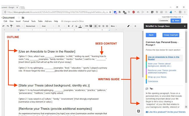
Award-winning writing software WriteWell is a useful productivity tool to help with any writing project. The Chrome extension offers a vast template library as well as outlines, tips, samples and smart phrases to guide you through the writing process – articles, ebooks, novels, blogs, etc.
02. DomFlags
A new way to work with DevTools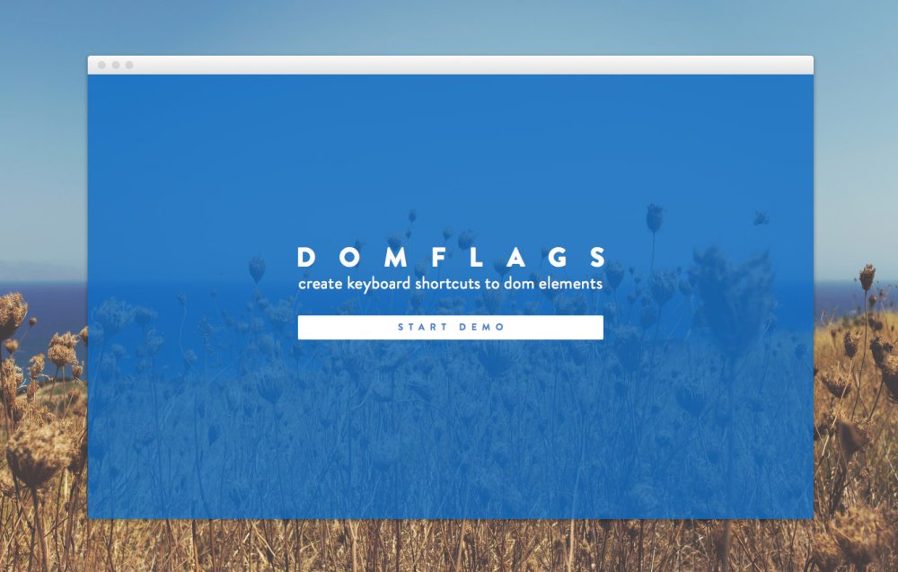
Radically speed up the processes of styling elements with DomFlags, a truly great extension that lets you create keyboard shortcuts for DOM elements! It's like having bookmarks for navigating the DOM; this will change the way you work with DevTools.
03. Highly Highlighter
Highly, a new way to participate in industry conversation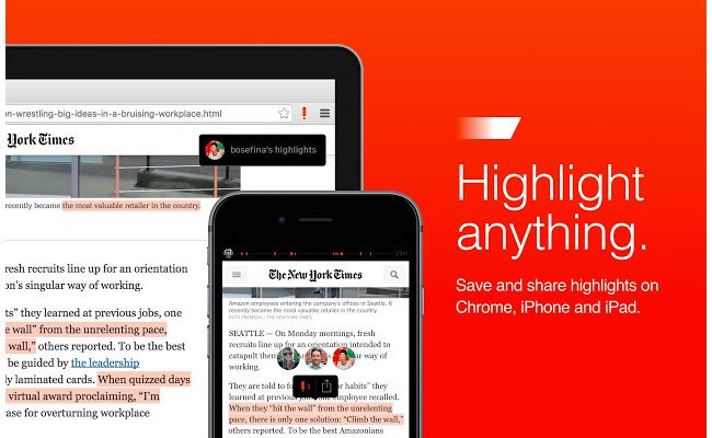
Here's an interesting way to bring people into a discussion: Highly lets you share highlights from articles on the web, so you can draw attention to the most significant bits of writing.
04. Booom
Get a better Dribbble experience with Booom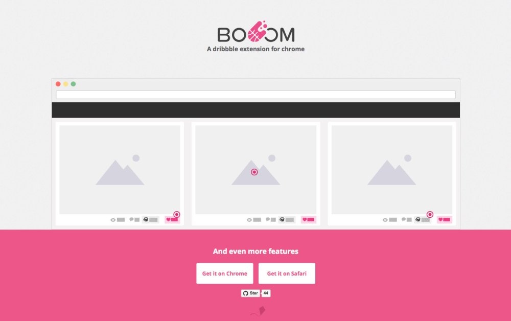
Booom makes Dribbble better by showing larger shots in lists; putting Like and Add to Bucket buttons in lists; making GIFs autoplay and bringing infinite scroll.
05. CSS-Shack
This Chrome extension lets you create layer styles and export them into a CSS file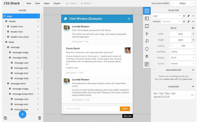
This powerful Chrome extension allows you to create designs then export them into a CSS file for use on your site. It supports layers and contains a plethora of the tools that you're used to from your regular photo editor.
06. Marmoset
With Marmoset you can create gorgeous code snapshots within seconds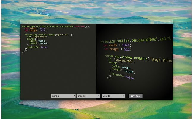
This brilliant extension will take your code and output snapshots for your demos and mockups. You can also add themes and effects to create images for promo and your online portfolio.
07. iMacros for Chrome
iMacros Chrome extension lets you record actions and save them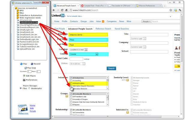
As a web developer, you may be required to test your webpages. Repeating the same actions over and over again can be a tiresome process. iMacros is a handy Chrome extension that lets you record your actions and save them so you only need to do them once. After that you can test your pages over and over again, repeating the action with a click of a button. It saves valuable time, freeing you to concentrate on more pressing matters.
08. Window Resizer
This Chrome extension re-sizes the browser window in order to emulate various resolutions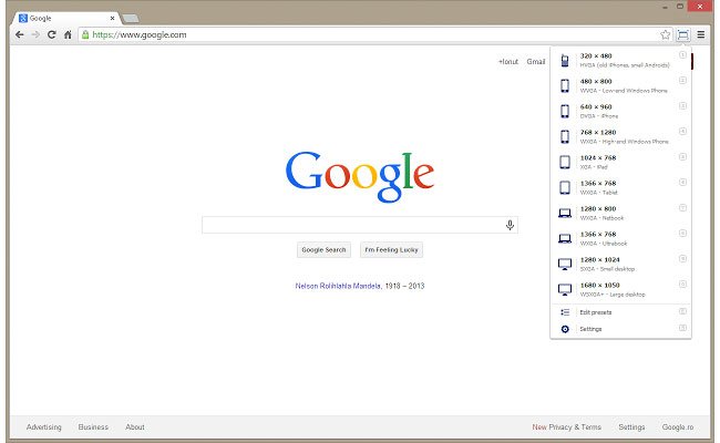
This Chrome extension is a useful tool that does exactly as it says on the tin – resizes your browser window to help you with your responsive website designs. Choose from a list of popular monitor dimensions or add custom sizes and resolutions for increased accuracy.
09. Project Naptha
With Naptha you can highlight, copy, edit, and translate text from any image on the web
If you ever find yourself working from a mockup image with embedded text, Project Naptha could save you a world of mild irritation. Thanks to some smart OCR trickery it enables you to highlight, copy and paste text from any image; it can even translate it for you too.
10. WhatFont
What font are they using? The WhatFont Chrome extension can tell you!
A very useful Google Chrome extension, WhatFont allows developers and designers to identify the fonts being used on a webpage. So, if you stumble upon a fancy-looking web font that you want to use in one of your future projects, just hover over it and find out instantly which font it is.
Next: 10 more Chrome extensions
11. YSlow
YSlow tells you what's slowing your page down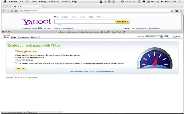
This tool doesn't just check how quickly your webpage loads, it also tells you what, if anything, is slowing it down. YSlow tests your webpage against 23 of the 34 rules identified by Yahoo's performance team. It's an extremely useful tool to analyse webpages and it also suggests ways to improve their performance.
12. Web Developer
The Web Developer Chrome extension provides a range of useful dev tools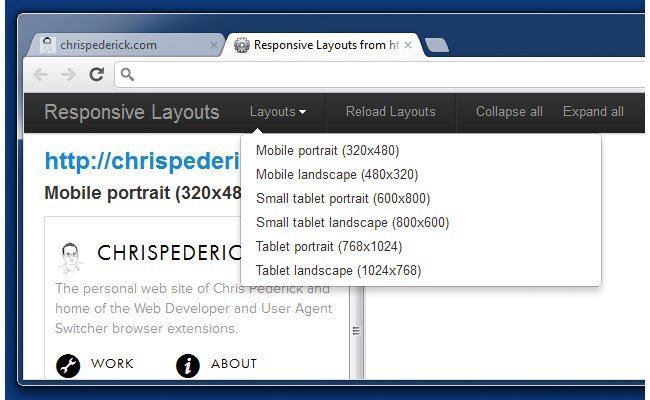
As a web developer, you might ask yourself how you have lived without this extension. It adds a toolbar button to Chrome with a plethora of useful web developer tools. It's the official port of the Web Developer extension for Firefox.
13. Page Ruler
Draw a ruler to get pixel dimensions and positioning with Page Ruler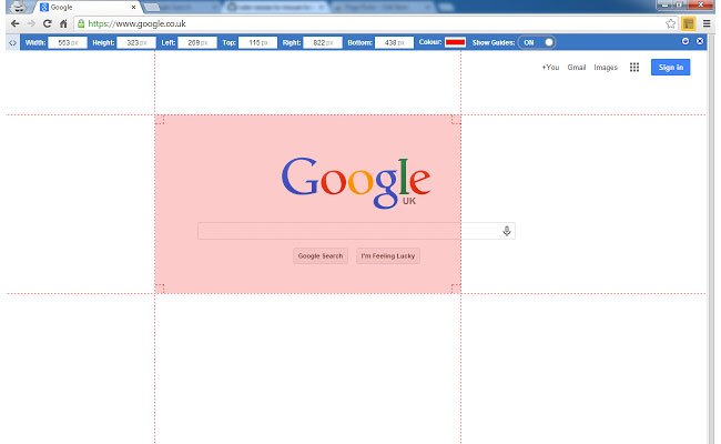
Page Ruler is a great tool for precisely measuring the elements on any webpage, then manipulating it for your benefit. Draw a ruler to get pixel dimensions and positioning.
14. Web Developer Checklist
Fix issues quickly with this handy Chrome extension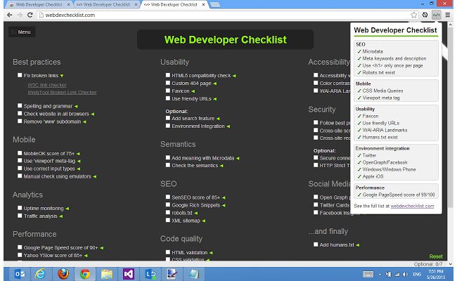
This tool allows you check if all of your webpages are following best practice when it comes to SEO, usability, accessibility and performance (page speed). So if, for example, you don't have an H1 tag on a webpage or if a webpage is missing its meta title or meta description, it will notify you so that you can fix the issue quickly. If you click the 'more info and help' link at the bottom of the extension, you will find a more in-depth checklist.
15. DevTools Autosave
Automatically save any changes to a page's CSS and JS to its source file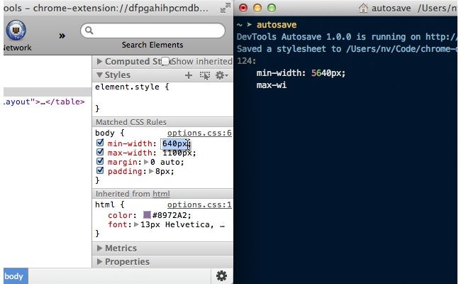
A true gem for all web developers out there, DevTools AutoSave allows you to automatically save any changes that you make to a webpage's CSS and JS via the Chrome Dev Tools environment to its source file. It's easy to set up and use and it will save you lots of time and stress.
16. Instant Wireframe
View live webpages with a wireframe overlay
Turn any webpage into a wireframe with just one click. This Google Chrome extension helps web developers and designers view webpages, whether local or live on the web, with a wireframe overlay.
17. ColorZilla
With ColorZilla you can get a color reading from any point in your browser
The ColorZilla Chrome extension is an advanced eyedropper, colour picker, gradient generator and useful colour tool that will help you in your design – right there in your browser window.
18. Streak CRM for Gmail
Turn an email conversation into a trackable, assignable ticket
Streak is the ultimate tool for managing CRM and support emails within Gmail. It allows you to turn a single email or an entire conversation into a trackable, assignable, organised ticket that you can manage yourself or share with others.
19. Search Stackoverflow
Get your questions answered quickly with this must-have extension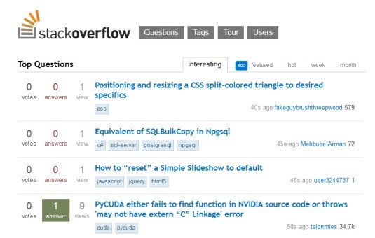
If you're a web developer then you've probably heard about Stack Overflow, the go to place for any development related issues. If not, then you definitely need to check it out. The community is thriving and it covers a wide range of topics from C# and Java to PHP and jQuery. This fantastic extension adds a search box directly into your browser, allowing you to search the vast resources of Stack Overflow. It's a must-have extension!
20. PHP Ninja Manual
All the PHP 5.5 documentation you need without leaving the browser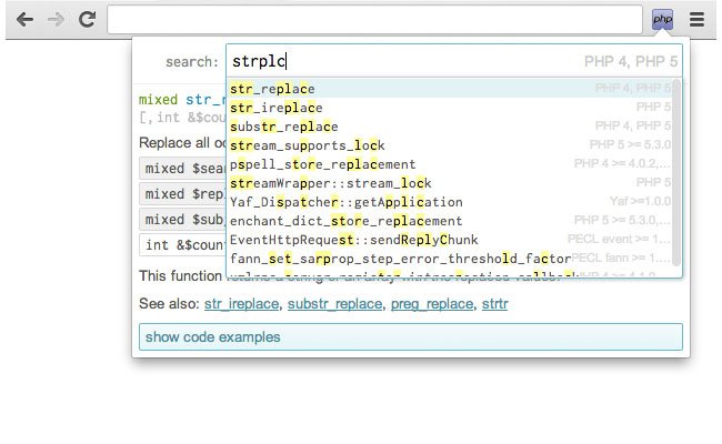
It can be difficult to remember every function, so if you've been wasting hours searching for specific PHP functions on Google, this extension is bound to attract your attention. The PHP Ninja Manual provides you with all the PHP 5.5 documentation with examples in eight languages without having to leave your browser.
Next: another 10 Chrome extensions
21. PerfectPixel
This extension helps you ensure your site matches the design pixel for pixel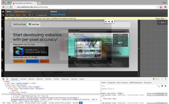
Designers hate it when their stunning design doesn't match up perfectly when it's coded. Perfect Pixel really is the perfect extension for web developers who are striving to develop sites that are accurate representations of designs. This easy to use extension allows you to put a semi-transparent image overlay over the top of your webpage and perform a per pixel comparison between them to ensure it is 100% accurate.
22. Code Cola
Edit your webpages' CSS on the spot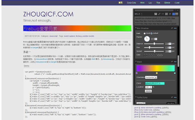
Not only does this tool allow you to view the source code of what you've been working on, but it also functions as a CSS editor. This means you can edit your webpages' CSS style on the spot and see the changes instantly.
23. User Agent Switcher
See how your site looks using different devices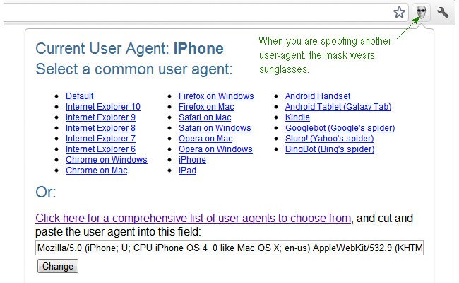
A great tool for seeing how a site looks using different user agents such as an iPad, iPhone or an Android device. This can be extremely useful if a site has been hacked, as you can view pages the way search engines see them.
24. IE tab
Test webpages with different versions of IE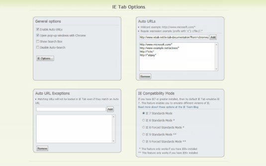
One of the most popular and useful IE emulators available on the web, this allows web developers to test webpages with different versions of IE directly in their Chrome browser.
25. PicMonkey
Grab every image from a webpage with a click of a button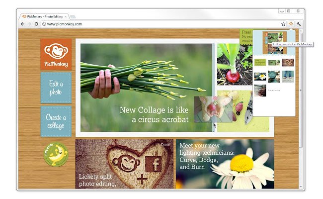
This is an easy-to-use free online photo editor that allows you to edit webpage images and screenshots. But that's not what makes it so good. PicMonkey also lets you grab every image and a screenshot of the entire page with a click of a button. Once you select an image you can edit it in any way you wish, from applying effects to changing exposure.
26. Chrome Daltonize
Create images more suitable for viewing by those with Colour Vision Deficiency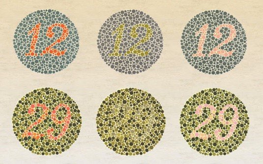
Colour Vision Deficiency (CVD) or colour blindness affects millions of people across the globe. This ingenious extension uses Daltonization, a technique that allows the creation of images more suitable for viewing by those with CVD. This fantastic extension can be used to simulate how images appear to people with CVD and to help you design a more accessible web app.
27. Check My Links
Check My Links crawls through your webpage and looks for broken links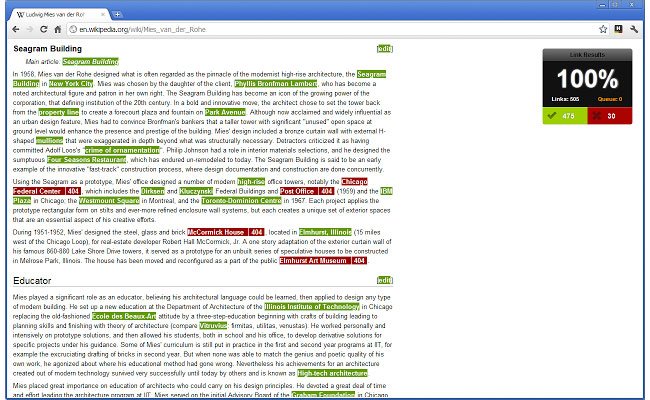
Finished building a site? Ah, but have you been through and checked all the links? No matter how careful you are, it's inevitable that you'll have overlooked one or two, and checking them all is a tedious chore. Unless! With the Check My Links extension you can simply put it to work and it'll comb through all the links on any page, highlighting valid ones in green and broken ones in red.
28. Flickr Tab
Smarten up your Chome tabs with beautiful Flickr images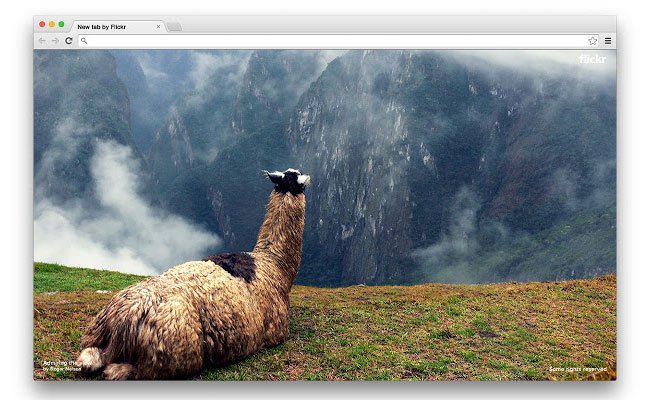
Are you tired of your Chrome tabs looking dull when you open a new one? The answer to your prayers has arrived in the form of Flickr Tab. It's a simple little Extension that displays a popular Fickr photograph each time you open up a window. Click the photo to view it in Flickr, or click the username to see more photos from the photographer.
29. Google Art Project
Make each new Chrome tab an adventure in art and discovery with the Google Art Project
Similar to Flickr Tab's glossy photos, Google's Art Project extension treats you to a high-res masterpiece from the likes of van Gogh and Monet in each new tab you open. If an image sparks your interest, click on it to go to the Google Cultural Institute website, which is full of information about the work and its creator.
30. Data Saver (Beta)
Save cash when viewing designs on your mobile with Google's compression based Data Saver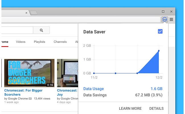
So, your latest bill from your mobile provider was rather toe curling? Don't panic. You need Data Saver, from Google. The extension does what it says on the tin: it reduces the amount of data used when browsing the web. When enabled, Chrome will use Google servers to compress pages before you download them. There's only one caveat: SSL and incognito pages won't be included.
Contributions: Creative Bloq staff
Related articles:
-
Whether you’re looking for freelance work, seeking a new job, or just wishing to build your personal brand, an online design portfolio is a must-have for any creative. But is yours letting you down?
In this post, we provide a simple checklist of common portfolio mistakes, and how to fix them, quickly and easily. You might also want to check out these excellent design portfolio examples.
01. Addressing the wrong audience
How to do it: interactive designer Nic Stauber has the right audience firmly in focus at his website
When you first launch a portfolio website, your first feedback comes from family, friends and co-workers. So there’s always a natural impulse, conscious or subconscious, to fashion something that these particular people will go ‘wow!’ at.
But that’s not the audience you need to be worrying about. You need to consider what a potential client or employer will be looking for and how they’ll be viewing your portfolio, which will usually be completely different from a friend or colleague. The former, for instance, will probably spend a long time looking at different aspects of your site; the latter will be seeking much more specific information, much faster.
Once you start thinking along these lines, what you need to include on your portfolio site and how you organise it becomes a lot clearer.
02. Too much work on show
You’re proud of everything you’ve done, and people want to see as much of your work as possible, right? Wrong.
Potential clients and employers don’t wish to spend ages trawling through your back catalogue until they find something they like. They’re more likely to glance at one or two pieces, and make a snap decision. So you need to be ruthless in selecting only your absolute best work and putting it front and centre.
While people are willing to rummage for cheap items at a jumble sale, when you enter a high-end store you see much smaller collection of carefully curated items. Apply the same logic to your portfolio site and you won’t go far wrong.
There’s no 'ideal' number of examples to exhibit; that’s going to vary from creative to creative. But one thing’s for sure: the more work you do include, the more organised it needs to be, with a clear hierarchy and everything categorised in an easy-to-understand manner. Our list of 6 famous agency websites and what they can teach us has some examples of good portfolio organisation.
03. Lack of context
How to do it: product designer Bjorn Meier provides plenty of detail about his projects
There’s no point in just posting visuals by themselves, with no explanation of the context for which they were created.
Let’s return to our potential client or employer. Ask yourself: what will they want to know? At the very least, probably a combination of the following: When was the work created? How was it created? Is this entirely your work, or a collaboration (in which case, who else was involved, and what part did you play?). What was the brief? Was the client happy? What was the timeline? What elements of the project are not shown here?
That’s the bare minimum you need, but it doesn’t hurt to provide more. Remember in maths at school when you were told not just to give the answer, but “show your working”? That’s a good rule to apply to portfolio sites too.
So if it’s possible (check with the client first!), consider writing a full case study, including notes on the design process; early sketches; rejected concepts and designs, and so forth.
04. Too little work on show
While including too many examples of your work is the most common portfolio mistake, designers at the beginning of their careers can often make the opposite mistake: showing too little.
Put simply, if the Work section of your website is too sparsely populated, it doesn’t give a great impression. Not had enough commissioned work? Then there’s nothing wrong with posting student projects, as long as you clearly explain what the brief was and how you fulfilled it.
Don’t have enough student projects? Then just do some designs of your own, label them as ‘personal projects’, and again, explain the thinking behind them.
Real-world commercial work is always preferable of course, but demonstrating that you can deliver something to a brief, even an imaginary one, is much better than leaving a blank space.
05. Vague and incomplete personal information
How to do it: UX designer and art director Melanie Daveid has a top-notch ‘About me’ page
As well as providing information about the work itself, you also need to provide a clear explanation of who you are and what you do, normally in an ‘About Me’ section.
There’s a current trend to just add a ‘snappy’ or ‘witty’ tagline under the designer’s name, something like “Designer of things for money”. You might be able to get away with this if you’re extremely well known, but if not, this is a massive turn-off for clients or employers.
Another common portfolio crime is making your contact details hard to find, or even non-existent. Again, if you’re a world-famous designer then refusing to give an email and saying “The best place to find me is on Twitter" might be acceptable. For the rest of us, it’s not, so just provide a damn email address. If you’re worried about spam, you can always write it in ‘code’, eg recast 'myname@gmail.com' as ‘myname [at] gmail [dot com]’.
06. A lack of purpose
Many portfolio websites avoid making the previous obvious mistakes but are still failures because it’s just not clear what they’re trying to achieve.
Often that’s because the designer doesn’t know themselves, beyond a general ‘well, you’ve got to have a website, haven’t you?’
But if you don’t think about what you want your website to achieve, how will you know if you’ve achieved it? So before you start, sit down to have a long, hard think about what your main goals are.
For instance, if you’re looking to get a job, have you made that clear? People are not telepathic so if you don’t say, people will assume you’re happy to remain a freelancer.
Alternatively, maybe you already have enough freelance work, but wouldn’t mind getting some better paid commissions? In which case, why not make your preferred rates clear, and avoid long email conversations with time-wasters who just want to lowball you?
Or perhaps you don’t want more work right now, but just want to steadily build up your name and reputation. In which case, you’ll want to think about including testimonials, press reviews and other ‘social proof’ to bolster your standing.
07. It doesn’t work on mobile
How to do it: Design director Jürgen Hassler’s smartly art-directed site performs as well on mobile as on desktop
The best way for someone to view your portfolio is always going to be on a big, beautiful widescreen monitor. But you can’t guarantee that’s what will happen.
These days, it’s increasingly likely that potential clients and employers will be viewing your portfolio site on mobile devices. So you need to make sure it’s not going to look awful on a small screen.
Most importantly, can you view the images properly, or do they reduce down to tiny, formless thumbnails? If the answer to that question is yes, then your site is not fit for purpose.
08. It’s out of date
Once you’re happy with your portfolio site, don’t just ‘set it and forget it’.
Potential clients and employers may well look at your site a number of times over the course of a year. If nothing new is added, they may assume you’ve had no work. So think about how you can refresh the site on a regular basis. Could you add new work examples, refresh the design or maybe even add a blog?
Also, sign on with Google Analytics to find out how many people are visiting the site, and which bits they’re most interested in. Don’t jump to unwarranted conclusions, but do use this information to improve the site and its content, bit by bit, over time.
Finally, it’s always helpful to check out what other creatives have done with their portfolio sites to get inspiration for improvements to yours. Start with the great examples we’ve featured here, from Nic Stauber, Bjorn Meier, Melanie Daveid and Jürgen Hassler, then check out our full selection of the best design portfolios.
-
Colour is a powerful tool for designers, and gradient colour is currently being used to add depth and manipulate perceptions of shape and form in a range of products. From mirrors to scarfs, these ombré effects applied to solid objects give them an ethereal quality, while subtle gradients serve to enhance angles and form.
Here's our selection of some eye-catching examples of the gradient colour trend in action.
01. Curved mirrors
Germans Ermičs’ Shaping Colour collection forms an investigation into the relationship between colour and shape. Applying dense pigment bleeds to simple geometric forms, Ermičs' work celebrates the power of colour to transform.
02. Mirrors with a coloured hue
Offround Hue is the latest addition to the Seeing Glass collection by Sabine Marcelis, in collaboration with Brit van Nerven for Etage Projects. The shaped mirrors aim to disrupt the viewer’s perception of objects and the spaces reflected in them.
03. Menswear
A contrasting design by Northern Ireland's Jonathan Anderson
At JW Anderson’s spring/summer 2017 menswear show, oversized shirts in cool blues and greys had the appearance of having been dipped in warm shades of yellow and brown.
04. Perfume packaging
A subtle bleed transforms this fragrance bottle
Fragrance brand Regime des Fleurs makes its fragrances stand out by using distinctive packaging, which blends vintage aesthetics and baroque detailing with super synthetic colour bleeds.
05. Clothing and accessories
The colour cascades down this scarf as it slinks down the stairs
Print All Over Me has collaborated with wallpaper designer Calico and Brooklyn concept store Swords-Smith to produce a collection of scarves and garments printed with Calico’s Night and Aurora designs.
This article originally appeared in Computer Arts issue 266. Buy it here!
Related articles:
-
Impressionist artwork was fresh and spontaneous, and executed with bold brushstrokes that didn’t reveal too much detail.
For this workshop, I’ll paint a contemporary café scene in watercolour using Impressionist artist methods (and a photograph) for reference.
Impressionistic techniques also match the essence of painting with watercolour. Washes are applied with one decisive brushstroke, and are never corrected or smoothed out. This gives the painting an almost unfinished look, enabling the viewer to finish the picture.

I usually try to create a painting in four stages:
01. Visualise how I want the final painting to look
You can produce a small pencil sketch or tonal study, if it helps. This stage will help cement the composition, the focal points and sources of light.
02. Start to paint very basic shapes with a large brush
This sets the tones and overall mood of the work. At this stage you should avoid adding any details and leave large areas of paper untouched.
03. Turn the basic shapes into more 3D objects
Next, once everything’s dry, I turn the basic shapes into more 3D objects by painting shades and shadows, reflections. I also start adding in people (though I did this early in this painting), while still avoiding any details.
04. Add details and accent colours
Painting with either the tip of the brush or a smaller brush, I use thicker pigments and explore dry brush effects. At this point, it’s best to hold back in case you overwork the composition. Slow down and paint decisively and then leave it alone. Remember, it’s for the viewer to 'finish the picture'.
With this four-part process in mind, I’ll now walk you through how I would paint a contemporary café scene in watercolour.
01. Start with light colours

Find the focus of your painting. For my picture, this will be the window and the waiter. I mix a light wash for the walls and paint in that area. Making sure I follow the correct perspective, I have the left and right window visible in the picture. I then start to paint in the background around the waiter.
02. Add the figures

Using a thicker mix of black, Ultramarine Blue and a bit of red, I paint the person on the left, as well as the waiter’s trousers and head. I leave an unpainted area for the two chairs in front of these figures. I will use this negative-space painting method throughout the scene.
03. Paint the foreground

Moving to the bottom of the paper, I paint the foreground. Using lots of water and pigment, I create swift, spontaneous brush strokes with my largest brush. I leave the top of the chairs unpainted.
04. Add the tables

Continuing with a dark colour, I make the paint a bit thicker and hold the brush at a steeper angle to the paper, to paint the round tables. I leave the tops white and paint in the reflections with vertical strokes, using more water. Every brush stroke is done once, then left alone.
05. Curtains and reflections

I paint reflections on what looks like two mirrors in the centre, at the top of the paper. For the red curtains I apply a dark tone on the top of them, using wet-in-wet. The colour will run a bit with this technique, but don’t try to correct anything. It’s tempting to add details, but leave them for the last step.
06. Abstract speed

Now I go to the top left-hand side to add in a grey/blue colour. I try not to be precise, because this isn’t an important part of the painting. It’s even better if it’s painted quickly in an almost abstract manner. I now step back, take a break, and assess what I’ve done so far.
07. Paint the ceiling

I mix dark greys and use more water and a larger brush to paint the ceiling. This is the last area to be finished before I start on the shadows. With the tip of the brush, I roughly paint in some details, such as the cornice details where the walls meet the ceiling.
08. In the shadows

In the reference photo the light is coming through the windows, so I paint the shadow line at approximately 45 degrees on the wall. For shadows, I use a grey-blue mix. It should be watery and transparent, but with enough pigment so that I only have to paint it once.
09. Add details

I take a thick dark pigment and practice on a piece of paper to check the brushstrokes. They should look like they were painted with a dry brush. I work with short, thick strokes, only adding in a few details from the photo. I have also added some light ochre to the bottom of the pane.
10. Final observation

If you stand back, you’ll see many areas that could be ‘improved’ or areas where more details could be added. Don’t do it! The only things I add are a few broad strokes indicating creases in the fabric at the bottom of the picture. I also make the very bottom of the picture darker, so as not to draw attention to that area.
This article was originally published in Paint & Draw issue 7. Buy it here.
Related articles:
-
Landing your dream job isn't just down to perfecting your design portfolio or creative resume – you also need to present yourself the right way in your interview. I have been in the room for a lot of web tech interviews, and on the way, I have picked up a few tips for web designers and developers looking to land a new job.
The following advice will help you convince interviewers you're right for the job – and lots of this is relevant to other disciplines beside web design.
01. Dress like them
Don’t show up to an interview for a tech job wearing a suit. Unless perhaps you are interviewing to be the CFO – but probably not even then. I don’t know any companies where designers or developers wear suits. It makes you look out of place, and that is the opposite of your mission – your goal is to convince them that you belong there.
How should you dress? Like them! This is easy if you have a chance to visit the workplace in advance. If that is not an option, look at the photos on the company’s website and learn what you can from its About us page. Many team photos are taken in the office, during a work day. If they have a blog, you will almost certainly find photos from events that give you a sense of what the dress code is like, if there is one at all.
When in doubt, just wear whatever clothes you would normally wear when you want to look ‘nice’ but still feel comfortable and natural. Don’t buy brand new shoes that will hurt your feet, or wear itchy new underpants.
02. Know what you're walking into
Some companies conduct really casual interviews over coffee, while others have a very formal process with multiple sections. Some companies will ask you to do a sample project, or present an example of your work.
In order to feel confident, it really helps to know what you should prepare for. So when you're invited to the interview, it's perfectly reasonable for you to ask about the company’s process.
Be respectful of their time (hiring is very time-consuming) and don’t ask so many questions that you seem desperate or paranoid. But feel entirely justified in requesting the following facts:
- Who are you meeting with?
- Which position are you being considered for (seriously, this gets confused a lot)?
- Are there any tests or evaluations that you’ll be asked to perform?
- Where does this interview fit within the overall hiring process?
03. Ask questions
At some point in the interview you’ll be asked if you have any questions. ‘No’ is the wrong answer. Having zero questions makes you seem disinterested and clueless.
When I am the interviewer I learn as much about a candidate from what they ask me as from what I ask them. I’m much more likely to hire a candidate who asks smart questions about things that matter rather than someone who just wants to know how long lunch is.
The questions you decide to ask the interviewer are your chance to talk about anything you want to. You might take this chance to (subtly) demonstrate your familiarity with the company, or mention something you want them to know about you. At the very least, it’s an opportunity to show what kinds of things you are interested in. Don’t waste it!
04. Don't panic about tests
Some companies ask candidates to do puzzles or tests. I have never used these as an interviewer because they tend to make candidates anxious, and at best they demonstrate how someone works when they are nervous and uncomfortable. Hopefully this doesn't strongly resemble what it will be like to work at that company.
Knowing this won’t necessarily get you out of doing them, but hopefully you can relax a bit in the knowledge that the interviewer’s attempt to test you has actually revealed something silly about them. Remember, you can learn a lot about an organisation from their hiring process.
For an entry-level job, it’s probably safer not to point out that you know their hiring process is flawed, but you can use this knowledge to your advantage by not getting fooled into thinking it matters how quickly you solve the puzzle. So stay calm. By simply not panicking, you demonstrate you are smart and confident enough to know that solving a silly brain teaser doesn't indicate how intelligent you are.
Seize every chance to interact in ways that show your ability to be part of the team
I recommend thinking out loud and asking plenty of ‘meta’ questions. For example, if you are asked how to calculate the total number of ketchup bottles in North America, ask what the figure will be used for and explain that the goal affects the accuracy requirements, which will dictate your methodology.
If you are asked how to move Mount Fuji, ask ‘How far?’ (after all, it is already in motion). This helps shift the focus away from whether you get the ‘correct’ answer (if there is one) and more towards your process for solving problems.
05. Pretend it's your first day
An interviewer’s job is not only to find someone with the skills to perform the work, but also who enhances the existing team. If there are dogs in the office and you are a dog lover, pet them (without being annoying). If a designer is using a special pen you love, compliment it, and if a conversation strikes up, don’t forget to introduce yourself.
If a technical question arises and the interviewer pulls in one of the current engineers to help answer it, welcome the situation as if you are already colleagues. Seize every opportunity to interact in ways that demonstrate your ability to do the work and be part of the team, even if it’s only for a minute or two.
Don't try to prove that you are better than the existing employees. You're not competing with them for the job, and it will make them dislike you. A smart boss will be more impressed by your ability to empower others than to upstage them.
06. Know what they do
If you're interviewing at a design agency that has one or two long-term clients, know who they are and what they do. This is a good idea for a number of reasons. It helps to show that you ‘get it’. You don’t want them to start telling you about something important, and be forced to interrupt them to ask who they are talking about.
If you are interviewing with a startup, download their app and spend some time learning how it works. If there are features or design decisions you don’t understand, or if you have ideas on how you could improve something, these are great questions to ask (politely) when it’s your turn. Just make sure you are also respectful and complimentary.
07. Be on time
Do I really need to explain this? If you are hired, most jobs will expect you to get to work on time, so demonstrate you are good at that. Know in advance where you’re going and how long it takes to get there so you arrive with extra time.
Don’t show up for the interview super-early. That’s awkward. Find a coffee shop or somewhere comfortable nearby to relax, then arrive five or 10 minutes before your appointment.
08. Interview a lot
Practice makes perfect, and the more you interview the more comfortable you will feel. So do it a lot – not just when you desperately need a job. At this point in my career, I genuinely enjoy going to interviews. I don’t get anxious because I know that if the interview is unpleasant, working there probably would be, too.
I also like seeing how others teams work, and I treat it as a chance to meet interesting people and expand my professional network. This is important because it lets me focus more on the process and less on the outcome. Even if nothing comes of it initially, I don’t consider it a failure. There have been many instances when I have worked with someone long after the interview, on a completely different project. So stay positive (even if you think it is going poorly) and have fun.
This article was originally published in net magazine issue 288. Subscribe here
Related articles:
-
WordPress powers some of the web’s biggest and most impressive sites. Now it can host yours as well. Pick up the skills and tools you need to get your site online with the Wpbasin Ultimate WordPress Bundle, on sale now with 98% off the retail price!
There's no web hosting platform more malleable than WordPress – you just need the right tools to make the most of it. You'll find everything you need in the Wpbasin Ultimate WordPress Bundle. You'll score tons of HTML templates to design your site, themes to make it look great, and plugins to give it all the functionality you require. You'll even get a full year of hosting to get your site online as soon as it's ready.
The Wpbasin Ultimate WordPress Bundle is valued at $3,655, but you can get it now for 98% off the retail price. You won’t find a better deal on such an incredible bundle, so grab it today!
-
Writing better CSS doesn't have to be a painstaking ordeal. A few minor adjustments to how you work within your CSS code file can have a big impact. In this article, we'll take a look at eight simple ways you can improve your CSS skills and write cleaner, more efficient, and better CSS code.
01. Start with a CSS Reset
CSS Reset gives you a clean base to work with
Some might argue that using a CSS Reset is unnecessary. However, a CSS Reset allows you to start with a clean base, making it easier to style your website, with more predictable outcomes across the board.
A CSS Reset resets or overrides the default styles of the browser. You may write your own, use one of the many resets available online, or use a combination of the two.
02. Know when to use CSS shorthand
Shorthand should reduce your file size and help speed up load times
CSS shorthand enables you to set multiple properties of an element in a single line. Using shorthand saves space and takes less time to load. However, you shouldn't use it for everything.
Sometimes longhand provides much-needed clarity. But more importantly, when you only need to set one or two properties – or you simply need to override something – longhand may actually be better.
Something else to remember: when you're using shorthand, the ignored properties will reset, which could have an undesirable effect.
03. Keep it DRY
Don't repeat yourself
Quite possibly the best advice for writing better CSS code is to follow the DRY methodology. DRY means 'don't repeat yourself' – essentially, don't use the same bits of code over and over again.
One way to keep things DRY in CSS is to group things together. Let's look at an example.
Original CSS
Refactored and DRY
As you can see, not only will this reduce the overall size of your CSS file – which creates faster load times – but you'll also benefit in the area of maintenance too. If the color property needs updating, you're only updating it one spot.
You can also use CSS custom properties to help stay DRY. Custom properties are created like so:
And then can be used anywhere within your CSS code, as often as you'd like:
04. Stop over-using !important
There are very few occasions where you need to use !important. It's one of the most – if not the most – misunderstood and over-used declarations.
Don't get me wrong, !important does have its place, but generally web developers use it in desperation when things don't look right. So to fix things, they give their rule a little more weight by adding the !important declaration to it.
The problem is, this starts to create a domino effect that rapidly turns into a maintenance nightmare, as more and more things are declared !important. Only use !important when it's absolutely necessary.
05. Keep consistent
Regardless of how you write your CSS, and in which order you add the properties, keep it consistent. Some people order their properties alphabetically, while others use more of a logical approach – for example, organising things by line length or type. I opt for the former, but it's entirely up to you. The bottom line is whatever you choose, stick with it so it's easy to find things later.
06. Name things intelligently
Use a standard naming convention for your selectors
This seems like a no-brainer, but when naming your selectors, don't get overly complicated. Be succinct and stick with a standard naming convention.
Some things to consider when coming up with your selector names:
- Avoid presentation words: These are the ones that involve colour and display location (for example, green-text or top-menu-bar)
- Only use lowercase: CSS is case-sensitive, so don't create names like, MeNuBaR. It should be noted, however, that camel case (menuBar) is an acceptable practice, just not preferred in some cases
- Separate multiple words using a dash: For example, main-menu. You may also use camel case (mainMenu), but again, this is often not preferred
- Don't be too specific: You'll end up using multiple selectors for the same type of element. For instance, list-one and list-two can be combined, creating a single list-items
07. Add comments when appropriate
While it's true that good code doesn't need comments, it's also true that adding comments to code is necessary in some cases. The rule of thumb here is that if the source code will benefit from the comment, then add it; otherwise, don't.
If you're wondering when comments might be necessary, here are a few examples:
- Commented code: If you comment out a specific portion of code, for a particular reason, leave a comment explaining that reason. If you don't, you may not remember why you commented it out in the first place
- Hot fixes: If you add a 'hot fix', it might be a good idea to add a comment explaining it too
- Reminders: You're likely working on more than one project at any given moment. If your attention is pulled before you have a chance to complete something, you can use comments as a reminder for what you still have left to do
- Explanations: If a section of code is unclear, and you feel an explanation would help clear it up, then add a comment – it's that simple
08. Explore Flexbox
Flexbox is the latest game-changer in web design
When it comes to aligning elements on the page, the Flexible Box Layout module (or Flexbox) gives you complete control. Using flex containers and flex items you're able to precisely define how things look. Flexbox also enables you to arrange items vertically on a page, which wasn't possible with floats.
It's a little tricky to get your head around, but well worth it. Start by reading our Web designer's guide to Flexbox.
Read more:
-
No matter your final use, most scenes centred on a man-made structure will benefit from a touch of the organic. The contrast in colour, texture and form can really help add interest to the final render, as well as bring life and interest into a piece.
Though there are ready-made options, it's best to know how to efficiently create your own pretty easily. To do this, you can make good use of Cinema 4D's MoGraph tools, with a very low polygon proxy object used as a placeholder.
The process is simple but effective and is easily adaptable to different needs. Files are available below, but try creating your own in order to get a better understanding of how it all comes together in practice.
Download the files and accompanying video for this tutorial.
01. Create leaves
Use the supplied leaf section or build your own
First off we need our leaf section. You can use the one supplied or create your own. The key is to use a format such as .png that allows for alpha channels and add a normal map as well, to help sell the details. Once you have that, apply it to a simple plane, bent in the middle to add a little life. Try to keep to around six to ten polygons.
02. Make low-poly object
Use a simple low-poly object as the base for your plant
Now create a quick low-poly object to act as the growth base. Remember that modelling to scale will help. Make any shape you like and add any other details you need such as stems or trunks. Then, move your leaf axis point to the start of the stem, pointing along its length.
03. Add a cloner
As you clone more leaves your plant will look more organic
Add a Cloner to the scene, with the leaf as its child. At first there will only be a clone at each vertex of the underlying mesh, so change the Distribution setting to Surface and increase the count. If you have a flat underside, it might look a bit odd, in which case delete the bottom poly of the growth base object. As you go on it will begin to look more organic.
04. Add a random effector
Finish off by adding some variation to your foliage
To finish up, add some variation by adding a Random Effector. Experiment with the settings to suit your needs but try to keep any scaling changes uniform, otherwise your leaves will stretch. Rotation and positional changes along all three axes can work well. If you find the faces of the leaves are too random, try changing the Up vector to +Y in the Cloner. Add more clones if you need to, until you are happy with the result.
This article originally appeared in 3D World issue 223; buy it here!
Related articles:
-
Corel Painter 2018's range of Thick Paint brushes enable you to mimic the look and feel of thick paint in your digital artworks. Right now you can take advantage of a free, fully functional 30-day trial of Corel Painter 2018, so you can try them out for yourself. Sign up for a trial here.
Since its launch, Corel Painter has brought artists the freedom to create exactly what they have in their minds. It has gained praise especially for bringing classic art practices and time-honoured techniques into the digital realm.
The most recent addition to Corel Painter's range of traditional art tools is its Thick Brushes, which use state-of the art Natural Media technology to simulate thick paint effect with startling realism.
Building texture
The range includes all the tools you'd find in an art supply store: different sized bristle brushes and palette knives carefully crafted to mimic their real-world counterparts. You can use them to blend, build up, push, pull and scrape paint using the pressure, tilt, and rotation of your stylus. You can also adjust the transparency of your brushstrokes and control how the paint interacts with the texture of the paper, opening up a world of creative possibilities.
To really give your paintings depth, use the brushes to create a traditional impasto effect, complete with ridges of paint. Adjust the shadows in the canyons and the ambient lighting and watch your digital artworks come to life.
Intuitive UI
Corel Painter 2018 is set up to deliver versatile, precise control over brush loading: tap the property bar shortcut and drag to load the brush, with a handy cursor that displays the exact amount and colour of paint you've loaded.
Download your free Corel Painter trial now
The Thick Paint property bar offers a range of presets, as well as quick access to settings that allow you to do things like ensure the brush never runs out of paint and control how your new brushstrokes blend with existing ones. All this means you can spend more time focusing on your work and less fiddling around with the UI.
Sign up for your free 30-day Corel Painter trial now to start experimenting with the Thick Brush range.
-
When it comes to 3D portfolios, there are many good reasons to have a dedicated portfolio website. It looks a darn sight more professional than using someone else’s platform, like Behance or ArtStation, and means that clients and other people in the industry are much more likely to check you out.
Whether you're freelance or a studio, having visual examples of your work all in one place is much more convincing than a website with just a basic description and contact details.
In this post, we look at five new or redesigned 3D portfolio sites that have hit the web in 2017. And while most of these sites won’t win any web design awards, they still offer a decent showcase for some great 3D work.
01. Goodbye Kansas
Goodbye Kansas’ portfolio site showcases its work across a wide variety of media
Goodbye Kansas is a fast-growing Swedish studio offering VFX, CGI, motion capture and animations for games, films, TV series and commercials. And it had a very good reason to refresh its website in 2017.
“This year we merged four of the studios in the Goodbye Kansas Group, when Fido, Bläck Studios, Pixel Grinder and Imagination Studios became Goodbye Kansas Studios,” explains Nils Lagergren. “This also included new logo and branding, so a new united site was an absolute necessity, and a great chance to show our unique width and scope of services.”
Designed in close collaboration with OneMotion, it aims to present the company’s work to both new and returning clients, as well as artists looking for employment, he adds. “We're always looking for talented artists, and you can apply for work directly on the site.”
Selecting the work to include in the portfolio was a challenge, Lagergren continues. “We don't limit ourselves to just doing VFX but supply a wide range of services... And it's always difficult to show all of that at a glance.”
Its solution was to choose to feature its best work in the intro reel and showcase nine of its most important projects on the landing page, making sure it covers all of the main business areas from VFX to creature design, and mediums from games to movies.
"We also use tags to help visitors browse around our extensive archive of projects.”
02. Adam Benton
Benton specialises in conceptual design and photoreal visualisation
Adam Benton, aka Kromekat, is an award-winning artist focusing on conceptual design and photoreal visualisation of concepts, science fiction illustration, visual tutorial creation and CG lighting.
“It’s important to me to have a bespoke portfolio website,” he says. “It’s both a way of attracting potential clients (design agencies, studios etc) and the place to which I direct all incoming artwork queries, from people who may have found me via other means.”
This year he decided his website, which he built using a WordPress theme, was due for a refresh. “Apart from not having properly populated the site, I was already tired of its look,” he says.
“So I found and purchased a new template I really liked the functionality of (good gallery and blog layout options, as well as being fully responsive and with social media connections). I finally grabbed some time to customise the new template to suit my desired look, and made sure I put in the time to populate it fully this time.
“It’s a fairly big undertaking to set up a new site,” he notes. “So I really took the time to look at how the template and site worked, and made the best use of its in-built shortcodes, and image/movie displaying options... Finally having everything integrated has totally altered the way I work with my site, and makes me want to keep it up-to-date.”
Curating his work is still a tough challenge, though. “In previous incarnations of my sites, I’d upload almost everything, feeling the need for a complete overview, or archive of my work,” he says. “But, from a professional point of view, you really need to shave it down to the best, or most relevant work.”
03. Videarium
Arch-viz studio wanted its work to sit front and centre on its portfolio site
Videarium is an architectural visualisation studio based in Madrid with global clients, including architects, real estate developers and marketing managers, interior designers and industrial designers. And with its new portfolio site, it wanted its work to sit front and centre.
“Our goal was to get an elegant and minimalist style where, at a glance, attention was directed exclusively to the images,” explains 3D architectural visualiser and architect, Güido Pilo.
“This is one of the reasons we chose a white background. We think that giving this kind of elegant and minimalist look, as well as being an expression of our personal taste, helps us to attract our target audience.”
Videarium designed the site in-house, and explains that “curating the portfolio is about striking the balance between the best quality images and the need to convey wide ranging types and styles of case studies to potential clients.”
04. Husni Qamhiyeh
Spanish artist Qamhiyeh recommends WordPress to other 3D artists
Husni Qamhiyeh is a character modeller and texturister/ 3D architectural visualiser living and working in Granada, Spain. He launched his website in June, and is using it to showcase his professional work to recruiters and potential clients, such as animation and videogame studios.
That means careful curation of projects is of the utmost importance. “This industry judges an artist by the quality of his work,” he says, “so it’s important that the site show only the best, professional-quality assets.”
Qamhiyeh built the site himself in WordPress and he’d certainly recommend the platform to other artists, he adds. “There are many templates that satisfy the needs of a 3D artist's portfolio – it’s easy to use, and isn't expensive,” he enthuses.
Check out our list of top-quality WordPress portfolio themes, some of them costing as little as $9.
05. Etienne Godiard
Godiard’s site showcases one project representing each of his multiple skillsets
Etienne Godiard is a French art director working for brands including La Française des Jeux, Daler Rowney and Total. And his simple yet stylish portfolio site, which he built himself, shows off his 3D, motion and branding work to great effect.
So much so, that it’s surprising to hear that he’s relatively new to digital design. “Redesigning my website was a personal challenge. I used to focus on print when I finished my studies, last year. Then I realised that digital was so important and also so extraordinary to experiment with that I've learned 3D, motion, and also WordPress.
“I was trying to blend all those skills in this website,” he adds. “It took me three months to build, with a combination of customised plug-ins, some skills in HTML/CSS and a lot of motivation.”
His biggest challenges were to make the site responsive, he says, and to decide which projects to include in the portfolio. “Choosing what to include is always hard, which is why I've tried to represent the different kinds of media I'm working on, with one project for each.”
8 iPad Pro apps that make the most of Apple Pencil
in Ειδήσεις από τον χώρο του Design και Hosting
Posted · Report reply
There's no doubt the Apple Pencil is an impressive design tool, but to make the most of it you need the right iPad Pro apps; ones that truly take advantage of its power and flexibility.
Happily, as this list shows, there is already a strong roster of iPad Pro apps from companies big and small, which really let the Pencil shine. All you have to supply is talent! (And a Pencil. And an iPad Pro.)
01. Adobe Comp CC

Create production-ready layouts as smoothly and easily as drawing on paperThe Adobe Comp CC iPad pro app is a revelation, and makes the process of wireframing or mocking up designs a cinch. The idea is that rather than pulling out your notebook and drawing dumb rectangles for pictures or a few horizontal lines to indicate where text would go in a layout, with a few simple and intuitive sketched shapes you can actually start building those layouts for real – and then pass them into InDesign, Illustrator or Photoshop.
It's worth familiarising yourself with all the different gestures for aligning, grouping and so on so you can work quickly and efficiently. You could do all this with just your finger, but using the Pencil feels delightfully like drawing in a notebook with a magical pencil, where birds you draw come to life and fly off the page.
Draw a rectangle, slash it with a diagonal cross and it becomes an image box that you can populate with assets from, say, your Creative Cloud Library. Draw a box and scrub a few horizontal lines in it, and boom, it's a text box, which you can style manually (there's also a handy, quick slider control for point size) or apply styles to from your CC Libraries. Rough squares snap to perfect geometric shapes.
It's fast, fluid and easy, and while sure, pro designers are likely to work from these wireframes like they would with one drawn in ink in a Moleskine – that is, merely referring to it but building from scratch, rather than importing it from Comp – but it can still be a boon to your productivity to be able to quickly mock up your designs using real live assets and styles.
02. Procreate

Procreate is the king of natural media apps on the iPadThis is the king of natural media apps on the iPad, and it is completely transformed with the addition of the Pencil. Sure, you can use your finger with it, a simple stylus, or even one of the increasingly complicated and expensive third-party styluses from the likes of Adonit, but none of these give you the fluidity and analogue-like experience that the Pencil does.
In part this is down to the Pencil's fine tip, in part the low latency and double-speed sampling rate, and in part because the palm rejection is nearly flawless. But all that technical stuff just fades away into the background when you're faced with the joy of sketching with a 6B pencil, turning it flat to block in big areas of shade, or mucking about with paints.
Yes, unquestionably Painter on a PC is capable of some more advanced natural media types – Procreate's watercolours, in particular, pale in comparison – but overall this is a wonderful app that really comes to life when you use it with a Pencil.
03. Adobe Photoshop Sketch

Sketch comes with some lovely natural media types built inProcreate may be the king of natural media apps on the iPad, but if so Adobe is like a deposed ancien régime monarch, plotting, in its exile, to win back its crown. And Sketch is genuinely really good, with not only some lovely natural media types built-in (and the option of adding more brushes via Capture CC), but also some features that might quickly endear it to you.
For starters, it can push layered PSDs directly to Photoshop on your Mac or PC, and you can add either a flat grid or even a configurable 3D plane grid to the background, plus preset geometric shapes, to help keep you on the straight and narrow. When you want to go on the wide and sinuous, there are French curves that you can trace against.
But that would be for naught if the natural media tools themselves were rubbish, but in fact they're generally very nice. Pay attention specifically to the watercolour tool, which has colours bleed into one another in a most pleasing manner. What's even nicer is that you can tap an icon – which looks like fan blades – to 'dry' the paint so that new colours added on top don't bleed, giving you some terrific flexibility. The tools are Pencil-aware, so react wonderfully to pressure and tilt differences.
04. Pixelmator

iPad Pro app Pixelmator makes the most of the Apple Pencil's featuresWe could have recommended Adobe Photoshop Mix here in place of this stalwart iOS bitmap editor – and certainly, the former's (bafflingly ropey) cut-out tools, layers, and paintable filters are generally quite nice – but Pixelmator just feels like the more mature and useful app.
As well as offering some (frankly a little underwhelming) natural media drawing tools that work with the Pencil, it gives you the ability to tweak the colours either by applying Instagram-style filters, or with sliders for brightness, contrast, saturation, RGB and white balance – or indeed by tweaking the curves.
But the pairing of Pixelmator and the Pencil really shine if you want to do some touch-ups or object isolation. The touch-up controls – repair, dodge, burn, sharpen, saturate and more – are easy to apply with the Pencil especially given its precision. When painting out backgrounds this precision, plus the various different eraser types available, are hugely welcome.
If we've one criticism it's that we'd like the option of pressure-sensitivity to affect the size of an eraser rather than its opacity, but nevertheless this is the closest thing you're going to find to Photoshop on the iPad – and the Pencil just makes it better.
Next page: four more great iPad apps for Apple Pencil...
05. Paper
We'd love to be able to recommend Noteshelf here, which is overall a richer notebook app (albeit one that's not quite as pretty or simple) but although it has recently added support for the Pencil, it's very basic – there's no tilt- or pressure-sensitivity.
Happily, though, Paper is easy to love. At first glance it might look like a reasonably simple drawing and diagramming tool – and on one level, for sure, that's what it is – but there are some smarts here. They are frustratingly difficult to discover, but again it's worth poking around the support files online to understand how the apparently simple tools can be used to create graphs, org charts and Venn diagrams, can easily duplicate shapes, link shapes with lines (with optional arrows at one or both ends) and much more.
Paper doesn't demand the kind of precision you get from the Pencil, but it's certainly welcome, and the slightly, delightfully cartoonish media work great with its sensors.
06. Evernote

Evernote is a rich, capable iPad Pro appAh, Evernote. Now, this definitely isn't for everyone. For some, this uber-notebook has become an indispensable place for gathering websites, sketches, notes, to-do lists and more – the detritus of modern life as well as inspiration and creative work – but for others it's just a bit baffling and never quite clicks.
It's definitely rich and capable, though, and the ability to record audio – during a briefing meeting, say, while you sketch ideas for a client – using its simple but effective drawing tools is great (though this isn't the only app to offer that, of course). It's pleasing how the eraser tool creates nicely rounded ends to the ink strokes rather than just slicing them into sharp points.
Using the Pencil rather than a dumb stylus or your finger gives you a more expressive line since it's pressure sensitive, but more importantly the palm rejection means that you can lean your hand on the screen like you would with paper, and Evernote won't get confused and make marks where your hand is resting.
07. LiquidText

This PDF document reader lets you annotate and excerpt textsEven without a Pencil this is a handy tool for reading and annotating PDFs, Word and PowerPoint documents, and web pages. It's designed to support 'active reading', so as you're reading you can be highlighting and snipping out sections to refer to later, collapsing sections of a document down so you can refer to disparate bits of it at once, and more.
Add in the Pencil, though, and it becomes even faster to use, and it's a great example of how the Pencil's pressure- and tilt-sensitivity can be used not just to mimic real-world drawing tools. Dragging the Pencil over text instantly selects it (rather than having to tap-and-wait with your finger), pressing harder selects any part of the document as an image, and dragging across text with the Pencil held at a flattened angle selects and highlights it. Smart.
Pencil support is also coming to the (actually pretty good) Microsoft Office apps, though at time of writing, the update hasn't hit yet.
08. uMake

This 3D drawing app makes great use of the Apple PencilWe'll come clean: despite its assurances that it 'empowers anyone to create 3D designs easily and intuitively' we don't have the chops to produce anything remotely impressive in this 3D drawing app, but we can nevertheless see that it makes great use of the Pencil. The idea is that you can sketch in 2D – optionally making use of smart symmetry controls – and then extrude your designs or even draw entirely in 3D space, connecting points on different planes.
Even if you're a bit clumsy and jittery, your lines are smoothed into flowing curves, and with practice we can see that it would be possible to create some elegant, organic forms at speed – and the precision of the Pencil's tip will make this whole process simpler than with any other stylus.
It might get frustrating for highly technical engineering work, but you can always use it as a tool for getting an initial concept down before exporting to IGES or OBJ files so you can work it up in other apps.
Related articles:
View the full article