

Rss Bot
-
Content Count
19,189 -
Joined
-
Last visited
Never -
Feedback
N/A
Posts posted by Rss Bot
-
-

It's been mocked and satirised, turned into cubist sexual cartoon imagery and had petitions against it, but designer Joe Stone beleives that the London 2012 Olympics logo design is a fantastic piece of branding that has got everything right. Here he explains why ...
Joe Stone on the majesty of the 2012 Olympics logo
Joe Stone
Ever since it debuted back in 2007 people have been talking about the logo whether they love it or hate it, and while there are still plenty of negative reactions to this day, it's stayed in the limelight for five years and remains instantly recognisable. People love to hate and insult it - after all, we all know that British public love to complain - but, negative comments or not, it remains impossible to ignore. I think the divisive nature of the logo had to be intentional to draw attention to something that could have ended up looking incredibly dull had the designers gone down the obvious route of previous Olympics logos.
Almost every other Olympics logo I can think of compromises the five rings and a colourful swoosh. The fact that Wolff Olins were so bold as to go in such an utterly different direction immediately makes it stand out amongst the group of otherwise dull and samey icons. The brilliant use of the CMYK-inspired colour scheme also goes against the tradition of using the host nation's colours, saving us from yet another lame use of the Union Jack plastered across a brand identity.Saving us from yet another lame use of the Union Jack.
There is nothing wrong in the slightest with being proud of ones nation or heritage, but to do something that stands out as much as this logo does is such a brave and exciting development that really helps to push the expectations of future Olympics branding forward into fantastic new directions, and can only enhance Britain's standing and importance in the design world.
The most common complaint I've heard amongst the design community is that it simply doesn't look very nice. It's obviously a very subjective matter in the first place, but more importantly I don't think that's what the designers were going for. The logo isn't representing the Olympic games, it represents London as the venue for them, and frankly 'nice' is too weak a word to describe our bustling capital. It's an edgy city. It's a cool city. It's cultural and busy and exciting and forward thinking, and a flaccid adjective like 'nice' doesn't summarise it at all.It's a cool city. It's cultural and busy and exciting and forward thinking.
Some people think the logo is downright ugly, but London itself was never designed to be aesthetically pleasing. It's a mesh of organically grown streets full of different styles and cultures. It's not an ugly city by any means, but it's not 'pretty'. I think the logo with it's sharp angles, strong shapes, defined edges and bright colours does a great job of representing the actual traits of London.
I see it as a bold, unique and forward thinking logo, which has been applied across the identity in exciting and engaging ways that are impossible to ignore. It does everything that a good identity should do, and it does them well. A triumph, whether you like it or not.Joe Stone is a freelance graphic designer and illustrator, and you can follow him on Twitter, too.
-
Negative space is, quite simply, the space that surrounds an object in a image. Just as important as that object itself, negative space helps to define the boundaries of positive space and brings balance to a composition.
More and more these days, the creative world is seeing an emergence of artists creating positive spaces and shapes that, in turn, cleverly carve out shapes in negative space. And the results can be stunning. Here, we've found some brilliant examples – enjoy!
01. Design from Finland
A beautifully minimal piece of typographic negative space
The Design from Finland mark was introduced in 2011 to provide consumers in Finland and elsewhere with evidence of Finnish design excellence, and its logo is a prime example. Designed by Rasmus Snabb from Werklig in Helsinki, it packs a glorious little piece of clever negative space into a mostly typographic treatment, turning the F and I of 'Finland' into a Finnish flag.
02. Air Max 2017
Negative space doesn't have to be static, you know. Nike wanted to draw attention to the ultralight support and maximum comfort provided by its Air Max 2017 trainers, and so ManvsMachine delivered a campaign that portrayed this through a series of visual metaphors inspired by scenarios encountered on an everyday run. Rather than use an actual Air Max, it instead employs a trainer-shaped piece of negative space to suggest air. Clever.
03. Monster bite cookies
Six hungry monsters are hiding in these cookies
This personal project saw Michael De Pippo putting his photography, Photoshop and cookie eating skills to test. The Canadian graphic designer used negative space to hide a hungry monster in each of these half-eaten cookies – he cooked up created six different biscuit flavours, and sold them as a limited-edition giclée print.
04. NBC
The NBC peacock's been a fixture of its logo since 1956
NBC first used a peacock in its logo in 1956. The design subsequently went through a number of changes, experimenting with a snake logo and variations on the letter N, until 1986, when the broadcaster introduced the best-known version with the peacock's body displayed as negative space. There have been stylised variants since then, but the peacock remains in place.
05. Yorokobu Numerografía
Forma and Co created these colourful negative space numbers
Each month, Yorokobu magazine asks an artist or designer to create a series of original numerical characters for its Numerografía section, and this was what Forma and Co came up with. The Barcelona-based team used eye-popping primary colours and a clever use of negative space that creates a 3D effect.
06. Mister Cooper
Johnson Banks set the tone for the company's unconventional brand
Briefed to design a distinctive logo for an adult-targeted alcohol and gourmet ice cream startup, renowned branding firm Johnson Banks utilised negative space to tell potential customers exactly what Mister Cooper was selling. The eye-catching identity system was rolled out across packaging, uniforms and merchandise.
07. Symbols
It's easy to become desensitised to sad news, but this video for the World Food Programme powerfully drives home the plight of refugees. Designed by negative space master Noma Bar and animated by Ale Accini, the 30-second video called 'Symbols' uses stunning visual shorthand to help stop hunger and start peace. And it's emotively narrated by Liam Neeson.
08. Typogiraffe
Bodea Daniel is a pro when it comes to negative space
Romania-based artist Bodea Daniel – aka Kretank – is a pro when it comes to negative space. Much of his work features the style, and he specialises in animal-based designs. Take a look at his logo portfolio and see if you can spot all the hidden messages!
09. Tang Yau Hoong
Tang Yau Hoong negative space art is always jaw-dropping
Tang Yau Hoong is an artist, illustrator, graphic designer living in Kuala Lumpur, Malaysia. With a passion for creative thinking, he creates art that is conceptual, surreal and fun in a simplistic and unique way. A whole section of his website is dedicated to the art of negative space.
10. Harry Potter
Olly Moss' book covers all have a hidden message
Illustrator Olly Moss is known for his super-smart use of negative space. When he was tasked with designing covers for the first ever worldwide digital release of the Harry Potter series, he didn't disappoint. They may look straightforward, but each one has a hidden message – take a look at the full set on his site.
Next page: 8 more mind-bending negative space designs
11. The Birds
Troy DeShano was inspired by one of Hitchcock's greatest movies
Michigan-based artist Troy DeShano has created tons of negative space art but it's this creation, based on Hitchcock's 'The Birds', that caught our eye. We love the way the figure's hair has been integrated with the silhouettes of flying birds.
12. FedEx
The FedEx logo is a classic use of negative space
This list wouldn't be complete without perhaps the most famous use of negative space in a logo. The white arrow between the E and the X, once seen is never forgotten. The logo has won ample design awards and is constantly featured in 'best logos' lists. The logo was originally designed by Lindon Leader in 1994. Read our interview with Leader about the design in our 10 best logos ever article.
13. Letters
Clever use of negative space to have the maximum impact (not literally)
We're used to seeing highly creative and quality work come from worldwide ad agency Leo Burnett, and this brilliantly clever campaign for Fiat is a particular highlight. Created by the Brazil studio, the series of ads encourages drivers not to text while driving.
A series of three prints, a large white letter R, N, and F are accompanied by a graphic of a little girl, dog, and bus respectively, each illustration creating the defining shape of each letterform. The taglines state: 'You either see the letter or the dog (bus, little girl). Don’t text and drive.'
This is a fantastic example of how clever use of negative space can make a big impact. The stark contrast between black and white creates beautiful silhouettes of the girl, dog and bus hidden within the type. An innovative idea that really drives home the dangers of texting while driving.
04. The Typefaces
Negative space gives this type a face
The Typefaces is a book from Singapore-based designer and illustrator Scott Lambert, which aims to celebrate playful products for kids and kids-at-heart. "Inspired by letterpress printing and childlike observations, The Typefaces are simply faces in type," Lambert explains. Negative space allows Lambert to give each letter a friendly face.
15. The Body Artist
One of many Don Delillo book cover designs by Noma Bar
Award-winning graphic designer Noma Bar's animation work has already featured in this list, but his still work is equally impressive. Using a limited colour palette, Bar carefully crafts and places positive space to give the negative space another meaning.
Using the bare minimum to communicate his message, Bar's distinctive work has gained him international recognition and work from leading companies including Vodafone, Coca Cola and the BBC.
16. Cut-Outs
Simon C. Page uses negative space trickery to depict Batman versus Penguin
It's Batman versus Penguin in this brilliant print by graphic designer Simon C. Page. Part of his Cut-Out series (click each pixellated image to see the real thing), Page cleverly depicts both characters using negative space. The bald head and long pointy nose are instantly identifiable as Danny Devito's Penguin, which in turn, carves out the bold silhouette of Michael Keaton as Batman.
17. Shigeo Fukuda
Japanese graphic designer made full use of negative space in his artwork
Japanese poster designer and graphic artist Shigeo Fukuda's optical illusions brought him international renown. Much like many of his pieces, this striking black and white print, constructed of minimal, considered lines, is slightly disorientating – a theme that ran through his work up until his death in 2009.
18. The Kama Sutra
Malika Favre is know for her naughty negative space work
When French artist and illustrator Malika Favre was commissioned to create the cover for this naughty classic, she went through many iterations – including this one – to get to the final design.
Known for her distinctive use of graphic shapes and bold colours, Favre comments on her website: "I try and get to the essence of my subject by using as few lines and colours as it needs to convey the core of the idea." And she's certainly done that for this version of the book cover, cleverly incorporated negative space into the design to depict various sexual positions.
Related articles:
-
Microsoft has said it will not patch a two-decade-old Windows SMB vulnerability, called SMBloris because it behaves comparably to the Slowloris attacks. The flaw will be disclosed and demonstrated during DEF CON.
-
We all could use some help optimising how we spend our time. Luckily, you can get advice from experts who have mastered the art of productivity. Learn valuable lessons to get more done with the Ultimate Productivity Bundle, on sale now for 97 per cent off the retail price.
The Ultimate Productivity Bundle is packed with eight courses taught by some of the most successful people in the world, who are willing to share their tips and tricks with you. Spend nearly 30 hours learning the life hacks that will help you stay on task and get more work done, from maximising your time to picking up new skills that you can add to your resume.
You can get the Ultimate Productivity Bundle on sale for 97 per cent off the retail price – now costing just $36 (approx £28). That's a huge saving for a course that will help you make the most of your time, so grab this deal today!
-
In this month's round-up, we'll be looking at tools every illustrator should have at the ready. While many of these feel like they're limited to comic book illustration, the truth is, they can be used for so much more. If you're a visual storyteller, this list will have something for you.
Read more:
-
Zell Liew is coming to London! The talented front-end developer will run a workshop on building scalable responsive components at Generate London on 20 September and follow it with a talk on the same subject at the conference the following day. Reserve your spot now!
The design world evolves super quickly today. New techniques and tools seem to come at you from every corner. One issue that bothers both beginners and experienced professionals is how to keep up with the insane pace.
The solution hinges on two skills: the ability to choose what to learn, and the ability to learn it quickly. In this article I want to focus on the latter, and show you my five-step plan for speeding up the learning process.
At Generate London, Zell Liew will present both a talk and workshop on building responsive components
01. Prepare for pain
A hard truth we have to accept is that learning anything is difficult. Think about the time you tried to pick up the guitar or ride a bike. How long did you take? How many times did you fail? Did you give up?
Many people (even myself) forget the path to learning is paved with confusion and pain. We want to believe we’re excellent humans with powerful cognitive skills. So if we fail to learn something quickly (like within a few hours), we give up and decide we’re not talented in this area.
Once you realise that learning is inherently difficult, you can adjust your expectations. Then you can create a game plan that will help you get even further than you can possibly imagine.
02. Make a game plan
Now it’s time for you to create a game plan to get you where you want to be. Your plan consists of four things:
Why do you want to learn [insert thing here]?
First, since learning anything is inherently difficult, you need to know why you want to learn whatever it is you’re trying to learn. The reason you give yourself must be strong enough to tide you through the initial difficulty.
What’s the goal you’re aiming for (in this stage of learning)?
Second, you want to create a tangible goal so you know where you want to be at your particular stage of learning. Don’t be afraid to set one that feels attainable, but is a stretch at the same time. Don’t aim for the sky, because you’ll fall and hit dirt. When you’ve achieved your first goal, you can create a new game plan and aim higher.
What steps do you need to take to complete your goal?
Third, if you’re taking on a completely new project, it might be worth spending an hour or two researching to see how other people have done it. You can then customise this path to hit your personal goal. The key here is practice – daily practice helps you remember things much faster. But how you plan is up to you.
When do you intend to complete your goal?
Finally, you want to give yourself a realistic deadline to complete your goal. If you can, create a timeline – this process will help you mentally prepare for the hardship in the days to come. While you’re at it, be willing to readjust your timeline if you foresee you’re not going to be able to hit your goal.
03. Don’t compare
Don’t compare yourself with other people. This invites envy (if they’re faster than you) or pride and arrogance (if you’re faster than them). These emotions hinder your learning.
Also, don’t compare yourself against yourself. You will unconsciously compare the speed at which you learn an entirely new skill with the speed you progress at something you’re already familiar with. You’ll feel like a snail. You’ll feel like you have no talent for the new thing. This is stupid. You can’t compare apples with oranges.
04. Focus on quality
Focus on learning things well rather than moving quickly. Learning well means understanding the concepts behind what you’re learning; it means breaking concepts down into principles; it means no copy-pasting; it means working out your own solutions whenever possible so your brain has to get creative. Finally, it means you’ll be slower today, but 20 times faster two weeks from now.
05. Adjust expectations
Accept that learning is an uphill task. You’re going to be confused. You’ll wonder if you’re untalented and worthless. You’ll think you’ll suck. Most people underestimate the emotional pain and quit. They give up. Don’t let that happen to you.
This article originally appeared in net magazine issue 289; buy it here.
Don't miss the opportunity to learn from Zell Liew at Generate London. If you buy a combined workshop and conference pass, you will save £95. Other workshops on 20 September feature Steve Fisher on running design and content sprints, Anton & Irene on idea generation and the selling of the idea, and - last but not least - Jaime Levy on user experience strategy.
Related articles:
-
Many web designers never think of using mobile apps to aid them in their work. But new mobile apps are being released all the time, and it’s easy to miss something that could profoundly change the way you work for the better.
In this post we round up some of the latest new and newly updated mobile apps that could make your web design work more productive, effective and fun. And who wouldn’t want that?
01. Dribbble (iOS)
It’s taken a while, but Dribbble finally has a mobile app
Founded in 2009 by Dan Cederholm and Rich Thornett, Dribbble has become the go-to place for web designers to share sneak peeks (aka ‘shots’) of the designs they’re working on, and invite comments and discussions around them. But perhaps surprisingly, Dribbble has never launched a mobile app to complement the service... until last month.
Available through the App Store for iPhone and iPad, the new Dribbble app is completely free to download. It provides interactions like double-tap to ‘like’ and pull to refresh, as well as faster browsing and iPad split screening, to make Dribbble easier to use on your devices.
Additionally, support for Handoff means you can browse Dribbble on the go, then view the same content back at your desktop. Plus support for Universal Links means that all links to dribbble.com will open directly in the app, rather than the browser.
02. Sketch Mirror (iOS)
Sketch Mirror lets you preview designs in real-time over Wi-Fi
If you regularly use Sketch to prototype your web designs, and you have an iPhone or iPad running iOS 9 or above, then you’ll want to check out Sketch Mirror. This iOS counterpart app from Sketch allows you to preview your designs in near real-time on any iPhone or iPad over a Wi-Fi network, wherever you are.
Sketch Mirror is optimised for the iPad Pro and supports Split View and multitasking. Through the Sketch Mirror overview, you can quickly browse between artboards on different pages, and if you lose your connection, the app will automatically switch back once it’s restored.
Compatible with Sketch 3.8 and above, Sketch Mirror is available to download for free from the App Store.
03. Adobe XD mobile (iOS or Android)
Adobe XD’s mobile app lets you preview your designs on iOS and Android mobile devices
Released in preview in 2016, Adobe’s Experience Design CC – or Adobe XD – is a wireframing and prototyping tool that has quickly established itself as a key part of the Creative Cloud. And its accompanying mobile app lets you preview your designs on both iOS and Android devices.
If you’re using Adobe XD on macOS, you can make design and prototyping changes on the desktop, and see them reflected in real time on all mobile devices connected through USB. Alternatively, both macOS and Windows 10 users can load Adobe XD documents from Creative Cloud Files. Just place your XD documents in your CC files folder on desktop, then load them into your devices using Adobe XD on mobile.
The Adobe XD app is available to download for free from the App Store for iOS or via Google Play for Android.
04. 920 Text Editor (Android)
920 Text Editor is clean and lightweight, yet feature-packed
There are dozens of text editors available for Android, but 920 Text Editor is our favourite. If you’re writing code on a small screen, you want your editor to be clean, lightweight and responsive, and this one ticks all of those boxes.
There are also some pretty nifty features: Multi Tab lets you open different files in different tabs for easy switching; you can lock the screen orientation into horizontal or vertical; and there are lots of cool shortcuts, such as using the volume keys to quickly switch the display or hide the toolbar.
By default, 920 Text Editor supports CSS, JavaScript, ASP, ActionScript, C/C++ , C#, Erlang, Frink, HTML/XML/WML, Java, JSP, Perl, PowerShell, PHP, Python, and more.
05. Things 3 (iOS)
Things 3 lets you bring together your to-do tasks and calendar events in one simple list
Unless you’re one of those rare web designers who’s naturally super-organised, you’ll be needing a decent to-do app to stay on top of your projects. Things has been around for a while, but if you dismissed it before, it’s worth taking another look at the latest version, Things 3.
Based on the productivity system known as GTD (Getting Things Done), Things was a big hit on its release in 2008, due to its clean UI and seamless integration with other services. But the latest version pushes its attraction further.
The main highlight is a new integration with your calendar app (Google or otherwise), which means you can view upcoming tasks alongside your other commitments, appointments and reminders. Things 3 also shows your progress on tasks, through the visual metaphor of empty circles, which get more filled-in the closer you get to completing them.
06. Py (iOS or Android)
iOS and Android app Py offers bite-sized lessons in coding
Learning to code a new language, such as Swift or Python, doesn’t sound like a fun activity, but Py makes it so by turning it into a game.
Offering more than 1,000 free lessons, this mobile app teaches you to code in bite-sized, gamified chunks, and there’s also a social element to encourage you to complete your training.
Launched in 2016 on iOS, Py was launched this month on Android, although it’s not available in all territories yet. It currently offers you the chance to learn Python, Swift, iOS development, data science, HTML, CSS, SQL, JavaScript and Java. The app is free to download and use for a one month free trial, after which you’ll be charged $9.99 (around £7.70) per month to continue using it.
Download it from the App Store for iOS or via Google Play for Android.
-
We’ve seen some amazing examples of questionable kerning in our time – but this tote bag from online fashion store BelleChic illustrates all too clearly what can happen when designers don’t pay attention to font choice, or legibility.
The tote is meant to say: ‘My favorite color is glitter’. Unfortunately, as Twitter users have pointed out en masse, there’s an alternative reading – and it’s decidedly different.
Is all publicity good publicity? We’ll let BelleChic be the judge of that.
Related articles:
-
Learning how to paint a portrait isn't easy, but there are some steps you can follow to help you on your way. In this tutorial, I'll show you my process, from blocking in the shadows to developing the form and making each brushstroke count.
Learning to draw and paint is a lifelong and fulfilling process, so learn to enjoy the journey.
01. Draw with a grid
Experiment with different tints for your canvas and see what you prefer. There are no rules, just results
I use a grid to create my drawing. I use pencil for the grid and when the drawing is done, I ink the important lines with a Micron Pigma Pen or India ink and then erase the grid. I also like to use a warm colour to start with. Bear in mind that the tint of your canvas will affect your final painting. Little patches of it will show through and add vibrancy.
02. Create an imprimatura on the canvas
Your goal is to establish large shapes accurately. Squint or stand back a bit to assess the likeness
The imprimatura is usually one or two pigments that are thinly painted over a toned canvas. Here I'm using Raw umber and Light red. This is the stage to focus on establishing the shadow shapes. Don't worry about perfect edges and brushstrokes. This stage is simply about creating accurate shapes. Let the paint be a bit washy in places. The variation is interesting, and will show through and add depth.
03. Establish the colour in your oil portrait
Let your shadows stay transparent and keep white out of your shadow mixtures. This will help you avoid "chalky" flesh
Now we begin to establish the colour for the flesh. Look for middle values in the light side and avoid the highlights for now. Like Frankenstein's creation, parts are coming together, but it still looks a little monstrous. Don't panic – slow and steady work will win the day. Keep your flesh colours simple, using only two or three pigments. Keep the "mud" out of your colours by mixing with like-temperatures. You can neutralise your colours with a grey of the same value.
04. Define the figure's forms
Don't let the edges of the lips become too hard. They should have a soft transition into the surrounding flesh
Now that the colour and values are in place we can start to work the transitions from dark to light. Try to mix the right colour rather than blending on your canvas. This will train your eye and improve your ability to mix colour. Focus at this stage and aim to mix the right colour with each stroke. Remember not to lose the big shapes as you refine the forms.
05. Finish with style!
Where flesh meets flesh, such as eyelid folds, the colour may be dark but saturated so don't use black. Instead, try Alizarin crimson
Don't be afraid to make artistic decisions throughout the painting process. You aren't a slave to your subject. I'll often add splashes of bright colour to the background and subject in the final moments. It adds vibrancy and is a lot of fun! This painting has a green/red palette that adds a strong energy. Analogous or monochromatic palettes are useful when creating mood.
This article originally appeared in ImagineFX issue 149. Buy it here!
Related articles:
-
You're reading How to Protect Your Design Work on the Internet, originally posted on Designmodo. If you've enjoyed this post, be sure to follow on Twitter, Facebook, Google+!

Are you worried about people stealing your designs after you publish them on the web? Web designers are faced with a “catch 22” situation. To attract new clients, they must showcase their work and put it on display on the internet. Yet, by doing so, they are more vulnerable to thievery. The possibility of people […]
-
Researchers have a devised a way to trick a web server into caching pages and exposing personal data to attackers.
-
There's a special kind of nostalgia that surrounds the fantasy and sci-fi films of the 1980s. Thanks to the impetus that Star Wars gave the film industry in the late-1970s, effects budgets grew and grew, but because CGI was a mere twinkle in John Lasseter's eye, the creatures and magic we witnessed were often handmade.
They looked tactile, and films like The Dark Crystal and Time Bandits felt lived in and quirky, more like real life than a cold computer screen.
Terry Gilliam drew the poster for Time Bandits himself
These were the days before Photoshop too, and the movie wallpapers and posters that enticed us into the cinemas were largely hand-painted. A whole crop of genius fantasy artists caught our imaginations with their pencils, ink and paint, with three-sheet or quad-sized posters going up around town whenever a new fantasy picture was on its way.
More than that, our nostalgia is tweaked on a deeper, more psychological level. Fantasy films back then weren't just a distraction from boredom. Generation Y and hipster haircuts hadn't been invented.
Back then kids were worried. Reaganomics and Thatcherism were ravaging economies. People began to die of AIDS. Famines killed millions in Africa. And the Cold War promised mutually assured Armageddon.
Renato Casaro’s poster for The NeverEnding Story captured the film’s magic using tempera and a bit of airbrushing on cardboard
So we gazed at Brian Bysouth's posters for Willow and Big Trouble in Little China. We were beckoned by the peculiar-looking Falkor, the luckdragon, on Renato Casaro's poster for The NeverEnding Story.
Artists like John Alvin, Richard Amsel, Ted CoConis, Bob Peak and Drew Struzan gave us a gateway into imaginary realms.
John Alvin was brilliant when it came to evoking a sense of mystery. John passed away in 2005, but his daughter Farah not only grew up alongside his work, but also appeared in it. You know the famous poster in which E.T.'s finger reaches out towards a human hand? She was a small child at the time, and that's her hand in the picture.
The design of E.T was kept secret by the studio
"Much of E.T. was kept top secret by the studio – not only the film itself, but what the characters and scenic elements looked like," she explains. "John was given a sketch of the alien's hand by a production designer to use for reference and then he took numerous Polaroids of my hand.
"He used these photos and the reference for the alien hand to create a composite sketch and then, ultimately, the painting we all know. The design concept, borrowed from Michelangelo, came from the studio. All of the aspects of light and colour were ultimately a product of his creativity."
Capture a film's heart and soul
The Gremlin's illustration sparks the viewer's curiosity and pulls you in
The Gremlins poster had to indicate that this cute creature had the potential to become horrible
John would often say that his job was "to create the promise of a great experience" and he worked on the concepts of the posters as much as their execution. The artist sought to identify the key elements of a film – its heart and soul – to convey in a single, emotive image.
With those little mogwai paws reaching out from under the shoebox lid, John's artwork for Gremlins is one of the most memorable of all time. "What was important about the Gremlins poster was to indicate that this cute, delightful creature had the potential to become horrible," explains Farah.
"But the film is sort of campy and scary, not gory, so I think he had to walk a very careful line and play up the mystery rather than the horror. You can't help but look at this poster and want to know what's in the box! That curiosity is, of course, the downfall of the characters in the film. So this poster reels you into the spirit and tone of the movie quite beautifully."
Richard Amsel’s poster for the 1982 re-release of Raiders of the Lost Ark perfectly embodies the film, conveying the characters, the intrigue and the whip
Generating intimacy with the observer is something a good painter can do if they have a unique style. Richard Amsel died of HIV in 1985, but his poster work for films such as Raiders of the Lost Ark, The Dark Crystal and Flash Gordon continues to resonate because the artist's hand is clear in the rendering of the images.
Adam McDaniel works in a film studio, and is an expert on Richard's art. "His use of pencils was extraordinary, as he'd draw in all sorts of frenzied directions, while maintaining control and getting the details just right," says Adam. "He was very gifted in capturing personalities, too; it wasn't enough to make something look photorealistic."
Intergalactic Kitsch
The great Richard Amsel camped up the 1980 revival of Flash Gordon, the art deco elements effectively invoking its 1930's origins
Richard's playful side came to the fore in his Flash Gordon poster. "The movie's called Flash Gordon, but it's Ming the Merciless who's front and centre, his penetrating gaze directed right at us, like a serpent ready to strike," says Adam.
"But the guy's got mascara on, wears a sequin dress, and has a sparkly ring of power. It's all wonderful, kitschy, 1930s sci-fi serials, as seen through the foggy vision of a 1970s glam rock concert. Richard wasn't out to make it look serious. He was in on the joke, and made the film look like the silly fun it was."
Richard Amsel used a number of layers in the Dark Crystal poster. The type is central, with the characters hinting at the story around it
His poster for Jim Henson's The Dark Crystal is stunning, and was innovative at the time. He centred the work around logo art created for the film by Brian Froud, who also designed many of its creatures.
On one layer there's a piece of velum with a montage of strange characters. The castle housing the crystal and the broken landscape around it burst up from the bottom of the poster in front of the parchment. It speaks of mythology, legend, and a time long ago.
Ted CoConis rose to the challenge of incorporating over 20 characters into the Labyrinth poster, and Jim Henson loved it
Jim Henson and Brian Froud also made Labyrinth together, and as with The Dark Crystal all the film's charm comes from its creatures and characters. This time, the artist Ted CoConis – who'd previously done posters for Fiddler on the Roof and Hair – was commissioned for the artwork.
Supplied with the idea of the Labyrinth and a logotype for the movie, the challenge for Ted was to bring the key characters together without it looking too complex. The film struggled at the box office, but its poster is iconic and today it has a cult following.
"Every single character is a work of art in itself: brilliantly conceived, masterfully constructed," says Ted. "In the end, Jim picked out a handful of key figures, and I was free to tie everything together with whichever ones worked best for the design.
"I was completely free to do whatever I thought would work best in terms of concept and design. The only client input – which I had to override – was their insistence that Sarah be portrayed in blue jeans. That was completely inappropriate for the look and feeling of the painting as well as the movie itself. She simply had to be wearing the gorgeous gown she wore in that fabulous ballroom scene."
Missing a touch of magic
Today, it's easy to see photos of the characters being montaged together, much like the posters for The Lord of the Rings films. But where would be the fun in that? Renato Casaro, who painted over 1,500 posters during his career, including those for The NeverEnding Story, believes that without the hand of an artist, today's posters are often devoid of that touch of magic.
"Hand-painted artwork died in the 90s," Renato laments. "To give you an idea of what we've lost, The Folkwang Museum in Essen, which is the most important poster gallery in Germany, organised a big retrospective including my movie posters.
"During the exhibition they invited graphic design students to transfer my artwork into Photoshop, and use elements of my artwork to create new posters. The results were unsatisfactory; they were unable to capture the special magic that you need in particular for movie posters."
How do we get some of that 80s magic back into movie poster art? Perhaps what some of these wonderful illustrators we've talked about here lends some inspiration. A sense of mystery and expectation, the return of a painterly feel, evidence of a painter's hand, and a fresh injection of character might just help us to escape the pressures of the 21st century, or at least feel a bit less like we're being marketed to. Artists, it's over to you!
Scroll through the gallery below for more fantasy poster inspiration:
This article was originally published in ImagineFX magazine issue 132.
Related articles:
-
For many new creatives, once the degree shows have been taken down the first step in a design career is applying for design placements and interning within an agency. Thankfully, these are now far more comprehensive and involved than making tea (although that definitely helps) and shyly handing out post, silently praying you’ve remembered everyone’s names correctly.
A lot of studios directly recruit their junior designers from internships, so we spoke to some top agencies about what to do to make sure you stand out from the rest, and how to have the best chance of getting hired full-time once your design internship finishes.
01. Do great work
Wolff Olins designed the London 2012 Olympics branding to reflect “London as a modern, edgy city.” Wolff Olins’ senior designer Haigh says the company looks to hire people who might bring new skills to the team
It’s likely that it’s a sparkling resume or design portfolio that got you the internship in the first place, but making superb, technically proficient, and beautiful work doesn’t stop when art school ends and your portfolio is done. It goes without saying, but it has to continue during the placement itself.
“Ultimately, we are looking for people who create work that excites us,” says Wolff Olins' senior designer Alison Haigh. “We ask: Do they have skills we don't have? Do they look at things differently to everyone else here?”
02. Be respectful
Supple Studio designed a set of postage stamps and products to celebrate David Bowie’s life for Royal Mail. Founder Ellul says being respectful – of the agency you're working in, and others – is key for making the right impression as an intern
"As a small team it’s essential that everyone likes and respects each other. I don’t want to spend eight hours a day with people who annoy me,” says Jamie Ellul, founder of Bath-based Supple Studio and formerly of London’s Magpie. He warns against slagging off other design agencies that you might have previously interned at. “It’s a very small world – we all know each other,” he says.
East London-based design, production and animation studio Animade offers rolling three-month placements to young creatives, and has a healthy track record of going on to recruit them full-time. According to Animade’s co-founder and creative director Tom Judd, it’s crucial that people “fit in and communicate. You have to have that closeness and connection with the team, as we’re so close knit.”
Wolff Olins' Haigh adds: “Others will notice how well you respect the people and space around you, as well as the responsibilities you've been given.”
03. Be open, driven and willing to learn
Gifts All Wrapped Up is a handdrawn animation created by Animade for Net-A-Porter, using Simone Massoni's 1930s-esque illustrations. Co-founder Judd says a willingness to connect with Animade’s close-knit team is important
Once you’ve landed a placement, nobody expects you to know everything already. That’s what placements are for: learning and developing. So don’t be shy if there are things you don’t know how to do. “Be self aware enough to ask for help,” says Koto founder and creative director James Greenfield.
Ellul agrees: “Honesty is the best policy – if you’re unsure, just ask for help. The best placement students aren’t afraid to ask for clarification or to raise a hand when they’re stuck.”
04. Get stuck in and have fun
Anyways (then INT Works) worked with Uniqlo and London’s Tate Modern gallery in Spring 2016 to created the London Dreaming campaign. Anyways’ Green recommends interns offer to help with anything
There’s a reason you want to intern at design agencies: because design is great, and designing can be fun, as can working in an agency. Greenfield looks for people who have a good sense of humour and “don’t need to work in silence.”
Ellul agrees: “It’s important to have a laugh at work.” Getting the tea and coffee round is also a cliche, but one that’s there for a reason – caffeine is the route to a team’s heart. Making a round of drinks is a really good way to get to know all the people in the studio,” Ellul says, “It’s also a chance to look over their shoulder and see what they’re working on and start a conversation.”
Callum Green joined Anyways (then INT Works) on a placement a few years back that since turned into a full-time role. He recommends always being proactive. “If you’re set a task and finish it early, ask if there is anything else you can help out with," he recommends. "You never know who you could meet from asking to help!”
05. Leave your ego at the door
Supple Studio turned the Mr Men and Little Miss book covers into a set of eight stamps for Royal Mail, working alongside the characters’ illustrator Adam Hargreaves. Supple Studio founder Ellul says the best interns are full of ideas, not ego
"The best interns I’ve worked with in the past are super keen to get involved, inspiringly motivated, full of ideas (good ones and bad ones), opinionated but ego-free and brave enough to think differently,” says Ellul.
“For me, hiring is 50% talent and 50% personality. Even the most talented designer won’t get a job with us if they’re a bigheaded precocious prima donna." This means never, ever "look grumpy,” he says, even when “asked to do something non-designery (ie tidying the library).”
Green adds: “Always be positive. There is nothing worse than asking someone to help you out on something and getting a Kevin-esque reply. You probably aren't there to do the fancy stuff, you’re there to help research, build decks, mock up designs.”
Don't be like Kevin the teenager
06. Bring the ideas
For their first Pentagram project, Hudson-Powell and Powell created the identity for Resonate, an international festival of music, visual and digital arts in Belgrade, Serbia. They say they look for junior designers who come up with creative solutions on placement
“Everything grounded in ideas,” says Greenfield.
For Ellul, a great intern is one who “makes all the other designers in the room jealous” by “nailing a great idea for a brief that no-one else thought of – blowing away everyone involved.”
London-based Pentagram partners Jody Hudson-Powell and Luke Powell say one of the main traits they look for in hiring a junior designer from a placement is “good thinking,” ie “someone who is good with coming up with creative solutions, or is good at thinking holistically about a project and is able to see beyond the little piece they’ve been given.”
07. Know the studio you’re working for
A recent intern-turned-new hire at Animade designed his own version of frankenSim – a web toy that’s “a grotesque, pink-hued dissection of the human body” – for a tailor-made job application
Animade recently took on an animator full-time following a placement, and his original application stood out head and shoulders above the rest as he created a completely tailored piece of work. The applicant had designed his own version of Animade’s web toy frankenSim, dubbing it frankIntern. “It was quite mind-blowing,” says Judd.
“Greenfield agrees: “Since we started two-and-a-half years ago we have hired two interns. In both cases they seemed to instinctively know that extra thought things needed, the ideas that got us excited and how the family nature of our business is important to gel with,” he says. “Look at the work the studio already makes and work out the 90% of it you would do the same and the 10% you would change. Apply that thinking to the briefs they give you.”
08. Have other interests and lucky timing
Koto created a new visual identity for Fanta, redrawing the logo and introducing a new colour palette. Founder and creative director Greenfield says Koto looks for people who are interested in brands of all kinds
“Don’t come in all guns blazing. Avoid gimmicks and tricks and cheesy ideas. Be calm and don’t do wacky,” says Greenfield, who also looks for people who are curious about the world around them, and interested “in brands of all kinds and not just cool ones.”
Ellul adds: “I look for people with talents and interests outside of the design sphere – playing a musical instrument, or an unusual hobby or interest. Interested people are usually interesting people.”
Judd agrees. “It’s not necessarily that people need to be extrovert or have all-out charisma, as not many animators are like that,” he says, “but they have to get involved and be interested in things.”
Sometimes, though, you can be that person with the great work, the great attitude, no ego/wackiness/lateness, but the fact is that right now simply isn’t your time. Sometimes, especially in smaller agencies, there just isn’t a job going.
“Plenty of great interns haven’t got a job with us because there wasn’t a job to get,” says Ellul. “So hard work needs to be combined with a bit of lucky timing.”
Now check out these related articles:
-
By itself, no tool can make you creative. But some can help you along the way, providing you with a burst of inspiration, a handy productivity boost, or even a whole new way of organising your creative process. In this post, we round up some of our favourite creative tools that should help you, whether you work in graphic design, typography, digital art, 3D, VFX, web design, illustration, art or other creative professions.
01. Adobe XD
Adobe Experience Design is a great UX tool
Do you love creating website mockups and UX prototypes in Photoshop? Us neither. Which is why Adobe has created Adobe XD, aka Adobe Experience Design.
Basically Adobe's answer to Sketch, Adobe XD enables you to create, test and share mockups in an interface that's both easy to use and carefully integrated with Adobe's other Creative Cloud apps, both for importing assets and exporting your mockups. And with a ton of competition in this market, Adobe's left nothing to chance: it has really thought this one through.
There are artboards for iPhone and iPad, as well as in custom sizes; built-in UI kits for iOS and Android; a repeat grid tool for adding lists of repeated items; a masking option for quick image insertion; an interactive prototype mode, which lets you connect different art boards together to mimic a user experience, and tools for sharing and getting feedback on your mockups. Assets from Adobe XD can be exported into both Adobe apps and third-party app creation tools.
For more info, take a look at our Adobe XD CC (2017 beta) review.
02. Font Flame
Swipe right! No, that's another app...
Font Flame calls itself Tinder for Font Pairing. Yes, really. In the same way that the dating app aims to create human pairings, this clever little tool helps you come up with original font pairings to bring your design to life.
Created by Jan Wennesland, Font Flames draws fonts from Google Font Library and puts them in random pairings that you wouldn't expect. Choose which ones you 'love' and 'hate', and the former will be set aside for you to revisit later on.
At best, you could discover a typographic match made in heaven that will make your design sing. At worst, it's a marvellous way to relax on a long train journey. We're excited to find out what new features Font Flame 2.0 may include – stay tuned for updates.
03. Affinity Photo
Affinity Photo is a genuine Photoshop alternative
Is your Photoshop running slowly, or crashing a lot? Affinity Photo, one of the best Mac alternatives to Photoshop around, promises something better.
This Photoshop rival promises faster speeds than Adobe's ageing warhorse, as well as other headline-grabbing features like one million per cent zoom and non-destructive editing.
So far, the software has gained plaudits from the design community – not least, those looking for an alternative to subscribing to the Creative Cloud (it's on sale for a relatively low, one-off fee of $49.99/£48.99). If you like it, there's an Adobe Illustrator rival, Affinity Designer, to try out too.
Originally Mac-only, Affinity Photo is now available on Windows, and there's a new iPad version that's attracting plenty of praise.
04. MozVR
This VR toolset will get you started with virtual reality
Affordable VR devices like the Oculus Rift and Google Cardboard are prompting creatives to ask if VR is the future of design. Enter Mozilla, which is determined to bring virtual reality to the open web. So it has released this great toolset that makes it easy for web developers to create VR experiences that run on any Web GL-enabled browser.
Resources include a WebVR Boilerplate to help you get started, and A-Frame, a framework for creating new and imaginative VR worlds for your users to explore. As you'd expect from Mozilla, it's all very well explained, and completely free.
05. Lingo
Lingo is a great time-saver
Noun Project is a well-known website that lets you use symbols and shapes from designers around the world. And its Lingo app will put a smile on the lips of disorganised designers.
If you spend much of your time at work hunting for design assets that you're 'sure you put in a folder somewhere' then Lingo is for you. Basically, rather than keeping everything on (cluttered and muddled) folders on your hard drive, it lets you drag and drop Photoshop, Sketch, Illustrator and Slack assets directly into Lingo for saving and retrieving later.
06. Stylify Me
Grab some great colour combinations with this handy tool
If you see a font you like on a website, but don't know what it is, there's a great tool you probably know about called WhatTheFont. But what you may not have heard of is Stylify Me, which does the exact same thing with background colours, text colours, image dimensions and typography – not just the font but also style, size, leading and colour.
In short, Stylify Me gives everything you need to reverse-engineer a website's design style guide.
If you like the look of a site, then, all you have to do is enter the URL in the top search menu, and you can see all the design details, including the exact HEX values of the colours. You can even download all the info as a PDF.
07. Foundation for Emails 2
Responsive emails made easy
Okay, so responsive HTML emails aren't a sexy topic. But far from on the wane, they're becoming an increasingly vital element in everybody's marketing mix.
Creating them can be a pain, though, so web agency Zurb has put its thinking cap on and come up with Foundation for Emails 2. In short, it's a brilliant app that makes it easy to create beautiful emails that really work. Yes, even on Outlook...
The app provides a fully flexible, responsive grid so your emails will look great even on small screens. There are also common UI patterns to draw on if needed, and because it's built with Sass, you can use variables, mixins and partials. Sweet.
08. Resizer
You won't believe how simple and useful this is until you try it
Google knows a thing or two about the web, so when it launches a web tool, it's probably worth checking out – especially when it's free. Resizer aims to help designers create responsive layouts, and it's a great example of a simple idea, smartly implemented.
To use it, just paste the URL of a web page into the search bar, and Resizer will show you what that page looks like in a range of layouts. This should help you work out which layout patterns will look best for different screen sizes.
For a long time, where to place responsive breakpoints in a design has been viewed more as a science than an art. This tool rights the balance, and gives you a way to combine the maths with your design eye, and provide an unbeatable visual experience for your multi-device-wielding users.
09. Bez
Bez is optimised for Apple Pencil and iPad Pro
Got an iPad Pro? Feel that your current drawing program doesn't make the best of its capabilities? Bez is a powerful new vector graphics editor that aims to make it easier to create beautiful and precise art on Apple's tablet.
With full support for Slide Over, Split View, Smart Keyboard, and Apple Pencil, Bez is squarely aimed at professionals designing high-quality illustrations.
It's free to try out, while a single 'Unlock Everything' in-app purchase enables all premium features, including Boolean shape operations like combine, subtract, intersect, and exclude, and 4,096% pan and zoom for more precise edits.
10. OpenToonz
This pro-level animation software is now open source
The animation software used to create Studio Ghibli films, as well as TV shows such as Futurama and Steven Universe, Toonz has been around for a while. In 2016 it went open source, released as a free download under the name OpenToonz.
As you'd expect, this powerful 2D production animation software is top of its class and brilliantly flexible – able to work with both traditional, handdrawn animation and purely digital animation. And because it's open source, you can modify the code and develop it in a way that suits you.
Related articles:
-
You have plenty of stress in your life. How much of it is caused by your phone? Forget all your notifications for a little while and let your phone get your mind right with Welzen, the ultimate meditation app. Get a lifetime subscription on sale now for 67% off.
Welzen is the best way to get a little more zen in your life. This simple meditation app can help bring mindfulness to your day in a way that fits your modern lifestyle. No matter where you are, you can always open Welzen and get a personalised meditation experience that will help you relieve stress and anxiety while keeping you focused. You'll get new lessons every day that will help bring a little peace to your busy life.
A lifetime subscription to Welzen usually costs $149.99, but you can get it on sale now for just $49 (approx £38). That's a saving of 67% off the retail price for an app that will make your days better, so grab this deal today!
-
It was big news yesterday: Microsoft Paint looked as though it was to be killed off, when an upcoming Windows 10 update showed that the basic graphics editing program was set to be either removed or no longer developed.
First released back in 1985 – with the very first version of Windows 1.0 – Paint is a familiar app to anyone who grew up in the 80s and 90s. It's provided generations of would-be designers, illustrators and artists with their first taste of digital creativity.
So it isn’t surprising that the quiet suggestion of its demise was enough to kick up a huge fuss among creatives – both professional and hobbyist – worldwide.
Now, Microsoft has announced that the original art app isn’t going anywhere. It won’t remain on Windows 10 by default – but it will soon be available for free on the Windows Store.
“Today, we’ve seen an incredible outpouring of support and nostalgia around MS Paint. If there’s anything we learned, it’s that after 32 years, MS Paint has a lot of fans,” said Megan Saunders, general manager, 3D for Everyone Initiative, Windows Experiences.
MS Paint’s successor is Paint 3D, which will be available for free with the Windows 10 Creators Update.
Related articles:
-
Website mockup by Ian Pilon
Asking 'What’s the best way to build a website prototype?' is like asking 'What’s the best way to make a website?' There is no single 'best' way. Each individual prototype, like each individual website, has its own styles, objectives, and strategies.
In this article we’ll explore three of the most common website prototyping methods: presentation software (mostly for beginners), coded prototypes (intermediate to advanced), and specialised prototyping apps (for all levels of expertise).
01. Prototyping with presentation software
Keynote is becoming increasingly popular for building prototypes
For starters, there's the traditional PowerPoint, a reliable business staple that has been used for presentations for over two decades. If you're looking for a more modern alternative, Keynote is rising in popularity.
Let's take a look at the pros and cons so you can make an educated decision.
Pros of prototyping with presentation programs
- Familiarity: You know the basics, and it's not that hard to learn more advanced features like animations, slide transitions, and linking slides for interactions
- Basic element libraries: Thanks to simple wireframing libraries like Keynotopia, you can quickly create low-fidelity wireframes and then link them together for a clickable prototype
- Natural linear flow: The slideshow nature of these tools takes you through a sequential user flow, which forces you to think about the experience aside from visuals. For more advanced users, you can link slides in complex ways that go outside the linear progression
Cons of prototyping with presentation programs
- Limited scope: As described in UXPin's free ebook The Ultimate Guide to Prototyping, once you start playing around with advanced user flows and interactions, you've basically hit the limit of presentation software
- Limited collaboration: Most presentation software doesn't offer any collaboration (except for Google Presentation). The trade-off is that collaborative presentation software lacks interactivity, graphics manipulation, shapes, text, and colour options that make them worthwhile for prototyping. If you want to collaborate without compromise, stick to a prototyping tool
- Limited flow charting: Although it is possible to communicate advanced user flows, it's not easy to do and sitemaps aren’t linked to the prototypes as they are in dedicated prototyping software
- Limited interactivity: Resourceful users can get pretty far if they use all the features in Keynote or Powerpoint, but if you're going to go to all that effort, it might be easier and more effective to switch over to something specialised
If you'd like to learn more, Keynotopia has some basic prototyping tutorials for Powerpoint and Keynote.
02. Coded (HTML) prototyping
One of the biggest questions designers have about creating a website prototype is whether or not to use code. This uncertainty stems from some designers' lack of comfort with coding: they either don’t know how to do it, or don’t like doing it. When compared with the more fun and intuitive method of using a prototyping tool or even sketching by hand, writing code can feel tedious.
Today there are more reasons than ever to start coding early. The 'I design it, you build it' waterfall mentality taken by designers in the past has become outdated as technology advances in large strides and collaboration becomes mandatory.
There are a few distinct advantages of prototyping in code, mostly owing to the fact that you’re starting the design in something that resembles the final form.
Pros of coded prototyping
- Platform-agnostic: HTML prototypes work on any operating system, and nobody needs outside software to use it
- Modular: HTML is component-based, which can help with productivity
- Low cost: There are many free HTML text editors, but you'll need to spend some time learning the language before it's helpful (or using this HTML cheat sheet)
- Technical foundation: Provided you're creating production-ready code (and not just throwaway for the sake of a quick prototype), you can end up saving time in development
Coded prototypes can be built in a variety of ways, but HTML is perhaps the most popular. Of course, the real consideration in deciding whether or not to use code in your prototype is your skill level. Not all designers have the ability to code, so don't overextend yourself unless you're technically confident.
Furthermore, diving straight into code may inhibit creativity – ask yourself how many interactions and page flows you can create with 30 minutes in a prototyping tool versus a code like HTML or JavaScript.
03. Using prototyping software and apps
Eager to dive straight into a computer program that's an actual representation of your idea? The beauty of prototyping software and apps is that they're specifically designed for this purpose, so they provide the perfect balance between functionality, learning curve, and ease-of-use.
Both beginner and veteran designers use specialised tools like the ones below – beginners for the ease-of-use, and veterans for the controls crafted to their particular needs.
A tool like UXPin can help non-coders build working prototypes
These tools vary in their capabilities, with some being better attuned to certain situations than others, so it’s best to find the one best suited to your needs. To start on your search, you can check out tools like UXPin, InVision and Omnigraffle. Take a look at our list of the top 10 prototyping tools for more.
These tools have an advantage in that they are built specifically for wireframing and prototyping. Once you learn the basic features, you may find it even faster to prototype with these versus traditional methods like paper prototyping.
Pros of using a dedicated prototyping tool
- Speed: Power users can work in specialised tools even faster than paper prototyping because they can create, copy and produce advanced interactions with just a few mouse clicks
- Element libraries: While tools like InVision are great for quick clickable prototypes that link together multiple screens with simple interactions (like click and hover), other tools like UXPin come with built-in element libraries (and let you create your own for repeated use)
- Advanced user flows: Flow and functionality are the most important aspects of prototyping, and most tools come with these features built-in. Most also enable you to generate sitemaps as you create new screens, and let you view them side by side for easy navigation
- Built-in collaboration: Many dedicated tools put collaboration front-and-centre, including the ability to comment on designs, edit them as a team, and share them via URL. The best offer revision history and cloud storage to simplify your workflow by making it device-agnostic
- Streamlined presentation: This can mean exporting to PDF, or exporting to a web or mobile app for a real prototype experience
Like anything in life, if you've never used it, you'll need to learn it – so it will likely take you some time to become familiar with the tool you choose. However, many app designers work to make the learning curve as shallow as possible.
Choosing a prototyping method
To take a stab at the question 'What is the best way to prototype?', we'll go with the answer: 'Whichever way works best for you'. That’s not a euphemism for 'Whichever is easiest' or 'Whichever requires the least work', though. The best way to prototype is the way that, for you, will produce the best results.
You must consider the specifics of both the product and the design team. Which platforms and methods are the designers and developers best at or most comfortable with? What are the specific goals, time frames, and limitations involved with the product you're working with. Knowing where you’re going is the most important part – we're just explaining the different routes to get there.
For more practical advice on low or high fidelity prototyping, download the free Guide to Prototyping. Learn how and when to use different prototyping tools and tactics, with best practices from Zurb, Google Ventures, IDEO, and many more.
Related articles:
-
The design sprint, a five-day process for solving, prototyping and testing design problems, was first brought to prominence by Google Ventures and quickly adopted by teams all over the world to improve their products and ultimately their businesses.
Steve Fisher, the founder of Canadian UX, content strategy and web technology consultancy the Republic of Quality, however, noticed one thing was missing from the sprints he saw: content.
“There are big benefits," he explains. "A sprint allows you to leap ahead and see what’s possible without having to spend too much effort and time. But we found people weren’t really talking about content design and how that would help the product.”Work across disciplines
Getting out of our silos and learning from each other was key for bringing content and design together
Steve FisherInitially, the clients that Fisher pitched the sprint process to were sceptical. It seemed expensive. You needed to allocate four to six people and up to a whole week for it to be successful. However, they soon saw the advantages – especially in content and design, which are at the core of the Republic of Quality ethos.
“Every single time those companies would see a huge saving and gains by the end of the project, because we had done sprints,” Fisher enthuses. “Once that word gets out, it’s pretty compelling.”
The team tackles a lot of tricky problems in large organisations – the key, Fisher asserts, is working together. “There are so many times when teams are separated physically and departmentally. Often, the only time that people of different disciplines come together is when they hand off their work. Getting out of our silos and learning from each other was key for bringing content and design together.”
Interdisciplinary collaboration is one of the big benefits of the sprint methodology. The team might consist of a UX professional, a content strategist, someone from IT or a developer, a marketing person and the business owner or someone who has the authority to make business decisions. These teams are a mix of client and vendor or in-house teams.
First, become a team
The first thing Fisher does in the sprint is to establish a framework that allows everyone to work better together as a team, so they can come to an agreement rather than having to compromise on decisions. “Compromising is easy, ” Fisher explains, “but it leaves behind this terrible underground river of conflict.”
In contrast to GV’s strict approach, Republic of Quality’s sprints tends to vary in length, and will often last just three or four days. “We focus a lot more on content design, to really understand the complexities, ” he explains.
“We might spend the first day digging into the ‘who are you?’ and ‘what’s the problem here?’ Then it quickly becomes about sketching out ideas, so at the week’s end we have a working prototype to test.”
Steve Fisher will host a workshop on running design and content sprints at Generate London and will present a brand new keynote on how our products can change the world for the better. Get a ticket for both and save £95!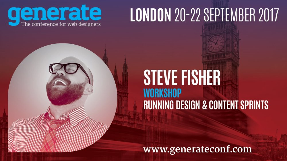
Use external testers
Fisher and his team work with a lot of provincial governments and large municipalities in Canada, as the sprint approach is beneficial to organisations that have complex problems and a huge scale. One project saw the team tackling a four year-old site that encompassed 20,000 pages and more than 100 content authors.
With such mammoth projects, sometimes the result can be completely different to what they initially anticipated. For example, when working on a sprint to make a building permits app responsive, the team discovered that particular app needed to be combined with three other apps in order for people to really want to use it.
“If we bring in external people, who are actually using products, to test and give feedback during these sprints, then we can find the real problem we’re trying to solve. That can be discovered quickly, but only if we bring in diverse perspectives and people from outside your group. We walked away having developed a much better product. It was a turning point for that government.”
Steve Fisher juggles running a consultancy, his own conference and speaking across the world
Test early and often
The prototype towards the end of the sprint is often created with Bootstrap or something similar, which is user-tested the following week. Fisher’s approach to user testing is to test early, often, and in bite-sized chunks.
“If you test more often with smaller groups, you’ll discover 80 or 90 per cent of the issues right away. When your team witnesses someone struggle or succeed with your product, it’s very powerful. It changes hearts and minds.”
A personalised approach can also have a big impact. “We like to go to people when we can, see them try something out and walk through everyday tasks in their environment, or make it as familiar as possible. If I have a MacBook with me and someone’s used to a PC, I’ll use a regular mouse and change the scrolling to what they’re used to. Little details like that make a difference when user testing.”
Fisher argues that often we get too bogged down in our tools, and sees the current fragmentation of tools as a big problem for web industry. The likes of Grunt, gulp and webpack might work for some people, but don’t fit well for others.
“There’s this sense you have to learn all the things, now, which can result in too much distraction,” Fisher laments. “It’s essential to be a lifelong learner, but we also have to learn focus and accomplish our tasks. There are so many things out there for us to know and learn and keep track of.”
He suggests designers and developers view the situation as an opportunity to discover products that will help them in their workflow. “We should talk openly about how we work. If we share with others what kind of system we develop with, for example, it will help our community learn.”
Embrace diversity
Another, perhaps more persistent, issue plaguing the web industry is its lack of diversity. “It’s probably not going to change for a long time,” Fisher sighs. “We don’t have nuanced teams because we only have a narrow amount of voices in a lot of companies, and especially in leadership.”
Fisher points out that the different voices, perspectives and ethnicities represented was what attracted him to net’s Generate conference. When conferences embrace diversity, everyone who comes across that event – in person, on the website, on social media – can see they themselves are represented on that stage.
“White dudes in the tech and design industry never go through ‘rep sweats’. They never feel they’re not represented,” Fisher notes. “We’re represented everywhere! If you’re a person of colour in America, you’ll have a different experience in life, and you won’t have the same experience of privilege.”
Steve Fisher loves his dogs – for more on Sloane the Vizsla, check out our article on design studio dogs
The web industry needs to continue to acknowledge its diversity problem. “Most people of privilege, white folks like me, get more opportunities more easily. I’ve seen that in my own life. It’s important I use my privilege to help the less privileged, the vulnerable in society, and not myself.”
It’s no surprise diversity is a crucial ingredient of Fisher’s own conference, Design & Content. But this was not always the way. “When we organised the first conference, we had more women than men speaking, but one perspective producing the experience. A white perspective, which resulted in 80 per cent of the speakers being white. We were well intentioned, but we messed up,” Fisher admits.
“It wasn’t until someone challenged us on the lack of diversity in our speaker roster that we recognised we needed to do better.”
We need teams that represent a true picture of diversity we see in the world
Steve FisherFisher decided to address the problem by putting together a diverse production team for the event, including people from a range of gender perspectives, backgrounds, ethnicities and age groups. Everybody has an equal voice and everyone is paid for their time. The process is documented on the studio’s blog.
“It changed everything for us. One of our team has mobility issues and attends the conference, so her perspective helps us plan for others. I wouldn’t have known; my biggest mobility issue is that I’m 40!”
Fisher believes that introducing a similar focus on diversity and inclusion into tech firms would make a big difference to how these companies work. “We’d have the possibility of teams that represent a truer picture of diversity we see in the world,” he says.
Diversity, it turns out, can improve every aspect of our industry, from product testing to conferences. The more diverse your company, the more views you can use to inform your product design and content decisions, which ultimately will result in happier (and more) customers.
This article was originally featured in net magazine issue 291.
At Generate London in September, Steve Fisher will appear alongside 16 other speakers from the world of web design, including Brooklyn-based design duo Anton & Irene, progressive enhancement pioneer Aaron Gustafson, and performance expert Patrick Hamann. You can also choose from four workshops: Running Design & Content Sprints (Steve Fisher), Building Scalable Responsive Components (Zell Liew), User Experience Strategy (Jaime Levy), and Concept, Create, and Sell! (Anton & Irene).
-
Researcher Paulos Yibelo said that Dashlane elected not to patch a vulnerability he disclosed more than a year ago in all versions of the password manager application.
-
Brand voice covers not only a company's tone of voice and the language used in its communications, but also what content and messages a brand shares and prioritises.
'Tone of voice' is the phrase you find in most brand guidelines, when you get to the section about language. But 'tone of voice' is only half the story and half the battle. After all, it covers how you speak, but fails to mention what you say.
Your tone is all about the character that comes through in your language. Whether you say, 'Welcome, Ms Jones, how can we help you today?' Or, 'Hi Fran, what can we do for you?' Or, 'Come on in, Francesca, you're going to love this. Those choices tell audiences about the personality of your brand, making it more (or less) engaging. And that matters. A lot.
But it misses out the content of your messages. When a new customer arrives, do you tell them you've been a trusted name in this industry for 150 years? Or that you've been voted Britain's Nicest Place To Work three years in a row? Or that you've just transformed investment banking with your new app?
All three could be true, but how you prioritise them – and whether you mention them at all – will be just as critical as your tone when it comes to how you're perceived. That's why at Reed Words we prefer 'brand voice'. (That, and the fact it's the clearest, least pretentious term we can find.)
British Heart Foundation's brand voice is positioned around 'Fight for every heartbeat,' and uses direct and clear messages to get its point across
Style is critical, of course: phrasing, formality (or lack of it) and whether you use quick, choppy sentences or long, flowing ones are all important aspects of a voice.
But substance is just as vital. What does the brand want to achieve? Who are its competitors, and what are they saying? What is the audience looking for – and what can we say to persuade them we're the place to get it?
A fully-fledged brand voice that balances tone and content is a strategic tool as well as a creative one – a red thread that runs through every touchpoint of the brand, if you like. And these days, that brand voice matters more than ever.
Brand voice works as brand glue
As we all know, brands project themselves in more complex ways than ever. You can now encounter an organisation in a tweet, live chat or Facebook post as easily as a TV spot or poster.
Gone are the days when 'identities' could be 'managed' with a book full of logo sizes and Pantone numbers (if they ever really could). Brands now have much less control over how they appear.
Often, they're embedded in someone else's platform – their own 'look and feel' becomes subject to someone else. So anything that can create that crucial 'red thread' through every touchpoint becomes an extremely valuable tool. Brand voice does that just beautifully.
Twitter is an obvious example. On a mobile app, @Nike looks pretty much the same as @adidas. The two obvious differences are the logo – and the language. Looking at the two feeds, @Nike's copy is strikingly short, sharp and active – even in conversation. Very 'Nike', in fact. As I write, its most recent tweets (all @ replies) say:
That's a pretty consistent voice – and we can probably all agree which is the weak link. The last one, by the way, is in response to a photograph of a Nike-swaddled baby.
And @adidas? Again, here are the latest five tweets at the time of writing (all @ replies again):
Apart from the obvious decision to end every tweet with an emoji, this voice doesn't seem as sharply defined as Nike's. You could reverse engineer some basic principles based on the Nike list. And many readers could probably guess the brand from those tweets alone. Both would be trickier with adidas.
The point is, Nike's brand comes through powerfully, with zero visual support. That's voice as brand glue. If you can get the same tone and messaging running through your ads, tweets, app, website, packaging, and everything else, it reinforces the brand at every encounter, wherever it happens.
That's not easy to achieve, obviously. In fact, once you get to any sort of scale, it's bloody hard. But it's a tremendously powerful asset. And brands have finally woken up to it – big time.
Rewriting the rulebook?
In a way, none of this is particularly new. The fact that you should change what you say and how you say it depending on what you're writing is kind of obvious. It's not like Bill Bernbach wrote every VW ad a different way. And David Abbott didn't write for Sainsbury's the way he wrote for the RSPCA. Copywriters – and audiences – have always understood that brands have personalities, which their voices should reflect.
Even so, it's taken a long time for 'brand voice' to move from that sort of intuitive, background assumption into more of a recognised discipline.
Perhaps that's because writing is one of those crafts that's easily overlooked. The best writing is often almost invisible. As George Orwell famously said, it's like a window pane: revealing its subject with beautiful clarity, but never drawing attention to itself.
Simple calls to action paired with bold, clear images helped transform the way Alzheimer's Australia was seen by both citizens and the Australian government
Writers don't help, to be honest. We tend to be a quiet bunch – very good at grumbling in pub corners about how little people understand or respect writing, but perhaps less brilliant about really getting out there and promoting it.
Despite all that, voice has slowly edged into the branding limelight over the past 20 years or so. It's still establishing itself in many minds (and budgets), but we've come a long way from: 'Here are the layouts, can you just fill in the text boxes please?'
How copywriting discovered its voice
Looking back, things seemed to really get moving in the latter half of the 1990s. For me, a few points along the way seem especially relevant.
First, in 1995, there was Howies. The clothing brand's clever use of copywriting fitted its products and catalogues perfectly, and helped take the brand to a new level – with customers becoming fans, not just consumers.
In 1997, Interbrand gobbled up legendary British design firm Newell and Sorrell – swallowing, in the process, a chap named John Simmons. A passionate believer in the power of words, Simmons was frustrated that this side of the brand equation was so overlooked. He coined the phrase 'verbal identity' (an equal partner to visual identity), and built a division at Interbrand to offer it.
That he could do this – that a major agency would support it, and clients buy it – was another big sign that words were gaining new currency in design and branding.
The identity for Birmingham Hippodrome – by Purpose, in collaboration with Reed Words – was informed by the idea of 'a stage for life'
Innocent burst onto the market in 1999, and as anyone who's attended a brand voice workshop knows, it changed the world. As its writer and head of brand, Dan Germain, has said, Innocent was a social brand before social media even existed. It even had its own hugely popular festival, Fruitstock. And arguably, it was Innocent's unique voice – silly, jolly and almost never about fruit – that was a massive contributor to its success.
In the same year, D&AD recognised the emergence of Writing For Design with a new award category of that name. And in the years since, brands and consultancies have rapidly become more sophisticated in the way they use – and commission – writing.
They've started involving writers at much earlier stages of branding – which makes sense, when you think about it. When you're trying to boil a complex offer down to a two- or three-word essence, it's worth having a wordsmith in the room.
More and more, brand writers are doing what they should have been doing all along: helping shape and crystallise the strategies behind brands, as well as developing the guidelines and communication.
The packaging for the Simple Value Argos range uses short and snappy copy to reflect the simplicity of the goods, and the honest tone reflects the products' solid quality and good value
Looking to the future
Looking at the examples we've covered, it seems brand voice can be useful in everything from clothing to charity to chatting to customers on the phone. As as far as we can tell, the future looks rosy for brand voice. (Unless it's just our spectacles.)
Partly, it's because of a need for coherence in an increasingly omnichannel world that never switches off. But it seems there's also a deeper recognition of how powerfully words can capture subtle, complex ideas in clear and compelling form. And as brands find more ways to talk (think artificial intelligence, for example), their voices can only become even more important in the future.
This article originally appeared in Computer Arts issue 266. Buy it here!
Related articles:
-
In 2017, exactly 60 years after the Moomins were created, a new Moomins animated TV series has surpassed its crowdfunding target, a Moomin Museum has opened and the first UK retrospective of Moomin creator Tove Jansson's stunning book illustrations and art has been scheduled. To celebrate all of this Moomin excitement, we headed to Finland to find out about the artist, her characters and the new Moomin reboot.
Sitting in the late Tove Jansson's studio apartment in Helsinki, her niece – Sophia Jansson – is wondering how the Moomins artist survived with no kitchen in her home. “I suppose she lived on a diet of coffee and cigarettes,” she jokes.
There are half-finished paintings and an abundance of books scattered across the modest living space, which comprises a bedroom, an open-plan living area and a mezzanine. Sculptures of Tove Jansson as a young girl, created by her father and fellow artist Viktor Jansson, are dotted along the shelves, and the steeple of the local church can be seen through the window.
Jansson created the Moomins towards the end of World War II, eager to escape the monstrosities of everyday life
The artist resided in the apartment for almost 60 years, after moving in 1944. Her life partner, fellow artist Tuulikki Pietilä, lived in the same building. While the pair didn’t hide their relationship, it was illegal to be gay in Finland at the time.
Sophia Jansson tells us how the couple would often work on their projects in their homes and then join each other for breaks – for coffee and a cigarette, perhaps.
Jansson originally created the Moomins towards the end of World War II, eager to escape the monstrosities of everyday life at that time. These characters went on to become one of Finland’s most beloved brands – and one of its most profitable, garnering over €700m in Moomin-related sales every year.
The Moomin Museum contains the very first Moomin comic strip that Jansson ever drew, published in 1947
It’s no surprise then, that the world’s first Moomin Museum opened its doors in June in Jansson’s native Finland.
Based in Tampere, the museum boasts 300 drawings and paintings and 30 tableaux, donated by Jansson before her death in 2001, alongside work by modern Finnish artists. An immersive and interactive experience, it’s testament to the Moomins’ longevity.
So why do these little characters continue to inspire?
Timeless illustrations and stories
There’s a reason why the Moomins have stood the test of time. The strong moral messages of the tales, teamed with timeless illustrations and universal themes have allowed Jansson’s stories to reach far beyond Finland’s shores.
Gutsy Animations’ creative director Tuomas Korpi – who is currently working on the all-new Moomin animation series – says it’s these universal themes that keep the Moomins modern. “The issues in the stories are universal, and the storylines combine the fantastical and the everyday so perfectly,” he says.
The Moomins stories have stood the test of time
There’s magic in everything Tove Jansson created – both the stories and the illustrations
Jonna Uhrman“The characters are relatable, too – there’s an adventurous little Moomintroll in all of us, but sometimes we’re scaredy-cat Sniff,” adds Gutsy Animations designer and illustrator Jonna Uhrman.
“And the family are so warm-hearted, you wish you could visit them. The stories are full of positivity and hope for the future, although there’s always an edge.”
Jansson’s work continues to inspire Finnish designers today. “Her original artwork is so deeply impressive and well put together. There’s magic in everything she created – both the stories and the illustrations,” continues Uhrman.
“There’s no doubt that she has had an impact on Finnish design and illustration – we’ve all seen and read her stories. In fact, I don’t think I know anyone who hasn’t or who isn’t a fan.”
“She is one of the few Finnish artists who have made it big internationally, and that alone is quite inspiring,” Korpi adds. “It makes people feel like success on that level is possible.”
Tove Jansson the rebel
In one of her very first paid commissions at the age of 15, Jansson openly mocked Hitler and Stalin
Jansson was a rebel with a creative cause. She went against what was considered the norm and in turn, produced characters that every person around the globe could relate to.
In one of her very first paid commissions at the age of 15, she openly mocked Hitler and Stalin in caricatures for liberal satire magazine Garm – a bold move for a country in the middle of a war.
As we mentioned before, Jansson was also in a relationship with fellow artist Tuulikki Pietilä at a time when being gay was still illegal in Finland. They worked on a huge range of projects together, with many of their collaborative tableaus on show at the Moomin museum.
Themes of acceptance and inclusivity run through the stories
Jansson brought this rebellious edge to her Moomins – creatures who took a chance on life and opened their hearts to the unknown. There’s Little My and Sniff, who live happily in the Moominhouse despite not being related to the Moomins. There’s also the philosophical thinking of Moominpappa and the wandering vagabond Snufkin.
And of course, there are all the life-changing adventures the Moomins embark on, never giving into fear and turning back.
Jansson not only created Moomintroll and his parents, Moominmamma and Moominpappa, but a whole range of characters with a depth and charm of their own. The Moomins are all about acceptance, with Moominmamma ensuring that the Moominhouse is always a safe and loving place – both for her family and for visitors.
These characters can inspire others, not just morally, but creatively, in terms of ensuring diversity. Like Jansson, it’s important to include things that aren’t always the norm.
Giving nature a platform
One of the biggest characters in Jansson’s work is not really a character at all – Moominvalley is perhaps one of the lushest and most visually stunning environments an artist and author has ever created.
“Nature features so largely in her artwork – forests, islands, seas – which is partly a Scandinavian thing, but Tove always made them more exciting and exotic,” Korpi says.
This Scandinavian influence runs throughout Jansson’s work, with Moominvalley mimicking Finland’s lush forestry.
The Moomins Museum shows off its magical landscapes
“One of her characters might wander into a normal-looking forest, but then stumble on impossible, giant flowers and a crocodile – not things you would normally expect to find. She created places that I wanted to visit, places that were familiar but new,” Korpi adds.
Tampere, where the new museum is based, is a quaint city that sits between the Näsijärvi and Pyhäjärvi lakes, with the Tammerkoski rapids in between. You can spot the water (and its floating saunas) from the Pyynikki observation tower.
Inside the Moomins museum
On entering the Moomin museum, you're surrounded by the sights and sounds of another world. Due to the delicate nature of Jansson’s work – it’s mostly sketched on paper – the lights must be kept low, which only enhances the mood of escapism.
One moment you're standing in a giant Hobgoblin’s hat, watching a flower spawn from your silhouette; the next, the sound of a comet shoots across the room as you stand below a fire-coloured glass sculpture.
The world’s first Moomin museum opened its doors in June
The winter area offers a quiet, reflective atmosphere as digital snow falls in front of giant pebble-shaped seats, while an extraordinary Moominhouse tableaux takes attention to detail to the next level.
One particular gem is the area created for visually impaired visitors, where attendees can feel what a Moomin looks like.
The new Moomins animation
Retelling the stories in a new medium – that is, cutting-edge animation – will create a new audience
Tuomas KorpiThe new Moomin animation series that Korpi and Uhrman are currently producing is testament to the Moomins’ versatility.
“Retelling the stories in a new medium – that is, cutting-edge animation – will create a new audience, introducing more people to Tove and her incredible body of work,” says Korpi. “Plus, we need her stories of a humane and tolerant world more than ever.”
“Love, peace and solidarity – there should always be room for those kinds of messages!” adds Uhrman.
Gutsy Animations ran a crowdfunding campaign that raised over $250,000 towards the visual development of the new animation, and the Finnish production company will be joined by a team of award-winning British Oscar-, Emmy- and Bafta-winning designers, animators and illustrators.
Using an innovative 2D/3D hybrid technique, the animation will be modern, while also paying tribute to the traditional aspects of Jansson’s work (as the video above shows).
The all-new 52-episode animation series is set for release in spring 2019, directed by Academy Award winner Steve Box (Wallace and Gromit: The Curse of the Were-Rabbit).
If the museum and animation aren't enough, Moomin fans can also grab the first Moomin novels in Special Collectors’ Editions in October 2017, released to coincide with the opening of the Tove Jansson retrospective at Dulwich Picture Gallery in London. The Finn Family Moomintroll book will even include the original fold-out map of Moominvalley, says publisher Sort of Books.
Read more:
-
This year's San Diego Comic Con has already impressed designers thanks to the stunning visuals for the Thor: Ragnarok poster. But another film that's been getting a lot of attention is Ready Player One.
Based on the novel by Ernest Cline, Ready Player One follows the journey of Wade Watts as he hunts for an Easter egg (not the chocolate kind, the hidden data kind) in a virtual reality game.
Thanks to the creator of the virtual reality game in the book being a huge fan of '80s pop culture, Ready Player One is primed to be a nostalgia-stuffed cinematic experience for viewers, with Tron Light Cycles brushing shoulders with Back to the Future's DeLorean.
To promote the movie, Pentagram's very own Emily Oberman has designed an ingenious retro logo (above) that combines puzzle solving and yesteryear visuals that tie into the main themes of the book.
The big brassy lettering and gradient colouring calls to mind logos commonly associated with the notoriously gaudy decade, such as those for Transformers, Thundercats and Tron. Admittedly the logo for Ready Player One has toned down the '80s look so as not to frighten away viewers with more delicate retinas. But the real Easter egg can be found in a fun little maze puzzle made up of gaps in the lettering.
It's a subtle piece of design that doesn't get in the way of the logo, but once you notice it's there you'll appreciate the design all the more. While the puzzle is pretty simple, we're happy to see designers not just relying on retro charm to communicate the message of a movie. See the completed puzzle route below.
Spoilers: Here's the solution to the logo [Click the icon in the top-right to enlarge the image]
Related articles:
-
London-based creative production studio and VFX specialist Saddington Baynes has released a batch of inspirational 3D animation videos made by its research and development team, SBLabs.
Ranging from videos celebrating Pride in London with a cherub doused in a rainbow of CG paint, to a dancer replicating the famous Gangnam Style jig through motion capture, the SBLab artists have created some imaginative videos that are sure to inspire 3D and VFX artists.
The SBLabs team aims to train the company's artists to achieve perfect visual discipline in preparation for tackling demanding commercial projects. It also gives artists a chance to indulge in some hands-on training to develop their skills in a fun way.
The resulting creative clips can be glimpsed in the showreel below. You can also find the clips in full on the Saddington Baynes Vimeo channel.
Related articles:
-
In this tutorial we will be creating a range images out of SVG triangles, and setting up an animated transition from one image to another on click. It’ll look something like the Faces of Power website.
To kick off we are going to start with two arrays: one with the values we’re animating to, and one with the values we’re animating from. Every time a link is clicked, we are going to find the SVG that matches the href of that link and get the points attribute of each of the polygons in that specific SVG.
We’re going to extract all the coordinates in the points attribute, get the fill colour of the polygon and then add these as properties of an object. Then we’ll add all these objects to one of the two arrays: the to array.
We’ll use TweenMax to animate the values of the from array to the values of the to array. When the animation is complete, we’ll set the to array to become the new from array.
On first run, the from array will contain all the points values and all the fill colours of the currently visible polygons.
01. Convert images to polygons
How the image will look before and after being run through Primitive
The first step is to actually make the images. For this I used a tool called Primitive (check out the GitHub repo). The images used in the tutorial are personal images of a few friends.
Run your chosen images through the Primitive utility using the command line:
-n 250 specifies 250 polygons, -m 1 specifies a triangle shape, and -i input.jpg -o output.svg are the input and output. It’s important that all SVGs have the same number of polygons and are the same shape. Output.svg will be a collection of polygons.
02. Paste your SVGs into the HTML
After creating the SVGs paste them into the body of the HTML. Duplicate the first SVG and give one of the duplicates the class .svg-holder.
The .svg-holder is going to be the only one that is technically visible; it will be the holder for all the polygons that are animated in and out of it. Give all SVGs except the holder the class hidden and an id with a unique name. This should match the href in the links. The hidden SVGs will be hidden with display: none;. It’s important to make sure the href of each link matches the id of its respective SVG.
Then declare the variables:
03. Extract polygon coordinates
Now we have to run through each of our polygons and get the coordinates in the points attribute. We can do this using regex:
04. Update the polygon arrays
Saved as an SVG, all triangles become elements
Every time a link is clicked, we’re going to run a function that takes the href of the clicked link as an argument and find the matching SVG, get the points values, animate it, and update the from array.
This function calls two other functions – createPolygonPointsObject and animatePolygons.
createPolygonPointsObject converts all the polygon elements into objects that we can animate the values of, and animatePolygons animates the polygons inside .svg-holder.
This uses our getCoordinates function to get all the coordinates in the points attribute and creates an object with each coordinate and the fill. It returns an array of objects. I decided to make them objects because that data type seems to be easier to work with when you are animating a lot of values at once.
05. Animate the polygons
In the final version, the SVG polygons will transition via an animation
Let’s use TweenMax to animate the polygons.
On every frame of the animation, this loop animates the points attribute of the currently visible polygons in .svg-holder to the new values set above. The onUpdate method in TweenMax.to is called every time the animation updates, so here it’ll get run on every change in the values of obj.one, obj.two, obj.three, and so on. This way, the points values animate and the shape morphs to have different coordinates.
Next we can animate the fill. For each polygon in .svg-holder, set the fill to the fill in the toPolygonArray that is in the same index.
Now the polygons will animate their coordinates and their fill colours as expected.
Read more:
How to press start on your game art career
in Ειδήσεις από τον χώρο του Design και Hosting
Posted · Report reply
If you have a passion for video games, there’s no better time to turn that love into a lucrative career. From ground-breaking new technology to innovative new titles, the video games industry is a particularly exciting place for digital artists right now.
“There are all kinds of exciting opportunities in games,” says Cloud Imperium Games character art director Josh Herman. “Games are such a massive part of our lives now and they aren’t going to go away – the industry is just going to get bigger and bigger and there will always be quality jobs if you have the skill and the drive to find them.”
As more ambitious titles are being developed and pioneering technology such as real-time gains momentum within the creative industry, wanting to work in the world of gaming is a goal shared by many. But, like other creative fields, it can be a tricky industry to break in to.
Here artists at world-class gaming company Cloud Imperium Games share their pro tips to help aspiring games artists get their foot in the door…
01. Portfolio is king

Cloud Imperium Games' record-shattering crowdfunded title Star Citizen is in production“Specifically, the first 10 per cent of it,” says Nathan Dearsley, vehicle art director at Cloud Imperium Games. “Don’t be in the habit of thinking that quantity makes quality, because it doesn’t. In fact, it’s usually the opposite.”
“Only show your best stuff. You will be judged by your weakest piece on your reel/site,” adds CIG character art director Josh Herman.
02. Demonstrate a range of styles
“We do all kinds of characters, from one with fully cloth costumes that are totally covered in layers to fully armoured heavy marines, alien races, and realistic human faces,” says Herman. “So, in a new recruit I want to see that they have a lot of range in a realistic style.
03. Show the fundamentals
“For junior artists, a couple of strong pieces that illustrate a solid understanding of the fundamentals and knowledge of the game art process will help you stand out,” Herman explains.
04. Tailor your portfolio
“Also, if you are applying to be a character artist then you should send a portfolio of just character artwork. Don’t confuse me with environments, animations or VFX. A prop or gun can be okay if you’re feeling like you don’t have enough work, but they aren’t needed.”
05. Try to find your niche

A highly ambitious and challenging project, it’s no surprise that Star Citizen has attracted the attention – and talents – of leading game artists“There’s no point in applying to Blizzard if all you want to do is make something that’s the complete polar opposite,” points out Dearsley. “Because ultimately, you’ll get there and be unhappy and that’s not cool. If you want to make fantasy-type games, go and work for Blizzard. If you want to make space games, come and work for us. It’s very straightforward. Always try to focus your portfolio on that.”
06. Specialise if you can
Herman mirrors that advice: “If you know what you want to do, specialise. Knowing as much as you can about the other disciplines is great, but if you want to get a job you will need to have professional-level work in at least one of them. Specialising is the best way to do that.”
07. Be prepared to fail. A lot
“Failure is a big part of personal development,” Dearsley comments. “Fail lots – you’ll come out the other end better for it.”
08. Mix with the community
“Get involved, start liking artists on Facebook, comment on their work, get out there and start mixing with people on places like Polycount because it’s an extremely small world and an even smaller industry. You just never know where that next work offer will come from,” Dearsley says. “Project a really good image of yourself online.”
09. Build an industry presence
“We use some recruitment forums such as ArtStation, but a lot of the time we find people by asking our devs if they know people who are looking for work, who do good work, and who are fun to work with,” Herman explains.
10. Be nice!

Always do your research before interview“No one wants to work with a jerk,” says Herman. Dearsley agrees, especially when it comes to interviewing: “When you do get to the point where you’re getting interviews, make sure you research the company you’re going to be interviewed with.“
“I’ve sat in a few interviews where, when asked about the company, the answer is just a blank face. From that it’s clear you obviously don’t really want to work for us that much. Even if your work is great, at that point, I’m not really interested in working with you.”
Related articles:
View the full article