

Rss Bot
-
Content Count
21,437 -
Joined
-
Last visited
Never -
Feedback
N/A
Posts posted by Rss Bot
-
-
Before getting to the psychological part of performance optimisation, let's answer one question: what is web performance? For the majority of frontend developers, the answer would cover things like page response time, speed of animations, load times.
Guess what? The world is a cruel place and unfortunately not only web developers have access to the web. So how do regular users gauge web performance? Usually it's 'fast' or 'slow' ("The SpeedIndex of this site isn't as good as of that one. 280 millisecond slower first paint is the reason, I guess" – said no user without DevTools ever).
These diverging approaches to performance come from the fact that our estimation of time can be objective (the time we can measure with a stopwatch, the way we developers approach it) or subjective (time as it's perceived by users).
The reason why we should be looking at subjective, or psychological, performance is that unless users perceive the site as fast or faster, whatever we've done to our performance optimisation matters very little.
Time perception in humans
Mental activity makes waiting barely noticeable
Perception of time by humans is a complex process. We can sense the flow of time, but the exact nature of the mechanism by which this is done remains unclear. The lack of a dedicated brain area for temporal processing makes understanding the process difficult. This does not mean we are out of control. There is enough knowledge about it for the purpose of performance optimisation. Let's start with the basic functional mechanism.
Event in a nutshell
Our memories about some period in time consist of events. Try to remember your last vacation. Probably, you don't recall it as a continuous process but rather as a set of events: dinner with a loved one, trip to mountains, broken leg (maybe that last one is just me, but nevertheless, you get the idea). The same happens on the web, all interactions with a web application are defined by events: loading a site, requesting a page, searching information and so on.
Almost all of such events can be split further into smaller events or phases. For example, the event of loading a page usually consists of the following two phases:
- User is looking at the white screen
- User starts consuming the information on the page
Here, the original event (fully loading requested page) is not necessary over and might continue in the background, considering some basic optimisations are in action.
Phases during which our brain is triggered into active state and is forced to output information or process incoming one (typing, reading, etc) are called active. On the other hand phases when our brain is idling (looking at the white screen) are called passive. Multiple research suggests that people have a tendency to significantly (by about 36%) overestimate passive durations while underestimating active durations. Why so?
Sometimes there is a big difference between time measurable with a stopwatch, and time as we perceive it
At any given moment our limited attentional resources are divided between all the concurrent tasks, including timing. As aforementioned, the brain lacks a dedicated temporal processing area, and to build our perception of time, it has to use information from different sensors. During the active phase of an event, mental activity drags attentional resources off the temporal processing, making users consider the wait as a shorter one or not noticeable at all.
Passive phase is not defined only by brain idling. Typical features of it are:
- Waste of time: The more valuable the customers' time, the more negative their perception of those that waste it
- Boredom: This is the result of the idling state. Boredom arises when an individual does not get enough interesting information
- Lack of control: Users either have to wait for the event to be over or cancel the event (close the tab in our case). Lack of perceived control has a significant, negative impact on human physical and psychological well-being
Due to these features, users' complaints about waiting, in most cases, are related exactly to the passive phase. Let's summarise:
- User's interaction happens discretely: loading a page, returning search results etc
- Events, even remaining objectively unchanged, can be split into active and passive phases
- Active phase is well tolerated by users, does not cause troubles and does not need to be treated anyhow. Contrary to active, passive phase is the core of the waiting problem and is the part that should be addressed
Using this knowledge let's proceed to the basics of psychological performance optimisation (PPO).
Reducing perceived waiting time
Psychological performance optimisation does not change the duration of an event; instead it extends the active phase at the cost of the passive one
Here we should make an important note, changing the objective duration of the event is not the aim of PPO even though most of the techniques do reduce objective durations. Instead, it's all about manipulating users perception of time.
So how do we make users perceive an event as a shorter one without changing its objective duration? Simply, within the time limits of an event, we should reduce the harmless passive phase by increasing the tolerable active one. We should either a) start the active phase as soon as possible or b) keep users in the active phase as long as possible. Once this becomes clear, understanding a lot of performance optimisation techniques and their purpose won't be a problem for you.
At first, it might look like an unusual view at performance. But when it comes to the examples of the PPO there is nothing new I could tell. As long as you do performance optimisations, there is a high chance you're already using PPO even, possibly, without realising it. The list of relevant techniques includes but is not limited to:
- Critical rendering path optimisation: rendering the very first bits of information on the screen as soon as possible. If we speak events, this one is for loading a site or a new page.
- Optimistic UI: update interface in response to user's actions optimistically, disturbing the user only if something goes wrong. Optimistic UI is useful for any type of non-critical action.
- Resource hints: rather new specification of special <link> instructions to the browser that speed up communication and connection to external hosts or assets on your own site. Very broad field of application when it comes to events, from faster loading of subsequent pages on the same site to faster loading of the external pages if you need to.
- PRPL: pattern in general and its separate parts. Again, when it comes to events, PRPL pattern benefits loading the whole site or a newly requested page.
- Animations: probably the most seductive tool available to our disposal. But it comes with a warning. Animations, removing the boredom of the passive wait, indeed can significantly improve time perception of short events, related to the same page: outputting search results, putting item into cart, requesting additional information etc. It might even be used for cross-page transitions in SPAs. But, animations done badly might significantly harm not only performance, but also accessibility and overall perception of the project.
When we talk about psychological time, unfortunately, there is no way we could universally measure perception. But, are there any metrics we could rely upon in order to know how good our site is perceived by users?
What to measure?
Conventional parameters like an onload event are not very informative for measuring perception as they do not take users into consideration. Instead, we should rely on the new generation of metrics:
- First Meaningful Paint: this parameter is responsible for triggering your user from passive to active in the phase of the page loading event. But rendering on its own might not be enough. The browser window might still be unresponsive to a user's interactions due to the browser's blocked main thread.
- Time to Interactive (TTI): this is exactly the parameter that shows when users can actually use the site instead of simply taking a look at it.
Both parameters can be measured with popular monitoring tools like WebPagetest or Lighthouse. It also lands in Chrome DevTools. It goes without saying that these parameters should be as low as possible. You might also want to keep an eye on the Speed Index parameter to know how fast the visual part (not only the first paint) of your page is being output.
Conclusion
We've covered the basic principles of PPO. I would encourage you to keep going, read papers and any materials you can find on time perception. You will be surprised how weird and controversial our brain is. Better understanding of how humans are wired up might give you new opportunities in your work.
This article originally appeared in net magazine issue 293; buy it here!
Related articles:
-
Dan Povenmire and Jeff ‘Swampy’ Marsh are two modern-day heroes of American animation. Their talents span drawing, animating, writing and producing, and they even write their own songs. While they’ve worked on top programmes like The Simpsons on Fox and Rocko’s Modern Life at Nickelodeon, they’ve also created their very own shows for Disney.
- Your guide to Disney's 12 Principles of Animation
We caught up with them at the launch of Milo Murphy’s Law and asked them to share their top animation tips.
01. Photograph all your doodles
Characters in Milo Murphy's Law were based on old drawings
"I doodle all the time, and once I got a phone with a camera on it, I think it helped me a lot, because now I take pictures of every doodle I do," says Povenmire. "I also ‘favourite’ all the ones that I like and go back to them later on.
"A lot of the characters in Milo Murphy’s Law were drawings that I’d done years earlier, like the character Decker, who is played by Christian Slater in the show. When we found out that he wanted to do a voice, I went back in my phone and found the doodle, and was like: ‘This guy!’"
02. Try to make your characters think
"Watch Nick Park," Marsh advises. "He has mastered the art of making the inanimate object appear to think. The moment things become real is when you can believe that these characters are thinking. It’s not how big they smile or how fluidly they move, it’s when you’ve created the illusion that the character is processing information, and that’s that magic moment.
"I was watching Creature Comforts and just went, ‘Oh, my God, he’s nailed everything.’ You watch the Brazilian Puma, who’s sitting there on the log, he’s like, ‘Where I would like to live, and spend most of my time…’ He’s out there, he’s thinking, he’s imagining, he’s seeing things from the past and the future and you go: That’s alive. That hunk of clay is now totally believable because he’s imagining, he’s remembering, he’s thinking."
03. Explore different emotions in your faces
Candace is happy – until you put her eyebrows in...
"If you do angry eyebrows and a happy face, it looks evil," says Povenmire. "If you do angry eyebrows and a sad face, it looks angry. If you do happy eyebrows and a sad mouth, you get perplexed. If you do sad eyebrows and a happy mouth, it looks like your character is in love.
"You can do all these different things, and then within that you can use the eyelids to change an expression entirely: between wide-open eyes for an evil expression, and half-open eyes for a dopey expression.
"It’s like Candace, the sister in Phineas and Ferb – she’s pretty happy right up until you put the eyebrows in, and then she’s screaming at her brothers. Up until that moment it’s, ‘Aaaah!’ and right then it becomes, ‘You are so busted.’"
04. Think in three dimensions
Working on The Simpsons helped Marsh understand how to make characters instantly believable
"If you think of Bart Simpson, his head is a cylinder, a Coke can," Marsh says. "Draw it, and turn that character in three dimensions. If he turns his head a certain way, you get a bigger circle on the top of his head and a smaller circle where his mouth is.
"If your character turns and moves in three dimensions in a way that feels solid, people believe it a lot quicker. That’s the big thing that I learned when I started working on The Simpsons – how to construct things in a three dimensional way."
05. Use simple geometry
Protagonist Phineas and antagonist Doofenshmirtz share the same geometry
"In Phineas and Ferb, what’s funny is that our protagonist Phineas and antagonist Doofenshmirtz are essentially the same – they’re triangles with two circles for eyes," Povenmire explains. "You can put the hair in and they’re still impossible to tell apart.
"But if you add a crooked nose and a mouth, suddenly, one triangle is Doofenshmirtz, whereas with Phineas, the point of the triangle is his nose and his mouth is behind it. They’re very much the same, just as Minnie Mouse is indistinguishable from Mickey – up to the point where you add features and they diverge."
06. Don't over-exaggerate
The duo have lots of experience animating for prime time shows
"How you handle exaggeration is down to the specific gag, and very much down to your sensibilities." Marsh reveals. "We both have a lot of experience in prime-time animation such as The Simpsons and Family Guy, where it’s all very small reactions, not a lot of exaggeration.
"We’ve also worked on big, cartoony shows like Rocko’s Modern Life and SpongeBob SquarePants. They had big, ridiculous events. We tried to meet somewhere in the middle for our shows Phineas and Ferb, and Milo Murphy’s Law.
"If you’re more in the middle generally, when you do go want to go extreme, it really plays big and that’s when you get the effect you want."
07. Animate the antic
Povenmire learnt a lot by animating big gestures
"There’s a standard thing in animation called ‘the antic’, which is really sort of three drawings, put in the right order," Povenmire continues. "So if I draw Phineas reacting to something, he’s going to go from a normal to an alert position.
"Something big happens, and he’s got to react to it big. If you just draw the normal pose and then upright pose, it will just be OK. But if you give him the opposite action, instead of his head just going up, you have it go down first and then up, it becomes a bigger reaction to something.
"That was something I learned early on when I was trying to animate somebody suddenly running out of frame. It didn’t look good at all until I gave him this whole swing back first – a big, cartoony anticipation of a movement and then have him run off.
"You’ve got to have your characters move in the opposite direction first to give it weight."
08. Don't try to be perfect
Nick Park's Feathers McGraw shows the power of good storytelling
"As much as I believe in the quality of animation, if you’re telling a good story with some strong characters, you don’t need Disney-level resources," adds Marsh.
"You have to define your characters really well and know who they are and believe in them. And then, even a stick figure drawing will do.
"Think of Nick Park’s The Wrong Trousers, and the character Feathers McGraw. He’s a bowling pin! He doesn’t have any expression at all. There’s no smile. He blinks – that’s literally all he can do. But you know when he’s being menacing and evil. You know when he’s discovered something. He changes the pace at which he walks, and he stops and turns."
This article was originally published in Computer Arts magazine issue 266. Buy it here.
Related articles:
-
-
Whether you're looking to switch disciplines and try something new, or brush up on old skills, there's a ton of cool new art books to help you on your way. This month we've got guides on oil painting, how to draw manga and urban drawing techniques, plus a new and brilliantly named art craze: Zentangle. And not just regular Zentangle, but botanical Zentangle. We've also rounded up some the best tools to help you get started in each of these fields.
We look at a book that asks questions about creativity – what a good idea looks like, where it comes from – which is perfect for anyone suffering from bout of creative block. We also check in with Somerset House and its Print Club London film poster exhibition, and we've got our eye on a new, limited edition Moleskine collaboration.
01. Five-Minute Sketching: Landscapes
Get sketching on the move, even when you're short on time
This new book by urban sketcher Virginia Hein contains over 50 exercises to help artists of any level quickly sketch landscapes. "Suitable for both new and aspiring artists," publisher Search Press says, "this easy-to-use handbook will loosen up your creativity and show you how to sketch while outdoors or on the move, even if you have only a few minutes to spare."
02. Posh pencils
These charming pencils each feature an original design
London-based stationery designer Katie Leamon has created a new range of luxury pencils that are perfect for any budding urban sketcher. Traditionally made and inspired by nursery rhymes, fables and fairytales, the pack contains six mixed-grade pencils, each decorated with an original design. They cover everything you need for detail, textures, and tone.
03. Rolling Stones Moleskine
Choose from silk, denim, velvet or PU leather
This new, limited edition Moleskine collaboration sees the much-loved notebook brand join forces with one of the greatest bands of all time. The hook-up offers a series of covers made from rock'n'roll materials – silk, denim, velvet and PU leather – all of which include the Rolling Stones logo, the iconic tongue-and-lip design, created by English art designer John Pasche.
04. Zentangle
This new drawing craze is supposed to relax you
The Zentangle method is the process of drawing structured, repetitive patterns. Supporters say it increases focus, wellbeing and creativity. "With a focus on simple mark-making as well as drawing with the intention to relax and be creative," Quarto, the publisher of this new book, says, "tangle drawing is a powerful tool for people looking to tap into their inner artist."
The book contains more than 200 tangle-inspired botanical illustrations, with written instruction on how to draw them.
05. Summer Screen film prints
Posters on sale include Blow-Up by Lucille Clerc
Print Club London and Somerset House are collaborating on their fifth annual film poster exhibition celebrating the Film4 Summer Screen. The Dalston-based studio is inviting artists and illustrators to create screen-printed posters for the new and classic films shown at the outdoor events taking place in London this summer. The adjoining exhibition runs from 3-23 August. If you can't make it, posters are on sale here.
06. Manga for beginners
Learn how to turn basic shapes into expressive characters
In her new book, Edinburgh-based manga artist Yishan Li shows you how to draw manga-style characters and creatures. You'll start with basic shapes, and learn how to turn circles, squares, and rectangles into witches, wizards, and monsters. This guide contains over 130 step-by-step drawings and more than 1,000 individual illustrations.
07. Manga art set
These pens are smooth and smudge-resistant
Faber-Castell offers one of the best manga starter sets around. Its pens use water-based ink that's acid-free, waterproof and fade-resistant. The pens glide smoothly and are smudge-resistant, with the largest pen offering a brush-like line. They are professional-level pens at an entry level price.
08. What's in an idea?
This book might prompt more questions than it answers
If you're suffering from creative block, perhaps you need to go back to basics: What does an idea look like and where does it come from? "Grant Snider’s illustrations will motivate you to explore these questions, inspire you to come up with your own answers and, like all Gordian knots, prompt even more questions,” promises publisher Abrams.
09. The Encyclopaedia of Oil Techniques
A comprehensive A-Z reference to oils
Search Press is publishing a new, up-to-date edition of Jeremy Galton's popular encyclopaedia of oil painting. This A-Z reference book is split into two sections: the first offers step-by-step demonstrations that guide artists through a variety of techniques, and the second focuses on themes and common subjects, including landscapes, buildings, portraits, still life, skies and water.
10. Oil painting box set
This set is one of the best rated around
Royal & Langnickel's oil painting set for beginners is one of the best-rated around. The UK brand offers everything you need to get started, including brushes, a selection of colours, a beginner's guide to oils, and canvas boards, all housed in a compact, portable and well-made wooden box.
Related articles:
-
There's minimalist design, and then there's the new range of products from the appropriately named company, Brandless. Based in San Francisco and Minneapolis, the company claims to be a group of thinkers with big dreams about changing the world. To turn its ideas into reality, Brandless has launched a range of extremely minimalist products.
We say 'extremely minimalist' because Brandless has taken the drastic step of trademarking a white box design for its food and home items. Co-designed with the help of Brooklyn agency Red Antler, each product is made up of a single colour with the white box design dropped on top. The text in the boxes is effectively negative space, and is readable thanks to the colour underneath shining through.
"With Brandless, we wanted to invent something completely fresh and new," say the pair behind the design, Tina Sharkey and Ido Leffler.
"Something that puts purpose into every product and message shared, and models a new kind of relationship between people and the companies built to serve them – directly, with integrity, transparency, authenticity, and democratised access."
So far, so Silicon Valley. But the lack of identity means that the products are dodging a fee known as BrandTax, which in turn has let Brandless set a standardised price across all its items.
Explore the range of products by clicking left or right in the gallery below, and if you live in the US and like what you see, you can order the Brandless goodies online.
Related articles:
-
Fans of the epic fantasy drama Game of Thrones have a lot to be happy about recently. Not only has the show returned to our screens for a seventh series, but there's also the promise of a spin off to look forward to. As if that wasn't enough, game artist and illustrator Catherine Unger has created a series of busts based on the main cast.
Unger, who currently works as the lead artist on Nintendo Snipperclips, drew the Game of Thrones busts last year, but recently unearthed them on her Twitter page to celebrate the launch of the new series.
These illustrations stand out from the crowd thanks to Unger's chunky drawing techniques. We particularly like how the blocky forms look like they've been chiselled into life.
Explore all of Unger's Game of Thrones busts by clicking left or right in the gallery below, and if you like what you see, you'll be glad to head that she's open for commissions. Maybe the makers of the show should get in touch to request some official work...
Related articles:
-
Tens of millions of products ranging from airport surveillance cameras, sensors, networking equipment and IoT devices are vulnerable to a flaw that allows attacks to remotely gain control over devices or crash them.
-
Freelance designer and frontend developer Ally Long has a particular interest in designing for novice tech users and people in emerging economies. At Generate London on 21 September, she will give a presentation entitled 'Field-tested interfaces for the next billion'. We caught up with her to find out what it's all about.
Who are ‘the next billion’ and what kind of devices do they use to access the web?
AL: 'The next billion' refers to the next big wave of people coming online in emerging economies. Most of us here in Europe, and in other developed economies throughout the world, are already online in some form or another. In the UK, for example, over 90 per cent of the population is connected. The deed is done; we’re on the grid. But that’s not the case in many other parts of the world.You have far fewer people walking around with their heads in their phones in Lagos than you do in London. Same goes for São Paulo, New Delhi, Kinshasa – hugely populous areas with whole hosts of people who’ve never had access to the internet. This is changing constantly, though, and rapidly.
The cost of mobile data decreases, and the availability of cheap handsets (think second-hand Blackberry knock-offs) increases. Connected smartphones are bringing computing to many people for the first time, and changing the landscape of the internet in the process. Lagos is becoming quite a tech hub in West Africa – and it’s entirely possible that it could outpace London as a global technology centre in the not-too-distant future.
Ally Long's talk at Generate London will explore how to include millions of new users in your product thinking
How do you design interfaces for people that are learning to use smartphones for the first time?
AL: You need to start with some good research – this is not an area where you can rely on gut feelings, or most of the body of literature around what constitutes good design and UX.
You can’t even rely on empathy, because it’s hard to even know where to start empathising with people who have such a different experience of technology and their environment than you do.
You’ll also really need to check your ego at the door, because the interfaces that tend to work best for these markets might not be what you think is nice design – we’re talking big font sizes and icons, high contrast, and clicky-looking buttons. You need to always approach this work as a series of problems that need to be solved with good design thinking, and don’t conflate a beautiful-looking interface with something that provides value to people.
And how do you improve the user experience for them?
AL: By making the app or site as lightweight as possible – both in terms of data usage and battery suckage. If someone has to pay a not-insignificant portion of their income to buy data, and perhaps also shell out cash to a charging station to power their device if they don’t have working electricity at home, then you need to treat that constraint with the highest degree of respect.
You should also regard being offline as the default status, and not an error. Allow users to do as much as possible without a connection, save things locally, and update or sync when the device is online.
What kind of UX and UI patterns and conventions that we may take for granted do not work for this new audience?
AL: A lot of navigation conventions don’t make much sense if you haven’t been exposed to the evolution of these conventions over time. Hierarchies or tree structures don’t seem to be very intuitive – in terms of navigation it’s better to stick to a linear pattern: forwards and backwards.
Gesture-based navigation and UIs are hard. People do learn them after some time, but it’s a steep learning curve. The idea of pressing buttons is more instantly understood.
What kind of user research and testing do you do?
AL: The key to good user research is to understand the context and the constraints. So for the public health projects I’ve worked on, I’ve shadowed health or logistics workers as they go about their tasks so we can figure out what will work best in helping them digitise their processes.
It’s important to get some background information too – I usually also ask them to show me their phones, find out what their favourite apps are, see how they use them, get a sense of their comfort level.
Testing is a bit of a different beast – it’s where you really get into the nitty-gritty of which UI elements present the least amount of cognitive strain. How fast can people get shit done, basically.
I’m working on a project with Field in Nigeria at the moment, and we have a great group of people we can test with. At the end of every two-week sprint, we release a new beta version of the app and ask our testers to try to complete specific tasks, observe the results, and document it in detail.
Visiting a health facility in northern Nigeria
What are some of the main challenges you’ve witnessed on your field trips?
AL: Just getting from A to B can really test your patience. Whether it’s roads that become lakes in rainy season, an overloaded truck that’s overturned and blocked a main road for a whole day, potholes that’ll swallow a car, fuel shortages, bandits on the highways or other security concerns – it always takes a lot longer than I expect to get anywhere, and the same goes for everyone.
You’re often either waiting for someone to show up, or they’re waiting for you to show up. These infrastructural problems affect almost everything else too – poor internet connectivity, and lack of reliable electricity to charge devices makes technology slower for everyone.
Sometimes you need to join a motorcycle gang just to get around
What can people expect to take away from your talk at Generate London?
AL: Mainly some very practical tips on how to cater for the next billion users in your designs and processes – how to account for the constrained resources, varying literacy levels, intermittent connectivity.
But I also hope to convey a sense of excitement, and engender some curiosity about this work – I don’t want people to think it’s all constraints and no fun. It’s fascinating, worthwhile, and rewarding.
Generate London, on 21 and 22 September, will feature 16 great presentations for web and UX designers and is preceded by a full day of workshops on 20 September. Don't miss the opportunity to learn from the likes of Steve Fisher, Leonie Watson, Anton & Irene, Zell Liew, Aaron Gustafson and many more. Reserve your spot today!
-
There's no platform better to launch your website with than WordPress. All you need is a professionally designed theme from Visualmodo to give your site style and function right off the bat. Get lifetime access to these themes right now for just $39 (approx. £30)!
Visualmodo's WordPress themes make it easy to streamline any web project. Its library of professionally designed themes are easy to plug in and immediately offer you a wide variety of features. These customisable and flexible themes fit just about any project, but if you're having trouble making yours work for you, the award-winning customer service from Visualmodo can help you get your site up and running.
You can get a lifetime of access to WordPress themes from Visualmodo on sale for 84 per cent off the retail price. That makes your total just $39 (approx. £30). It's a great offer for themes that will make your site even better, so grab this deal today!
-
You're reading Blogs vs. Online Magazines: Differences in Design and User Experience, originally posted on Designmodo. If you've enjoyed this post, be sure to follow on Twitter, Facebook, Google+!

The design world is abuzz with the rise of online magazines. But the vast majority of these sites run on blogging platforms like WordPress, and they operate almost exactly like traditional weblogs. So where does someone draw the line between a traditional blog and an online magazine? And if you’re thinking of launching a new blog/magazine […]
-
Typography is one of the most important skills you can develop as a designer. And however long your career lasts, you never really stop learning.
The good news is that there’s a lot of free help and resources out there. So in this post, we gather together the best typography-related ebooks, tools, cheatsheets and games to aid you in your continuing typographical journey. We've separated each category into its own page to help you navigate your way through this whopping roundup.
First up on this page: ebooks. There’s nothing like a good book to really get you diving deep into a subject. And with so many free ebooks around, you don’t need to spend a lot of money to improve your knowledge and skillset. Here are five of our favourites.
01. Type Classification ebook
Learn all about the main type classifications
If you want to learn the fundamentals of typographical classifications, then this 27-page ebook is a good start. Created by Just Creative – the design studio and graphic design blog of Jacob Cass – it’s a reference guide to 10 broad classifications, namely Humanist, Garalde, Didone, Transitional, Lineal, Mechanistic, Blackletter, Decorative, Script and Manual.
02. The Vignelli Canon
The Vignelli Canon sets out Massimo Vignelli’s guidelines for using typography
Massimo Vignelli (1931-2014) was one of the 20th century’s most famous graphic designers. In this classic book, which Vignelli made available in free PDF form in 2009, he sets out his guidelines for using typography in graphic design.
03. Professional Web Typography
Truong's ebook is all about online typography
Anyone who needs to get their head around using typography on the web should make a beeline for this 2016 book by professional web designer Donny Truong, director of design and web services at Antonin Scalia Law School. It sets out an overview of how type works online, and outlines the author’s process for selecting fonts and typesetting on the web.
04. Practical Responsive Typography
Darlo Calonaci's book offers fundamentals and examples of responsive type
Written by Darlo Calonaci and published by Packt, Practical Responsive Typography outlines the fundamentals of web typography and explains how to make it work with responsive web design. Including code examples so you can put what you learn into practice, this is a must-read for web designers. Earlier this year, Packt teamed up with us to offer the ebook version to Creative Bloq readers as a free download: you’ll find full details here.
05. Fontology
Fonts.com is behind this comprehensive workbook of fonts
Many font foundries and font retailers have written their own ebooks to help users get to grips with typography. And one of our favourites is Fontology, from Fonts.com. Structured as a workbook, it covers topics including type history, type families, type anatomy, text typography, web typography, display typography, type choices, numbers, signs and symbols. It's a great self-learning tool for beginners and a handy reference and refresher for professionals.
Next page: Free typography tools
One thing the global design community is pretty good at is giving back to others. So there are a ton of tools and apps out there on the web, free for you to use to boost your typography prowess. Here are five we heartily recommend.
06. Type Zebra
Type Zebra lets you to test out different fonts by typing on screen
Made by Chilean agency UX Ready, Type Zebra is a browser-based app that allows you to test out different fonts simply by typing on screen. Use the top nav to choose between local fonts, Google fonts and Edge fonts, write your text below (or just use the supplied dummy text) and then choose your font from the left-hand nav.
07. Font Pair
Pair Google fonts easily
The brainchild of Hayden Mills, a design student at Indiana University, Font Pair aims to help designers pair Google Fonts together quickly and effectively. It basically aggregates a list of the most popular font pairs together in one place, and lets you try them out via editable dummy text.
The top menu handily groups all the pairs together in six combinations, such as Sans-Serif/Serif, Cursive/Serif, Serif/Serif, and so on. All in all, it’s a lot simpler and quicker than spending hours searching through Google Fonts manually.
08. Try.typography.com
Have fun playing with variations within each typeface
Another font tester, this browser-based app comes from renowned type foundry Hoefler & Co. It basically lets you choose from H&C’s catalogue and see what each font looks like at different sizes, with different line spacing, using a handy set of sliders. You can also really start to drill down by turning on and off specific details such as ‘short-tailed Q’ and ‘unjoined % sign’.
09. Font Flame
Which font pairing will make you swipe right?
It’s easy to spend your whole career relying on the same, safe font pairings. But Font Flame tries to prompt you to expand your horizons and experiment with new and different combinations. Dubbing itself ‘Tinder for font pairing’, it serves you up a continuous stream of font pairings you may not have considered, and asks you to ‘Love’ or ‘Hate’ them. All fonts come from Google Fonts, and you can review your favourites when you’re done.
10. Fontjoy
Fontjoy is an intelligent free service for font pairing
Fontjoy steps things up a notch, by using deep machine learning to make things more methodical than Font Flame's random pairings. It’s still very easy to use, though.
Just use the slider to determine what level of contrast you want between the fonts, and click on the Generate button to create a new font pairing. You can also click the ‘lock’ icon to lock fonts you like, edit the text, and choose a font manually.
Next page: Free font identification services
One of the most common questions you see posted on design forums is “Can anyone identify this font?” But before bothering a human, we’d urge you to first try one of these automated font identification services. They’re by no means infallible, but they should at least provide you with some handy hints to get you further on your way.
11. WhatTheFont
WhatTheFont is a phone app and desktop site
First launched by MyFonts in 2011, WhatTheFont is a free iPhone app for identifying the fonts in a photo, print ad, poster or web graphic. Take a picture with your phone and the app will tell you what font or fonts are being used in it. There’s also a browser version of the app.
12. Matcherator
Drag and drop, upload or paste an image URL to scan its fonts
Font Squirrel offers a free font identification service called Matcherator. Just drag an image onto the box (or add the image URL) and it will ask you to crop in on the area containing the text. Once you’ve done that, Matcherator will identify fonts that match your image, and where you can get them from.
13. Identifont
Identifont has a huge, free to use, library of fonts
Since its launch in 2000, browser tool Identifont has been allowing you to identify fonts in a huge variety of ways. The world’s largest independent library of digital fonts and font families on the web, it allows you to identify fonts by appearance; to find fonts by name; to discover picture or symbol fonts; and to search for fonts by designer or publisher.
14. WhatFont tool
Just hover and click on web page text to see the font used
Not to be confused with WhatTheFont (number 11 in this list), the WhatFont tool is the creation of Chengyin Liu, an engineer at Airbnb. It’s a quick and easy way to find what fonts are used on a web page without all that tedious mucking about in Firebug or Webkit Inspector. Just install the Chrome or Safari extension and then click the WhatFont button on any web page to find the information you require.
15. Type Sample
Type Sample is a free extension or bookmarklet
Type Sample is a tool for identifying and sampling web fonts that’s currently being built by Justin Van Slembrouck and Paul Barnes-Hoggett. Anyone can use the bookmarklet and save three samples for free, but to save an unlimited number, it's $5 a year. Either drag the bookmarklet up to your bookmarks bar, or install the Chrome extension to get started.
Next page: Free typography cheatsheets
The older we get, the more we learn. But just to keep us on our toes, nature also teases us by making it more difficult to retrieve information from our ageing memories, especially if we're tired. So it can be very handy to have a well-ordered cheatsheet to hand. Here are five great examples.
16. Typewolf typography cheatsheet
The correct use of double and single apostrophes is explained, along with much more
Launched by Colorado designer Jeremiah Shoaf in 2013, Typewolf has grown into a fantastically useful collection of font-related resources for designers. And one of the highlights of the site is this brilliant cheatsheet, which sets out a lot of great info on the proper use of typographic characters. Even seasoned designers will find this a useful reference to keep bookmarked.
17. The State of Web Type
Keep up with which typographic features currently are and aren't supported online
Browser implementation of typographic features is constantly and quickly evolving. So it’s great to be able to keep tabs on the state of play via one central resource. Designed by Jake Giltsoff and maintained by Bram Stein, The State of Web Type offers a comprehensive guide to what’s supported where, from alternative fractions to terminal forms.
18. Type Terms
The Type Terms cheatsheet by Supremo explains the fundamentals of typographical terminology beautifully
Looking for an animated cheatsheet? Us neither. But this creation by Dan Heywood, a designer at Manchester web agency Supremo, is still pretty awesome. Aimed at both typography beginners and more experienced designers looking for a refresher, Type Terms is a brilliantly interactive run-through of the fundamentals of type terminology.
19. The Art of Mixing Typefaces: Google Fonts Edition
The infographic specialises in Google Fonts
As a print company specialising in leaflets and flyers, FastPrint knows a thing about fonts. And so it has produced this great cheat sheet to how well 20 popular Google Fonts work together. It’s based on inspiration from a handout that was created by the International Journal of Typography in 1992.
20. The A-Z of Typographic Terms
This online guide is a great typography jargon buster
Founded in 1997, Fontsmith is a boutique font foundry based in London. And it has created this rather wonderful cheatsheet setting out an A-Z of typography terms. This guide sets out everything you need to know about font-related jargon, from anti-aliasing to x-height.
Next page: Free typography games
Practice makes perfect, and it’s only by constantly pushing our typographic skills forward that we improve them. But if your day job isn’t providing that practice, then why not try one of these fun games; all enjoyable, some even addictive?
21. Kern Type
How did this farcical attempt score 8 marks?
Kerning – the art of adjusting the space between letters – is a skill every designer must master. So why not practise using this fun game made by interaction designer Mark MacKay for his peer-to-peer educational website, Method of Action?
You can use the mouse on your computer or your fingers on an iPad to tweak the letters, and the results are compared to those of a skilled typographer and scored accordingly.
22. Type Connection
Never has type pairing been so attractive
Type Connection is billed as a ‘typographic dating game’. In other words, it’s a fun way to learn how to pair typefaces. Created by Aura Seltzer, a senior product designer for the New York Times, it presents you with a series of familiar workhorse typefaces and asks you determine which work best with which.
23. Shape Type
We did it wrong on purpose, obviously
Shape Type is a game of letter shaping also created by MacKay, the developer behind Kern Type. You’re presented with 10 letterforms, each from well-known typefaces, and your challenge is to reshape them into the correct shape, using either your mouse or finger.
24. Rag Time
Cheers! We like the heady rewards for each effort
Ragged text is an often neglected aspect of good typography, so this game from Boston agency Fathom Information Design attempts to right the balance. You’re challenged you to fix a bad example of ragged text against the clock and, as the title suggests, there’s some glorious ragtime music to chivvy you along.
25. The Rather Difficult Font Game
A truly tricky type quiz!
One for true type nerds, this fiendishly difficult quiz from the I Love Typography blog will challenge your font-related smarts like nothing else. Created by Finnish designer Kari Pätilä, this is free to play on the web, although the iOS app costs £1.99.
-
Pixel art is a type of digital art where artists specify the location of individual pixels, which are built up to create intricate scenes, game backgrounds, characters, and 3D effects – all with a limited colour pallet. Think about those 8-bit graphics first seen with the release of gaming consoles in the early '80s and you'll know what we mean.
Developing this artwork doesn't require expensive photo editing software and a load of other fancy equipment, just a lot of time. Here are 37 top examples of pixel art from some seriously talented, not to mention patient, artists...
01. Diego Sanches
The world's greatest ever minds get handy in Science Kombat
Diego Sanches is a Brazilian illustrator based in São Paulo, who has a great sideline in pixel art. We particularly love the animations he created for Science Kombat, a browser-based beat-em-up game for Superinteressante magazine.
It features eight playable scientists, including Albert Einstein, Charles Darwin, Marie Curie and Sir Isaac Newton, each with their own basic and special attacks, plus a final boss: The Divinity, able to take the form of various gods.
02. Pixel Jeff
"I've got a bad feeling about this."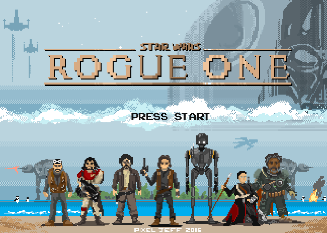
Based in Taipei, Taiwan, Pixel Jeff has been making pixel art since 2013, usually creating work inspired by movies, video games and animation. His Tumblr page is a treasure trove of animated pixel joy; we were drawn there by his reinterpretation of Disney's Moana as a video game, but it's his take on Star Wars: Rogue One that really grabbed our attention.
03. Ivan Dixon
Can you spot your favourite Bowie look in this pixel art tribute?
Following the sad news of David Bowie's passing on January 10th, illustrator and gif-extraordinaire Ivan Dixon paid tribute in the only way he knew how. Featuring a range of Bowie's iconic styles, the homage is a wonderful pixel art look at why he was so influential.
04. Gustavo Viselner
Star Wars Episode IV: A New Hope gets a pixel art makeover
It might have been released over a month ago but Star Wars fever is still rife among fans. Graphic designers and illustrators galore have been inspired by the new story, with some harking back to the old favourites – like this pixel art tribute by Gustavo Viselner. The artist has also created pixel art for Back to the Future, Aliens, Lord of the Rings and more.
05. Ben Porter
One of Porter's most recent pixel art creations
Ben Porter loves pixel art so much that last year, he embarked on a 365 day challenge, producing pixel art every day for a year. He also launched Pixel Dailies, a twitter account which shares daily pixel art inspiration and new creations by the man himself.
06. Marty Guerero
A look into Guerero's latest game design
A game developer and pixel artist, Marty Guerero produces some really incredible pieces. This pixel art is a snapshot into Guerero's latest game design, with the artist also produces homages to Mario and a range of Studio Ghibli characters.
07. William Alexander
Some pixel fan art to feast your eyes upon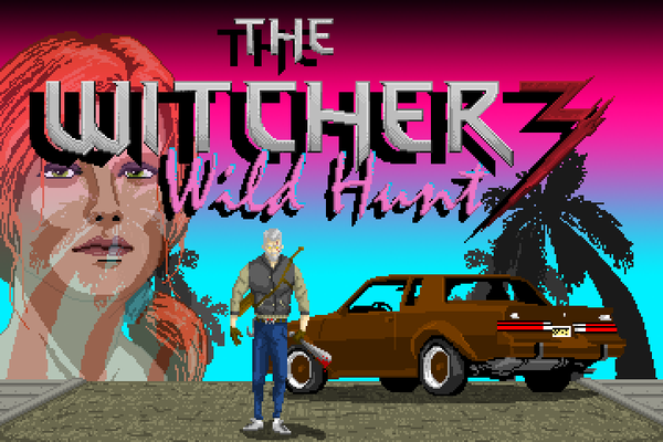
"Sometimes, I get really hyped about something, and I need to express it. Usually this involves just talking about it or reading more into it. Sometimes I do fanart! I was really hyped for the Witcher 3 earlier this year, and was listening to a lot of synthwave. That inspired this artwork," explains Ohio artist William Alexander.
08. Tom Schreiter
Tom Schreiter created a pixel art interpretation of The Blues Brothers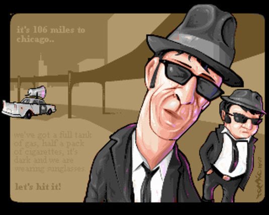
We can't help but love this pixel art interpretation of the 80's American musical class The Blues Brothers by Tom Schreiter. Pixelling since 1995, and doing so on a daily basis ever since, he's got a ton of brilliant pixel artwork under his belt – but this definitely one of our favourites.
09. Aled Lewis
Simon Pegg and Nick Frost star as 16-bit game sprites in this brilliant piece by Aled Lewis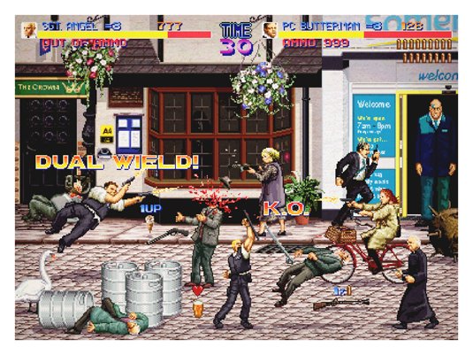
Hot Fuzz meets Japanese arcade game Final Fight in this epic pixel artwork by designer and illustrator Aled Lewis. This piece forms part of an awe-inspiring portfolio, most of which has been influenced and inspired by his main passions in life; games, comics, film and television.
10. Pixellent
We love this unique Polaroid by Pixellent
You don't often see pixel art go vintage, which is one of the main reasons we like this 'Don't forget to fix your Polariods' piece so much. Created by the artist known as Pixellent, this piece has been executed beautifully, the design featuring gorgeous, detailed pixel art, framed and styled to look like an old Polariod shot.
11. José Eduardo Contreras Moral
"I am your father" – pixel-art style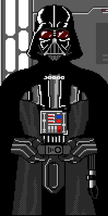
We've seen many artistic tributes to Darth Vader over the years here on CB, but we particularly like this cool pixel art version by illustrator and pixel artist José Eduardo Contreras Moral. Despite being stripped back to basics, Moral's design of the dark lord still looks incredibly menacing.
12. Nasc
"Make pixel, not war," says Nasc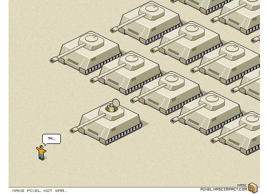
This brilliant 'Make pixel, not war' piece was developed by the artist known as Nasc. A developer specializing in Flash development, Nasc creates pixel art in his spare time. A minimal, yet expressive and powerful piece, this artwork. Expressive and powerful. This artwork is reminiscent of the Tiananmen Square protests of 1989.
13. Wanella
Wanella produces wonderful pixel-based visual landscapes with fantasy possibilities
Wanella produces these wonderful pixel based visual landscapes with fantasy possibilities. Her love for pixels is evident and original. Adding movement to her work with these vast examples of moving pixel worlds is a great example of how a combination of colour, squares and movement can be combined to great an original dynamic world.
Next page: 12 more stunning pieces of pixel art
14. Pixel Pour
Goeller's piece shows how the digital world can work in a different context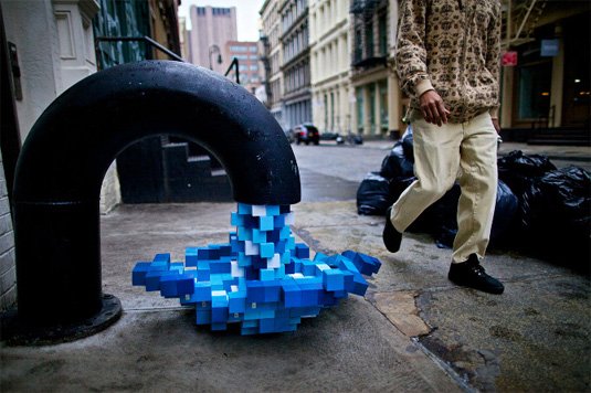
Visual artist Kelly Goeller based in Portland took the concept of the pixel and worked around it a real life concept. This original installation is a great alternative to how the digital world can work in a different context. Her water flowing pixels was installed around the city offering citizens a playful visual and imaginary context brining both worlds together.
15. Fine Pixel Art
John O'Hearn is another visual artist that works with the tiny elements to create impressive and live size scale works exploiting the potential of colour, elements and illusion. His examples of portraits is a great example of how he achieves this and exploits the potential of pixel art and design.
16. Metin Seven
Seven's work combines pixel art with 3D elements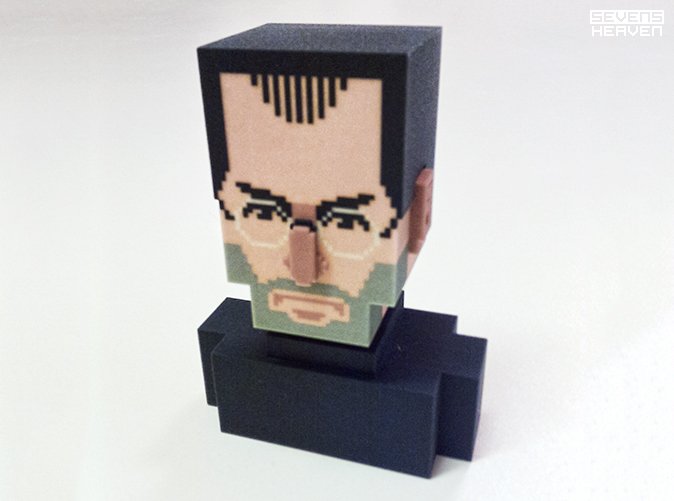
The work of Metin Seven combines design and pixel art with 3D elements creating the final artwork into a much more dynamic and detailed result. Along with the Steve Jobs re-interpretation, he has produced a series of characters based on square element combined.
17. Christian Zuzunaga
Christian Zuzunaga creates an original alternative to the use of pixels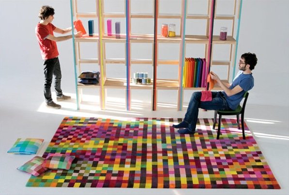
Although print and digital designs are the most common when looking at pixel art and pixel artisits or designers. Here is an original alternative to the use of pixels when combined with fashion, textile design and furniture. The beautiful use of colour and pattern with squares inspires great creative possibilities and exploring what is outside comfort zone.
18. Talk to me
The MoMA bridge the gap between design and communication using pixel art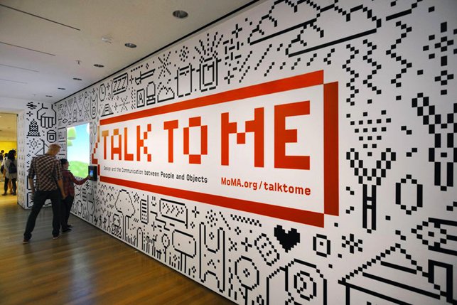
The MoMA took a spin on the pixel world with the use of simple square combinations to create a vivid and interesting pattern mural based on objects from their exhibition. Building the bridge between design and communication. The use of simple black and white strips it down further creating an interesting and dynamic overall feel for the exhibition.
19. Ben Fino-Radin
Ben Fino-Radin shows how pixels can inspire and drive various areas of design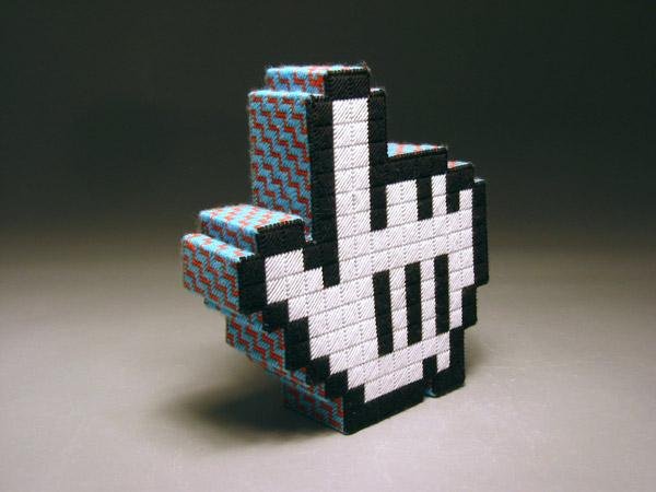
This is a great example of the way in which pixels can inspire and drive various areas of design to create original and innovative pieces of work. This life size hand embroidered piece of design is part of a collection that exploits the ideas of size shape and combination to create these hand life size mouse icons.
20. Jaebum Joo
Jaebum Joo's work combines small squared elements, simple movement and colour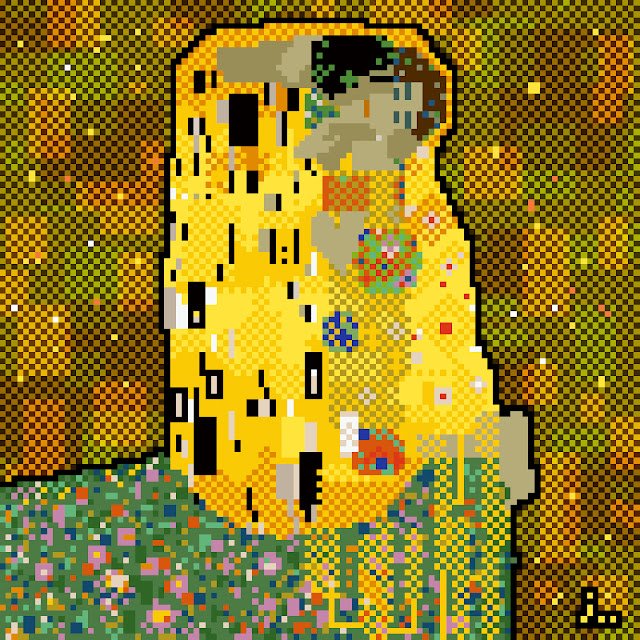
Coming back to more flat designs using pixels Jaebum Joo is a visual designer that combines small squared elements and simple movement and colour. His vivid portraits and landscape are an interesting remark on not only colour combination but also a sense of size and depth within design and its impact.
21. Mario Sifuentes
Mario Sifuentes uses pixel art to create his own interpretation of a pre-hispanic god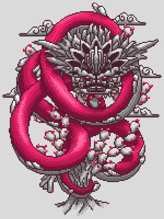
Mexican designer Mario Sifuentes created this interesting and beautiful interpretation of a pre-hispanic gods. Inspired by the '90s visual video game style, based on the combination of pixel and simple colour to imagine and re-create a world.
22. Eboy
Introducing the godfathers of pixel art: Eboy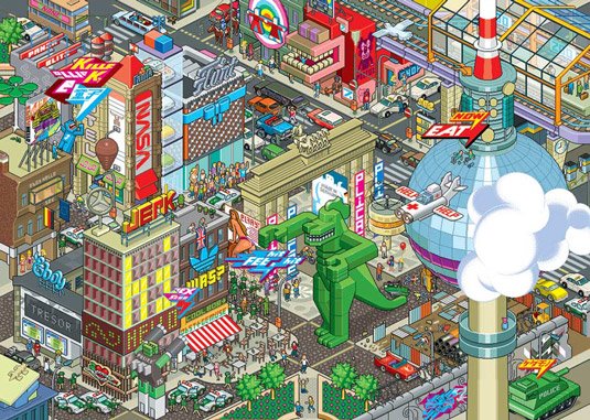
Some of the most well-known creators of pixel art are Kai Vermehr, Steffen Sauerteig and Svend Smital, aka Eboy. These guys create re-usable pixel objects and use them to build complex artwork. Famous for their illustration, web design, fonts, and toys, Eboy has created work for many leading brands, including Adidas, Nike, Pespi and Renault.
23. Paul Robertson
Paul Robertson is a pixel art master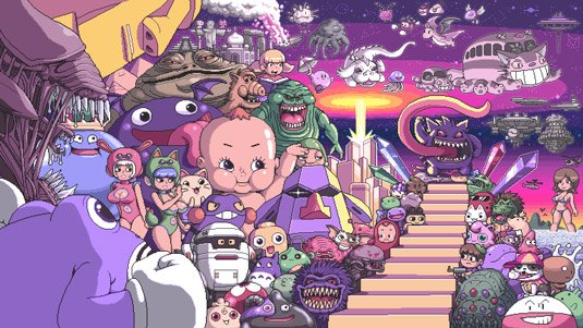
Australian artist Paul Robertson is a pixel art master. His intricate illustrations include everything from family-friendly pieces to some which are really NSFW... Even if you're not familiar with the name, you might recognise his work; he was the lead artist on the 2010 Scott Pilgrim video game and worked on the American animated TV series Gravity Falls.
24. Army of Trolls
Gary Lucken's pixel art is inspired by videogames and more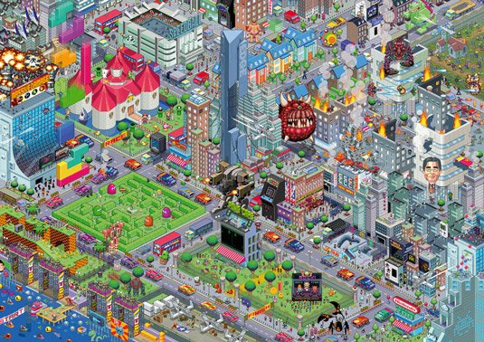
Army of Trolls is the portfolio of London-born videogame enthusiast and artist Gary J Lucken. Based in Bournemouth, UK, Lucken works from home, surrounded by Japanese toys and piles of old 2D videogames to inspire him. The artwork this talented artist is directly influenced by his love of videogames, toys, and pop culture.
25. Bugpixel
If you like pixel art, you'll like the portfolio of artist Jalonso
Bugpixel is the showcase gallery of skilled pixel artist Jalonso. An advertising art director by trade, Jalonso manages to find time to create numerous illustrations – his awe-inspiring portfolio features work he's developed for various video games, CD, and magazine covers.
Next page: the final 12 examples of pixel art
26. Rod Hunt
Rod Hunt creates highly detailed pixel art landscapes
Award-winning London-based artist Rod Hunt has built a reputation for detailed character-filled landscapes for everything from book covers and advertising campaigns to iPhone apps and art installations. Hunt is also the illustrator behind the bestselling Where's Stig? books, created for the BBC's TV show Top Gear.
27. Sven Ruthner
Sven Ruthner is a top pixel artist to be inspired by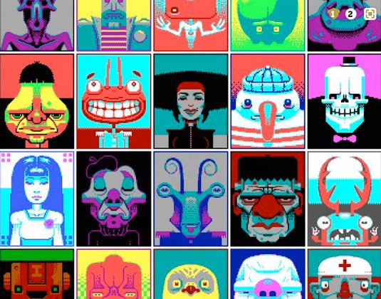
Freelance pixel artist Sven Ruthner has received international appreciation for his pixel artwork. Based in Germany, Ruthner uses limited colour palettes when developing his work, similar to the offerings of early home computers, such the ZX Spectrum. For example, this particular piece, titled CGA Faces, was created using just 16 colours.
28. Fool
Fool's artwork is highly intricate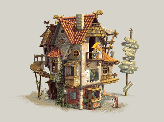
The pixel artist known as Fool in the community is a 43-year-old male, originally born in Moscow and currently residing in Ohio. A self-taught artist, Fool has been practising pixel art for over six years.
29. Tim Wesoly
Tim Wesoly's pixel art Robinson Nerdo character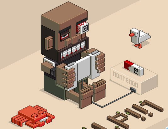
Tim Wesoly is the lead developer of 3D pixel art modeller Qubicle. When not working on his software, he spends time using it to create awesome pixel art, such as this cool Robinson Nerdo character. The illustration is deceptively complex – you'll find yourself noticing new things each time you look at this piece.
30. Denise Wilton
Pixel artist Denise Wilton has attracted many clients with her detailed style
Currently a creative director at Berg London, artist Denise Wilton has many skills, one of them being the creation of awesome pixel art. Her talent has attracted the attention of many big clients during her career, including The Financial Times, the BBC, Lynx, and Nokia.
31. Simon Anderson
Simon Anderson is known for his pixel art-style work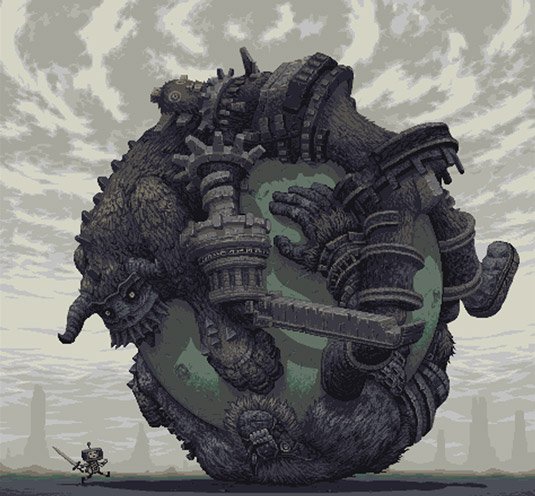
Simon Anderson, aka Snake in the pixel art community, is a Norwegian game developer and artist by trade. The co-founder of D-Pad Studio, Anderson's fascination with tiny squares began at a young age, drawing pictures and figures using his mum's cross stitch and knitting grid pattern designs.
32. Flip Flop Flyin'
Famous people. But really, really small.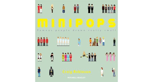
Craig Robinson is an artist from the United Kingdom who now lives in Mexico. Amongst his pixel art is a book called Minipops: Famous People Drawn Really Small, which does exactly what it says on the tim – in pixels.
33. Michael Myers
Michael Myers takes on Sherlock; now there's a film we'd like to see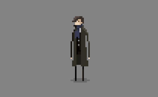
Instead of putting on a Halloween mask and murdering people, this Michael Myers is an illustrative designer with a sweet sideline in pixel art and animation. He has a great selection of TV, film and game-inspired pixel art on his site; we were particularly taken with this lovely little Sherlock animation.
34. Matt Yee
Matt Yee's ANSI art is a blast from the past
A member of Blocktronics - an international creative network dedicated to the production of ANSI art - Matt Yee is a designer whose more traditional typographic and illustrative work rubs shoulders with gloriously blocky graphics that hark back to the pre-web days of dial-up text-mode bulletin boards.
35. Richard Evans
Totoro and other Ghibli faves get the 8-bit treatment from Richard Evans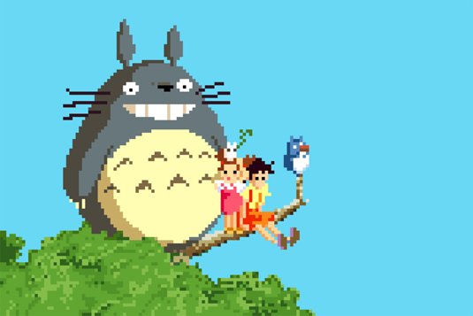
Birmingham based designer Richards Evans paid tribute to the work of Studio Ghibli with a set of 8-bit makeovers that we're sure you're going to love. Featuring characters from My Neighbour Totoro, Ponyo, Castle in the Sky and Spirited Away, they're beautifully inspiring in their colour and execution.
36. Karina Dehtyar
Pixel art escapes into the real world in Karina Dehtyar's pixels in photo series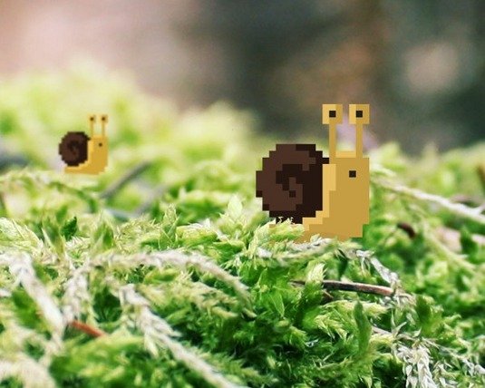
Karina is a Moscow-based illustrator and designer who specialises in film and video game inspired pixel art. Our favourite part of her portfolio, though, is the bit where her pixel creations venture into the real world, in her pixels in photo series.
37. Txaber
Peel slowly and see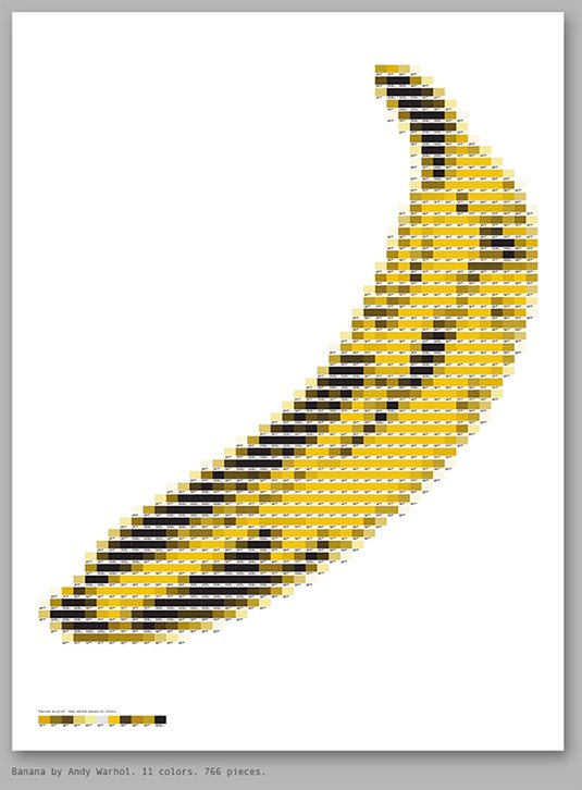
Spanish designer Txaber has used Pantone modules to produce an array of pixel art images. "The process is to convert the images into colour mosaics, then each colour is replaced one by one by the corresponding Pantone module," he explains. "It is a laborious process, but I think the result is interesting." The pixel artwork include imitations of Mario, Andy Warhol and iconic logos such as The Rolling Stones and Apple.
Related articles:
-
Oracle's July Critical Patch Update included fixes for 308 vulnerabilities, 165 of which are remotely exploitable.
-
Oracle today in its Critical Patch Update addressed a critical vulnerability in its Oracle E-Business Suite of business applications that allows for the download of business documents.
-
Substance Designer is a great 3D tool for creating realistic tiled floors, as the huge array of noises, patterns and generators available give you lots of creative freedom.
However, Substance Designer is a program that plays well with others, as height, mask and other texture maps can be easily imported and used to springboard your texturing process, especially if you have something specific in mind.
- Download the files for this tutorial
Over the course of this tutorial, we will show you how to combine mask textures created outside of Substance Designer to generate a modifiable ornate tiled floor. We will show you how to create a striking albedo map, believable tile damage, and how to realistically age your texture through the use of subtle surface details and blends.
We'll also cover some tips and tricks to help you generate masks and interesting details that will aid you in creating believable, high-quality materials. For a deeper look into the texturing process, head over to my Gumroad page.
01. Gather material references
Find some reference images of your chosen material (Click the image to make it full-screen)
Before creating any Substance material, gather a body of high-resolution reference images of your chosen material, preferably in different lighting conditions.
For this tiled material, looking on Shutterstock, Google images and Flickr uncovered 10 images that show close and medium distance detail. It can help to create a mood board to refer to, perhaps on a second monitor.
02. Create the input patterns
Create tile patterns in Hexels, then clean them up in Photoshop (Click the image to make it full-screen)
To generate the various tile patterns, use Hexels then clean up in Photoshop. Create three different patterns, each made of solid blocks of colour defining each tile in the texture. It's important to ensure that no two adjacent tiles have the exact same colour, or the Edge Detect node in Substance will merge them together, giving oddly shaped tiles.
Import the patterns into Substance Designer, where you can swap and replace them with others, which is part of what makes the program so powerful.
03. Combine the input patterns
Combine your inputs to create a new tile pattern (Click the image to make it full-screen)
Combine the patterns using Safe Transform, Transform 2D and Symmetry Slice, plus a few simple blend nodes. Use the cropping and mask functionality of the blend nodes to mask each pattern together.
The combined patterns are used as the initial base colour for each tile in the albedo map, with a mask for tile Edge Detect and warping of grunge and noise information.
04. Create the tile height
Follow these steps to give your tiles depth (Click the image to make it full-screen)
Make a greyscale version of the images, Edge Detect (to keep the masks' sharpness) then combine them. This gives you a black and white mask of each tile with a black border that you then need to bevel for tile height.
To vary tile size, use two Histogram Scan nodes with different values then blend the result using a mask generated from a Multi Directional Warped fractal sum pattern.
05. Add tile edge damage
Use the Slope Blur node to rough up the edges of your tiles (Click the image to make it full-screen)
To give the tiles some age and character, add damage to the edges. The Slope Blur node pushes detail from one input down the slopes of a second height input for this.
Combine some grunge and patterns to generate a heightmap with varied detail, allowing for large and small edge damage. The heightmap also contains areas of solid black where edge damage will not occur.
06. Cause surface damage
Follow up the edge damage with some surface damage (Click the image to make it full-screen)
Now that the tiles have damaged edges, add some surface damage to remove larger chunks. To generate the damage, use a Tile Sampler node scattering Gaussian shapes. To make sure the damage originates from the edges of each tile, use the tile height from earlier in the graph as a mask.
The other nodes in this step Slope Blur and Warp this data with grunge and noise to get a more detailed damage map. This helps to ensure that each tile looks uniquely worn.
07. Add tile cracks
The Cells 3 node is a great starting place for adding cracks (Click the image to make it full-screen)
To make the tiles look like they have undergone years of foot traffic, blend in cracks using the Darken blend mode over the unbroken tiles. The Cells 3 node is a great place to start when building cracks, but is too uniform without some modification.
After Warping the cracks, use consecutive Slope Blurs with Grunge/Noise inputs and a blurred version of the input itself. Slope Blur an input by itself at low intensities to give the effect of the inflated details.
Next: grout and finish off your tiles
08. Create the grout
Don't forget your grouting (Click the image to make it full-screen)
Make the grout by subtracting the tile height you already have from a Slope Blurred and reduced range version of itself. The final Histogram Range node modifies the grout blend with the tiles – the brighter the pixels the closer the grout is to the height of the tiles.
This works as the tiles and grout are eventually blended together using Lighten (max), so only the brightest pixels show.
09. Create the grout detail
Add detail to your grout to make it look more natural (Click the image to make it full-screen)
To make the grout feel old, use the Clouds 2 node as three inputs on a Multi Directional Warp to get a marbled effect.
Then combine this with BnW Spots 2, contrast and Slope Blur to add natural detail and multiply onto the base grout height. Make some pebbles and pores using Gauss Spots 2, pass through a Tile Generator and use the Add/Sub blend mode to blend with the grout.
10. Vary the look of each tile
Bring the floor to life by adding some variety to your tiles (Click the image to make it full-screen)
With the heightmap out of the way and the grout looking damaged, you can move on to the albedo/colour map. To darken the tile edges, blend the combined inputs map from step 03 with a darkened version of itself, then use a mask based on the edge bevel to regulate the effect.
To give the tiles some variation, blend in some hue adjustment using a tile mask generated by Warping the Perlin noise zoom node for added realism.
11. Build the albedo map
Your albedo map will need plenty of layers (Click the image to make it full-screen)
Building up a good albedo/colour map takes many layers. Hairline cracks are a great example of this kind of subtle detail. Although not immediately obvious, they add believability to the tile texture when it's viewed up close.
Create these as well as a thin layer of surface dirt, using some Warped Perlin noise combined with the pebbles and pores masks that you already made in step 09. This gives the tiles a really lived-on look.
12. Albedo map the grout
Give the grout an albedo map as well (Click the image to make it full-screen)
Create the grout colour by passing the grout height through a gradient map with brown values. Use a saturated version of this grout colour as the interior colour of the broken tiles, and blend with a contrasted heightmap so only the very highest parts of each tile show their tile colour.
Finally, add some extra edge damage using an inverted Ambient Occlusion generator as a mask.
13. Create a roughness map
The roughness map is made up from previous masks and details (Click the image to make it full-screen)
The roughness map is the last map to create when making a material, as it's mostly made from previous masks and detail.
Use your tile mask from step 04 and reduce its contrast in the Histogram Range node. Then subtract a surface dirt mask and add in the tile edge mask from step 12. Blend in the grout made from a uniform colour and a mask reused from the pebbles and pores.
14. Finish off
Add some final touches and you're ready to go (Click the image to make it full-screen)
Lastly, apply some finishing touches now. By Non-Uniform blurring the height with the Histogram scan output from step 10 then multiplying this result with the previous height, you get more variation in the heightmap.
To make the tile surface catch better specular reflections, blend some tweaked normals created with Warped Perlin noise and a gradient map full of tangent space normal colours. Finally, generate and output the Ambient Occlusion and the final height.
This article originally appeared in 3D World issue 223. Buy it here!
Related articles:
-
As Marvel Studios gears up to celebrate its 10th anniversary, we take a look at the typographic trends behind the Marvel movie logos.
With a plethora of superheroes to choose from – The Incredible Hulk, Thor, Captain America and more – Marvel has released a new movie each year since its 2008 release of Iron Man, building the brand into one of the most powerful in the world.
But with great power comes great responsibility, especially when it comes to the logo design of each movie. So what of the typography? How have the film's superhero logos developed over the last decade? And what can designers learn from their evolution?
Here we pick out seven big type trends from Marvel movie logos, and offer insights from designers.
01. Back to basics
The Inhumans logotype is based on the 1998 comic logo by JG Roshell
One clear typographic trend across Marvel’s 2017 and 2018 movie logos shows many of the designs increasingly returning back to their original comic book roots.
“From the get-go with the first Iron Man movie, Marvel Studios’ film branding wasn’t necessarily tied too closely to its comic book counterparts – with the exception of the Avengers logo,” explains comic designer and creative director Tom Muller. “This was done in order to establish IP and brands that reached further than comics.”
Another factor is that many older films were licensed out to other studios. Now, that trend appears to be reversing, with many of the newer logotypes giving a nod to their original comics.
The wordmark for 2018 film Inhumans is modelled closely on the 1998 logo designed by Comicraft’s John ‘JG’ Roshell, while the Captain Marvel logo takes inspiration from comic book letterer Jared K Fletcher’s original design.
02. Anti-flat design
The next instalments in the Avengers story sport logos that go against flat design
2016 might have been the year of flat design, but simplification of type continues to be a clear logo trend throughout 2017. Which makes it all the more notable that the newer Marvel movie logos are doing things differently – as showcased by the Avengers: Infinity War logo, which boasts blocky 3D type.
“There's been a global design shift towards simpler, cleaner, 'flat' design in recent years so, it's interesting to see this going in the opposite direction,” points out award-winning typographic designer Craig Ward.
“You can make the argument that the titles serve as a nice metaphor for the movies, which themselves have become darker, more mature and deeper.”
03. Textured type
The Black Panther logo shows off a 3D, metallic texture
Earlier Marvel movie logos saw the studio stick to simple typography, with faded hues often serving as the dominant special effect. With the new announcements, Marvel is moving into more textured territory, enabling movie titles to say even more about a film's characters and plot, while also popping from Marvel’s standard black backdrop.
“One thing that I'm noticing now is how the new graphics have more texture,” agrees designer Paolo Grasso. “The initial logo for Thor: Ragnarok evokes a rocky texture, while there’s a metallic shine on the Guardians of the Galaxy: Vol 2 and Black Panther logos."
"The older logos seem to stay with that 'laser on black' effect," he continues, "which reminds me of movie logos of the late '90s, such as Mission: Impossible.”
04. Bolder colour palettes
The use of blue marked the first Marvel movie logo to steer away from the classic red and silver colour scheme
In Marvel’s earlier movies, the logos largely stuck to its standard silver and red colour palette – with a few exceptions. Lately, however, the typography has shifted towards gold and brass tones, which can be seen in the logos for Avengers: Infinity War and Black Panther.
Tom Muller adds that while the typography in the logos of Guardians of the Galaxy: Vol 2 and Thor: Ragnarok are “squarely embracing their four-colour origins”, they’re doing so “with a decidedly bolder colour palette.”
And it’s worth pointing out that the Guardians of the Galaxy: Vol 2 logo was the first Marvel movie to use blue as its main type colour.
05. Rounded edges
The Captain Marvel logotype is based on Jared K Fletcher’s original design
Looking at the upcoming Marvel movie logos together, the typography of one in particular sticks out as noticeably different to the others. While most of the logos feature square-shaped typography, Captain Marvel veers towards the circular. It’s based on Jared K. Fletcher’s original design, but it’s a noticeable shift towards something different.
A similar style was used recently in Spider-Man: Homecoming, perhaps signalling the way Marvel movies target younger audiences. Spider-Man: Homecoming is a light-hearted film (compared to, say, The Avengers) and the hero himself is one of the youngest in the universe.
This circular geometric type evokes a youthful sense of fun, rather than a distinguished type used for the older heroes.
06. 1980s gaming
Thor: Ragnarok gets a typographic blast from the past
Speaking of a shift in direction, the latest Thor: Ragnarok typography looks undeniably different to the series’ previous logo outputs. 2011’s Thor saw a thin, metallic design, while 2013’s Thor: The Dark World provided a bold, textured type, similar to the initial Thor: Ragnarok logo.
However, a new movie logo was launched earlier this year and its retro gaming aesthetic marks the series’ change in tone. Director Taika Waititi described Thor: Ragnarok as a "70s/'80s sci-fi fantasy" movie – and the type in the new logo represents the new vision.
It’s clear from the Thor: Ragnarok trailer that the tongue-in-cheek approach that made Guardians of the Galaxy so successful will be taking centre stage in the new instalment. And while we're on the subject of Guardians of the Galaxy, the same effect can be seen in the Vol. 2 logo.
“It’s something of a trend, but adds much more character and gives a nod to the fun heritage of their comic counterparts,” explains designer Kyle Wilkinson. “A focus on the actual type design seems to be coming into focus too, as opposed to hiding some questionable type choices behind a cloak of special effects.”
07. Mismatched fonts
The mismatched fonts in this movie logo ensure an eye-catching design for audiences
A retro and comic book influence can also be seen with the hand-drawn ‘Homecoming’ in the Spider-Man: Homecoming logo, and ‘Vol. 2’ in the Guardians of the Galaxy: Vol 2 logo.
While this mismatched vibe is achieved by using contrasting colours and nontraditional colour palettes, an unusual font pairing can also be an effective way to catch the attention of your audience.
Related articles:
-
Japanese graphics tablet specialist Wacom has announced that a larger edition to its popular Cintiq family is on the way. The new 24 and 32-inch creative pen displays have been built to meet the demands of professional artists, designers and illustrators, who will now have more room to let their ideas breathe.
Announced last week, the new Cintiq Pros join the 13 and 16-inch models in the range. Unlike previous releases, Wacom plans to unveil a series of behind-the-scenes details over the next six months to generate a buzz around the products.
Pro Pen 2 delivers a natural drawing experience
Both models pack brilliant 4K displays with a billion colours and maximum colour accuracy. Thanks to edge-to-edge glass screens, creatives have free reign to draw as large as they want. Pro Pen 2 technology accompanies the release to deliver the best drawing experience Wacom is capable of.
Edge-to-edge glass gives users more room to create
Slated for release in January 2018, the wait for these tablets might be unbearable for some. If nothing else, the advance notice gives creatives a chance to start saving their pennies. Prices for the new models range from $1,999 to $3,299.
Related articles:
-
Plenty of people dream of designing their own game. It's never been easier or more accessible than it is now, thanks to the 2017 Zero to Hero Game Developer Bundle. You can get it on sale now for 96% off the retail price!
This is the bundle you need if you want to make 2017 the year you learn to develop your very own 3D games. With 83 hours of actionable content that will train you on the industry standards, this course is the perfect place to get your start.
You'll pick up the programming languages you need to know to code your creation and the 3D tools that make it possible to design and develop your dream game.
The 2017 Zero to Hero Game Developer Bundle is valued at nearly $1,500, but you can get it on sale now for 96% off the retail price. That's just $49 (approx £37.50) – a great deal for a training bundle that could set you down the path to your dream job, so grab it today!
-
Colour sells. Whether you’re working with a product, service or space, the ‘right’ combinations of colours can influence how someone feels, thinks and behaves – with powerful results.
According to a study by the Loyola University Maryland, colour is registered by the brain before either images or typography. The same study found that colour can increase brand recognition by up to 80 per cent.
So why, then, is brand colour so often dictated by the personal preferences of a client or committee? What are the ‘right’ combinations, and how can designers sidestep subjective debates to harness the power of colour more effectively in branding projects?
Colour theory in branding
When it comes to harmonious colour combinations, it helps to know the basics – so here’s a quick refresher of colour theory (and the colour wheel).
But what does it mean in practice? How relevant, really, is traditional colour theory for designers when it comes to branding?
Traditional colour theory is based around the colour wheel
According to Jonny Naismith, creative lead at Moving Brands New York, colour theory can provide a useful starting point when deciding the palette for a new branding project, but there are a lot of other factors involved too. “For us, these types of relationships can help generate ideas – particularly when extending out from a core, identifiable colour,” he says.
“However, in the early stages of projects, we’re often looking for varied points of reference. In a saturated market, it’s becoming harder to truly ‘own’ a colour, so we try to employ far-flung points of references to help surprise or create something memorable and unexpected. This could come from working with real materials, spending time photographing subjects or browsing the local bookshop.”
Moving Brands’ designers also employ a number of tools during the exploration process, he adds, including Adobe’s colour scheme generator, Kuler; Pantone’s Studio app, which converts photography into a selection of swatches; and a tool called Colorable, to ensure colour combinations are in line with Web Content Accessibility Guidelines (WCAG).
Moving Brands combined a vibrant secondary palette with ValuePenguin’s neutral primary palette to create a sophisticated, memorable scheme for the financial advice firm
Interbrand’s executive creative director Sue Daun agrees that colour theory is useful, but says that it doesn’t play a formal part in the global brand agency’s creative process.
“While many of these systems are intuitively used, it’s more about the need of the brand and the attitude we’re trying to convey – as opposed to following a system rigidly,” she explains.
Daun says that there isn’t a fixed formula at the brand firm for considering colour, because every job – and brand – is different.
“Clients commission work for different reasons, whether that’s growth, new directions, new audiences, redefined purpose or simply modernisation,” she reasons, explaining that Interbrand aims to unpack the brands it works on, and reframe them with purpose.
Colour ideas in the design process
“Every design element is considered with the same intensity, because in combination, they form a graphic equalizer to convey just the right level of distinction, relevance and authenticity for the brand’s new face.”
However, just because Interbrand doesn’t have a set formula for working with colour, doesn’t mean there isn’t a process for arriving at the perfect palette. “Very early on we ideate around the brand personality, and this builds an initial hypothesis in the minds of the designers,” Daun explains.
“The development process is then about defining not just the core colours, but the proportions used, the way they are used or what they are used for. Every decision focuses the final story to one of clarity and cohesion.”
Interbrand used a gradient to liven up Siemen’s colour palette
Global brand strategy firm Siegel+Gale takes a similar approach. Finding the right colour palette starts with the same key questions asked during the wider branding process: what does the brand want to stand for? And how does it want any touchpoint across its brand journey to deliver that experience?
Siegel+Gale’s designers work closely with strategists to answer these questions, rapidly prototyping holistic brand ideas and core thoughts, and beta-testing brand ideas to ensure concepts work in the real world. “These are early messaging ideas, communications opportunities and experiential concepts,” explains Steven Owen, executive creative director (EMEA) at Siegel+Gale.
“As we build these, we explore how they come to life: the visual language they may adopt; the tone of voice they might consider. Colour exploration is a vital part of this process. Each brand idea should have a different tone or personality, and subsequently, each route might use colour in a different way.”
Exactly how specific colours are chosen, however, is more arbitrary: “It’s a bit like asking how Siegel+Gale take their showers in the morning,” Owen laughs. “I’m sure we all have different methods and orders in which we wash the parts of our bodies, but the important point is: we all come to work clean.”
Colour psychology
One reason why colour theory, in traditional form, might not be so helpful to the branding process, is the fact that it was originally designed for artists and painters, and lacks the psychological and behavioural insights required for creating a brand that connects.
That’s according to Karen Haller, a leading authority in the field of applied colour psychology. “There’s so much more to colour than the colour wheel,” she says. “To really understand how to use colour to its full effect, you need to include the psychology of colour: how it influences us on a mental, physical and emotional level,” she explains.
Karen Haller offers a host of colour training courses
Haller warns there’s a lot of pop psychology around. “Many people get colour psychology, colour symbolism, and their personal colour association all mixed up together, which is why it’s easy to dismiss colour as being subjective,” she explains. “But they are three different things – and it’s important to understand why.”
Colour symbolism refers to the use of colour in culture, and the conscious associations we’re conditioned to make. In China, for example, red can symbolise good luck, while white often represents death.
In Muslim countries, there are certain products that aren’t designed in green because it represents the prophet Muhammad, but some Islamic banks might use this colour in their logos in order to convey trust.
Personal colour association, meanwhile, relates to the memories or experiences of an individual. “You might like terracotta because you were in Tuscany,” says Haller, “or a certain red because it reminds you of your favourite bike as a child.”
SomeOne followed a five-step process to avoid ‘rainbowageddon’ in its branding for St Catherine’s Hospice
If a client has ever said your colour scheme looks like their daughter’s bedroom – which has happened to Naismith at Moving Brands – or you’ve watched a meeting descend into endless debate, you’ll know the hurdles that personal colour association can bring into the branding process.
But some of these can be avoided. Unlike the previous two definitions, colour psychology relates to the subconscious way colour can affect how we think, feel and behave. And according to Haller, these reactions aren’t as subjective as might be believed.
Individual interpretations of a colour can vary (you might see a certain red as exciting; another person might see it as aggressive), but when psychology is combined with the study of tonal colour groups, reactions can be predicted with surprising accuracy.
The holy grail of colour
Haller isn’t the only one to take this line. In the ’80s, colour psychologist Angela Wright identified links between patterns of colour and patterns of human behaviour. She found that all colours can be classified into one of four tonal groups, and that mathematical relationships underpin the shades and tones within each group. In other words, Wright actually proved objective colour harmony.
Wright went on to develop the Colour Affects System, which identifies links between the four colour groups and four basic personality types, based on original research involving Aristotle, Newton and German writer Johann Wolfgang von Goethe.
BP uses group 1 colours; Bedding firm Dreams uses group 2 colours; McDonald’s corporate colours are mainly group 3, while Texaco uses a group 4 palette
Crucially, Wright found that colour schemes drawn from a single group always harmonise, no matter which personality type is interpreting them; while schemes that mix groups create disharmony. In addition, each personality type has a natural affinity with one colour family, meaning that people react even more positively to palettes crafted from ‘their’ colours.
Theoretically, then, if designers can establish which psychological colour family best conveys a brand’s message, it’s possible to create a colour palette that truly engages its audience – as long as every hue used in all brand communication is drawn from that same group.
“There are millions wasted by companies struggling with subjective, endless expensive debates about colour, and it’s usually decided on the basis of rank,” says Wright. “But objective colour harmony is underpinned by mathematics. If you stick within the groups, everyone can understand the message,” she explains.
Ask the right questions
So how do you get to a final colour scheme? As with any branding project, it’s about asking the right questions to get to the core of the brand.
For Laurie Pressman, vice president of the Pantone Color Institute, these include: what does your brand stand for? What message do you want to convey, and how can colour help you tell the story? Who is the consumer?
And if you’re targeting a global audience, will local cultural meanings be ascribed to the colours used – does the palette need to be modified to reflect this?
Mast turned to nature for colour palette inspiration when it released two recent products
Pressman adds that it’s key to look at what it is about the brand – including colour – that will prompt a ‘buy’ response in the targeted consumer, and to know where colour trends fit in. “Ask whether you should use a more unusual colour story,” she says. “Will the colours separate you from your competition? It’s important to be unique.”
“We often look at the competitive landscape,” agrees Naismith. “This helps to identify potential gaps or opportunities beyond colour.”
London-based SomeOne, too, surveys the competitive sector to establish the norm and find the gaps. To test its schemes, the studio starts by visualising applications, before doing print tests, and then accessibility and usability tests for digital projects.
“We’ve built a bespoke cloud-based brand tool to test colour compliance,” says partner Laura Hussey. “Branding’s never finished, so we embed this in guidelines. As it adapts and changes, so does the colour system.”
SomeOne applied a lively, optimistic colour palette to the branding for St Catherine’s Hospice, in order to amplify the charity’s voice and achieve market standout
The other key aspect to choosing the right colour scheme is knowing how colours work with each other. “There are thousands of greens,” points out Haller.
“You have to understand what every tone of every colour means, in the context of how you’re using it. Then, if you really tap into who the brand is – if you know its story and authentic personality – the colours to use will be clear. Who a brand is will dictate which colours, tones, combinations and proportions to use to convey – on a subconscious level – what the words are saying on a conscious level.”
Whatever you do, she warns, don’t confuse standing out in the market with shouting. “For a long time, to make a brand stand out, designers have been using really bright colours, but it’s the equivalent of shouting.
"All of a sudden everyone was using magenta pink, it was like: ‘Hello, look at me!’ You might stand out, but is that colour actually saying what your brand is about? You must be giving the right message.”
The key, as always, is to be authentic. “People have an emotional connection with colour first. Then we take in the shapes, the logo, and we read the words,” says Haller. “If we sense a mismatch, it’s the colour we don’t believe, despite the beautifully crafted words.”
This article originally appeared in Computer Arts issue 266. Buy it here!
Related articles:
-
Netflix prototyper David Aragon gives us an exclusive behind-the-scenes look at his work for the entertainment giant.
What’s your immediate team like?
DA: I’m on the TV and site design team, along with nine other product designers. Together we design the Netflix experience that ships on TV devices (set-top boxes, games consoles, smart TVs, Blu-Ray players and so on), as well as the website experience you use in a browser.I work most closely with my immediate team, but also frequently partner with the wider design team, which focuses on mobile, acquisition and Netflix Originals. Product managers, consumer insights analysts and engineers are also crucial in moving any project along.
What kind of prototypes do you create at Netflix and what tools do you use to build them?
DA: I prototype mainly in two environments: the browser and the TV rendering engine. My choice depends on the aim of the prototype. If I’m looking for quick iteration, I’ll build in a browser, since it’s hard to beat the reliability and ubiquity of WebKit. But if I need to see how a specific idea will render on actual TV hardware, I’ll build directly in our TV rendering engine, called Gibbon.In both cases I build with JavaScript and React. On the web I add in SCSS and WebPack, and with Gibbon I use gulp.
The conference rooms at Netflix are movie and TV themed
How do you approach cross-platform testing when you build your prototypes?
DA: Because we have dedicated apps for each device class, it’s rare for me to need to test a single UI across platforms. That said, the TV device landscape is diverse and fragmented, so even just testing within that subset feels like cross-platform testing. We have a number of strategies for benchmarking and testing across a wide range of devices. One of those tools is a Raspberry Pi, which simulates different tiers of devices, from low-powered Blu-Ray players to the latest game consoles.What are your favourite tools and technologies you work with?
DA: I absolutely love React for its speed and ease. It makes it easy to translate ideas and architecture from one platform to another. I’m also using Sketch more and more for wireframing.
At Generate London David Aragon will explain how to design and build prototypes, as well as how to conduct your own qualitative user research
You work with product designers, algorithm teams, content specialists, and the platform team. How does collaboration work at Netflix?
DA: I can’t speak for every team at Netflix, but my team doesn’t cling to one specific process. Netflix subscribes to the mantra of 'context, not control'. That is to say, your manager should give you enough context so you can do your job well, but should not micromanage the actual work.In the early phase of a project, we often use week-long design sprints, followed up by qual research. Once an idea has matured, we work towards several internal milestones but rarely focus on a specific launch date. When an idea is ready, it goes through a gauntlet of tough strategy meetings before an engineer writes a single line of code.
What are the main challenges of doing user research and testing for a product with a user base as massive as Netflix's?
DA: That’s a good question. TV entertainment has become more and more personalised, so what I think of as my favourite shows and watch routines probably won’t match up with yours.I might think of Netflix as my after-work sitcom unwind time, but for you it might primarily be the early-morning babysitter, keeping the kids distracted with cartoons. I can’t rely on my own instincts and behaviours because my motivations are so different from tens of millions of other Netflix members.
This is why qual research is so crucial. You get to talk with people whose experiences don’t overlap your own. Our consumer insights team does a great job of recruiting qual participants from diverse backgrounds, so we get a broad range of feedback.
How do you analyse the data and create user personas?
DA: Data is crucial to product development at Netflix. It helps us find pain points in the aggregate that we couldn't see in the individual level. A great example of this is box art testing.Users essentially pick the box art we use for content by voting with the play button. The more users that play a movie based on artwork A, the more likely it is that artwork A becomes the standard for that title.
Artwork goes through several rounds of A/B testing
What can people expect to take away from your talk at Generate London?
DA: People will leave with a broad understanding of how Netflix approaches user research, specifically from a design prototyper’s point of view. I’ll also detail the technical side of building prototypes for qual and how everyone can leverage user research, no matter how big their company.What's your favourite hidden gem at Netflix?
DA: If we’re talking content, I’d have to plug Happy Valley. Check it out! Regarding Netflix as a whole, the degree of autonomy I’m granted is rather astonishing, and empowering. It’s really on me to control the success of my projects, and that level of freedom (and responsibility) means I’m excited and proud about all my projects.Generate London on 21/22 September features 16 talks from the likes of Aaron Gustafson, Anton & Irene, and Zell Liew, covering adaptive as well as conversational interfaces, UX strategy, web animation, performance, accessibility, responsive CSS components, and much more. There are also four workshops to choose from on 20 September and you can save £95 on a combined pass. Get your ticket today!
-
In this article we've lined up some of the best Photoshop plugins available for Adobe Creative Cloud's photo editing giant. Photoshop is an amazing tool – capable of producing sublime images, high-quality video and very passable renders for 3D art.
All this power offers a world of possibilities – but occasionally it's worth adding a few optional extras to get the most out of your investment.
There's a plethora of plugins available for PS users, but we've selected the best of those that you can download and use straight away.
Promoted: Filter Forge 6.0
Filter Forge offers a load of filter options
- Publisher: Filter Forge
- Price: $149-$399 (now with 80% discount $29 - $79)
- Good for: Photographers, photo editors, graphic designers, 3D artists
Currently in version 6.0, Filter Forge offers 11 thousands of filter effects and textures, covering almost every application you can imagine. It's almost infinitely versatile and creative, and capable of a vast range of different styles and looks - and when you get bored with the presets, you can start making your own custom effects (and textures!).
01. Fontself Maker for Photoshop CC
The Fontself Maker Photoshop plugin brings you font creation superpowers
- Publisher: Fontself
- Price: £43
- Good for: Designers
Ready to start creating your own fonts? It’s easier than you think with this handy Photoshop plugin. Fontself Maker lets you turn any image or vector layer into colourful OpenType fonts using Photoshop CC 2015.5 or CC 2017.
You can drag and drop layers to create new characters, and capture any colour, shade or texture you want. The makers are working on updates all the time – think kerning, ligatures, alternates and so on – which they distribute to Fontself Maker owners for free.
02. EyeCandy
A multitude of effects are available with EyeCandy
- Publisher: Alien Skin
- Price: $129 (free trial available)
- Best for: Designers
EyeCandy has been around for over a decade, offering a broad range of effects ranging from fire to chrome, glass to extrusions. Useful for many different scenarios, a lot of the effects need dialing down from the default settings to achieve something other than a cheesy result, but there’s a lot of hidden gems in the suite.
03. Fluid Mask 3
Fluid Mask is designed to make masking simpler
- Publisher: Vertus
- Price: $149 (free trial available)
- Best for: Photographers & Designers
Masking is a fine art all in itself, and while Photoshop has improved its built-in masking tools with CS5 and CS6, there's still plenty of room for a dedicated tool to help you get the cleanest and most accurate masks possible - especially around problem areas such as hair and fur. Fluid Mask makes this normally laborious process quick and (relatively) easy!
04. Getty Images
- Publisher: Getty Images
- Price: Free
- Good for: Graphic designers, web designers
Everyone needs a bit of stock imagery now and then, so why make things difficult for yourself. Getty Images' own plugin makes it easy for you to search for and filter images and hi-res comps, not only for Photoshop but also Illustrator and InDesign. If you already have a Getty account you'll have access to all your previous downloads, and you can set your preferences to tailor the plugin experience towards your own needs.
05. ParticleShop
ParticleShop brings Corel Painter tools to Adobe Photoshop users
- Publisher: Corel
- Price: £44.99
- Good for: Illustrators and Photographers
Painter is a long established digital art favourite amongst illustrators, but, thankfully, Corel has finally brought its brush technology to Photoshop with ParticleShop.
Brushes can make a huge difference to your creativity and productivity, and this powerful plugin offers non-destructive brushstroke layer support and includes 11 great brushes, including Debris, Fabric, Fine Art, Fur, Hair, Light, Space, Smoke and Storm.
06. Ink
Ink is a must have for designers working with developer teams
- Publisher: Chrometaphore
- Price: Free
- Good for: Web designers
Ink is built for team players. Sometimes developer teams might not be as Photoshop savvy as you, the designer. Ink helps you communicate your designs.
This Photoshop specs generator that allows you to include subtle information in your Photoshop document. You can add essential specifications such as text formatting, layer styles, typography, effects and sizes. All this information is then compiled into one handy folder to keep it neat and tidy.
This all ensures that your final product looks how it is expected to look when handed over to developers.
07. Fixel Contrastica 2
Contrastica is a smart contrast intensifier that targets both local and global contrast at the same time
- Publisher: Fixel Algorithms
- Price: $29.99
- Good for: Photographers
Available for both Photoshop and After Effects, Contrastica is a smart contrast intensifier. From Fixel Algorithms, a company specialising developing and implementing "Advanced and Innovative Image and Video Processing Algorithms" in order to expand image and video manipulation abilities.
Contrastica is a simple to use, focused and highly tuned filter. It targets both local and global contrast at the same time – making it easy to create the image you need in less time.
08. Perfect Resize 9.5
Perfect Resize can enlarge your photos up to 1000% without losing image quality
- Publisher: On1
- Price: $79.99
- Good for: Photographers
Perfect Resize 9.5 will enlarge images taken on your DSLR and even mobile devices. The plugin uses genuine fractals powered algorithms for optimizing clarity and detail for different image types.
With built-in presets and manual controls you can easily create high quality enlargements. You can print directly from Perfect Resize 9.5 and it includes cropping and levelling.
09. B&W Effects
Tweak the specific color and intensity of filters to transform colour images into beautiful monocrome photographs
- Publisher: Topaz Labs
- Price: $59.99
- Good for: Photographers
We could have picked any of Topaz Labs products - they are a must-have for any photographer. Providing texture effects, making remasking easy and turning your photos into impressionist paintings - there is nothing Topaz hasn't come out with to maximise your Photoshop creativity.
However, their black and white tool makes others pale in comparison. It uses a unique B&W conversion engine that emphasises tone and texture in order to help you get B&W images that pop.
10. Kubota Texture Tools Industrial
Texture Tools Industrial includes a set of 50 metallic filters
- Publisher: Kubota
- Price: $69
- Good for: Photographers
Kubota describe themselves as the 'Mecca' of photo enhancing tools, and this latest industrial pak accompanies their extensive range of textures, borders and templates.
As usual with Kubota, you can try these metallic filters before you buy. With this pak you can give your images a man-made finish thanks to a selection of 50 metal themed textures. You'll be able to manipulate the filters to fit your images, giving them an edgy final touch that will make them stand out from the crowd.
11. Page Curl
Bend your images with this powerful plugin
- Publisher: AV Bros
- Price: £34.95
- Good for: Graphic designers
Page Curl 2.0 allows you to create a page turn and page fold effect on both regular and arbitrary-shaped objects (such as non-rectangular objects, or areas with full or partial transparency.)
Ideal for ecovers and designers, this powerful plugin is straightforward to use and designed to fit in with other Photoshop tools. The latest update allows you to switch the direction of the folds and curls (choose between Upwards or Downwards), as well as supporting CMYK coloured images and much more.
12. PSD Cleaner
Easily look after your layers with PSD cleaner
- Publisher: Source
- Price: $19.99
- Good for: Graphic designers, web designers
Sorting through layers and layers of design work is a laborious, tedious task that is the bane of graphic designers and web designers everywhere. But thanks to PSD Cleaner, the process has got a whole lot easier.
From one simple panel, users can identify unnamed layers, recreate Photoshop effects in CSS, delete empty layers, find out if layers are beyond the canvas and much more.
13. Velositey
Design a website prototype in seconds with Velositey
- Publisher: D&K agency
- Price: Free
- Good for: Web designers, developers
The simple and efficient Velositey plugin makes short work of creating a website template. With over 60 templates to choose from and no charge (they only ask for social media mentions), Velositey is a polished, sophisticated tool that will benefit both designers and developers.
Everything has been designed to fit in with the existing Photoshop setup, so it only takes a couple of minutes at most to create a suitable website template for your project.
14. Google Nik Collection
The Nik Collection's now completely free; go get it!
- Publisher: Google
- Price: Free
- Good for: Photographers
We've enthused about many of the photographic plugins featured in the Nik Collection before, but now there's no need to agonise over which ones to buy; Google bought it and then, back in March, decided to release the entire collection for free. So now you can equip yourself with top quality plugins such as Silver EFEX Pro and Viveza that would previously have cost you $95 a go, as well as five other powerful and versatile plugins, without spending anything.
Next page: more top Photoshop plugins
15. virtualPhotographer
Give your photos a makeover with virtualPhotographer
- Publisher: Optik Verve Labs
- Price: Free
- Good for: Designers, photographers
If you're a designer in a hurry, or you're not yet confident using Photoshop to create stylised images, virtualPhotographer is a quick and effective way to get some sophisticated looks in a hurry.
16. WebZap
WebZap is aimed specifically at designers
- Publisher: Cazoobi Creative Solutions
- Price: $19
- Good for: Web designers
Although many web designers advocate designing in the browser, many designers remain wedded to Photoshop when creating interfaces. The problem is, Photoshop was initially designed as a retouching tool, and although it’s taken on features for working with layout, it’s still a frequently clunky tool for dealing with web design.
Aimed specifically at web designers, Photoshop plugin WebZap enables you to create layouts based on a 960 grid system, with a web page broken up into three areas: navigation, feature and fold. In addition, the plug-in provides the means to quickly add form buttons, create text, and style text across an entire layout.
17. Subtle Patterns
A great plugin to make using the free texture library simple from Photoshop
- Publisher: Atle Mo
- Price: $17.99
- Good for: Graphic designers, web designers
Subtle Patterns is a high quality library of free, tilable textured patterns by Atle Mo. The Subtle Patterns plugin feeds all this textured goodness directly into your Photoshop panel. You just click the pattern thumbnail and the texture is applied as a layer style to your current layer - a great time-saver and well worth $11.99.
18. Renamy
Renamy lets you rename multiple Photoshop layers at once
- Publisher: Klaia
- Price: $14.99
- Good for: Photographers, graphic designers, web designers
Naming your layers right is the first rule of Photoshop etiquette. But sometimes you need to rename layers retrospectively, which can be a pain. With Renamy you can rename multiple layers at once, and there's even a cool autocomplete function to save your typing fingers. There's a free demo version so you can give it a try before you buy.
19. Pixel Dropr
Create icon collections and import them into Photoshop with Pixel Dropr
- Publisher: UI Parade
- Price: $19
- Good for: Graphic designers, web designers
Pixel Dropr lets you create your own 100-piece collections of icons, buttons, UI kits or photos and instantly drop them into a Photoshop document while you work. A great way to boost your productivity when you're using assets across multiple projects.
20. Perspective Mockups
Create perspective mockups for your designs using CSS3 3D transforms
- Publisher: Perspective Mockups
- Price: $19
- Good for: Web designers
There's a lot of swearing and obscenity on the Perspective Mockups site, which you may find either hilarious or offensive. But the plugin is definitely worth checking out. Essentially it's a great way to make perspective mockups for your designs using CSS3 3D transforms. The plugin sits within your Photoshop tools palette and includes eight different layouts to choose from.
21. CSS Hat
We take our hat off to CSS Hat
- Publisher: CSS Hat
- Price: $39.99
- Good for: Web designers
CSS Hat is a a Photoshop plugin that turns your Photoshop styles into usable CSS3 for your website. You just click on a layer designed with some layer styles, and the markup pops up instantly, for you to copy to your clipboard.
22. Flaticon.com
Flaticon is a free project, created for and by designers and developers
- Publisher: Flaticon
- Price: Free (Premium $9.99)
- Good for: Web designers
If you want to download free icons, Freepik has launched a tool entirely dedicated to this end: Flaticon.com. The largest database of free vector icons, it enables you to download all of its thousands of icons in .svg, .psd or .png format. And this free plugin for Photoshop lets you quickly find all the icons without leaving your working environment.
23. CSS3PS
CSS3PS makes it easy to convert your Photoshop layers into CSS3 layers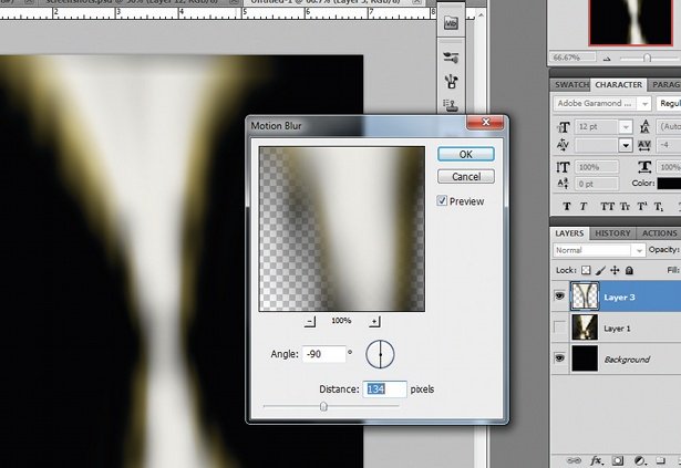
- Publisher: CSS3PS
- Price: Free
- Good for: Web designers
This free plugin uses the cloud to perform the calculations required to convert your Photoshop layers into CSS3 layers, complete with live-rendered effects where these are achievable with CSS. So, drop-shadows, strokes, outer glows, text and rounded corners are all converted to CSS3 automatically. Well worth a try to see if it could save you valuable coding time.
24. Fractalius
Fractalius uses fractals to generate sketch-like effects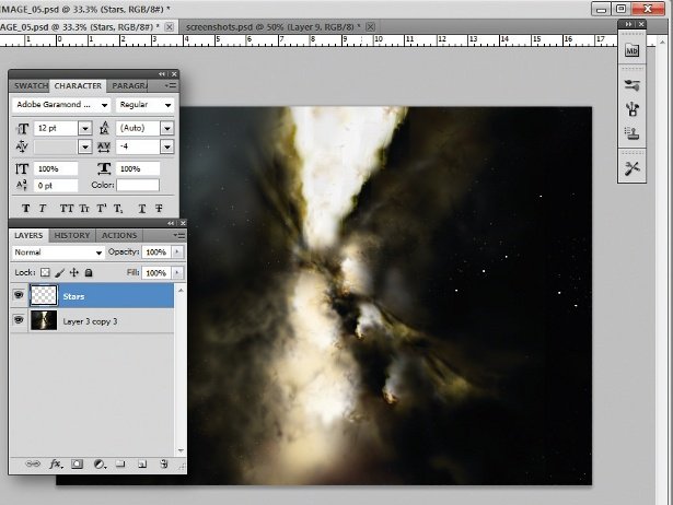
- Publisher: RedField
- Price: $39.90
- Good for: Designers, artists
This unusual plugin uses fractal patterns, apparently hidden within the source image, to generate procedural effects that are reminiscent of pencil sketches, or stylised light glow streaks.
25. Dream Suite Ultimate
Dream Suite Ultimate is a pricey but powerful suite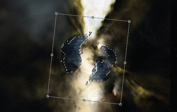
- Publisher: Auto FX Software
- Price: $179.99
- Good for: Photographers
This all-encompassing suite of effects covers everything from textures to pseudo-3D effects, tonal correction and borders. It's not cheap, but covers such a wide range of effects that if you want to buy just one plugin, this should be in your shortlist of options.
26. Machine Wash Deluxe
Add weathering effects with Machine Wash Deluxe
- Publisher: Mister Retro
- Price: $99
- Best for: Designers and Photographers
This filter brings insanely beautiful scratchy textures to your designs and images with accurate, believable weathering and aging effects. Effects include the ability to place artwork on a leather base, render onto wood with the grain visible through the artwork and rust effects. It produces especially nice effects on simple typography.
Next page: more top Photoshop plugins
27. 3D Invigorator
This plugin simplifies the complex 3D process
- Publisher: Digital Anarchy
- Price: $175 (free trial available)
- Best for: Designers
While Photoshop has come on leaps and bounds with its own 3D engine and rendering, there's still room for additional tools that can simplify the process of creating complex 3D scenes and models. This plugin features a simple object editor that uses a pen-like tool for drawing and editing shapes.
28. Blow Up 3
Create pin-sharp enlargements without compromising on quality
- Publisher: Alien Skin
- Price: $99 (free trial available)
- Best for: Designers and Photographers
Blow Up allows you to create pin-sharp enlargements from photos without compromising on quality. The algorithm is more advanced than Photoshop's own bicubic filters, which allows the plugin to produce accurate images without artifacts. This makes it a great tool for designers where clients send over images that aren't of a high-enough resolution.
29. Photomatix Pro
Photomatix Pro simplifies the creation of extreme HDR images
- Publisher: HDR soft
- Price: from £39 (free trial available)
- Best for: Photographers
Photomatix Pro is an High Dynamic Range (HDR) processing and toning tool that integrates with Photoshop either standalone or as a plugin (depending upon which version you go for). This tool goes beyond Photoshop's built-in HDR processing capabilities, especially with the toning aspects and allows for the creation of extreme HDR images with relative ease.
30. Perfect Effects 3
If you want to get a quick effect on your image, try this plugin
- Publisher: onOne Software
- Price: Free
- Best for: Photographers & Designers
Perfect Effects 3 FREE is a handy tool for getting a quick effect on an image, whether that's a colour treatment, addition of texture and noise, or creative borders. The plugin features an effects library (a bit like the filter gallery in Photoshop) and allows you to stack multiple effects to achieve interesting new results.
31. Noiseware
Noise is tricky to deal with, but not if you have Noiseware
- Publisher: Imagenomic
- Price: $79.95
- Best for: Photographers
Noise is a problem for everyone, but no more so than Photographers who need to present clients with clean images regardless of the conditions when the shot was captured. Noiseware is a specialist noise-suppression tool that will both remove noise and sharpen at the same time making it a really useful addition to Photoshop.
32. Texture Anarchy
Rich textures are possible with Texture Anarchy
- Publisher: Digital Anarchy
- Price: $129 (free trial available)
- Best for: Designers
A combination of three different filters for Photoshop that each provide seamless and rich textures you can incorporate into your designs. Some of these are a little predictable, but the sheer range available, along with the ability to generate true fractals, makes this a great addition to Photoshop.
33. Portraiture
This plugin automatically smooths without softening detail areas
- Publisher: Imagenomic
- Price: $199.95
- Best for: Photographers
Portraiture is a combined plugin for Photoshop, Lightroom and Aperture that automates the process of retouching portraits for a perfect-skin look. The plugin automatically smooths skin tones while removing blemishes and, crucially, avoids softening or destroying detail areas such as eyelashes and skin texture.
34. SuperPNG
SuperPNG allows greater control over PNG images
- Publisher: fnord
- Price: Free
- Best for: Designers
If you're a regular user of the PNG format, you'll know that Photoshop can sometimes struggle a bit to render PNGs quickly. SuperPNG aims to fix this by offering more control over your PNG output, allowing for a balance between speed and file size, control over the alpha channel and meta data. SuperPNG's a handy tool for taking control of your image export, and is free!
35. Exposure X2
Simulate film effects for digital projects with this creative tool
- Publisher: Alien Skin
- Price: $149 (free trial available)
- Best for: Photographers
Exposure is a creative tool that allows you to simulate film effects on your digital images. For its X2 release, publisher Alien Skin has improved its special effects offering to include textures, overlays, vignettes and creative focus, as well as portrait touch-up tools like spot heal, iris enhancement, and skin softening. Users can also now layer up different effects.
Exposure X2 is available as a plugin for Photoshop or Lightroom, or as a complete standalone raw photo editor.
36. ToonIt
ToonIt quickly turns an image into a cartoon
- Publisher: Digital Anarchy
- Price: $129 (free trial available)
- Best for: Designers
ToonIt is a straightforward way to turn regular photos into a cartoon-style image, suitable for use in graphic novels or other scenarios where you don’t want photo-realistic images but need to base images on a photographic original. The plugin works automatically on an image, but there is a degree of control you can exercise to change the final output. Niche, but fun!
37. GuideGuide
GuideGuide makes it easy to create a grid system
- Publisher: Cameron McEfee
- Price: $10
- Good for: Print & web designers
This simple Photoshop plugin makes it easy to create a grid system in your Photoshop document, hijacking the built-in guides system to create a pinpoint accurate grid according to your chosen settings. You can use negative margins for special hanging columns, separately define individual margins and gutters, and save your preferred options for quick access in the future. Perfect for anyone using a grid to help them create their layouts.
38. Cut&Slice me
Cut&Slice Me makes it easy to export your designs to the web
- Publisher: Daniel Peruho
- Price: Free
- Good for: Web designers
This super-handy CS6-only plugin makes it easy to export your designs from Photoshop to the web. Rather than rely on Photoshop's outdated export for web functionality, Cut&Slice me offers a new way of doing things; allowing overlapping slices, multiple button states and even exporting different resolutions of the same assets to cater for different screen sizes and devices.
39. Freeware Boundary Noise Reduction
Freeware Boundary Noise Reduction is a big improvement on Photoshop’s own noise reduction filter
- Publisher: Colormancer
- Price: Free
- Good for: Photographers
This Photoshop plugin is a freeware version of the full Boundary Noise Reduction plugin from Colormancer. Offering a simplified set of user controls when compared to the pro version, it's superior to Photoshop's own noise reduction filter.
40. NKS5 Natural Media Toolkit
Nkurence's tool lets you quickly access real-media preset effects
- Publisher: Nkurence
- Price: Free
- Good for: designers & artists
This amazing free Photoshop plugin provides a new panel in Photoshop CS5 and above, allowing you to quickly access real-media preset effects in order to generate documents with natural paper backgrounds, realistic water-colour brush strokes and many more.
Related articles:
-
You're reading Simbla, the Database Driven Website Builder, originally posted on Designmodo. If you've enjoyed this post, be sure to follow on Twitter, Facebook, Google+!

Simbla is a website builder launched back in 2013 by a team on enthusiasts and innovators. Built as a hassle-free solution for individuals and companies looking to establish an online presence and boost their businesses, Simbla impresses with elegance and functionality. In additional to building websites, Simbla also allows anyone to extend their website with database […]
-
It's not often you see illustration used in brand campaigns these days. But for that very reason, it can be a great way to make your marketing stand out, capturing attention and eliciting an emotional response from the viewer.
From hand-drawn images to vector art, the power of illustration cannot be underestimated when done well. So to inspire your own projects, we've brought together 10 examples that show just how illustration can be used in branding in creative and imaginative ways.
01. Oreo
This illustrated campaign infused Oreo with a sense of wonder
To celebrate its 103rd birthday, sandwich cookie company Oreo wanted to update its brand but still convey a sense of childlike wonder. Via The Martin Agency, Oreo commissioned 10 artists to create a character that embodied a single word. The only stipulation was that the character use the Oreo cookie wafer as the face/head.
The beautifully intricate example shown above was the work of Shotopop, whose word was 'twist'. You can view the full campaign here.
02. Penguin
Y&R China's campaign pokes fun at Penguin book jackets
Everyone loves classic Penguin covers. And this multi-award winning campaign for Penguin Group China draws wryly on that sense of nostalgia, to promote its range of audio books.
In each of the ads, commissioned by Y&R China, a flipper-footed sound technician subtly invades the scene. The Moby Dick illustration shown above was created by Swiss artist Jared Muralt, and you can see the full campaign here.
03. Ram trucks
This retro ad for Ram trucks tugs on the emotional heartstrings
Selling automobiles is about engaging the emotions as much as anything else. So these print ads for Ram pickup trucks summon memories of the illustrative posters created in the 1930s and 1940s to awaken the public's taste for adventure.
The Richards Group commissioned Anderson Design Group (ADG) to create the poster art, inspired by the Art Deco-style WPA National Park posters created after the Great Depression to promote America's parks.
04. Faber-Castell
Redma Hoekstra's stunning illustrations show the versatility of Faber-Castell Aquarelle pencils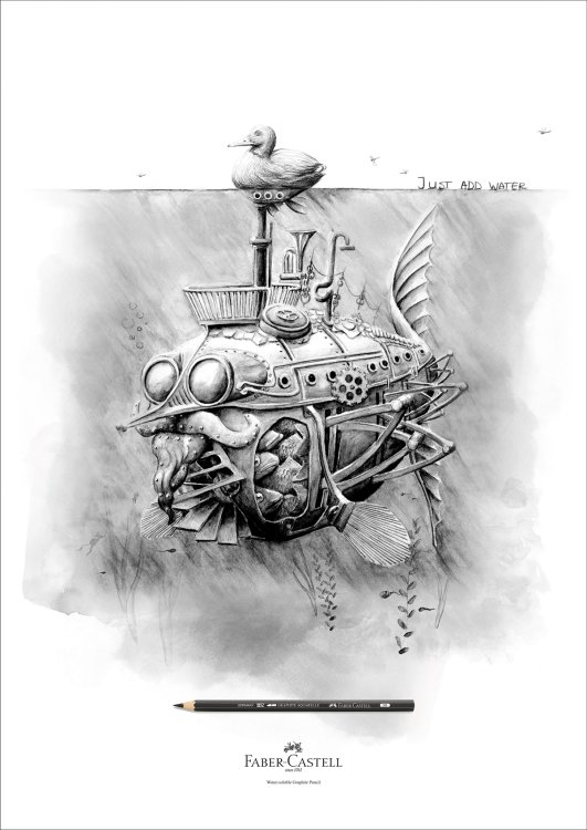
If you're going to advertise a drawing tool, why not show what it can do? Faber-Castell Aquarelle pencils can be used for normal drawing but also, as the slogan says, you can 'just add water' to make watercolour effects. This inventive campaign by Ogilvy & Mather Hong Kong brings that concept to elegant visual life. Illustrated by Redma Hoekstra, and you can see the full campaign here.
05. Kuoni
Malika Favre's bold, minimal illustrations gave Kuoni a brand new look
For its 2016 brochure design, high-end travel operator Kuoni wanted to move away from photography. So, working with Altavia, it commissioned a series of illustrations to depict some of the world's most desirable locations in an attention-grabbing way.
The brief for illustrator Malika Favre was to create a hero cover and a series of four complementary images for the different sections of the brochure. Favre's bold, minimal style gave Kuoni's brochure a look that really stands out as a premium product. You can see the full campaign here.
06. Royal Ascot
This detailed artwork gives insights into the stories behind Royal Ascot
San Francisco artist Lauren DiCioccio uses sewing and embroidery to create unique illustrations, and she was commissioned by Royal Ascot to create this stunning piece, 'Like Nothing Else', to promote its 2015 event. The 48x27 inch tapestry depicts carefully selected elements of the Royal Meeting and took around five weeks to create. You can see a time-lapse video of the creation process here.
07. Schusev Museum of Architecture
There's more to Russia's famous buildings than meets the eye
This campaign by Saatchi & Saatchi Russia for the Schusev Museum of Architecture was based on the concept: 'Discover the Full Story'. Art directed by Polonski Yuri and produced by Carioca Studio, the poster campaign focused on three symbolic buildings in the city: the main building of Lomonosov Moscow State University, St Basil's Cathedral on Red Square and the Bolshoi Theatre.
Each illustration demonstrates that behind the familiar exterior hides a story and there is much more to be discovered. Find out more here.
08. Mercedes
This bizarre ad draws on the emotional struggle between our logical and creative sides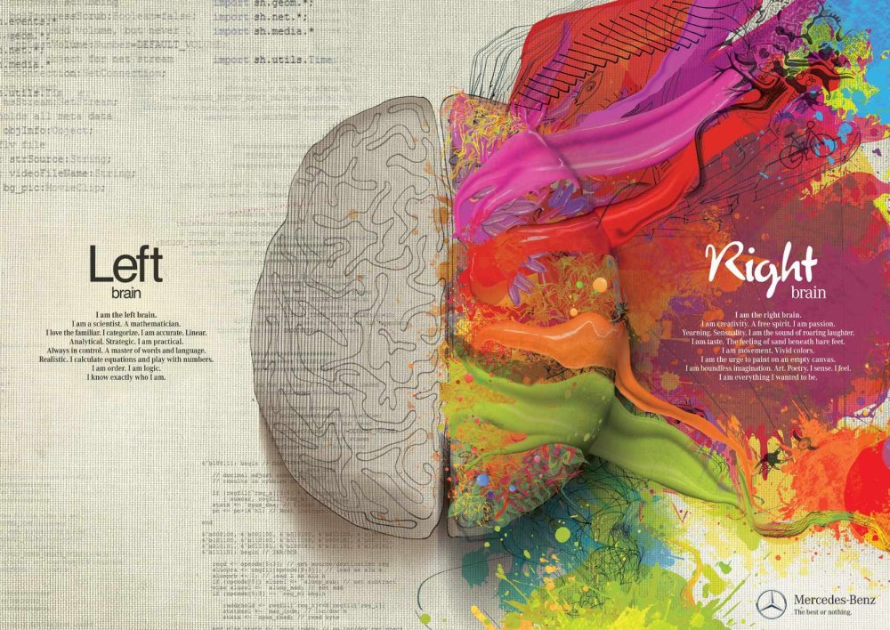
This unusual ad is the work of illustrators Gil Aviyam and Lena Guberman, commissioned by Y&R Interactive Tel Aviv to promote Mercedes cars. The concept is that like the brain, split between left and right hemispheres, the Mercedes Benz is a combination of opposites that together create technological innovation, inspiring design and passion.
09. Nike
Little Thunder celebrates Air Max in gloriously garish neon
Nike's has a long and glorious tradition of using illustration in advertising, and this campaign celebrating Air Max Sneakers is no exception. Ogilvy & Mather Hong Kong created a series of ads with the help of local illustrators, each featuring a different Air Max sneaker model; this one was created by comic artist Little Thunder.
10. Lexus
This fun campaign gave an automotive makeover to famous works of art
Wanting to convey the idea that every one of its cars is a masterpiece, Lexus commissioned this fun campaign to reinvent famous works of art in its own image. This example swaps bulbs for headlights to reinvent Van Gogh's famous Sunflowers painting. Saatchi & Saatchi Singapore masterminded this print ad campaign, which also parodied Salvador Dali and Andy Warhol, and was art directed by Ronojoy Ghosh.
Related articles:
-
Researchers Tavis Ormandy and Cris Neckar privately disclosed a critical vulnerability in Cisco's WebEx extension for Chrome and Firefox that allows for remote code execution.
The 23 best Illustrator brushes
in Ειδήσεις από τον χώρο του Design και Hosting
Posted · Report reply
Brushes are a great way to beef up your Adobe Illustrator work. You can go a long way with Illustrator's basic tools, but with the right set of brushes – and the flexible way in which Illustrator allows them to be used on vector shapes – you can quickly and easily add texture and character to any piece of work.
Managing brushes is more straightforward than ever before; with Illustrator CC, you can now save your brushes to your Creative Cloud library for easy access, no matter which machine you're using at the time.
There's also the handy new Brush CC tool that allows you to define and share artwork in the form of brushes directly from your iOS device. These elements of workflow finessing means it's perhaps time to look again at brushes in Illustrator, so without further ado here are 20 of the best!
01. 8 free stipple shading Illustrator brushes

Build up tone and shade with these brilliant free Illustrator brushesDesigner Chris Spooner – aka Spoongraphics – crafted this free pack of eight stipple shading brushes to help you easily paint grungy details onto your artwork with Illustrator’s brush tool.
Stippling is a traditional technique that uses lots of dots at different densities to build up tones and shade, and is particularly effective for creating a retro effect in your illustrations.
02. Free halftone vector brushes

Quickly create halftones with this set of free Illustrator brushesThis sample selection of free halftone Illustrator brushes are part of a larger pack of halftone vector brushes. Created by UI/UX designer Rob Brink, they’re perfect for adding old-school texture to your illustrations, without spending a penny.
03. Rodeo

Old rope for no moneyYee-hah! Rope can be really fiddly to draw, so if you need some in your imagery the go for this easy option instead. Rodeo is a hand-drawn rope brush for Adobe Illustrator CC. You can apply it to any path, as well as change the rope width and colour.
04. Marker pen strokes

These marker pen brushes are magicGet your sharpie on with this set of 64 free marker pen strokes and scribbles, and give your designs a more natural, hand-drawn look. They're high quality and compatible with all versions of Illustrator from CS onwards, and they're free for both personal and commercial work.
05. Smoke

Light up your work with this excellent smokeThis set of smoke-like brushes is perfect for adding a bit of atmosphere to any illustration, whether it's for backgrounds or things that smoke, steam or mist. Play around with the opacity and blend modes in Illustrator to get some really nice effects.
06. Doodle lines

You can use these doodle brushes commercially for a very reasonable priceIf doodling by hand is too much effort for you then achieve the same look with this set of free doodle brushes. It's a varied and versatile selection that allows you to create a hand-drawn sketched look, as well as decorative borders, curls and doodle style illustrations. They're free for personal use, while a licence for commercial use will cost you just £4.
07. Illustrator wedge brushes

Create classy designs with this pack of wedge brushesFree for non-commercial use, this pack of Illustrator brushes by freelance illustrator and graphic designer Mels Brushes is perfect for adding swirls, swishes and decorative curls to your designs.
08. Floral vector and brush pack

A wider selection of florals than that which ships with IllustratorThis handy set of floral plate-inspired brushes is also available as a set of EPS assets for those times when you simply want to drop in stock art into your project.
The quality of the art itself is comparable to the free florals that ship with Illustrator, but there's a wider selection available here, and the fact that they're not part of Illustrator's default arsenal means you're less likely to get instant recognition of the source.
09. Fur Illustrator brushes

Sometimes you need to add hair...Need to add a furry effect? These eight hairy Illustrator brushes from Mels Brushes work particularly well when you build them up using different tones. They're free for personal use, and you can buy a license for commercial projects.
10. Abstract brushes

These abstract brushes can be used to create crazy embellishmentsDeviantart is always a good place to find free-to-use resources and assets, as this example from alethiologie demonstrates. A handy set of brushes that you can use to create abstract shapes and patterns, including some pretty crazy-looking ornaments.
11. Lino cut brushes

These free Illustrator brushes give a hand-finished lookThis is another example of digital replicating the natural imperfections of analogue artwork, but for all its irony, these free-for-personal-use brushes have a wonderful quality to them that brings out a lovely hand-finished look in your artwork.
12. Vector Brush toolbox

You get 200 best-selling vector brushes, including sponge and ink splatter brushes, halftone, pencil, charcoal, watercolor and more, in this packWe mentioned there were two paid-for options in this list – and you’ll soon see why the Vector Brush Toolbox earns its place in a round-up of the best Illustrator brushes.
Including six of RetroSupply’s best-selling Illustrator brush packs – that’s over 200 best-selling vector brushes – the Vector Brush Toolbox is the ultimate brush kit for illustrators, giving you every brush you’ll ever need for vector-based drawing. (Plus, you save $41 when you buy the bundle.)
Next: More excellent Illustrator brushes
13. 15 paint brushes

These brushes are based on real paint brushesThis set of 15 paintbrush-inspired brushes has been around a while, but the real-media feel they offer means they're still well worth downloading and installing. This is even more the case given they're absolutely free of charge.
The brushes themselves are each based around a different style of real paint brush, offering a beautiful feeling of paint oozing out under the pressure of the brush. Great for those times when you want something a little less clean and imperfect.
14. Dry paint brush strokes

Produce handdrawn-looking brush strokes with this free packTo add a dry brush stroke effect to your designs, try this free pack from Duesseldorf-based designer Scorp1. According to Scorp1, the brushes were created using a dry brush with acrylic color, scanned, vectorised with Streamline and corrected manually where needed.
15. Mycanthus brush pack

For some extra flourish, try this pack of art and scatterbrushesMycanthus brush pack 1 contains five ornamental art brushes and five scatter brushes. "I call this pack 'Mycanthus' – since I didn't stick with traditional acanthus leaf designs," says Deviant Art member r2010. The pack is free to use – just send r2010 a link to your work "to make it worthwhile".
16. Doodle Pattern Zentangle Borders

These brushes are well-suited to bordersAnother from designer Mels Brushes, this pack of 28 doodled zentangle style Illustrator pattern brushes will add a handdrawn feel to your art work – and they're free for personal use.
17. Pattern brushes

For stunning patterns, look no further than this set of 15 free Illustrator brushesThis set of 15 Illustrator pattern brushes is perfect for creating vector borders and frames. Designed by New York-based digital artist Gina Startup – aka StarwaltDesign – they're all free.
18. Stipple shading brushes

These stipple shading and scatter brushes are a great additionChris Spooner is well known to many designers on the web for his excellent tutorials and free resources. This selection of eight stipple shading and scatter brushes will make a lovely and versatile addition to your brush collection, allowing you to create fantastic half-tone style shading on your artwork with ease. Spooner has even provided a mini-tutorial showing how to get started with the brushes for best effect.
19. 57 multi-colored Illustrator brushes

These free Illustrator brushes recreate oil brushesThis lovely collection of 57 real-media-like brushes recreates the feeling of traditional oil brushes, alongside the vivid colour that medium provides. Created by Grant Friedman specifically as a free download, the brushes are nonetheless of a high quality and very useable in your projects.
20. Free floral brushes for Illustrator

These free floral brushes are beautiful in their simplicityCreated by Romanian web designer, Gratiela Dascalu, this set of twelve beautifully simple floral brushes make short work of crafting flora-based embellishments. The brushes are free for both personal and commercial use, so you can get stuck straight in to using them on client projects too.
21. Grunge

These mucky brushes will cost you but it's worth itAnother gem from Deviantart, these deliciously mucky brushes come at a price: $2.50 per pack, of which there are two. Despite the (very low) cost, it's difficult to begrudge paying for a bit of grunge, especially when the brushes themselves create such visually gorgeous lines!
22. 3D star scatter brushes

These free brushes add a retro feel to your vector projectThis is a pretty basic set of 24 scatter brushes for Illustrator, but the 3D effect works well for retro artwork and the colours/shading lends itself well to the same. Great if you need to add a little sparkle to some artwork in a hurry, and free!
23. Paper tooth brushes

Great for adding an authentic torn-paper feelA paper's tooth is the slight ragged edge or the nooks and crannies you'll inevitably find where the fibres of the medium have knitted together. These brushes create a look of authenticity in your artwork, accentuating and simulating the effect of a paper stock with bite!
Related articles:
View the full article