

Rss Bot
-
Content Count
21,437 -
Joined
-
Last visited
Never -
Feedback
N/A
Posts posted by Rss Bot
-
-
Owners of Apple devices will rush to update to iOS 11 as soon as it's available. You can be ready to launch your apps alongside the update by learning how to develop for Apple's mobile platform with the Complete iOS 11 Developer Course. Pre-order it now to start building your developer career today!
Every version of iOS brings new, game-changing features that developers will want to make the most of. iOS 11 will be no different, and you can ready yourself to make the most of the update with the Complete iOS 11 Developer Course.
In addition to preparing you for the update, you can also learn the fundamentals of the OS with the iOS Mastery Bundle, a collection of courses that will lay the foundation for building on Apple's platforms.
You can get the Complete iOS 11 Developer Course and iOS Mastery Bundle now for 97% off the retail price. That's just $29 (approx £22). This pre-sale will give you access to the iOS 11 course as soon as it's available, and immediate access to the iOS Mastery Bundle. Don't let this deal pass you by, grab it today!
-
We know that cycling's a passion for a great many designers, as the volume of bike art out there testifies to, so we're sure that many designers will have at least half an eye on this year's Tour de France – the high point of the cycling calendar.
The Tour has been through a few rebrands since its conception in 1903 (it's run every year since then, except during the two World Wars), and it has even inspired other designs. Here we take a design-focused look at cycling's most prestigious event – starting with the striking Tour de France logo design.
The current Tour de France logo design
The current Tour de France logo was spawned from the 100e anniversary design
The current Tour de France logo was created by French designer Joel Guenoun back in 2002 and it's remained unchanged ever since. The playful brush script gives it a distinctly Gallic feel, while the splash of yellow reflects the famous yellow jersey awarded to the winner of each stage. It also forms part of a neat little typographic sketch of a cyclist formed within the word 'Tour'.
The current Tour de France logo was introduced in 2003 for the race's 100th anniversary, with a 100e (French for 100th) in grey underneath and cleverly superimposing the 'e' over the last letter of 'France' to create a drop shadow effect. The main part of the logo has been retained ever since.
Previous Tour de France logos were austere by comparison
It's all in marked contrast to the previous Tour de France logo, which feels a lot more corporate and a lot less fun in comparison. The basic blue and white logo – stern sans serif capitals ringed by a series of lines that we suppose are meant to evoke bicycle spokes – had little going for it.
The more colourful version used from 2000 to 2003, with the year added in red italics to the side, is a little more lively, but still not as fun.
Grand Départ designs
The Tour De France begins with a Grand Départ that regularly takes place outside of France. In 2014 it was in Yorkshire, UK; in 2015 it set off from Utrecht, Netherlands; in 2016 it left from La Manche, France; and in 2017 it left from Düsseldorf, Germany.
Scroll through the gallery below to see how these events have been branded.
The Dutch city of Utrecht marked the occasion of its Grand Départ with a fantastic set of city branding designed by Total Identity, the only agency whose pitch didn't contain any realistic bicycle elements.
Utrecht's logo was formed around a red triangle, the central part of the city's ancient coat of arms. It connects a yellow circle that represents the start of the Tour de France to another circle containing a rotating tricolour that cleverly alternates between the Dutch and French flags.
The whole campaign, says Total Identity, combined urban dynamics and pride with speed and narrative sports elements, and the whole cross media campaign even included an animated short soundtracked by top Dutch pop band C-mon & Kypski.
Designs inspired by the Tour de France
At this early stage it's too early to say who'll win this year's Tour de France. Although Britain's Chris Froome appears to be a strong contender, Richie Porte, Geraint Thomas, Romain Bardet and friends pose a strong threat.
If you struggle to name any Tour de France winners other than Bradley Wiggins and Lance Armstrong (who doesn't count any more since he got stripped of all his wins) then this print project by Neil Stevens could be a helpful aide-mémoire.
Neil Stevens' Tour de France-themed artwork includes this tribute to Bernard Hinault
Stevens – clearly a massive cycling fan, as a brief glance at his site will tell you – has created a series of prints inspired by iconic cycling jerseys from throughout the Tour's history. "I've always loved the look, style and even feel of those old cycling jerseys," he explains.
"The colours, logos, type and design style always grabbed my attention and in many ways they're what makes the Tour the big draw that it is."
Bradley Wiggins is there of course, with an eye-catching maillot jaune enhanced with a mod target symbol, but Stevens also celebrates winners going as far back as Fausto Coppi in 1949. Our favourite, though, is definitely Bernard Hinault's Mondrian-inspired jersey from 1984.
Otto Von Beach's Tour de France artwork employs his trademark lithographic style
Going even further back, modern Victorian illustrator Otto Von Beach created a set of six prints in his trademark lithographic style, commemorating the original Tour de France back in 1903.
Von Beach's prints celebrate some key moments from the inaugural Tour, including the moment when race leader and eventual winner Maurice Garin nobbled fellow racer Fernand Augereau by bending his rear wheel. Cycling was a serious business, even back then – Garin went on to be stripped of his 1904 title for cheating and was banned for two years.
For electronic music fans, Tour de France means only one thing
Of course, we can't discuss the Tour de France without mentioning Kraftwerk's song of the same name. Released in 1983, the minimalist electronic anthem was inspired by the band's love of cycling, and uses sampled voices and mechanical sounds to evoke the spirit of the race. The single's cover is a similarly minimal masterpiece.
Uncredited, but most likely the work of long-time Kraftwerk collaborator Emil Schult, the cover depicts four cyclists in a paceline, on a road formed by the French flag. The cyclists were adapted from a 1953 Hungarian postage stamp, and the artwork was updated in 2003 for the release of Tour de France Soundtracks, an album recorded for the race's centenary.
Like this? Read these:
-
We all know that pretty things are hard to resist. In fact, a lot of the content on our site is based on pretty projects that we simply had to share because they look so amazing. To make sure your next piece of work wins people over with its adorable aesthetics, check out these 10 pretty fonts.
01. Carolyna Pro Black
Be sure to use Carolyna Pro Black with open-type friendly applications
Format: OTF, TT
Starting off our list of pretty fonts is Carolyna Pro Black. This handwritten calligraphy font has a touch of charm about it thanks to its characterful swashes and thick brush strokes. Carolyna Pro Black comes with over 1,000 characters and stylistic alternatives, and is available to download for £63.99 (around $82.50).
02. Mulberry
Mulberry is a more slender calligraphy font alternative
Format: OTF, TT
Looking for a calligraphy set with a bit more variety? Meet Mulberry, another stylish font with a handwritten finish. Unlike Carolyna Pro Black, Mulberry comes as a group of six fonts that cover a whole array of different styles and ligatures. What's more, you can download them all now at a discount price of £57.57 or $16.
03. Hollyhock
Hollyhock has a whimsical messy finish
Format: OTF
The first two fonts have been lovely and neat, but if you're after something a little more rambunctious, be sure to give Hollyhock a whirl. This typeset is on the slipshod end of the pretty spectrum, and there's always the option to switch between the wild and tame letter styles. Download these rebellious letterforms for £22.99/$32.
04. Saturday Script
Celebrate the good things in life with Saturday Script
Format: OTF
Describing itself as "a care-free, handwritten script with authentic tell-tale dry brush imperfections", Saturday Script is a stylish set that celebrates all the good things in life. (It's named after the best day of the week after all.) With two sets of extra alternate lowercase letters. Saturday Script can be yours for just £12.99/ $16.
05. Flowertype
Talk about flower power
Format: OTF, TT
What could be more pretty than a field of flowers? How about a font set that's made up of hundreds of little flowers and petals? That's exactly what you get with the sensibly named Flowertype, a typeset that realises letters, numbers and symbols with tiny pieces of foliage. Pick up Flowertype today for the reduced price of £39.88 (around $51.50).
06. Azoe
Azoe is a characterful font that stays easy to read
Format: OTF, TT
Azoe is a stylised handwriting font that keeps a sense of character but crucially makes it easy to read. This set comes with extended characters, plus Western European diacritics and ligature. Available as two sets (standard and bold), you can grab all the Azoe fonts for the reduced price of £39.88 (around $51.50).
07. Maris
You get a lot for your money with Maris
Format: OTF
36 fonts in total make up the Maris font family, so there are plenty of pretty styles to choose from in this typeface alone. Underpinning all of these fonts, though, is a richness, elegance and subtlety. Perfect for custom headlines and logotypes, the whole cornucopia of Maris fonts can be yours to download for £106.98/$149.
08. Daft Brush
Daft Brush has a stylish and contemporary attitude
Format: OTF, TT
Time to move away from the quaint and handwritten pretty fonts, and time to meet a typeset loaded with summer vibes. That's right, Daft Brush is a versatile font with four alternatives for each letter, and thanks to its smooth shape and textured finish it just screams summertime fun. Snap up both fonts in this set for just £27.99/$29.
09. Selfie
Selfie achieves its elegance with a purity of form
Format: OTF
This connected, sans serif font is based on vintage signage scripts found in Galerías in Buenos Aires. Favouring an elegant shape over different brush thicknesses usually found in pretty calligraphy fonts, Selfie includes five styles that you can download for £25.99 (around $33.50) each.
10. Sorvettero
This cute and fun font is perfect for packaging
Format: OTF
Another font family based in signage, Sorvettero is a sans serif, layered and unicase typeface that's ideal for logos, packaging and signage, or whatever else your imagination can bring to life. The family includes six different styles for £49.99/$80.
Related articles:
-
In the 1980s, colour psychologist Angela Wright identified links between patterns of colour and patterns of human behaviour. She found that all colours can be classified into one of four tonal groups, and that mathematical relationships underpin the shades and tones within each group. In other words, Wright proved objective colour harmony.
She went on to develop the Colour Affects System, which identifies links between the four colour groups and four basic personality types, based on original research involving Aristotle, Newton and German writer Johann Wolfgang von Goethe.
If harnessed correctly, designers can use the Colour Affects System to control the message of their colour palettes and, crucially, kill subjective debate around colour in client meetings with evidence to back up their decisions. Here's how it works…
Colour Affects System: the basics
BP uses group 1 colours: clear, delicate and warm
Every shade, tone or tint on the colour spectrum can be classified into one of four colour groups, based on how warm or cool it is. All colours within each group correlate mathematically and naturally harmonise, while colours combined from different families don't.
There are also four basic personality types – ranging between extrovert and introvert – and each type has a natural affinity with one colour group. Universally, everyone will find a palette chosen with colours from the same group harmonious, but they'll find a palette drawn from their personality type's corresponding colour group even more attractive.
You'll find a breakdown of the different colour groups on the next page.
Bedding firm Dreams uses elegant and timeless group 2 colours
Colour in harmony
"Music and colour work in much the same way," explains Wright, who developed the Colour Affects System from her earlier research, The Wright Theory. She's provided colour palettes for clients ranging from Shell International Petroleum Company and Procter & Gamble to BT, Unilever, and more.
"One musical note has its own properties, but it doesn't do much until you put it with other notes. There are no wrong notes, and there are no wrong colours, either. It's how you use them. If you put them together in harmony, they produce a positive response. But it only takes one bum note to throw the whole thing out."
Currently, Wright is working on a digital version of the Colour Affects System, which will be launching at the end of this year. The software enables users to select their starting colour – the dominant logo colour, for instance – and then classifies it into one of the four groups, removing all colours from the other three groups. Users are left with a huge, harmonious selection from which to then develop a brand's colour palette.
McDonald's corporate colours are mainly group 3: intense and fiery
"You pick the subsequent colours for your branding scheme in the same way as you do now," Wright explains. "You've got a large framework – there are millions of colours to choose from – except there are no bum notes, because there are mathematical correlations that underpin each colour," she adds.
How effective is the Colour Affects System?
A few years ago, Wright was asked by a mail order company to adjust the colours of a leaflet selling an opera CD. "The in-house design team had created a leaflet and they wanted me to tweak the colours into harmony," she recalls. "The ones they'd used were okay – quite familiar – but they're weren't right, either psychologically or harmoniously."
Texaco uses a group 4 palette, suggesting efficiency, sophistication and excellence
Wright adapted the colours so that the chosen palette came from the same tonal family. "They sent out two identical mail shots, and they sold 560,000 more CDs with the tweaked leaflet than the original," she says.
"And all I did was tweak the harmony after it had been designed – I didn't specify the colours used in the first place." It seems the right colours do sell.
Next page: the four colour groups revealed
Group 1: Type 1 personality
Group 1 colours are often used for fun brands
Group 1 colours are clear, delicate and warm, and contain yellow, but no black. Examples include soft cream, turquoise and cobalt. "They're lively, sharp, fresh, clean and youthful – all about new beginnings," says Wright.
"It's very common to use them in the branding of things like children's toys, PR, sales, sport, and fun sectors of anything." However, if misused, these colours can be perceived as frivolous and immature.
Personalities that reflect these colours are "externally motivated and eternally youthful". Light on their feet, these people love to dance and are clever, but don't like being bogged down with academic debate.
Group 2: Type 2 personality
Group 2 colours reflect understated elegance and timelessness, but are seen as recessive
Group 2 colours are cool (they contain blue), mid range (most contain grey) and delicate, but not necessarily light – for example raspberry, maroon or sage green. Characteristics include understated elegance and timelessness.
"The personalities are cool, calm and collected," says Wright. "They're internally motivated, but very sensitive to how others are feeling. They don't want to be at the forefront of anything, but they'll be the power behind the throw. In branding terms, these colours are rarely – if ever – used, because they're very recessive," she explains.
Group 3: Type 3 personality
The Group 3 palette features quite flamboyant and unusual colours
Group 3 colours are warmer than group 1 (they contain more yellow-based hues), are intense and fiery, and contain black. Examples include olive green, burnt orange and aubergine. "They're quite flamboyant and unusual; you don't get many primaries in there," says Wright. "And the personalities are strong. Like type 1, they're externally motivated – but they're fiery, even if it isn't immediately apparent."
Friendly, traditional and reliable, these tones are popular in branding and work for well-established companies. However, they can convey bossiness or appear old-fashioned if they are misused.
Group 4: Type 4 personality
Group 4 suggests efficiency, sophistication and excellence, but also expense and unfriendliness
Group 4 colours contain blue and are cold rather than cool. They're pure and either very light, very dark or very intense. "The personalities are the same - very clear; everything's black and white," says Wright, adding that type 4 personalities are internally motivated, often very efficient and don't suffer fools.
Containing black, white, magenta, lemon and indigo, this group's characteristics include efficiency, sophistication and excellence – but misused, the colours can be seen as unfriendly, materialistic and expensive.
This article originally appeared in Computer Arts issue 266; buy it here!
Related articles:
-
Ad agency Wieden+Kennedy and Swedish artist Fredrik Andersson have joined forces to create Arse Vase, a cheeky set of 100 handmade, ceramic bum-shaped vases.
Designed to raise funds for east London HIV awareness charity Positive East, the £40 Arse Vases come in pink, tan or brown – with a choice of smooth and hairy options. (“Your flowers go in the arse hole, naturally,” reads the website.)
Fredrik Andersson's Arse Vase hasn't hit a bum note, so far
According to the makers, the Arse Vase is around the size of “a small loaf of bread”. It’s also watertight and can house a variety of items – although flowers are recommended. Helpfully, W+K has provided a hotline to call, should your finger become stuck.
The project ties in with London Pride week, which runs from 24 June to 9 July. “This year around London Pride, we wanted to create something that helped raise badly needed funds, helped fight the stigma around HIV in a playful way and raise awareness about who Positive East are and what great work they do,” explain the team.
And there’s more: “It would make the best gift. Gift receivers will love and remember you for a long time and consider you an interesting, compassionate and culturally relevant person.”
Indeed. Either way, all proceeds go to Positive East, so if you’d like to own a limited-edition Arse Vase, now’s your chance.
Related articles:
- The designer's guide to working for nonprofits
- 40 must-see examples of billboard advertising
- 21 outstanding uses of colour in branding
-
Web design has become more interactive and layered over the years. There are plenty of powerful web design tools available now, but web developers and designers also need better collaborative tools for their teams, in order to keep up with the workflow. The right review and feedback tools can ensure every team member and stakeholder can stay in the loop.
These new tools offer features such as the ability to add annotations on issues, and leave comments in real time on live projects or mockups. This significantly reduces the feedback process, as compared to long message threads or emails. Having a one central channel for all review and feedback needs helps teams stay on the same page. It eliminates the need to switch between various applications to collaborate with team members. Let's take a look at some of the best options on the market.
01. zipBoard
zipBoard allows users to assign team members as watchers to a task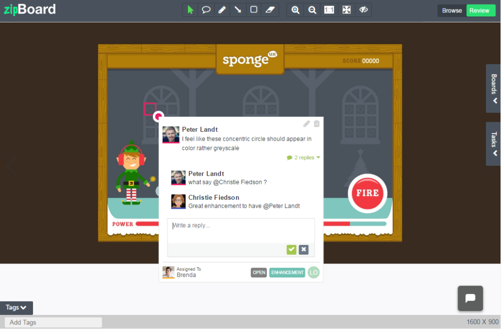
zipBoard is a visual bug tracker that can be used as a review and feedback tool for teams of all sizes. It allows teams to annotate on live web pages by entering their website URL, or on mock designs by uploading their own images. It works on most of the major browsers as a browser extension. zipBoard allows users to assign team members as watchers to a task, which means that they will get automatic updates on the issue’s progress, even if the issue isn’t assigned to them. It also allows reviewers to inspect designs in different screen resolutions to ensure a responsive design for the project.
zipBoard has a central task manager from which teams can filter through bugs and issues based on assignee, priority, screen resolution or reviewer. It also lets collaborators message each other from within the application or communicate via a central project manager. One project is always free on zipBoard and no matter what plan you choose, there is no limitation on number of collaborators.
02. Notable
Notable lets users provide feedback on interface designs
Notable lets users review and provide feedback on interface designs. It can be added as a browser extension or downloaded the Mac/Windows application, and it’s also available for iOS. Users can get feedback from guests on their designs or mockups by sending them a custom URL, which can be used to access and review the project. PowerPoint presentations can also be uploaded to the application, with each slide being extracted as a separate post for annotating on them individually.
It is also possible to add team members to the project as reviewers, and give them selective access based on their role. Based on the access given to collaborators, projects can be arranged as single posts, sets of different projects, or a comprehensive workspace comprising entire projects.
The basic plan for Notable starts at $19/month. However, there is also the option to access a free plan with limited features.
03. Diigo
Add sticky notes to web pages with Diigo
Diigo is a tool that lets users highlight any part of a web page and add sticky notes to specific parts of the page or the entire page. It can be used as a social bookmarking tool as well for tagging and sharing web pages. The online bookmarks can be stored in an online directory that users can access from anywhere, via their Diigo account.
The online directory offered by Diigo can be structured as a research base for curating web pages and online resources. As part of the Premium plan, users can archive annotations on web pages and store them forever, even if the original source is not live anymore. Users can also share curated and bookmarked web pages with other collaborators individually or as a group.
Diigo offers a free subscription with ads and limits on the number of annotations. Alternatively, the standard plan starts at $40/year.
04. JIRA Capture
Capture works on top of JIRA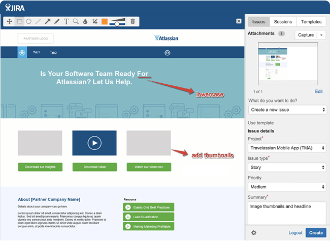
JIRA is a popular project management tool for collaboration between larger teams. Capture is an extension offered by JIRA for visual feedback and testing. The prerequisite is, of course, that teams should already have a JIRA setup, which is quite extensive. But for teams that do not want to move outside JIRA’s environment, Capture is a great review and feedback option.
With Capture, team members can capture any screen within their browser and add annotations to it; set a priority for the issue and add comments to it; add screenshots as tasks to projects within JIRA; and provide contextual feedback during testing sessions and collaborate faster in JIRA.
The main advantage of using Capture is that users can also combine its advantages with other Atlassian offerings, such as JIRA Service Desk, Core, HipChat, and BitBucket. But for smaller teams that are not already on JIRA, this solution may not be best fit. Pricing for JIRA software starts at $10/month for up to 10 users.
05. TrackDuck
TrackDuck can be added to a website via a code snippet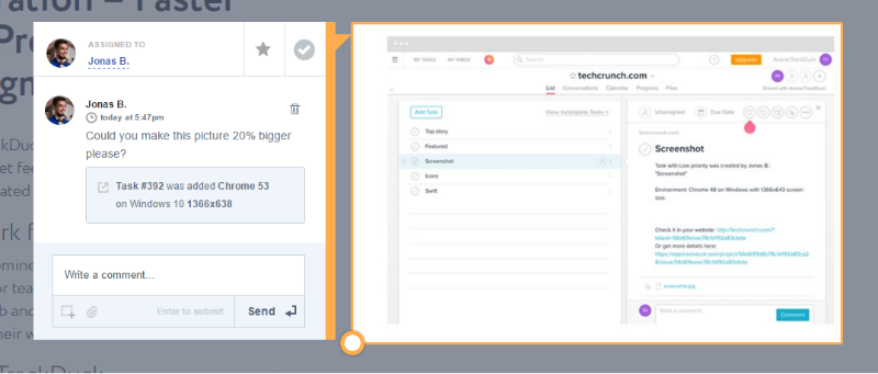
Part of InVision’s family of products, TrackDuck is a visual feedback and bug tracking tool. It works as a browser extension in Chrome and Safari browsers, or can be added to a website via a code snippet to enable TrackDuck to provide review and feedback options natively. Team members can be added to projects in three different roles with different permission levels: reporter, contributor or administrator.
TrackDuck integrates with many other project management tools, including JIRA, Trello, GitHub, Asana and Slack. It also automatically captures technical details such as browser version and operating system.
A basic two-project plan on TrackDuck starts at $9/month.
06. BugHerd
BugHerd is organised around a kanban board-style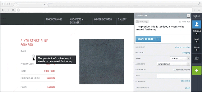
BugHerd offers a range of review and feedback features in a kanban board-style environment. Team members can add issues as tasks to four lists in their dashboard: Backlog, To Do, Doing and Done. This dashboard is arranged like a kanban board, where cards in each list can be moved around when the status of that task changes. BugHerd can be used as a browser extension but the recommended method is to embed a code snippet in your site.
Each annotation in BugHerd has a screenshot attached when it is added as a task. Collaborators can be given full access as team members, or guest access to review screens. BugHerd also notes browser and environment information, and notifies which selector in the HTML code has been annotated upon. For greater functionality, other applications that can be integrated, including PivotalTracker, Basecamp, Zapier, Redmine and JIRA. Plans for BugHerd start at $29/month.
07. Marker
Marker is a simple screen capture tool for Google Chrome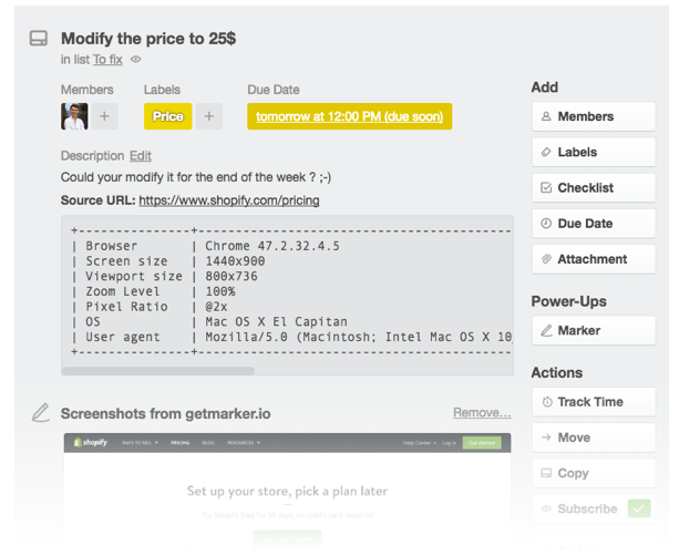
Marker is a simple screen capture tool available for Google Chrome. It focuses on getting issues across to your team via their collaboration tool of choice, as quickly as possible. The tools that can be integrated within Marker’s setup include Trello, GitHub, JIRA, Slack and email.
For each tool users can select specific details, such as a particular JIRA board, Slack channel, or GitHub/BitBucket repository. Any annotations added in the Chrome browser will be converted to tasks and directly sent as an issue to the user’s selected tool, along with a screenshot.
When capturing the user’s browser information, Marker goes a step further by also noting the zoom level, pixel ratio and user agent. This information is reported as part of a feedback card displayed inside the project management tool. Integrations are lined up for more tools like Asana and WordPress.
A free plan for one user includes access to only Slack, while for accessing all integrations plans start at $19.99/month for up to five users.
08. PageProofer
PageProofer lets you add virtual sticky notes to your designs
The basic requirement when providing feedback is to add a virtual sticky note, and that is what PageProofer provides. It does not work via browser extensions, rather focusing on embedding a code snippet into projects. The advantage of this is that review and feedback can be provided in any web browser – but it does mean that no quick extension can solve your issue. PageProofer is phone- and tablet-friendly and hence, works for touch devices.
Users who have been added as reviewers can see if a particular page has been annotated upon via a red note indicator. Guest reviewing is also available in PageProofer, as well as a number of third party integrations including Slack and JIRA. Teams can request for other integrations should they feel the need for one that is not already provided. The basic plan for PageProofer starts at $20/month for up to five users.
09. DoneDone
Issue tracker DoneDone is organised around a central hub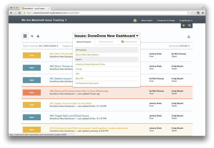
DoneDone is an issue tracker that aims to simplify the review workflow across teams. It functions as a central hub for the collaboration needs of web development teams. Feedback can be added inside the application on web pages and designs, or it can be sent to the central dashboard via email. This is especially useful in cases where customers want to send feedback directly to teams. Teams can reply directly to the customer and correspond via mail.
User can set up the tool so it synchronises with commits on Git and various releases. This helps create a holding pattern for issues that are to be addressed in future releases and hence should not be marked for review on the tester’s current workflow.
Whenever the issue has been fixed and marked as ready for next release, testers will be automatically notified of the new release batch and when that particular issue has been addressed. DoneDone’s Starter plan costs $39/month and is suitable for smaller teams. Bigger teams can subscribe to the Pro, Max or Premium plan.
10. Usersnap
Usersnap integrates with an impressive range of other tools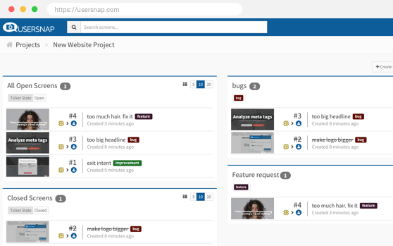
Usersnap offers a lot of the same features as the other tools on this list, such as setting priority for issues, collecting browsers and OS information and offering different permissions for reviewers to control access. One thing that sets Usersnap apart is the high number of integrations available for a variety of tools in different web development domains.
Usersnap integrates with project management tools like Basecamp, JIRA, Trello, Asana and Kanbanize; with other issue tracking applications like FogBugz, GitLab and BitBucket; with customer support apps like Zendesk, Intercom and JIRA Service Desk; and with CMSs such as WordPress, Drupal, Joomla and Magento.
Apart from working as a browser extension, embedding a JavaScript code snippet allows Usersnap to record client-side errors and send reports directly to developers. Usersnap’s pricing is on the higher side, with the basic startup plan priced at $69/month for up to 10 users and three projects.
Related articles:
-
You're reading Best Practices of Hotel Website UX Design, originally posted on Designmodo. If you've enjoyed this post, be sure to follow on Twitter, Facebook, Google+!

User experience is an integral part of any website design and there is no doubt about that. However if there’s a single industry where user experience matters more than anything else is, of course, hospitality. Screenshot of the Conca Del Sogno Hotel Website Hospitality is all about meeting and exceeding guest expectations and providing stellar […]
-
Have you thought about the size of your site's CSS? If your style sheet is ballooning, it could be delaying page rendering.
Though CSS isn't the largest asset type you'll serve, it's one of the first that the browser discovers. Because the browser is blocked from rendering the page until CSS is downloaded and parsed, it must be as lean as possible.
Here are five tips to help you get there.
01. Use shallow selectors
Your parents told you that shallowness isn't a virtue, but when it comes to CSS, they're wrong. Used consistently, shallow selectors can trim kilobytes off big style sheets. Take this selector:
This could be expressed more succinctly:
As well as helping to keep your CSS svelte, the browser will also render the elements targeted by shallow selectors faster. Browsers read selectors from right to left. The deeper the selectors are, the longer it takes for the browser to render and re-render the elements those selectors are applied to. For complex DOMs that reflow often, short selectors can also cut down on jank.
Ideally, you want selectors to be as shallow as possible, but this doesn't mean you should cut everything down to the bone. Sometimes you need additional specificity to extend components. Strike the right balance, but be pragmatic, too.
02. Use shorthand properties
Using shorthand CSS will speed up your site
This seems like common sense, but you'll be surprised at how often longhand properties are used needlessly. Here's an example of some longhand properties in use:
That's a lot of CSS! Let's tidy that up:
The font shorthand property condenses several declarations into a handy one-liner that takes up much less space.
In the example shown above, the shorthand uses about 40 per cent less space than its longhand equivalent. It's not as readable at first glance, but the syntax becomes second nature after you've spent some time using it.
Of course, font isn't the only shorthand available to you. For example, margin can be used in place of longer properties such as margin-top, margin-right and so on.
The padding property works the same way. For more ways to clean up your CSS, Mozilla Developer Network offers a helpful list of shorthand property references.
What if you need to override a value further down in the cascade? For example, let's say you have a heading element that needs to change its font size for larger displays.
In this case, you should use the more specific font-size property instead:
This isn't only convenient, it also increases component flexibility. If any other part of the underlying font property is modified, those changes will percolate up to larger displays. This works great for component overrides where a new context requires a different treatment.
03. Use the preload resource hint
The preload resource hint can give the browser a head start on loading your site's CSS. The preload resource hint tells the browser to initiate an early fetch for an asset.
You can set it as a <link> tag in HTML:
Or as an HTTP header in your server configuration:
In both of these scenarios, preload gives the browser a head start on loading /css/styles.css. Using preload in an HTTP header is preferable, since this means the browser will discover the hint earlier in the response headers, instead of later on in the response body.
Another reason to use preload in an HTTP header is that it will initiate a server push event on most HTTP/2 implementations. Server push is a mechanism by which assets are preemptively pushed to the client when requests for content are made, and it offers performance benefits similar to inlining CSS.
Server push isn't available on HTTP/1. However, using preload in an HTTP/1 environment can still improve performance.
04. Cull redundancies with csscss
csscss will analyse any CSS files you give it and let you know which rulesets have duplicated declarations
It can pay to check your CSS for duplicate rules with a redundancy checker. Take the Ruby-based tool csscss, for example.
Ruby users can install it with:
Once installed, you can examine your CSS for redundancies like so:
This command lists which selectors share rules that you can de-duplicate to save space:
You can move duplicate rules under one selector:
You'd be surprised at how much space this process can save in large projects. Use the --help option to see more commands you can use to tweak things further.
05. Go the extra mile with cssnano
cssnano takes your nicely formatted CSS and runs it through many focused optimisations
For the cherry on top, you can use cssnano – a node and PostCSS-dependent tool. cssnano not only minifies CSS, it makes many focused optimisations that can reduce your CSS even further.
Install it on your system with npm like so:
Then use it to optimise your CSS:
If running commands ad hoc isn't your style, you can automate cssnano with a build system. Here's how to use cssnano in a gulpfile:
The buildCSS task reads the CSS you write in css/styles.css, then pipes the optimised output to the css/optimized directory. The watch task kicks off buildCSS whenever changes occur in css/styles.css.
The watch task can then be invoked in the terminal like so:
With some tweaking, you can build a workflow that performs this specific optimisation in addition to other CSS-related tasks, such as building Sass/Less files, autoprefixing and more.
This article originally appeared in net magazine issue 292; buy it here!
Related articles:
-
While we love to bring you new and exciting typefaces and free fonts, that doesn’t mean we don’t respect the classics. After all, there’s a reason that certain fonts become iconic, and remain in popular use for decades.
So in this post, we bring together five classic typefaces designed by five famous graphic designers and explain the thinking behind them and why they work so well.
01. Geneva by Susan Kare
Geneva is a realist sans-serif that offers a distinct alternative to Helvetica
Born in 1954, Susan Kare is an artist and graphic designer who created many of the interface elements for the Apple Macintosh in the 1980s, including the Happy Mac and the bomb symbol. Along the way, she created some of Apple’s most iconic fonts, including Chicago, Monaco and Geneva.
A realist sans-serif, Geneva is essentially a redesigned version of Helvetica, hence the name (Helvetica is Latin for Switzerland, while Geneva is Switzerland's second-largest city). And it’s been hugely popular, most recently retunning to prominence when Facebook switched to Geneva from Helvetica in 2016.
Unusually for neo-grotesques, the current version of Geneva includes a basic set of ligatures and the archaic long s and R rotunda (both descendants of traditions in medieval writing) as optional alternates.
Charles Bigelow and Kris Holmes, who also worked on the typeface, explain in Notes on Apple 4 Fonts how Geneva offers a distinct alternative to Helvetica. “The semi-enclosed counters of letters like ‘a’, ‘c’, ‘e’,and ‘s’ are more open,” they write. “The terminals do not enclose the internal spaces as much as in other Grotesques.
"Even though the terminals end with a horizontal cut-off, there is more breathing room for the internal white space. This keeps the counters open and the terminals from visually joining at small sizes, which allows for better differentiation of the letterforms.”
02. Exocet by Jonathan Barnbrook
Exocet cleverly combines modern and antiquated forms
Born in 1966, Jonathan Barnbrook is a British graphic designer and film-maker who’s known for designing David Bowie’s 21st century album covers, as well as working with Damien Hirst. Currently, he runs his own studio Barnbrook Design, which he founded in 1990.
He’s also a font designer and has released a number of typefaces with provocative titles, such as Bastard, Exocet, False Idol, Infidel, Moron, Newspeak, Olympukes, Sarcastic and Shock & Awe.
Designed in 1991, Exocet is inspired by incised Greek and Roman letter carvings, with geometric shapes used for the main construction. For example, its stylised Q is based on qoppa, an ancient form of Q, while the O with a cross is an early form of theta.
An all-capital font, but with different capital glyphs for both lowercase and capital letters, Exocet’s combination of modern and antiquated forms have ensured its continuing popularity.
It’s been used on a wide variety of products, from films such as Demolition Man and Star Trek: Nemesis, to Goth album covers, to videogames such as Diablo, as well as more genteel uses such as Tazo tea packaging.
03. Glaser Stencil by Milton Glaser
Glaser Stencil evokes Modernist proportion and Manhattan self-assurance
Born in 1929, Milton Glaser is one of history’s most celebrated graphic designers. He's best known for the I ❤ NY logo, the psychedelic Bob Dylan poster and the Brooklyn Brewery logo.
His work has been exhibited worldwide and won numerous awards, including the National Medal of the Arts from President Obama in 2009. He co-founded Push Pin Studios in 1954 and co-founded New York Magazine in 1968.
Glaser wrote in 1973 that he was “not a type designer,” and that his typefaces were only the product of graphic ideas applied to letterforms. Despite this, his heavily stylised, three-dimensional typefaces have remained influential and popular to this day.
Glaser Stencil was created in 1970, based on type that had originally appeared on a Carnegie Hall poster he designed in 1967. This geometric stencil font instantly summons a feeling of both Modernist proportion and mid-century New York self-assurance. An all-caps font, the letterforms echo some of the most popular sans serifs of the time, such as Futura and ITC Avant Garde Gothic.
A great choice for large, attention-grabbing headlines, Glaser Stencil’s bold weight was digitalised in the computer age, while the forgotten lighter weights have recently been brought back to life by Face37.
04. FF Meta by Erik Spiekermann
FF Meta is a beautifully legible font by design guru Erik Spiekermann
Born in 1947, Erik Spiekermann is a multi award-winning designer and author. He co-founded MetaDesign, now Germany’s largest design firm, which has offices in Berlin, London and San Francisco. In 1988 he started FontShop, a company for the production and distribution of digital fonts.
A hugely influential voice on design matters, today Spiekermann sits on the board of the German Design Council, is an honorary professor at the University of the Arts Bremen and is also on the supervisory board of Edenspiekermann, which has offices in Berlin, Amsterdam, London, Stuttgart & San Francisco. He was the first designer to be elected into the Hall of Fame by the European Design Awards for Communication Design.
FF Meta is a humanist sans-serif designed in 1991. Based on an unused commission for the West German Post Office in 1985, Spiekermann developed it to be a "complete antithesis of Helvetica", which he found "boring and bland".
Features including a large x-height, open apertures and an “l” with a tail to distinguish it from a ‘1’ or ‘I’ help to make it super-legible. Consequently, FF Meta is today used extensively across the world, from product labelling to signage.
05. Avenir by Adrian Frutiger
The late type designer Adrian Frutiger considered Avenir his best work
Adrian Frutiger (1928-2015) was a hugely influential Swiss typeface designer and author whose commissions included creating the in-house typeface for BP plus logotypes, signage systems and maps for clients including Air France, IBM and the Swiss Post Office.
Frutiger won awards including the Chevalier de l’Order des Arts et Lettres, the Gutenburg Prize of the city of Mainz and the 1986 Type Medal of the Type Directors Club of New York.
His most famous creations, Univers, Frutiger and Avenir, spanned the three main genres of sans-serifs: neo-grotesque, humanist and geometric. Avenir was a late-in-life design by Frutiger, who considered it his best work. Originally released in 1988, it reinterprets the rigid geometric sans serif designs of the early 20th century in a way that adds elements of organic humanism.
With vertical strokes that are thicker than the horizontals, an ‘O’ that’s less than a perfect circle, and shortened ascenders, it’s a beautifully legible font that works well for both text and headlines.
Famous examples of Avenir abound, including its use by Samsung Galaxy, Walt Disney Parks, the Eurovision Song Contest and Apple Maps.
-
Do you ever use emails to communicate with your clients, send documents and action multiple to-do lists and find this difficult? Whether you are working on a small or large scale project, instituting a team management software will help you become successful.
Using a project management tool will help better communicate with your team and keep your clients informed. Having all your tasks laid out and assigned to the correct person will allow you to stay organised and ensure tasks are completed on time.
With a huge variety of project management applications available, we'll spotlight on the 10 best ones in the market.
01. Basecamp
Basecamp is considered the leading project management and collaboration tool available
Basecamp is the grandaddy of project management apps. Basecamp is considered the leading project management tool around. It boost a simple and easy to use interface to collaborate with your team and client. It allows you to create multiple projects and setup discussions, write to-do lists, manage files, create and share documents, and organise dates for scheduling. It is fully responsive so you can manage your projects and check statues on your mobile device on the go. Basecamp’s basic plan starts at $20 a month.
02. Teamwork Projects
Teamwork Projects is the ultimate productivity tool to manage projects with your team
Teamwork Projects is the ultimate productivity tool to manage projects with your team. Teamwork allows you to keep all your projects, tasks and files all in one place and easily collaborate with a team. Teamwork helps you to visualise the entire project through a marked calendar and gantt chart and setup reporting.
Teamwork supports file management with Google Drive, Box.com and Dropbox. As well as integration with leading apps such as third party accounting software and customer support apps.
Plans only start at $12 a month with unlimited users.
03. ActiveCollab
ActiveCollab boost advance project management features including invoicing and tracking expenses
ActiveCollab recently released its new version 5.0. The new revamped app is now more powerful and focused project management tool. It offers team collaborating features, task management, time tracking and importing expenses. One of the biggest asset of ActiveCollab is it offers invoicing features. You are able to track payments and expenses and have invoices paid directly within ActiveCollab with PayPal, and other credit card payments.
ActiveCollab cloud plans starts at $25 a month and they offer a self-hosted version if you want to run this application on your own web server.
04. Zoho Projects
Zoho Projects allows you to plan, coordinate and management a project efficiently
Zoho offers a wide range of business software including Projects. Zoho Projects is an proficient tool to project plan and project coordinator from start to finish.
It boost all the features you need for project management with some advance features including reporting, integration with Google Apps and Dropbox, bug tracking, setup Wiki Pages to build a repository of information, forums and more.
You can start Zoho Projects with a free plan and upgrade to a paid premium account starting at $20 a month.
05. Trello
Use Trello to easily display and organise your to-do lists and discussions on a visual board
Trello isn’t your average project management tool, instead this app is a free visual way to to glance at the entire project with a single view. With Trello you can organise cards, these cards can be your thoughts, conversations and to-do lists and be placed on a board for everyone to collaborate on.
Trello is absolutely free but also offers a gold package at $45 a year, which extends larger attachments, extra sticker packs, saved searches and more.
06. Jira
Jira made specifically for software developers to track issues and bugs and proactively resolve them
Jira is specifically targeted for software development teams. Jira offers abilities to raise issues and bugs. Jira makes it real easy to track bugs and see which issues are still outstanding and how much time was spent on each task.
Atlassian owners of Jira, also offer other products including Confluence a document collaboration tool, and HipChat a team chat and video and file sharing platform and other products. Which you may integrate with Jira seamlessly.
Jira starts at $10 for for 10 users a month.
07. Asana
Asana is the top work tracking and project management app for teams
Asana is the easiest way for teams to track their work so everyone knows who's doing what, by when. With tasks, projects, conversations and dashboards, Asana keeps your work organized, and teammates accountable so you can move work forward faster. Asana also lets you keep track of your work wherever you are with mobile apps for both iOS and Android.
Asana is free to use for teams of up to 15. For more members and top features like custom fields, task dependencies, and advanced search, check out Asana Premium or Enterprise.
08. Podio
Podio is a versatile platform for project managing, use as an intranet and CRM system
Podio is a ever growing tool to organise and communication tool for any business. Podio allows you to personalise this platform to fit your business needs. Besides being able to communicate with a team, setup task management, use as a file storage system, like a traditional project management app, Podio can be an internal intranet for all your colleagues and departments to interact. Podio can also be transformed into a CRM system. Podio plans start at $9 a month.
09. Freedcamp
Organise and plan an event, project, or even a wedding using Freedcamp, all absolutely free
Whatever your project may be, either setting up an event, a web project or organising a wedding, Freedcamp helps you organise and plan effectively.
Freedcamp has an organised dashboard to view the entire project at a glance. You can easily setup tasks, use sticky notes to visually setup tasks and organise them into the calendar. Freedcamp provides advance add-ons for high level business use including CRM, invoicing, issue tracking and setting up wiki pages.
Freedcamp is free to start with and only add-ons are chargeable.
10. Wrike
Work smarter with Wrike, by making sure you are always on track and have the available resources
Wrike is advance application to help you work smarter. By making sure you are always staying on track and ensure you have the adequate resources to finish on time and on budget.
Setting up tasks, engage your team and integrate with your business tools including Google Apps, Microsoft Excel, Dropbox and many more is so easy with Wrike. You can even make your emails more productive by converting emails into tasks with a simple click of a button.
Wrike is free for the first five users and paid professional plans start at $49 a month.
Conclusion
Make sure when you adopt a project management app it helps to improve your overall work efficiency and workflow. You don’t want to select a project management tool that ends up taking more time to mange than doing the actual job.
-
The July Android Security Bulletin patches 11 critical remote-code execution bugs including one dubbed ‘Broadpwn’ that impacts both Android and iOS devices.
-
One of the most common routes into graphic design is through a junior designer position. But what is a junior designer? What do they do every day? How much do they get paid, and how quickly can they progress? Our guide to becoming a junior designer brings you everything you need to know.
It's no secret that a career in the creative industries is extremely competitive, but by mapping out a clear career path from the start, you can sharpen your focus and gain that all-important edge.
01. What a junior designer job entails
You're starting at the bottom, but working as a designer, not just making tea (Image: Sweaty Eskimo)
A junior designer job is an entry-level position, generally aimed at creatives with between zero and three years of commercial design experience. At this level, you'll work closely under the supervision of more senior designers, who will provide mentoring as you learn the ropes in design conception and implementation.
During your first few years you'll be assigned the smaller aspects of multiple projects. Depending on the company, you could find yourself doing anything from laying out pages and making colour corrections, to designing stationery and website banners, to sitting in on client meetings.
02. What a junior designer job doesn't entail
Here's what a junior designer isn't: someone who solely pours the coffee, answers the telephone or runs errands. If you find yourself in this position, talk to your senior designer, map out your expectations and ask for new work. If the situation doesn't improve, it might be time to move on.
03. Do I need a degree?
A degree isn't essential, although it does help
You don't necessarily need a degree to become a junior designer – although the benefits of learning design theory and design thinking, plus the freedom to develop your own ideas outside of client briefs, shouldn't be underestimated. Bear in mind, too, that some job adverts will specify being educated to degree level.
However, while a relevant degree will stand you in good stead when it comes to getting on the graphic design career ladder, it by no means guarantees you paid employment. Talent, experience and confidence will often triumph over a degree.
"The most important things that Landor looks for in a candidate are talent and attitude," agrees Peter Knapp, an executive creative director at Landor Associates. "Spirit and raw ability are things that are preloaded."
04. Typical junior designer starting salary
Starting salaries vary wildly depending on sector and geographical location. As a junior designer in the UK you can except to pocket anywhere between £20,000 and £25,000. According to Major Players' 2017 salary survey, the national UK average salary works out at £22,000.
For those of you in the US, use this salary calculator to see what you can expect in your state.
05. What experience you need
Craig Ward did "a string of terrifying placements" as a young designer
Relevant work experience – and lots of it – will stand you head and shoulders above the competition, so it's good practice to have at least one placement or internship (and preferably more) on your resume when it comes to looking for your first junior designer position.
"Fear put me into the industry in the second year of my degree," recalls award-winning designer and art director Craig Ward. "I did a string of terrifying placements, and when I graduated I was ready to make the most of my final placement, which became my first job."
Placements and internships show that you have valuable real-world experience and, crucially, that you've started to translate your hard-won skills and knowledge of design theory into practice. The more you can chalk up, the better placed you'll be when applying for a job as a junior designer.
06. Specific skills you need
You'll need skills in Adobe software such as InDesign
As well as a strong understanding of design and the processes required to do it, you’ll need to be good at problem-solving (you’ll be expected to come up with creative solutions) and pretty handy with programs like Photoshop, Illustrator and InDesign.
Communication skills also rate highly. After all, being a brilliant designer isn't much use if you can't explain your decisions to clients.
"You need to be hard working, passionate and reliable, as well as prepared to do the less desirable jobs," advises Ben Topliss, creative at LOVE, who quickly rose through the ranks after graduating.
"Despite being the youngest member of the team, you should also be able to bring something new to the table; whether it's knowing a piece of software no-one else does, or an unhealthy obsession for obscure type foundries," he adds.
07. In-house or design agency?
Some of the work created by Target's in-house design department called, er, InHouse
As a junior designer in a studio or agency, you'll be involved in strategy and creative problem-solving, producing graphic design, advertising or visual communication work for a wide range of different clients.
The pros? Variety and creative stimulation. The cons? Burnout. Deadlines are final: miss one and you risk losing the client, which could have huge knock-on effects on job stability for studio members.
As an in-house junior graphic designer at a large organisation like HSBC, Google or the government, you'll work as part of a team of designers who are responsible for the company's marketing and advertising material, website and so on.
Pros here include stability, predictable working hours and potentially better pay. The cons? Working on a single brand for too long can limit your portfolio – particularly a risk for junior designers – and numb your creative juices.
08. How to progress
Progression from junior designer to a middleweight position or senior designer is normally possible within around three to five years, after which the next step might be art director, creative director or a more managerial position with the studio or firm.
"Work hard and build good relationships with as many people as you can," advises Topliss, adding that it's essential to develop both your reputation and book of contacts before you take the next step.
"Aim as high as you can," concludes Martin Brown, creative director at Paul Bedford Ltd. "Try to work for people you revere and companies you respect. That first name makes such a difference for your second job."
09. What it's actually like to do the job
Now a senior designer, Ben Topliss explains what it was like being a junior designer
In 2013, multi-disciplinary designer Ben Topliss had just started a new senior designer position at sports and fashion-wear retailer JD PLC that was created especially for him. We caught up with him to find out how he made the jump from junior designer to senior...
Creative Bloq: Your first job out of uni was junior designer at an architectural practice called Prism. What did you study at uni, and how well did your course set you up for this role?
Ben Topliss: I studied product design at university, with a minor in interactive design. I didn't realise until I'd signed up to study for the interactive modules that graphic and digital design were things I was really passionate about and wanted to do after graduating.
The main thing I took from studying design at university was the process of design and problem-solving. I didn't do any placements or internships in agencies or studios, but I did as many jobs as I could get my hands on for local businesses, designing anything they'd let me including identities, branded stationery, websites, booklets, flyers and menus.
Taking this also route taught me about the other side of design - dealing with clients, and managing my time and finances - which can be just as important as the actual work.
CB: What was the job market like after you graduated? How tricky was it to get your first job as a junior designer?
BT: It was a struggle to get a job after graduating. It's so competitive out there and it's hard to differentiate yourself, especially when competing against others with graphic design degrees. I wrote a lot of letters but didn't really get anywhere. I had a few interviews and finally got something in the September after graduating. It was great to finally get a job.
CB: Why did you decide to work in-house as a junior designer, rather than in a design studio or agency?
BT: Prism was a small design studio and I got to work on projects for clients including Sainsbury's, Cambridge University and Marks & Spencer. There were only four designers - two senior and two junior - so I got to work on some large projects straight away, as everyone had to get stuck in.
Ben is currently working at TBWA
CB: Talk us through a typical day what were your responsibilities?
BT: As it was only a really small agency I'd have to do plenty of admin-type jobs like order the stationery, be the IT guy and make tea for everyone. But I'd also get to head out to client meetings and take ownership of projects, which was good as you might not necessarily get that level of trust working somewhere larger.
CB: What was the best part of the job?
BT: Actually doing work and getting paid for something I wanted to do was great. It wasn't groundbreaking stuff by any stretch of the imagination, but I was working in the industry I wanted to be in and gaining experience all the time. To me then, that was amazing.
CB: How long did you work in this position before taking the next step in your career, and what did it take to move up the ladder?
BT: I spent a year at Prism, and another year in my next job - both in small teams so I did get to take control of a lot of projects, but I maybe missed the guidance I would have got from larger organisations.
Stepping up to the next level in a much larger agency was fun: suddenly I was working with a large group of really talented creatives. I certainly had a feeling that I needed to up my game. That's how you improve though. You need to get out of your comfort zone, push yourself to be better and learn from those around you.
CB: How long did it take you to get to a senior designer position?
BT: I graduated about seven years ago, with the last three of those working at TBWA. There I had the opportunity to learn from lots of talented people and gain some good experience working on some great projects, big and small, for clients like Manchester United, EA Games and BP.
CB: What do you love most about your job now?
BT: Getting to work with talented and inspiring people. I've got a busy couple of months coming up, with the launch of at least two iOS apps and a couple of site redesigns on the horizon.
CB: What advice would you give a junior designer for becoming a senior designer?
BT: Work hard, ask questions and soak up as much as you can from more the experienced people you are working with, whatever their job role. Do the jobs no-one else wants to do - make yourself indispensable.
Also, it pays to be nice. The industry is smaller than you think - you never know when you'll come back into contact with someone you used to work with, met at an industry event or even slated on Twitter.
Further reading:
-
This week saw Penguin Random House's non-fiction imprint, Ebury, rebrand itself with a less corporate and more creative logo that appears to cash in on some of 2017's biggest design trends.
Designed by London-based studio Form, the centrepiece of the new look is a capitalised letter 'E' wordmark. This isn't the first rebrand we've seen this week that's based on this idea. Just a few days ago we saw how Elton John's new visual identity pulled a similar trick with its star-shaped glasses inspired lettering.
And just like the musician's makeover, Ebury's rebrand treads the same path as other big brands such as Fanta and Calvin Klein in that they all seem to have adopted 2017's biggest logo design trend: uppercasification. (That's our unofficial term for saying brands currently have a habit of putting all their text in uppercase.)
Click through the image gallery below to see how the new Ebury logo compares with the old one.
Replacing the lowercase, italic red logo previously used by Ebury, the new design opts for a new colour scheme that Form partner Paula Benson describes as "fresh and vibrant."
Following another trend, the colour choice also taps in (coincidentally) to a major global survey which found that a rich teal hue is the world's favourite colour.
Thanks to an overprint of two semi-opaque colours, the logo appears three-dimensional and leaps off both the screen and printed page. The overprinting method also references traditional practices such as screen printing. This results in a sense of imperfection that Bensons says helps to "embrace the spirit of creativity."
Capitalisation is used to communicate the imprint's name
This logo is even more striking thanks to its use of contrasting colours. The 'E' itself is rendered in a beautiful teal, while the drop shadow is picked out in the Penguin brand's signature orange. The consistent typography also brings it in line with the overall Penguin Random House branding.
The new logo has already started to appear across online platforms, and readers can expect to see more of it later in the year as it continues to roll out across marketing materials, products and packaging.
[Via Design Week]
Related articles:
-
Testing frontend code is still a confusing practice to many developers. But with frontend development becoming more complex and with developers responsible for stability and consistency like never before, frontend testing must be embraced as an equal citizen within your codebase. We break down your different testing options and explain what situations they are best used for.
Frontend testing is a blanket term that covers a variety of automated testing strategies. Some of these, like unit and integration testing, have been an accepted best practice within the backend development community for years. Other strategies are newer, and stem from the changes in what backend and frontend development are used for now.
By the end of this article, you should feel comfortable assessing which testing strategies fit best with your team and codebases. The following code examples will be written using the Jasmine framework, but the rules and processes are similar across most testing frameworks.
01. Unit testing
Unit testing, one of the testing veterans, is at the lowest level of all testing types. Its purpose is to ensure the smallest bits of your code (called units) function independently as expected.
Imagine you have a Lego set for a house. Before you start building, you want to make sure each individual piece is accounted for (five red squares, three yellow rectangles). Unit testing is making sure that individual sets of code – things like input validations and calculations – are working as intended before building the larger feature.
It helps to think about unit tests in tandem with the ‘do one thing well’ mantra. If you have a piece of code with a single responsibility, you likely want to write a unit test for it.
Let’s look at the following code snippet, in which we are writing a unit test for a simple calculator:
In our Calculator application, we want to ensure that the calculations always function independently the way that we expect. In the example, we want to make sure that we can always accurately add two numbers together.
The first thing we do is describe the series of tests we’re going to run by using Jasmine’s describe. This creates a test suite – a grouping of tests related to a particular area of the application. For our calculator, we will group each calculation test in its own suite.
Suites are great not only for code organisation, but because they enable you to run suites on their own. If you’re working on a new feature for an application, you don’t want to run every test during active development, as that would be very time consuming. Testing suites individually lets you develop more quickly.
Next, we write our actual tests. Using the it function, we write the feature or piece of functionality we are testing. Our example tests out the addition function, so we will run scenarios that confirm that it’s working correctly.
We then write our test assertion, which is where we test if our code functions as we expect. We initialise our calculator, and run our addNumbers function with the two numbers we wish to add. We store the number as the result, and then assert that this is equal to the number we expect (in our case, 10).
If addNumbers fails to return the correct figures, our test will fail. We would write similar tests for our other calculations – subtraction, multiplication, and so on.
02. Acceptance tests
If unit tests are like checking each Lego piece, acceptance tests are checking if each stage of building can be completed. Just because all the pieces are accounted for doesn’t mean that the instructions are properly executable and will allow you to build the final model.
Acceptance tests go through your running application and ensure designated actions, user inputs and user flows are completable and functioning.
Just because our application’s addNumbers function returns the right number, doesn’t mean the calculator interface will definitely function as expected to give the right result. What if our buttons are disabled, or the calculation result doesn’t get displayed? Acceptance tests help us answer these questions.
The structure looks very similar to our unit test: we define a suite with describe, then write our test within the it function, then execute some code and check its outcome.
Rather than testing around specific functions and values, however, here we’re testing to see if a particular workflow (a sign-up flow) behaves as expected when we fill in some bad information. There are more minute actions happening here, such as form validations that may be unit tested, as well as any handling for what shows our error state, demonstrated by an element with the ID signupError.
Acceptance tests are a great way to make sure key experience flows are always working correctly. It’s also easy to add tests around edge cases, and to help your QA teams find them in your application.
When considering what to write acceptance tests for, your user stories are a great place to start. How does your user interact with your website, and what is the expected outcome of that interaction? It’s different to unit testing, which is better matched to something like function requirements, such as the requirements around a validated field.
03. Visual regression testing
As mentioned in the introduction, some types of testing are unique to the frontend world. The first of these is visual regression testing. This doesn’t test your code, but rather compares the rendered result of your code – your interface – with the rendered version of your application in production, staging, or a pre-changed local environment.
This is typically done by comparing screenshots taken within a headless browser (a browser that runs on the server). Image comparison tools then detect any differences between the two shots.
Using a tool such as PhantomCSS, your tests specify where the test runner should navigate to, take a screenshot, and the framework shows you differences that came up in those views.
This visual regression framework illustrates decision trees in your application, exposing complexity to those outside of development
Unlike acceptance and unit testing, visual regression testing is hard to benefit from if you’re building something new. As your UI will see rapid and drastic changes throughout the course of active development, you’ll likely save these tests for when pieces of the interface are visually complete. Therefore, visual regression tests are the last tests you should be writing.
Currently, many visual regression tools require a bit of manual effort. You may have to run your screenshot capture before you start development on your branch, or manually update baseline screenshots as you make changes to the interface.
This is simply because of the nature of development – changes to the UI may be intentional, but tests only know ‘yes, this is the same’ or ‘no, this is different’. However, if visual regressions are a pain point within your application, this approach may save your team time and effort overall, compared to constantly fixing regressions.
04. Accessibility and performance tests
As the culture and awareness around frontend testing grows, so does our ability to test various aspects of the ecosystem. Given the increased focus on accessibility and performance in our technical culture, integrating this into your testing suite helps ensure these concepts remain a priority.
If you’re having issues enforcing performance budgets or accessibility standards, this is a way to keep these requirements in the forefront of people’s minds.
Both of these checks can either be integrated into your workflow with build tools like Grunt and Gulp, or semi-manually within your terminal. For performance budgets, a tool like grunt-perfbudget gives you the ability to run your site through WebPageTest automatically within a specified task.
However, if you’re not using a task runner, you can also grab perfbudget as a standalone NPM module and run the tests manually.
Here’s what it looks like to run this through the terminal:
The same options are available for accessibility testing. So for Pa11y, you can either run the pa11y command in your browser for output or set up a task to automate this step. In the terminal:
Most tools in these categories are fairly plug-and-play, but also give you the option to customise how the tests get run – for example, you may set them to ignore certain WCAG standards.
Resemble.js is a popular image comparison library, and gives you a lot of control over what triggers a visual differentiation
Next page: How to introduce testing into your workflow
Many developers are on board with having some kind of frontend testing present in their codebase, but some are still skeptical about the cost-benefit balance. If you're just considering how testing would fit into your team and workflow, you should think about the following:
01. Start with known pain points
If you’re constantly seeing the same bugs popping up in certain parts of your codebase, it’s wise to investigate if testing could help.
If it’s code regression and it’s not possible to unit-test the code, try to adjust your acceptance tests so they cover the scenario at a higher level. This will also give you a baseline test to experiment against. If the number of regressions on this feature goes down after writing tests, you may find other developers more inclined to embrace testing in the future.
02. Make it part of the workflow
In order to keep the team honest about their test-writing, everyone should hold themselves and others accountable. Perhaps talking about tests becomes part of your code review process: ask why tests weren’t written, or point out areas where they might be helpful.
By having an open dialogue about tests, you may find ways to motivate your team to keep writing them. Using a continuous integration service such as Travis CI to run your test suite automatically on your development branches can also make your test suite more visible.
Services such as Travis CI can make testing more visible
03. Don’t do everything at once
For teams that are new to testing, adopting all the testing types at once might be overwhelming – and if you’re starting with new code, you might not even need all the methods. For example, if you don’t have a lot of client-side logic or user interaction, maybe visual regression tests will cover most of your application.
Introducing one testing type at a time will give your team a chance to learn how to test and adjust any parts of the process that prove difficult. At the end of the day, your team needs to be on board and dedicated to this practice.
04. Revisit and review
Testing, like any other part of your codebase, requires constant revisits to make sure your current implementation still makes sense. Remember, a test suite that nobody runs is a test suite that may as well not exist.
But if you put the time and effort into your testing strategy, the time saved by fixing regressions means time that can spent building new features, or making your existing code even better.
This article was originally published in net magazine issue 285, buy it here
Next page:
-
We've decided to shake things up in the latest issue of Paint & Draw with the introduction of a new regular feature. With Masterclass, we talk to renowned artists about the pieces of work that inspire them the most.
Kicking off this feature is portrait artist David Cobley, who gives an impassioned speech about his favourite painting. We hope you find this a pleasant change of pace from all our hands-on tutorials and workshops!
Buy issue 10 of Paint & Draw here!
On top of this, our cover feature sees Paint & Draw's resident pastel expert, Rebecca de Mendonça, reveal how to create a beautiful, realistic illustration that guides the viewer's eye across the page. As if that wasn't enough, you'll also find a ton of our usual tips, tutorials and lessons to push your skills to the next level. Make sure you don't miss it!
Subscribe to Paint & Draw here!
Realise fresh paper collages
Clippings from old magazines can form the basis of a collage
In our easy to digest Bitesize tutorials, Sylvia Paul reveals how creating a collage can help you break out of an artistic routine.
Create lifelike pastel illustrations
This pastel tutorial captures the energy of a beautiful Arabian horse
Rebecca de Mendonça helps you build up your pastel skills with the latest instalment of her in-depth feature. In this issue she shows you how she drew this stunning Arabian horse.
Artist interview: Stan Miller
Stan Miller discusses his love/hate relationship with watercolours
Every artist has a medium that they struggle with. For Stan Miller, it's watercolours that prove to be a difficult tool to master. In this interview the American artist discusses how he keeps his passion for painting alive.
Construct buildings with shapes
Simple shapes can form the basis of architecture artwork
When it comes to painting buildings, getting bogged down in details is a mistake that trips up a lot of artists. In this article, Amnon David Ar demonstrates how breaking buildings down into shapes can make the whole process a lot easier.
Draw textures with coloured pencils
This lifelike illustration looks good enough to eat
Believe it or not, this amazing still life was created using just coloured pencils. Want to know how it was done? You're in luck! Steven Marquette is here to show you how he creates his realistic drawings that are bound to leave you hungry.
-
A style frame is a snapshot of a finished frame as it would look within a longer animation. It aims to capture the overall look and feel of an animated or live action video, but in a still image.
Style frames can help capture the colours, mediums, textures, photography, and assets that you plan to use in your video. Showing a client both a storyboard and style frames is an excellent way to make sure you both are on the same page for what to expect with the project.
These examples are very different, but all do a great job of communicating what the final piece will look like [click the icon to enlarge the image]
You can see in the examples above that style frames don’t show every frame of the video, as a storyboard would.
Let’s get into what it takes to create style frames in Photoshop. We'll focus on some of the main techniques you need to know to make multi-photo composites all feel like they are part of the same piece of work.
For this tutorial we'll use an example for a title sequence that would precede a new TV show. This show has themes of mystery, preconceived notions about class, and it’s based near the ocean.
01. Start with a single image
This image will be our starting point. Click the image to download it
First, let’s take a look at the star of our show. The photo above will be our starting point, and I have a lot of plans for it. I want to isolate our hero from the background, wrap some neon light loops around her, and integrate them by adjusting the lighting.
02. Cut out the figure
Start by quickly selecting the rough silhouette [click the icon to enlarge the image]
Start by using the Quick Selection tool to get most of the figure’s silhouette. Click the Select and Mask button at the top, and a Properties dialog will appear. Make sure your view is set to Onion Skin and turn the Transparency slider down so you can see the area you’ve already masked out.
03. Focus on the hair
Now let's deal with those wispy hairs. It would have been tricky to cut these out using just the Refine selection tools, but Photoshop CC 2017's new Select and Mask functionality make things much simpler, even considering the low light conditions in our image.
Grab the Refine Edge brush tool and begin painting it over those hairs. Now crank the transparency back up to 100% to see where you need to use the Brush tool to bring back any areas where you’ve overdone it.
04. Finalise your selection
Refine your selection until you're happy with the result [click the icon to enlarge]
Repeat these steps back and forth until you’re happy with the hair selection. At this point, increase your shift edge just slightly, as well as the contrast, and add a bit of feathering (2px). Click OK. Click the Layer Mask button to commit this selection to a mask.
05. Adjust the background
Now add a solid background. Use the colour picker to match a dark shade on the figure’s jacket. You might notice that the selection doesn’t look as perfect now it’s isolated on a dark background – don’t worry, we’ll cover this up with the relighting.
06. Paint in some neon lights
The swirls should both overlap the figure’s head [click the icon to enlarge]
Before you get to any relighting, add those neon lights. Choose two colours from the subtle sunset in the original background: a soft pink and blue. Using the Pen tool in Shape mode, set the Fill to none and the Stroke to one of your colours. Set the Stroke Width to 26px.
Now you can have some fun – on two different layers, draw some pink and blue neon swirls.
07. Add a glow
A narrower, white strip creates the illusion that the lights are glowing [click the icon to enlarge]
Now duplicate both of the shapes, change the stroke colour to white and decrease the stroke width to 9px. This white stripe should sit in the middle of each swirl – if you notice it’s not lined up correctly, select all your strokes and use the Set Shape Stroke Type drop-down to choose Center Alignment.
Change the feather of the wider strokes to 9px and the feather of the narrow white ones to 5px. If you feel the effect isn’t vibrant enough, duplicate the coloured strokes and feather them at 6px.
Clean up and group all these by selecting them and hitting the Create Group button. Finally, add a layer mask to the group and paint out the area of the lights that goes behind the figure’s head.
08. Start relighting
Use the neon shades to paint over the wispy hairs [click the icon to enlarge]
To begin relighting, create a few new layers and begin painting over the wispy hairs using the pink and blue swatches. It should look rough and crazy.
Convert all your painted layers for smart filters and add gaussian blur. You want to blur the biggest strokes the most – for the smaller strokes, you might even want to turn the opacity down.
09. Mask your layers
Save time by reusing our mask from earlier [click the icon to enlarge]
We need to mask these layers, but instead of making a new mask, we can simply reuse the one we made before for the background. Hold alt and click the mask on the original photo. Then hit cmd+A to select all, and cmd+C to copy. Select each of the layers you painted on individually and add layer masks to them. alt+click into each of those masks and hit cmd+V to paste the copied original mask.
10. Refine your work
Change the blend modes on your relighting layers [click the icon to enlarge]
Go into each of those masks and paint black over any areas you think have too much colour. You can also use the Smudge tool on the light painting section, in order to add some of that wispiness back in.
Change the blend modes for these layers to something like Lighten, Screen or even Colour Dodge. I added another layer of freehand painting on top of the hair to give it a little more depth of colour. Put all these layers in a group called 'Relighting'.
11. Add some dust
Motion-blurred dust particles really bring the image together [click the icon to enlarge]
Now to really pull it all together I want to add a layer on top of everything that looks like some motion-blurred dust (download this photo from Shutterstock).
Place the photo at the top of the layer stack and resize it if needed so it covers the whole canvas. Change its blend mode to Screen. Add a brightness and contrast adjustment layer and alt+click between the adjustment and the dust layer to clip the two together, so the dust layer doesn’t affect other layers. Decrease the brightness slightly and crank up the contrast.
Next page: Add two more images to your style frame and tie all the colours together
12. Add a secondary photo
This will be our second image [click the icon to enlarge]
Now it’s time to add two more photos. Let’s start with the one above. I’m going to use a gradient map to match the colours in the image.
Open the photo and colour pick that darkest blue in the water. Add a Gradient Map adjustment layer, and click the gradient to edit it. You should begin with a white stop on the far-right, and make the stop on the far-left that dark blue swatch colour.
13. Colour-match the previous image
This is a very simple way to get the colours to match up [click the icon to enlarge]
Now click the bar just below the gradient to add more colours. Towards the white end we want to add the pink neon swatch from our previous composite, and towards the blue end add the previous neon blue. This neon blue swatch will look a little odd and slightly too light, so double-click on it and make it a little darker.
14. Round things out with one more photo
Our third and final image [click the icon to enlarge]
Let’s work on one more photo to round the set of style frames out (download the photo from stockSnap.io). We’ll use the same gradient map technique but with a twist.
15. Adjust the gradient map
Turn down the opacity so some of those original colours peep through [click the icon to enlarge]
Follow the same gradient map steps as before but leave out that neon blue colour. Make the pink a slightly hotter shade than the one you used previously, and push the dark blue slider over to the right so that more of the image will be on the dark end of the spectrum.
We want to maintain some of those amazing colours from the original photo, so turn down the Opacity of the Gradient Map layer to 75 per cent.
16. Add a light leak
A light leak adds interest to the image [click the icon to enlarge]
Now you can spice things up a bit by adding a light leak effect (I used an image from Shutterstock for this). Duplicate the gradient map and clip it above the light leak image. You may need to turn up the opacity of the gradient map on the copy.
17. Bring the images together
Place the three style frames in a wide document [click the icon to enlarge]
Now bring all these images together into one document. You’ll need to save out your style frames as PNGs or JPGs first, then create a new document with a very large width such as 4000px. Place the style frames into the new document and space them evenly.
18. Match the tones and values
The central image appears too dark at the moment [click the icon to enlarge]
We want to match that darker middle frame with the others, which appear much more similar to each other in colour and value. First rasterize your layers by right-clicking them and choosing Rasterize Layer. Create a copy of the middle style frame ('styleframe1'), then with this selected go to ‘Image > Adjustments > Match color’.
Choose the Source as this ‘CombinedStyleFrames.psd’ if you have multiple Photoshop documents open. Then select either style frame 2 or 3, depending on which one you prefer – I went for 2. Turn down the opacity of this copy to blend it with the original frame until you have just the right mix of colour.
If you want to learn more about style frames, take a look at my full video tutorial.
About Pluralsight
Pluralsight is an enterprise technology learning platform that delivers a unified, end to end learning experience for businesses across the globe. Through a subscription service, companies are empowered to move at the speed of technology, increasing proficiency, innovation and efficiency.
Related articles:
-
For a web developer, a line of code can look like a stroke of paint on a canvas. If you want to see code as a work of art, then you need to check out the Ultimate Front End Developer Bundle. You can get it now for just $39 (approx £30)
For any aspiring web developer, the Ultimate Front End Developer Bundle is the perfect starting place. This collection of courses will teach you how to work with the most important languages in web development, from JavaScript to HTML5 and CSS3, to bring your dream designs to life.
There are eight courses with 48 hours of actionable lessons that you won’t want to miss.
You can get the Ultimate Front End Developer Bundle on sale for just $39 (approx £30), which is 96% off the retail price! That’s a massive saving on a course that could set you down a new career path, so grab this deal today!
-
Digital painting has historically suffered from looking too artificial, but with the vast range of software available today, it’s much easier to realistically replicate the look of natural media.
Here I’ve done a quick sketch using Photoshop, demonstrating a few ways to create an organic, painterly feel, using a process that also reflects the way I paint in oils.
01. Tone your canvas
Turn on Color Dynamics [click the icon to enlarge the image]
I start off with toning my canvas using a heavily textured canvas brush to give the subsequent paint something to ‘grip’ on to. I also have Color Dynamics turned on – this is a good way of adding subtle hue variations that mimic the mixing of colours on a canvas.
Foreground/background Jitter is great when you have a colour range in mind. Otherwise, Hue Jitter on a low percentage is usually fine.
02. Block out a sketch
Set Angle Jitter to Direction [click the icon to enlarge the image]
I create a quick sketch and then, just like I would when oil painting, start by blocking out the darker shadow shapes before gradually laying in lighter colours.
The orientation and direction of brushstrokes play a huge part in replicating the look of natural media, so at times I have the Angle Jitter set to Direction. This is a good way to create organic strokes that showcase your brush’s textures, such as the hairs on a bristle brush. I like to use this when painting hair or for bold impasto brush strokes that follow the form.
03. Adjust your brush angle
Manually adjust your brush orientation [click the icon to enlarge the image]
When I want an even more controlled brush angle, I switch the Angle Jitter off and use the brush orientation compass to turn the bristles to the angle that I want. This can give you great control over the look of your brush strokes and is great for flat brushes. Using this method does require a little more patience, but it can yield organic and decisive painterly strokes.
This article originally appeared in ImagineFX issue 149. Buy it here!
Related articles:
-
When I started my career, I was a web designer. I worked in web design for four years, starting with small business sites and eventually moving on to bigger clients.
I found out that it wasn't graphic design that interested me, nor working for bigger brand names. I was more interested in pagination patterns, the way people interacted with forms, and things like perceived performance, than the visual design of a web page.
When I watched sci-fi movies, I would look at the interfaces. And when I played videogames, I would observe the way the menus were laid out. If any of these traits sound familiar to you, you might also be a UI designer at heart.
I quit my agency job and started my own company. On my LinkedIn page, I tried to summarise my new career goal: to make the best software possible. It's been four years since I started as a freelancer, and my journey hasn't stopped. These days I help run a small UI design company called Mono. We recently welcomed our fourth team member.
In this article I want to describe what it's like to be a UI designer:
- What does the work constitute?
- Where are the best learning resources?
- How do you get better at your craft?
The work of a UI designer
A UI designer’s job can be roughly split into four key areas
I find that generally you can divide the work of a user interface designer into four categories. You communicate with the client, you research, you design and prototype, and you communicate with the developers. Let's take a look at each of these phases in more detail.
Client communication
Client communication is all about understanding the client's problem. The goal is to get to grips with your client's business. The beginning of a project typically constitutes a lot of talking. It's fine not to know too much about your client's domain when you start out – you can look at their business in a fresh way while you envision possible design solutions.
To be a good UI designer, you need to be able to eventually think along with your client's business. For example, your client might be in aviation. Working for them will eventually make you pretty knowledgeable about that industry. So, a tip for your own happiness here is to choose the industries you work for wisely, so you don't end up being an expert in something you don't care about or have no interest in.
During a project, the communication doesn't stop. As a designer, you will be presenting your work constantly. At our company we are a remote team, so we don't have many in-person meetings. Instead, we make heavy use of screen sharing through video conferencing. Communication tools like Skype and Slack are used every day.
It's useful to combine synchronous and asynchronous communication methods. A call is great if you need a lot of information quickly, but you have to be around at the same time. We think of Slack as our 'virtual water cooler' and use Basecamp to manage complex design projects. When we design prototypes using HTML and CSS, we use GitHub Issues to discuss code directly.
Research
As well as client communication, you will do a lot of research. This could include field studies, workshops with the client, analysing the competition or defining a strategy – essentially, just about anything that helps you understand the problem at hand.
Research is what informs your design choices. It's an article you once read, or that new thing Apple just released. When it's time to explain why you made a particular design choice, your research backs you up.
Research can be very broad. I often test new devices for research purposes or sign up to a new web app to study its user interface.
Design and prototyping
Some of our tools of choice: Sketch, Illustrator and InVision
As a designer, you will likely spend most of your time doing design and prototyping work. A UI design project can move forward in any number of ways, from sketching, to detailed design, to coding.
The method you use largely depends on the type of project. What are you designing? Is it a website, or would you rather call it an app? Does it use native technology? Is it a redesign or are you starting from scratch?
At our company there is no fixed process, but most projects follow the same rough order: they start with sketches and wireframes, go on to detailed visual and interaction design, and end with a prototype.
As designers, we spend a lot of time thinking about our tools. While great tools are important, they aren't the most important thing. Being able to use the Adobe Creative Suite and apps like Sketch competently is the equivalent of being able to use a pencil to draw or a brush to paint. You still need to make the painting.
That being said, a healthy interest in tools is a good thing. I love trying new tools that can help me to be more productive. My favourite vector editing tool is Illustrator, but most of my visual design work is done in Sketch these days. Other team members have switched to newer tools like Affinity Designer.
Tools are a very personal choice. As long as we can easily work together, everyone is free to choose their own. To make it simpler to talk about our designs with clients, we make prototypes with InVision. For more advanced prototyping, however, we use HTML and CSS. The tool you need all depends on the job you want to do with it.
Developer communication
GOV.UK provides a guide to enable users to make their service consistent with the main site
An oft-forgotten part of the work of a UI designer is developer communication. These days you can't get away with just sending your designs off to the devs and hoping they get implemented correctly. The best designers know the challenge isn't in creating the design, but in communicating it – not only to the stakeholders who have to give their approval, but also to the developers who have to implement it.
Communicating a design comes in many forms: detailed specifications, providing assets, reviewing the design together. What it makes sense to deliver in each instance largely depends on whether the project is a native or a web application.
The traditional approach is to deliver assets next to screen designs. The screen designs can be used to see what the design will look like as a whole, while the assets are ready-to-use PNGs and SVGs of icons, so the developers don't have to deal with a graphics editor.
Explore adaptive interfaces at Generate London with keynote speaker Aaron Gustafson, who will discuss and dissect several adaptive interfaces and demonstrate how they smartly morph to meet their users’ needs
At our company we are proponents of delivering more than that. We use component style guides to help maintain consistency in our designs. When we're dealing with a web project, we deliver detailed sets of HTML and CSS, documented piece by piece, ready for implementation. I believe that having a design eye in every phase of software development is the only way to reach my goal of creating world-class software.
Web vs native apps
When you design a native app for a platform (eg iOS or Android), you tend to adhere to certain guidelines. When you design for the web, there's not so much guidance. What typically happens is that your client has a set of graphic guidelines for their brand that determines how things should look.
However, these guidelines tend to be tailored towards marketing websites, and what's in there doesn't always lead to good user interface decisions. Fonts tend to be chosen for marketing reasons, not for legibility reasons. Colours may be bold and striking, which works in an ad campaign, but not in an app you use day-to-day. These guides have to be interpreted.
There are few UI guidelines for the web. You could argue the web is a melting pot of different styles. If you are making anything that feels more like an app than a website, you need to know about widely used frameworks like Bootstrap and ZURB Foundation. The framework starts to determine how things should look, because you don't want to reinvent the wheel. And that's probably a good thing.
At our company, we like to use Bootstrap. It provides sensible default sizes for common UI elements like buttons, data tables and modals.
In web design, you are more constrained by the technical capacities of the web. It used to be that it would be difficult to implement simple visual flourishes like rounded corners on a website. These days are long gone – you now are free to draw user interfaces with plenty of shadows, transitions, animations and even 3D.
As a designer, it's way more realistic to take control over the process and design in the browser. I haven't seen many UI designers take over the UI programming of a native app, but a designer doing the HTML and CSS of a web app is a common occurrence. If you can code your own designs, you will have an edge over your non-coding peers, and to me it's the only way to truly understand how the web works.
Web constraints
You will soon discover that not all the cool tricks you learn are supported in every browser, and that's the reality of designing for the web. It's good to follow well-known principles like progressive enhancement, where you load enhanced content whenever possible, but also think about how the content degrades.
Recently, 'cutting the mustard' has become popular. Championed by the BBC's web team, this involves differentiating between 'good' and 'bad' browsers, and providing a limited experience to 'bad' browsers. However, it really only works for content sites.
When it comes to application-like experiences, many people are limiting support to a few leading browsers only, to make development easier. Sadly, this brings us back to the 1996 situation where you need a certain browser to view content.
Improving your skillset
So, how do you keep up to date with the fast-moving web industry and improve your skillset? Let's look at a few different methods for boosting your skills ...
Platform knowledge
A major part of a designer's arsenal is platform knowledge. You should know about the various operating systems, and how people are using them. As designers, we tend to use Macs, but then it's easy to forget that the majority of people out there are using Windows boxes to get their work done.
I feel you can only truly understand something if you use it yourself. I prefer using my Mac to design, but spend a lot of time catching up on the evolution of various other platforms. I have several copies of Windows installed on my Mac as virtual machines. I've been busy testing new builds of Windows 10 using Microsoft's Insider Program to check out the various changes in the UI.
I also regularly buy new hardware to test how it works. I bought an Apple Watch just to test the platform. I then sold it because I felt it wasn't adding so much to my life.
Further to this, the web can be seen as its own operating system. It's constantly evolving, with new features being added to every browser vendor each week. It's extremely worthwhile to know about the technical aspects of browsers, especially regarding CSS and graphics abilities. You need to know what SVG and WebGL are, and how you can use the Web Animations API.
Every platform evolves over time and as a user interface designer it's your task to stay up to date. After all, whatever you are designing doesn't live in isolation, but is part of a bigger software ecosystem.
Go back to the basics
What we are struggling with today is not so different to what we were struggling with 20 years ago. There is a ton of good advice in books. Try Defensive Design for the Web by Jason Fried and Matthew Linderman and Don't Make Me Think by Steve Krug for starters.
If you don't know about concepts like modality and affordance, you need to read up. You should to be able to explain what Fitts' law is. The Gestalt law of proximity? This is the bread and butter of UI design.
Get inspired by games and films
The UI for 2006’s Oblivion (left) is much more decorative than that of Skyrim (right), released in 2011
As a UI designer, I draw on other sources of inspiration to do my work. I find a lot of inspiration in games. Some games are very complex, and the UI designers have had to solve the same complex interface problems as UI designer working on business projects.
Games can also signify trends. The minimalism found in the menus of Colin McRae Rally reminds me of the direction of iOS7. In a way, the UI animation design that is now trendy was appearing in games years and years ago. The move from skeuomorphism to bare, functional interfaces and 'flat design' has been apparent in games too. Compare 2006's Oblivion with 2011's Skyrim. Both games are RPGs in the same series, but the difference is striking.
The futuristic interfaces in Marvel films like Iron Man have also been an inspiration for me. They aren't exactly usable examples, but they do make me think more about computing as a whole. Do we want a future of screens, or do we want the screens to disappear? This is probably a good question to pose in a pub full of designers.
Honing your craft
You grow as a designer through hard work, persistence, talking to your peers, and reading an awful lot. About a year ago I read a piece in the New York Times about people well into their 80s that continue to hone their craft. I feel like I'm only starting. What about you?
In his Generate London talk Aaron Gustafson will also introduce you to a battle-tested tool for planning, discussing, building and testing adaptive interfaces, while Ally Long will explain how to build field-tested interfaces for the next billion and Giles Colborne will explore conversational UIs. Get your ticket today!
Related articles:
-
Whether you're designing a website for a client or yourself, it's very easy to create something that looks like every other site. And sometimes that's a good thing: if visitors are primarily coming to your site to access a service or buy a product, a familiar looking design can help them from A to B quickly and easily.
But if the purpose of your site is to showcase your agency's design smarts and originality, then often you'll want to do things a little differently.
In this post we've brought together 10 of our favourite agency websites. All show how it's possible to infuse your site with a sense of personality and individuality that shows what your agency is all about.
01. Sagmeister & Walsh
Sagmeister's site offers live feeds of the office, nude pics and more
Whenever superhip New York design studio Sagmeister & Walsh releases something for public consumption, it never fails to make a splash, whether that be its superlative work for big brands or its trademark nude pictures of team members.
The agency's website continues in that tradition, featuring three angles of live feed video from the studio, including one from inside its pet snake's enclosure (yes, really).
These webcam scenes form part of the navigation of the site, with the main destinations superimposed over each view. The case studies, such as the agency's work for Appy Fizz, make delightful use of subtle effects and animations to really engage the visitor.
02. Stink Studios
Stink Studios' site makes full use of its screen space
A global creative agency comprised of Stink Films and Stink Studios, Stink has some huge clients including Google, Spotify, Twitter, Ray-Ban and Nike, and consequently a lot of great work to show off. This it does masterfully on this site.
Huge, bold imagery and video dominate the case studies and make full use of the screen. But it's the little touches and attention to detail that really float our boat, such as being able to filter projects by subject and discipline, and the written-out times that appear when you mouseover the location of each office in the website footer.
03. Bolden
Dutch studio Bolden makes, er, bold use of type on its inventive site
A strategic design and development studio based in Amsterdam, Bolden makes intriguing use of typography on its wonderful new site. From the opening spread shown above (click on the red and blue shapes to reveal each slogan) to the big and beautiful type of the menus, the confident use of lettering throughout this site compels you to delve further.
04. Haus
Haus's portfolio site is vibrant and filled with colour and energy
In a world of cookie cutter sites, it's great to see something original in digital, and that's just what LA-based brand development agency Haus has brought us with its site. The structure may be clean and simple, but everything is presented in such an energetic and inventive fashion it never stops being visually stimulating and engaging. And if you thought the idea of showcasing your work in a carousel was outdated, just check out what Haus has done with it here.
05. Studio Rotate
Studio Rotate makes great use of its name to inject visual playfulness into its site
Dutch digital agency Studio Rotate takes its name as the central organising design principle of its new site, making for an innovative approach to presenting work based on hollowed-out circles. It's a minimal design, and in fact not that easy to navigate, but the visual playfulness of it all can't help to put a smile on your face.
06. Active Theory
Active Theory's site uses background video to make it pop
Active Theory is a creative digital production studio based in Venice, California, and its compelling website makes great use of background video to draw you in. Rather than the dreaded video wallpaper that adorns many agency homepages, there's a real sense of movement and energy to these clips.
07. Twenty Nine NYC
Twenty Nine NYC's fanzine-style site is a beautiful hot mess
Twenty Nine NYC, a "small but good creative studio", does things a little differently, and that certainly applies to its anarchic website. Breaking almost every rule about how an agency site should look and function, this intentional mess of a design looks more like an old-school fanzine than a website, but it's infused with a sense of fun just makes you want to learn more about this charming company.
08. FCINQ
FCinq's portfolio of work is a joy to scroll through
Parisian agency FCinq (French for 'F5') has one of those websites that's just a joy to scroll through. Its catalogue of work is presented artfully, in a way that allows both text and images to breathe. In many ways it feels more like a magazine or newspaper blog than an agency portfolio. The ability to switch between English and French is also a nice touch, and adeptly implemented.
09. Joan
Joan's website makes a bold statement about its future direction
Joan is a creative studio founded in 2016 by ad agency veterans Jaime Robinson and Lisa Clunie, formerly of Wieden + Kennedy and Refinery29 respectively. The shop's site is big, bold and beautiful, announcing its arrival in style, with formidable design smarts. We love the multitude of logo designs for Joan, the intense colour scheme, and the general devotion to 'irregular thinking' behind this simple yet stylish site.
10. Zulu Alpha Kilo Inc.
Idiotic campaigns and ridiculous buzzwords are among the agency website cliches sent up here
If you're thinking this homepage looks awful, then fear not: this is not a real agency site but a parody of such (albeit launched by the real agency of the same name). In short, it's a hilarious sendup of the worst agency website cliches, from OTT inspirational posters to cringeworthy founder bios, with a ton of terrible jargon and buzzwords holding it all together.
One case study describes how the agency created a viral video to promote condoms: "We sent out fake positive STD tests to influential college students and captured their reactions on hidden camera. Their reactions were priceless. Best of all, we never revealed it was a hidden camera prank, so they only learned the truth when they saw themselves crying on a national television campaign."
Related articles:
-
GnuPG recently patched cryptographic library Libgcrypt, preventing a local side-channel attack; something that could have allowed full key recovery for RSA-1024.
-
When painting ocean scenes, as with most of my painting projects, I start by gathering some marine photo references, to ensure that I've got a good grasp of the subject matter. I also find it useful to look at the work of great seascape painters from history, whatever artistic movement they belonged to.
Marine waves are usually caused by wind that generates ripples across the sea surface. As the ripple effect increases, the sea surface starts to form a crest that then falls on itself in a shape that's more or less comparable with an irregular pipe.
I have to consider this tubular shape when illustrating waves, so I paint the light and shadow as I would for a cylinder, with a soft shadow in the lower part and in the hollow body. I also bear in mind the transparency of the water. In the upper part of the wave, near the crest, the water will be thinner as it comes to a point – and it catches the light, too. This means the blue-green colour needs to be more vibrant and saturated in this area.
Download Sara's custom brushes for this tutorial.
01. Start with a sketch
Start by sketching out the wave's key elements
I begin laying down a quick sketch of the wave form, so I have an idea of its key elements: the crest and its hollow body. Sketching motion lines will also help me to keep in mind the flow of water, so I'm able to maintain a strong sense of dynamism and movement in the scene.
02. Take lighting into account
The top of the wave should be lighter and more saturated
Because the water's transparent, the top of the wave will be affected by light, so I apply a light blue and green that's more saturated than the tone I use for the surface of the sea. I then choose a hard brush and add some neat brush strokes that simulate the water ripples.
03. Build up the crest
Finish your waves off with a lovely foamy crest
I start painting the crest from the top of the wave that drops down. I choose a very light grey and use my custom brush, set to Scatter and with irregular edges. This will mimic splashes and spurts of water. I add areas of white foam to help emphasise the tubular shape of the wave.
This article originally appeared in ImagineFX issue 150; buy it here!
Related articles:
-
Business card specialist MOO has really cornered its market by creating beautiful products that people are proud to own and share. MOO's recent designs include business cards inspired by famous artists, but its latest range takes its lead from ancient papermaking methods.
Created in partnership with long-term partner Mohawk Fine Papers, MOO's Cotton business cards are made entirely out of T-shirt offcuts. This material is a normal waste product of the garment industry that has found a new lease of life thanks to a technique that dates back thousands of years.
Cotton paper makes printing lettering pop
Textile rags were once one of the primary materials for making paper, but fell out of common use when wood pulp grew in popularity and affordability. Recently, cotton paper has only been used for bank notes and legal documents, thanks to its strength and high production costs. But by using T-shirt fabric for its business cards, MOO has revived the lost art.
The result is a naturally bright white paper that provides vivid contrast for images or lettering printed on it.
Waste cotton is pulped and processed into strong and flexible paper
“This paper’s really a hallmark of the relationship we’ve developed with MOO – we’re always working towards something that’s just beyond reach, and finding a way to get it done,” says Chris Harrold, VP creative director of Mohawk. “It was exciting to discover a way to bring cotton, rag-made paper back – there’s really nothing like it.”
White cotton can be printed with your colour and message of choice
The cards have the same premium feel as quality gsm paper, which stays true to MOO's devotion to great materials and innovative creative techniques. Get your name out there by ordering a pack of 50 cards for £19.19 (around $25) from MOO's website.
You might also like these articles:
-
Typography can have a crucial impact on a design’s effectiveness, and choosing the right typeface can also have a big impact on a brand’s personality, introducing subtle variations in its tone of voice, depending on the font used.
For instance, geometric, sans-serif typefaces with homogenised proportions feel pure, clean, slick and modern – which is why so many technology brands embrace them. High-end fashion brands, however, will often opt for timeless elegance, using high-contrast typefaces with smooth curves, hairline strokes and edgy, bracketed serifs.
These are two fairly extreme examples, but the fact remains that the details of a typeface – such as contrast, proportions and angles – can have a big effect on its emotional characteristics.
To help you decide, here are five questions you should ask of any typeface you’re considering…
Is it serif or sans serif?
There are many varieties of serif and sans serif, all with their own distinct character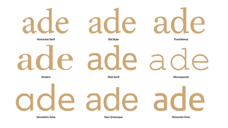
This is a pretty top-level decision, being one of the most obvious at-a-glance differences between typefaces. Purely for practical reasons, serifs are considerably better for large bodies of text as they tie words and sentences together for a smoother, more legible reading experience.
Their origins give them character, too. Serifs hark back to the days of carved inscriptions in ancient civilisations, giving them a certain gravitas, class and cultural weight.
Sans serifs, meanwhile, are a considerably more recent invention, first emerging in the 19th century for commercial use in advertisements, and latterly on screens (which struggled to render the finer details of serifs until relatively recently).
In very simple terms, whether you should choose a serif or a sans serif depends on whether you’re looking for cool, clean modernity, or timeless, classical authority.
Is it high or low contrast?
Bodoni is a high-contrast serif that’s beautiful at display sizes, but is illegible if used too small
Contrast, in type terms, simply means the variation between thick and thin strokes in each letterform – a skill perfected by hand by calligraphers.
As a rule, very high-contrast fonts suffer the smaller they get, with the thinner strokes disappearing altogether if they’re scaled down too much. This makes them almost exclusively the preserve of display fonts, where their distinctive attributes can be appreciated.
At the other end of the scale, very low-contrast fonts are solid and uniform, again making for a strong statement when blown up large, but suffering for the opposite reason when used small, as individual letterforms lose definition and become blocky.
When it comes to personality, high contrast fonts – similar to serifs – can help convey dignity, refinement and elegance, rather like the calligraphic script that inspired them. Low contrast fonts have more in common with sans serifs, and are solid, confident and powerful.
While they share similar characteristics, they are not directly interchangeable. To achieve the nuanced character you’re looking for, a high-contrast sans serif or a low-contrast serif may be suitable.
Does it have diagonal or vertical stress?
Different stresses make a significant difference to the feel of a letterform
Here’s where it starts to get a little more complicated. The stress (or axis) of a font refers to the angle at which contrast occurs in its letterforms – this is usually either vertical, or diagonal.
The easiest way to determine this is by studying how the letter ‘O’ is drawn in the typefaces you’re considering. Is the bottom left thicker than the top left, or vice versa? If so, it has diagonal stress – another calligraphic throwback, with a traditional, wholesome heritage that feels warmth, friendly and inviting.
Conversely, if the contrast of the ’O’ is split horizontally, so the sides are thicker than the top and bottom, that means it has vertical stress. These characters feel bold, modern and confident, particularly at display sizes. However, they do run the risk of feeling clinical and cold compared to their vertically stressed counterparts.
What are its vertical parameters?
This diagram from Computer Arts issue 267 demonstrates different aspects of a font
You’ll often hear type designers talking about ‘x-height’ of a font. Combined with the height of its ascenders and descenders, this can have a significant impact on both legibility and personality.
As a rule, the shorter or taller a font’s ascenders and descenders, the more distinctive it becomes, but also the more effort it takes to read. Fonts with a particularly tall x-height have clearly defined individual characters as a result, but often at the expense of word and sentence legibility.
Short x-heights have the opposite effect. Although each character might lose definition by being squashed down, particularly in bolder weights, the overall shape of words and sentences flow more easily.
So how do you achieve the perfect balance? That depends largely on the intended use, so consider this from the outset. The font needs enough x-height for lowercase letters to be defined clearly at the sizes you need it, particularly complex letters such as ‘a’, ‘e’ and ‘s’.
Does it have open or closed counters?
Open counters create ‘apertures’ (see ‘s’ or ‘c’), closed counters create ‘bowls’ (‘b’ and ’o’)
As well as the vertical lines of a font’s ascenders and descenders, the curves that define its counters – the areas of letters that are entirely or partially enclosed, such as the inside or a ‘p’, ‘b’ or ‘d’ – go a long way to shaping its personality.
Pay particular attention to whether these counters are open or closed. While the examples above are almost always closed, when it comes to a lowercase ‘g’, for instance, different variations have either two closed counters, or one open and one closed counter.
Similarly, lowercase ’a’, ‘c’, ‘e’ or ’s’ letterforms may have tightly hooked outer loops that create almost entirely closed counters inside. This can bring a distinctive twist to a font, but often at the expense of its legibility – particularly at small sizes.
An enlarged x-height can help here, as can more extreme contrast to make the definition between different parts of the letter clearer. In short, it’s only by balancing all five of the above factors that you’ll find the perfect typeface for your particular needs.
Read more:
Threatpost: Leaky WWE Database Exposes Personal Data of 3M Wrestling Fans
in Ειδήσεις από τον χώρο του Design και Hosting
Posted · Report reply
Personal data of 3 million wrestling fans were left exposed on a database owned by World Wide Entertainment.
View the full article