

Rss Bot
-
Content Count
18,744 -
Joined
-
Last visited
Never -
Feedback
N/A
Posts posted by Rss Bot
-
-
You're reading Playful Physics – Liquid in Web Design, originally posted on Designmodo. If you've enjoyed this post, be sure to follow on Twitter, Facebook, Google+!
Physics explains things around us. Whether it is a natural phenomenon or a device created by humankind, physics is the theory behind why it works. Despite being one of the oldest fundamental science disciplines, it is something that not everyone …
-
Whether or not you choose to follow the latest design trends, some movements are just too big to ignore – and affect the industry at large. It's not necessarily about following the herd and developing a similar style – often the visual aesthetic is secondary to the social context that's driving it.
As a result, the most significant trends aren't just flash-in-the-pan occurrences that pass in a few months – they evolve, grow and expand as different designers interpret that underlying movement in their own way. In some cases, the bandwagon gets overladen with people who misinterpret and distort the original roots: we can all name our fair share of design trends we're tired of hearing about, after all.
Major social, political or environmental events may encourage designers, and the brands they work for, to think differently. In some cases, a forward-thinking brand sets an example through its behaviour, and blazes a trail for others to follow.
Amongst the 2018 design trends we identified at the start of the year are new approaches to colour, art direction, typography and even how ideas are expressed – but 2018 has also seen bigger-picture developments in methodology and ideology that could have lasting repercussions far beyond aesthetics.
Read on for four major shifts in brand behaviour that we've seen develop during 2018, and which we predict will play an even bigger role in 2019...
01. Brands acting sustainably
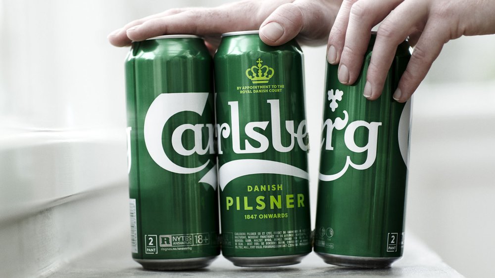
Carlsberg worked with its production partners to develop Snap Pack, a way to join multipack cans with minimal plastic
Unless you're the current US President perhaps, sustainability is climbing up the international agenda fast. Brands are starting to put their money where their mouth is, too. If a product uses recycled materials, responsibly sourced ingredients, is ethically produced and strives to be carbon-neutral, it's not just an altruistic venture for the company in question – it's a major selling point for environmentally conscious consumers too.
Reduction in plastic is a particular concern for many brands. In April 2018, no less than 10 D&AD Pencils were awarded to AMVBBDO's Trash Isles campaign for LADBible and Plastic Oceans, encouraging the UN to recognise the huge floating island of plastic in the Pacific as a country, so the world has a shared responsibility to intervene.
Two household-name Danish brands have also been blazing a trail in this space in recent months. LEGO has announced its first sustainable bricks, made from plant-based plastic, while Carlsberg unveiled various market-leading innovations alongside its global rebrand by Taxi Studio. Most notably, Snap Pack is a new method of gluing multipack cans together, reducing the plastic required by up to 76%.
Sustainability was also a key part of Taxi's brief, and the Bristol-based agency crafted a timeless, distinctively Danish branding system that's designed for longevity, rather than fading into obsolescence in a few years. We predict many more brands will put sustainability front and centre in 2019.
02. Brands expressing their personality in new ways
A distinctive personality is crucial for brands to cut through the noise in a crowded market – and tone of voice can play a big part. For a decade, Innocent was celebrated as the leading example of this. Countless imitators followed, desperate to achieve the same quirky, playful, chatty tone that raised a smile when you drank a smoothie. More recently, a generic 'artisanal' tone has gained traction, packed with earnest adjectives like 'hand-crafted' and 'authentic'.
Following trends won't get you anywhere when it comes to market stand-out, and brands are finding new ways to express their personality visually as well as verbally. A distinctive style of illustration can give a brand personality just as effectively as its tone of voice, and brands launched this year such as Anna by NB Studio are combining the two to great effect.
Another stand-out example is Superunion's recent brand refresh for BBC Two (see video above), which rethinks the role of channel idents to express a progressive, risk-taking personality. Putting stimulating, original programming at the core of BBC Two's identity, the agency turned the entire junction between programmes into an extended ident, using a range of stunning animations to express the mood a piece of content evokes, rather than just its genre.
Instead of overtly branding the idents, the content does the talking, with only a subtle curve motif – hinting at the outline of a '2' – to indicate the channel name. It's a bold way to express a brand's personality that bucks sector trends, and we predict even more forward-thinking brands will do so in 2019.
03. Brands taking a stand

Nike's campaign was divisive but brave
Ever since 2016 – one of the most globally divisive years in Western politics for quite some time, with the shock election of Donald Trump following hot on the heels of the UK's dramatic Brexit referendum – it's become increasingly common for brands take a side. The result is a fast-growing trend for divisive campaigns that attract love and hate in equal measure.
In 2018, a prominent example was Nike's defiant stance in support of Colin Kaepernick – the outcast American football player fronted the campaign to celebrate the 30th anniversary of its world-famous tagline. While many applauded its bravery and integrity, others destroyed their Nike goods and threatened to boycott the brand in future. With the world more divided than ever on deep-rooted, ideological issues, we predict more brands will take a stand in 2019.
04. Brands focusing on experience
As consumer demand shifts and brands such as Amazon, Uber, Netflix and Airbnb cause widespread disruption in their respective sectors, forward-thinking companies are increasingly putting digital products and services at the core of their business model, rather than just seeing digital as a glorified marketing channel.
Logo design is becoming a less important way for brands to express themselves distinctively, compared to the value of a coherent, intuitive multi-platform user experience that communicates brand values through every touchpoint.
Studio Output's multi-channel rebrand of BBC Sport, which picked up a coveted Brand Impact Award in September 2018, is a case in point. Pre-rebrand, BBC Sport's identity system was tailored for broadcast – and as it expanded across every other digital platform, it lost any sense of coherent user experience.
The solution was to communicate brand values through colour, type, and motion principles, translating it seamlessly across all devices and platforms – the logo became secondary. As digital products and services become ever more integral to brands' DNA across all sectors, we will only see this trend increasing in 2019.
Related articles:
-
Popular card readers like Square and PayPal have various flaws that allow attacks ranging from fraud to card data theft.
-
Design may be mostly done on computers these days, but everyone loves a bit of old-fashioned ink drawing.
The only problem is that to make your work look good you need an assortment of pens, of different line widths, and eventually they end up taking over your desk. If only there was a pen equivalent of simply increasing the line width in Photoshop CC.
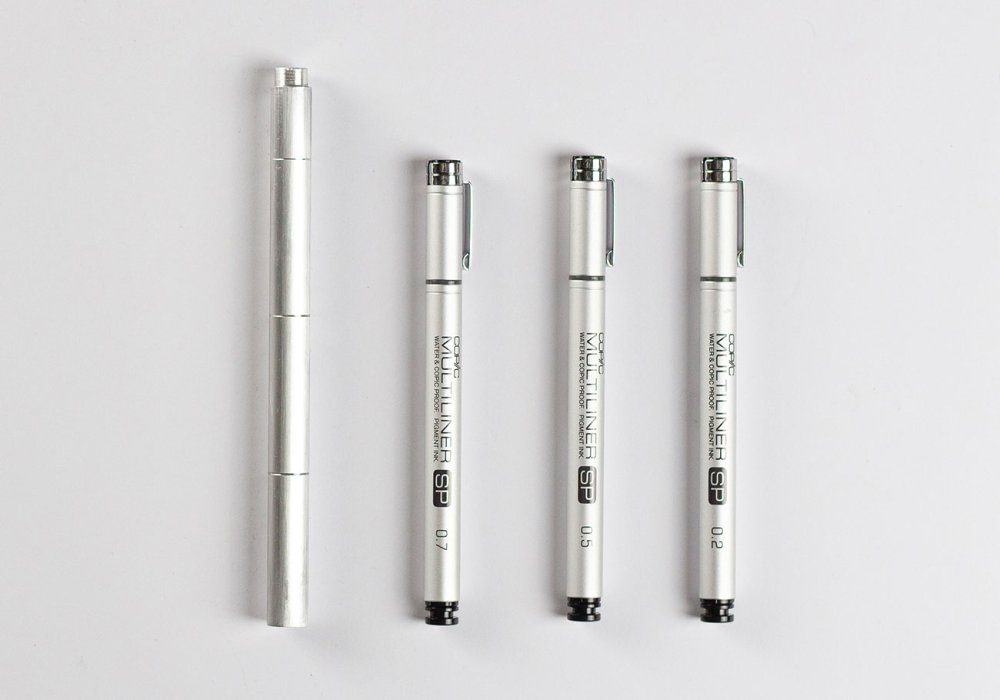
Take three pens into the studio? Not any more!
Well, now there is; or at least, there soon will be. The Wright Pen, by Wright Design, is the world's first magnetic multi-tip drawing pen, giving you three line weights in a single aircraft-grade aluminium body, and it's available to order now via KickStarter.
Designed for artists, designers, illustrators and just about anyone else who needs fine control over their line weights, the Wright Pen is basically three little pens that slot together to make one versatile drawing implement.
And what about the magnets? Well, the last thing you want is your pen falling apart right in the middle of some especially fiddly cross-hatching, so the Wright Pen uses powerful neodymium magnets to ensure that the three pen tips stick together properly and only come apart when you need to switch tips.

The Wright Pen's suitable for ladies and their delightful illustrations...
The Wright Pen's three nibs come in 0.2mm, 0.5mm and 07.mm widths, giving you a great variety of line weights, and if you need different weights you can simply customise your pen with replacement nibs from the Copic Multiliner SP family. Each tip has its own 3.6mL ink cartridge, ready for you to fill with your favourite drawing ink.

...and for men with their SERIOUS TECHNICAL DRAWINGS
Sleek and lightweight, the Wright Pen has just sailed through its (admittedly low) KickStarter target in around an hour, but there's still plenty of time for you to back the project and reserve your own pen for $56/£44 – 23 per cent off the retail price. Bear in mind, though, that it'll be a while before your pen arrives; according to Wright Design's timeline, production's due to kick off early in 2019, and the pens themselves will begin shipping in August next year.
Related articles:
-
If you're the rugged outdoors type who loves documenting your escapades on camera then you'll know there's really only one choice when it comes to picking the right kit: you need a GoPro.
They're not cheap, though, and if you want to get a great deal when buying one then Black Friday and Cyber Monday 2018 are the best opportunity to do so. We're going to be hunting down the best GoPro Black Friday deals so you won't have any problems finding the model you need at a knockdown price. Here's everything you need to know right now.
The best Black Friday/Cyber Monday GoPro deals: What we expect to see

GoPro's new Fusion model is great for 360-degree photos
GoPro is currently keeping things simple with its range of action cameras. Head to its site and you'll find it features just four models: the GoPro HERO7 black, HERO7 White and HERO7 Silver (be aware that these aren't just colour options; each model has slightly different features, with the Black the best of the three), and its 360-degree GoPro Fusion camera.
These are only its most recent models, though, and there are plenty of earlier GoPros out there that still pack some great performance and give you stunning video and photos. These older models are the ones that are almost certain to receive the most attractive Black Friday deals.
In particular, look out for GoPro HERO6 Black Friday offers; this model has only recently been superseded by the GoPro HERO7 and there's really not a lot to separate them. The GoPro HERO6 Black will still give you 4K video at 60fps, and it also features super-slow-motion 240fps video at 1080P, and while its retail price isn't much less than the GoPro HERO7 Black, when it comes to Black Friday then it's sure to see some much bigger discounts than its younger brother.
There's still a lot to be said for the even older GoPro HERO5 range, too. If you're not too fussed about having the very latest specs and have an eye for a bargain then this could be the sweet spot for the best of the price cuts.
For the cheapest GoPro option, however, look for the back-to-basics GoPro HERO, which launched this year. Simple and straightforward, it's lacking in fancy features such as 4K video and exposure control, but it's rugged and waterproof with voice control, and it sells for less than half the price of its full-powered siblings. We doubt there'll be huge discounts to be had, but what price cuts there are will be well worth sniffing out.
The best UK Black Friday and Cyber Monday GoPro deals in 2017
What sort of GoPro Black Friday deals can you look forward to in 2018? Here are some of the UK offers we found last year.
How to get the best GoPro deals on Black Friday/Cyber Monday

Look for older models like the Hero 6 Black, and see if there are any extras thrown in
The most important thing to bear in mind, once you've set your heart on finding GoPro Black Friday deals, is that by the time Black Friday comes around you may have already missed some of the best offers. Black Friday is big business for retailers and they don't want to miss the opportunity to shift some stock, so you'll find numerous stores jumping the gun and rolling out their deals in the weeks leading up to Black Friday. In short, start looking now, and don't be afraid to hop on a deal well in advance of the big day.
With that in mind, you'll also want to decide in advance exactly what kind of GoPro you're after and how much you want to pay for it. As we've already mentioned, there are subtle differences across similar-looking GoPro models; in the Hero range the Black has the best specs, followed by the Silver and the White. If you want to shoot 60fps 4K video then you're going to be very disappointed if you see a great offer on a Hero 7 Silver and order it without thinking.
Check for Black Friday deals with extras thrown in to sweeten the deal. Last year Amazon ran a fantastic offer on a GoPro HERO5 with a rechargeable battery and 3-way arm; two essential extras that you'd find yourself needing to get at some point anyway, so if you see a similar offer this year then it could be well worth your money.
And of course, use the same common sense that you would when buying anything else online; watch out for cashback offers that'll give you a welcome extra saving, check that the guarantee covers you if things go wrong, and don't forget to keep your receipt just in case you change your mind once the Black Friday fever wears off. Happy shopping!
3 GoPros to look out for on Black Friday/Cyber Monday

If you demand the best in action cameras then you need to opt for the GoPro HERO7 Black; it's a great reminder of just why the company has dominated this market. It's expensive and has its faults, but it's great to see the company refining its gear and paying attention to key areas like video stabilisation. Great videos, great images and, great fun; what's not to love?

There are plenty of better-specified action cameras available for a similar price, including ones that'll give you 4K video, but they don't have GoPro HERO's slick design and polished. If you're just starting out with action cameras or need a budget option, this is a great choice.

The Fusion's less about 360 video and more about not missing a thing thanks to its over-capture that allows post-editing in widescreen video; it's also brilliant for selfies framed without the selfie stick showing, and for 360-style photos. However it's let down by its app, which has connection issues and fiddly editing options as well as slow download speeds, and its Fusion Studio software, which is slow to use and heavy on processing power. The device itself works well – and it's waterproof too – but there are better 360 options available such as the Yi 360 VR and new Insta360 One X.
Today's best pre-Black Friday GoPro deals
Winter's drawing in and you might not want to wait until Black Friday to snag a cheap GoPro, so here are the best deals available right now; go get 'em!
Related articles:
-
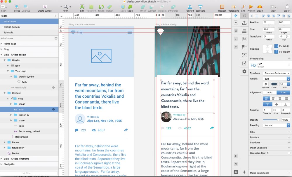
The ideation and wireframing stage of any design enables you to consider the layout and user experience from the very start of your project. By only using the core components for your web design — header, footer, navigation, buttons — to begin with, you can always ensure your focus is on the user, without getting distracted by which colour palette to use.
There are plenty of wireframing tools out there, but today many web teams use Sketch. Its usability and unrivalled speed make it the obvious choice.
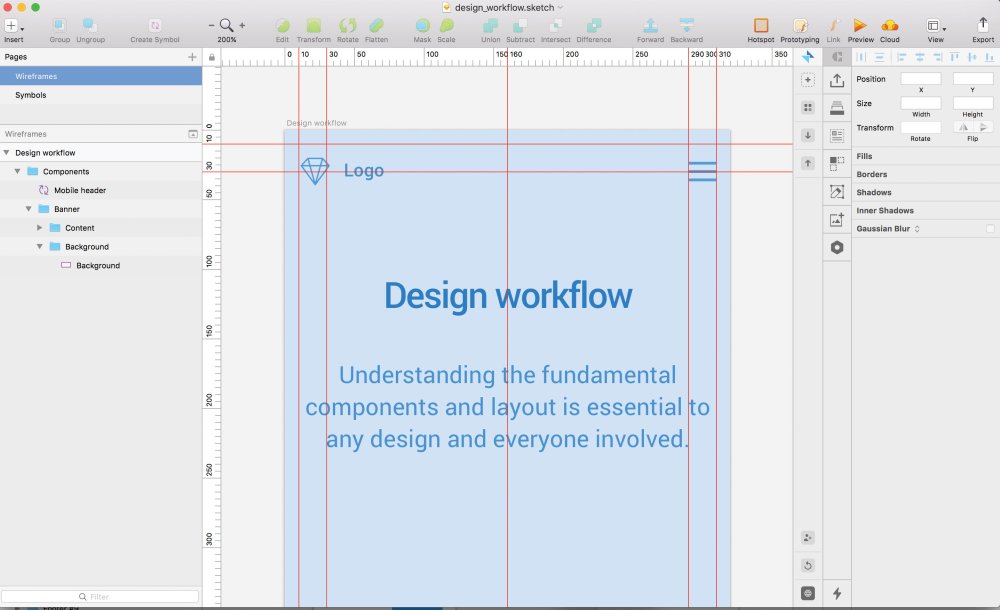
Starting with the header, what do we need if we are approaching this project mobile first? Is the logo the main focus? Should we consider using a ‘burger’ navigation to ensure best practice? These are the questions any designer should keep asking themselves throughout the process when building their wireframe components and creating a page design, and here's how to address these questions, and more, using Sketch.
Click the icon in the top right of each image to enlarge it

Wireframing in Sketch
01. Build the components in Sketch
The first steps should be to create an artboard for mobile or desktop, and begin to build the components on the page with simple shapes, in order to define the outline of the components, like the header.
Too many colours can be distracting, so minimise your colour palette to clearly define important elements in your wireframes. Highlighting the important stuff (call-to-action buttons, header text) with bolder colours is a subtle yet effective way of creating a visual hierarchy when sharing the designs with colleagues and clients.
For example, within the header, inserting a logo and navigation in a bold blue colour, on a pastel blue background, will present them as the important elements in your component.
It’s also worth noting that it’s possible to update the link colours in your Sketch preferences, just in case there is a colour clash in a design with the default orange.
02. Use a grid and guides
Grid lines can help you define your wireframe
It’s also important to consider a grid system, padding and margins as soon as possible when defining the wireframes. Show rulers in a Sketch file by going to View > Canvas > Show Rulers (or ctrl+R). Clicking on these rulers (down the left and above your artboard) will create guides, which in turn saves a lot of stress when sharing designs, as consistency is key when defining a design system.
03. Create symbols in Sketch
Planning to use these components in more than one artboard? Why not create a symbol? Symbols are the best feature in Sketch by far, they act as super-components that update all the artboards they currently sit in. To create a component, right-click an element, and choose Create symbol. This will be saved into one packaged item manageable from the symbols page.
Improve your Sketch prototypes
04. Add animations in Sketch
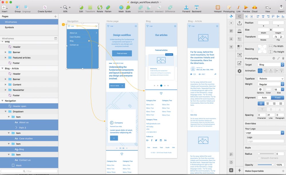
Underneath the target area on the right-hand panel there is the option to add animations between your artboards. Using animations is a great way to add more life to your prototype. However, the current options are more tailored towards app prototypes, and don’t offer much flexibility if demonstrating a website design. That said, it’s expected the list will grow in future updates of Sketch with options like fading transitions, for example.
05. Flag your starter page
When previewing a prototype, the flag icon that sits in the header of the popup next to the select dropdown is a great way to indicate which of the artboards is the home page. Once selected, every time the prototype is opened, this artboard will be the first page. This will also set the homepage when sharing the prototype in the cloud.
Collaborate in Sketch
06. Use Sketch Cloud
Sketch Cloud is a great platform to do some user testing
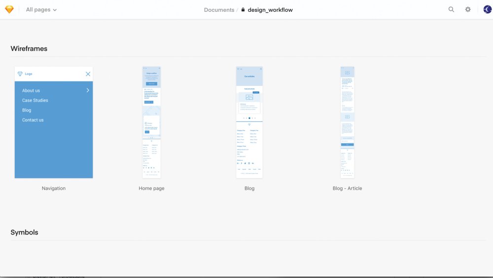
Sketch’s latest cloud feature is an online showcase of all pages and artboards in one place. Anyone can sign up to use Sketch Cloud to view, download, and comment on Sketch files, which have been shared publicly or privately straight from Sketch.
Pages act as sections on your Sketch Cloud link and are displayed in order of their structure in Sketch (from top to bottom). Artboards within these pages do the same, so make sure the structure is correct (for artboards, order from left to right) to show designs in a specific order. This is also a great platform to perform some user testing once you’ve shared your cloud link.
When the prototype is complete, click on the Cloud icon, sign up with an account, and upload the designs to the cloud. From this point onwards, the link will remain the same, so any future amends added to the project will be uploaded when clicking on the cloud icon and selecting Update in the share popup.The dashboard on the cloud is self-explanatory with prototypes, artboards and symbols available to view in order.
07. Prototypes in Sketch Cloud
If you viewed your prototype in your Sketch file earlier, and flagged one of your pages as the starting page, Sketch Cloud will create a new section with this prototype ready to go.
Can’t see a prototype? Simply go back to your Sketch file, highlight the artboard you want to be the starting page, click Preview so you see the popup, and finally click the flag icon. On your next push to the cloud, this prototype will be waiting for you.
08. Enable comments in Sketch Cloud
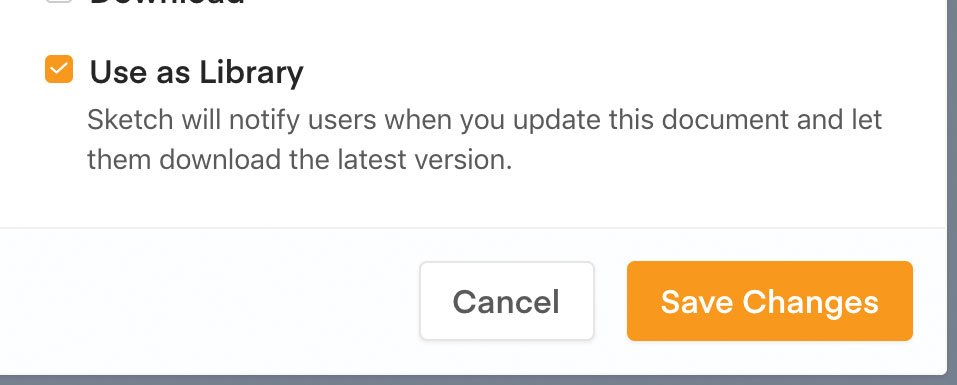
All users with access can leave comments on each artboard, enabling all feedback to be kept in one place, so there's no need for that long-winded email anymore.If you are looking to get feedback on your prototype or designs, or want to share the prototype on a public link, click on the cog icon in the top-right corner of your cloud dashboard. Here, you can enable comments (which will appear once viewing a design by clicking the bottom-right icon), and create a public link for your designs for sharing.
You can keep the designs private, and give access via email to a lucky few. To share a direct link to your prototype without the user having to navigate in Sketch cloud, adding ‘play’ or grabbing the URL in prototype mode and enabling a public share link will do this. For example: sketch.cloud/s/1abc2/all/website/home/
09. Essential shortcuts in Sketch Cloud
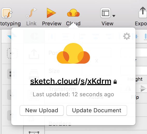
Push changes to the Cloud by selecting this icon
Push your latest changes to cloud by selecting this icon – your browser will open the link once completed.
Declutter your Sketch cloud link by selecting only the page you want to show in the top left dropdown, and share the URL from here instead.
You can share changes with your team with this feature
In the settings panel popup, tick ‘Use as library’ to automatically let your team know there’s been a change.
Flag your opening artboard in preview mode before pushing to cloud to make it appear first on your Sketch cloud link.
Build a design system in Sketch
10. Stay organised
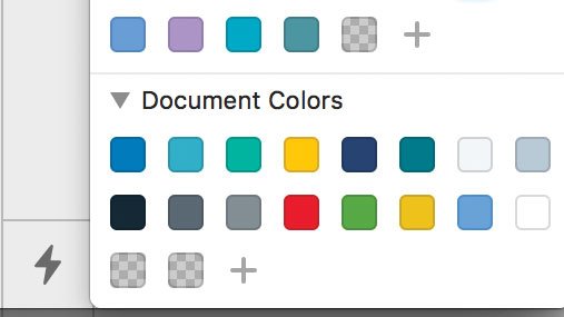
It's easy to organise your colours in Sketch
Keep your brand colours organised in your document palette by choosing the said colour and clicking the ‘+’ icon.
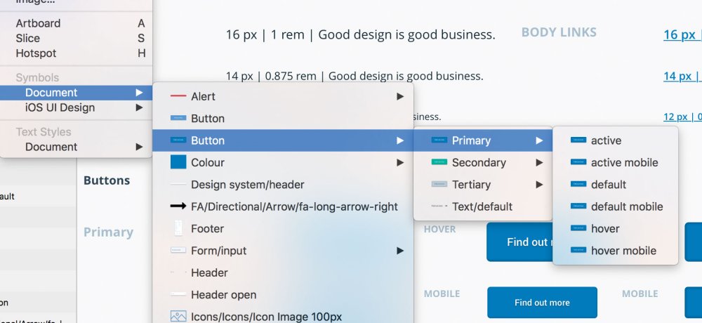
Name your symbols correctly to keep them organised
Keep your favourite symbols organised in their multiple states by using slashes when naming your symbols, for example naming your symbols ‘Button / Active’ and ‘Button / Disabled’ will group your symbols together under the same category.
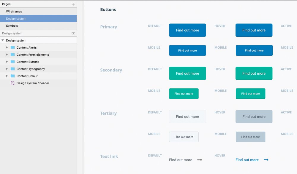
Show everyone where they can grab the assets with a single page in Sketch
Create a design system page by separating all your elements that define your brand into its own page in Sketch. This is a simple way to show everyone where they can grab the assets.
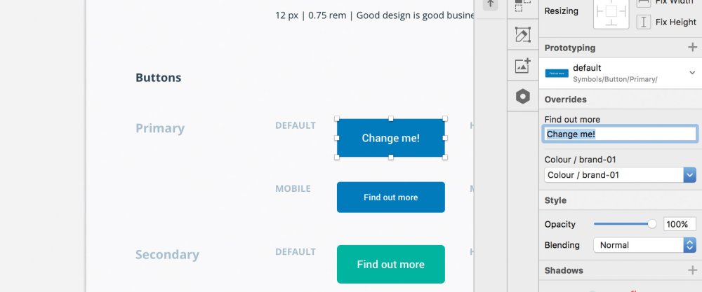
Making small changes in easy in Sketch
You can overwrite the content in your symbols, such as text in your button (see above), so you don’t need to worry about making new elements if it’s only a small change.
Create a page design
12. Create a strong visual hierarchy
Designing user-centric components first can help structure your site
A strong visual hierarchy ensures clarity in any user-centric design. To get started, design the most universal components – such as colour and typography – first, and then work down to smaller ones such as buttons and input components.
To insert just about anything into your design, hover over to Insert tab at the top of the Sketch UI, click, and then start importing elements onto your artboards. Keep in mind your wireframe and design system to ensure consistency in your work.
13. Use colours sensibly
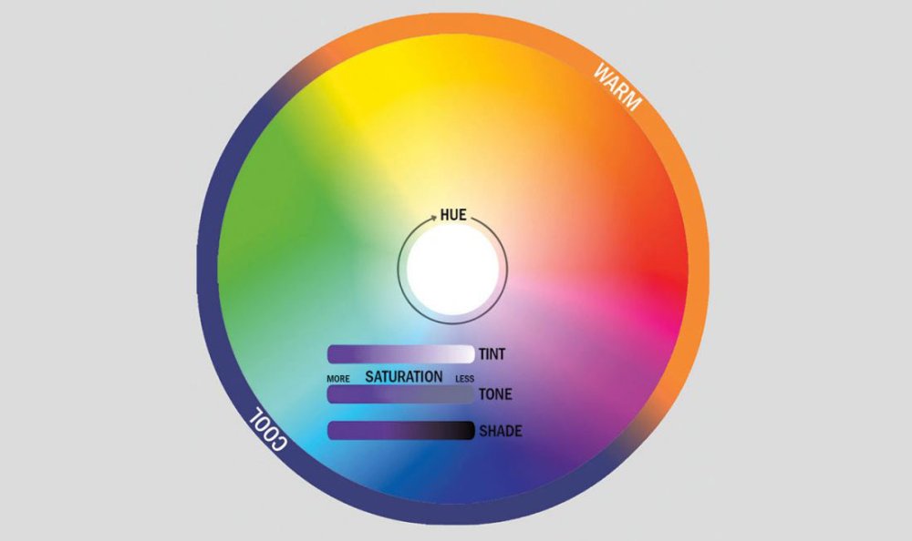
Colour is arguably the most important element in any design workflow. With colour, we can set the overall look, feel and tone of a design, so always ensure you use it in correlation to the importance of the elements that they are assigned to.
Try grouping your colours like so:
- Primary colours: the main brand colours, used to create the basic colour scheme of a project and crucial elements like buttons.
- Secondary colours: these accompany the primary colours, and compromise different shades, gradients and tints from the primary colours.
- Tertiary colours: an important group, which display system messages, such as alerts, warnings, and notifications.
To make your colours as efficient as possible, create each colour as a symbol in your Sketch file to ensure any changes update the elements across your design.
14. Use typography effectively
It’s important to design the style and size of all the headings (H1, H2, H3, and so on) and paragraphs to create a visual hierarchy. Usually, typography doesn’t have many stylistic variations, such as colour or weight, so consider using your colours effectively to present the brand personality.
Once your happy, define your text styles in the right-hand panel, by clicking on the ‘no text style’ dropdown and selecting ‘new text style’, once saved, you can use this typographic style throughout your design, like symbols.
15. Use icons to add context
When used effectively, icons add context to more complex components such as buttons, labels, or tables. Icons in your design can be functional by encouraging users to interact — using an ‘X’ in a button to signify a Remove action, for example.
Consider creating a set of UI icons as nested Sketch symbols to help complement other UI elements in the design framework, – arrows, for example – that can be used in sliders, previous and next buttons and pagination.
16. Design buttons and inputs
When designing buttons and inputs, make sure to design their individual ‘states’. Each have multiple states and provide visual feedback to users to indicate the current state (for example, hover, clicked). It’s good practice to create each state as a separate symbol, since this adds flexibility.
17. Complex components and sections
At this stage, the design could be considered complete since it has everything needed to create a functioning product. However, it’s worthwhile spending more time creating components for the UI framework, such as cards, tables and forms. These can then be combined to develop sections, shaping the blocks to which our websites and applications rely on such as headers, navigations and banners.
This article originally appeared in issue 277 of Web Designer. Buy issue 277 here or subscribe.
Read more:
-
In just a couple of hours time we're expecting to hear news of the latest iteration to Apple's popular tablet, the iPad Pro 2018 (or iPad Pro 3). As invites to a special hardware Apple event in New York today have been flying around, speculation is rife about the new device. And we've got some of designer interest to share.
We've already seen the release of an entry-level iPad this year, which, as our full iPad 9.7 review states, is more laptop-like and art-friendly than ever before. But if some of the rumours suggested by @OnLeaks on behalf of MySmartPrice are true, Apple's latest iPad Pro looks set to take that to a whole new level.
The gist we're getting, more than anything, is Apple really pushing this device as a 'laptop replacement', boasting powerful iOS 12 (tablet-focused) software and rumoured new features including TrueDepth camera technology and a USB-C port replacing the current Lightening one. Combine that with the fact that software companies like Adobe and Affinity are clearly focusing efforts on iPad-specific apps, and this could soon be an interesting time for creative professionals.
That said, there are other rumours surrounding functionality, which might make it less desirable to artists and designers. Our sister site techradar recently reported early sights of the new device saw no sign of a 3.5mm headphone port and that measurements of the 2018 version were significantly smaller than that of the 2017 model.
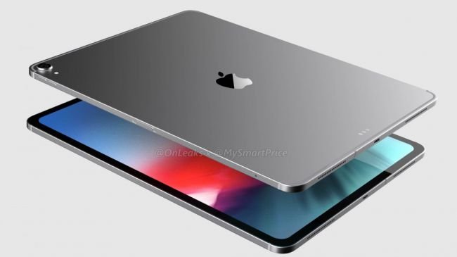
The new 2018 iPad Pro is rumoured to be significantly smaller than its predecessor
Obviously all of this is speculation at the moment, as is whether Apple will refer to new device as the iPad Pro 2018 or the iPad Pro 3. But one thing we can be sure of is that it won't come cheap. Nor that we'll see any iPad Pro Black Friday deals, sadly, especially when leaks suggest the cost of a new iPad Pro will be in the region of $649/£619.
We'll be sure to cover any Apple news as and when it comes in, including details on announcements expected to drop on shiny new MacBooks , so make sure to check back later for any updates.
Read more:
-
If you think that developing vibrant animated characters is difficult, you'd be right – it usually is. But this CrazyTalk Animator 3 Pro makes it simpler than ever before, using a wide range of motion templates to bring any image, logo or prop to life.
You can even use instant facial motion capture from newer iPhones to make animating 2D characters even simpler, and utilise character templates, motion libraries, a powerful 2D bone rig editor and more to develop characters. That lets you create 2D talking characters for videos, web, games, apps and presentations.
Check out CrazyTalk Animator 3 Pro for $79 – that's 55 per cent off the regular price.
Related articles:
-
-
Anyone who wants to create something beautiful online needs to have an eye for design – but sometimes needing to know how to use Photoshop or other design-related tools can be off-putting for the average joe. This piZap Pro: Lifetime Subscription lets you access enormous, diverse suite of digital programs to complete nearly any digital design task, without needing to understand complex programs.
Utilise hundreds of fonts to spice up flyers and graphics, use royalty free stock images for blogs, edit photos and more. You can even design your own emojis, showing off your creative spark.
Try this piZap Pro: Lifetime Subscription for just $39.99 – that's 77 per cent off the regular price.
Related articles:
-
You're reading The Economist Redesign Does It Right, originally posted on Designmodo. If you've enjoyed this post, be sure to follow on Twitter, Facebook, Google+!
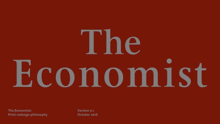
It’s been decades since one of the oldest news magazines in the world has looked different. That all changed in October when The Economist launched a redesign that freshens up the look of the news and makes it easier to …
-
-
We asked 10 of our favourite designers to think back to the beginning of their careers and remember the best bit of advice they received. Designers being designers, none of them went in for your typically 'inspirational' guidance. There's no talk of 'looking through the rain to see the rainbow' going on here – instead, it's more like: 'shut up' and 'accept that you're a failure'.
Read on for the brutally honest but perennially useful lessons that helped these designers climb to the very top of their disciplines…
01. Think for yourself
This personal project by Craig Oldham has advice for new designers on it
Craig Oldham is known for giving brutally honest advice in print – his book Oh Sh*t... What Now? is out now – and in person as a public speaker. The Manchester designer was once told: 'If you can think, we can teach you everything else.' It's stuck with him throughout his career. "This," he says, "hands down, is the most reassuring, inspiring, and supportive thing I was ever told as a young designer. It's something I refer back to myself still, and something I always share with others."
02. Know when to shut up
The best bit of advice David Airey ever received can be boiled down to this: there are times you need to speak up and be heard, and there are times you need to shut your gob and listen. The Northern Irish logo and branding expert offers plenty useful advice in new book Identity Designer: The Definitive Guide to Visual Branding. He puts it in far more constructive, far more diplomatic terms: "You don’t learn much when you're talking."
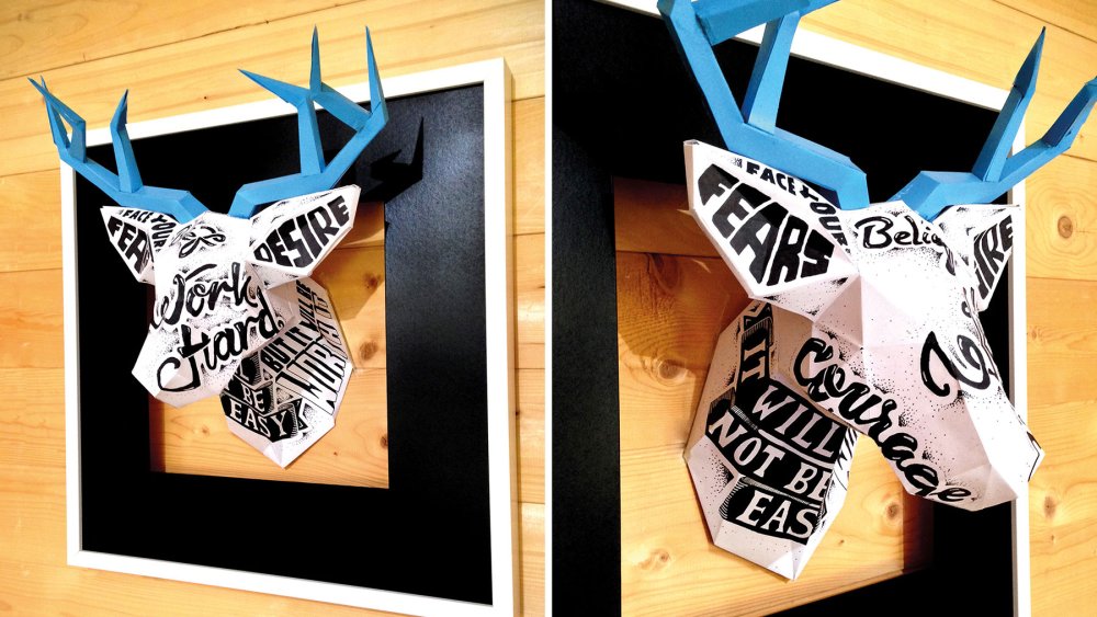
03. Seek out failures
Based in Glasgow, Craig Black specialises in lettering and exterior design. A recent personal project saw him build and hang paper-sculpted stag heads decorated with typography. He says it's important you don't go into projects blindfolded. "The best piece of advice I received," he says, "especially when I wanted to pursue being an independent designer, was from my good friend and amazing letterpress designer Nicole Phillips: 'Find people who've done it before you, ask about their successes and, more importantly, their failures.'"
04. Do what you do best
Johan Debit is co-founder and creative director at Brand Brothers in Paris. The studio recently created a new identity for the 'book-lovers website' Reading Wild. Identity, logo design, typography: this what Brand Brothers excels at, Debit explains. So the team leave graphic and communication disciplines to others. They don't take on work they can't do to the best of their ability.
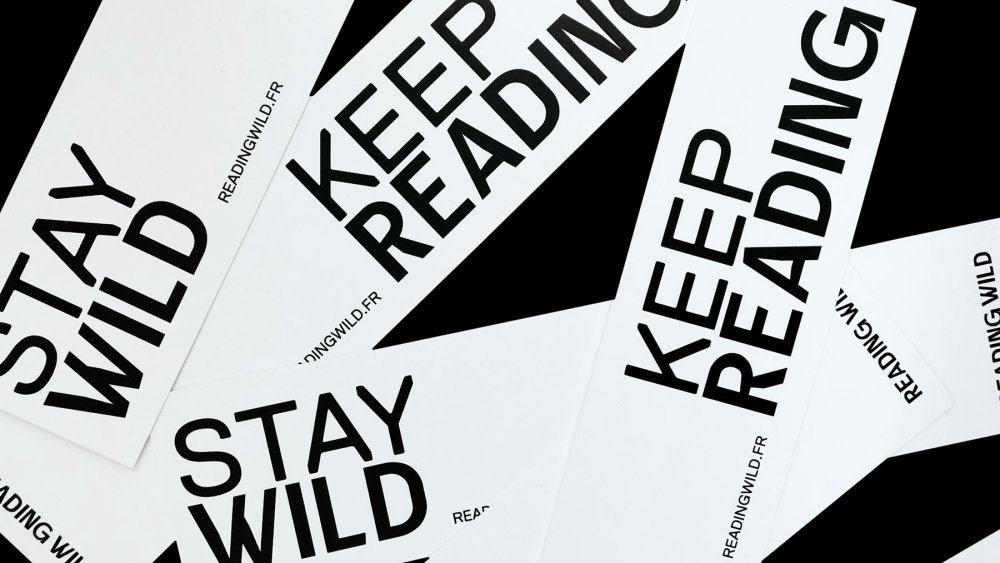
Branding schemes – such as this one for Reading Wild – are what Brand Brothers excel at
"This ultra-specialisation choice has made us better and much more visible, while drastically reducing stress situations and increasing our pleasure dramatically," Debit says. "The best advice I received was to focus on what I could do best. There is a great temptation to know how to do everything, but it is impossible. In artistic disciplines, it takes a lifetime – or 10 – to hope to become excellent."
05. Face your enemies
Jaime Zuverza makes some of the coolest, weirdest posters around. The advice the Austin-based designer and musician would like to pass on is pretty open to interpretation: "Your enemy is your friend."
It could mean taking on projects that push you out of your comfort zone, or possibly that a certain amount of self-doubt can spur you on to do better work. Or maybe it's a bit more philosophical: that you shouldn't be jealous of other people's successes.
If that's a bit too deep for you, then try this, his tip on doing plenty of research before you put pen to paper: "Never start with a blank canvas."
06. Avoid surprises
Sophie Brown is project director at Freytag Anderson. The Glasgow studio recently created the identity for The Modern Croft, which was an "opportunity to reinvent the Scottish tradition of crofting in a contemporary retail brand". It was a success, and based on simple principles.
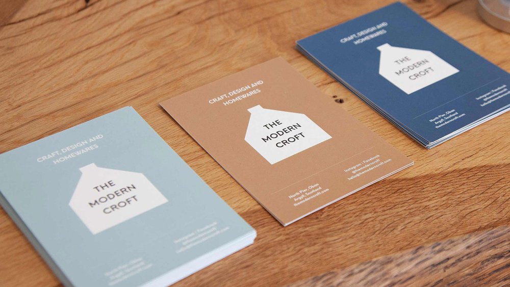
The team at Freytag Anderson believe in the power of clear communication
Brown says: "The best piece of advice I’ve ever received would be to communicate, communicate, communicate! Make sure everyone knows what they’re working to. If something has to to change, tell the client in advance. If something’s agreed verbally, follow it up in writing. That way, there are no misunderstandings and no surprises."
07. Work with people who are better than you
Max Ottignon is co-founder of Ragged Edge, the London branding studio whose clients includes Grey Goose, Google and the BBC. The studio owes its success to following a simple (but hard to implement) bit of advice. Ottignon was once told: 'Hire people better than you.'
He says: "To start with it was hard to get my head round it. Not being the best felt like an admission of failure. But once I managed to put my ego to one side, it enabled Ragged Edge to do things I never thought possible."
08. Stay curious
Vanessa Eckstein is the founder and creative director of Blok Design. The Toronto studio recently designed the branding for 48North, a Canadian cannabis business, a project that required them to visually represent 'the boldness and the clarity' of the company.
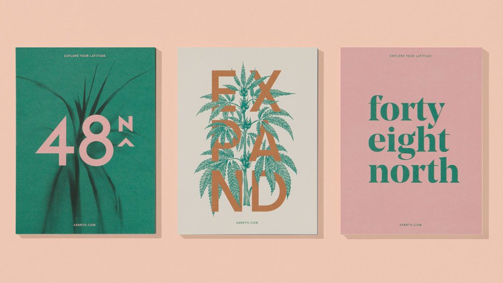
Blok Design's work for 48North
In work and life Eckstein always refers back to a TS Elliot quote her father often repeated: 'We shall never cease from exploration / And the end of all our exploring / Will be to arrive where we started / And know the place for the first time.'
"My sense of eternal curiosity, the need to question from different points of view, the openness and hunger to keep on growing, and to experiment, knowing that the journey is more important than the immediate result, since all will also arrive at the right time. All these pathways in this one quote that I still keep close."
09. Don't expect immediate results
During their career, Yarza Twins have had their fair share of bumps in the road. The London-based Spanish designers were told early on that it was going to be this way. Very few – if any – designers make great work from the get-go. It takes time and patience.
Marta says: "We don't think that it's possible to become a designer from one day to another. To be a good graphic designer is a process that can take years to learn. So don't feel frustrated if your early creations are not good."
10. Don't rely on talent
As a young designer, Mark Richardson – aka Superfried – heard a few pieces of advice that stuck. Really, they're all riffs on the same theme: "Nothing counts until it is in the bank … You're only as good as your book … Talent is not enough." They're about staying motivated, staying hungry, about always wanting to do better.
Richardson has had countless 'potentially' exciting projects that fell through or, worse, the clients didn't pay up. Similarly, he says, just because you went to an exciting university and got a first-class degree doesn't mean you're going to do well as a professional.
That's why talent alone doesn't equate to success. "I have worked alongside some of the most talented in the business and they work harder than anyone else I have met! Hard work should be a given, but don’t kid yourself, there is always someone out there working harder than you."
Read more:
-
For the aspiring artist wanting to create your own character design, it can be tempting to just follow the manga template wholesale. It’s important to note that basic art and storytelling fundamentals are still necessary in the creation of good manga art.
Here, three artists from Collateral Damage Studios – Loe ZI Rong, Tan Hui Tan and Ho Wei Rong share their expertise and experience when it comes to creating and refining manga character art. From how to clean up your character sketches, work with colour theory and craft a story for your creations, there’s plenty to incorporate into your own manga workflow.
Use the icon in the top right of each image to enlarge it
Clean up your sketches
01. Tighten up your roughs
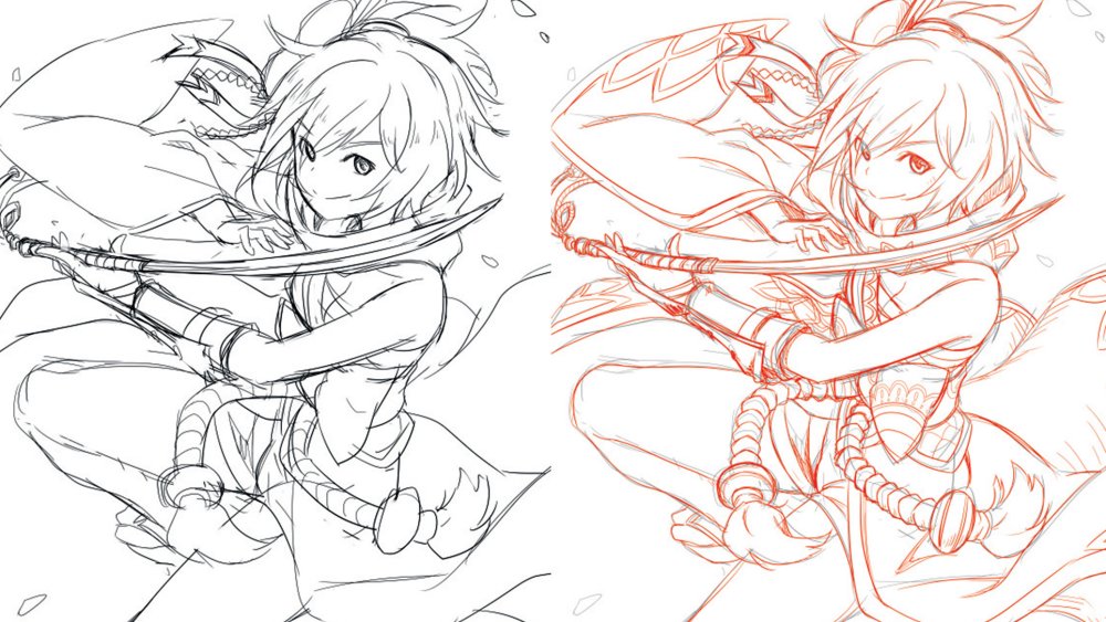
Use a new layer to add detail to your sketch
I usually start with a rough sketch, working out the pose and the flow of the other objects such as the costume and hair. Then I’ll take a quick second pass to refine parts of the picture and add more details that can aid in my line-work process later. If you’re working on a single layer it can be easy to accidentally erase portions of the original sketch when you’re zoomed in and focused on adding details, resulting in the overall composition being altered. I recommend using a new layer to flesh out the details, while keeping the original composition on another layer for easy reference.
02. Differentiate layers with colour
For clarity, use a different colour to add detail
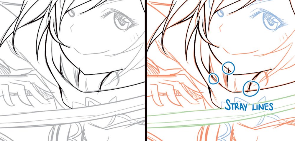
I find it useful to change the colour of my pencil before cleaning up your sketch. Even if you reduce the opacity of the sketch layer during the clean-up stage, unwanted lines that are overlooked might be mistaken for lines from the original sketch. Changing the colour of the sketch to another colour can make the distinction between the sketch layer and clean-up layer more obvious, and reduce stray lines when cleaning up. Using colours to highlight different areas that you might want to separate into layers also serves as a visual reminder when lining them.
03. Add weight to your lines
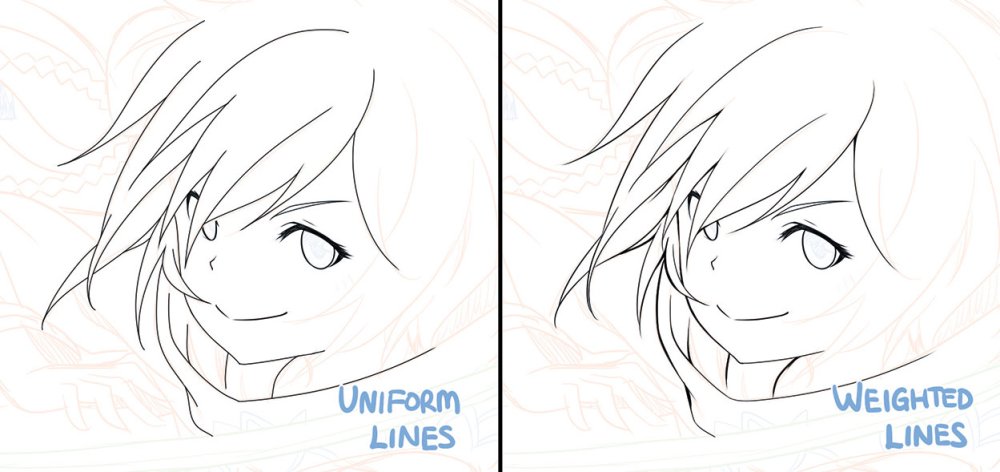
Varying line thickness can help add depth to a drawing
Apart from certain art styles or production requirements, giving your lines different thicknesses helps to add depth to your drawing. In general, drawing thinner lines of elements closer to the light source and thicker lines for those further away can make your art pop. One example when it’s not necessary to add weight to your lines is for animation production, when production time is limited and the consistency of lines between frames is more important.
04. Rotate and flip the canvas
Flipping your artwork can reveal things you didn't previously notice
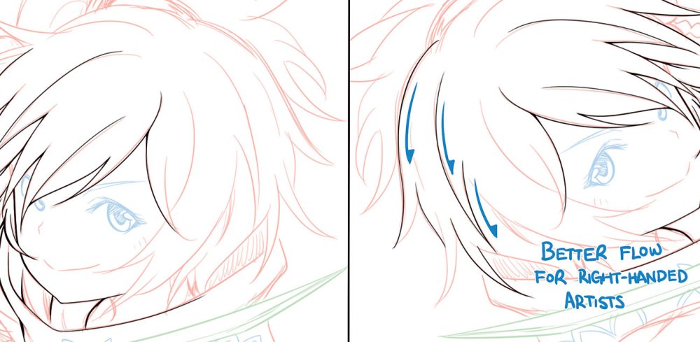
To achieve clean and smooth-flowing lines, it’s usually better to clean up curves correctly in a single stroke. Most painting software enables you to rotate and flip the canvas freely to adjust the angle at which you tackle those curves. Flipping the canvas as you draw is also a good way to check the balance of the image if you’ve been staring at your artwork for too long.
05. Check the developing artwork
Zoom out of your sketch to look at the bigger picture
As mentioned earlier, during cleanup we tend to zoom in and focus on the finer details of the artwork. We end up taking localised decisions on how certain strokes would be cleaned without bearing in mind context of the whole image. This might result in, for example, a well-drawn hand that’s clearly out of proportion when compared to the rest of the body. Therefore, it’s important to zoom out occasionally to check everything’s still on track as you clean up your sketch.
Apply colour theory to your figures
06. Think about the colours you use
Colours have different connotations in different cultures
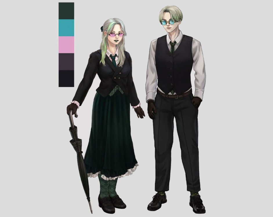
Colours convey mood and meaning, and you can use it to direct or misdirect the audience. At its most effective, just the colour palette can bring to mind the object. It also serves as a bond when different objects share the same palette, such as the historical significance of the red, blue and white stripes in Pan-slavic flags.
Beyond basic colour theory, the science of colours and its everyday usage can be useful information. For instance, knowing that in European culture, royalty is represented by purple, while in India, deep red and ochre symbolise grandeur and wealth, can be useful in creating culturally specific characters.
07. Concept and usability
These two characters have almost identical colour palettes
When I create a character design, form follows function. A hierarchy of information applies to colour design, too. Areas of high contrast will attract more focus, and bright colours can indicate narrative significance. I try to go from a macro overview before tackling details.
Here, the characters are twins working as bodyguards. They share a black, green and white palette, but also have spots of pink or cyan to differentiate them. I also try to ensure that no other in-universe characters have a similar palette. The narrative theme is dark, and therefore the general colour palette reflects that and is muted.
08. Build a palette
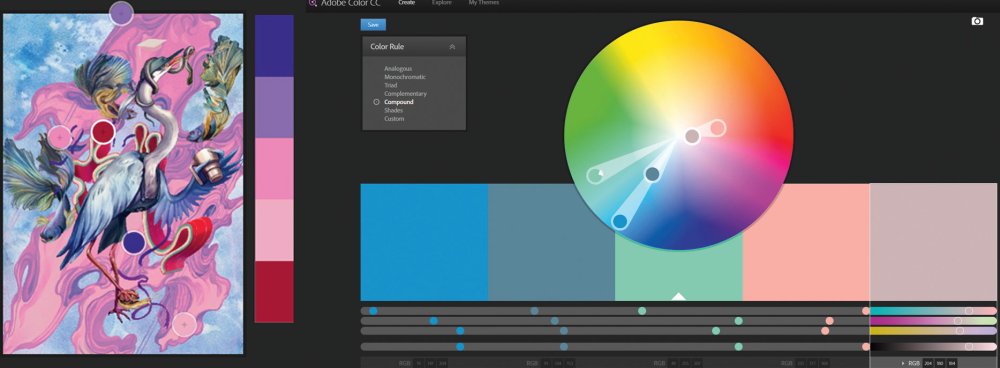
Before deciding on a palette, explore options with a character colour sheet
I use tools like Adobe Kuler and ColourLovers for inspiration – you can use Kuler to create a palette from an existing image. Before deciding on a palette, explore options with a character colour sheet (usually with flat colours). Also, keep in mind the usage and context of the image. If, say, it’s meant as a final asset in an environment, make sure it contrasts against the main environmental colours. I tend to use a neutral white light for shading, so that it’s easy to adjust the character art in different lighting conditions afterwards.
09. Colour psychology and symbolism
A character's colour palette can reveal their traits
People perceive colours differently (think of viewers who might suffer from chromophobia or experience colour blindness). But there are general meanings and physiological effects associated with colours. For instance, I tend to avoid fully saturated colours such as CMYK magenta, because it gives me a headache! There are some exceptions when a ‘pop’ aesthetic may be preferred.
In my example, the character is a heiress who’s revealed to be the main villain of the game towards the end. Her smaller stature and weak body makes her an unexpected villain, but the impression of vulnerability is further enforced with a predominantly pink and white palette, which signifies innocence. Whereas, the impression of inner darkness is supported by the presence of a darker palette.
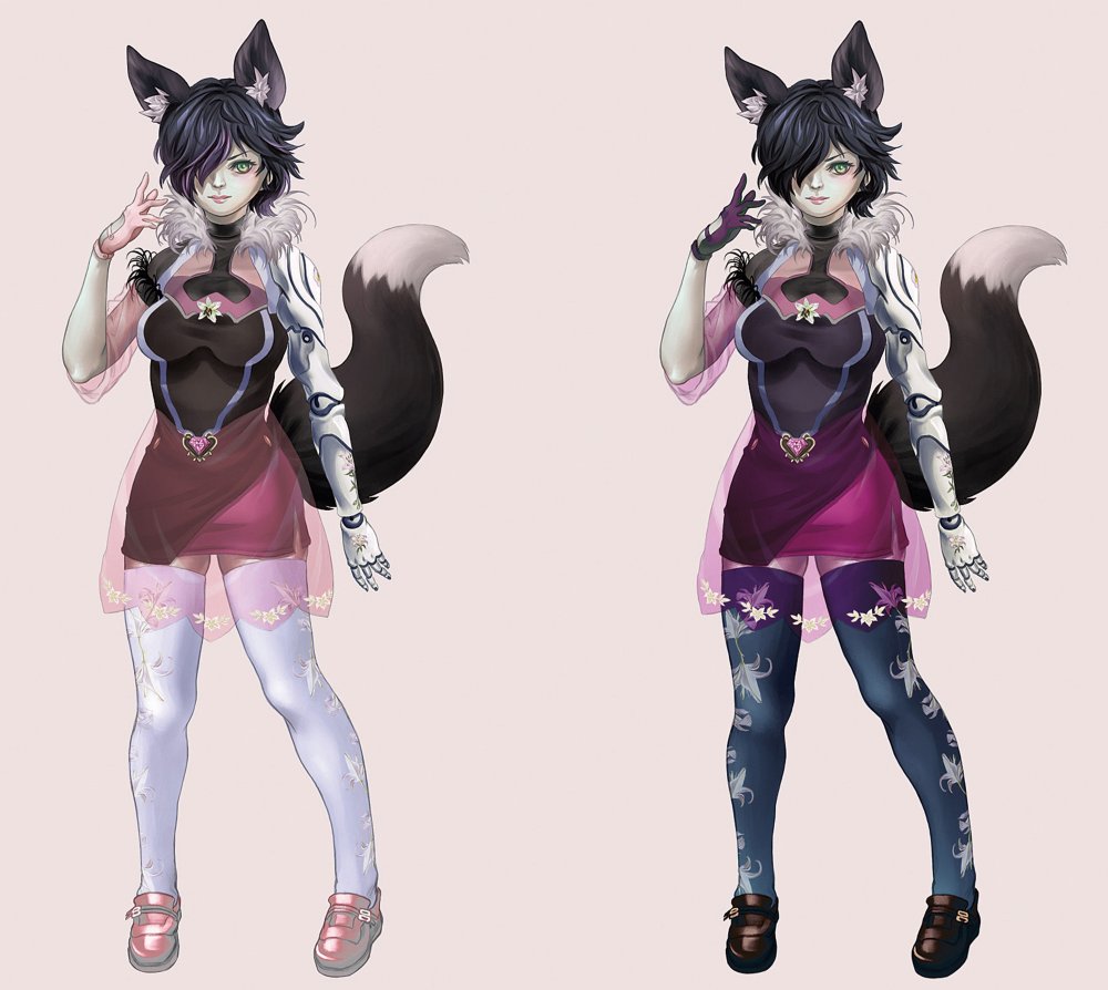
10. Change your colours
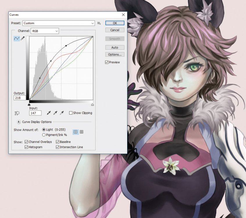
Make sure all the different parts of the character are on individual layers for ease of editing
If you want to change the colour on an element that's already rendered, first, separate out the elements. Make sure all the different parts of the character are on individual layers for ease of editing. If I want to change a character’s hair from black to pink for instance, I’ll use Photoshop’s Curve tool to brighten it first.
To do a gradient colour on her hair, ctrl-select the hair layer, and then place a solid gradient on a new layer. Duplicate the gradient layer multiple times, and play around with Color, Overlay and Screen blending modes.
To make other adjustments, I use Color Balance, as well as a separate layer set in Screen mode, to finalise the colour change. Sometimes, when there isn’t enough tonal information for the colour change, I’ll paint them in as needed.
Develop a story for your character
11. Create a focus
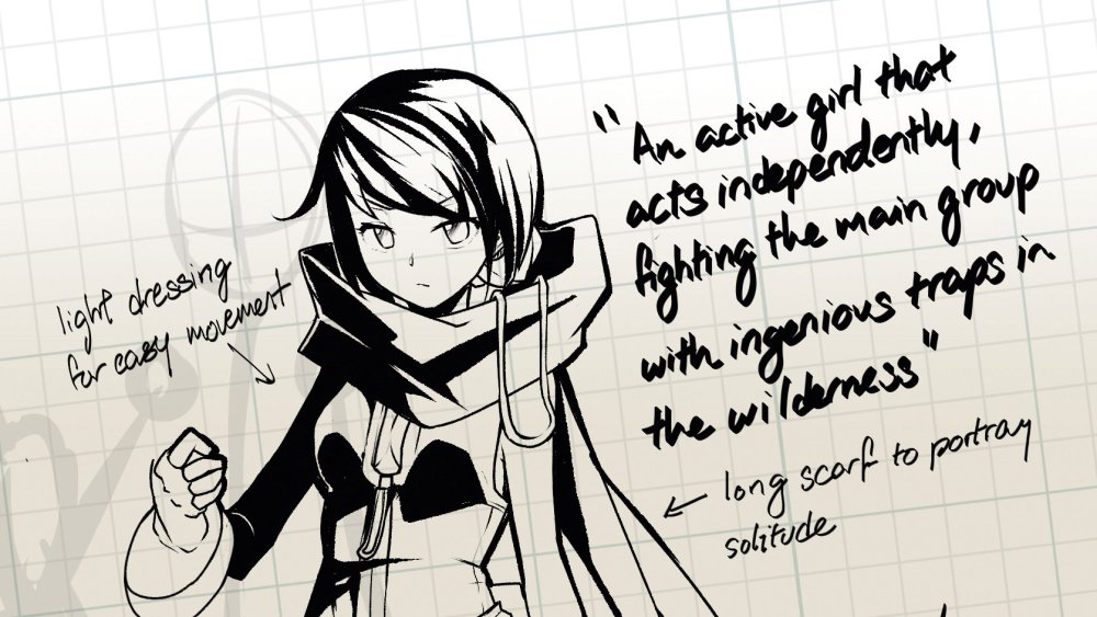
If you can't describe your character in one line, you need to rethink them
The key to creating a good character story is to have a strong centre to build your story around – the selling point that your readers can instantly recognise. It should be easily described in one succinct line. I use this one-liner to provide direction from which I develop the rest of my character’s story. Something as simple as 'a girl with a love of stationery and humanity thrust into circumstances beyond herself' can be enough to form the base of your character’s story.
12. Colour code characters

One effective way to differentiate characters is through colour
When differentiating characters, the quickest and most visible way to do so is by the use of colours. Colours can tell a story on their own, whether through the meaning of individual hues, or the relationship between certain colours.
I use purple for a character with royal poise and wit, and red for a go-getter type with a childish lilt. And the contrast between red and blue enables me to create a story of contrasting opinion and values.
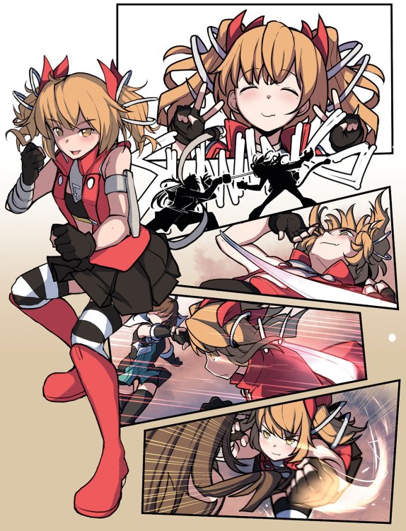
13. Create a distinct silhouette

Hairstyle and clothing help to make manga characters different from each other
Bodies come in all shapes and sizes in western comics. However, for manga, most body types and sizes fall within the same general categories, only differentiated by gender. In trying to create a distinct silhouette within the stricter rules of manga, I often fall back on two specific areas: hairstyle and unique design elements. I use contrasting hairstyles for my different characters, which allows for the variation in silhouette demanded for distinction. Where available, I also add unique shapes and objects to my clothing design to further set the silhouettes apart.
14. Tell a story through visuals
Everyday problems can help set the scene in manga comics
When introducing a character, it’s important that both their personality and abilities are displayed within the first few frames. To that end, in battle comics I ensure that their introductions enable them to fight an enemy.
I use this approach to establish the character’s verbal tics and choice of actions, as well as the powers and capability that they’re able to display. For a comic set in everyday life, I use a mundane daily task or scene for the same function, showing how the character approaches a problem that would be immediately familiar to the readers.
15. Begin with an end in mind

Your character's role in the story should influence their design
It’s relatively easy to create a character’s personality and traits. What isn’t easy is creating a role for the character. I begin this task by deciding what purpose this character will play in my overall storyline. I use something vague, but directional, like 'background character in the second arc', or 'mid-stage villain boss for the hero’s first battle'. This influences my choice of colours, elements and extravagance of design. After all, a throwaway character who appears in the background of two chapters will be much more subdued in design than one who has a major role in the hero’s development.
This article originally appeared in ImagineFX, the world's best selling magazine for digital artists. Subscribe here.
Read more:
-
When unboxing Wacom’s Intuos Pro medium, first impressions were a mix between thoughts about how great the tablet looks, and concerns over how long it will stay that way before becoming marked, scuffed and worn. In the box you’ll also find the Wacom Pro Pen 2, a stand, four coloured pen rings and a cable.
Documentation mainly consists of a couple of diagrams showing how to use the stand, which conveniently houses both the nibs and can be used to extract a nib from the pen. Lastly there are samples of rough, standard and smooth texture sheets. The sheets (sold separately) stick to the tablet work area, replacing the existing surface with a new texture, allaying fears of marking the tablet. the backing is of the ‘peel-off- and-throw-away’ variety, which is problematic if you chose to peel it off to switch between textures. It would prolong the pen nibs’ lifespan if the tablet shipped with the default smooth surface applied.
Before use it’s necessary to install drivers and firmware updates. Once done, you’ll want to open a Wacom account then hop into the Wacom Desktop center and fine-tune how the tablet functions to your preferences. Ignoring the fairly pointless set-up wizard, the other options provide a wealth of useful customisation tweaks, including: on-screen controls; orientation settings that are ergonomically designed for left and right-handed artists; touch settings for multi-touch gestures to navigate around your project; and ExpressKeys and touch ring functions, providing handy shortcuts that during testing became preferable to keyboard hotkeys for speed.
It does take time to adapt to the many features the tablet is capable of, which underlines its suitability for professional use and fast workflow.
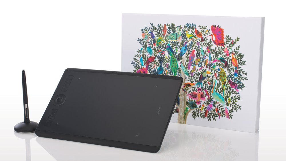
The Intuos Pro is a flexible tool for creative projects and helps you work in comfort
The medium version sports a slightly smaller physical footprint than its predecessor and yet gains a larger active area. Depending on your desk size you could place it alongside your keyboard if you prefer not to use the ExpressKeys and touch ring. However, taking advantage of these time-saving features and shortcuts is far more productive. It’s also wireless, with Bluetooth 4.2 helping you to declutter your desktop and work from your sofa.
Wacom Pro Pen 2
The Wacom Pro Pen 2 is incredibly responsive but feels slightly too sensitive with the default settings. Once set up, it does provide a very natural feel when drawing concept designs, texture painting and sculpting, and it performed well in Photoshop, Painter, mari, Maya and ZBrush during testing, although that was after a few hours of getting used to it.
There is very little noticeable lag, which can be a problem with cheaper tablets, and the pen is comfortable in your hand for long stints, providing superb pressure responsiveness and giving you innate control and precision for detailing. tilt recognition and 8,192 levels of pressure come into play the more you use it and is a noticeable gain compared to cheaper tablets on the market. Being 13.2 x 8.5 x 0.3 inches and lightweight it’s ideal for freelancers on the go, and the battery life is reasonable, allowing for a full day’s work.
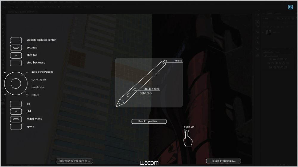
The Wacom Pro Pen 2 is comfortable to hold for long periods of time, and has impressive pressure sensitivity
The Pen’s stand however doesn’t grip the Pen suitably and it’s prone to being knocked over easily. It can be laid flat, but this doesn’t really solve the issue. Inside the stand base you’ll find the nibs; to open it you have to twist the base, but there isn’t much grip to make this an easy process and it’s quite stiff to open until it has been more worn in.
This article originally appeared in 3D Artist magazine.
Also read: The best Black Friday and Cyber Monday deals 2018
-
Wondering how to build an app? There are a number of different approaches that are now open to you. Tools such as React Native and Flutter (Google's recent addition to the party) are opening up new possibilities when it comes to mobile app development. Read on for our rundown of five different ways to build an app, to help to decide which one is right for you.
01. Native
The default way of developing on mobile is to write native code for each device – usually Java for Android and Swift for iOS. This can give you the best result, but the problem is that you then have two codebases to maintain.
02. WebViews
The earliest way to get around this was to build 'hybrid' apps that were essentially web pages rendered within an app container (referred to as WebViews). The Ionic framework is an example of this approach. This has limitations in user experience and relies on a JavaScript 'bridge' to interact with native services, which can impact performance.
03. React Native
The release of React Native gave us the ability to write JavaScript code (with React syntax) that used entirely native widgets. It still uses a JavaScript runtime but the presentation is not HTML and it doesn't use a WebView. This takes away a major limitation of older hybrid apps but can still suffer performance issues due to reliance on the JavaScript 'bridge'.
04. Flutter
While they offer similar reactive development styles, the major difference between Flutter and React Native is that Flutter dispenses with runtime JavaScript completely and compiles native code for multiple platforms. This offers superior start-up times and app performance. For more on this framework, take a look at our guide to [LINK getting started with Flutter].
05. Progressive Web Apps
One possible future for mobile development moves away from the native environment completely. Web APIs now enable much more extensive interaction between web pages and devices than in the past and service workers mean pages can be cached and work offline. The technology isn't quite there yet but some people are betting that the future of mobile apps is actually web technology. For tips on how to get the most out of them right now, take a look at our article on nine amazing PWA secrets.
This article was originally published in net, the world's best-selling magazine for web designers and developers. Buy issue 310 or subscribe.
Read more:
-
Planning upcoming marketing campaigns and hungry for inspiring visuals to take them to the next level? You've come to the right place.
Perhaps you're looking for evocative images of the autumn/fall season, or you need to piece together a last-minute Halloween-themed design? Are you already planning your big Thanksgiving campaign, or even thinking ahead to Christmas and New Year?
Read on for our pick of six stunning, premium stock images that could keep your seasonal campaigns fresh 'til 2019...
01. Spooky Halloween vibes

Halloween campaigns don't have to be full of witches, ghouls, and goblins – although if you go down that route, you'll find plenty of quality stock illustrations to get you going in libraries such as iStock by Getty Images.
As the nights start to draw in and there's spookiness in the air, try drawing inspiration from great horror movies. Use eerie imagery to create a sense of foreboding based on what you can't see, rather than what you can.
Full moons shrouded in wisps of cloud, such as the image above, dark, moody woodland clearings, and deserted, cobweb-draped cellars – these are all great background images to add atmosphere to your Halloween visuals.
02. Rich, colourful leaves

Autumn/Fall is a beautiful season, filled with burnt oranges, rich ochres, and striking reds. Whether you're creating a Thanksgiving campaign, launching a seasonal range of products, or just keen to reflect that distinctive palette in your designs, fallen leaves are a great way to do so.
You're spoiled for choice for premium assets on iStock by Getty Images, whether you need a stylish background image to add colour and texture to your design, such as the example above, or individual leaf elements to position as you see fit. There's a rich selection of illustrated elements to choose from, too.
03. Dramatic firework displays

Whether it's Guy Fawkes Night in the UK or Thanksgiving in the States, Autumn/Fall is synonymous with fireworks on both sides of the Atlantic – and of course, if you're planning campaigns ahead for New Year's Eve, the whole world gets involved.
Vibrant images of fireworks evoke excitement, awe, and wonderment. You can almost smell the gunpowder lingering in the air. Unless you're a pro at night-time photography, firework displays are notoriously difficult to capture effectively, but there are plenty of premium images to be found at iStock by Getty Images.
One great aspect of fireworks images is they tend to be naturally set on a clean, black flat-colour background – like the example above – making them easy to work with for campaign graphics that need text set in negative space. More dramatic, close-up images also make striking backgrounds.
04. Warm, crackling fires

If there's a nip in the air outside, few things are more appealing than a welcoming fire, crackling in the grate. As we enter woodburner season, examples such as the one above make great background images – you can almost feel the warmth, and catch the rich aroma of woodsmoke on the air.
Homely hearths are too small-scale for Guy Fawkes Night campaigns, of course – UK designers can supplement all the fireworks imagery with depictions of giant, roaring bonfires. Look for examples shot against black for maximum versatility.
05. Mouth-watering feasts

Nothing captures Thanksgiving or Christmas quite like a table full to bursting with delicious, seasonal food. If you need a mouth-watering background image for your next campaign, iStock by Getty Images can help you there.
Designed specifically for framing text as part of a campaign graphic, carefully art directed images such as the example above leave ample space for you to work with in the centre. Alternatively, a more packed table can make an ideal background to lay text on top.
06. Sparkling white snow

As Autumn/Fall slips into winter, crisp, colourful leaves give way to something colder, but no less beautiful. High-quality macro images of sparkling frost make evocative campaign backgrounds, while a layer of snow captures the magic of Christmas.
Sharp blades of frozen grass, such as the example above, encapsulate the onset of crisp, frosty weather, as well as being visually striking in themselves. And when it comes to snowy scenes, you’ve got a lot of options to choose from on iStock by Getty Images – an image of fresh snowfall on a pine forest, for instance, captures the mood of the festive season perfectly.
Whether you're looking for beautiful background photography or versatile illustrated elements, iStock by Getty Images is the perfect solution for all your seasonal campaign assets. The original resource for premium, royalty-free stock imagery, iStock offers millions of assets including its own exclusive imagery. Until December 31st, you can get 15% off an annual subscription: use code ANNUAL15 at checkout.
-
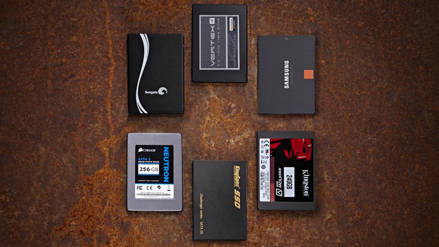
Anyone working in the creative industries knows the importance of having plenty of storage options. Internal hard disks, and especially SSDs, can quickly fill up when you're banging out multiple versions of massive image files for clients, and even if you have plenty of room on your computer it still pays to have an external drive for backup purposes.
With Black Friday coming around, now's the perfect time to upgrade your external storage. That's why this year we'll be combing the web for the best Black Friday external hard drive deals; here's what you need to know.
The best Black Friday/Cyber Monday external hard drive deals: what we expect to see

External drive bargains won't be prominent, but you'll still find them
Let's be clear: external drives aren't especially sexy tech, so you're not going to see much in the way of headline-grabbing Black Friday hard drive deals. If you're after a bargain external drive then you're going to have to look hard for it; or rather, just sit back and let us do the hunting.
Your best bet for a getting a great deal on an external drive is to keep an eye on the big names. Companies such as Western Digital, Seagate, LaCie and Sandisk are notable for having large ranges of external drives, and they're introducing new models on a pretty regular basis.
This means that come Black Friday and Cyber Monday, they're likely to have plenty of stock of models that have either been recently superseded by a newer version, or simply aren't selling as well as other external drives in their range, and these will be the most obvious candidates for the best deals.
Our top tip for Black Friday bargains is to look out for Western Digital offers. The company has recently reported a big drop in profits, and it might try to tackle this by driving Black Friday and Cyber Monday sales with some attractive deals. Watch this space.
How to get the best external hard drive deals on Black Friday/Cyber Monday

Hard disks give you loads of storage, but they're not fast
If you have your heart set on Black Friday external hard drive deals then the best thing you can do is start looking out for them now. There's an increasing amount of competition between retailers to shift their discounted stock, so every year we're seeing stores and sites kick off their Black Friday sales earlier.
Figure out your budget and exactly what kind of drive you're looking for. If you need plenty of storage and aren't too worried about transfer speeds then you should probably concentrate on old-fashioned hard drives; they might not be fast but they'll give you a lot more gigabytes for your buck.
If speed's important, though, you should look for an SSD instead. They're fast and reliable, and because they have no moving parts they're a lot more suitable for taking out and about with you. The downside is that you get a lot less storage than you would from a comparably priced hard disk.
Always look for big name brands such as Western Digital or Seagate when you're searching for an external drive; not only are these where you'll probably find the best deals, you can also be much more certain of getting a reliable drive that won't fail on you. If you spot a dirt-cheap drive from a brand you've never heard of, look around for reviews to get an idea of its reliability; it could be cheap for a very good reason, and it's probably not where you want to stash your important backups.
Don't forget to check an assortment of retailers for the biggest choice. Amazon's Black Friday deals are always worth a look, but explore some other online stores as well. Some of them might have cashback offers that could save you a bit extra, so that's always worth looking out for.
Finally, use the same common sense that you would when making any purchase online; check the guarantee, make sure you're buying from a reputable store, and keep your receipt just in case you change your mind later on.
External hard drive features/specs that creatives should look out for
SSDs are lightning quick and a lot less fragile than hard disks because they have no moving parts
Once you've decided whether you need a hard disk or an SSD, the key thing to look for is the amount of storage you'll get. It all depends on your needs, naturally; 500GB is probably fine if you don't work with enormous files, but if your business involves videos then you're probably well into terabyte territory.
Beyond that, the most important thing to check is what type of connections an external drive has. At the very minimum you'll need a USB 3.0 connection; anything less and you'll be waiting ages for your files to transfer back and forth. If you have a recent Mac then it may have a Thunderbolt 3 port; if so, try to find a drive that's compatible and you'll get lightning-fast transfer speeds.
3 external hard drive to look out for on Black Friday/Cyber Monday

For an excellent all-round external hard drive, you'll have a tough job beating Western Digital's My Passport 4TB. The latest generation features excellent transfer speeds and cloud storage options as well as 256-AES encryption to keep your files safe, and WD's backup software will take care of transferring your data.
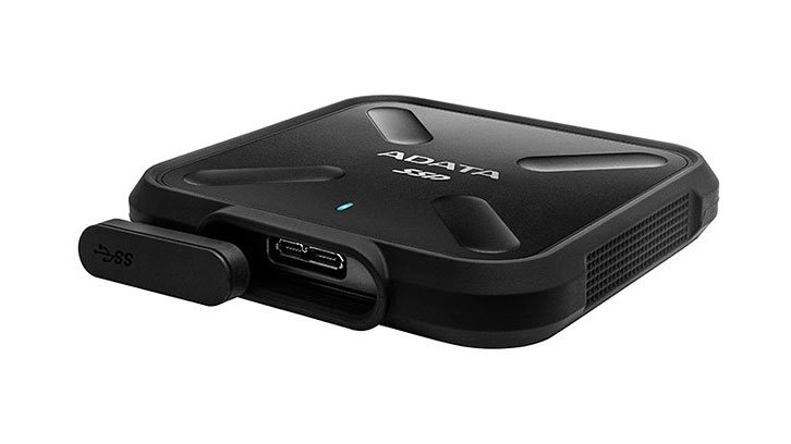
If you want a fast, portable drive that won't cost the earth, Adata's SD700 External SSD presses all the right buttons. It's an SSD with excellent transfer speeds that can take quite a bit of mistreatment; its IP68 rating means it can withstand dust, dirt and sand, and it's resistant to submersion in up to 1.5m of water for up to 30 minutes. It's available in capacities up to 1TB.
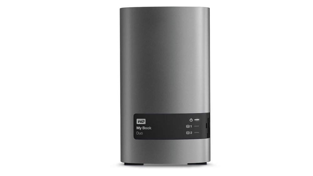
Serious about protecting your files? This 16TB monster from Western Digital is for you. You can either use the full 16TB, or you can instead run the My Book Duo's two 8TB drives in a RAID configuration, meaning that should one fail you'll still have a safe backup on the other. This USB 3.0 drive also features 256-bit AES encryption and automatic backup software; bear in mind though that it's formatted for Windows, so if you're on a Mac it'll need reformatting.
Today's best pre-Black Friday external hard drive deals
What's that? You can't wait until Black Friday to grab to grab a lovely external hard drive deal? Fear not; we've found all the best deals available right now.
Related articles:
-
Owning a MacBook is, for many designers, the impossible dream. They're so thin and pretty and swish, but lord, they're expensive. The great news is that Black Friday and Cyber Monday 2018 are just around the corner, which means it's the perfect time to snap up a MacBook without getting stung for the full whack.
We'll be keeping tabs on all the Black Friday MacBook deals for you this year so you won't miss a trick; read on for all the important details you need to know so that you're all set to drop your hard-earned readies on a shiny new Apple that's right for you at the best possible price.
The best Black Friday/Cyber Monday MacBook deals: what we expect to see

Don't expect to see many serious price cuts on the vanilla MacBook
The vanilla MacBook is a popular choice, and it's easy to see why; if portability is your thing, it's worth noting that the most recent 12-inch MacBook is both thinner and lighter than the 13-inch MacBook Air, with better specs and a Retina display.
What this popularity means, though, is that you're unlikely to see much in the way of massive Black Friday MacBook deals. Keep your eyes peeled and you'll spot some tasty discounts, but don't expect to get much more than 10 per cent off and be prepared to act fast, as these deals are likely to get snapped up quickly.
The best Black Friday/Cyber Monday MacBook Pro deals: what we expect to see

The MacBook Pro is available with a Touch Bar, for a price
If last year's Black Friday MacBook Pro deals are anything to go by, you could make some major savings on the top-end models in Apple's MacBook range this year, especially if you're prepared to make do with an older model. On lesser laptops this might be an issue, but even an old MacBook Pro is ludicrously powerful compared to the average laptop, making it well worth taking a punt.
The MacBook Pro's high price – especially, say, the touch bar models – means it's easier for retailers to deliver a huge temporary price cut and still turn a profit, so if you're looking for a powerful creative laptop it's worth bearing in mind. You'll still be paying out quite a bit for it, but it'll be worth the expense.
The best Black Friday/Cyber Monday MacBook Air deals: what we expect to see

It's getting on a bit, but the MacBook Air could be a good bargain option
The lightweight MacBook Air hasn't seen much love from Apple over the last couple of years. There are rumours that Apple's about to refresh the Air as an entry-level machine aimed at students, and it may well drop the 'Air' designation when it does it, and that's a good sign that there may be some fantastic Black Friday MacBook Air deals on offer this year as retailers clear out their old stock.
The downside to plumping for an Air is that it's the least powerful MacBook you can get, and it's not even the thinnest and lightest any more. However if you simply have to have that MacBook cachet but you're on a budget, it's the obvious choice.
The best US Black Friday/Cyber Monday MacBook deals in 2017
What sort of MacBook deals can you expect to find this year? Here are some of the great deals we found in 2017 to give you an idea.
The best UK Black Friday/Cyber Monday MacBook deals in 2017
There weren't quite so many hot MacBook offers in the UK last year, but we still managed to dig up a few gems.
How to get the best MacBook deals on Black Friday/Cyber Monday
Preparation is key when it comes to getting good Black Friday MacBook deals, especially when you bear in mind that a lot of retailers can't wait for Black Friday, and are likely to start shipping their bargains well in advance of the big day. In the run-up to Black Friday and Cyber Monday we'll be keeping tabs on new deals as they appear, so keep checking back for offers that you won't want to miss.
You'll need to decide whether it's a vanilla MacBook you want, an Air or a full-fat MacBook Pro. If you're planning to use your new MacBook as an all-round work machine then it's worth holding out for a good deal on a Pro as it'll be able to cope with just about everything you throw at it. If you're less of a power user then the ordinary MacBook should suit your needs, and while the Air's more limited it should be the one to go for if you want a MacBook at rock-bottom prices.
Beware of older models – they're likely to see the biggest discounts but they'll be packing less power than more up-to-date machines. And of course, use a bit of common sense while shopping; look out for cashback offers, always check the guarantee and make sure you keep your receipt in case of faults or buyer's remorse.
MacBook, MacBook pro and MacBook air features/specs that creatives should look out for

Many MacBooks are severely lacking in ports; bear that in mind when make your choice.
There might only be three main models of MacBook to choose from, but there are plenty of variations in the line that are well worth noting when you're looking for Black Friday MacBook deals. Firstly, the CPU: the MacBook Air's is the least powerful of the lot, with an old Intel Broadwell chipset running at 1.6GHz, or 1.8GHz for more recent models. Both the MacBook and MacBook Pro boast beefier chipsets; Kaby Lake for 2017 models and Skylake before that. As a rule the MacBook Pro packs faster-clocked processors than the vanilla model, and the 15-inch MacBook Pro has quad-core CPUs rather than dual-core.
Lower end MacBooks – the Air and the 13-inch MacBook Pro – only give you 128GB SSD, which is likely to mean that you'll need to invest in some external storage. All other MacBook models feature 256GB SSD; bear in mind that if you work with large files then you'll probably burn through that pretty quickly.
If you're going to need to plug peripherals into your new MacBook, check the number of available ports; the standard MacBook only has one USB-C port, while most MacBook Pros have four. Meanwhile the older MacBook Air has three ports; they're USB 3.0 and Thunderbolt 2, and while they shouldn't give you any problems, bear in mind you might need an adapter for more recent peripherals.
Display-wise, all the MacBooks apart from the Air feature crisp Retina displays (the Air has a 1440 x 900 screen). And they'll all serve you well in terms of battery, but watch out for MacBook Pros with a Touch Bar; Apple claims that this makes no difference but our friends at TechRadar have found that the Touch Bar can take a fair toll on battery life.
3 MacBooks/Pros to look out for on Black Friday/Cyber Monday
If you need all the power you can handle and don't mind paying for it, the 15-inch 2018 MacBook Pro is the only way to go. Powered by a six-core Intel Coffee Lake processor and with the option of AMD Radeon Pro graphics, there's little this machine can't cope with. Storage options go from 512GB up to 4TB of SSD, and you can have 16 or 32GB RAM. In short it's a mighty creative powerhouse that won't let you down, assuming you have the means to afford it.
You may have read complaints about the temperamental Butterfly keyboard on recent MacBooks; the latest MacBook Pro still features it, but it's an improved version with less noise and more reliability. This model also features a Touch Bar that'll give you time-saving, context-sensitive commands for various apps, as well as an up-to-date CPU and plenty of storage and memory options. If you want an entry-level MacBook Pro, this is the one to go for.

Don't need the power of a Pro? This vanilla MacBook should suit you nicely; it's super-portable and lightweight, with a 12-inch Retina screen, and as long as you don't mind paying the extra it's a much more attractive prospect than the ageing MacBook Air. It's low on ports, but that's the price you pay for such a slimline machine, and if you need a reliable MacBook that you can take anywhere then this is really the only choice in town.
Today's best pre-Black Friday MacBook deals
So, you've got all excited about MacBooks and you really can't wait for Black Friday? Don't worry, there are plenty of deals available right now; take a look through these offerings.
Related articles:
-
You're reading Postcards – Responsive Email Templates Builder [Full Overview Video], originally posted on Designmodo. If you've enjoyed this post, be sure to follow on Twitter, Facebook, Google+!
![Postcards - Responsive Email Templates Builder [Full Overview]](https://designhost.gr/applications/core/interface/imageproxy/imageproxy.php?img=https://designmodo.com/wp-content/uploads/2018/10/postcards-review-747x420.jpg&key=0e3a9844ebc0611778396cdbc36da70362b471fad940da9b739536a586c8d298)
Postcards is used to create beautiful emails or newsletters HTML templates in minutes with drag and drop features and ready-made modules. You can create professional emails super fast without having any knowledge of code!
-
Being a successful designer in this digital age isn’t just about having strong creative and conceptual skills. As modern technology evolves, a designer’s skillset now needs to be vast in order to stay relevant, with the crossover of disciplines - web and graphic designer, illustrator and web designer, etc - becoming more and more apparent.
But while designer’s may well need to dip their toes into new disciplines to stay ahead of the digital game, the good news is demand for skilled creatives is also on the up. As this free-to-download white paper from no-code apps and content company Rakuten Aquafadas explains, the enterprise content landscape has changed significantly in recent years, and companies wanting to deliver quality, engaging content are quickly realising how crucial a designer’s role is in achieving that.
With that in mind, the future certainly looks bright for designers who possess the skills to work across a range of mediums and platforms. But what if your creative portfolio is somewhat lacking in digital-based disciplines? That’s where Rakuten Aquafadas can help, arming designers, with no technical ability, the tools to build highly interactive, cross-platform content and mobile apps with ease and speed. Rakuten Aquafadas tools are so intuitive, designers can create apps either by enriching existing content or developing new digital content from scratch, delivering a finished product in just three weeks!
Zero coding

Rakuten Aquafadas technology enables the creation of highly interactive content and cross-platform apps without a single line of code
The thought of tackling apps and interactive content, which might require knowledge of coding, can be a daunting prospect for some designers. Rakuten Aquafadas solutions remove the stress of searching for technologies which allow the creation of highly interactive content and the need for expensive external developers, and has instead made creating these kinds of digital projects accessible to everyone. Using easy-to-use tools, designers are able to simply drag and drop components to create cross-platform native apps - not a single line of code is required.
Once the content is built, it can be published on multiple operating systems, including iOS, Android, Windows, MacOS X and the web (including ePUB and HTML5 content), so catering for everyone’s needs is a synch.
A simple adjustment
Rakuten Aquafadas technology means creatives with little digital experience no longer need to feel held back or miss out on new opportunities. The tools on offer allow creative professionals to adequately meet the demands of today’s digital climate. So whether you want create sales brochures, product demos, sales enablement materials or ‘wow’ at an interview with an impressive presentation, Rakuten Aquafadas allows you to do so with ease.
The design landscape is changing, and having relevant creative skills is getting more challenging every day. Rakuten Aquafadas tools remove the need to spend time and money learning a new craft. Thanks to its InDesign Plugin, designers can use already familiar tools to create highly interactive, stand-out digital content that was previously out of reach.
-
-
An unsophisticated but effective botnet is targeting exposed cloud servers and racking up millions of infections.
-
When it comes to tablets there's one brand that so far ahead of the rest of the pack that it's not even funny: the iPad. And with Black Friday 2018 fast approaching – that's 23 November if you need to make a note on your calendar – now's the time to be thinking about finding the best Black Friday iPad deals.
Of course you may be happy with another brand of tablet – if so, check out our guide to finding the best Black Friday tablet deals. Otherwise, read on to be prepared for scoring anything from an iPad Mini up to a hefty iPad Pro without paying the full whack.
The best Black Friday and Cyber Monday iPad deals: what we expect to see
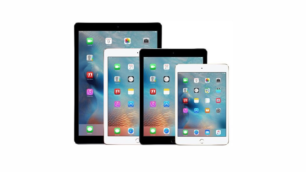
New models could mean big discounts on older stock
Apple isn't exactly renowned for rolling out massive price cuts on its gear, so if you're hoping for some epic Black Friday iPad deals then you'd be wise to temper your expectations a little. That said, at the time of writing Apple is gearing up to announce new models, which could translate into bargains across the iPad range if you're happy to make do with some older tech.
Word is that Apple's going to launch new 11- and 12.9-inch iPad Pros with the A12 chipset, razor-thin bezels, Face ID and a USB-C port, so if these are on sale by Black Friday 2018 then it's a fair bet that you'll be able to snag some significant Black Friday iPad Pro deals on older stock.
There's also talk of a long-overdue update to the iPad Mini, with a faster chipset and cheaper display. Again, expect decent iPad Mini 4 Black Friday deals if this comes to pass.
As for the standard 9.7-inch iPad, that received a major update earlier in the year, adding Apple Pencil compatibility among other things. We doubt you'll find much in the way of major discounts on this one, but if using a Pencil isn't high on your list of priorities then you'll be likely to save on a 2017 model if you shop around.
The best US Black Friday and Cyber Monday iPad deals in 2017
What sort of Black Friday Apple iPad deals can you expect this year? Here are some of the best from last year to give you a clue.
The best UK Black Friday and Cyber Monday iPad deals in 2017
Meanwhile, here are some of last year's iPad deals from the other side of the pond. Hopefully there'll be more options this time around!
How to get the best iPad deals on Black Friday and Cyber Monday
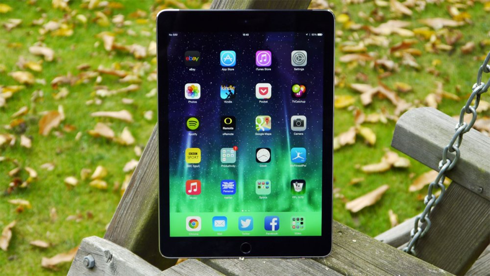
Be prepared to shop around to find a good deal
If there's one thing you can be sure of when it comes to Black Friday iPad deals, it's that they're going to be in short supply, and serious discounts are going to be even more rare, so you're going to need to be prepared to leap on a good deal as soon as you spot it. The best offers are likely to appear as lightning deals with limited stock available, so keep checking back here for news on them as soon as they come up.
For the best chance of finding great Black Friday Apple iPad deals, you'll need to keep an eye on as many retailers as possible; Amazon had some good deals last year and you can expect some more this time around, but you're also likely to find savings from eBay as well as major electrical stores. If you're in the USA, watch out for deals from Walmart and Newegg, while in the UK firms such as Currys PC World and John Lewis are likely to come up with the goods.
Decide in advance roughly what model you're after; do you want a standard iPad, a Pro or a Mini? And watch out for retailers shifting older models at knock-down prices; they'll look pretty much the same but you'll have to make do with poorer performance than the latest iPads, especially if you're running iOS 12 on aged stock.
Finally, try to overcome your Black Friday excitement and take the same care you would for any other major purchase. Check for cashback offers, make sure the guarantee's going to cover you if something goes wrong, and make sure you keep your receipt in case you need to return your shiny new purchase.
iPad features/specs that creatives should look out for on Black Friday
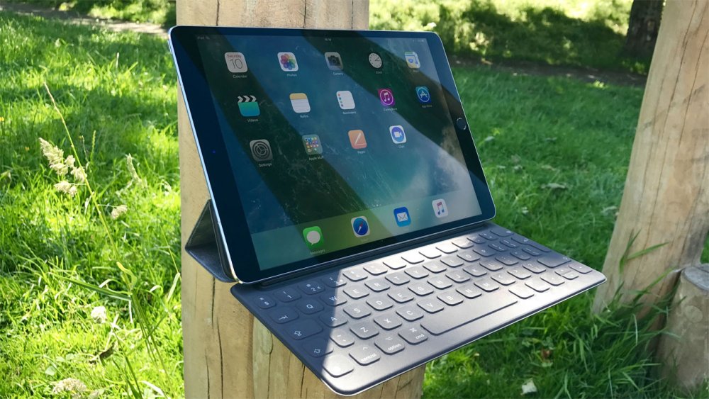
If you want to use the Smart Keyboard you'll need an iPad Pro
The beauty of the iPad range is that you don't need to worry too much about specs; the major distinction between models is the amount of storage you get, and whether they're Wi-Fi or cellular, and these options can make a big difference to the price.
If you're likely to fill up your iPad with photos, videos and music then you should naturally opt for as much storage as you can comfortably afford (up to 512GB on the iPad Pro), but do you really need to pay the extra for a cellular model? The smarter option is to tether a Wi-Fi iPad to your iPhone, and use that for a mobile signal when you're out of range.
None of the iPads currently on sale are particular slouches; however for the best performance look out for the 2018 9.7-inch iPad or the 2017 iPad Pros. These pack the A10 and A10X processors respectively, which clock in around 30 per cent faster than the previous generation A9 processor.
And of course if you want to use your new iPad for drawing then be sure to plump for a model with Apple Pencil support. This used to mean buying an iPad Pro, but as of 2018 the standard 9.7-inch iPad has Pencil support, although whether or not we'll see much in the way of deals for that model is another matter altogether.
3 iPads to look out for on Black Friday and Cyber Monday

If size matters to you then this is your only serious iPad choice. The 12.9-inch iPad pro is the closest you'll get to a 2-in-1 touchscreen MacBook, and it's brilliant for both productivity and entertainment.
Its huge, sharp screen is ideal both for drawing with the Apple Pencil or for showing off images and video to best effect, and if you add a Smart Keyboard to the mix then it becomes just the thing for getting admin work done wherever you may be.
The massive screen could be a drawback if all you really want is a tablet, but if you're after something portable that can adapt to pretty much any scenario then you really can't go wrong with this model, just so long as you can afford the steep price.
This surprise 2018 addition to the iPad range is ostensibly aimed at the student market, but its USP – it's the first non-Pro iPad to support the Apple Pencil, makes the new iPad a must-have for budget-conscious creatives.
Its big downside is that it's not compatible with the Smart Keyboard, making it less of an all-round workhorse than the Pro range, and the maximum storage you can get is 128GB. But if you can cope with these little drawbacks then this is absolutely the best standard iPad available.
The iPad Mini 4 is definitely showing its age; launched in 2015 it's saddled with an A8 processor rather than the the A10-series chipsets in the Pro and iPad 9.7 (2018), but that's just about its only disappointing area (and to be fair, the A8's still pretty powerful).
Small and light with a beautifully bright 7.9-inch screen, it's a lovely little piece of portable kit that can do just about everything its bigger siblings can, and if you're on a limited budget then it's definitely the iPad to opt for; maybe more so if Apple updates the Mini in time for Black Friday, resulting in even bigger discounts on the Mini 4 as retailers clear their old stock.
Today's best pre-Black Friday tablet deals
It's not long now until Black Friday 2018, but if you really can't wait for a deal then don't worry; we've gathered together some of the best iPad deals available now.
Related articles:
A designer's guide to printing a poster
in Ειδήσεις από τον χώρο του Design και Hosting
Posted · Report reply
Taking digital designs into the real world can be fraught with gotchas and gremlins. We’re so used to the world being digital that some of us have forgotten how to prep our work for print. This poster printing guide is here to help.
If you’re thinking of doing a run of poster designs for a campaign, party or gig (or simply to adorn your own walls with) here’s a guide to how to print your work. Follow our tips and you'll soon be poster printing with confidence – and you'll no longer have to worry about that guy in the printing shop laughing at you...
If you don't want to go to a professional, or if you want to try and few practice runs with your design, you'll need the right printer. Take a look at our roundup of the best home printers for some guidance.
01. Design in CMYK

Work in CMYK rather than RGBIf you're producing your own designs with the intention of taking these to a poster printing shop, then make sure you're working in the CMYK colour space rather than RGB. In Photoshop you can easily switch to this mode via 'Image > Mode > CMYK color'. This colour mode will give you a more accurate representation of how your colours will print.
02. ... or convert to CMYK
If you’ve been working in RGB and have converted your work to CMYK, just before you send the file for printing you may notice the greens and blues in your image have become lifeless and dull. You can use Photoshop’s Gamut warning tool ('File > View > Gamut warning') to highlight the colours that will have trouble converting from RGB to CMYK.
The RGB colour space has a greater array of colours than CMYK. Remember: all the computer-specific colours you pick in Photoshop for your poster then have to be printed with a selection of real-world inks. Those that can't be replicated will become 'out of gamut', and be printed with what is possible with the available inks.
03. Use vectors if possible
Designer Franz Jeitz advises: "When it comes to printing, especially large-format printing, vectors are your friend. Try to design as much as possible in a vector-based program such as Adobe Illustrator. Not only will it reduce your file size, but it will ensure that you get the crispest print result."
04. Work at 300DPI
Skinn's super-sized posters for a Belgian arts centre
Print files are BIG. One of the most common delays in poster printing jobs is work being sent back by the printer because the resolution is too low. Files destined for print should be set to 300 DPI (dots per inch). Simply put, the more dots that make up the image, the higher the resolution. More printed dots in an inch means a higher-quality reproduction.
If your resolution is too low, you're going to end up with a blurred and pixelated poster. In Photoshop you set the dots per inch when you create a new document ('File > New'). 300DPI is the standard resolution you want for a good quality print document.
05. Select your paper
Popular poster printing sizes are A2 (594mm x 420mm), A3 (420mm x 297mm) and A4 (297mm x 210mm). Paper choice and weight can be discussed with your printer, but 170gsm Silk or Gloss Art FSC or 150gsm are good choices. GSM stands for grams per square meter and determines how heavy the paper stock is.
06. Supply files as PDF
Supply your print files in the PDF format (print resolution at 300 DPI) or tiffs with no compression at the same DPI. It is possible to send JPGs if they’re high-res enough. So if you just want to print a poster of your pet pooch from a photo on your smartphone you can do this by sending a JPG, but be warned: the edges of the photo will be cut off and the colour will shift.
07. Consider litho printing
You'll need to decide between digital and litho printing
You have two choices for poster printing: digital or litho. (Well, okay you have three: you can always print at home. But chances are you don’t have a printer big enough.) A wide variety of mass-produced print items (books, posters, newspapers and so on) are produced using litho printing. Put simply, a litho print involves the printer making a set of 'plates' that are used to press the image to the paper.
Creating these plates comes at a cost and doesn’t offer the immediacy of digital poster printing. The initial outlay can be expensive, but if you’re doing a large print run and want to output up to A1, it’s the process that offers a higher quality print and finish than digital printing.
The choice between digital and litho printing will mostly be dependent on the money you have for the print job and how soon you need it doing. Digital printing with inkjet or laser printers is the cheaper and quicker of the two and good for smaller print runs. If budget is an issue and you’re not being too exacting over the quality, go with digital printing. This is also fine if you're not going above A3.
08. Choose the right poster printing shop
Different printers have different levels of expertise, so it's worth doing your homework and getting personal recommendations. Also make sure you tailor the printer to the job at hand.
In the UK, for example, Metroprint is well known for high quality and specialist work as well as being one of the few places around to use laser light source printers and genuine black and white photographic prints. For high quality, crystal clear prints on heavy stock, quality Kodak paper these are the people to visit.
However, you might just want to print lots of stuff digitally without a special finish or on the highest grade paper. So don't write off high street poster printing at places such as Prontaprint and Snappy Snaps. There's a reason they're everywhere: they offer a decent, affordable service and will print your photo posters direct from a memory stick, mobile phone, Instagram or Facebook. They can also help you enhance your work with a range of photo art effects.
Next page: bleed rules, vectors, and the final checks you should be making...
09. Check your spelling!
Even if there are only a few words – as on this poster series by Fatih Hardal – double and triple check them
Luke Woodhouse advises that you to "spellcheck, spellcheck, spellcheck. Then get your mum to spellcheck it and anyone else who will read it for you. There's nothing more soul-destroying than a typo, and they're easy to miss if you're too close to your masterpiece." And that goes for the big words as well as the small ones – its not uncommon to caught up in checking the small print, only to miss a glaring error in the headline.
10. Set the correct bleed
What is bleed? It's simply a little margin (usually 3 or 5mm) around the edge of your poster design that, depending on how the printer cuts the paper down, may or may not be shown in the finished result. It's essentially your room for error and ensures there isn't a random white line on the edges of your printed poster.
Programs such as InDesign and QuarkXPress make it easy by showing you guides, so you can see where the bleed starts and finishes. Always ask the printer you're using (or check your own printer settings) to determine how much bleed is required for your poster printing.
11. Consider the trim
The trim is the edge of the final printed output. To prevent text or logos being chopped off the final output, they should be placed with some breathing space around them. Design elements should be no closer to the trim edge than 3-5mm, depending on the size of the poster.
12. Run a pre-print check
Always run a pre-print check. This will bring up any issues, such as RGB files being used or fonts used that aren’t embedded. In InDesign this is known as a 'pre-flight'. The programme can package up all your print files and links ('File > Package') into one folder, which will spare you any missing font nightmares.
13. Get your blacks right
Ben Powell advises you avoid RGB black as it will look grey in printBen Powell suggests: "When printing posters using black, there are so many different types of black you can use (RGB, Photoshop, neutral rich, registration, flat, designer, and so on).
"My tip would be to avoid RGB black as this is primarily used for the web/digital and will look washed-out and grey in print. Which black you should use will depend entirely on your printing process and what paper stock you're using, especially if you're printing solid blacks.
"When I designed a recent infographic piece, I spent days printing various different blacks on different stocks of paper to get the most accurate black whilst making sure the colours didn't bleed into each other; a really lengthy but worthwhile process. Always leave plenty of time to test your blacks – it can completely ruin a fantastic poster design if you don't."
Related articles:
View the full article