

Rss Bot
-
Content Count
18,858 -
Joined
-
Last visited
Never -
Feedback
N/A
Posts posted by Rss Bot
-
-
Websites that are slow to load, hard to read and confusing to navigate aren't good for users or clients. Here are some of our top web design bugbears; feel free to join in and let us know what design quirks you find annoying.
01. Light grey text on a white background
A poor contrast ratio makes your text hard to read, so why do we see it so often?
A design trend that many regard as unfortunate has taken hold in recent years: the use of light grey text on a white background. Sometimes the lack of colour contrast even gets paired with a tiny typeface, making the resulting copy uncomfortable to read even for people with good eyesight, and totally inaccessible for those with any level of visual impairment, which is quite a lot of people.
The thinking behind grey text rather than black is that too much colour contrast can cause eye strain. This is true, but it's important to make sure you're striking the right balance between the visual assault of black-on-white versus ghostly text that fades into the mist. The first thing to know is that the W3C Accessibility Guidelines state that you need a minimum contrast of 4.5:1 for most text, so making sure you hit that is a good starting point.
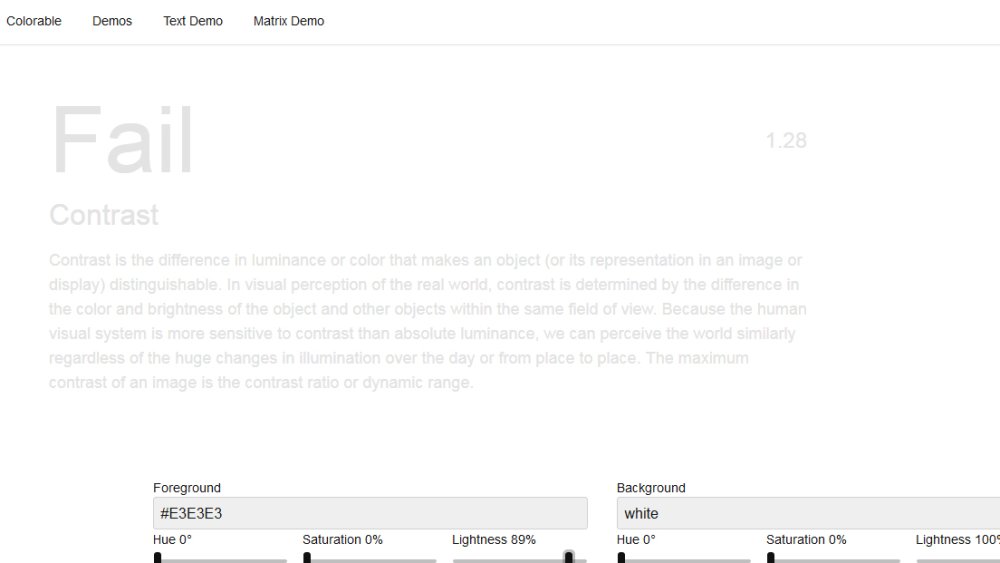
Lea Verou's Contrast Ratio tool is good for getting the mathematical information about your colours, and there's also some sample text so you can see how it looks. It will accept colours in any format: words, hsla or hex values, and it tells you whether you're compliant with the accessibility guidelines.
Colorable (pictured above) is a good option for judging by eye, and it has sliders so you can tweak things until it's just right. Remember that testing text colours on different devices and lighting situations is important – what's readable on your high-end screen might look very different on another device. Even if you've hit the minimum contrast ratio for accessibility, there are other factors that affect how text actually appears to the end user – so testing is the only way to make sure you've got it right.
02. Modals
Modals are taking over the web – here are some things you can use instead
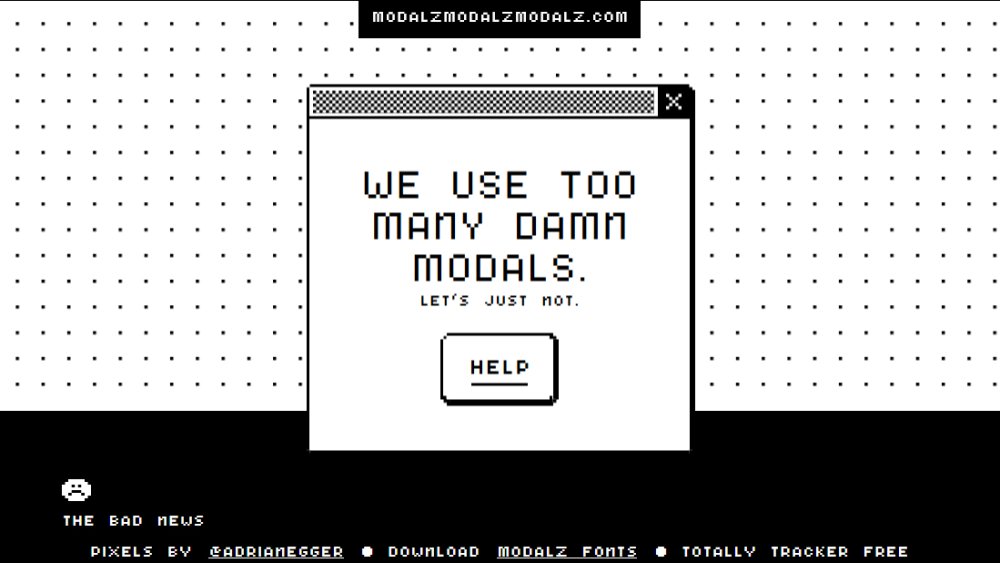
Modals are a user experience horror that have taken over the web in recent years, adding the administrative chore of closing an intrusive pop-over to the process of visiting many websites. It's particularly bad on mobile, and can make your site extremely frustrating or totally inaccessible to those using assistive technologies. MODALZ MODALZ MODALZ by designer Adrian Egger provides advice on alternative options for those moments when the urge to use a modal strikes.
"Modals are the crutch of the inarticulate designer and developer," he writes. Instead of a modal, he suggests that you could use an expanding element, a non-modal dialog, or it might be more appropriate to use a new page. If you can't resist, or someone else is insisting on modal-usage, he's got some pointers for making them as tolerable as possible, and some particular pitfalls to avoid.
03. Not optimising images
The low-down on how to make sure your site's images are optimised efficiently
Large images are one of the biggest sources of unnecessary page weight, and optimising them is one of the easiest things you can do to improve your site's performance.
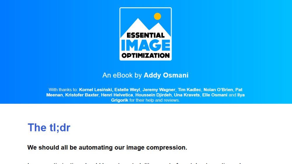
Addy Osmani's free ebook, Essential Image Optimization, is an excellent resource for learning about how to do this. If you don't have time to read the whole thing, he has a handy 'the tl;dr' at the top that points you towards resources for automated image compression, which he recommends, and other efficient tools if you're not going to automate.
Responsive Issues Community Group (RICG) chair Mat Marquis' book Image Performance is also a great read on this topic, and also check out our 4 essential image optimisation tips.
04. Not prioritising performance
Work out how big each page resource can be if you want the site to load at a particular speed
The statistics on this vary, but the overall picture is that if your website takes more than a few seconds to load, people start leaving in droves. According to this article, most people will choose to browse fast sites that are irrelevant to what they're looking for than a slow site that contains the information they want. And of course, this intolerance for slowness has a massive impact on conversions. According to these numbers, slowing load time from 2.4 to 3.3 seconds can lose you a quarter of your conversions.
With this in mind, it's clear that speed has to be a top priority if you want to create a good user experience and maximise your conversion rates. Here are some great resources to help you out:
Performance Email
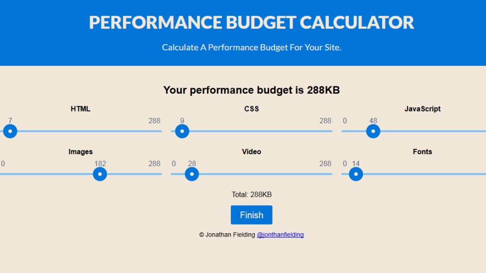
This newsletter is great for staying up-to-date with all the most useful performance-related tools and information.Performance Budget Calculator
Decide how fast you want your site to load on which kind of connection and this calculator tells you how much page weight you can spend on each resource. There are sliders so you can adjust the allocation between CSS, images, fonts and so on.Browser Calories
Check out your competitors' sites with this browser extension that compiles a report on the page resources of any site you visit, comparing them to the weights of the web's top 100 sites.Smashing Magazine's Front end Performance Checklist
As well as the checklist, this article is packed with a huge selection of performance resources and general guidance on getting started with optimising your site.Also read our post with four tips to improving your page's performance.
05. Using a big framework you don't need
Do you really need this for a simple site?
If you've put in the time to learn a big framework such as React or Angular it can be tempting to use it for all your projects, but laying down reams of boilerplate code and introducing complex technology and a bunch of dependencies for a simple site that doesn't need it usually isn't wise. Why bloat things up when a static site would be faster and leaner?
Chris Coyier has written up his take on the situation here, where he discusses the good and not-so-good reasons for using a framework.
Sometimes, writing things from scratch can be the right call even for more complex projects as it gives you more control and you end up with a leaner code base and fewer dependencies. This article explains why the team behind MeetSpace decided to build without a framework.
06. Small body text
Consider larger body text to improve readability
There are many reasons why we tend to design with text that is smaller than the ideal: pressure to fit a lot of content on the first screen of a page; a perception that larger text somehow appears less sophisticated; and the default font sizes in the big frameworks, to name just a few.
In his post Your Body Text is Too Small Christian Miller explains the many benefits of using larger text – it improves readability, it works better from a distance (maybe your site is being viewed on a smart TV) and it improves visual impact and usability. Another interesting side-effect of using bigger type is that it improves copywriting because it encourages you to use fewer words.
The ideal font size for your website is probably larger than you think, and Miller has some great advice on how to design with bigger text in mind.
07. Not prioritising the user
User research will help you find out what people want from your site
A sure-fire way to end up with a terrible website is to prioritise what a client wants to say over what a user wants to know. The entries below from The Oatmeal and xkcd may be old, but they still do a great job of articulating a phenomenon that persists to this day – a complete failure to consider why someone is visiting your website.
In the Oatmeal piece, the author lists the things most people want when they go to a restaurant site, such as a menu, address with link to a Google Map, and opening hours. Then he presents a site that demonstrates what we often get: images or animations you don't care about, text about 'ambience' or the ethos or history of the place, the menu as a downloadable PDF, and pertinent information hidden away.
The xkcd cartoon does the same thing for university websites: people want course lists, contact information and application forms, but they get a photo slideshow, a letter from the president and the institution's mission statement.
The way to avoid this is to do user research and testing, even if it's just an informal conversation with a sample of users. Find out the main reasons someone visits your site, the main tasks they want to achieve, and prioritise those. Our tips for better user testing will get you started.
Read more:
-
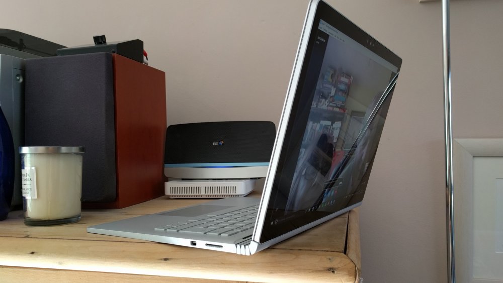
While this model has now been replaced by the Surface Book 2, there are plenty of original Surface Book bargains and Black Friday deals to be had. The fact remains that this is a formidable device if you’re in the market for a PC as an alternative to Apple’s MacBook Pro.
There’s now no reason not to use a Windows machine for creative work and Microsoft’s continued preaching about Windows as an operating system for creatives goes right to the heart of Apple’s traditional stronghold.
The Surface Book is, from first pickup, a device that makes an impression. The build quality and overall production is stellar.
As with the newer model, there’s a flexible, accordion-like hinge that’s a masterpiece of industrial design. You get the Surface Pen with the laptop – and whilst it isn’t as ergonomic as the Apple Pencil, say, it’s pressure-sensitive and accurate. The display also features 10-point multi-touch. There’s also the Microsoft Ink workspace, which when activated enables you to quickly sketch, write notes or annotate your screen (the latter being useful for client amends and collaboration on projects).

The Surface Pen - which comes with the Surface Book - is pressure-sensitive and accurate
The Surface Book is a hybrid, which means you can detach the screen and use it in Windows 10 Tablet Mode. Just hit the button next to the Delete key and the screen pops off using a clever muscle wire mechanism. Apps such as Illustrator can be used in Tablet Mode as well, so the Surface Book is not only a super-powerful machine for video editing and 3D, it's also pretty much the ultimate sketchbook.
The Surface Book has another trick up its sleeve – something that illustrators and video editors will love. Detach the screen, turn it over 180-degrees, fold the laptop down and you have a sketchpad you can use in an entirely natural way. Raise the screen up a bit and you can use it as a display for reviewing video. It’s hugely flexible.
Screen specs
Let’s look at the specs of Microsoft’s PixelSense screen for a moment. The term 'Retina display' is bandied around a lot due to Apple’s excellent marketing, but for its 13.5-inch size the Surface Book packs in an incredible 3,000 x 2,000 pixels at 267ppi (Apple’s MacBook Pro is 2,560 x 1,600 at 232ppi).
The screen is absolutely stunning. It’s thin, bright, and hugely responsive to touch and stylus control. Putting the resolution all the way up does result in some pretty small icons, but when editing using the Surface Pen it’s simply a joy to use.
The Surface Book is hugely flexible
Design demands
Your choice of model depends whether the Surface Book is your main machine or a creative ‘on-the-go’ device. As someone pushing say, Adobe Creative Cloud to its limits, you’ll need top specs in your laptop. We recommend the Intel Core i7 2.6GHz model with 16GB of memory and the Nvidia discrete GPU (with 2GB RAM). You’ll probably need 512GB of storage. If you just need an on-the-go device, perhaps go for the lower-end model – you still get Core i7, 8GB RAM, and 256GB SSD.
Coincidentally, the tablet part of the machine uses integrated Intel HD Graphics, which is more than enough to drive the display when detached. Coincidentally, if you go to detach the tablet when using an intensive app, the system will warn you.
All this means that the Surface Book races through simple tasks in Photoshop, Affinity Designer and doesn’t struggle one bit with more complex video projects in Premiere.
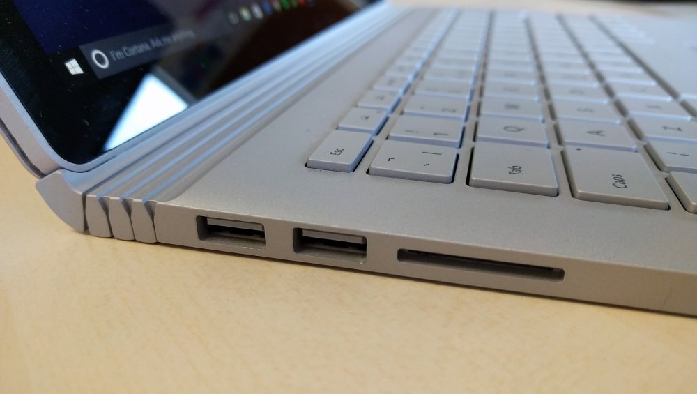
There are healthy number of ports on the Surface Book
There are two batteries – one in the tablet and one in the main body. The tablet part only lasts around 4 hours, but with both batteries you’ll get around 10-11 hours of use. Microsoft originally quoted up to 16 hours, but we never got that much out of it, especially when watching video or using creative apps.
There are healthy number of ports for expansion here with two USB 3.0, a full-size SD card reader, Mini DisplayPort and headphone jack. The original Surface Book is slightly too old to feature USB-C, although there is one on Surface Book 2.
Other specs include an ambient light sensor, accelerometer, gyroscope and magnetometer. There are two cameras, front and back on the display – the rear comes in at 8-megapixel and can shoot at 1080p; the front 5-megapixel (also able to shoot 1080p video). There’s even facial recognition sign-in, which works 99.9 per cent of the time in our experience. And Dolby-enhanced speakers make the Surface Book sound as good as it looks.
Moving over from Mac
Of course, you may be moving over from a Mac (or at least thinking about it). The Surface Book is undeniably more powerful than the MacBook Pro 13-inch, and has a number of features – such as being able to flip it to ‘draw mode’ – that the designer or illustrator will really like. But Windows 10, although hugely refined, will feel foreign and a little unintuitive to begin with.
There’s no real problem with files any more – Adobe’s cross-platform compatibility is excellent, although you may need to look at your font file types.
Why you should - or shouldn't - buy the Surface Book
Even though it’s been replaced by the Surface Book 2, the original model remains a formidable computer. With system requirements for software not increasing at anywhere near the rate they once did, there’s no reason why a Surface Book 1 couldn’t live with you for the next half-decade, especially if you have the discrete Nvidia graphics. The new model does offer a few advantages – the USB-C connectivity being one of them – but if you’re not too worried about that, snap one of these up before they disappear.
Read more:
-
When starting a fresh project, it can be easy to slip into some bad user experience habits. As applications grow, components can start swelling in size and when the time comes to reuse a section of it, it can be hard to break apart. Large components become awkward to test, difficult to extend and easy to break.
The best way to avoid this problem is to split the UI into smaller, generic pieces that are easier to reuse because they get their data as props – a pattern known as presentational components. By focusing on the quality of smaller components like a button or input field, we know anything that would use those components will work as well.
Storybook is an environment to help develop these reusable components. By creating them in isolation, we can be sure they have no external dependencies that we haven’t explicitly defined. The result is an interactive style guide for an application, which can be helpful not only to developers but to designers and testers also.
Storybook applications can be exported separately and run independently of the main application without the need of a development environment. As the result is just HTML, CSS and JS, they can be hosted on a service like GitHub Pages and live alongside the repositories that use them. Anyone in the company can load up the site and check it out.
Here's how to use Storybook in your React projects.
01. Add Storybook
To get started, we first need a React project ready to go. This can be any project but we can use createreact- app to generate one in a couple of lines. Open up the command line and run the following:
From there we can install the Storybook CLI. This in-depth will add the basic features of the environment to the application. By installing this globally, it can be used to add Storybook to any NPM project in the future.
This command updates storybook-app and adds a couple of commands to the package.json. Run the first one, which starts a local Storybook server ready to develop. Once it’s ready, run the following and head to localhost:9009 in a browser.
Storybook provides an overview and an example component when it first gets installed. These can be adapted or removed entirely.
02. Get set up in Storybook
Storybook works through the concept of ‘stories’. Each component being developed will have its own set of stories that outlines a few typical use cases. The component that comes with Storybook, for example, has one story for plain text and then another for emoji.
By default, these stories are saved in stories directory at the root of the project. While this technically works, it’s nonetheless best to keep all files related to a component together alongside other related files like styles and tests. We can change where Storybook finds its stories by updating config.js in the .storybook directory.
Once Storybook is restarted, it will now look for any files ending in .stories.js anywhere inside a components directory.
03. Create a component in Storybook
Our first component will be a button. As this will be a styled <button> element, we get a lot of its default behaviour for free.
The key to a reusable UI component is that it gets all of its data from props. No application behaviour should be assumed unless explicitly defined through those props.
Create a new Button directory under components and then create an index.js file that will hold the button. Create styles.css and add some styling there also, including when the type prop is set to 'primary' or 'danger'.
04. Create a story in Storybook
With the component set up, we can now import it into Storybook by creating its own story.
Each set of stories start by calling storiesOf, which will group all stories after it together. The first argument is the label of that grouping.
Each story is created by calling the add method from there. The first argument labels the story, while the second is a component to render. While we could render <Button/> directly, it means we can’t change any of its props later on.
Create a Button.stories.js and create a story to render the button.
When you are creating reusable components, it works best to have styles such as fonts inherited from the parent. As these aren’t set yet, we get a fallback font.
05. Add global styling
Some components may rely on inherited styles from higher up the tree. While it would be impractical to include them in every story, Storybook provides a way to inject content into the <head> of an iframe that the components are rendered in.
Create a new file in the .storybook directory called preview-head.js use it to import a font and apply it to the contents of the iframe. Restart Storybook for this to take effect.
06. Control props with knobs
Utilise knobs to adjust props in real time and avoid having to create stories to cover all possible prop combinations
While stories themselves are great for setting up typical scenarios, often we want to see what happens with a specific combination of props. As the number of props grow, so do the different combinations possible. Instead of trying to cover each scenario with its own story, we can use on-screen controls called knobs to adjust the props in real time.
Knobs are an example of an add-on – plugins available for Storybook that enhance the core experience. Each add-on is installed and imported separately. To use knobs, we first need to fetch them from NPM.
Once installed, we need to let Storybook know about them by adding them to ./storybook/addons.js.
To be used within a story we need to add them as a decorator. A decorator wraps the story in a special component that provides the behaviour. For knobs, all that’s needed is to import the decorator and add it just before creating a story.
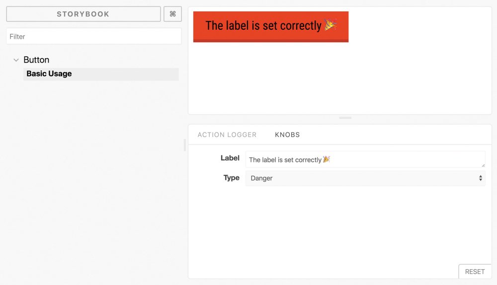
The knobs add-on comes with a set of common controls to alter the rendered props from the bottom of the screen.
The two we want are 'text' to render a textbox for the button label and 'selectV2' to provide options for the type prop. Both take a label and default value, with 'selectV2' taking an object of options as its second argument.
The components update with the content in real time. This can be useful to see exactly at what point a design starts to break.
07. Try other add-ons
There are plenty of add-ons available to help out on any project.
The Actions add-on provides a way to dummy out actions within a component. By passing in an action as an event prop, we could check to see our button’s onClick handler was behaving correctly.
The Storyshots add-on can help create Jest snapshots from stories. When each test runs, it renders each story and compares it to the last time it ran. Any differences are flagged for investigation.
The Viewports add-on provides a pre-defined list of common viewports to check how the components behave. This helps avoid having to try and resize the window without including the Storybook sidebar.
Depending on the needs of the project, it is also possible to create custom add-ons for each Storybook project. These can be useful for common setup such as state management systems or localisation strings.
See a full list of add-ons provided by Storybook here.
This article was originally published in net, the world's best-selling magazine for web designers and developers. Buy issue 310 or subscribe.
Related articles:
-
When it comes down to development, it can feel overwhelming to decide what to specialise in – whether you choose front end or back end, full stack, this Core Development Bundle By Devslopes has everything you need to launch a development career.
With more than 100,000 students enrolled and a project-driven curriculum, this course provides hands-on experience learning the top coding languages out there, including HTML5, CSS3, Javascript, Bootstrap 4, Node and more. Plus, you'll learn to develop for iOS, Android, macOS, for game development and every other platform you'd want to learn.
Get the Core Development Bundle By Devslopes for $39 – that's 97 per cent off.
Related articles:
-
Affinity Designer is a suite of vector editing tools available for Mac and Windows, as well as on the iPad. It provides a great middle ground between the more basic free graphic design software and the pricey but feature-rich Creative Cloud suite, and it offers incredible quality for the cost.
In this tutorial we're going to look at how to use grids in Affinity Designer for Mac. Any designer will know that a solid understanding of grid theory can take some of the guesswork out of the design process. I use grids in around 90 per cent of my work – they're handy for everything from providing construction guidelines for logos, to ensuring consistency in detail-heavy illustrations. Turning grids on and enabling the 'snap to grid' option helps you plot lines and shapes quickly and easily.
Read on for a rundown of how to use grids in Affinity Designer, or watch the video above for a mini-tutorial to get you started.
Click the icon in the top right of each image to enlarge it
01. Enabling the grid
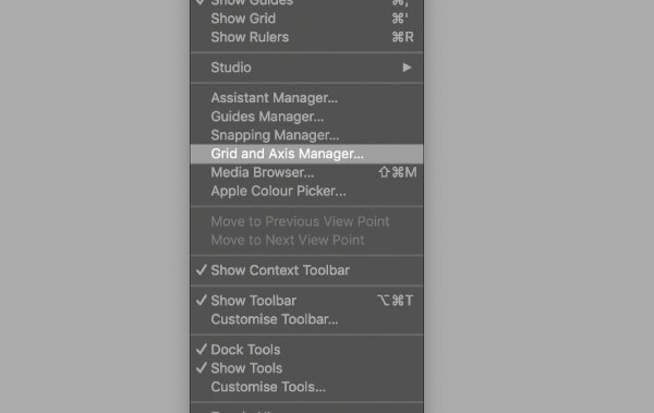
Enable grids using this drop-down
To enable the grid, go to 'View > Grid and Axis Manager'. With the sub-menu open, you can check ‘Show grid’. You can also toggle the grid on and off by pressing cmd + '. I find being able to toggle the grid off is quite useful when illustrating, so I can get more clarity.
02. Tweaking the grid
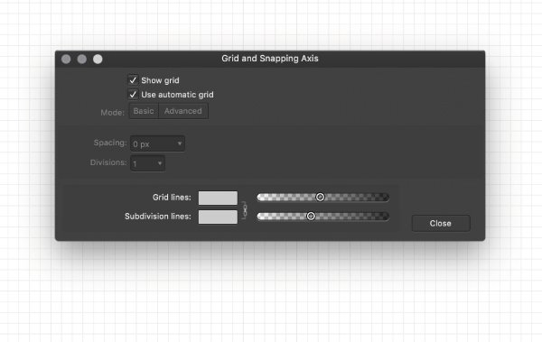
You can adjust the spacing of your guidelines
To tweak your grid, uncheck the 'Auto grid' option. I usually keep my spacing at 5mm, but you should experiment with different sizes to see what suits you and your design style. Just bear in mind that the bigger the spacing, the less detail you will be able to go into if you are snapping your design to the grid.
04. Snap to grid
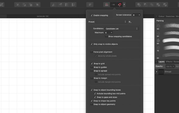
Snapping to grid can help ensure your designs are lined up
When designing I enable snapping to grid. This can be toggled on and off by clicking the drop-down menu next to the snapping item on the top bar menu. With this enabled, shapes and Pen tool nodes you plot will snap to your grid. This is a very quick way to ensure your designs are lined up as you wish, and improve accuracy in logo designs and illustrations.
03. Advanced features
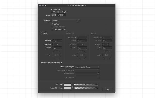
There's a host of more advanced features for you to explore
Clicking the 'Advanced' mode option with expand the menu to show you a plethora of other options for you to tweak. I usually don’t touch any of these, but it’s good to have the capability if you need it. There are several grid types you can select from; the isometric grid is particularly useful when making 3D art or type.
Read more:
-
As a designer, your portfolio is your shop window. As well as selling your skills and your individual style – and hopefully winning you work in the process – it's also a chance to express your personality, and what you're like to work with. Getting it spot-on is no mean feat, and even the best portfolios have room for improvement.
Creative Bloq teamed up with moo.com to provide some killer advice to help you craft your ideal portfolio, whatever discipline you work in. Following a global call-out for submissions, over 100 portfolios were whittled down to just five – ready to be critiqued by an expert panel from Google, Wolff Olins, MOO and BrandOpus.
Those five are:
Watch our panel – including moo.com's head of design Millie Scarlett Davies, Google Creative Lab ECD Steve Vranakis, Pedro Messias, multidisciplinary designer at Wolff Olins, and Meghan Hagerty, marketing director at BrandOpus – critique these five diverse portfolios in the video below...
The video above is packed with insights and advice from our expert panel. Here are five key takeaways to apply to your own portfolio website today...
01. Show things in context
Millie Scarlett Davies was particularly impressed with how Gabriella Barouch made the effort to show her commercial work in situ, rather than just the illustrations in isolation. "From our perspective, if we ever want to work with an illustrator, it helps to see that the work translates into the real world," she explains.
02. Design for mobile first
While the panel though Bishal Limbu's site felt a little sparse on desktop, it works more effectively on mobile. "We look at these sites in the moments in between the work we have to do – when we're commuting, or have a chance to get a tablet or phone out," points out Steve Vranakis. "Designing for mobile is a must."
03. Take viewers on a journey
The panel particularly liked how Jon Banuelos leads viewers through his portfolio, with twists of personality throughout. Meghan Hagerty compares his case studies to awards entries, a technique she admires: "He's got what his brief was, what exactly he did, and who he worked with," she says. "Everything is spelled out."
04. Curate an experience
Although several of the panellists felt that Victor Renaux's portfolio made people work a bit too hard to see his projects, Pedro Messias praised the way he gave each project its own cover image as part of a unified theme: "There's an element of storytelling to it; he's treating each project as a different chapter," he explains.
05. Don't be afraid to experiment
Less is often more when it comes to design portfolios, but Kendall Slade took the chance to show off her personality – and her coding skills – with her simple, but ever-changing layout. "It's got attitude, it's a bit punk," says Steve Vranakis. "It's like she's taken a digital crowbar and smashed up the windows of the shopfront."
Once you've nailed your portfolio, you need some top-quality self-promo materials to point people towards it. Digital print and design company moo.com provides fun, affordable, easy-to-use tools for creating premium business cards, postcards, stickers and more. There's even a 100% satisfaction guarantee with the MOO Promise: if there's any kind of mistake on the design – even if it's your fault – they'll fix it for free!
Related articles:
- 10 steps to go freelance this year
- Pro's guide to creating memorable business cards
- How to project your work onto the global stage
- 6 sure-fire ways to build your creative network
- Nail the art of networking and get more from events
- 4 brilliant personal logos – and why they work
- 3 tips for crafting stunning print promo materials
- Create better business cards in less than 5 minutes
- 5 ways to earn more as a freelancer
-
Whether you’re an amateur, semi pro or professional photographer, you’ll want fast and reliable storage media that doesn’t cost the earth – and that’s the direction this buying guide is looking to point you in. When you find the one that suits you, make sure to check for any Black Friday deals as there's already some great savings to be made.
Which is the best SD card?
Most photographers will be aware that the postage stamp sized SD (secure digital) card, also available in SDHC and SDXC iterations, is the memory card most commonly supported by today’s digital cameras. Within that context, we think that the SanDisk Extreme PRO SD UHS-I is one of the best SD format memory cards currently available.
But there’s also the fingernail-sized microSD utilised by smartphones and tablets, the older but still popular CompactFlash (‘CF’), utilised by many DSLRs, plus what has been termed CF’s successor in the newer XQD format memory card.
Eyebrows were raised when the Nikon Z6 and Z7 mirror-less cameras were recently introduced with a single XQD card slot. While they may be currently less common (and pricier), the good news is that the XQD memory card has been specifically designed to keep up with the shooting speeds that these latest generation cameras offer; a blazing fast read and write time a particular advantage when capturing Raw files or 4K video.
So when choosing your own best-fit memory card it’s very much a case of horses for courses. You’ll need to consider what you’ll be shooting on, how fast you’ll be shooting, whether you mostly shoot Raw or JPEG, Full HD or 4K video – as well as what your budget is – and choose a memory card with a capacity and performance to match accordingly.
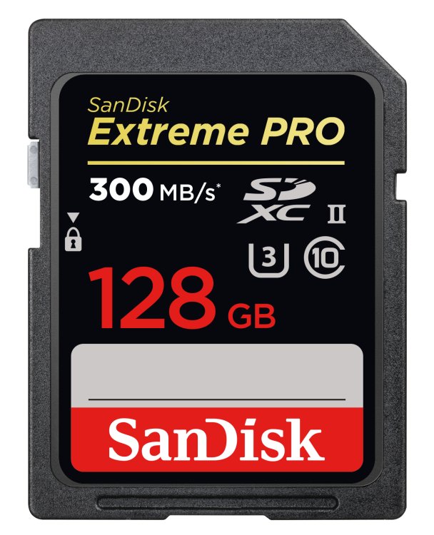
Power users are advised to check out the Extreme PRO SDXC card from long standing card manufacturer SanDisk. Available in capacities from 32GB up to an impressive 512GB, this option offers a speed class 3 rating. The real practical advantage here is not only write speeds up to an impressive 90MB/s – which means that it is able to deal with rapid fire sequential shooting and in both JPEG and Raw – but also a extremely fast transfer speed of up to 95MB/s, which will speed up the workflow of enthusiasts and pros. Aside from making it easier to capture a sequence of Raw photographs, the data crunching on offer here also makes it suitable for 4K video shooting.
To sum up, this is one capable contender.
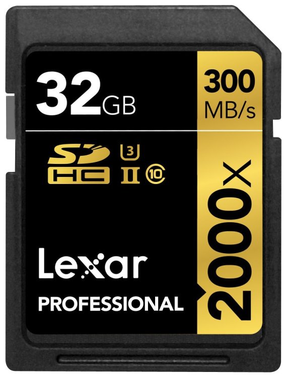
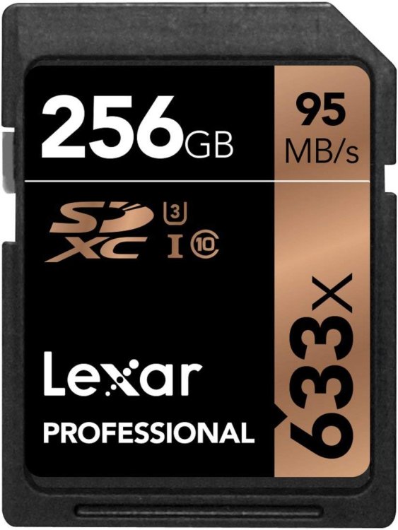
Lexar has long been the go-to card for photography enthusiasts and professional shooters, and, despite disappearing from the market for a little, while it has bounced back with plenty of Lexar options still available. A solid choice for us is this card, which deploys UHS-II tech to enable transfer speeds up to 300 MB/s and write speeds up to 260 MB/s.
This ensures that, whether we’re recording full HD, 4K video, or shooting high-resolution Raw files, this card delivers the goods, even if maximum data capacity is 128GB, rather than the maximum 512GB offered by some rivals. A close alternative in terms of specification and performance would be SanDisk’s Extreme PRO SD UHS-II (also featured here), but we feel you can't really go wrong with this one.
It can be an expensive mistake to miss capturing that essential image if you’re working as a pro photographer – and especially irritating if it’s because your card can’t keep up. Therefore try and avoid the unfortunate ever happening by investing in this ultra speedy, inevitably costlier, example from industry stalwart SanDisk that, in offering read speeds of up to 300 MB/s and write speeds of an equally impressive 260 MB/s, is a class leader among memory cards.
The above specification makes it a must-have option for reportage, sports and wildlife photographers, shooting bursts of rapid fire stills, or videographers wanting the clarity of 4K resolution video, with the inevitable data hungriness that comes with it. As this is an SDXC (‘Extended Capacity’) card too, storage is impressive via available card offerings from 32GB up to 128GB, but truly the accent is on speed here above and beyond anything else.
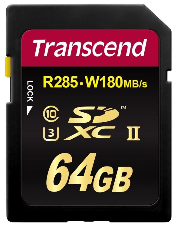
If it’s Raw files you primarily need to capture, then you’ll want a card that can cope with the highest quality imagery in sequential bursts – as well as one that provides a sufficient storage capacity to avoid having to swap out the media in use at that decisive moment. While the 64GB maximum capacity (the alternative being 32GB) may initially appear a little small when compared with other options here, the performance is anything but, via commendably quick read and write times of 285 MB/s and 180 MB/s respectively.
Obviously you will need UHS-II compatible DSLR or camcorder to be able to use this one – so check – but speeds of up to 3x faster than standard UHS-1 SD memory cards can be delivered. Furthermore these Transcend branded cards are shock and X-ray proof, thereby providing a degree of certainly for photo and video enthusiasts and pros.
As photographers, we always think we have enough storage capacity until suddenly we don’t. Designed for use by DSLR owners, with up to 512GB of storage capacity offered, this Lexar branded contender is top of the SD card format class. The only (inevitable) downside is that the read and transfer rates are a little more modest than the lower capacity yet higher speed cards likewise pitched at professionals. This necessitates us to decide which is more important to us – having the space to store many hours of video, or having the potential to transfer it between devices even faster than we’d do normally. Ultimately the fact that there is a choice between the two makes us as consumers the victors.
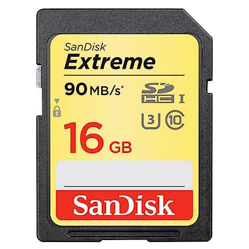
Stateside manufacturer SanDisk offers users the peace of mind of it being long and well established when it comes to providing removable media. Its ‘Extreme’ range of cards comes in either standard or ‘Pro’ versions, with the former starting at around £34.99 for a 16GB capacity, with the latter costing a still reasonable £60 (also available are pricier 128GB and 256GB cards).
Fortunately for those on a budget, even the standard Extreme cards feature UHS speed class 3 compatibility, meaning they can cope with both Full HD and 4K recording. If buying a 16GB SanDisk Extreme card, you’ll get data read speeds up to 90MB/s, while write speeds of up to 40MB/s are also possible. While that sort of spec will satisfy most photo and video enthusiasts, they’re also water, shock, temperature and X-ray proof. To sum up, this is very sensible jack-of-all-trades option for photographers/videographers who don’t need decisively swift read/write speeds.
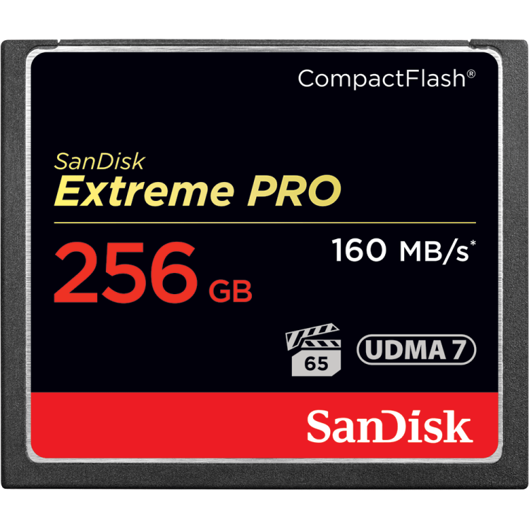
CF cards may be older and bulkier than the newer SD format alternative, but that doesn't mean they can't still deliver sufficient capacity and speed to satisfy today’s DSLR user. A case in point is SanDisk’s CompactFlash range, which offers capacities from a useful 16GB to a power user 256GB, so we don’t have to swap out media cards in the heat of the action.
Also impressive with this one is write speeds of up to 140MB/s at maximum 256GB capacity (otherwise it’s 150 MB/s for the 128GB and lower capacities), which also makes it just a suited to video use, particularly for those DSLRs also offering Full HD capture. In fact, with a minimum sustained write speed of 65MB/s, the claim by its manufacturer is that this one is class leading.
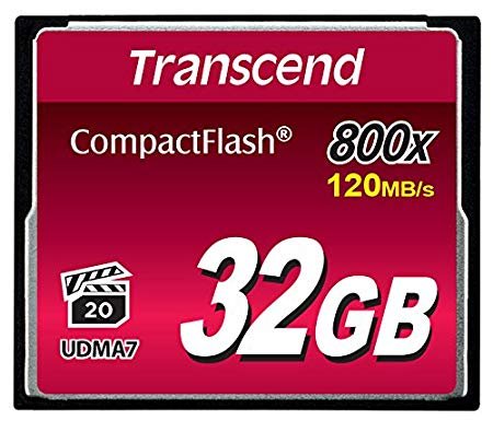
While it may not be as recognisable to the casual observer as competing card brands, Transcend is one of the longer-term players in the market – and, usefully, still makes many low-capacity cards, holding obvious appeal for those on tighter budget. However, even the higher capacity offerings that may appeal to semi pro DSLR users – such as this CompactFlash 800 series – are hardly expensive for what’s on offer.
Capacities run from a standard 32GB up to a slightly more impressive 256GB. Specification is also solid for what’s a budget card; here we get read speeds of up to 120 MB/s and write speeds of 60 MB/s – actual performance of course affected by camera hardware and software, as is the case with any card. However here there’s even a built-in error correcting code to detect and correct any transfer errors.
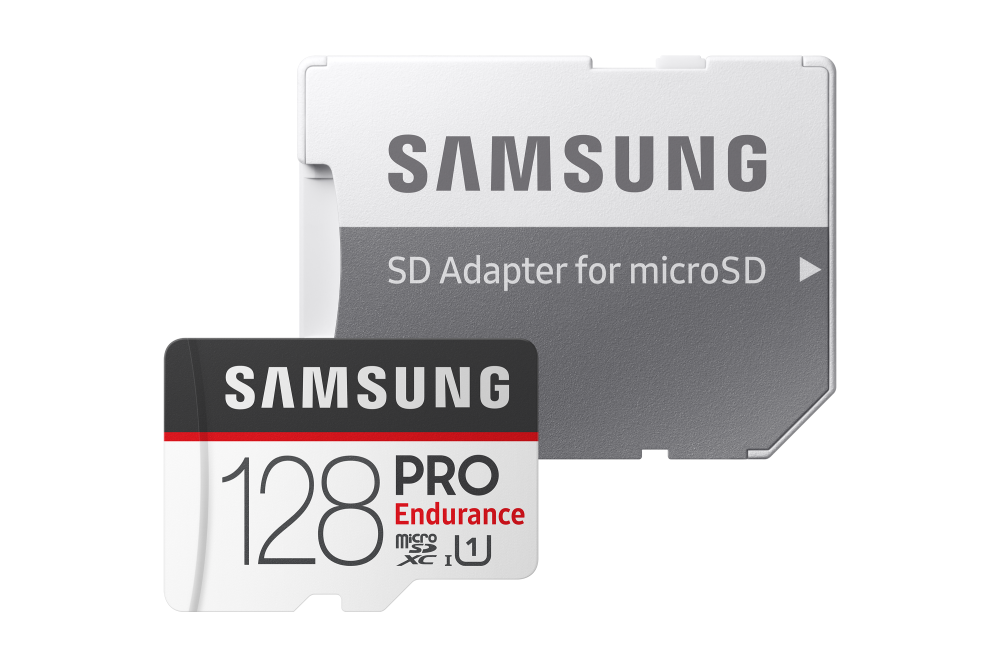
Yes, if we want the best then we’ll have to envisage paying more than for bog standard microSD cards with larger SD card sized adapters; though at £30.99 for 32GB, or up to £112 for the £128GB variety – less than one pound sterling per gigabyte – this series of cards will hardly break the bank. The enticement here includes the fact that the cards are claimed to be able to withstand harsh environments, are longer lasting – hence the ‘Endurance’ name – and are particularly suited to use in action cameras. This is because they can continually record at high read/write speeds (100MB/s and 30MB/s respectively). Also promised for the highest capacity card is an industry best of 43,800 hours of continuous video recording. Peace of mind comes courtesy of warranties of between two years for the lower capacity cards, to five years for maximum capacity cards.
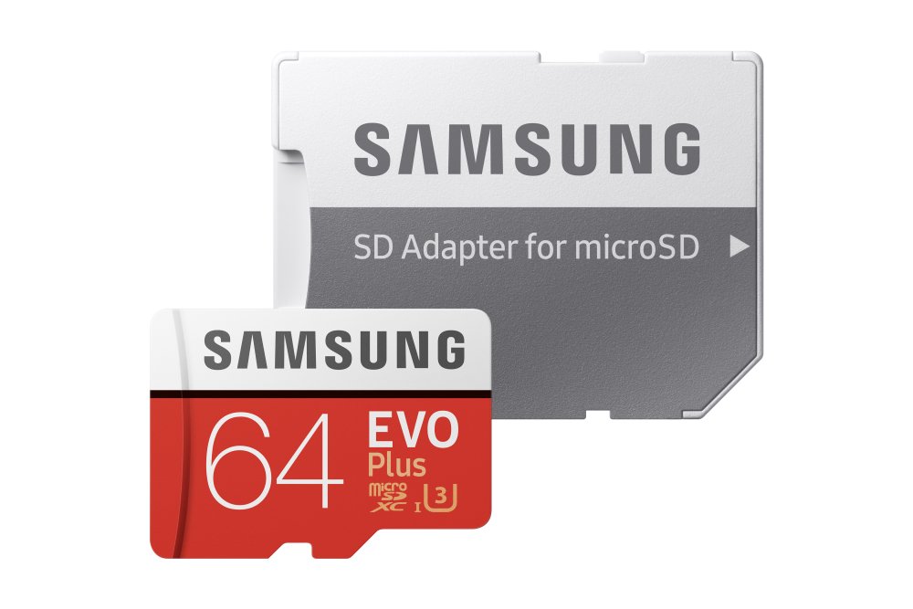
Arriving with us in 32GB, 64GB, 128GB and 256GB capacities, these Class 10 microSD cards handily come with an SD adapter that allows them to be used in cameras just as easily as a smartphone or tablet. Costing a reasonable under £20 for the lowest 32GB capacity, this seems like good value considering they manage read speeds of 100 MB/s (albeit a modest write speed of 30MB/s). A bright red design also ensures this jack of all trades option from Samsung won’t readily get lost down the back of the sofa, despite being fingernail sized. Peace of mind also comes via a 10 year limited warranty, plus the fact that the cards are claimed as waterproof, temperature proof, X-ray proof and magnetic proof. Seemingly there are very few barriers to recommendation here.
Read more:
-
Security updates across all Apple platforms released alongside its new products.
-
The CG Awards are back, and we’ll be celebrating the world's best computer graphics from the last 18 months live at Vertex, on 8 March 2019.
You can still vote for your favourite game, favourite film VFX sequence, favourite short form, favourite community artist and more, but be quick! Voting closes 15 November 2018, after which we'll have two nominees per category to give to our judging panel.
Find out more about some of our expert judges for CG Awards 2019 below.
Gleb Alexandrov
Gleb Alexandrov is an artist, blogger and tutorial maker at Creative Shrimp, the website with tips and tricks for those who want to get better at computer graphics. Gleb has become one of the biggest and well known 3D artists in the open source computer graphics community.
Jodie Azhar
Jodie Azhar is an award-winning game developer and BAFTA Breakthrough Brit. Her career in the games industry has covered a decade – including working at Kuju, Rebellion and Creative Assembly – and she rose to the position of technical art director before starting her own game development studio earlier this year.
Izzy Burton
Izzy Burton is an artist and director currently working at Blue Zoo Animation. She directed the award-winning short film Via and was named one of Animation Magazine’s Rising Stars of Animation 2018. She graduated from Bournemouth University with a degree in Animation in 2015.
Adam Dewhirst
Adam Dewhirst is the modelling and texture supervisor for The Mill NY; he has 14 years experience in film, commercials and TV. He was the lead modeller on Guardians of the Galaxy at Framestore. Notable film work includes The Dark Knight, WWZ, The Golden Compass as well as commercial spots for Cartier, Audi, Lexus and Legoland.
Justin Holt
Justin Holt is texture department supervisor at Atomic Fiction in Montreal QC. Currently he is supervising work on The OA, Rim of the World, Top Gun 2, Stranger Things season 3, Bloodshot and Wonder Woman 2.
Carrie Mok
Carrie Mok is editor of 3D Artist magazine, one of the top publications in the world for CG tutorials, behind-the-scenes access on the tools and technology behind the biggest movies and games, and industry insight. She has been working on the magazine since 2015, interviewing key industry figures in VFX, animation and games from ILM, MPC, Double Negative, Epic Games and more, and bringing the spotlight to the inspiring art and techniques of professional artists.
Rob Redman
Rob Redman, editor at 3D World magazine, is a 3D artist and creative director, working across film and TV. When not in the studio he is often found presenting at various industry events, or building guitars.
Glen Southern
Glen Southern runs a studio, producing content for TV film and more, plus training for CG artists.
Maarten Verhoeven
Maarten Verhoeven is a freelance digital sculptor, concept and VFX artist specialising in work for film, commercials, prototypes and toys. Having a background in art, he handles different aspects of production, from concept to sculpting, compositing and colour grading. Today he’s working as a freelance ZBrush artist, contributing his talents worldwide to various companies, publications and projects.
Read more:
-
Whether you’re looking for your first camera bag or it’s time for an upgrade because your kit has grown and your needs have changed, we’ve put together a curated list of recommendations to help you find the right carrying companion. And you're timing couldn't be better, with Black Friday just around the corner, there's every chance you can soon grab a great bargain.
Right now, we think the Tenba Axis tactical backpack is one of the best camera bags out there. It gives you a decent build quality and plenty of room to expand for a reasonable asking price. But the right camera bag for you naturally depends on your personal requirements. While most find space to stash a tablet or laptop alongside photographic equipment, some are better for compact system cameras than bulkier DSLRs while others offer space for a camera drone too. So study the following list closely in order to find your own best fit.
How to choose the best camera bag and case for you
Of course, it’s not just the gear you’re going to be putting in the bag you need to think about. Also consider what you typically photograph – and what environments that places you in. For example, a street photographer might be better suited to an equally unobtrusive shoulder-worn messenger type bag that doesn’t obviously scream ‘photographer’.
Landscape and wildlife photographers, used to covering a fair bit of terrain and being out in all elements, may be better suited to a waterproof backpack; something that has room for a water bottle and provisions as well as that camera and tripod, while being padded and featuring breathable fabrics for extra comfort. Those who regularly hop on and off aircraft meanwhile may favour a rolling trolley-style set up – while being mindful of whether it will match current carry-on luggage rules and regulations, naturally.
The more you think about it, the more choices there are to make. So, to help, let’s look at what we consider some of the best camera bags and cases right now (and why)…

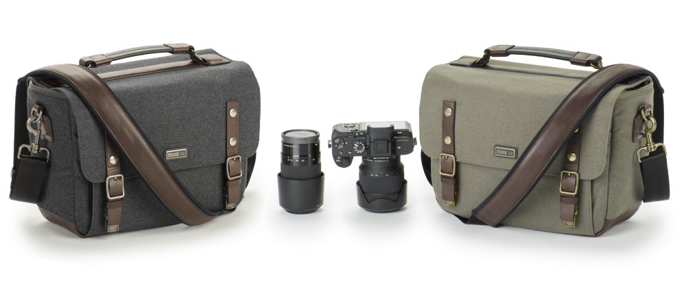
Aimed at pro photographers and videographers with a couple of camera bodies and long lenses, who need to keep said gear protected from the elements, are these military inspired ‘expedition’ packs featuring a water repellent exterior plus YKK zippers and reinforced stitching.
There are three capacity options, all with space for a laptop plus two camera bodies and lenses. Three access points at the top, back and sides usefully enable cameras to be retrieved while the packs are being worn. An ‘airflow’ harness is height adjustable for comfort, while webbing on the exterior allows for battery pouches and memory card wallets to be added. A rain cover and space for a tripod ensures these options tick most photographers’ boxes.
Those photographers who want an unobtrusive camera bag to stash their compact system camera or consumer level DSLR could check out this Manfrotto option which, with prices staring at just under £20, won’t break the bank.
While obviously not designed for a pro DSLR with a 400mm lens attached, Manfrotto’s nimble Street Pouch/Holster option can still host a CSC with lens attached along with two additional lenses. Alternatively, you can pack a DSLR with a standard zoom attached. Or there’s the Sling/Waist pack option that houses a premium CSC, entry level DSLR or even DJI Mavic Pro. Either way you have transport for your system that doesn’t obviously scream camera bag while being very reasonably priced with it. Neat.

If you’ve spent around £1,000 – possibly more – on a premium compact camera or CSC, you might want something equally classic and swish to transport it in at an a lot more affordable £100. Enter Billingham’s unobtrusive yet stylish vertical option in, the British made, pouch-like ‘72’, which comes complete with handy shoulder strap and brass and leather fixtures.
With construction that includes hardwearing materials that manage to be both moisture and heat resistant, this option also comes in a choice of five different colour combinations. There’s a useful front pocket for your camera batteries and cards, a padded interior divider, plus the peace of mind of a five-year manufacturer’s guarantee.
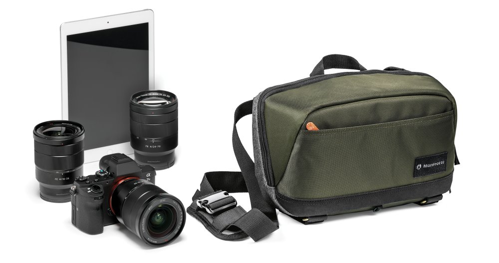
Most cameras these days mix the classic with the contemporary, so why shouldn’t the bag you choose to carry it in function the same? This is a modern take on the shoulder bag that still features a tactile wool-feel fabric and hand-sewn construction, yet the weather protection and durability with it that today’s photographer would demand.
There a couple of options available in the ‘10’ or ‘13’ bags – the numbers referring to the size of tablet or laptop in inches that can also be housed alongside a DSLR sized camera and lenses. We also get a dedicated mobile phone pocket, while the dividers and foam in the base can be removed to create a completely collapsible bag for convenient storage when not in use.
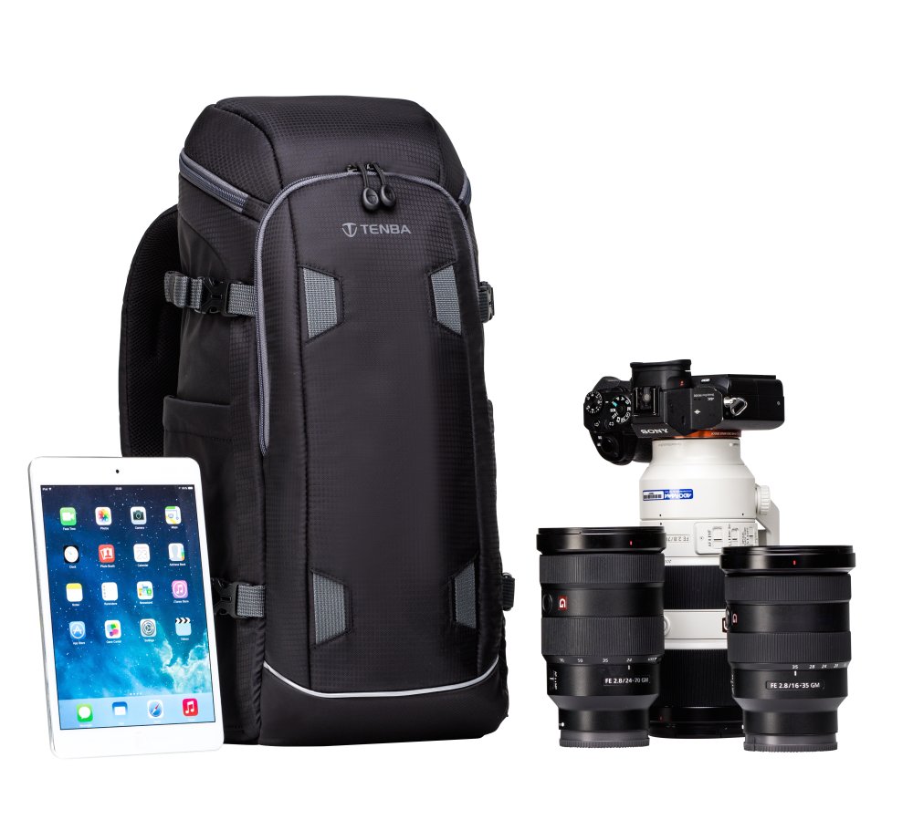
Again there are several size options available in this series of backpacks for the hearty outdoor snapper with an array of gear. A case in point; these packs can transport a DSLR or mirror-less camera with three to four lenses, or a DJI Mavic type drone, while also finding room for an iPad Mini type tablet.
Depending on your requirements, choose from the 12L, 20L or 24L models, which increase in size and capacity in line with their product numbers. Boasting both practicality and durability, naturally the interior is fully adjustable, with even the smallest pack being able to accommodate an equipment set up such as that detailed above, while the largest option can fit one or two DSLRs and a whopping five to seven lenses. With padded, adjustable dividers, this is a pack not just for the solstice then, but moreover a bag for all seasons.
For those looking for a compact camera bag for an equally small spend, Hama’s Zambia range is worth seeking out. It's capable of transporting everything from a premium compact camera, through a bridge camera, to a DSLR plus lens.
Size wise we’re looking at everything from a snug bag with dimensions of 7x6.5x13cm weighing just 150g – making it suitable for the most compact of system cameras – to an option that can transport a DSLR, while being a still very trim 16x9x14cm in size and weighing a manageable 220g.
With prices ranging from a suggested £21.99 to £34.99 these polyester construction bags are inexpensive options with it.

Every photographer – especially the pro – wants level horizons for their landscape shots and that means packing a tripod. Manfrotto manufactures both tripods and bags, so naturally they’re designed to work in unison – its compact yet expandable Advanced Befree backpack aimed at travel and landscape photographers being a case in point.
Cabin size friendly, it can comfortably stash its travel-sized tripods (Befree Advanced and Befree GT series models) alongside your camera gear via a specially provided expandable padded side pocket. Naturally it also finds space for your camera gear and personal belongings besides and comes with a protective rain cover.
The dedicated camera compartment is padded and is located close to your body when the pack is worn for added security. Water resistance is provided via a rain cover.
Featuring an armoured exterior with padded top and side handles, plus an interior described as flexible, this streamlined and lightweight ‘spinner’ bag on wheels has a depth of 8.8-inches, ensuring it can be taken on board flights as hand luggage. It also provides a panel via which to access a laptop without opening the entire bag, while the four wheel design provides a wide degree of movement, enabling photographers to manoeuvre around obstacles - other bags and people – when travelling.
Capacity is such that it can stash up to eight lenses and speedlites alongside one or two pro DSLRs – one with a 70-200mm f/2.8 lens attached. There are also customisable dividers and zippered mesh pockets inside for transporting a wide range of accessories. A larger, versatile option for when you need it.
A smart yet unobtrusive looking backpack from Lowepro for just over £100 features convenient side body access and a robust fabric construction in a choice of either grey ‘Canvex’ or black ‘Cordura’ with, typically for a bag of this type, a fully customisable interior with flexible dividers. This enables a mirror-less camera, DJI Osmo or Mavic type drone to be stashed.
An all-weather cover is also provided for those photographers who enjoy hiking in the great outdoors, while there’s a dedicated sleeve for a 13-inch laptop alongside that inevitable Thermos. A back panel provides a cushion and a low profile design for added comfort too.
If you’re looking for pro grade robustness when it comes to keeping your kit safe then the Peli brand comes highly rated. Not only is it claimed to be crushproof, waterproof and dustproof thanks to a rubber O-ring seal (meaning that your precious kit will be better protected than via most options on the market), this trunk-like hard case features the added benefit of a retractable handle and wheels, with foam padding for the interior.
It can accommodate one or two pro grade DSLRs and up to eight lenses while also featuring the swish addition of a pressure equalising valve, plus a degree of buoyancy. As well as the standard black, it also comes in a range of bright colours and can manage all of the above while remaining a size that means it can be taken aboard a plane as carry-on luggage.
Read more:
-
Halloween decorations can often get a little messy. If you're not up to furnishing your office with cobwebs from a spray can, why not jazz up your desktop with these creepy Halloween wallpapers?
Just like our movie wallpapers, we've separated the wheat from the chaff to bring you 10 of the best free Halloween wallpapers that are sure to delight and unnerve. With familiar icons and scenes from scary movies, these wallpapers are the perfect way to celebrate the spookiest time of the year. Read on, if you dare...
01. Jack Skellington

What's this? What's this? It's a Jack Skellington wallpaper, that's what
Jack Skellington, the beloved pumpkin king from Tim Burton's 1993 film The Nightmare Before Christmas, has won over a legion of fans thanks to his creepy yet cute charm. Over the years he's become a mascot for Halloween in the real world, so who better to adorn your desktop than the man, or skeleton, himself?
02. Pumpkin

You can't beat a carved pumpkin on Halloween
Well, Halloween wouldn't be Halloween without a carved pumpkin, would it? There are millions Jack-o'-Lantern wallpapers to choose from, unsurprisingly, but we decided to settle on this one because it makes great use of lighting to create a dramatic effect that won't get in the way of your icons.
03. Happy Halloween
Are you out trick or treating this Halloween?
Halloween isn't all about getting scared out of your skin. For lots of people, especially kids, the sweet treats are the most exciting part. In this illustrated Halloween wallpaper we see a street of trick or treaters going about their business in the midst of ghosts, bats, and the undead. But where do the costumes end and the creatures begin?
04. Witch

We love how this wallpaper finds a new look for a classic witch
What do you think of when you think of a witch? Green skin? Warty nose? Pointy hat? Witches are are so well-known that it's hard to think of a new approach to them, but that's exactly what this wallpaper has done with its geometric shapes and bold colours. We're glad to see she's still zipping around on a broomstick though.
05. Vintage pumpkin

Keep your Halloween classy with this vintage pumpkin wallpaper
Are you one of those people that complains about how commercial and tacky Halloween has become? If so, this is the wallpaper for you. Instead of ghosts and ghouls, this tasteful design uses an olden times pumpkin sign, complete with some amazing typography. But with it's dark colour scheme, you know this wallpaper is down for some Halloween hijinks.
06. The Babadook

Will you let the Babadook into your desktop?
Fans of the 2014 supernatural horror film The Babadook will be downloading this wallpaper quicker than we can say 'Let me in!' Making use of the pop-up book seen in the film, this wallpaper is sure to make you jump when you shut down your windows at the end of the day.
07. Blair Witch Project

"In spite of what Mike says... this wallpaper is my fault"
Found footage masterpiece The Blair Witch Project terrified audiences upon its release in 1999. This wallpaper remembers a chilling scene from near the end of the movie where Heather breaks down and apologises down the lens to her fellow filmmakers. Did you hear those children laughing?
08. Halloween nighttime

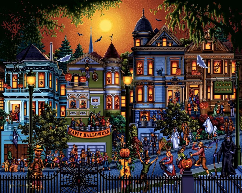
This is the greatest hits of Halloween imagery
Looking for a more traditional Halloween wallpaper? You can't go wrong with this one, which brings together some of the most recognisable motifs of the big day. Black cat? Check. Creepy mansion probably filled with ghosts? Check. Cobweb - because nothing is more scary than a spider? Check. And look how big that creepy crawly is compared to the moon. Terrifying.
09. Halloween icons

These spoopy wallpaper icons will make your Halloween extra cute
If you're not down with your internet lingo, you might not have come across the phrase 'spoopy'. For some people, it means a decoration or aesthetic that is as cute and funny as it is scary. We'd definitely say these icons of bones, coffins and cats are more spoopy than spooky, so be sure to give this wallpaper a whirl if you like your Halloween to be fun instead of frightening.
10. Happy Halloween

They did the monster mash...
Frankenstein's monster, the creature from the black lagoon and Nosferatu are all here to wish you a Happy Halloween in this mash up of monsters from iconic scary films. See, they're not all bad.
Related articles:
-
It needs little introduction, but Affinity Designer is a suite of vector art editing tools available for mac/windows and now also on the iPad. This graphic design tool is a great middle ground between the more basic free graphic design software and the pricey but feature-rich Creative Cloud suite, and it offers incredible quality for the cost.
Here is a quick overview of how Affinity Designer's Pen tool works. Watch the video below or scroll down for a short explanation of each of the features to explore.
01. Launch the Pen tool
Bring up the Pen tool using the icon on the left-hand toolbar, or use the shortcut P. The Pen tool on Affinity Designer is incredibly similar to other Pen tools you may have used elsewhere. You should be able to start using it fairly easily – although there are some added features that set it apart.
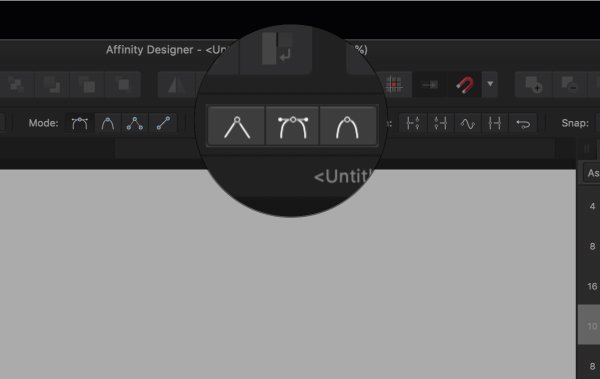
02. Pen tool modes
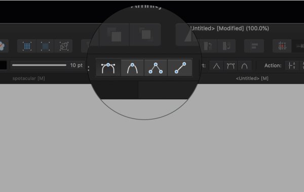
There are four modes: Pen mode, Smart mode, Polygon mode and Line mode
Affinity’s Pen tool has four different modes. First, there's the basic Pen mode. Smart mode will assist you in creating flowing curves that naturally arc. Polygon mode can be used to draw straight, connecting lines. Finally, Line mode is used to create lines that do not connect.
All have their own benefits and uses, and you can select the one you want using the icons shown in the image above.
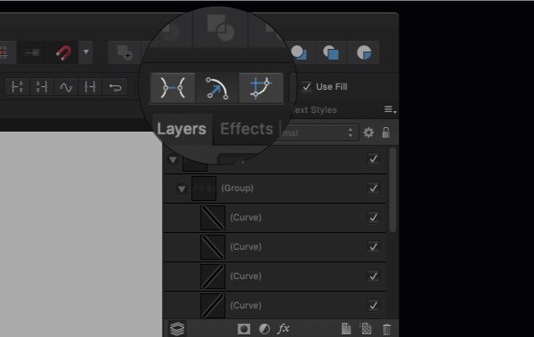
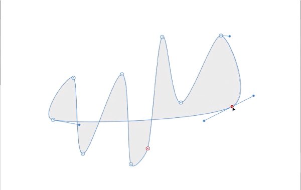
03. Converting your path
Adjust your line using the conversion options
You've created a path using your Pen tool, you can adjust it using the conversion tools shown in the image above. These will enable you to do things like smooth a zig zag or make it jagged again.
04. Line actions
There are also a number of actions to choose from. With your path or node selected, you can select from the following: Break Curve (opens the path at the selected node), Close Curve (closes the path at the selected node), Smooth Curve (adjusts the path and smooths or simplifies it), Reverse Curve (toggle to draw from the opposite end of the path).
05. Snapping
Play about with different snapping settings to find which one suits you
Snapping is used in a variety of ways in Affinity Designer. For the Pen tool I recommend you play about with the different settings to figure out your preference. Your options are as follows: Align to node of selected curves; snap to geometry of selected curves; snap all selected nodes when dragging; snap off curve handles.
06. Use Fill
Toggle fill on and off
The last feature to be aware of is the Fill feature. When checked, this will fill the inside of your path with your chosen colour as you draw.
Read more:
-
When it comes down to building a great app, you need to consider both function and design. The Complete UI/UX Fundamentals Bundle shows you how to create apps that everyone will love to use – and that look as good as they work.
This bundle includes eight courses that covers the concepts behind building apps that are usable, accessible and enjoyable to use. You'll also learn to conduct the discovery it takes to define your user audience and solve their potential problems by understanding their point of view.
Snag the Complete UI/UX Fundamentals Bundle for $29, 97 per cent off the usual price.
Related articles:
-
Taking digital designs into the real world can be fraught with gotchas and gremlins. We’re so used to the world being digital that some of us have forgotten how to prep our work for print. This poster printing guide is here to help.
If you’re thinking of doing a run of poster designs for a campaign, party or gig (or simply to adorn your own walls with) here’s a guide to how to print your work. Follow our tips and you'll soon be poster printing with confidence – and you'll no longer have to worry about that guy in the printing shop laughing at you...
If you don't want to go to a professional, or if you want to try and few practice runs with your design, you'll need the right printer. Take a look at our roundup of the best home printers for some guidance.
01. Design in CMYK
Work in CMYK rather than RGB
If you're producing your own designs with the intention of taking these to a poster printing shop, then make sure you're working in the CMYK colour space rather than RGB. In Photoshop you can easily switch to this mode via 'Image > Mode > CMYK color'. This colour mode will give you a more accurate representation of how your colours will print.
02. ... or convert to CMYK
If you’ve been working in RGB and have converted your work to CMYK, just before you send the file for printing you may notice the greens and blues in your image have become lifeless and dull. You can use Photoshop’s Gamut warning tool ('File > View > Gamut warning') to highlight the colours that will have trouble converting from RGB to CMYK.
The RGB colour space has a greater array of colours than CMYK. Remember: all the computer-specific colours you pick in Photoshop for your poster then have to be printed with a selection of real-world inks. Those that can't be replicated will become 'out of gamut', and be printed with what is possible with the available inks.
03. Use vectors if possible
Designer Franz Jeitz advises: "When it comes to printing, especially large-format printing, vectors are your friend. Try to design as much as possible in a vector-based program such as Adobe Illustrator. Not only will it reduce your file size, but it will ensure that you get the crispest print result."
04. Work at 300DPI
Skinn's super-sized posters for a Belgian arts centre
Print files are BIG. One of the most common delays in poster printing jobs is work being sent back by the printer because the resolution is too low. Files destined for print should be set to 300 DPI (dots per inch). Simply put, the more dots that make up the image, the higher the resolution. More printed dots in an inch means a higher-quality reproduction.
If your resolution is too low, you're going to end up with a blurred and pixelated poster. In Photoshop you set the dots per inch when you create a new document ('File > New'). 300DPI is the standard resolution you want for a good quality print document.
05. Select your paper
Popular poster printing sizes are A2 (594mm x 420mm), A3 (420mm x 297mm) and A4 (297mm x 210mm). Paper choice and weight can be discussed with your printer, but 170gsm Silk or Gloss Art FSC or 150gsm are good choices. GSM stands for grams per square meter and determines how heavy the paper stock is.
06. Supply files as PDF
Supply your print files in the PDF format (print resolution at 300 DPI) or tiffs with no compression at the same DPI. It is possible to send JPGs if they’re high-res enough. So if you just want to print a poster of your pet pooch from a photo on your smartphone you can do this by sending a JPG, but be warned: the edges of the photo will be cut off and the colour will shift.
07. Consider litho printing

You'll need to decide between digital and litho printing
You have two choices for poster printing: digital or litho. (Well, okay you have three: you can always print at home. But chances are you don’t have a printer big enough.) A wide variety of mass-produced print items (books, posters, newspapers and so on) are produced using litho printing. Put simply, a litho print involves the printer making a set of 'plates' that are used to press the image to the paper.
Creating these plates comes at a cost and doesn’t offer the immediacy of digital poster printing. The initial outlay can be expensive, but if you’re doing a large print run and want to output up to A1, it’s the process that offers a higher quality print and finish than digital printing.
The choice between digital and litho printing will mostly be dependent on the money you have for the print job and how soon you need it doing. Digital printing with inkjet or laser printers is the cheaper and quicker of the two and good for smaller print runs. If budget is an issue and you’re not being too exacting over the quality, go with digital printing. This is also fine if you're not going above A3.
08. Choose the right poster printing shop
Different printers have different levels of expertise, so it's worth doing your homework and getting personal recommendations. Also make sure you tailor the printer to the job at hand.
In the UK, for example, Metroprint is well known for high quality and specialist work as well as being one of the few places around to use laser light source printers and genuine black and white photographic prints. For high quality, crystal clear prints on heavy stock, quality Kodak paper these are the people to visit.
However, you might just want to print lots of stuff digitally without a special finish or on the highest grade paper. So don't write off high street poster printing at places such as Prontaprint and Snappy Snaps. There's a reason they're everywhere: they offer a decent, affordable service and will print your photo posters direct from a memory stick, mobile phone, Instagram or Facebook. They can also help you enhance your work with a range of photo art effects.
Next page: bleed rules, vectors, and the final checks you should be making...
09. Check your spelling!
Luke Woodhouse advises that you to "spellcheck, spellcheck, spellcheck. Then get your mum to spellcheck it and anyone else who will read it for you. There's nothing more soul-destroying than a typo, and they're easy to miss if you're too close to your masterpiece." And that goes for the big words as well as the small ones – its not uncommon to caught up in checking the small print, only to miss a glaring error in the headline.
10. Set the correct bleed
What is bleed? It's simply a little margin (usually 3 or 5mm) around the edge of your poster design that, depending on how the printer cuts the paper down, may or may not be shown in the finished result. It's essentially your room for error and ensures there isn't a random white line on the edges of your printed poster.
Programs such as InDesign and QuarkXPress make it easy by showing you guides, so you can see where the bleed starts and finishes. Always ask the printer you're using (or check your own printer settings) to determine how much bleed is required for your poster printing.
11. Consider the trim
The trim is the edge of the final printed output. To prevent text or logos being chopped off the final output, they should be placed with some breathing space around them. Design elements should be no closer to the trim edge than 3-5mm, depending on the size of the poster.
12. Run a pre-print check
Always run a pre-print check. This will bring up any issues, such as RGB files being used or fonts used that aren’t embedded. In InDesign this is known as a 'pre-flight'. The programme can package up all your print files and links ('File > Package') into one folder, which will spare you any missing font nightmares.
13. Get your blacks right
Ben Powell advises you avoid RGB black as it will look grey in print
Ben Powell suggests: "When printing posters using black, there are so many different types of black you can use (RGB, Photoshop, neutral rich, registration, flat, designer, and so on).
"My tip would be to avoid RGB black as this is primarily used for the web/digital and will look washed-out and grey in print. Which black you should use will depend entirely on your printing process and what paper stock you're using, especially if you're printing solid blacks.
"When I designed a recent infographic piece, I spent days printing various different blacks on different stocks of paper to get the most accurate black whilst making sure the colours didn't bleed into each other; a really lengthy but worthwhile process. Always leave plenty of time to test your blacks – it can completely ruin a fantastic poster design if you don't."
Related articles:
-
You're reading Playful Physics – Liquid in Web Design, originally posted on Designmodo. If you've enjoyed this post, be sure to follow on Twitter, Facebook, Google+!
Physics explains things around us. Whether it is a natural phenomenon or a device created by humankind, physics is the theory behind why it works. Despite being one of the oldest fundamental science disciplines, it is something that not everyone …
-
Whether or not you choose to follow the latest design trends, some movements are just too big to ignore – and affect the industry at large. It's not necessarily about following the herd and developing a similar style – often the visual aesthetic is secondary to the social context that's driving it.
As a result, the most significant trends aren't just flash-in-the-pan occurrences that pass in a few months – they evolve, grow and expand as different designers interpret that underlying movement in their own way. In some cases, the bandwagon gets overladen with people who misinterpret and distort the original roots: we can all name our fair share of design trends we're tired of hearing about, after all.
Major social, political or environmental events may encourage designers, and the brands they work for, to think differently. In some cases, a forward-thinking brand sets an example through its behaviour, and blazes a trail for others to follow.
Amongst the 2018 design trends we identified at the start of the year are new approaches to colour, art direction, typography and even how ideas are expressed – but 2018 has also seen bigger-picture developments in methodology and ideology that could have lasting repercussions far beyond aesthetics.
Read on for four major shifts in brand behaviour that we've seen develop during 2018, and which we predict will play an even bigger role in 2019...
01. Brands acting sustainably
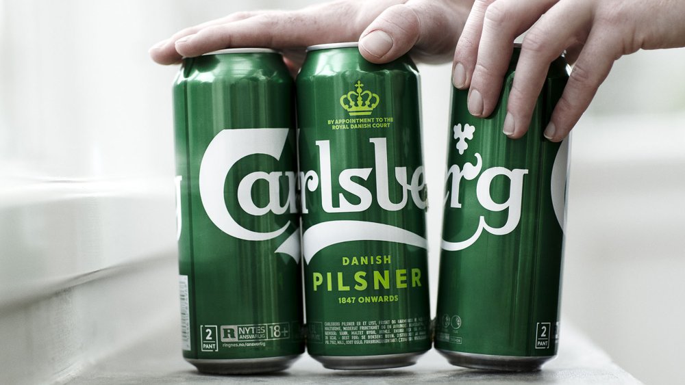
Carlsberg worked with its production partners to develop Snap Pack, a way to join multipack cans with minimal plastic
Unless you're the current US President perhaps, sustainability is climbing up the international agenda fast. Brands are starting to put their money where their mouth is, too. If a product uses recycled materials, responsibly sourced ingredients, is ethically produced and strives to be carbon-neutral, it's not just an altruistic venture for the company in question – it's a major selling point for environmentally conscious consumers too.
Reduction in plastic is a particular concern for many brands. In April 2018, no less than 10 D&AD Pencils were awarded to AMVBBDO's Trash Isles campaign for LADBible and Plastic Oceans, encouraging the UN to recognise the huge floating island of plastic in the Pacific as a country, so the world has a shared responsibility to intervene.
Two household-name Danish brands have also been blazing a trail in this space in recent months. LEGO has announced its first sustainable bricks, made from plant-based plastic, while Carlsberg unveiled various market-leading innovations alongside its global rebrand by Taxi Studio. Most notably, Snap Pack is a new method of gluing multipack cans together, reducing the plastic required by up to 76%.
Sustainability was also a key part of Taxi's brief, and the Bristol-based agency crafted a timeless, distinctively Danish branding system that's designed for longevity, rather than fading into obsolescence in a few years. We predict many more brands will put sustainability front and centre in 2019.
02. Brands expressing their personality in new ways
A distinctive personality is crucial for brands to cut through the noise in a crowded market – and tone of voice can play a big part. For a decade, Innocent was celebrated as the leading example of this. Countless imitators followed, desperate to achieve the same quirky, playful, chatty tone that raised a smile when you drank a smoothie. More recently, a generic 'artisanal' tone has gained traction, packed with earnest adjectives like 'hand-crafted' and 'authentic'.
Following trends won't get you anywhere when it comes to market stand-out, and brands are finding new ways to express their personality visually as well as verbally. A distinctive style of illustration can give a brand personality just as effectively as its tone of voice, and brands launched this year such as Anna by NB Studio are combining the two to great effect.
Another stand-out example is Superunion's recent brand refresh for BBC Two (see video above), which rethinks the role of channel idents to express a progressive, risk-taking personality. Putting stimulating, original programming at the core of BBC Two's identity, the agency turned the entire junction between programmes into an extended ident, using a range of stunning animations to express the mood a piece of content evokes, rather than just its genre.
Instead of overtly branding the idents, the content does the talking, with only a subtle curve motif – hinting at the outline of a '2' – to indicate the channel name. It's a bold way to express a brand's personality that bucks sector trends, and we predict even more forward-thinking brands will do so in 2019.
03. Brands taking a stand

Nike's campaign was divisive but brave
Ever since 2016 – one of the most globally divisive years in Western politics for quite some time, with the shock election of Donald Trump following hot on the heels of the UK's dramatic Brexit referendum – it's become increasingly common for brands take a side. The result is a fast-growing trend for divisive campaigns that attract love and hate in equal measure.
In 2018, a prominent example was Nike's defiant stance in support of Colin Kaepernick – the outcast American football player fronted the campaign to celebrate the 30th anniversary of its world-famous tagline. While many applauded its bravery and integrity, others destroyed their Nike goods and threatened to boycott the brand in future. With the world more divided than ever on deep-rooted, ideological issues, we predict more brands will take a stand in 2019.
04. Brands focusing on experience
As consumer demand shifts and brands such as Amazon, Uber, Netflix and Airbnb cause widespread disruption in their respective sectors, forward-thinking companies are increasingly putting digital products and services at the core of their business model, rather than just seeing digital as a glorified marketing channel.
Logo design is becoming a less important way for brands to express themselves distinctively, compared to the value of a coherent, intuitive multi-platform user experience that communicates brand values through every touchpoint.
Studio Output's multi-channel rebrand of BBC Sport, which picked up a coveted Brand Impact Award in September 2018, is a case in point. Pre-rebrand, BBC Sport's identity system was tailored for broadcast – and as it expanded across every other digital platform, it lost any sense of coherent user experience.
The solution was to communicate brand values through colour, type, and motion principles, translating it seamlessly across all devices and platforms – the logo became secondary. As digital products and services become ever more integral to brands' DNA across all sectors, we will only see this trend increasing in 2019.
Related articles:
-
Popular card readers like Square and PayPal have various flaws that allow attacks ranging from fraud to card data theft.
-
Design may be mostly done on computers these days, but everyone loves a bit of old-fashioned ink drawing.
The only problem is that to make your work look good you need an assortment of pens, of different line widths, and eventually they end up taking over your desk. If only there was a pen equivalent of simply increasing the line width in Photoshop CC.
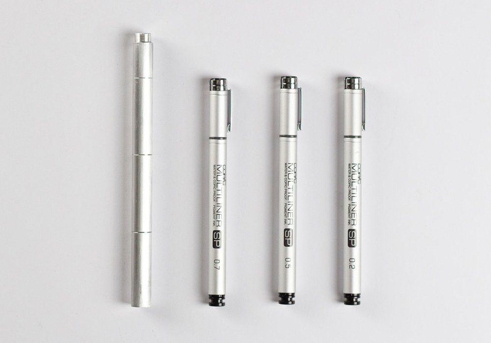
Take three pens into the studio? Not any more!
Well, now there is; or at least, there soon will be. The Wright Pen, by Wright Design, is the world's first magnetic multi-tip drawing pen, giving you three line weights in a single aircraft-grade aluminium body, and it's available to order now via KickStarter.
Designed for artists, designers, illustrators and just about anyone else who needs fine control over their line weights, the Wright Pen is basically three little pens that slot together to make one versatile drawing implement.
And what about the magnets? Well, the last thing you want is your pen falling apart right in the middle of some especially fiddly cross-hatching, so the Wright Pen uses powerful neodymium magnets to ensure that the three pen tips stick together properly and only come apart when you need to switch tips.

The Wright Pen's suitable for ladies and their delightful illustrations...
The Wright Pen's three nibs come in 0.2mm, 0.5mm and 07.mm widths, giving you a great variety of line weights, and if you need different weights you can simply customise your pen with replacement nibs from the Copic Multiliner SP family. Each tip has its own 3.6mL ink cartridge, ready for you to fill with your favourite drawing ink.

...and for men with their SERIOUS TECHNICAL DRAWINGS
Sleek and lightweight, the Wright Pen has just sailed through its (admittedly low) KickStarter target in around an hour, but there's still plenty of time for you to back the project and reserve your own pen for $56/£44 – 23 per cent off the retail price. Bear in mind, though, that it'll be a while before your pen arrives; according to Wright Design's timeline, production's due to kick off early in 2019, and the pens themselves will begin shipping in August next year.
Related articles:
-
If you're the rugged outdoors type who loves documenting your escapades on camera then you'll know there's really only one choice when it comes to picking the right kit: you need a GoPro.
They're not cheap, though, and if you want to get a great deal when buying one then Black Friday and Cyber Monday 2018 are the best opportunity to do so. We're going to be hunting down the best GoPro Black Friday deals so you won't have any problems finding the model you need at a knockdown price. Here's everything you need to know right now.
The best Black Friday/Cyber Monday GoPro deals: What we expect to see

GoPro's new Fusion model is great for 360-degree photos
GoPro is currently keeping things simple with its range of action cameras. Head to its site and you'll find it features just four models: the GoPro HERO7 black, HERO7 White and HERO7 Silver (be aware that these aren't just colour options; each model has slightly different features, with the Black the best of the three), and its 360-degree GoPro Fusion camera.
These are only its most recent models, though, and there are plenty of earlier GoPros out there that still pack some great performance and give you stunning video and photos. These older models are the ones that are almost certain to receive the most attractive Black Friday deals.
In particular, look out for GoPro HERO6 Black Friday offers; this model has only recently been superseded by the GoPro HERO7 and there's really not a lot to separate them. The GoPro HERO6 Black will still give you 4K video at 60fps, and it also features super-slow-motion 240fps video at 1080P, and while its retail price isn't much less than the GoPro HERO7 Black, when it comes to Black Friday then it's sure to see some much bigger discounts than its younger brother.
There's still a lot to be said for the even older GoPro HERO5 range, too. If you're not too fussed about having the very latest specs and have an eye for a bargain then this could be the sweet spot for the best of the price cuts.
For the cheapest GoPro option, however, look for the back-to-basics GoPro HERO, which launched this year. Simple and straightforward, it's lacking in fancy features such as 4K video and exposure control, but it's rugged and waterproof with voice control, and it sells for less than half the price of its full-powered siblings. We doubt there'll be huge discounts to be had, but what price cuts there are will be well worth sniffing out.
The best UK Black Friday and Cyber Monday GoPro deals in 2017
What sort of GoPro Black Friday deals can you look forward to in 2018? Here are some of the UK offers we found last year.
How to get the best GoPro deals on Black Friday/Cyber Monday

Look for older models like the Hero 6 Black, and see if there are any extras thrown in
The most important thing to bear in mind, once you've set your heart on finding GoPro Black Friday deals, is that by the time Black Friday comes around you may have already missed some of the best offers. Black Friday is big business for retailers and they don't want to miss the opportunity to shift some stock, so you'll find numerous stores jumping the gun and rolling out their deals in the weeks leading up to Black Friday. In short, start looking now, and don't be afraid to hop on a deal well in advance of the big day.
With that in mind, you'll also want to decide in advance exactly what kind of GoPro you're after and how much you want to pay for it. As we've already mentioned, there are subtle differences across similar-looking GoPro models; in the Hero range the Black has the best specs, followed by the Silver and the White. If you want to shoot 60fps 4K video then you're going to be very disappointed if you see a great offer on a Hero 7 Silver and order it without thinking.
Check for Black Friday deals with extras thrown in to sweeten the deal. Last year Amazon ran a fantastic offer on a GoPro HERO5 with a rechargeable battery and 3-way arm; two essential extras that you'd find yourself needing to get at some point anyway, so if you see a similar offer this year then it could be well worth your money.
And of course, use the same common sense that you would when buying anything else online; watch out for cashback offers that'll give you a welcome extra saving, check that the guarantee covers you if things go wrong, and don't forget to keep your receipt just in case you change your mind once the Black Friday fever wears off. Happy shopping!
3 GoPros to look out for on Black Friday/Cyber Monday

If you demand the best in action cameras then you need to opt for the GoPro HERO7 Black; it's a great reminder of just why the company has dominated this market. It's expensive and has its faults, but it's great to see the company refining its gear and paying attention to key areas like video stabilisation. Great videos, great images and, great fun; what's not to love?

There are plenty of better-specified action cameras available for a similar price, including ones that'll give you 4K video, but they don't have GoPro HERO's slick design and polished. If you're just starting out with action cameras or need a budget option, this is a great choice.
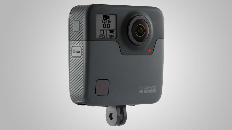
The Fusion's less about 360 video and more about not missing a thing thanks to its over-capture that allows post-editing in widescreen video; it's also brilliant for selfies framed without the selfie stick showing, and for 360-style photos. However it's let down by its app, which has connection issues and fiddly editing options as well as slow download speeds, and its Fusion Studio software, which is slow to use and heavy on processing power. The device itself works well – and it's waterproof too – but there are better 360 options available such as the Yi 360 VR and new Insta360 One X.
Today's best pre-Black Friday GoPro deals
Winter's drawing in and you might not want to wait until Black Friday to snag a cheap GoPro, so here are the best deals available right now; go get 'em!
Related articles:
-
The ideation and wireframing stage of any design enables you to consider the layout and user experience from the very start of your project. By only using the core components for your web design — header, footer, navigation, buttons — to begin with, you can always ensure your focus is on the user, without getting distracted by which colour palette to use.
There are plenty of wireframing tools out there, but today many web teams use Sketch. Its usability and unrivalled speed make it the obvious choice.
Starting with the header, what do we need if we are approaching this project mobile first? Is the logo the main focus? Should we consider using a ‘burger’ navigation to ensure best practice? These are the questions any designer should keep asking themselves throughout the process when building their wireframe components and creating a page design, and here's how to address these questions, and more, using Sketch.
Click the icon in the top right of each image to enlarge it

Wireframing in Sketch
01. Build the components in Sketch
The first steps should be to create an artboard for mobile or desktop, and begin to build the components on the page with simple shapes, in order to define the outline of the components, like the header.
Too many colours can be distracting, so minimise your colour palette to clearly define important elements in your wireframes. Highlighting the important stuff (call-to-action buttons, header text) with bolder colours is a subtle yet effective way of creating a visual hierarchy when sharing the designs with colleagues and clients.
For example, within the header, inserting a logo and navigation in a bold blue colour, on a pastel blue background, will present them as the important elements in your component.
It’s also worth noting that it’s possible to update the link colours in your Sketch preferences, just in case there is a colour clash in a design with the default orange.
02. Use a grid and guides
Grid lines can help you define your wireframe
It’s also important to consider a grid system, padding and margins as soon as possible when defining the wireframes. Show rulers in a Sketch file by going to View > Canvas > Show Rulers (or ctrl+R). Clicking on these rulers (down the left and above your artboard) will create guides, which in turn saves a lot of stress when sharing designs, as consistency is key when defining a design system.
03. Create symbols in Sketch
Planning to use these components in more than one artboard? Why not create a symbol? Symbols are the best feature in Sketch by far, they act as super-components that update all the artboards they currently sit in. To create a component, right-click an element, and choose Create symbol. This will be saved into one packaged item manageable from the symbols page.
Improve your Sketch prototypes
04. Add animations in Sketch
Underneath the target area on the right-hand panel there is the option to add animations between your artboards. Using animations is a great way to add more life to your prototype. However, the current options are more tailored towards app prototypes, and don’t offer much flexibility if demonstrating a website design. That said, it’s expected the list will grow in future updates of Sketch with options like fading transitions, for example.
05. Flag your starter page
When previewing a prototype, the flag icon that sits in the header of the popup next to the select dropdown is a great way to indicate which of the artboards is the home page. Once selected, every time the prototype is opened, this artboard will be the first page. This will also set the homepage when sharing the prototype in the cloud.
Collaborate in Sketch
06. Use Sketch Cloud
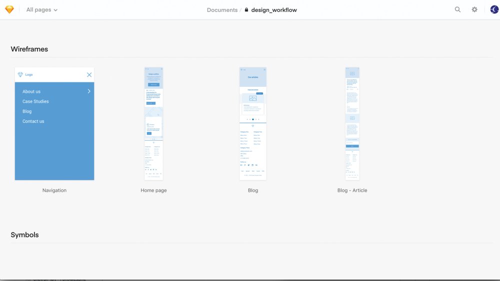
Sketch Cloud is a great platform to do some user testing
Sketch’s latest cloud feature is an online showcase of all pages and artboards in one place. Anyone can sign up to use Sketch Cloud to view, download, and comment on Sketch files, which have been shared publicly or privately straight from Sketch.
Pages act as sections on your Sketch Cloud link and are displayed in order of their structure in Sketch (from top to bottom). Artboards within these pages do the same, so make sure the structure is correct (for artboards, order from left to right) to show designs in a specific order. This is also a great platform to perform some user testing once you’ve shared your cloud link.
When the prototype is complete, click on the Cloud icon, sign up with an account, and upload the designs to the cloud. From this point onwards, the link will remain the same, so any future amends added to the project will be uploaded when clicking on the cloud icon and selecting Update in the share popup.The dashboard on the cloud is self-explanatory with prototypes, artboards and symbols available to view in order.
07. Prototypes in Sketch Cloud
If you viewed your prototype in your Sketch file earlier, and flagged one of your pages as the starting page, Sketch Cloud will create a new section with this prototype ready to go.
Can’t see a prototype? Simply go back to your Sketch file, highlight the artboard you want to be the starting page, click Preview so you see the popup, and finally click the flag icon. On your next push to the cloud, this prototype will be waiting for you.
08. Enable comments in Sketch Cloud
All users with access can leave comments on each artboard, enabling all feedback to be kept in one place, so there's no need for that long-winded email anymore.If you are looking to get feedback on your prototype or designs, or want to share the prototype on a public link, click on the cog icon in the top-right corner of your cloud dashboard. Here, you can enable comments (which will appear once viewing a design by clicking the bottom-right icon), and create a public link for your designs for sharing.
You can keep the designs private, and give access via email to a lucky few. To share a direct link to your prototype without the user having to navigate in Sketch cloud, adding ‘play’ or grabbing the URL in prototype mode and enabling a public share link will do this. For example: sketch.cloud/s/1abc2/all/website/home/
09. Essential shortcuts in Sketch Cloud
Push changes to the Cloud by selecting this icon
Push your latest changes to cloud by selecting this icon – your browser will open the link once completed.
Declutter your Sketch cloud link by selecting only the page you want to show in the top left dropdown, and share the URL from here instead.
You can share changes with your team with this feature
In the settings panel popup, tick ‘Use as library’ to automatically let your team know there’s been a change.
Flag your opening artboard in preview mode before pushing to cloud to make it appear first on your Sketch cloud link.
Build a design system in Sketch
10. Stay organised
It's easy to organise your colours in Sketch
Keep your brand colours organised in your document palette by choosing the said colour and clicking the ‘+’ icon.
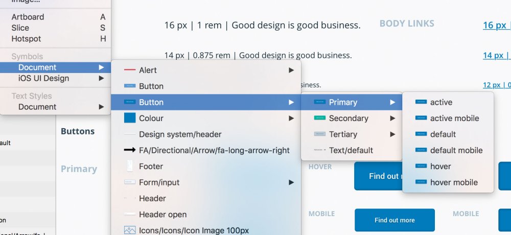
Name your symbols correctly to keep them organised
Keep your favourite symbols organised in their multiple states by using slashes when naming your symbols, for example naming your symbols ‘Button / Active’ and ‘Button / Disabled’ will group your symbols together under the same category.
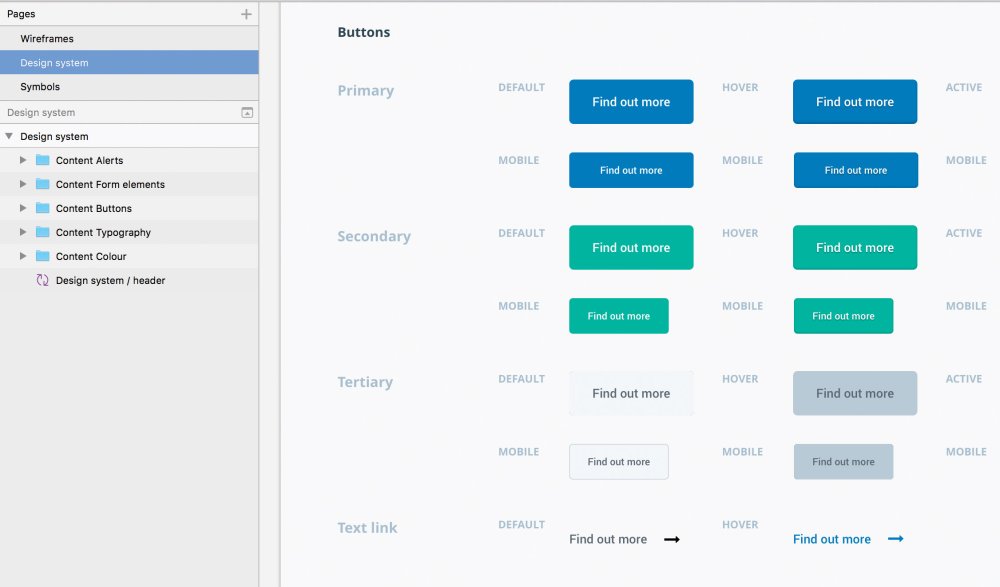
Show everyone where they can grab the assets with a single page in Sketch
Create a design system page by separating all your elements that define your brand into its own page in Sketch. This is a simple way to show everyone where they can grab the assets.
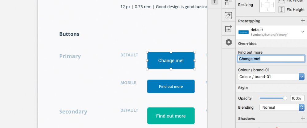
Making small changes in easy in Sketch
You can overwrite the content in your symbols, such as text in your button (see above), so you don’t need to worry about making new elements if it’s only a small change.
Create a page design
12. Create a strong visual hierarchy
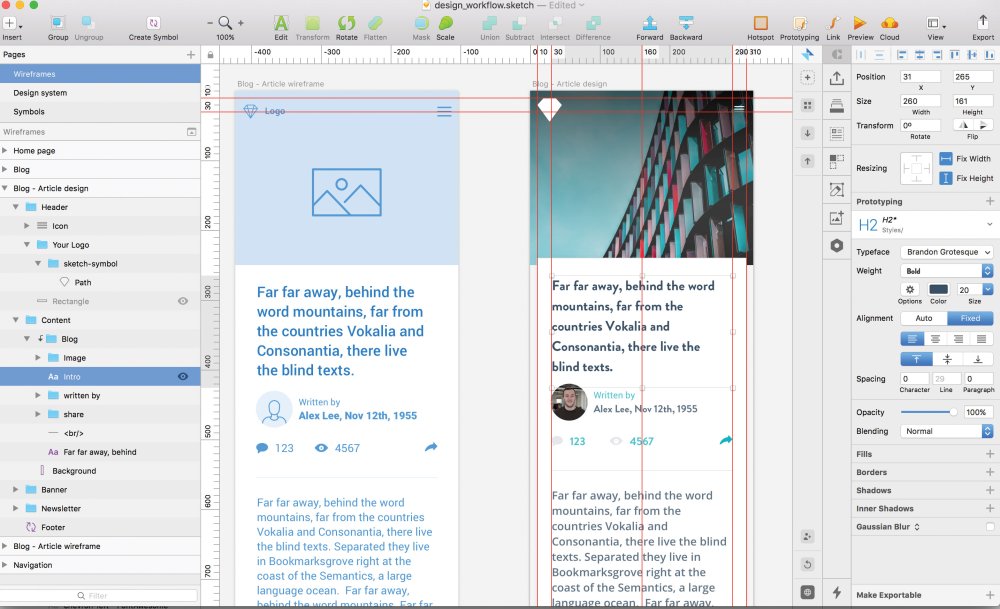
Designing user-centric components first can help structure your site
A strong visual hierarchy ensures clarity in any user-centric design. To get started, design the most universal components – such as colour and typography – first, and then work down to smaller ones such as buttons and input components.
To insert just about anything into your design, hover over to Insert tab at the top of the Sketch UI, click, and then start importing elements onto your artboards. Keep in mind your wireframe and design system to ensure consistency in your work.
13. Use colours sensibly
Colour is arguably the most important element in any design workflow. With colour, we can set the overall look, feel and tone of a design, so always ensure you use it in correlation to the importance of the elements that they are assigned to.
Try grouping your colours like so:
- Primary colours: the main brand colours, used to create the basic colour scheme of a project and crucial elements like buttons.
- Secondary colours: these accompany the primary colours, and compromise different shades, gradients and tints from the primary colours.
- Tertiary colours: an important group, which display system messages, such as alerts, warnings, and notifications.
To make your colours as efficient as possible, create each colour as a symbol in your Sketch file to ensure any changes update the elements across your design.
14. Use typography effectively
It’s important to design the style and size of all the headings (H1, H2, H3, and so on) and paragraphs to create a visual hierarchy. Usually, typography doesn’t have many stylistic variations, such as colour or weight, so consider using your colours effectively to present the brand personality.
Once your happy, define your text styles in the right-hand panel, by clicking on the ‘no text style’ dropdown and selecting ‘new text style’, once saved, you can use this typographic style throughout your design, like symbols.
15. Use icons to add context
When used effectively, icons add context to more complex components such as buttons, labels, or tables. Icons in your design can be functional by encouraging users to interact — using an ‘X’ in a button to signify a Remove action, for example.
Consider creating a set of UI icons as nested Sketch symbols to help complement other UI elements in the design framework, – arrows, for example – that can be used in sliders, previous and next buttons and pagination.
16. Design buttons and inputs
When designing buttons and inputs, make sure to design their individual ‘states’. Each have multiple states and provide visual feedback to users to indicate the current state (for example, hover, clicked). It’s good practice to create each state as a separate symbol, since this adds flexibility.
17. Complex components and sections
At this stage, the design could be considered complete since it has everything needed to create a functioning product. However, it’s worthwhile spending more time creating components for the UI framework, such as cards, tables and forms. These can then be combined to develop sections, shaping the blocks to which our websites and applications rely on such as headers, navigations and banners.
This article originally appeared in issue 277 of Web Designer. Buy issue 277 here or subscribe.
Read more:
-
In just a couple of hours time we're expecting to hear news of the latest iteration to Apple's popular tablet, the iPad Pro 2018 (or iPad Pro 3). As invites to a special hardware Apple event in New York today have been flying around, speculation is rife about the new device. And we've got some of designer interest to share.
We've already seen the release of an entry-level iPad this year, which, as our full iPad 9.7 review states, is more laptop-like and art-friendly than ever before. But if some of the rumours suggested by @OnLeaks on behalf of MySmartPrice are true, Apple's latest iPad Pro looks set to take that to a whole new level.
The gist we're getting, more than anything, is Apple really pushing this device as a 'laptop replacement', boasting powerful iOS 12 (tablet-focused) software and rumoured new features including TrueDepth camera technology and a USB-C port replacing the current Lightening one. Combine that with the fact that software companies like Adobe and Affinity are clearly focusing efforts on iPad-specific apps, and this could soon be an interesting time for creative professionals.
That said, there are other rumours surrounding functionality, which might make it less desirable to artists and designers. Our sister site techradar recently reported early sights of the new device saw no sign of a 3.5mm headphone port and that measurements of the 2018 version were significantly smaller than that of the 2017 model.

The new 2018 iPad Pro is rumoured to be significantly smaller than its predecessor
Obviously all of this is speculation at the moment, as is whether Apple will refer to new device as the iPad Pro 2018 or the iPad Pro 3. But one thing we can be sure of is that it won't come cheap. Nor that we'll see any iPad Pro Black Friday deals, sadly, especially when leaks suggest the cost of a new iPad Pro will be in the region of $649/£619.
We'll be sure to cover any Apple news as and when it comes in, including details on announcements expected to drop on shiny new MacBooks , so make sure to check back later for any updates.
Read more:
-
If you think that developing vibrant animated characters is difficult, you'd be right – it usually is. But this CrazyTalk Animator 3 Pro makes it simpler than ever before, using a wide range of motion templates to bring any image, logo or prop to life.
You can even use instant facial motion capture from newer iPhones to make animating 2D characters even simpler, and utilise character templates, motion libraries, a powerful 2D bone rig editor and more to develop characters. That lets you create 2D talking characters for videos, web, games, apps and presentations.
Check out CrazyTalk Animator 3 Pro for $79 – that's 55 per cent off the regular price.
Related articles:
-
-
Anyone who wants to create something beautiful online needs to have an eye for design – but sometimes needing to know how to use Photoshop or other design-related tools can be off-putting for the average joe. This piZap Pro: Lifetime Subscription lets you access enormous, diverse suite of digital programs to complete nearly any digital design task, without needing to understand complex programs.
Utilise hundreds of fonts to spice up flyers and graphics, use royalty free stock images for blogs, edit photos and more. You can even design your own emojis, showing off your creative spark.
Try this piZap Pro: Lifetime Subscription for just $39.99 – that's 77 per cent off the regular price.
Related articles:
Threatpost: Two Zero-Day Bugs Open Millions of Wireless Access Points to Attack
in Ειδήσεις από τον χώρο του Design και Hosting
Posted · Report reply
Called BleedingBit, this vulnerability impacts wireless networks used in a large percentage of enterprise companies.
View the full article