

Rss Bot
-
Content Count
18,853 -
Joined
-
Last visited
Never -
Feedback
N/A
Posts posted by Rss Bot
-
-
Over two dozen third-party ecommerce plugins contain zero-day vulnerabilities being exploited in a recent Magecart campaign.
-
The unpatched flaw allows an attacker to delete any kind of file on a victim machine, including system data.
-
After a two-quarter lull in the action, malware activity resurged in the third quarter of the year, especially on the business front.
-
The digital world is so vast, that sometimes it feels hard to make your voice heard amongst all the noise. To take a look at the next wave of innovation in digital creativity, and examine how designers can create products and experiences that stand out, we hosted an afternoon of talks at Bath Digital Festival, and invited top designers from the South West to speak.
All of the studios represented in the lineup had developed a reputation for crafting engaging projects that stand out from the noise. Here are 6 pieces of advice that will help you do the same...
01. Understand your brand purpose

When brands forget that they are all about emotion, they're in trouble, said Nick Ellis from Halo
"Brands are entirely emotional," said Nick Ellis of Bristol's Halo, talking about that time in the '80s when Coke relied too heavily on market research, launching a 'new Coke' it was forced to pull just a few months later, despite having hard-earned and expensively gathered data that said it was going to do well.
"Coke forgot who owns its brand," he said. It forgot about the role it plays in people's lives, and it forgot its purpose. "Hear your audience, listen to your instinct," Ellis advised. "Sometimes you have to frame that market research for yourself, and think about the context in which you did the testing."
As a brand, you are trying to get a response from an audience, he continued, we often want to get people to buy stuff. "And to understand that, you need to know what your purpose is in their life."
02. Create the right content
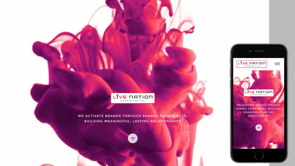
Halo works with Live Nation on "all things digital", including persuading the team they didn't need so much content
The thing about the digital world is there's an awful lot of noise, or, as Ellis put it: "Blogs are bollocks on the whole, and we have to accept that."
When you're working in content creation, you need to once again consider the role you play in your audience's lives. "The key here is good content, and more importantly, relevant content," he said, giving the example of Live Nation, which used to put out huge amounts of music-related content, even though its core purpose was to sell gig tickets.
"Instinct tells us that the brand should shut up and sell me some tickets," said Ellis. That's precisely what Halo suggested Live Nation do, and it worked.
03. Say yes to lots of different things
Saying yes has led Supple Studio to work for clients such as 4 Creative
Supple Studio's Jamie Ellul also likes to follow his instincts. And those instincts tell him to say yes, a lot. This led him to co-founding Magpie Studio with two friends back in 2008. "We were completely green," he recalled. "We said yes to lots of things. The ones that we said yes to where we didn't know what we were doing were the best projects we’ve ever done."
Since founding Bath's Supple Studio, Ellul's continued to say yes, and this has led him to work with an array of different businesses. "Ideas are the way you blag things," he said. "And that's why I keep saying yes."
It's also vital to get the right team, he added. "I employ people who are better at something than me. I let them do their thing, and that’s where the magic happens."
04. Invest in passion projects
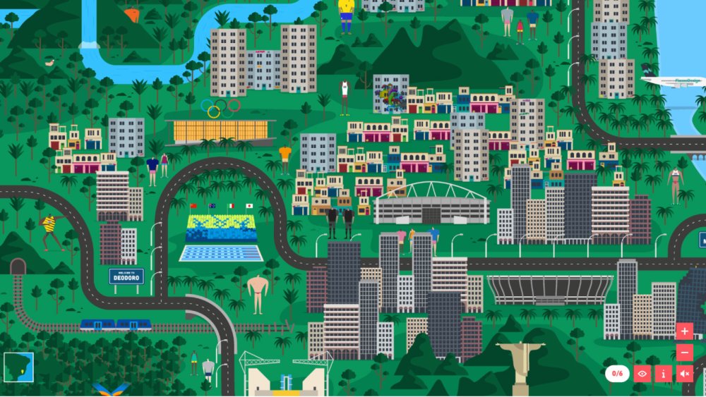
Fiasco Design's illustrated map of Rio for the 2016 Olympics
Back in 2014, Ben Steers of Fiasco Design and his team were watching the news stories coming out of the Sochi Winter Olympics with interest, and they wanted to take these stories and turn them into some sort of "information discovery".
"We started researching Sochi, and illustrating the different characters. We gave ourselves a month," he said. The illustrated, interactive map ended up being picked up by The Guardian, and the Fiasco Design team was buoyed up to create a bigger and better map for the 2016 Summer Olympics in Rio.
"Since then, we’ve had a lot of enquiries about illustrated maps," said Steers. "But a lot of people don't actually want to pay for them." However, one enquiry did pay off. The team received an email asking them to create an interactive map of a luxury resort in Mexico. It didn't seem real, but Steers decided to go on a research trip anyway. And this illustrated interactive map is due to go live tomorrow (keep an eye on Fiasco Design's site for details).
"Follow your passion and the paper will follow," said Steers. "We started off with a passion project and five years later we're sipping mezcal in Mexico with a new client. Get your work out there, push yourself and you might find there’s a little bit of paper at the end of the rainbow."
05. Get to the heart of the brand
Ed Robin explained how Mytton Williams rebranded three different law firms in completely different ways by getting to the heart of their propositions
In today's world, "it's become a bit rarer, that you get something that gets to your heart a little bit more," said Ed Robin of Bath's Mytton Williams. In order to find that heart, you can use digital tools, as long as it "comes from the heart of the idea and its creativity", he added.
"If you get that heart right, then as the work goes out, it all comes from the same place." This makes it easier to apply a brand in different ways.
Robin also emphasised the power of working with the right people, especially when you are ultimately handing the brand over to them. "The brand guidelines don’t have to be a straitjacket," he said. "They can be a more flexible thing that people can take and do their own thing with, and do it better."
06. Put the craft back into digital
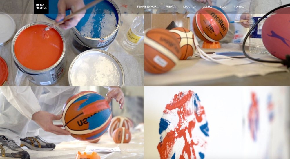
Mr B & Friends used tactile methods to create a digital marque for GB Basketball
The last speaker of the afternoon addressed a question that the other speakers had all touched on in some form: how do we bring craft and creativity back into the digital world? "It's not a given," said Kate Gorringe of Bath's Mr B & Friends.
She said that with the advent of computers and graphic design software, "pretty much anyone who could get their hands as a computer could set themselves up as a designer". This means that sometimes the creative gets forgotten as people focus on the digital and reproduce the same types of sites, for example, over and over again.
How can we address this? By engaging in real experiences – using a ball to splatter paint on a wall, like the agency did for its GB Basketball identity, for example (see image above). By blending the real and virtual worlds and acknowledging that people live in both, like Pedigree did with its Selfie Stix campaign. And by thinking about what digital allows us to do that we couldn't do before.
Like Ellis, Gorringe emphasised the importance of brand purpose. "Let digital support, not fight, your brand. There's a lot you can do with digital, but if it doesn’t support your brand, don’t do it," she said.
"Don’t pigeonhole yourself," she concluded. "And don’t just be a digital designer, be a creative."
Read more:
-
There’s no denying that smartphones and tablets can capture good-quality photos but, when you want to get creative, there’s no beating a ‘proper’ camera. They’re tools that are literally designed for the job. The bigger decision is what sort of camera you should go for.
For simplicity and portability, there’s a lot to be said for a small point-and-shoot camera that you can slip into your daily bag or even a spare pocket. Most models have a respectable zoom range and a built-in flash, while some add a viewfinder that helps when composing shots under bright sunlight.
To add versatility, you’re better off with a ‘system’ camera. These have a separate body and interchangeable lenses, so you can mount the optic that’s best suited to the shooting scenario at hand. They start small, with mirrorless compact system cameras, whereas DSLRs tend to be more of a handful. That can be a good thing, as they often feel more comfortable and natural in the hand, and the reflex mirror gives you an unadulterated ‘through the lens’ image of what you’re shooting, via an optical viewfinder.
Whatever type of camera you go for, it needn’t be complicated. Let’s take a closer look at the best beginners’ options on the market right now.

It’s particularly easy to get up and running with the Nikon D3500. As well as an ‘intelligent’ fully automatic mode, there are wide-ranging scene modes and effects to choose from. More uniquely, there’s a Guide shooting mode, which serves as a kind of interactive photography course. There’s no shortage of quality either, with a high-performance 24.2MP image sensor and processor, a generous ISO (sensitivity) range, speedy 5fps maximum burst rate and a high-resolution LCD screen.
However, it’s not a touch-sensitive screen and lacks a tilt or pivot facility. Another drawback is that autofocus is relatively slow in live view and movie capture modes but, overall, the D3500 is currently the most appealing beginners’ camera on the market.
Despite being remarkably inexpensive for a DSLR kit that comes complete with camera body and zoom lens, the 4000D is capable of delivering lovely image quality. Full auto mode incorporates real-time ‘intelligent’ scene analysis, and there are plenty of scene modes and creative filters to choose from. There’s a built-in feature guide and a Creative Auto shooting mode that helps to bridge the gap between basic and more advanced modes.
For extra guidance, Canon also offers a Photo Companion app that you can download for Android or iOS. Overall, the 4000D is good value for money but the kit lens doesn’t feature optical stabiliaation, the continuous shooting speed is rather pedestrian, and the rear screen is relatively small and low in resolution.
Typical of Canon DSLRs, the 800D is easy to get to grips with. It has a very logical and highly intuitive interface, with an excellent Quick menu for accessing important settings via its fully articulated touchscreen. Like the 4000D, it also features a full auto shooting mode with intelligent scene analysis, a Creative Auto mode, and a Guided option for the menu system.
The menu system itself is rather more complex, and adds a number of custom settings, for tailoring the camera to your specific shooting requirements.
The autofocus systems are particularly impressive, with a 45-point AF module for shooting stills through the viewfinder, and a Dual Pixel AF image sensor that makes autofocus impressively fast and responsive for live view and movie capture, at least for a DSLR.
The kit lens is far superior to that of the cheaper 4000D, with silent STM (Stepping Motor) autofocus and the addition of image stabilisation.
Immaculately turned out in a choice of black, dark silver or champagne gold, the Fujifilm X-T100 is is one of Fujifilm’s latest compact system cameras. The impressive feature set includes high-resolution thrills all round, from the 24.2MP APS-C image sensor, to the 1,040k 3-way tilting touchscreen and the 2,360k electronic viewfinder. There’s also 4k UHD movie capture on the menu, although it’s limited to a disappointingly slow 15fps frame rate.
Further highlights include intelligent scene analysis and intelligent hybrid AF, which combines phase-detection and contrast-detection for fast yet consistently accurate performance. The 15-45mm kit lens is also a delight, delivering very good image quality while adding optical image stabilisation and power-zoom for smooth focal length transitions when shooting movies.
Typical of bridge cameras, the Sony DSCHX400 has a fixed rather than interchangeable lens, but with a body shape that more closely resembles a DSLR than a compact camera. It makes sense really, because the massive 25-500mm effective zoom range would be hard to handle without a comfortable and natural grip on the camera, especially when you’re trying to keep things steady at the telephoto end.
The Sony is no slouch when it comes to shooting speed, with a maximum burst rate of 10fps. Although the 1/2.3-type image sensor is physically small, it boasts 20.4 megapixels and the 3.0-inch tilting screen has a high resolution of 922k. However, it’s not a touchscreen and the resolution of the electronic viewfinder is comparatively disappointing, at just 201k pixels.
For such a small camera, the Panasonic TZ100 packs in some seriously big specifications and features. It has a 20.1MP 1.0-type sensor that’s physically large for a compact camera, and retains relatively noise-free image quality even at high ISO settings. It also crams in an electronic viewfinder and a high-res, 3.0inch rear screen, plus a 10x zoom lens with an effective range of 25-250mm.
To keep things steady, there’s optical image stabilisation for stills and 5-axis hybrid stabilisation for video capture. You can also shoot at 4k UHD for both stills and video, with a frame rate of up to 30fps. For full-resolution stills, the burst rate is still speedy at 10fps.
Clever tricks include ‘post-focus’, which enables you to capture a burst of stills with automatically transitioning focus distances, and select the frame with the ideal focus point afterwards.
Panasonic makes an enviable range of Micro Four Thirds mirrorless cameras with interchangeable lenses. This one – the Panasonic DC-GX800KEBK – is particularly beginner-friendly, nice and compact, and the least expensive. The interface is clear and simple, based around a touchscreen that features a 180-degree tilt facility, ideal for selfies. The so-called Light Speed AF is fast and accurate, and 4k UHD is available both for video and a rapid burst of stills.
One drawback of the slimline design is that there’s no viewfinder. You therefore need to compose shots on the LCD, which can be a struggle under bright sunlight. The 16MP stills resolution is also a bit on the low side but it’s a particularly good camera for shooting video.
One of the upsides of Micro Four Thirds mirrorless system cameras is that they tend to be fairly small and lightweight. That’s certainly true of the Olympus E-M10, which is now in its third generation. Although small, it’s impeccably well built and beautifully turned out with classic retro styling. The 14-42mm EZ kit lens is similarly small, with a retractable design that enables compact stowage.
Even so, it features a built-in motor that enables smooth zooming during video capture. The maximum burst rate for stills is a speedy 8.6fps, although autofocus can be a little slower than in many competing cameras, making it tricky to follow fast-moving action. 4k UHD movie capture is a bonus.
Great for following the action in sports and wildlife photography, the Nikon D5600 has an advanced 39-point autofocus system that boasts auto-area, dynamic-area and 3D-tracking modes. The optional 18-140mm VR kit lens is also particularly suitable for these types of photography, with its 27-210mm ‘effective’ zoom range and competent Vibration Reduction (optical image stabilisation) system. And for when you need to trek into the countryside for shooting wildlife, or stand for long periods at a sporting event, the D5600 won’t weigh you down as it’s one of the lightest and most compact DSLRs on the market.
The fully articulated touchscreen is an extra bonus, although for live view and video capture, the sensor-based contrast-detection autofocus facility can be painfully slow.
Like other ‘tough’ compact cameras on the market, this Olympus Tough TG-5 is designed to take the knocks. It can withstand being submerged in water to a depth of 15 metres, dropped from a height of 2.1 metres and frozen to -10 degrees Celsius. If you’re feeling particularly mean, you can even try crushing it with a 100kg weight, and it’ll still keep on working.
All in all, it’s a great camera for everything from skiing down mountains to snorkelling in the sea. The maximum burst rate is a similarly action-packed 20fps, and you can also capture 4k UHD movies. The 4x optical zoom lens adds versatility, as do the built-in macro and microscopic modes. To take things even further, a range of optional accessories includes fisheye and telephoto lens converters.
Read more:
-
In this article you'll find everything you need to know about what to expect from Microsoft Black Friday 2018 and Cyber Monday. We'll be covering all the hottest offers (including any great Black Friday Microsoft Surface deals) as soon as any information is announced. But for now, we've rounded up what we know so far, plus some predictions for what to look out for based on past Black Friday events.
Microsoft has upped its game over recent years. Ranges such as Surface are providing serious alternatives to Apple products, and making Microsoft a much stronger option for designers looking for the best creative kit. But like any great tech, it doesn't come particularly cheap, which is why it's worth making the most of any Black Friday Microsoft deals that do become available.
This year's Black Friday will take place on 23 November, with Cyber Monday following on 26 November. If you don't have time to wait until then, scroll to the bottom, where you'll find all the best prices on Microsoft products right now.
For offers outside of Microsoft products, take a look at our roundup of the best Black Friday and Cyber Monday deals in 2018.
How to get the best Microsoft Black Friday deals
To start with, bookmark this page. We'll be updating this article with all the best Microsoft Black Friday 2018 deals as soon as we hear about them, so make sure you check back. As well as the Microsoft Store itself, other major retailers will certainly be getting in on the action with some strong offers of their own.
Take a look at our posts for the best Amazon Black Friday and Walmart Black Friday deals, and keep an eye on other tech retailers such as Target and Currys. To make the most of the offers, it's worth checking for add-ons or gift cards that will make your deal even better.
Black Friday Microsoft Surface deals: What to expect

The products everyone's interested in right now is Microsoft's Surface range. Last year, Microsoft itself offered a couple of great Black Friday Surface deals, offering a saving of over £250 on the Surface Pro Core m3 and the Surface Pro i5. Amazon slashed prices on Microsoft Surfaces as part of its bank holiday (UK) and Prime Day sales, which suggests that there may be more deals on the way from Amazon this Black Friday.
Microsoft's big news is the launch of two impressive new Surface laptop models: the Surface Pro 6 and Surface Laptop 2. Although at time of writing they'd only just hit the market, both have already gained rave reviews. We'd hope to see some strong Surface Pro 6 and Surface Laptop 2 Black Friday deals.
Our sister site TechRadar called the Surface Pro 6 "the best Windows tablet money can buy", with longer battery life and improved performance over the Surface Pro 2017 (read the full review here).
The Surface Laptop 2 has also impressed reviewers. TechRadar awarded it a nearly-perfect four and a half stars, saying "it ultimately achieves the most pure Windows 10 experience on a laptop" (read the review).
The arrival of these supercharged devices might also mean the older and alternative models, such as the Surface Studio, will be going into the Black Friday sale as retailers seek to shift stock. These are definitely worth a look – we were particularly impressed by the original Surface Book. Not sure which Surface is for you? Take a look at our reviews for an idea of what each one offers:
- Surface Book review (5*)
- Surface Book 2 review (4.5*)
- Microsoft Surface review (3.5*)
- Surface Pro review (4*)
Microsoft Office Black Friday: What to expect
Microsoft Office has never been cheap, but 2017 saw a number of Microsoft Black Friday deals taking the sting out of shelling out for Word, Excel and the like. Shoppers could get up to £30 off O365 Home – a Microsoft Office bundle that includes Word, Excel, PowerPoint, Outlook and OneNote, which is all the essentials covered.
Microsoft Black Friday Xbox deals
Shoppers are also hungry for a Black Friday Xbox deal. No news yet as to if there's anything planned for this year, but in 2017 Microsoft offered some good bundle and accessory deals, including an Xbox One S Minecraft bundle for just shy of £200 (saving around £120). Meanwhile, these are the best Xbox deals currently available.
The best Microsoft deals right now
We'll be announcing any great Microsoft Black Friday and Cyber Monday deals as soon as they're announced. For now, here are the very best prices for Microsoft's flagship products. Our tool checks over 130 million products every day, so you can be sure you're getting the best price around.
-
You're reading Best Tools for Code Collaboration, originally posted on Designmodo. If you've enjoyed this post, be sure to follow on Twitter, Facebook, Google+!

According to Forbes, 50 percent of Americans will work as independent contractors by 2027. Many tend to downplay freelancing as pertaining to only small-scale or personal projects and dismiss the implication and economic sustainability of freelancing. Independent contractors are not …
-
Many of us bemoan the fact that we waste too much time watching TV. But what that usually means is that we waste too much time watching dross: mindless reality TV, dumb game shows and the like.
Great television, however, can be enriching, inspiring, even life-changing. And after a long hard day, it can be just the ticket to recharge your batteries, provide new perspectives and inspire you creatively.
The good news is that we're living in a golden age for TV viewing, with the big streaming services pumping huge sums of money into high quality programming, and the traditional broadcasters upping their game to match.
The only problem is, there are now so many shows on so many different services, it can be hard to find the real gems. So in this article, we list the cream of the crop, and explain why these are shows that every designer should watch.
01. Mars

Mars dramatises a future colonisation of the Red Planet
As creatives, we’re constantly seeking visual inspiration, and what more inspiring sight could there be than the wonders of the wider universe? Having said that, straight documentaries can sometimes be a little samey, while fictions set in space are often over-the-top and play hard and loose with the scientific facts.
Mars, however, combines the best of both approaches, and comes up with something quite unique in the process.
Blending real-life interviews with a fictional story of a group of astronauts as they land on the red planet, it dramatises an imagined first attempt to colonise the Red planet in 2033 in a way that's utterly compelling.
“Mars by National Geographic offers a glimpse into our species’ greatest achievements, and what’s to come,” enthuses Kasper Christensen, founder and product lead at Nomad Rental. “There’s no better way to stay motivated and inspired while this show is running in the background, along with stunning eye candy for anyone into design.”
02. The Americans

The Americans puts an intriguing twist on the Soviet spy genre
The Americans is an Emmy-winning spy drama set in the 1980s during the Cold War. So far, so unremarkable... but the twist is that the ‘Americans’ of the title are actually Soviet KGB officers, posing as an native married couple in the suburbs of Washington DC.
With compelling characters and dramatic twists propelling the show through six thrilling seasons, it’s also a treat for the eyes, with its first-class costumes, set designs and attention to period detail.
"The Americans is a really entertaining series,” says Peter Sayn-Wittgenstein, executive creative director at global digital agency Mirum. “It features some great throwback set design that expertly captures the Cold War era… and if you're into wigs, you cannot do better than this."
03. The Wire
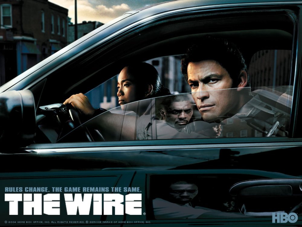
The Wire is widely considered the best TV show of all time
Running from 2002 to 2008, the Wire was one of the first shows to really turn the public on to the idea of streaming TV, and if you still haven’t seen it, there’s no time like the present.
Chronicling the war on drugs in Baltimore, Maryland, it’s one of the few shows to honestly portray both the realities of urban life and the machinations of politics and law enforcement. Plus it’s constantly gripping, emotionally engaging and regarded by many critics as one of the greatest TV shows of all time.
Mustafa Kurtuldu, a design advocate at Google in London, is among its army of fans, and describes it as “a well researched and brilliantly written series that tackled different aspects of the city, from the police department to the life of the kids in a broken town; I loved it!”
04. The Walking Dead

The Walking Dead goes far beyond horror cliches
You’ve spent years hearing your colleagues rave about The Walking Dead. So why not just grasp the nettle and watch it already?
Based on the comic book series written by Robert Kirkman, this gritty drama portrays life in the months and years that follow a zombie apocalypse. But it’s not just for fans of low-budget horror.
This is actually a grown-up, movie-quality drama with well formed characters and emotionally resonant storylines, that just happens to be about zombies.
As Robby Designs, a freelance web designer based in Plymouth, puts it : “It's a great show for designers. After all, if you've been up all night designing, you feel like a zombie anyway…"
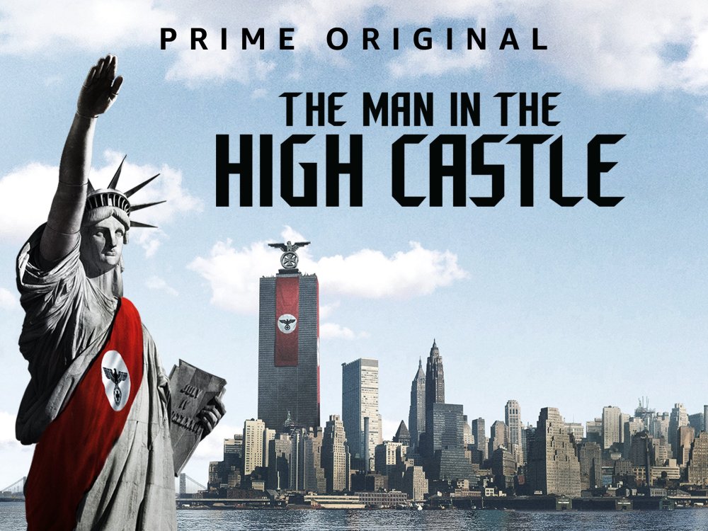
05. The Man in the High Castle
The Man in the High Castle is set in a world where America lost the Second World War
Based on a novel by Philip K Dick, The Man in the High Castle imagines an alternative 1960s in which the Nazis won the Second World War. They now occupy the Eastern half of the USA, in an uneasy alliance with the Japanese, who control the Western states.
"The show immediately sparked my interest," says Pittsburgh-based visual designer Christopher Watson , "probably for the same reason I'm obsessed with Back to the Future or even the Dennis Quaid film Frequency, both of which pose the synopsis of an alternate reality. I think it's baked into our human nature to inquire the possibility of a different outcome reflecting on past events and decisions; to what degree would probably stem from the level of our self-loathing."
And it's a concept he feels has been executed perfectly in the show, now on its third season. "The pace of the series is undoubtedly a factor that's kept me engaged," he reports. "The mix of longer and shorter sequences provides a great flow for me; maintaining the immersive feel of a full-length drama, but never feeling too drawn out."
Watson is especially struck by the opening sequence. "As of late, I've been drawing a lot of inspiration from motion graphics to integrate into web and interaction design, so intros are always a point of interest for me," he explains. "And the thoughtfulness and detail that Patrick Clair and his team at Elastic have put into the show's title sequence unveils a plethora of poetic nuances.
"One stand-out example would be the descending paratroopers in front of Mount Rushmore, reminiscent of tears running down Washington's face. I also think the projector treatments do a fantastic job of touching on plot points, capturing the essence of original propaganda footage, and depicting the 'projection' of what could have been our reality.
"Last but not least, the title track Edelweiss, written by Jewish-American songwriters Rodgers and Hammerstein, demonstrates a carefully crafted concept engaging multiple senses."
06. Doctor Who

Doctor Who continuously regenerates its hero, and introduces new characters to accompany him or her
- UK: Watch Seasons 1-11 on BBC iPlayer
- US: Watch seasons 1-10 on Amazon Prime
- Download season 11 episodes via Amazon Video
Since 1963, Doctor Who has been a sci-fi show like no other. Centred around a charismatic yet eccentric hero, The Doctor, who can travel anywhere in space and time, the concept offers a near-infinite range of dramatic possibilities. Not least because The Doctor can regenerate, allowing a succession of actors to take the lead; the latest is Jodie Whittaker, the first woman to inhabit the role. For these reasons, despite a quite staggering 843 episodes being aired at time of writing, it never fails to feel fresh.
That said, anyone who saw Doctor Who during the 1960s-1980s eras may remember its low-end production values, which compared poorly to the blockbuster US sci-fi movies of the time. But when the show returned in 2005 with Christopher Eccleston as the lead (resetting to 'Season 1'), it finally got a decent sized budget. And since then its alien worlds, monsters, robots and battle scenes have all looked pretty darned good.
It's still produced on a relatively small amount of money, but Jason Pickthall, a freelance concept artist who's worked for the likes of Rare, Activision Blizzard and Angry Birds, feels that's actually a positive.
"In an age where VFX is thrown at shows, I like the fact Doctor Who has a tight budget," he notes. "I love the thinking and rationale behind the design of the creature of the week, plus it makes it more relatable and grounded in the world of the day-to-day; so it's a win-win."
07. The Handmaid’s Tale

The Handmaid's Tale is as compelling as it is harrowing
Based on the 1985 novel of the same name by Margaret Atwood, The Handmaid’s Tale envisions a dystopian future in which America is ruled by a Taliban-style cabal of Christian fundamentalists, and fertile women are forced into child-bearing slavery.
If that all sounds a bit far-fetched, then be prepared for a shock, because the way these events come about is frighteningly realistic and quite believable. And Atwood based the novel on real events that had already happened around the world.
A superbly written and acted drama, beautifully directed and shot, every moment will leave you on the edge of your seat, and make you think twice about how fragile society really is.
Pickthall loves the way the show crosses multiple genres so effortlessly. "Handmaid's Tale is on the surface a sci-fi cautionary tale," he points out, "but visually it reads as a period piece, and the use of colour is so well thought out; these are no accidents."
08. Electric Dreams
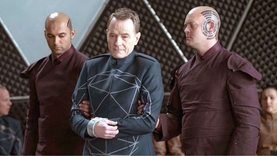
Executive producer Bryan Cranston appears in the episode 'Human Is'
- UK: Watch on All4
- US: Watch on Amazon Prime
Electric Dreams, produced by Sony Pictures Television for Channel Four and Amazon, takes 10 of the classic short stories of sci-fi legend Philip K. Dick and cleverly updates them for a contemporary audience.
Featuring an all-star cast including Bryan Cranston, Steve Buscemi and Anna Paquin, each episode is feature-film epic in scale, but with a touch of Black Mirror-style wit making everything feel up-to-the-minute modern.
Some stories take place at the far reaches of the universe, some closer to home, and each can be enjoyed on its own. But despite this, they add up to more than the sum of their parts, believes Pickthall. "Even though Electric Dreams was an anthology series, with individual parts that were very disparate, it was great seeing a common tone throughout the run," he says.
09. Black Mirror

Black Mirror is the sci-fi show that everyone is talking about
Black Mirror is a bit like a modern version of the Twilight Zone, only funnier. Essentially, it’s a dark satire on new digital technologies, which highlights the disastrous results they might lead to if we’re not careful.
“If you ask someone why they like the show, more likely than not, they'll tell you it’s because it feels highly plausible,” says Joshua Jenkins, a freelance designer based in New Mexico, and writer of the web series The Hand Unseen. “If you ask a designer, though, they'll probably tell you it's the design within the show, from composition to type to set design. The exciting part is that they're saying the same thing.
“Almost every episode features some piece of tech that has sent our modern world into chaos. That tech comes with typography, logo, packaging, and implementation that feels wholly grounded in our reality, which sells the show. If I wouldn't buy the product the characters in a show are buying, why would I buy the premise?”
Dale Harper, UX designer at London digital agency SharpEnd, couldn’t agree more. “The attention to detail in the design of Black Mirror is excellent,” he stresses. “While the dystopian themes encourage reflection and caution in your own work, they also provide a great deal of inspiration both in aesthetics and function.”
10. Abstract: The Art of Design
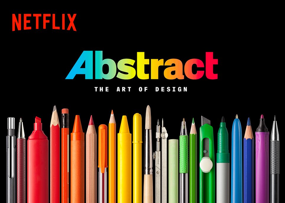
The best documentary series on design we've seen to date
There aren’t many TV documentary series about design, but there is one very good one. Abstract: The Art of Design was created by former Wired editor-in-chief Scott Dadich. Each of the 45-minute episodes takes you behind the scenes of leading creatives in a variety of disciplines, and it’s all fascinating and insightful stuff.
Freelance art director and designer Kirsten Murray is a big fan. “If you’ve ever wanted to know how Pentagram design icon Paula Scher comes up with ideas, or what it was like for renowned photographer Platon to shoot Vladimir Putin for the cover of Time Magazine, then this is the series for you,” she enthuses.
“It’s so much more than a documentary of the creative process," she adds, "it delves into the personal lives of some of the world’s most influential designers. What was their childhood like? What drives them to create? How did they get where they are today?
"Nuggets of wisdom in the series will stay with you long after you’ve watched it. I’ll leave you with this one from Paula Scher: ‘The design of the logo is never the hard part of the job. It’s persuading a million people to use it’.”
-
It's been an exciting year for Affinity users. So far 2018 has seen the launch of the first full-spec vector art app for iPad in the shape of Affinity Designer, plus the release of Affinity Publisher in free beta and an Affinity Photo update for iPad.
The expansion of Serif's creative armoury comes as no surprise. Its tools have won over creatives thanks to their excellent functionality and very reasonable prices. For users frustrated with subscription-based alternatives, the imminent launch of Affinity Publisher on iPad could be the final incentive they need to switch to the platform.
And speaking of excellent functionality, Affinity has made its tools even easier to use thanks to a series of keyboard cheat sheets for both Windows and Mac users. These shortcuts are designed to help users create in a quicker and more intuitive way. Get a taste of how these shortcuts can help you by clicking on the Affinity Designer keyboard cheat sheets below.
The fun doesn't end there though. Over on the Affinity website you can find shortcuts for Affinity Photo, plus German versions of each cheat sheet. All of the shortcuts are also available to download as PDFs for ease of use.
Affinity Designer Windows keyboard shortcuts
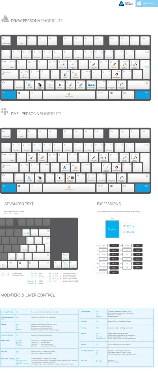
Click the image to see the Affinity Windows keyboard shortcuts
Affinity Designer macOS keyboard shortcuts

Click the image to see the Affinity macOS keyboard shortcuts
Related articles:
-
Does your website need a healthy dose of visuals? This huge collection of logo templates will get your site where it needs to go. The DesignShock Stock Logo Templates Bundle features 1,000 stock logos that will help enhance your brand visually, with themes ranging from vintage to gradient to handmade.
You can each edit each theme using Adobe Illustrator, as they're all in the .ai format. Feel free to resize them, change up the colours, add some additional features, and more. Bring a splash of visual interest to your brand with DesignShock Stock Logo Templates Bundle.
This bundle is 34 per cent off right now, so it's yours for only $19.
Related articles:
-
You're reading Web Designers, Eliminate These Design Pains Before They Kill Your Productivity, originally posted on Designmodo. If you've enjoyed this post, be sure to follow on Twitter, Facebook, Google+!
Every job can have its ups and downs. Yet, it seems that this is especially true for those brave souls who decide to be web designers. Constantly experiencing the highs of new projects and displaying their masterpieces to the world. …
-
With such huge branding budgets at their disposal, you'd think the world's most iconic logos would have every detail carefully considered. After all, if they're so ubiquitous, they must be polished to perfection, right?
Well, beauty is in the eye of the beholder. Logo design is not an exact science – often, it's about establishing an emotional connection with a brand – and sometimes perfection somehow... looks wrong. Sometimes brands will deliberately introduce little imperfections and idiosyncrasies, and unusual logo designs will often have fascinating stories behind them as a result.
In other cases, the imperfections are very far from deliberate. Many of the world's most-hated logos are flawed for all the wrong reasons, or kick up controversy and offence by missing the mark entirely.
Read on for six of the biggest imperfections in world-famous logos – some of which are intentional, others very much not – and what we can learn from them....
01. Google's imperfect circle
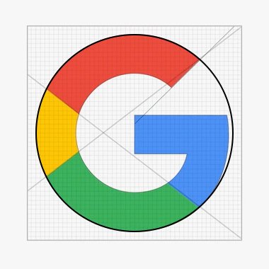
Google's 'G' deliberately deviates from a perfect circle to make it more approachable and unconventional
When Google swapped serif for sans serif as part of its 2015 rebrand, that wasn't the only aspect of its new logo that attracted attention: the shape of its G sparked a whole correct design debate. Detail-obsessed designers soon clocked that although the on-trend typeface choice was a geometric sans serif, the 'G' – frequently used as a standalone icon – is not based on a perfect circle.
On the one side there are advocates of perfect symmetry who believe the clean, simple minimalism that permeates the rest of the brand should be adhered to here, and criticise the slight deviation from perfection. Google insists it was intentional, to make the brand appear more approachable and unconventional.
When you place the 'G' side-by-side with a geometrically perfect equivalent, some argue the latter feels a little off-balance to the naked eye – in short, it's a deliberate imperfection that soothes some, and irks others. You can't please 'em all.
02. Starbucks' asymmetrical mermaid

Lippincott elongated the shadow on the Starbucks siren's nose to break the symmetry and make her more human
And so we come to another deliberate 'flaw' in an iconic logo, almost imperceptible to the untrained eye. When Lippincott rebranded Starbucks, as well as breaking the famous siren out of her branded restraints and turning her green, the agency also introduced a tiny imperfection.
While conventional wisdom holds that perfectly symmetrical facial features are the most attractive, in practice Lippincott found that conversely, symmetry made the mermaid look cold and inhuman. The solution? Making the shadow on the right-hand side of her nose just a fraction longer than the left, to inject some more warmth and humanity.
03. Wikipedia's Chinese blunder

Wikipedia swapped out a problematic Mandarin character on its globe as part of a 2010 rebrand
How much attention have you paid to Wikipedia's logo over the years? The world's fifth most popular website had a brand overhaul in 2010, simplifying its distinctive puzzle globe, and making it easier to scale. But you might need to be a bit more eagle-eyed – or a native Mandarin speaker – to spot what else changed.
To show the vastness of its global reach, each piece in Wikipedia's logo features a letter from a different alphabet. Many of these represent the letter that most closely resembles the English 'W' for Wikipedia. In the case of Mandarin, this would be the character anglicised as 'Wi', but its first iteration had an extra stroke added that effectively made it gibberish. After a small tweak, it did become a recognisable character, but the wrong one – 'Jie'.
In 2010, Wikipedia gave up trying to nail 'Wi', and replaced it with a different character altogether. It also replaced its Klingon character for one from the Ethiopian Ge'ez language instead. It's tough enough to make sense of 16 Earth languages, after all, without attempting interstellar communication too.
04. 7 Eleven's lowercase 'n'
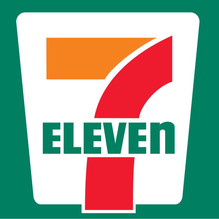
According to 7-Eleven, its strange approach to capitalisation was intended to make it look more graceful
You don't need to be a typography aficionado to spot the difference between lowercase and uppercase, and you'd certainly hope that 7-Eleven's rather blatant mixture of the two – rounding off its all-caps 'ELEVE' with a cheeky lowercase 'n' – wasn't a result of a designer nudging the shift key with their elbow.
7-Eleven's official story is that back in the 1960s, the wife of the company's then-president believed that an uppercase 'N' looked too harsh at the end of the wordmark, and dropping it to lowercase was more graceful. It's an interesting theory – and her suggestion has stuck ever since, despite flouting one of the most basic rules of the English language in the process.
05. London 2012's accidental offence
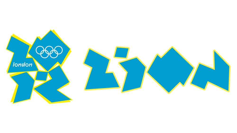
London 2012 attracted its fair share of design critics around the world, but some had more political objections
Despite making a lot more sense in application, the poor old London 2012 logo remains a popular inclusion on most-hated logos lists – with criticisms ranging from the blunt to the bizarre, such as drawing similarities to Lisa Simpson in a rather compromising position. Others just disliked the logo on a more basic level, finding its abstract graphic shapes and neon colours to be garish and illegible.
Other criticisms would be significantly more serious, if they weren't so tenuous. Some likened the shape to a Swastika – which is something of a stretch – while the Iranian Olympic team threatened to boycott the Games as they believed it spelled out 'ZION'. They were duly convinced otherwise, but it just goes to show how the harshest critics of a logo can find flaws and imperfections in the most unlikely, unintended places.
06. Pepsi's middle-aged spread

With a few little additions, Lawrence Yang transformed Pepsi's ill-advised 'smile' into a bulging belly
Pepsi has undergone many rebrands over the years, but has always struggled to attain the kind of effortless brand recognition that its fiercest rival Coca-Cola has enjoyed – Coke is arguably one of those brands so strong they don't need a logo.
Pepsi's most recent major overhaul in 2008 rotated its circular red and blue icon, distorting the long-established wiggly white line in the centre into a kind of lopsided smile, designed to vary depending on the product in question. Unfortunately, this introduced an unintended flaw that designers soon pounced on with glee.
With a few simple additions, the 'smile' is reframed as a bulging belly, spilling out between a red shirt and blue trousers. Obesity is not something a fizzy drink manufacturer ever wants to be associated with, and artist Lawrence Yang wasted no time in pointing this out, as did many others. Creatives can be brutal.
Related articles:
-
Flash is slowly being abandoned by Adobe in favour of HTML5 and JavaScript; its official end-of-life is set for the year 2020. And that's where this article will come in handy.
The tips described below aim to help HTML5 game developers avoid common mistakes when converting Flash games to JavaScript, as well as making the whole development process go as smoothly as possible. All you need is basic knowledge of JavaScript, WebGL and the Phaser framework.
Changing your game design from SWF to JavaScript can yield a better user experience, which in turn gives it a modern look. But how to do it? Do you need a dedicated JavaScript game converter to get rid of this outdated technology? Well, Flash to HTML5 conversion can be a piece of cake – here's what an experienced JavaScript game developer has to say about the matter.
01. Improve the HTML5 game experience
Converting a game to another platform is an excellent opportunity to improve it, fix its issues and increase the audience. Below are few things that can be easily done and are worth considering:
-
Supporting mobile devices
Converting from Flash to JavaScript allows reaching a broader audience – users of mobile devices support for touchscreen controls usually needs to be implemented into the game. Luckily, both Android and iOS devices now also support WebGL, so 30 or 60 FPS rendering usually can be easily achieved. In many cases, 60 FPS won't cause any problems, which will only improve with time, as mobile devices become more and more performant. -
Improving performance
When it comes to comparing ActionScript and JavaScript, the latter is faster. Other than that, converting a game is a good occasion to revisit algorithms used in game code. With JavaScript game development you can optimise them or completely strip unused code that's left by original developers. -
Fixing bugs and making improvements to the gameplay
Having new developers looking into game's source code can help to fix known bugs or discover new and very rare ones. This would make playing the game less irritating for the players, which would make them spend more time on your site and encourage them to try your other games. -
Adding web analytics
In addition to tracking the traffic, web analytics can also be used to gather knowledge on how players behave in a game and where they get stuck during gameplay. -
Adding localisation
This would increase the audience and is important for kids from other countries playing your game. Or maybe your game is not in English and you want to support that language?
02. Achieve 60 FPS
When it comes to JavaScript game development, it may be tempting to leverage HTML and CSS for in-game buttons, widgets and other GUI elements. Our advice is to be careful here. It's counterintuitive, but actually leveraging DOM elements is less performant on complex games and this gains more significance on mobile. If you want to achieve constant 60 FPS on all platforms, then resigning from HTML and CSS may be required.
Non-interactive GUI elements, such as health bars, ammo bars or score counters can be easily implemented in Phaser by using regular images (the 'Phaser.Image' class), leveraging the '.crop' property for trimming and the 'Phaser.Text' class for simple text labels.
Interactive elements such as buttons and checkboxes can be implemented by using the built-in 'Phaser.Button' class. Other, more complex elements can be composed of different simple types, like groups, images, buttons and text labels.
03. Loading custom fonts
If you want to render text with a custom vector font (eg TTF or OTF), then you need to ensure that the font has already been loaded by the browser before rendering any text. Phaser v2.6 doesn't provide a solution for this purpose, but another library can be used – Web Font Loader.
Assuming that you have a font file and include the Web Font Loader in your page, then below is a simple example of how to load a font. Make a simple CSS file that will be loaded by Web Font Loader (you don't need to include it in your HTML):
Now define a global variable named WebFontConfig. Something as simple as this will usually suffice:
Remember to put your code in the 'active' callback shown above. And that's it!
04. Save the game
Now we're in the middle point of our Flash to JavaScript conversion – it's time to take care of the shaders. To persistently store local data in ActionScript you would use the 'SharedObject' class. In JavaScript, the simple replacement is the localStorage API, which allows storing strings for later retrieval, surviving page reloads.
Saving data is very simple:
Note that in the above example the 'progress' variable, which is a number, will be converted to a string.
Loading is simple too, but remember that retrieved values will be strings or null if they don't exist.
Here we're ensuring that the return value is a number. If it doesn't exist, then 0 will be assigned to the 'progress' variable.
You can also store and retrieve more complex structures, for example, JSON:
There are some cases when the 'localStorage' object won't be available. For example, when using the file:// protocol or when a page is loaded in a private window. You can use the 'try and catch' statement to ensure your code will both continue working and use default values, which is shown in the example below:
Another thing to remember is that the stored data is saved per domain, not per URL. So if there is a risk that many games are hosted on a single domain, then it's better to use a prefix (namespace) when saving. In the example above, 'myGame.' is a prefix and you usually want to replace it with the name of the game.
If your game is embedded in an iframe, then localStorage won't persist on iOS. In this case, you would need to store data in the parent iframe instead.
05. Default fragment shader
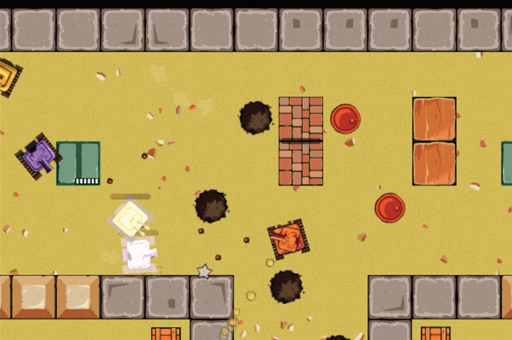
A custom default shader can be used to replace the tinting method in Phaser and PixiJS. The tanks flash white when hit
When Phaser and PixiJS render your sprites, they use a simple internal fragment shader. It doesn't have many features because it's tailored for speed. However, you can replace that shader for your purposes. For example, you can leverage it to inspect overdraw or support more features for rendering. Below is an example of how to supply your own default fragment shader to Phaser v2.
06. Change tinting method
A custom default shader can be used to replace default tinting methods in Phaser and PixiJS. Tinting in Phaser and PixiJS works by multiplying texture pixels by a given colour. Multiplication always darkens colours, which obviously is not a problem; it's simply different from the Flash tinting. For one of our games we needed to implement tinting similar to Flash and decided that a custom default shader could be used. Below is an example of such a fragment shader:
This shader lightens pixels by adding a base colour to the tint one. For this to work, you need to supply negatives of the colour you want. Therefore, in order to get white, you need to set:
07. Inspect overdraw
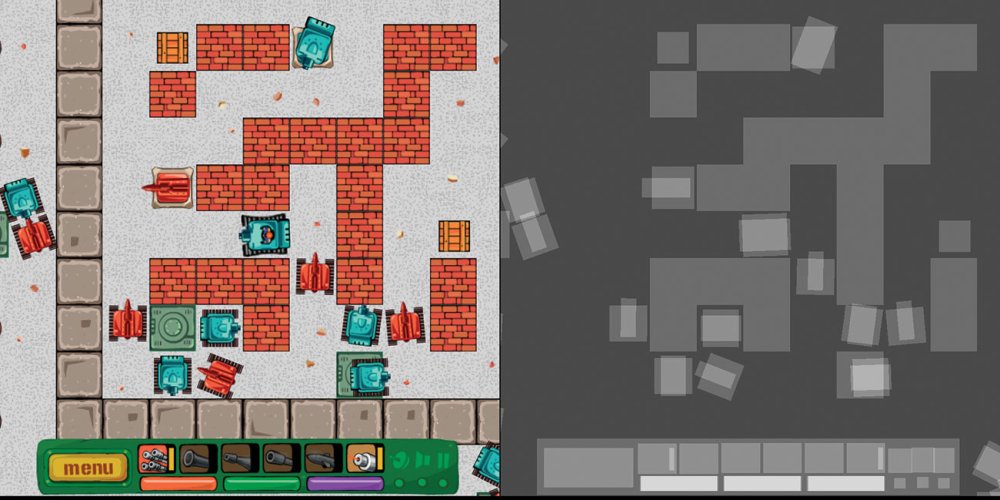
The picture on the left shows how a player sees the game, while the one on the right displays the effect of applying the overdraw shader to the same scene
Replacing a default shader can also be leveraged to help with debugging. Below we've explained how overdraw can be detected with such a shader.
Overdrawing happens when many or all pixels on the screen are rendered multiple times. For example, many objects taking the same place and being rendered one over another. How many pixels a GPU can render per second is described as fill rate. Modern desktop GPUs have excessive fill rate for usual 2D purposes, but mobile ones are a lot slower.
There is a simple method of finding out how many times each pixel on the screen is written by replacing the default global fragment shader in PixiJS and Phaser with this one:
This shader lightens pixels that are being processed. The number 7.0 indicates how many writes are needed to turn pixels white; you can tune this number to your liking. In other words, lighter pixels on screen were written several times, and white pixels were written at least seven times.
This shader also helps to find both 'invisible' objects that for some reason are still rendered, and sprites that have excessive transparent areas around that need to be stripped (GPU still needs to process transparent pixels in your textures).
08. Why physics engines are your friends
The left part of the image is a scene from a game, while the right side shows the same scene with the Phaser physics debug overlay displayed on top
A physics engine is a middleware that's responsible for simulating physics bodies (usually rigid body dynamics) and their collisions. Physics engines simulate 2D or 3D spaces, but not both. A typical physics engine will provide:
- Object movement by setting velocities, accelerations, joints, and motors;
- Detecting collisions between various shape types;
- Calculating collision responses, i.e. how two objects should react when they collide.
There is a Phaser plugin that works well for this purpose. Box2D is also used in the Unity game engine and GameMaker Studio 2.
While a physics engine will speed up your development, there is a price you'll have to pay: reduced runtime performance. Detecting collisions and calculating responses is a CPU-intensive task. You may be limited to several dozen dynamic objects in a scene on mobile phones or face degraded performance, as well as reduced frame rate deep below 60 FPS.
09. Export sounds
If you have a Flash game sound effects inside of a .fla file, then exporting them from GUI is not possible (at least not in Adobe Animate CC 2017) due to the lack of menu options serving this purpose. But there is another solution – a dedicated script that does just that:
How to use the script to export sound files:
- Save the code above as a .jsfl file on your computer.
- Open a .fla file with Adobe Animate.
- Select Commands > Run Command from the top menu and select the script in the dialogue that opens.
- Now another dialogue file pops up for selecting the export destination directory.
It's done! You should now have WAV files in the specified directory. What's left to do is convert them to, for example, MP3, OGG or AAC.
10. How to use MP3s
The good old MP3 format is back, as some patents have expired and now every browser can decode and play MP3s. This makes development a bit easier, since finally there's no need to prepare two separate audio formats. Previously you needed, for instance, OGG and AAC files, while now MP3 will suffice.
Nonetheless, there are two important things you need to remember about MP3:
- MP3s need to decode after loading, which can be time-consuming, especially on mobile devices. If you see a pause after all your assets have loaded, then it probably means that MP3s are being decoded
- Gaplessly playing looped MP3s is a little problematic. The solution is to use mp3loop, read more in this article posted by Compu Phase.
This article was originally published in issue 277 of creative web design magazine Web Designer. Buy issue 277 here or subscribe to Web Designer here.
Related articles:
-
Supporting mobile devices
-
Various brush types and application can result in a soft and dewy composition, or a hard-edged, vibrant scene. Primarily, I’ll use the highest quality round Kolinsky Sable brushes I can find, but I began developing my watercolour techniques with student-grade brushes to discover my preferences.
Although they got the job done, cheaper brushes suffer from stray brush hairs, an inability to hold as much water as I like, and pointy tips that don’t last too long. Once I invested in higher-quality brushes, my technique improved greatly.
Once you’ve discovered the brushes that you enjoy working with most, it’s important to treat those brushes kindly. While watercolour doesn’t require harsh mediums and rigorous rules to work with, some care goes a long way in preserving your brushes, and that includes reserving them for water media only.
Working with a brush that was previously used with oils or even acrylics will diminish its effectiveness in carrying water and pigment. Keep your brushes upright or flat and pointy and your paintings will thank you for it.
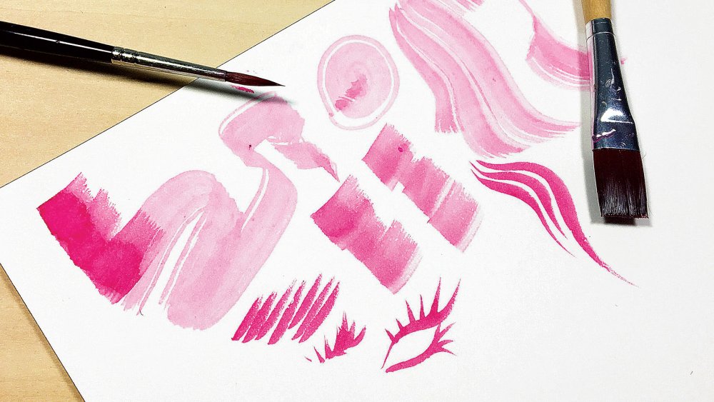
01. Watercolour brush types
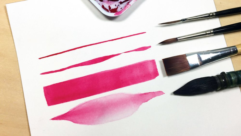
The types of brush Kelly uses from top to bottom: Size 1 Kolinsky Sable Liner brush, Size 2 Kolinsky Sable round brush, half-inch synthetic Flat brush, size 1 squirrel hair Mop brush
Every brush has the potential for many uses with watercolour, and some are better than others for specific tasks. Round brushes are the most commonly used because of their versatility. Liner brushes are excellent for maintaining width, and Flat brushes are able to create crisp edges. Finally, a Mop brush is ideal for soaking and distributing large amounts of water.
02. Contouring with a steady hand
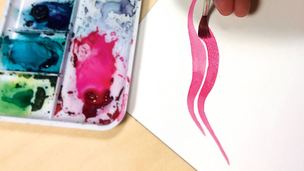
McKernan paints on Arches 140lb hot press watercolour paper
To achieve precise strokes, your application technique requires a steady hand. Sitting while aiming for precision is best, but you can also stabilise your hand with your little finger anchoring the paper (I tend to use Arches hot pressed watercolour paper.)
Another technique when using a Round brush is to twist the brush while dragging, to achieve thinner lines. Remember, the larger the Round brush, the more versatile your stroke will be.
Another thing to keep in mind is that, when loading up your brush with watercolour, you need to pay attention to the ratio of water pigment as this affects the fluidity of the paint as it's applied to the surface. It's also important to practise gaining control of the brush by creating strokes that butt up against each other but don't overlap.
03. Varying the line width
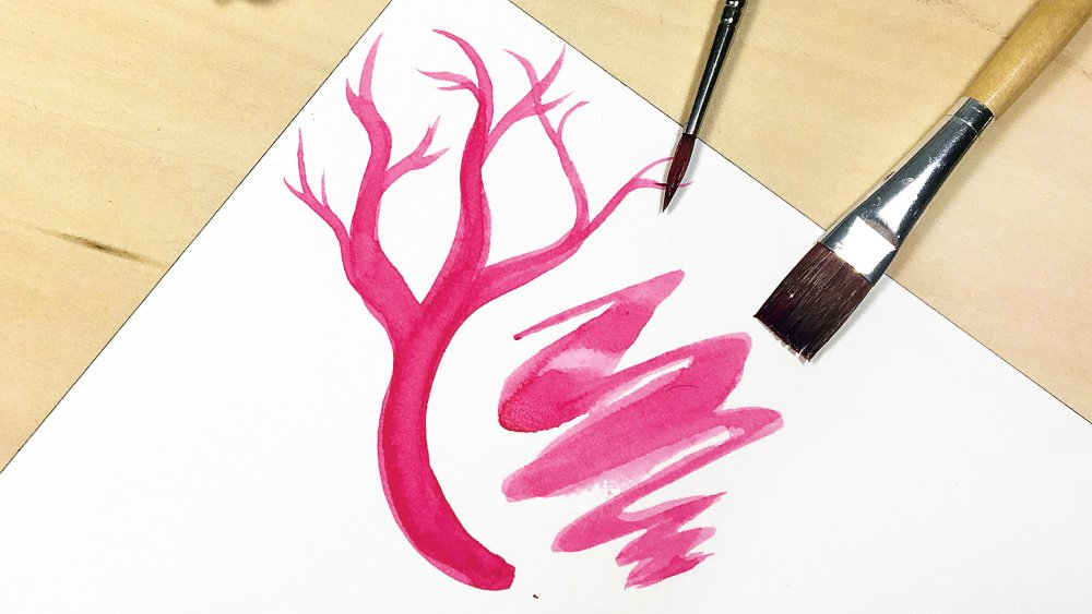
With experience you can create consistent colours in a single stroke
To get the most out of your brushes, learning to vary the line width can contribute to some expressive strokes. This helps to develop a sense of the watercolour that your brushes contain in one stroke, which in turn assists in consistency.
Take the tree paint test on the left in the image above. A large round brush is excellent for creating its branches that vary in width. Meanwhile the trunk is a good example of how, once you're comfortable, you can challenge yourself to maintain consistency as the watercolour dries.
As for the brush test on the right, this shows how a Flat brush can create flat shapes, zigzags and expressive marks. It's possible to create varying widths with Round and Flat brushes, demonstrating their versatility on paper.
04. Drybrushing creates interesting effects
Test out different brushes and discover the different kinds of drybrushing marks they can make
Especially effective with a Flat brush, drybrushing is achieved when the bristles separate because there’s less moisture present. This can be used to create a range of effects, including hair, grass and wood grain. The shorter the brush, the easier this is to achieve.
Try varying your application technique with coarser brushes, such as scrubbing, patting or dragging at various angles. I enjoy creating expressive eyelashes by twisting a lowmoisture Round brush.
Drybrushing can be tricky with sable brushes, so you may want to experiment with brushes that encourage more texture with coarser hair, such as synthetic blends, hog or ox bristle brushes.
05. Combining brush techniques
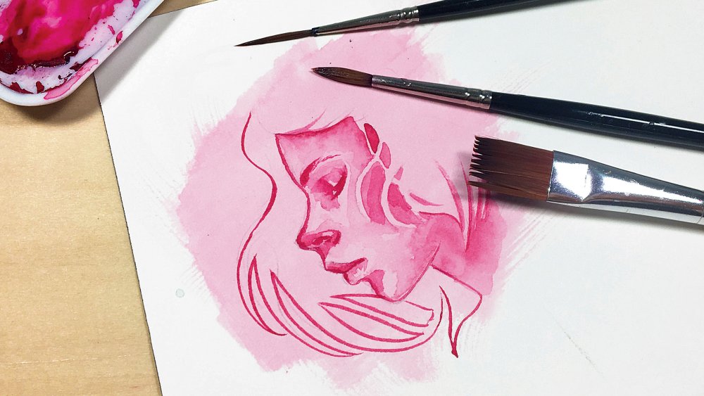
This lively portrait uses several different watercolour brush painting techniques
With time and practice, you’ll discover ways in which you can combine techniques to create interesting results. In my portrait above I've combined several different brushstrokes to create a dynamic painting.
For filling in the face, I’ve used my trusty size 2 Round brush, layering several times to build up my value range. Meanwhile I’ve used my liner brush on the hair outline. This enables me to more easily maintain a consistent width in the stroke.
If you look closely, you'll see pencil marks in the bottom left hand corner. To lighten pencil lines before applying watercolour, roll a kneaded eraser over the lines to gently lift the graphite. Later on, this makes it easier to erase once the watercolour is dry. Finally, I’ve used a Flat brush to lay down a base layer with dry brush texture at the edges.
Watercolour requires some intuitiveness and so the more comfortable you are with your brush techniques, the more receptive you’ll be to those magical moments when the watercolour tells you what your next move will be!
This article originally appeared in issue 163 of ImagineFX, the world's leading magazine for digital artists. Subscribe here.
Related articles:
-
The world of social media is a fickle one. Even if you're lucky/dedicated enough to amass a million followers on Instagram, you'll still need to work hard to keep from losing those followers once you've got them.
To find out the worst social media sins, those ones that have you reaching for the Unfollow button, we asked our readers on Twitter and Facebook what annoys them the most about brands and other creatives on social media.
We also, rather unscientifically, asked around our office to see what gets design journalists' and art editors' backs up online. Here's what you shouldn't do if you want to keep your hard-earned followers...
01. Talk politics
Various people mentioned this as a big no-no, which is interesting seeing as some big brands, such as Nike, have used politics in their campaigns recently. Nike's decision to use outcast American football player Colin Kaepernick in its campaign with the slogan 'Believe in something, even if it means sacrificing everything' led to admiration from some, and outrage from others (for more on this, take a look at our article on divisive ad campaigns).
The thing is, Nike is big enough that it doesn't matter if a few thousand people decide to burn its trainers or boycott it. But if you're not Nike, steer clear of politics, even if you're pretty sure a lot of your audience agrees with you.
02. Post irrelevant content
If your account primarily shows your illustrations, then it's fine for you to also show your followers glimpses of your everyday life. In fact, it's a good idea. But if you suddenly go on a five-post rant about your latest car, or decide to share every minute of your day, documenting every meal consumed, for example, then you're playing with fire. This leads nicely to our next point.
03. Post too often
There's nothing more annoying than opening an app to find it flooded with posts from one account. We don't want to see all the images of your holiday drip fed to us one at a time over a period of hours. Nor do we want to see images of the same bag from 100 different angles across 10 different posts.
How often should you post? That depends on how much you have to say, but according to Social Report, you should post three to five times a day on Twitter, once or twice a day on Facebook and Instagram, once a day on LinkedIn, and three times on Pinterest.
Most of all, you should try not to post just for the sake of it. Post because you have something you want to share with your audience, or else you run the risk of boring people with 'filler' content.
You should also be wary of posting exactly the same thing across platforms, as people may get irritated by seeing the same thing several times. Try and tailor your message for each platform.
04. Try to be too cool
Several people also mentioned their pet hate as brands trying to be too 'millennial' or 'cool' by using slang, or overusing the same phrases – one Twitter user, Krissy, gave the example of using 'Fri-yay' every week.
Frankly, we don't know what you kids are talking about, we ❤️ Fri-yays.
Seriously, though, if you wouldn't use a phrase or word in real life, you should avoid it on social media. We also agree with the commenter above who said you should aim for originality and creativity in your posts. Think about it: if you can't be creative on social media, why would someone hire you to be creative elsewhere?
05. Use too many hashtags
We've all #seen this one. #allthetime
Brands that overuse hashtags in their main posts, so you can barely read what they're trying to say are #annoying.
There's also the ones that post about 50 hashtags under the main post, or in the comments. This seems a little needy. #sorrynotsorry
Read more:
-
-
A favourite for many at Adobe MAX 2018, Sneaks is the session where audiences get an inspiring and entertaining look into future technology at Adobe.
Hosted in the South Hall of the LA convention centre, it was quite a sight to see the main doors open and MAX attendees quite literally running to the front to find seats. Excitement and anticipation filled the room, and, as the show got underway, it quickly became apparent why.
This year's Sneaks was co-hosted by senior Creative Cloud evangelist Paul Trani and comedian Tiffany Haddish, who came into her own as she helped Trani introduce each project, leaving the audience laughing their way into the next Sneak.
But the real magic came when the Adobe engineers made it to the stage. This year there are some truly outstanding innovations, which were, quite rightly, met by huge appreciation and applause. But before you get too carried away, remember these tools don't exist yet and some might never actually make it into Adobe's shipping software. However, the innovations inform the future product development at the very least, so everything you see here has serious potential.
So, without further ado, here's the MAX Sneaks class of 2018...
Brush Bounty
Sneaks kicked off with Brush Bounty, a new tool that allows users to add simple motion to illustrations using a brush. Impressive in itself, but it didn’t stop there. With Brush Bounty, the motion can be altered depending on a number of variables, including the number of likes a project gets on social media and the weather conditions in a certain country, at a specific time. With Brush Bounty, a smartphone can also be used to control the direction of the animation. Mind blowing stuff.
Project Smooth Operator
Using Adobe Sensei technology, Project Smooth Operator identifies the most interesting parts of video footage and reframes it accordingly. The technology intelligently works out what’s important in the video and crops it to that, so you always have your point of interest in frame. Genius.
Fantastic Fold
Designers everywhere dealing with complex packaging designs rejoice! This Fantastic Fold tool analyses a dieline and automatically determines the folded 3D shape as well as interactive mapping between the 2D and 3D representations. This tool not only bridges the 2D and 3D worlds, it would also mean never again will you design a super-cool box and not have the designs match up when it's folded.
Project Waltz
A mobile companion app, Project Waltz allows you to control 3D virtual cameras more precisely on a 2D surface, with precise and natural camera motions.
Fontphoria
The project that easily got the biggest cheers, Fontphoria uses Adobe Sensei technology to automatically transform a static image into an alphabet or complete set of fonts. It makes modifying text so easy, it's magical.
Project Fast Mask
Rotoscopers beware, there's a new tool (almost) in town. Project Fast Mask is another project utilising Adobe new’s AI technology, with Adobe Sensei accurately identifying an object and applying a mask across multiple frames of a video, making a laborious manual editing process almost automatic.
Project Model Morph
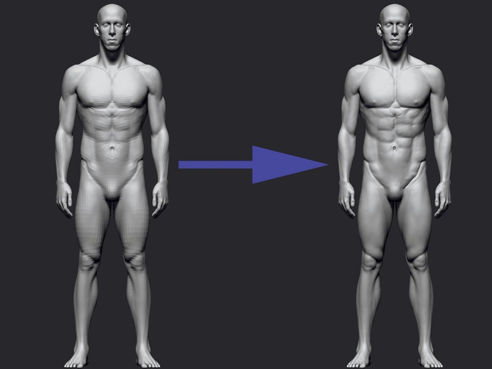
One for the 3D artists among us, Project Model Morph is an intuitive and easy-to-use tool for editing 3D man-made objects. Anyone who works with 3D geometry will know how time-consuming editing thousands, if not millions of polygons can be. Project Model Morph does all the hard work, scaling objects easily and quickly, preserving symmetry, and eliminating distortion.
Moving Stills
Want to animate a photo? The Moving Stills tool animates any image, so that it appears in 3D. Again, using Adobe Sensei technology, Moving Stills uses deep learning to generate videos from a single still, meaning that a job that would usually take hours to achieve can be done in a matter of minutes.
Project Kazoo
Charismatic Adobe engineer Zeyu Jin put on quite a show, impressing the audience with Project Kazoo, another tool using Adobe Sensei magic to effortlessly turn your voice into music.
Project Good Bones
This was another huge crowd pleaser, and seeing as editing vectors can be a complicated process, it's not hard to see why. Project Good Bones enables intuitive and shape-aware editing of complex vector graphics objects via automatically added segment handles and ‘bones’ connecting them, thus creating a skeleton.
Read more:
-
Companies are always trying to become more efficient in their operations, and that's what makes project management so important. If you want to build a career for yourself in this promising field, check out The All-Inclusive Project Management Bundle.
This bundle gives you access to more than 100 courses that will teach you project management disciplines and performance analysis techniques, and you'll even explore Agile, Lean and Scrum. Tests and quizzes will help to guide your learning, and at the end of each course, you'll receive a certificate of completion.
Try The All-Inclusive Project Management Bundle for just $19.
Related articles:
-
We are pleased to announce the launch of, our new package for professionals in the web, design and CG industry .
Join 3D World Pro

Join Computer Arts Pro

Join Net Pro

-
ZBrush tutorials are widely available on the web, often for a cost but sometimes for free. The best ZBrush tutorials can help novice 3D artists to get started with the application, and more competent users to learn a new trick or two about some of the best 3D modelling software around.
But how do you separate the useful ZBrush tutorials from the ponderous or pointless? Well, we're here to filter out the dross for you. In this article you'll find our pick of the best ZBrush tutorials on the web. You'll find tips on everything from the basics you need to get started making 3D art, to specific tutorials to help you create fur, hair, fabric and more.
01. ZBrush: core skills

Pluralsight's tutorials are tailored to your skill level
If you sign up for a free trial account with Pluralsight, you can access easy-to-follow suite of ZBrush tutorials that cover everything you need to learn more about the sculpting software. You'll start by doing on of Pluralsight's 'IQ' tests to determine your ZBrush skills, and ensure you start at the level suitable for you.
02. ZBrush 4 essential training
Everything a beginner needs to get started with ZBrush
This course from online software training website Lynda introduces ZBrush to artists that are making a transition from another sculpting program. It covers the most popular tools and techniques for digital painting and sculpting in ZBrush. This course may be a few years old now, but the basic functions have not changed in this time, making this a great place to learn core skills. And with a free month's trial, you can get started at no cost.
03. Workflow tips for ZBrush
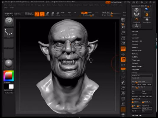
Madeleine Scott-Spencer shares insider techniques for better sculpting in this video tutorial
Weta Workshop veteran Madeleine Scott-Spencer sits down with 3D World magazine to share some of her insider techniques for sculpting better-looking models in less time with ZBrush.
04. Gnomon Workshop tutorials
There are few better places to get ZBrush tutorials than the Gnomon Workshop
The Gnomon Workshop offers a wide range of ZBrush tutorials, but you do need to pay a subscription fee to access them. If you're not sure, sign up for a three-day free trial, which should be enough time to try a few of them out. This training website doesn't just cover ZBrush: there are also tutorials for a whole host of other programmes, too.
05. Speed sculpt a creature
In this workshop for ImagineFX, Adam Dewhirst walks through how to combine Zbrush and Photoshop to turn a loose concept into a fully realised idea, playing to both programs' strengths. Find the video above and click here to discover how to follow the process.
06. Sculpt a demon
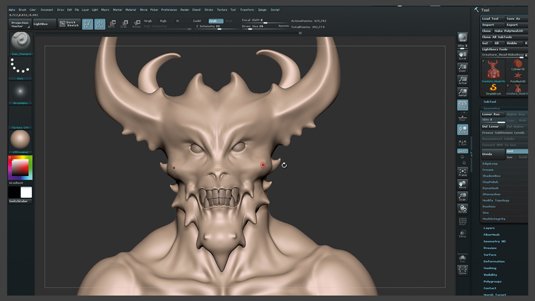
Titouan Olive shows you how to use ZBrush to push your sculpts to the next level
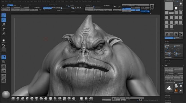
In this tutorial, lead character artist Titouan Olive shows you how to use ZBrush to apply Hollywood model-making techniques without a Hollywood budget. There's a clear walkthrough to follow, plus handy videos to illustrate trickier points.
07. Make a hair texture in ZBrush
Ensuring hair looks as realistic as possible is a difficult task for any ZBrush user. This short video tutorial sums up how you can create texture to guarantee the best outcome.
08. Cloth fold sculpting in ZBrush
Creating realistic look cloth folds is no easy task in 3D. In this two-hour video tutorial, 3D artist David Richardson explains the process behind it.
09. Create characters from scratch
In this popular tutorial, 3D artist Liam Shaw walks through the process of creating digital characters from scratch in ZBrush. It's aimed at those still getting to grips with the software.
10. Model a stormtrooper in Maya and ZBrush

Learn to create a 3D model of the iconic Star Wars character
For this project, 3D artist Juan Martin Garcia Forn give some tips about how to model a Stormtrooper from the Star Wars franchise using all the best bits of Maya, ZBrush and Photoshop. He reveals how to plan the composition ahead of beginning the modelling, and how rendering proved the most challenging aspect. "Since I had a very clear idea of how the final image should look, the lighting and camera angles had to be planned before the execution," he tells 3D World. "Everything was then pretty easy thanks to KeyShot's very friendly interface."
11. Modelling ears for beginners

Let's face it, that looks pretty freaky doesn't it
This super-quick and simple tutorial shows you how to model humanoid ears. You should already know the very basics of ZBrush to do this tutorial.
12. Sculpt realistic anatomy
This tutorial explains everything including adding muscle volume
This tutorial is ideal for those who want to look beyond the easy option of downloading free 3D models and learn how to sculpt realistic anatomy using ZBrush. ZBrush provides you with the much-needed freedom required when shaping forms – perfect for this type of sculpting.
13. Making of Alien in ZBrush
Create the alien from Alien with this tutorial
You'll already be aware that we're pretty obsessed with H.R. Giger's alien, thanks to our previous sci-fi design features. Here, you'll discover how to reincarnate the alien character using various ZBrush tools such as the ZSketch feature.
14. Model an alien pirate creature
Discover how to sculpt realistic fine details to complete an alien creature’s face
Darrell Abney demonstrates how he sculpted the face of his creature, Worgrock, to help you learn how to create a 3D alien pirate character. Abney chose ZBrush as his main weapon of choice due to its "many sculpting tools, and generally being fun to sculpt with", but he also uses Maya, Substance Painter and V-Ray in this tips feature.
15. Creating tiling meshes in ZBrush

Not just for video game design, creating tiling mesh is a useful skill
Tiling meshes are helpful for creating video game environments. This tutorial is particularly effective when it comes to those little details on cliff faces and rocks. It's important to get these looking realistic and this step-by-step guide will help you to do just that.
16. Pose a character in ZBrush

Harness the tools of ZBrush to create interesting character poses
If you're after a way to make your 3D models more interesting, making them walk or hold an object can work wonders. ZBrush has a wide range of tools to help with this, with various posing processes to choose from. This tutorial runs through exactly what those processes are and drops in some tips to ensure you get it right.
17. Using PolyPaint with PolyGroupIt
Paul Gaboury shows how to use PolyPaint with PolyGroupIt
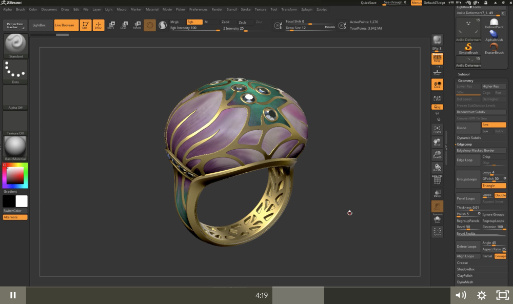
Paul Gaboury demonstrates PolyPaint in conjunction with PolyGroupIt, first by creating the helmet panels on a character head sculpt by artist James Cain, then by adding gold panelling to a ring created by Nacho Riesco Gostanza.
Related articles:
-
A critical streaming bug impacts Live Networks LIVE555 RTSPServer, but not the popular VLC and MPLayer client-side software.
-
Remember when branding used to be called 'corporate identity’? It spoke to one of the key branding rhetorics of the day: ‘you can trust me because I’m a big, global business.’
But last year’s damning research by Ipsos Connect revealed that 42 per cent of people claim to distrust big brands and 69 per cent distrust advertising. As a result, brands don’t always want to look big, corporate and powerful anymore. They want to look real and personable and reflect their true values and roots.
Some attempts to do this can be very successful, building brand loyalty and bolstering beliefs in what a brand stands for. But equally, some attempts to appear more human can be met with massive scepticism and at worst, fury. So, how can brand designers successfully navigate this minefield?
Apologise when necessary

This brand apology was particularly memorable
Success comes from telling the human story and getting the tone just right. An example of brilliant thinking when it comes to this was KFC’s response to the recent ‘chicken crisis’. In a genius print ad by Mother, the letters of the ‘KFC’ identity were playfully rearranged to read ‘FCK’.
It expressed a genuine, human reaction to the issue with the brand holding its hands up and acknowledging its failings with a perfect, relevant tone of voice for the moment. Implicit in the art direction is the idea that KFC’s chicken is so good that it’s unsurprising supplies ran out. It’s one of the best brand apologies we've ever seen, and has since won awards.
Make it obvious
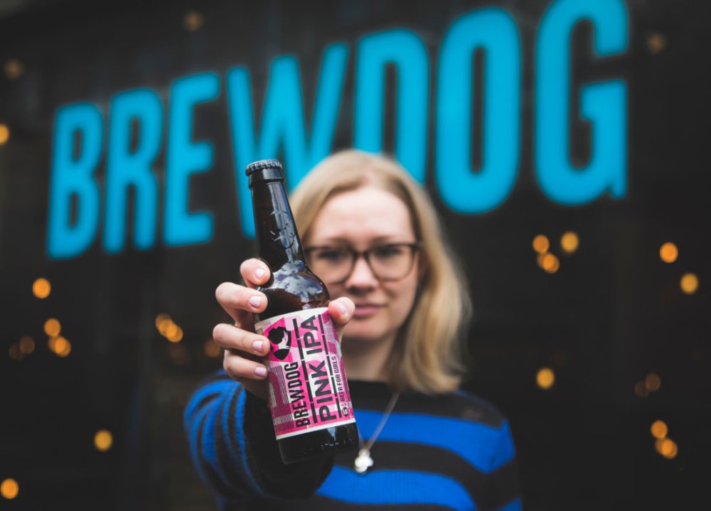
BrewDog was called out for its 'patronising' product aimed at women
Other attempts to reflect a brand’s ‘human’ values through design do not always hit the mark. BrewDog recently created a ‘beer for girls’ to raise awareness of the gender pay gap, available a fifth cheaper for “those who identify as women” to make the point. Unfortunately, many viewed the pink packaging and ‘beer for girls’ slogan patronising and stereotypical.
BrewDog explained the ‘Pink IPA’ product was a pun on its flagship product ‘Punk IPA’, and the branding was deliberately satirical and ironic. However, if you have to explain the rationale behind a creative ‘big idea’, it’s probably not the right idea.
Don't patronise your audience
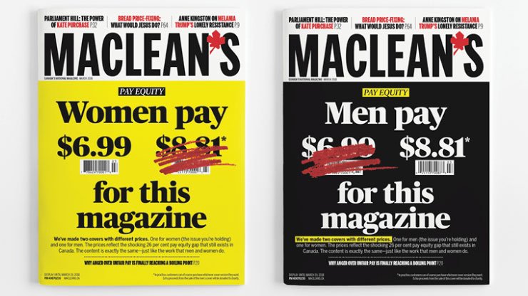
Maclean's used clear messaging to address the gender pay gap
The Canadian magazine, Maclean’s, had the same idea as BrewDog in addressing the gender pay gap, but it was executed without feeling at all patronising. It made the point clearly, without gimmicks that ran the risk of being misinterpreted.
Another brand that didn’t quite hit the mark when addressing gender inequality is McDonald’s. It flipped its logo upside down for International Women’s Day, causing a backlash from people claiming the brand should spend more time addressing its own pay and equality issues, and less on creating symbolic gestures of ‘corporate feminism’.
Make it personal

Lacoste's range of polo shirts featured endangered species helped it build on its brand equity
Showing that a brand cares about more than just its profits carries through to broader issues. Earlier this year, fashion brand Lacoste launched a range of polo shirts that replaced the iconic crocodile logo with various endangered species, to raise money for their protection as part of a three-year commitment.
It’s a great creative execution. The shirts look good and build on the brand’s equity, but issues can arise if there is not complete transparency around the results or how much the initiative will actually make a difference. Consumers are now so cynical about brands with a ‘human purpose’ that they will question everything.
Burberry got it right when it incorporated rainbow-hued stripes into its classic tartan to show solidarity with the LGBT community. It avoided being seen as a ‘big brand’ jumping on the bandwagon by making it about one individual, creative director Christopher Bailey, who designed the special edition tartan for his final collection for the brand. This made the story a human one. In parallel to announcing the rainbow tartan, it also announced donations to three LGBT charities.
Discover what makes the brand human
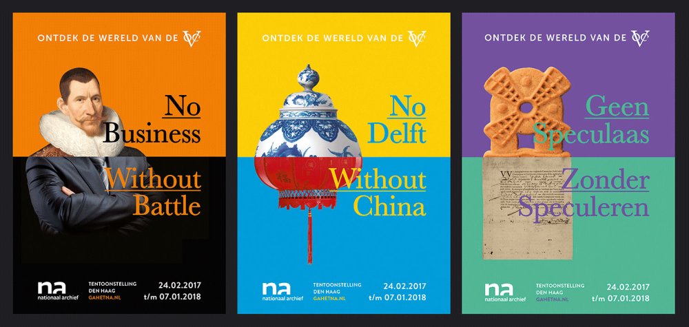
Design Bridge helped The National Archive of the Netherlands position itself as the nation's 'true north'
It doesn’t always have to be about cause-related issues. Another approach is for brands to celebrate what it means to be human. At Design Bridge, our recent work for The National Archive of the Netherlands celebrates human connections.
Once seen by many as an irrelevant institution, the new identity places the archive at the heart of the Dutch national identity. A compass logo, and supporting visual language, positions the archive as the nation’s ‘true north’, helping people discover where they’ve come from – as an individual, a family, and a nation.
Some of the big digital players have also managed the human touch really well. YouTube’s recent rebranding shows an understanding of how to connect to consumers in a more human way: it’s turned the red play button that millions of people engage with everyday into its main visual asset.
Ultimately, it’s all about discovering what makes you – as a brand – human, expressing this with clear creative execution that’s relevant to the people you’re trying to reach, and then backing it up with transparency about how you act and what you do as a brand. The era of distrust may not be set to change anytime soon, but brands have the power to make changes, big and small, to ensure they help keep people engaged.
This article originally appeared in issue 282 of Computer Arts, the world's leading graphic design magazine. Buy issue 282 or subscribe here.
Read more:
-
Affinity Designer is a popular vector editing tool for Mac, Windows and now iPad. The app is cleverly broken down into three interchangeable personas: the Draw persona for vector editing, the Pixel persona, and lastly the Export persona. In this tutorial we’re going to briefly look into the Pixel persona, and how to use it in your vector art.
While Affinity Designer is primarily for working with vectors, you can make use of a selection of raster editing tools within its Pixel persona. This is incredibly useful if you need to make quick retouches to images. Alternatively, if you illustrate with vectors and are also interested in digital painting, combining the two can yield some interesting results.
Watch the video below for an overview of what you need to know, or read on for five essential tips to get you started.
01. Switch to the Pixel persona
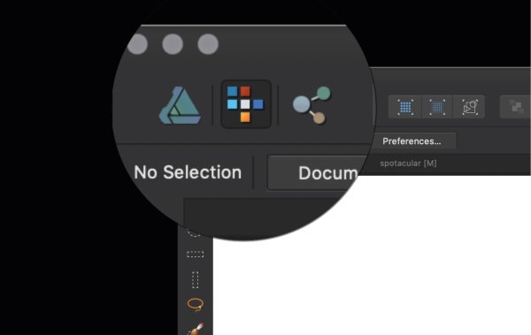
Select the Pixel persona with this icon
When you fire up Affinity Designer, by default you'll be in the Draw persona. To switch to the Pixel persona, select the middle icon in the top left (as shown in the image above) – hovering over should confirm. As you switch to the Pixel persona you will see the toolbars will change to raster editing tools.
02. Raster selection tools
This toolbar includes marquee tools, a pixel lasso tool and a selection brush
The top set of tools on the left are for raster selection. These include marquee tools, a pixel lasso tool and a selection brush, which work much like other raster editing software would. Do note that they won't work on vectors unless you rasterise them. To rasterise a vector object, right/alt-click on the object in the Layer panel and scroll down to the Rasterise option.
03. Pixel editing tools

These tools are useful for creating pixel art
Below the raster selection tools on the left-hand toolbar you'll find some pixel editing tools. The Pixel tool enables you to change the colour of individual pixels to whatever colour you have currently selected. This is particularly useful for pixel art. You can also change the size of your brush.
Next up is the Brush tool, which enables you to make use of all the raster brushes that come with Affinity Designer (these can be found in the Brushes panel to the right). Last up is the Flood Fill tool, which you can use to fill in sections of pixel layers only. Again, make sure you rasterise your layer before attempting this.
04. Retouch tools

Affinity helpfully includes some retouching tools in Designer
There are also a selection of retouch tools, which are useful to have if you are looking to make quick changes to imagery. Normally if you wanted to retouch a photo you would have to take it into a photo editing software. The fact that Affinity includes these tools in Designer streamlines the design process and saves time.
05. Combine vector and raster
Try combining vector and raster elements in your designs
It may seem counterintuitive but Affinity Designer makes it incredibly easy to combine vector and raster together. For example, you may illustrate a character or a scene in the Draw persona, then switch over to the Pixel persona to apply raster textures with the brush tool. This opens up a whole new world of creative possibilities.
Read more:
-
Conversions are often a clear driver of profit. It’s no surprise then that keen developers religiously test their websites and put together data visualisation reports to find the design that drives the most conversions. While the process may seem simple enough, the key to higher conversions is not always intuitive.
Enter AI. Using the enormous power of artificial intelligence, it’s possible to test every idea a marketer could imagine, shedding light on the mysterious world of what makes people convert. Here are five counterintuitive findings uncovered by AI-powered conversion testing.
01. Be indirect

Directional text improved HR GO plc's conversion rate
Conversion experts always stress that specific, direct CTAs are paramount to driving conversions. However, using biometric tests, HR GO plc, a job placement firm, found that visitors felt stressed on its website and that urgent messages discouraged them. AI revealed that directional text like ‘Read more’ increased conversions far more than previous variations. These changes resulted in a 153 per cent conversion rate increase.
02. Expand your palette
ABUV Media creates content-rich websites that help people make informed decisions about their future. It wanted to test hypotheses about its form that connects users to universities. Using AI, it found the best-performing form variant was a designer’s worst nightmare: a hot pink form widget whose fields contained green text. Nevertheless, this design increased conversion rates by 45 per cent.
03. Reorder your funnel
Nexway found unique ways to shake up the purchasing funnel
We’re all used to a shopping funnel: add item to cart, input your address, then your payment option and finally hit the order button. But Nexway, which provides full-service ecommerce and marketplace solutions, found that this formula was dated. It saw a 17 per cent conversion rate increase by simply reversing the payment and address fields in the checkout process, among a few other small changes.
04. Focus on the search bar
Sometimes highlighting a feature like the search bar is just the extra push the customer needs in order to engage with it. One online tobacco company, for instance, outlined its search bar with a thick, dark border so it would be easier to find.
This visual highlight increased the customer’s interaction with the search bar, so that they found exactly what they were looking for faster than when browsing generic categories. As a result, this company saw a 4.4 per cent conversion lift towards its goal of increasing online sales.
05. Defy colour convention
Pink colours gave Cosabella's click-throughs more oomph
We were surprised to find that when we tested pink buttons against the original black buttons on online lingerie retailer Cosabella’s website, the pink outperformed the black, betraying our intuition about Cosabella’s shoppers. Lingerie is usually thought of as sexy, sleek and sophisticated so black seemed like the perfect colour – except it wasn’t.
With traditional A/B tests, these companies might have tested more conservative hypotheses because their testing volume is limited. With AI, however, they were able to test all of their ideas at once, leveraging the power of evolutionary algorithms to reveal the best performing variants quickly. This all goes to show that testing more and not being afraid to try new ideas can lead to massive improvements.
This article was originally published in issue 309 of net, the world's best-selling magazine for web designers and developers. Buy issue 309 here or subscribe here.
Related articles:

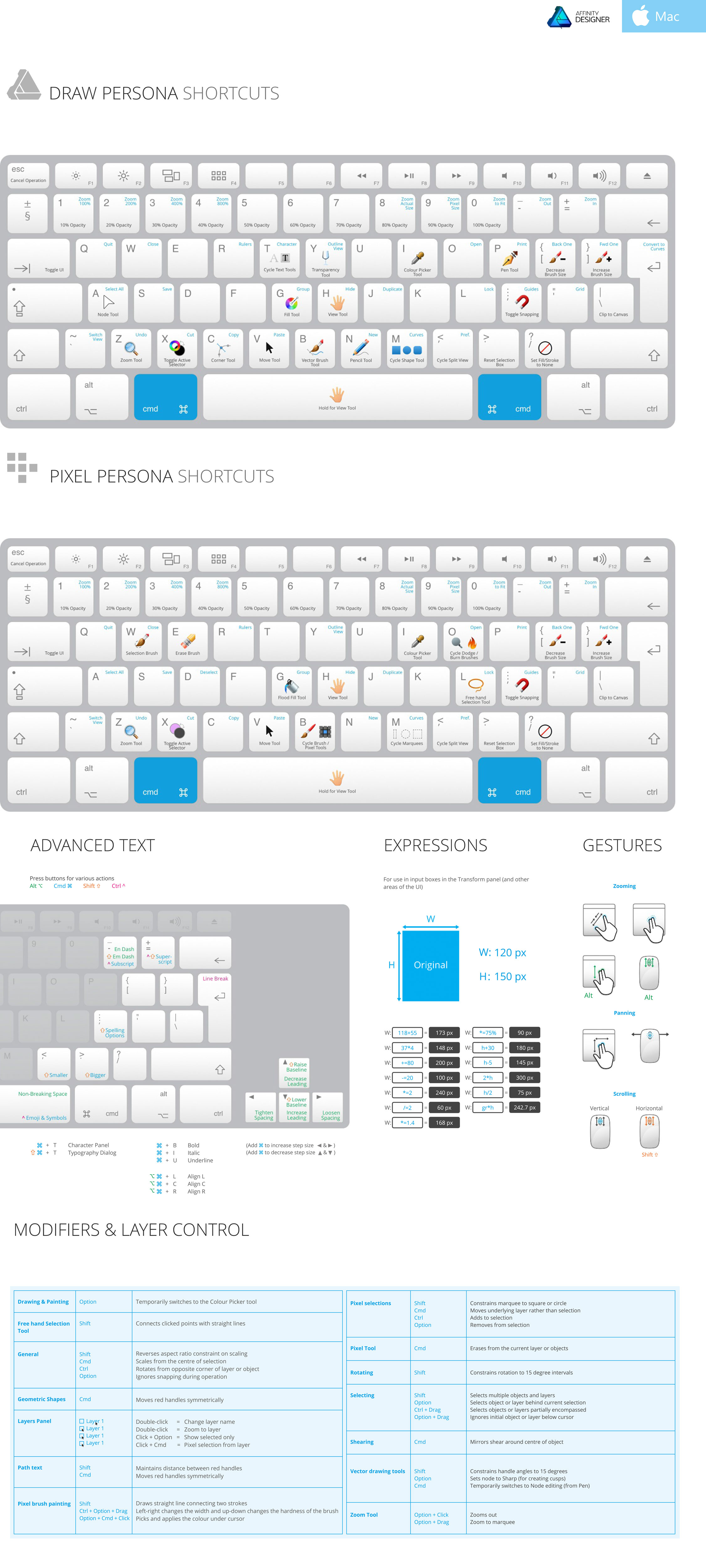
10 top tips for making the most of Black Friday
in Ειδήσεις από τον χώρο του Design και Hosting
Posted · Report reply
The Black Friday period is fast approaching, and nobody wants to grab a bargain on creative tools and hardware more than us, here at Creative Bloq. But we're not selfish – there are enough heavily discounted Black Friday goodies to go round, so we're going to share our best tips for scooping up a great saving during this shopper's Shangri-la.
Before we even start to impart the intelligence, here's our best Black Friday and Cyber Monday deals 2018 page, where we explain exactly what the period's all about, and we'll also be adding any conspicuous bargains on products that are of specific use to web and graphic designers, as well as digital, traditional and VFX artists.
But stick with us here to read our top bargain-hunting recommendations.
01. Save the date
Be aware that this year's Thanksgiving is a week earlier than you might expect (especially for Thanksgiving naïfs like those in the UK) – it is not the final Thursday in the month, meaning that Black Friday falls on 23 November and Cyber Monday on 26 November. On top of that bombshell, Amazon Black Friday kicks off earlier and earlier every year, and for 2018 we expect virtually every day in the month of November to have a Black Friday flavour in the Amazon world.
02. Use Google Alerts
These are particularly useful if you're after a specific item. Simply head to Google Alerts, enter your alert queries separated by a comma (eg Black Friday, MacBook Pro), click 'show options', choose 'As-it-happens' from the 'How often' drop-down, and click Create alert. Now you'll get an email every time your selected target appears in a new article.
03. Do your research
Which Wacom to buy? Research your options in advance
It's a bad idea to sit back and twiddle your thumbs before pouncing into action on Black Friday. So you've decided you want a new graphics tablet, how will you know whether the one that has 70 per cent off in a flash sale is any good? HURRY – LIMITED STOCK LEFT!!
Don't panic – just make sure you've done your research in advance so that you can tell your Ugees from your Huions, and your XP-Pens from your Wacoms. Read reviews from reputable sources, like 3D World and ImagineFX, and ask colleagues and friends for their advice.
04. Don't just stick to Amazon
For many, the eye of the Black Friday storm is Amazon. Some will head to the online shopping behemoth during November and set up camp there, only moving to click refresh. But Amazon is not necessarily the best place to find offers on high-quality, niche items specific to the design discipline of your choice, so try manufacturers' websites like Wacom, Dell and Lenovo, and electronics specialists like Currys, Ebuyer and Overclockers.
05. Be sure it's a bargain
Don't just frantically enter your card details and hit BUY when you spot the item you want with a BLACK FRIDAY banner above it. Is it actually a great deal? Is it even reduced? Do a quick price comparison on Google or comparison websites before you buy. Often, if you add your item to basket, it'll be reserved for a short time allowing you the chance to verify the price – but ensure that's the case before leaving the checkout procedure.
06. To bundle or not
Cameras are often offered in bundle deals with masses of accessories – decide if this is right for you
The way to make the biggest savings on electronics is to buy a bundle – but do you need all those accessories or software? If it's something you'll never use, you may not be getting the bargain you expect. And don't assume you'll be able to make money back on unwanted accessories by selling them on eBay, either – many other deal-hunters will have that idea too, driving down resale prices or making it impossible to find a buyer.
07. Decide what you want and stick to it
It is all too easy to get distracted when shopping – it's no secret to say that confusion is a deliberate tool utilised to great effect in retail – but the best way to snare a bargain is to decide what you want (or, even better, need) and stay on target until you find that exact item at exactly the price you're willing to pay, then buy it and shut down your laptop. Easier said than done…
08. Learn to love previous-gen tech
A year-old laptop could be an upgrade on your existing computer, if the price is right
Having the latest gear is very, very cool – but if the previous-generation Wacom Cintiq or Surface Pro is an upgrade from your existing tech, it could be worth foregoing the very newest model in exchange for a recently supplanted version – at a discount. In the case of upgradeable items, such as MacBooks, aim for the fastest processor and biggest SSD and RAM options on the older model and you could end up with a better spec than the new model at a lower price. Win!
09. Think outside the box
Consumer electronics is what made Black Friday a global phenomenon, but you'll find plenty more special offers in other areas too. Keep an eye on creative software companies' websites, such as Adobe deals, Ucraft, Corel, Boris FX and Reallusion; all of whom have offered Black Friday discounts in recent years. And remember to check third-party sellers, too.
10. Look into learning
Creative software is not the only area to monitor – e-learning platforms may also slash prices around the Black Friday period. Check the likes of Gnomon Workshop, EnvatoTuts+, Lynda, Pluralsight and Udemy for deals (see our round up of the best online art schools). Two years ago the wonderful Miss Led also discounted one of her fantastic video courses, so ensure you're scanning social media for #BlackFriday to find out about this kind of offer.
Read more:
View the full article