

Rss Bot
-
Content Count
18,754 -
Joined
-
Last visited
Never -
Feedback
N/A
Posts posted by Rss Bot
-
-
Microsoft has revealed a new supercharged Surface Pro 6 and Surface Laptop 2 as the battle to create the best devices continues. The company also unveiled a much-needed upgrade to its Surface Studio 2 desktop and new Surface headphones at its recent big product launch in New York.
News of the Surface Book Pro 6, especially, will be welcomed by creatives on the hunt for a powerful and flexible alternative to the MacBook Pro. As our Microsoft Surface Book 2 review revealed, these devices have been designed as a do-anything machines with both ultimate versatility and swashbuckling power.
Beautiful inside and out
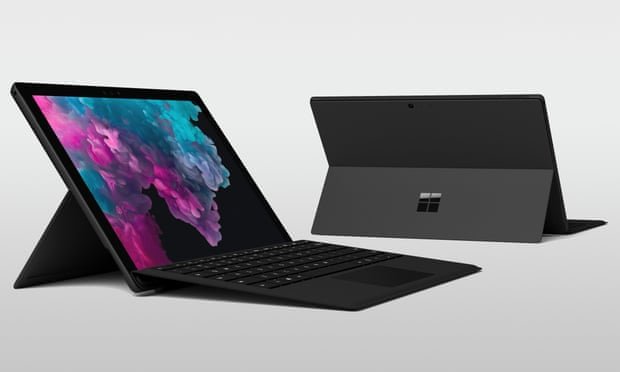
The new Surface Pro 6 comes complete with Intel's 8th-generation Core processors
Harnessing a new kind of power, the Surface Pro 6 and Surface Laptop 2 now come complete with Intel's 8th-generation Core processors to match competitors such as Apple’s MacBook Pros, meaning a 67 and 85 per cent increase in speed respectively. Battery life is also on the up, with the Surface Laptop 2 now boasting 14.5 hours and the Surface Pro 6 maintaining a solid 13.5 hours on a single charge.
Microsoft has focussed its efforts very much under the hood with the Surface Pro 6. Maintaining its part-tablet, part-laptop functionality, the new model, available in black and platinum, looks largely the same to the naked eye. The Surface Pro starts at £749, which makes it a great option to those creatives who need to compromise slightly on budget but not power.
The Surface Laptop 2, however, has undergone a noticeable makeover, sporting a new touchscreen and thinner than ever LCD display. This is also the quietest model, with the keyboard covered in Microsoft's signature Alcantara fabric, and there's new new colour options too for the Surface Laptop 2, now available in black, burgundy, platinum and blue. Pricing for the Surface Laptop 2 starts at £949, with both models available to preorder now.

The new thinner than ever Surface Laptop 2 is a thing of beauty
Surface Studio 2

Microsoft has updated its all-in-one PC with a large 28in articulating screen
Also among Microsoft's announcements was the exciting news of its Surface Studio 2, the first major update to its desktop PC, which we first saw back in 2016.
Features of the Surface Studio 2 include 50 percent more graphics performance, a 28-inch display which is reportedly 38 percent brighter and has 22 percent more contrast than the original model. Microsoft have seemingly gone all out with this device, including a brand new Surface Pen with tilt function and Surface Dial controller with haptic feedback.
The Surface Studio 2 is available for pre-order now, expected to ship 15 November, and priced at $3,499.
Easy listening

The Surface Headphones are expected to be released in time for Christmas
Computers weren't the only hardware on the menu at Microsoft's product launch, with the unveiling of its Surface Headphones. Complete with noise cancellation, automatic pause and play and Microsoft's digital assistant Cortana, these wireless headphones not only offer excellent sound quality, they can also read you emails, or kick off your conference call. The Surface Headphones are expected to be released later this year, firstly in the US at $350, before heading across the pond to the UK in time for Christmas.
To add to this extensive list of updates Microsoft also announced that the Windows 10 October update will arriving for users later this month.
-
If you want to build your own games and make a career out of it, this training is for you. The School of Game Design: Lifetime Membership will teach you all about game development and design through 120 hours of training videos.
Set your own pace, and follow along with expert instructors who have over 16 years of industry in the field. From access to royalty-free game art, to Unity3D training, to animation techniques, this course has it all.
Develop your coding and digital artistry abilities with this comprehensive, easy-to-follow course. The School of Game Design: Lifetime Membership is yours for only $59.
Related articles:
-
Attractive to both white-hats and cybercriminals, AI's role in security has yet to find an equilibrium between the two sides.
-
Businesses are increasingly adopting artificial intelligence, but all too often these platforms don't feature security-by-design.
-
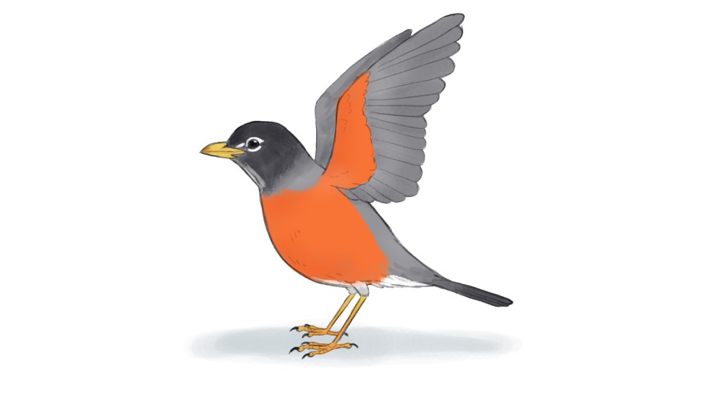
Have you ever looked at a bird and thought about how fascinating they are? These amazing creature can look significantly different from each other based on their diet, habits, environment and abilities, such as flying, swimming or running. Each and every type of bird has their own physical composition that's truly unique, which, as an artist, makes for an exciting challenge.
Our feathery friends are quite complex when it comes to the skeletal and muscular structure, as well as the formation of the wings and feathers. So to create an accurate representation of a bird, you'll need to pay attention to detail.
This how to draw a bird tutorial is a step-by-step guide on drawing a side view of a bird, using an American Robin as an example. The lesson begins by explaining the six major body parts to watch for when drawing a bird, before carving out its mass and structure. Finally the guide will cover the fine details, such as the facial features, feet, and most importantly, the feathers. There are also tips on how to draw a bird with its wings open. And when you've finished, we've got a brilliant selection of other how to draw tutorials to get stuck in to.
Note: having a photo by your side for reference to observe a bird's subtle angles and details that can be easily missed is highly recommended.
How to draw a bird: a step-by-step guide
01. Understand the skeletal structure
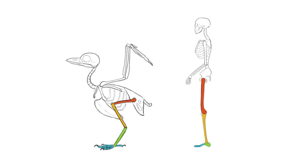
This simple drawing of the bird skeleton shows the similarities to the human skeleton
It's often thought that a bird's knees bends backwards, but in fact, what we consider as a bird's legs, are actually the joints of the heel and toes. When a bird uses its legs, it's designed to move mainly at its knees. Birds' hips don't rotate like ours do, so their knees act as a hip joint.
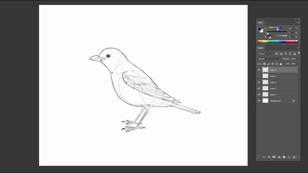
02. Observe the major body parts
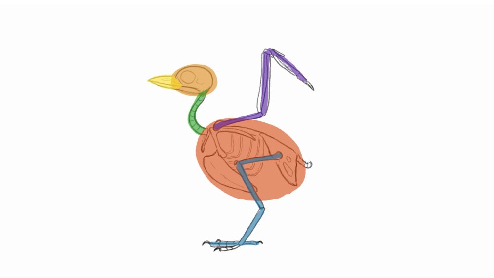
The proportion of each basic shape can determine what type of bird it is
All birds have the same basic skeletal structure but with different variations in size and shape depending upon the species. One way of simplifying the skeletal structures is to divide it into six parts; the head, beak, neck, torso, legs and wings. Just by changing the proportion of each part, you can draw any type of bird.
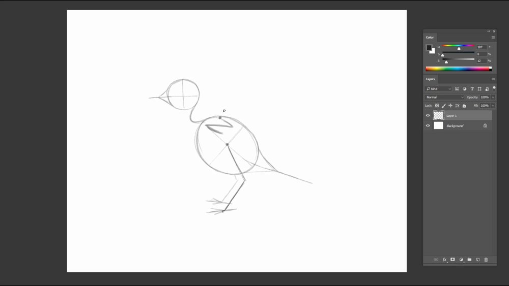
03. Sketch in the torso and head shape

Draw in simple shapes first, before adding any limbs
Draw a big round oval for the torso, and a circle that's half the size for the head. Divide them into quarters so that later on it will be easy to locate landmarks on the body.
04. Attach the neck, beak and tail
The simple lines determine the length of the beak and tail
Draw in a curved neck from the head, attached close to the top of the oval. Form a balloon-like shape to the head and torso to find the overall shape of the beak and tail.
05. Draw in the arms and legs

The simple lines will help to find the mass of the wings and leg
Take the centre of the torso to draw the legs. The toes have one long middle toe, two shorter ones on each side and one in the back. The length of the legs should be roughly the same. The shoulders will start from the top of the torso, and the arms will bend like a 'Z'.
06. Mass out the body structure
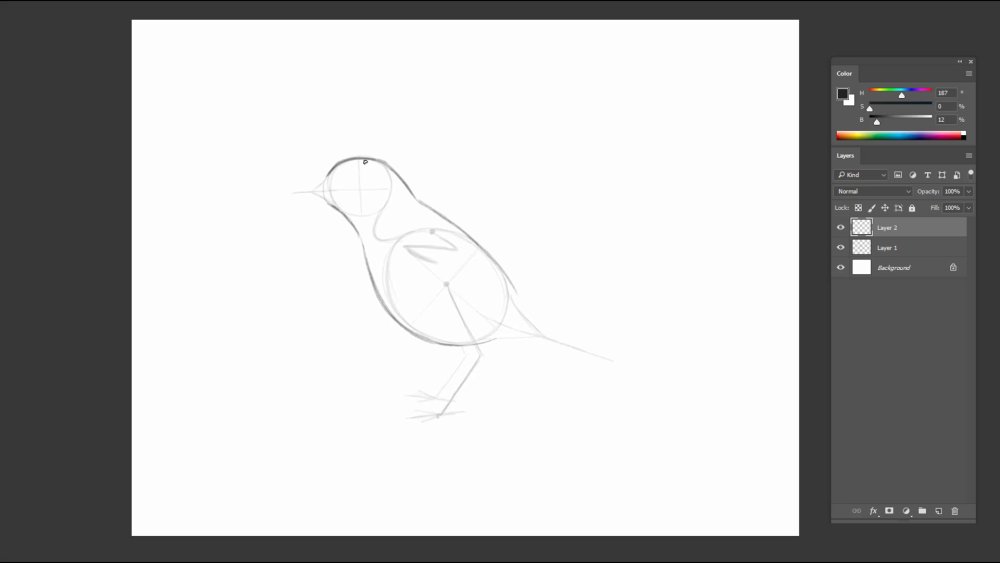
The mass of the bird's head and torso looks like an hourglass
Connect the head to the body. As the neck approaches the back and chest, the form of the body gets rounder past half way.
07. Form the shape around the beak and tail

The beak and tail are important characteristics of a bird
The beak is rounded at the top and slightly curved at the bottom, reaching back to the eye. Draw in a long rectangular shape for the tail.
08. Draw the legs and wing

Draw simple shapes in this stage for the complex legs and wings
Draw the overlaps of the flank and leg over the body to add some perspective. The legs and toes form like thin twigs. The toes curve upwards with a bulb at the tip.
09. Carve out the details of the head and beak
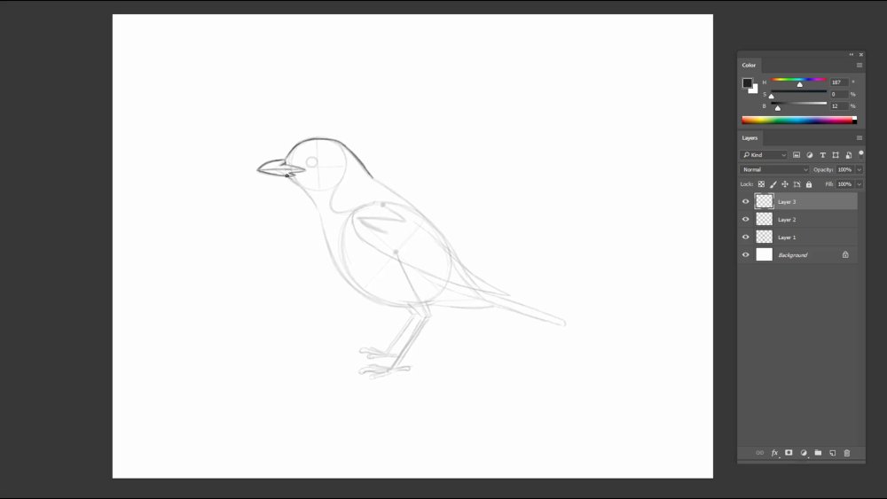
There are small indents where the beak connects to the head
Follow the underdrawing to draw the head. Indicate the nose just where the beak and head meets. The lower part of the beak also has an indent similar to the shape of the nose indent.
10. Draw small feathers on the torso

Small feathers tend to be more visible on the under tail covert
Follow the rest of the under drawing to draw the body. Draw some feathers in areas that stick out of the torso.
11. Add details to the feet, eye and tail
Watch out for the small details in the eye and feet
Draw in beady eyes with a dark pupil and small white highlight. The joints are relatively boney in the toes, so draw them more rigid. Following the form of the toes, draw some lines wrapping around. At the top of the bulb, etch in some thin sharp claws.
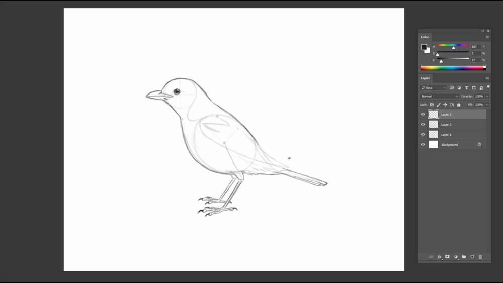
12. Indicate the layers of the wing
The wing comes in three sections, with three layers
The wing comes in three major sections. The scapulars, secondaries, and the primaries. If you look at the feather direction, they are anchored from the structure on the wings. When you break it down further, each section has three layers of wings. When the wing is in a resting position, the feathers will fold and overlap – like a fan tucks itself away neatly.
13. Draw in the feathers
Drawing overlapping areas with darker outlines helps add perspective
Make sure you follow your photo reference to avoid stiff and repetitive feathers. To avoid the feathers looking too complicated and messy, draw a thinner, lighter line to suggest the overlaps.
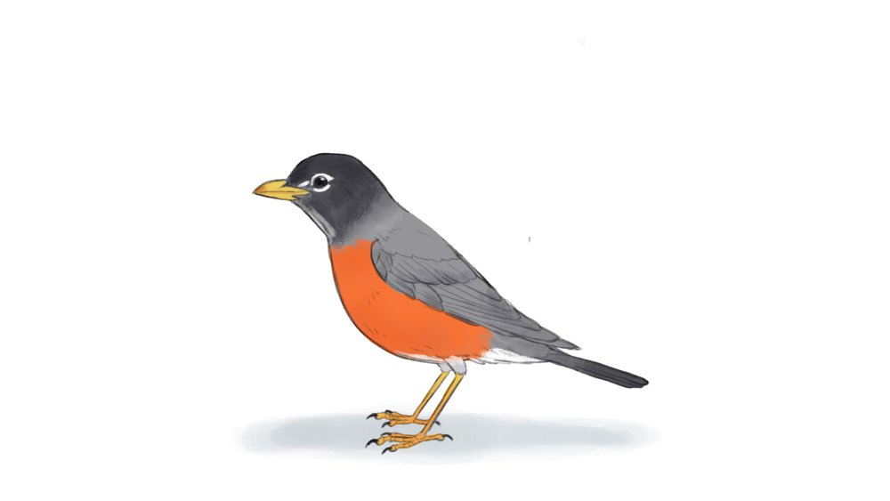
The finished bird
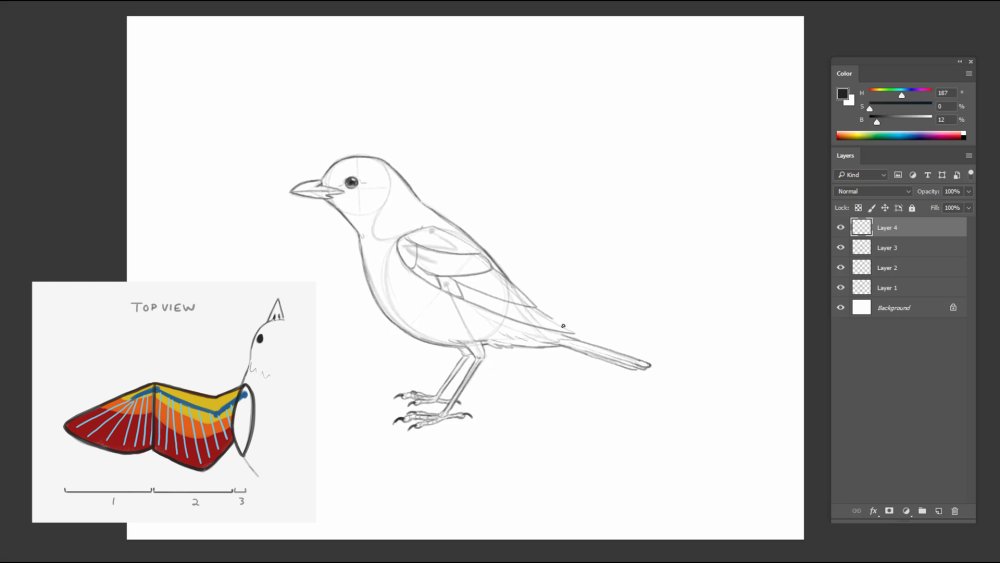
How to draw a bird with open wings
14. Find the skeletal form and under drawing of the open wing
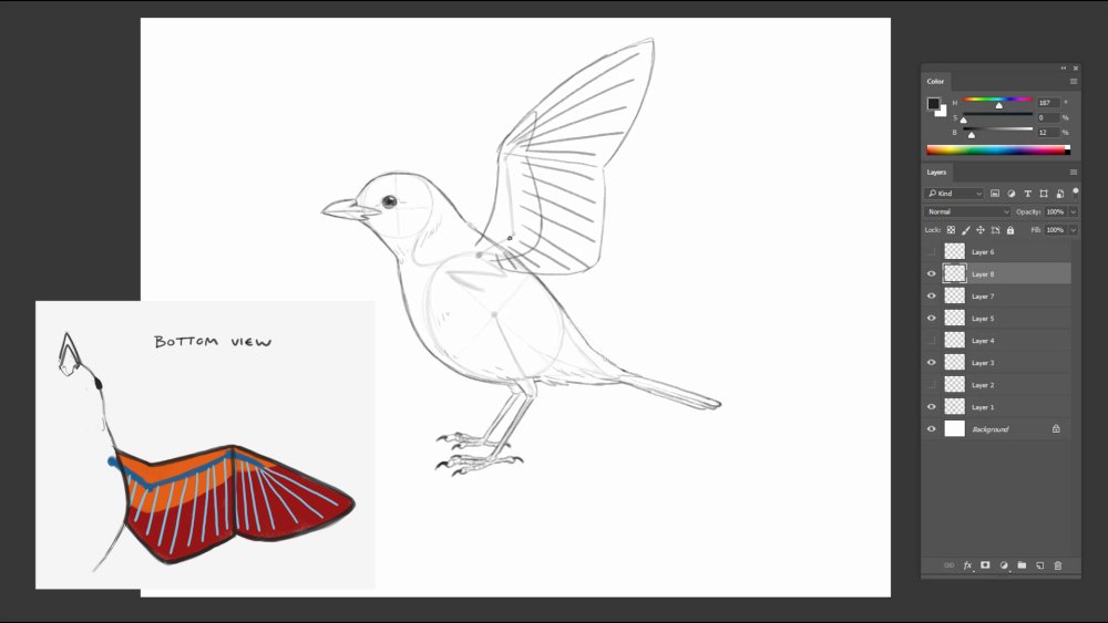
Draw the basic shapes before adding in the feather details
To create a sketch of a bird with its wings open, draw the skeletal structure of the wing and the feather directions. On this under surface of the wing, there are only two sections and two visible layers of the feathers overlapping. The wing lining, which consists of smaller feathers, covers the longer feathers.
15. Draw in the feather details
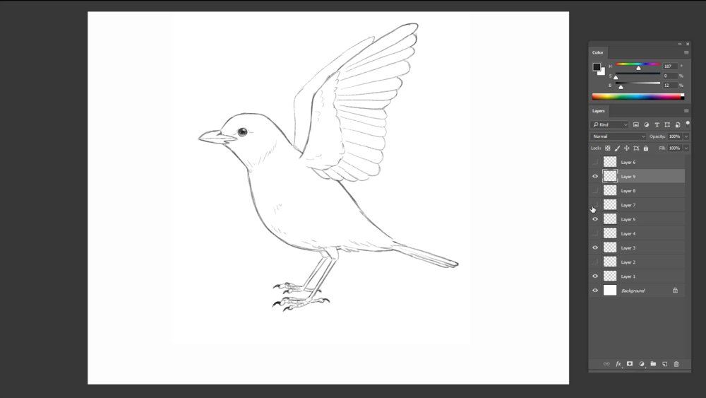
Look at reference to add a more interesting variety of feather lines
The layering of the feathers should start from the top, with the last feather at the bottom of the stack. Lastly, add the back wing to finish the drawing.
Your bird is now ready to take flight
Read more:
-
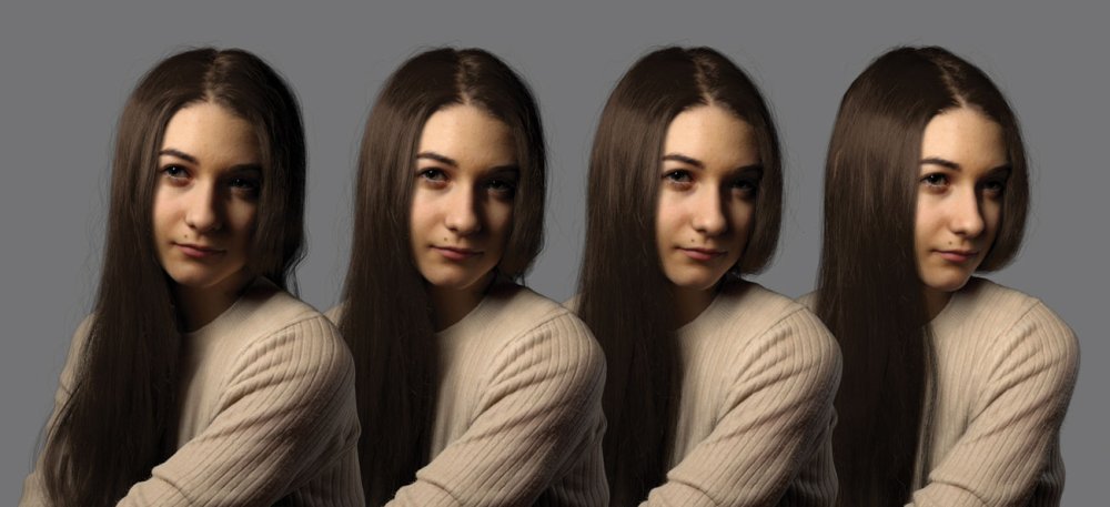
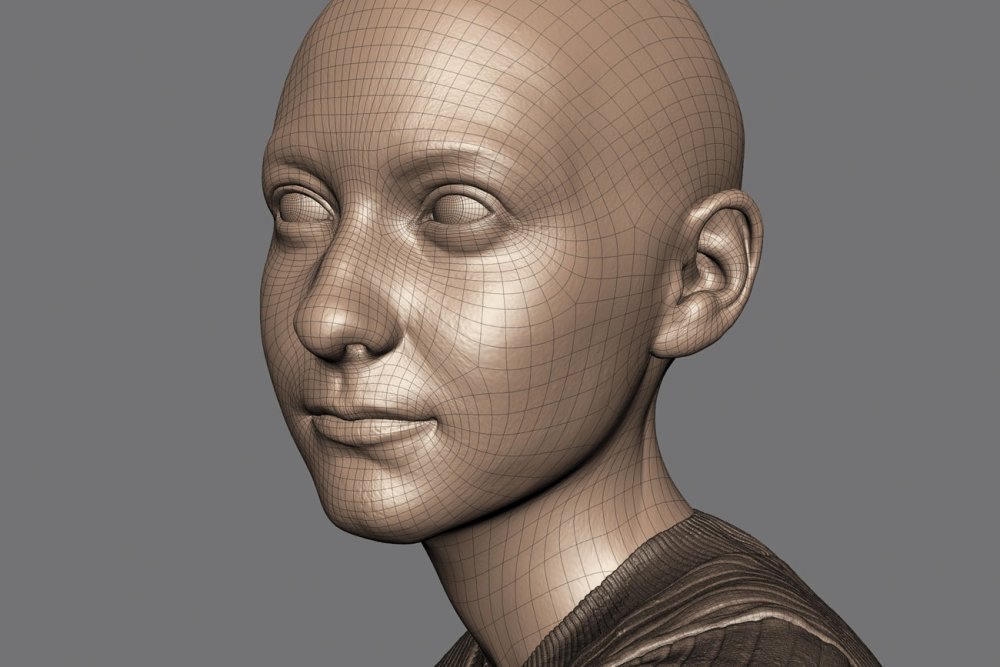
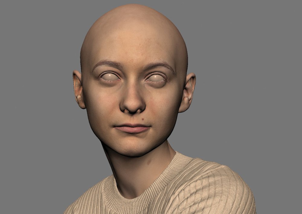
You might know how to draw people, but creating a digital portrait that's indistinguishable from a photograph – like the one above – is another matter altogether. It's difficult to get right, but it can be an incredibly rewarding exercise in 3D art.
Portraits are like a window into the subject's life; you really have to know someone to be able to represent them well, as it is not only facial features you are representing, but also their personality. It is also said that behind every portrait is a self-portrait, as it is also the story of the artist; throughout all my portraits hopefully you will also learn a little about myself.
My work is inspired by the great masters, Rembrandt, Caravaggio, Vermeer – these paintings were done hundreds of years ago, but we still connect to them as if these people were still alive today. The fact that we are in the digital age we now get to use new tools in creating these portraits, which has never been done before – we are creating a new form of portraiture.
Download the files for this tutorial.
01. Add personality
The better you know your model, the more of their personality you can capture
The reason every portrait I do is a family member or friend is because I know them, and by knowing them I can add their personality. Digital humans need a personality to make them believable; characters in a T-pose might look real, but we won't connect with them. When we see people, we try to read them, we want to know who they are, and we should do the same with digital characters – make them as real as possible, not only on the surface but also under the skin.
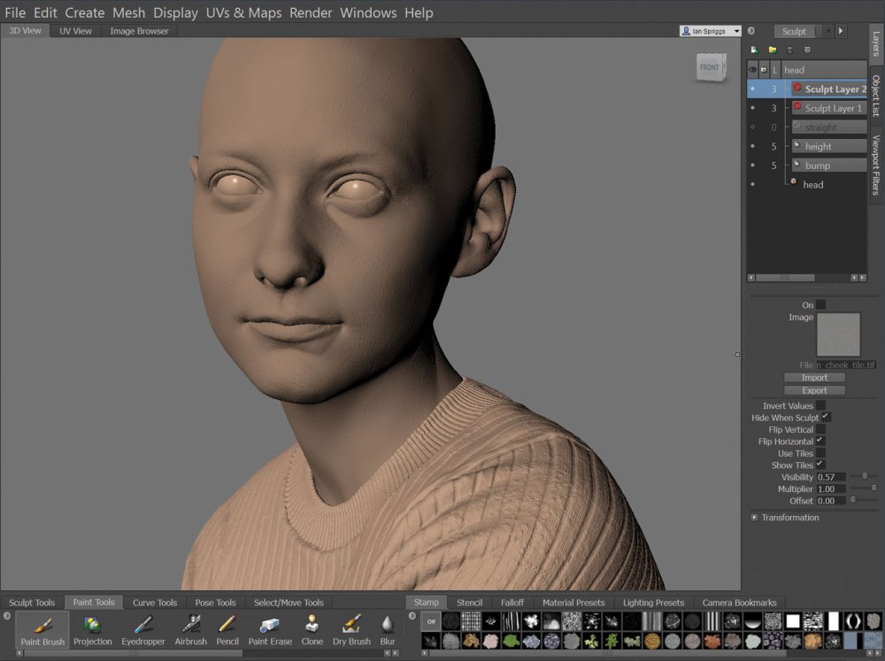
02. Use breakdowns

A good breakdown lets people appreciate the work that's gone into a digital portrait
Breakdowns are a really good way to help promote digital characters. They reveal behind the curtain and show exactly what you are looking at. By demonstrating that we use tools like a paintbrush or a chisel, it shows that the work is not just a click of a button. Digital humans are new and people want to see the magic behind them. A breakdown clears any confusion that it could be a photograph, and hopefully people will spend a little longer appreciating the hard work that went into it.
03. Look to the masters for inspiration
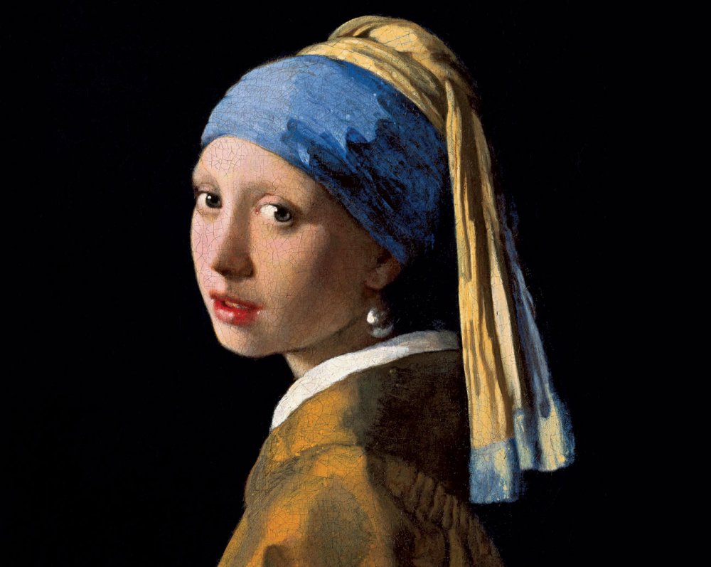
Vermeer created a story by simply adding a pearl earring: is this maid being dressed up in Vermeer's wife's jewellery?
It is always important to have inspiration. My inspiration comes from the masters. For example, Rembrandt's style creates a mood that you can feel; his subjects are relatable and every one of his portraits feels alive. Another inspiration is Vermeer, and a perfect example is his Girl with a Pearl Earring painting. This woman has a pearl earring even though she looks like a maid; she obviously could not afford this yet she is wearing it, so it makes you question whether Vermeer had a love interest in her, posing her with his wife's jewellery. This creates a back story that we want to know more about; adding a story to our digital humans will make them more believable.
04. Make it personal
A painting in the background, a scarf around the neck, or a hand on the chin are all references to artworks in history
Personal work should be personal. If you are going to go home to work and you're creating something someone else wants to see, that is just work, as you are making some else's dream come true. It is not sustainable if you want to continue doing work outside the hours of 9am-6pm. If you want your digital humans to connect to the audience, loving what you do will show in the work, so make it personal – the more you care about it, the more it will stand out. By doing so you will create something original.
05. Avoid the uncanny valley
Staying out of the uncanny valley requires work and a bit of imagination
The uncanny valley is still a huge valley we have yet to cross. There are an infinite number of variables that make us human, yet when we try to create them we pick and choose the top few that we know about. I have seen cartoon characters feel very real despite the fact that they don't look real at all – these artists are phenomenal at expressing the emotional side of us. Create an emotion you want to express. With Cassidy, I tried to imagine what she was thinking and have that thought as the base for the portrait, and everything stems from this one thought.
06. Focus on anatomy
Learn your anatomy. Even though we look different, every person has the same anatomy, the same bones, the same muscles, the same building blocks. In photos, it is sometimes hard to determine the shape and forms, so using your knowledge of anatomy will help fill in these areas. The first thing I look at in a digital character are the ears – something easily skipped, but once you notice flaws like this it is hard to believe that these are real people, and they become almost like a mannequin.
07. Do a photoshoot
I always do a photoshoot of my subjects, roughly between 100-200 photographs. First I will take photos from every angle, and these photos are used to model and texture. Second I pose and light the subject to create a mood, and I try multiple ways to best represent who the subject is. When creating a portrait, it is important to refer to these photographs; it is easy to get caught up in making our work stylised, but to create a likeness you need to be true to the subject, and that means you cannot flatter them and try to make them better.
08. Model your subject
Mudbox is a great tool for portraits; using the sculpt layers you can create multiple versions to compare to get the best likeness
I pose a pre-rigged base mesh in Maya then take this geometry to Mudbox for sculpting. I don't use scans, but my modelling process is much like how a scan is made. Since I took photos from every angle I will align these photos in Mudbox. I will match the model to the front angle, then the profile, then the three-quarter view, and so on. I will have at least 8-10 photos I use to sculpt from. Once the likeness is there I will start to focus on the expression and body.
09. Keep textures simple
Try to keep your texturing as simple as you can
I do all the texturing in Mudbox; I use each angle of the photos to project onto the model. There is a lot of cleanup, repainting and colour correction which Mudbox is great for. I have started to use XYZ texture maps to help bring out the details in the pores. I use the VRayFastSSS2 shader for the skin. I will push the diffuse map as far as I can before I worry too much about the spec, bump and the SSS maps. I believe in simplicity when it comes to texturing, as the simpler it is, the easier it is to make changes during the lookdev stages.
10. Spend time on the eyes
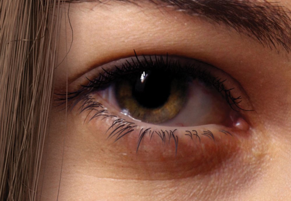
Eyes are the heart of the portrait. Everyone understands what an eye looks like, and we are experienced in understanding the subtleties of them
The eyes are the heart of the piece, as the eyes are usually the first thing we look at when we interact with others. The slightest change will completely change the expression. Every human knows what an eye looks like; from birth we understand the subtlety of an expression, and even someone who has no experience in art will notice any flaws. It is the reason why the uncanny valley is so hard to overcome – one mistake and it will fall into the uncanny valley. I spend a long time just working on the eyes and go through many variations before I can get them looking decent.
11. Don't overdo the details
Get your detailing right but don't draw attention away from the portrait's main focus
Your eye loves detail; a lot of it we read subconsciously, and a lack of detail will stand out. But if you overdo it you might take attention away from what is important. Detailing is used to create realism and support the overall image, but it is not meant to be shown off. In my portraiture work my main focus are the eyes and face; everything revolves around this and supports it, if it doesn't then I will get rid of it.
12. Use X-Gen for the hair
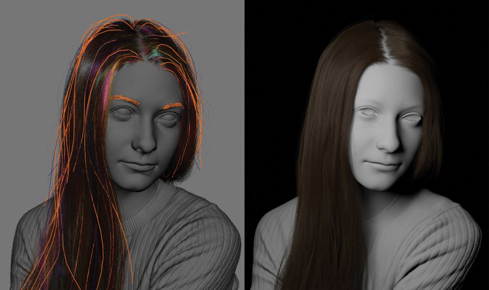
X-Gen is perfect for creating all kinds of hair
Cassidy's hair was the biggest challenge I had in this portrait, as it covers most of the canvas. It was my first time using X-Gen but I am happy with the results. X-Gen enables you to create hair that is random from strand to strand and is great in creating those flyaways. It is great at creating that peach fuzz too – it's subtle, but adds that realism. I added a V-Ray hair shader to the hair with colour variation to each strand. By making hair random it loses the clean look that sometimes digital work can have.
13. Create a mood with lighting
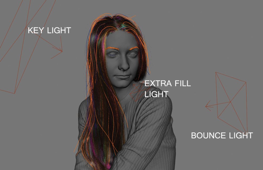
I kept my lighting as simple as possible which complemented the composition; for Cassidy I wanted to keep the viewer's focus on her face with little distraction elsewhere
The lighting is key to the mood of the work, as it drives and magnifies the emotion you are trying to portray. Caravaggio is an example of how a hard light can change an image; his work has strong high-contrast lighting making his work dynamic and aggressive. Alternatively Rembrandt usually uses soft lighting, which gives his work a welcoming warmth to it. In Cassidy's portrait I wanted to show youth, so I used a warm, soft light to show her as a person of compassion. The piece is actually inspired by the soft lighting of the Mona Lisa.
14. Think about your composition
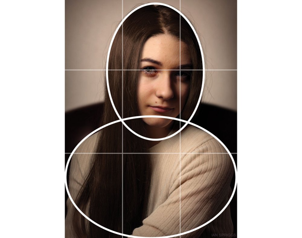
This composition is based on ovals and the rule of thirds
To reinforce the soft lighting I made sure not to have any hard lines in the composition. The composition is created from ovals and the rule of thirds. The background divided into two, the light allowing her head to pop out, and the dark to allow her jumper to stand out. Being able to read the silhouette creates less distraction from her face and her gaze, which is the main focus point. Composition and lighting is what really defines a portrait – these are great tools to use to help create a connection with the subject.
This article was originally published in issue 236 of 3D World, the world's best-selling magazine for CG artists. Buy issue 236 here or subscribe to 3D World here.
Related articles:
-
What do you do if you want to really draw attention to a campaign? If you're United Way – a Canadian network of non-profits that work locally to raise funds and improve lives in their communities – you rope in Pantone to use a bit of colour theory and create a new hue that can't be ignored.
For its new campaign, Show Your Local Love, United Way wanted to make local issues – such as poverty, homelessness, domestic violence, mental health and social isolation – unignorable. So it partnered up with the Pantone Color Institute to develop a unique Pantone shade aimed at highlighting these issues in a way that's hard to overlook.
The result is Unignorable, a colour that's guaranteed to grab your attention. It's described by Laurie Pressman, VP at the Pantone Color Institue, as an instantly captivating, brightly coloured hue that radiates pure heat and energy. "The Unignorable colour boldly calls out for attention while remaining friendly, approachable and optimistic," she says.
United Way has a long-standing association with good design. Its logo, depicting a helping hand cradling mankind and surrounded by a rainbow symbolising hope, was created in 1972 by Saul Bass. And to help get the message of its new campaign across, United Way has brought in another design icon, Malika Favre, to create a series of eye-catching images that use Unignorable to illustrate the issues the organisation is attempting to tackle.
"The idea behind the campaign was to grab people’s attention with a unique and bold colour," says Favre, "combined with a hidden narrative that highlights everyday issues. Our colour is here to make them look and our story to make them think."
Malika Favre's minimal illustrations use Unignorable to grab people's attention
United Way is also working with Canadian brand Peace Collective to create a series of Unignorable items that you can buy through its store, starting with a signature T-shirt and with more pieces to follow.
To find out more about United Way, Show Your Local Love and of course the new Pantone Unignorable colour, head this way.
Related articles:
-
Adobe MAX 2018 is nearly here. At this annual gathering of over 12,000 graphic, web and multi-disciplinary designers, art directors, film, video and motion graphics pros and photographers, inspiration is very much the name of the game.
Leading creative conference Adobe MAX offers over 300 sessions, labs and creativity workshops taught by industry leaders to help ignite your imagination and grow your career. This is a place where you can learn about industry trends, see new products and technology in action and kickstart your creativity all under one roof.
When and where is Adobe Max 2018?
This year's Adobe MAX is being held at the Los Angeles Convention Centre from the 15-17 October. If you can make it, we'll see you in (hopefully) sunny LA. But if you're not able to get to the Southern California city, never fear, you can still join in the action via Adobe's live stream.
And action aplenty is pretty much guaranteed. Adobe always pulls out all the stops for its annual conference, and Adobe MAX 2018 is no exception. Among the keynote speakers you'll find legendary producer and director Ron Howard, DJ and musician Questlove, comic book artist Nicola Scott, YouTuber Lilly Singh, and photographer Albert Watson.
Adobe MAX attendees will also be invited to witness all the latest and greatest updates to Adobe's Creative Cloud suite, as well as learn some techniques to create amazing content. The learning sessions range from lectures to hands-on demonstrations in everything from photography and videography to prototyping and character design – there really is something for everyone!
What we already know about Adobe Max 2018
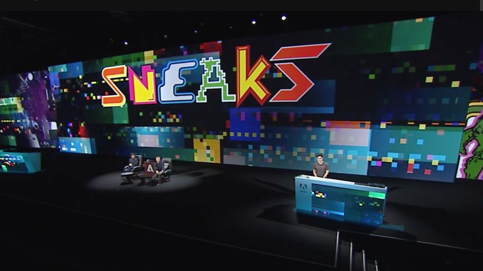
Last year's Sneaks session revealed a number of new innovations, and this year is sure to be no different
For the past few weeks, Adobe has teased with a number of sneak previews of the updates made to some of its most popular creative apps. These included details of a supercharged Content-Aware Fill tool in Photoshop and an exciting new toolbar feature in Illustrator.
These are no doubt the tip of the iceberg, with Adobe sure to wow audiences at Adobe MAX 2018 with even more handy new features and updates to help creatives realise their full artistic potential. While we currently don't know what these might be, we're super-excited to be reporting live from the event, so stay tuned for all the top Adobe MAX news. Don't forget to follow us on Twitter, Facebook and Instagram for the latest updates, and keep checking this page for all the latest news.
Read more:
-
You're reading Postcards 2 Updated with Online Editor & Projects Features, originally posted on Designmodo. If you've enjoyed this post, be sure to follow on Twitter, Facebook, Google+!

A long waiting feature is here! Now you can save email templates directly in the Postcards app and edit it later. If you regularly send newsletters, you will not need to edit the same template and data, just duplicate the template …
-
For most brands, the real success of a Twitter campaign will depend on cold, hard clicks, and ultimately conversions. But it's likes and retweets that help broaden the reach of a campaign, and magnify its effectiveness.
Many of the most shared tweets of all time originate from world-famous individuals with followers in the millions and a sphere of influence that far transcends social media. We can't all be Barack Obama, Ellen DeGeneres or One Direction. But celebrity isn't a prerequisite for viral Twitter success: the top spot, after all, is just a guy who loves chicken nuggets.
Sometimes retweets are explicitly asked for as part of the original post. But trying that approach without something shareable that capture's people's imagination will surely backfire. If a brand asks for retweets without some substance behind it, it simply looks desperate.
So what can we take from all this? Read on to discover six lessons to be learned from the world's most-retweeted images...
01. Support the underdog
In a sea of selfie-taking celebs and global brands, a guy from Nevada called Carter Wilkerson stands alone as the man behind the most-tweeted image of all time. When he tweeted the notoriously snarky @Wendys asking how many retweets would win him free chicken nuggets for a year, Wendy's took the bait: 18 million.
Impossible, surely? Wilkerson wasn't discouraged. Accompanied by a screenshot of his reply from Wendy's, his simple plea 'HELP ME PLEASE. A MAN NEEDS HIS NUGGS' captured the imagination of the world, and eventually the endorsement of global multinationals like Microsoft, Amazon and Google.
The hashtag #NuggsForCarter absolutely flew, and it took just 34 days for his tweet to sail into the number-one spot, overtaking global celebrities, music superstars and even the President. He got his nuggs, too, despite ending some way short of 18 million. What can we learn from this? Simply that everyone loves an underdog, and savvy brands should never shrug them off.
02. Give behind-the-scenes access
Before Carter Wilkerson swooped in to claim his bucketloads of nuggs, the number-one most-retweeted spot was held by one of the most start-studded selfies of all time: Ellen DeGeneres was definitely in the right place at the right time at the 86th Academy Awards.
Packing in Bradley Cooper, Jennifer Lawrence, Brad Pitt, Angelina Jolie, Kevin Spacey, Julia Roberts, Channing Tatum, Meryl Streep, Lupita Nyong'o and more, the tweet sailed past the previous top spot, held by none other than Barack Obama, in just over half an hour.
Clearly, having a roomful of superstar celebs to pull together in a huddle isn't an asset most brands have at their fingertips – and even if you have the budget to hire them in, that's not necessarily enough to command hundreds of thousands of re-tweets. People will see through it.
The lesson here is about giving people candid, behind-the-scenes access – the snap by DeGeneres feels immediate, natural and relatable, despite its star-studded credentials, and gives people a totally fresh view of the Oscars.
03. Show some genuine humanity
Barack Obama's thoughtful, reasoned, appropriately statesmanlike tweets may seem like a long, long time ago in the inflammatory, reactive age of @realDonaldTrump, but his most popular offering is still one of the most retweeted of all time, much to his successor's chagrin no doubt.
Following his second election victory in 2012, the beautifully human image of Obama embracing the First Lady with the simple caption 'Four more years' caused a Twitter storm. It evoked joy, relief and passion – it wasn't boastful, reactive or arrogant.
Perhaps the current President can learn a thing or two from that – as can brands the world over. As long it comes from the right place and isn't forced or manufactured, showing some humanity can truly engage people.
04. Support a good cause
When Pedigree pledged to donate one bowl of dog food to needy animals for every retweet in its #tweetforbowls campaign, 210,000 hungry dogs got fed. The lesson here is simple: if a simple retweet leads directly to a brand putting its money where its mouth is and supporting a good cause, people will get involved.
Bizarrely, the tweet that broke the bank wasn't from Pedigree's branded account – it was from political columnist Andrew Malcolm, who received over 800,000 retweets alone. If your campaign has a good cause at heart, influential figures are more likely to endorse it, and magnify its reach.
05. Engage with the big issues
Another offering from Barack Obama next, and it's the first in a three-part quote from the late, great Nelson Mandela: "No one is born hating another person because of the color of his skin or his background or his religion [...] People must learn to hate, and if they can learn to hate, they can be taught to love [...] For love comes more naturally to the human heart than its opposite."
The other two parts received retweets in the hundreds of thousands, but this first one – accompanied by a touching photo of Obama smiling at a group of children through a window – is currently on a staggering 1.7 million.
Tweeting quotes by luminaries such as Nelson Mandela or Martin Luther King won't make your brand a beacon of anti-racism. If you do it clumsily or disingenuously, the backlash will be swift. But make it relevant – and more importantly, back it with action – and you will surely engage your audience. Just look at Nike.
06. Sometimes, fakery works
So after a lot of talk about humanity, integrity, meaningful engagement and, er, chicken nuggets, we're ending with a rather more lighthearted example. No doubt inspired by Wilkerson's nugg bounty from Wendy's, Dean Baer from Iowa fancied some of the action – but upped the ante a touch by shooting for a cruise liner.
Five minutes in Photoshop gave him the 'evidence' he needed for the challenge: two million retweets and the Oasis of the Seas was his. Despite Royal Caribbean patiently wading into thread several times to assure eager retweeters that it was clearly fake, Baer still secured almost 700,000 retweets. And may have inadvertently tempted a few of those to book a Royal Caribbean cruise in the process.
The lesson? Everyone loves to share something that seems unbelievable. We don't recommend Photoshopping 'evidence' though.
Related articles:
-
Foxit Software has patched over 100 vulnerabilities in its popular Foxit PDF Reader. Many of the bugs tackled by the company include a wide array of high severity remote code execution vulnerabilities. Foxit on Friday released fixes for Foxit Reader 9.3 and Foxit PhantomPDF 9.3, which addressed a whopping 124 vulnerabilities. It’s important to note […]
-
The most dire vulnerability targets the Android framework and could allow an adversary to execute arbitrary code on targeted devices.
-
The CSS Grid Layout module introduces a new and versatile system for positioning elements within a website layout through the use of a highly customisable grid. CSS Grid is now supported by the last two versions of all major browsers so it’s about time we start adopting it in all our projects. In this tutorial we will take an in-depth look at how to use main properties of CSS Grid.
What is CSS Grid?
With CSS Grid, designers can create completely different device-specific layouts in pure CSS
CSS Grid is an extremely powerful tool for element layout. It introduces unprecedented flexibility in layout, using just pure CSS and without absolutely positioning elements (a technique that can lead to many problems). CSS Grid enables us to achieve extremely diverse and device-specific layouts from the same exact HTML markup.
We no longer have to rely on hacks, absolute positioning nor JavaScript DOM manipulation to realise dynamic, shape-shifting layouts. CSS Grid gives designers a blank canvas to create whatever layouts they desire without having to worry about how to achieve it, ushering in a new era of web design and development with freedom from the CSS limitations and workarounds of the past.
How to define the Grid
In order to create a grid within a container it must be given the CSS property display: grid. The number of columns and rows are determined by the number of space-separated sizes assigned to grid-template-columns and grid-template-rows respectively.
Sizes can be any valid CSS unit such as px or vw, or the auto keyword that enables columns or rows to stretch across available space. For instance, grid-template-columns: 10px auto leads to a 10px column followed by a second column that fills all available space.
Grid also uses a 'fractional' unit fr that causes any remaining space to be distributed to columns or rows based on the ratios of these units. grid-template-rows: 1fr 2fr creates two dynamic rows with the second twice the size of the first, while grid-template-columns: 1fr 1fr 1fr 1fr defines four equal-sized columns. The latter can be simplified using the new repeat() function to grid-template-columns: repeat(4, 1fr).
Grid with equally sized cells resulting from equal-ratio, dynamic-width columns and 75px tall rows
A grid can therefore be created inside a container of class grid with four equally sized, dynamic columns and four 75px tall rows (as shown above) using:
Complex grids with unequal sized cells can be created by combining the different units mentioned earlier. We can also use the minmax() function to define the minimum and maximum sizes of dynamic columns and rows. Hence, grid-template-rows: 40px 2fr repeat(2, minmax(75px, 1fr)) leads to four rows with the first 40px tall, the other three stretched over remaining space in a 2:1:1 ratio, and the last two having a minimum height of 75px, which sets the minimum height of the second row to 150px.
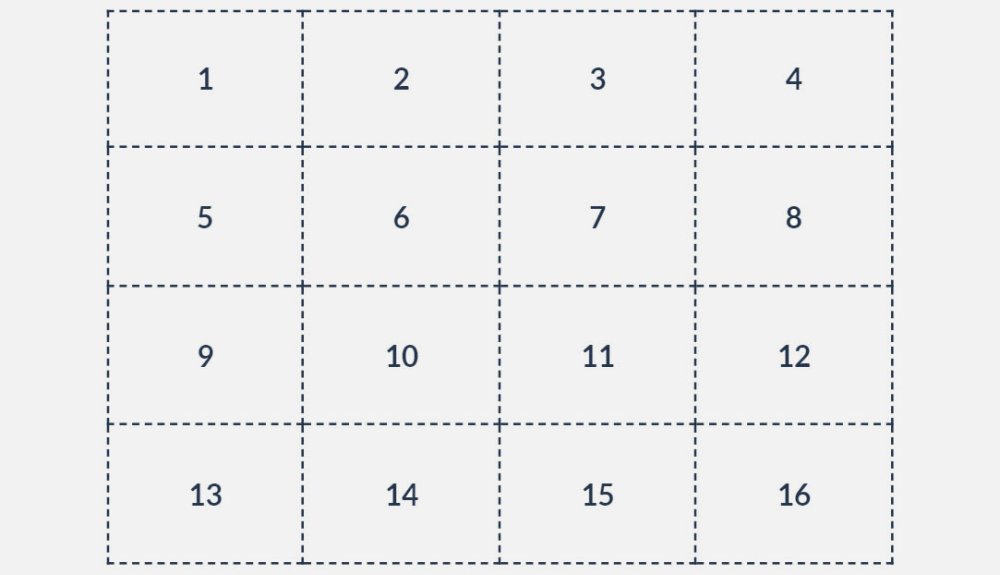
Once a grid is created, grid lines, represented by dotted lines in the images, are automatically numbered from the top for rows or from the left for columns. The lines are also given a second, negative number relative to their index from the bottom for rows or from the right for columns.
For instance, the first dotted vertical line on the left in the grids above is 1 and -5, and the third line is 3 and -2. These numbers can be used as the boundary lines of items placed in the grid. The grid lines can also be named by adding a string between square brackets in the property declarations, e.g. grid-template-rows: [1st] 1fr [second-line] 1fr [last].
Grid with minimum and maximum heights created using a combination of px and fr units and the minmax() function
Similar to Flexbox, the horizontal and vertical position of items placed in the grid can be controlled by setting justify-items and align-items respectively, to start, center, end or stretch.
The same is applicable for grid column and row positions within a larger container using justify-content and align-content respectively. Valid options for these properties also include space-between, where extra space is divided between columns/rows, as well as space-around and space-evenly where space is divided evenly between columns/rows with the same or half the amount of space on the ends respectively. We can also define align-content and justify-content (in that order) using place-content, and align-items and justify-items using place-items.
Positioning items using line numbers
To place an item in the grid we can set its grid-column-start and grid-column-end properties to the vertical line numbers between which the item should be stretched. For rows, the properties are grid-row-start and grid-row-end – and of course the numbers refer to the horizontal lines.
Items can be contained within a single grid cell or stretched across multiple columns and grids
We could also make use of the shorthands grid-column and grid-row, by setting them to only the starting grid line, causing the item to automatically stretch to the next grid line only. As per the image above, using these methods, item1 can be placed between vertical lines 2 and 4 and horizontal lines 3 and -1 (last line or first from bottom), and item2 from vertical line 3 and horizontal line 1 to the next grid lines using:
To simplify further, the declarations grid-column-start: 2 and grid-column-end: 4 can be combined together as grid-column: 2 / 4, with the same applicable for rows using grid-row.
The caveat with using these placement methods is that some of the declarations are somewhat misnomers. For example, grid-column-end: 4 and grid-column: 2 / 4 can be misinterpreted as meaning 'end item placement in column 4' and 'place item in columns 2, 3 and 4' respectively. This is of course not the case as the numbers represent the grid lines rather than columns. To avoid this potential pitfall, we can declare the starting grid line number and the number of columns or rows the item should span across use the span keyword.
Use the span keyword to determine the number of columns or rows you would like an item to span
Using these methods, we can reposition item1 between horizontal lines 2 and 4 and vertical lines 1 and 2, and item2 starting from vertical line 2 and spanning across three columns and from horizontal line 3 spanning across two rows (as in the image above) using:
Believe it or not, item placement can be simplified even further with the property grid-area, which is a shorthand for grid-row-start, grid-column-start, grid-row-end and grid-column-end in that order. If only the first two properties are defined the item will automatically be placed between those lines and the following ones.
This grid property also enables line numbers to be combined with the span keyword. Applying these methods, we can reposition item1 and item2 as such:
Positioning items using area names
Although using grid line numbers and the span keyword is a great way of positioning items, there is an even more intuitive and easy way to place items in the grid. It involves using the grid-area and grid-template-areas properties.
To achieve this, each item to be positioned in the grid must first be given a name by setting its grid-area property to a string that can then be included in the grid’s grid-template-areas declaration. It then becomes possible to define grid-template-areas using a visual ‘map’ in which rows are enclosed in quotation marks, with the contents of each grid cell represented by a string pertaining to the grid-area names of the items.
Empty cells are symbolised by a full stop (.) and spaces signify vertical grid lines. The rows can be placed on new lines to provide a visual representation of the grid, as follows:
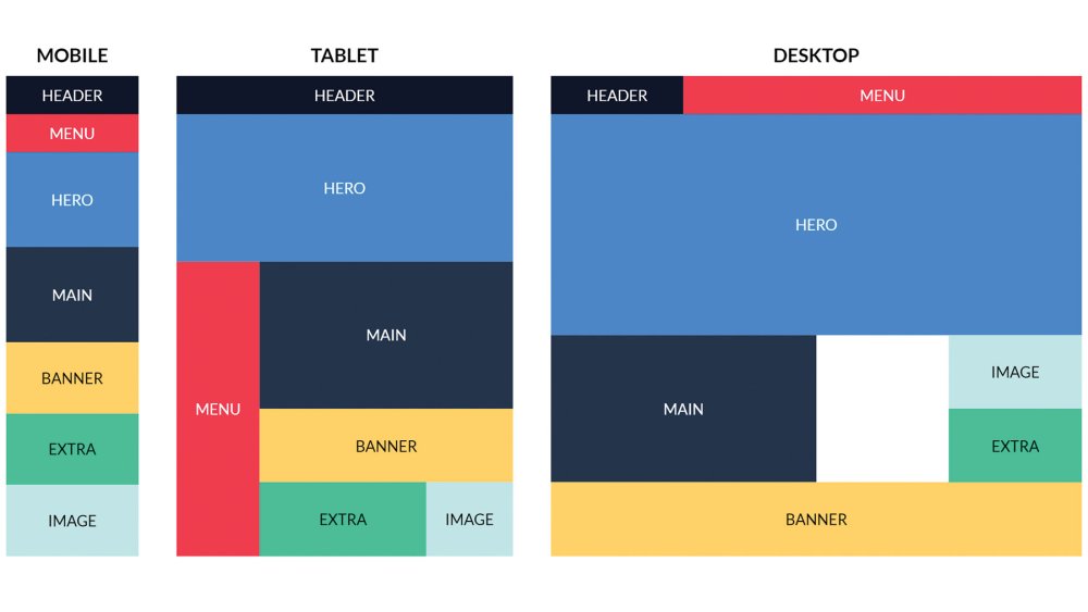
How to create a responsive layout using CSS Grid
CSS Grid can be used with media queries to restructure items on different screen sizes without changing the markup. Item shape, size and position can all be completely changed, thus leading to a truly responsive and highly customised layout.
Figure 1
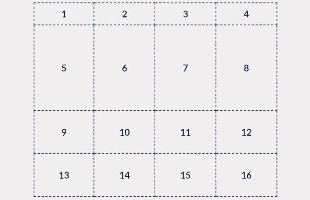
Let’s say we have a list of elements generated from this HTML markup (figure 1):
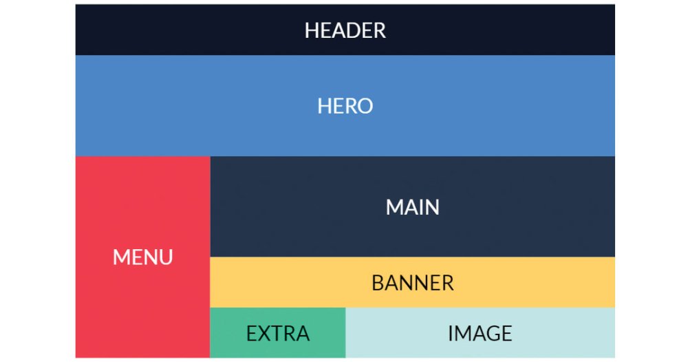
Figure 2
Using what we have learned about Grid so far we can apply styles for screens that are wider than 720px, using a media query (figure 2):
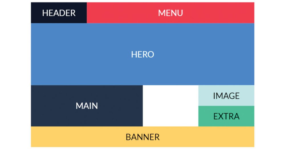
Figure 3
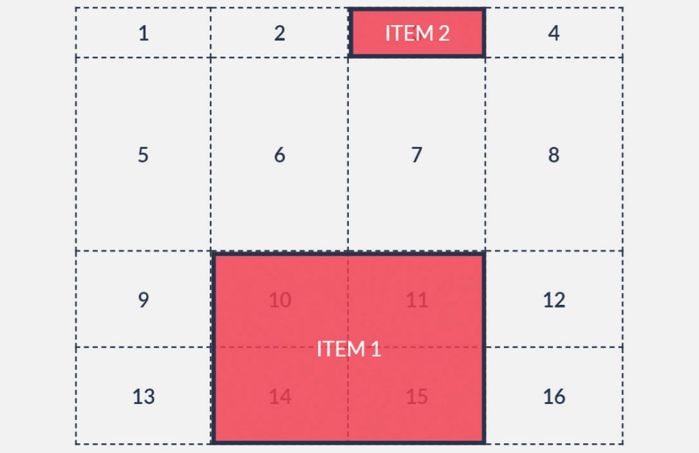
We can also easily reposition and resize the items for larger screens that are wider than 1000px using another media query (figure 3):
That’s not all – the number of grid columns and rows can even be changed to make allowances for certain screen sizes, if this is desired, by redefining grid-template-columns and/or grid-template-rows within the media queries.
Overlapping elements can also be achieved using CSS Grid. Multiple items can occupy the same grid cells and hence can overlap with one another, utilising the z-index properties of the items to control the order in which they stack.
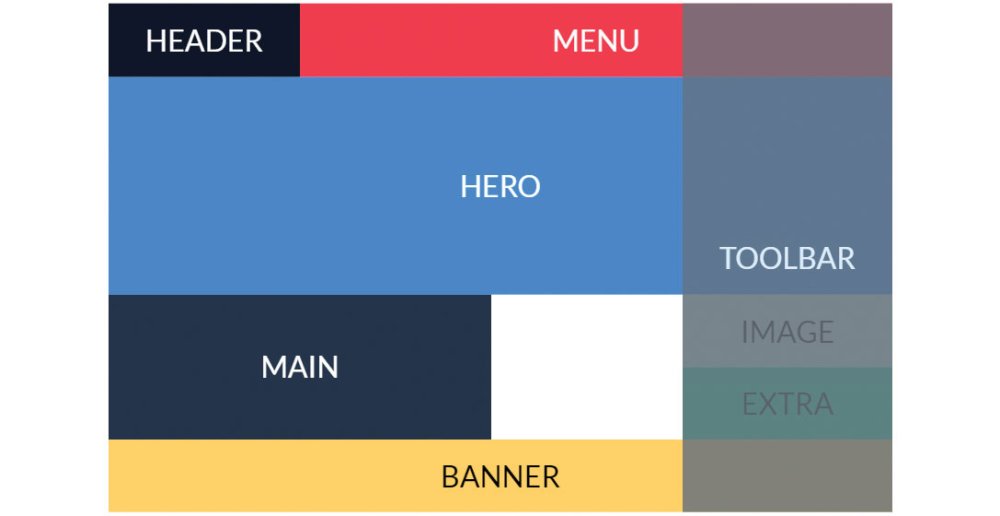
Figure 4
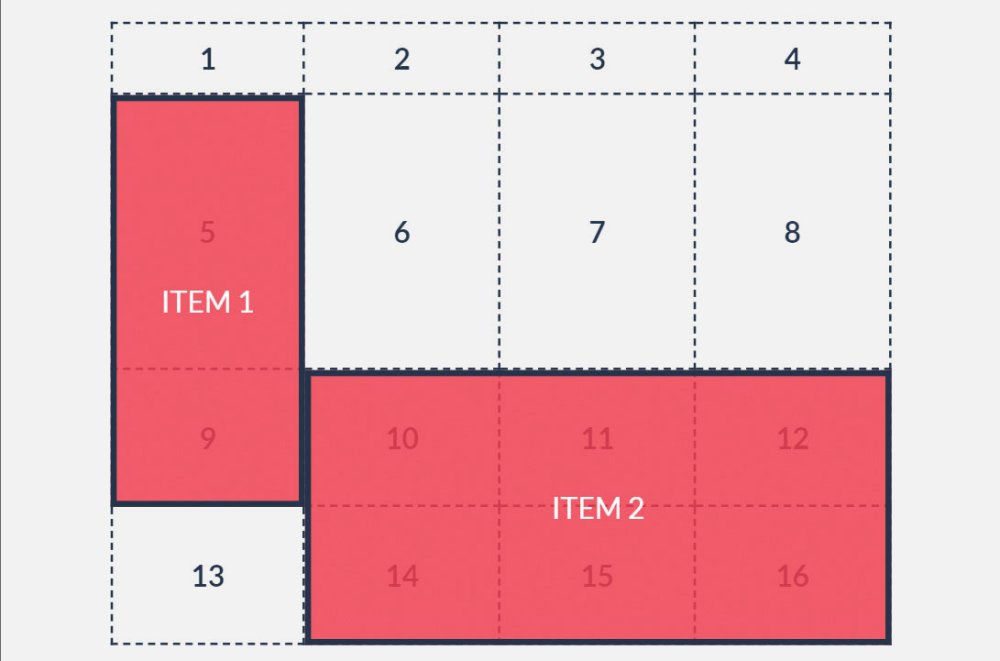
For example, we can add a semi-transparent element with the class toolbar inside the grid container and position it in the right-most column so that it overlaps with all the other elements (figure 4):
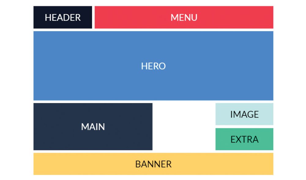
Figure 5
The final aspect we will discuss is the spacing between columns and rows or gaps (figure 5). Items in the grid can be separated using the grid-column-gap or grid-row-gap properties that set the size of the gap between columns and rows respectively. The shorthand property grid-gap can set both.
CSS Grid fallbacks for older browsers
Laying out CSS Grid properties below mobile properties ensures browsers that still don’t support Grid will ignore it and render the mobile version. We can alternatively add a basic fallback layout using @supports, a query that applies rules based on browser support for a specific CSS feature. We can thus set a fallback layout for screen sizes wider than 720px:
If for some reason you need this fallback to be shown for Internet Explorer 10 and 11, which don’t support Grid nor, ironically, the @supports query, you can use a well-known query that applies styles only in IE10 and 11:
If you require IE9 and older support, load an additional stylesheet in the HTML with the relevant styles using:
CSS Grid resources
For more information and tutorials on the CSS Grid Module have a look at the following resources.
MDN web docs
As always, the Mozilla Developer Network web docs site is a great place to start with – or continuously return to depending on how strong your memory is – for web developer resources. Its CSS Grid layout page in particular has explanations for all of Grid’s properties, as well as interactive examples for you to try yourself.Scrimba interactive: CSS Grid tutorial
Scrimba is an interactive code courses platform. You can pause the videos, edit the code in them and see the results before resuming the tutorial. It’s a fantastic way to learn coding and Per Harald Borgen’s free, 14-part CSS Grid course is great for those who prefer video tutorials.Grid Garden game
A great interactive way of learning to code is through games. Grid Garden is an online game that has you watering a carrot garden by typing CSS Grid properties into an editor. It’s a lot of fun and surprisingly satisfying, even if your harvest is just a digital one.This article was originally published in net, the world's best-selling magazine for web designers and developers. Buy issue 309 or subscribe.
Read more:
-
No matter how successful you become, how much money you make, how many awards you win, you will still make mistakes. In the age of online perfection, it's easy to forget that even those with the most gorgeous design portfolios have at some point dropped a clanger. So we contacted some of our favourite designers and asked for their worst, most painful stories about design disasters.
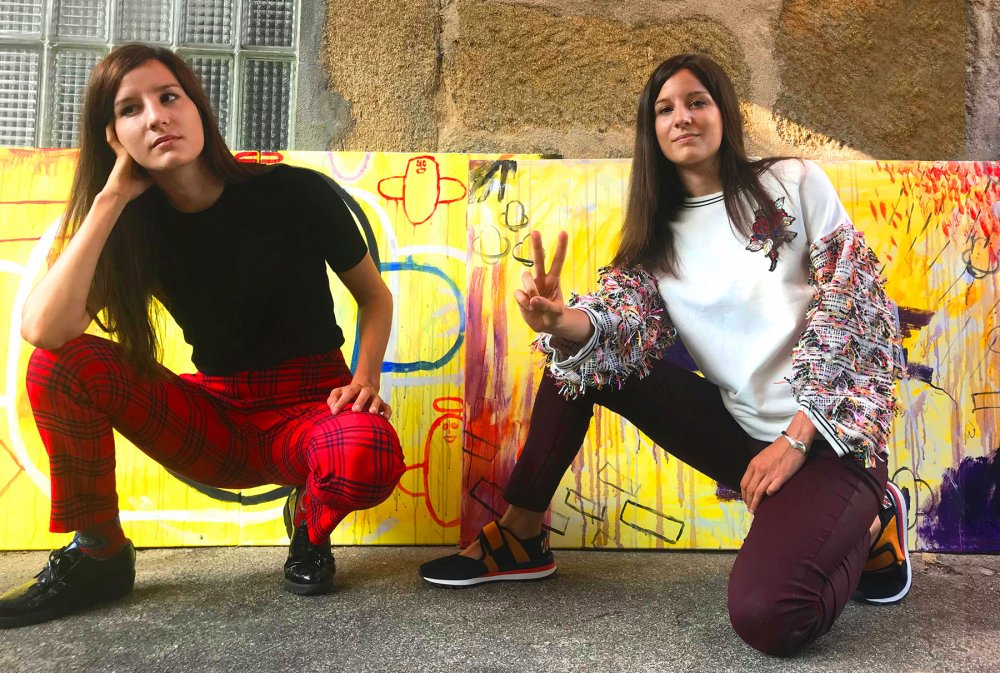
Yarza Twin shared a chilling story about how a typo lead to a pop star's sister threatening to have them deported. Craig Black explained that just because someone says they know more than you, doesn't mean they actually do. Brand Brothers said they were once bullied into bad design by a tech giant. Raquel Quevedo did something you should never do when it comes to sending stuff to the printers. And Love told us why it’s a bad idea to shop for black snow in China. Read on for a selection of design disasters, and what you can learn from them.
Too good to be true
Yarza Twins grappled with an unfamiliar language and an unreasonable client
At the start of their career, Yarza Twins Marta and Eva received an offer from the sister of a "very famous and controversial singer (who we will keep anonymous)”. This client made various products and wanted a catalogue. The budget was next to nothing, but the Spaniards were new to London at that time and were trying to get their studio up and running.
It was a three-day deadline, but the job sounded easy enough. The client would send images and Yarza Twins would lay them out alongside text. "It was a big deal for us," Marta Yarza says, "so we felt very lucky and accepted it."
We cannot share pictures, because we don't want that woman back in our lives
Marta Yarza, Yarza TwinsThe client sent the images she wanted to use – over 3,000 of them, including duck-face selfies and holiday snaps. None of them were named. Yarza Twins had to guess which picture went with which text. Then the client started adding to the brief. She wanted website banners, contact cards, posters …
"We were inexperienced and stupid," Marta says, "so we accepted to do all that work." They worked till four in the morning every day and got the work done. But the client spotted a word, in Arabic, that had been misspelled.
Yarza Twins don't speak Arabic, and the word was incorrectly spelled when they received it. But the client freaked out, refused to pay and began to make threats. She claimed she was hiring a famous lawyer to get the twins deported from the UK: "All because she spelled badly an Arabic word that could be super-easily replaced on the design," Marta says. "We cannot share pictures, because we don't want that woman back in our lives."
What can you learn from this? If you have a bad feeling about a client and a deadline, you should listen to your instincts, and don't let a client add more work to a brief without the promise of more pay.
To infinity and beyond… and back again
Craig Black is a lettering specialist. Branding agency MadeBrave approached him to paint a mural in their studio and it sounded like a simple enough job. The client knew exactly what they wanted: ‘To Infinity and Beyond’ – one of its brand values. Black came up with a concept that had the lettering set against a yellow background. The client signed it off. Time to get painting. The wall was already white – a blank canvas.
"However," the Scot says, "I was informed by a paint specialist that I should use a grey primer paint on top of the white wall to make the yellow background paint stand out. I was unsure about it. It's something I'd never previously done but I followed the paint specialist’s instructions." It didn't work.
The grey primer muddied the yellow, and Black had to cover the grey with two coats of white paint and three coats of yellow to get rid of it. "This had a knock-on effect, as there was a videographer booked in on those days to capture the making of the mural, which had to be delayed due to this mishap, inadvertently costing the client more than what was intended."
The lesson? Sometimes you really do know best.
A date with disaster
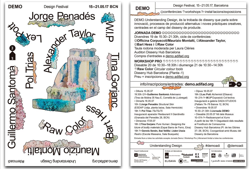
... when is this taking place again? (hit the icon in the top right to enlarge the image)
Can you spot what's wrong with the poster above? Raquel Quevedo made it for the Understanding Design festival. The Barcelona designer and art director says there's a ton of possible reasons why this mistake happened: the deadline was very tight, the brief repeatedly changed, she had to really beat the keys on her knackered old keyboard … But she isn't solely to blame. "Despite being seen by a thousand eyes," the Spaniard says, "no one noticed that the date was wrong."
Quevedo put the date of the festival not as 2017 but 2007. Thousands of flyers and posters were printed and distributed throughout Barcelona. "Not many people noticed the failure," she says. "The lesson? Do not send anything to print from one day to the next, even if the client demands it!"
Client control

Band Brothers' idea of futuristic tech turned out to be different from its client's
In 2014, Brand Brothers – which has studios in Paris and Toulouse – got a job from one of France's leading tech companies. They had to design and make 100 metal boxes, which would be given out to the tech company's clients at an event, alongside various promotional materials. Johan Debit remembers being excited about the project because they had full creative control. The problem was the deadline – a month, by the time the contract was signed – and that the elements that made up the box were coming from five different suppliers.
The client, Debit says, was "impossible to talk to”. They kept asking for strange revisions. Brand Brother hit their deadline, but by then, there had almost no creative control. The finished pictures for the promotional materials, as requested by the client, showed business people (stock photos) using "futuristic" touchscreen holographic technology. It looked like something from a dodgy '90s sci-fi film.
We were ready to go to court if the client persisted in withholding the payment that was due
Johan Debit, Band Brothers"We were getting to a point where we had been so excluded from the creative process that we just wanted to get this work over with," Debit says. Things got worse. The manufacturer delivered the parts: foam inlays didn't fit the boxes they were made for. Plus, some of the boxes had been damaged during delivery.
Brand Brothers paid for remanufacturing out of their own pocket, but the client became increasingly bad-tempered and refused to pay for anything. A shouty meeting followed. The tech company tried to use its size advantage to intimidate the small design studio.
"We reminded him that, even if he was a major client, we had honoured our commitments and he had not, and that we were ready to go to court if he persisted in withholding the payment that was due. Our determination paid off: the client eventually gave up his blackmail and we won. The full payment was received within only a few days."
The lesson? Listen to your instincts, and ensure you've always got a contract.
Broken promises
Photo: Adrian Taylor
In 2007, Sony marketed the PlayStation 2 console as gateway to a dark, sinister world called ‘The Third Place’. Sony asked Manchester studio Love to create something suitable to hold a USB that it would sent out to journalists. We wanted to impress," says Chris Myers, "and developed a dark, sinister snow globe – complete with black snow and a twisted Christmas scene within."
The client liked it, but Love's production team worried the deadline and budget were too tight. "Plus," the senior creative director says, "this was clearly not an off-the-shelf item."
We developed a dark, sinister snow globe... This was clearly not an off-the-shelf item
Chris Myers, LoveThe production team eventually found a supplier in China. Contact was infrequent and only by email. Messages were vague and noncommittal. "After weeks of stress," Myers says, "the supplier sent us the picture of our prototype snow globe, adding we could have as many of these as we wanted: the image was of a tacky, regular, white snow globe – the kind you get from a Christmas store for a £1”.
Love had lost weeks waiting for this ‘prototype’. They had to admit they wouldn't be able to deliver the black snow globes, which Sony wasn't happy about. Love managed to keep PlayStation as a client, but an important lesson was learnt: "Never present an idea to a client if you don't know how you are going to make it a reality. At least have some idea of cost and production, or you could end up looking like creative fools."
Read more:
-
View Conference in Italy takes what looks like a standard animation and VFX conference and makes something special with it. Not content with simply drawing in a few top notch artists to talk for an hour or two, View surpasses expectations with a speaker lineup that many events could only dream of.
From Keynote speaker Hans Zimmer (yes, really) who has had a profound impact on anybody with an interest in film (we all know sound plays a huge part), to nine-times Academy Award Winner, Dennis Muren, to Rob Bredow of ILM, everywhere you look you will find the very best of the industry.
The organisers have outdone themselves, not only with top keynote speakers but in every other area of the event, including the venue, which has moved from its traditional home to the Official Grandi Riparazioni – a fitting location for this year's amazing content.
Talks to inspire
The speakers are there to inspire as well as inform
No conference would be complete without talks, but sometimes the keynotes can be a bit dry. View is set to buck that trend with some amazing talent talking about their passions and showing off elements from some of the biggest projects in recent times.
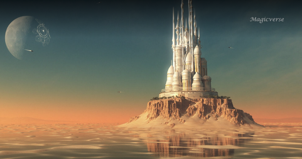
As well as the names already mentioned, Oscar winner John Gaeta will be talking about the Magicverse; Bafta and VES award-winner David Vickery will be delving behind the scenes on Jurassic World: Fallen Kingdom; Troy Saliba and Aharon Bourland will be discussing the VFX of Venom; and Netflix director Phil Rynda will be looking at character before design.
There are too many to list here, so take a look at the rest of the stellar talk programme to see what is on offer.
Practical workshops

Give your skills a boost with View's workshop programme.
As much as a dose of inspiration can set you on the path for your next project, it's important to remember that learning the right skills – either to spread your wings, or to become more efficient at what you do – is vital to become a better artist.
View has long had a workshop programme and 2018 (the 19th edition of the conference) sees the level of teachers and content lifted to new heights.
Highlights of the programme include Pixar Effect Supervisor Bill Watral, who will be teaching you how to find the balance between realism and stylisation, and Danielle Feinberg, the DoP on Coco, will be running a workshop on visual storytelling, including a look at the visual nuggets you didn't realise you were seeing.
In the masterclass section, you will find a whole host of topics covered from animation and characters with Carlos Baena, incredible developments of Renderman with Dylan Sisson, Cinema 4D R20 for Guerilla VFX with Helge Maus, and many more.
Find a new job
View is far more than talks and workshops, as it is also host to a recruitment fair that includes portfolio reviews, a games development programme, and the View Award, celebrating the best in CG/VFX from any level.
For more on View Conference head over to the official site, where the full programme and details of all speakers can be found.
Read more:
-
When people make a point of talking about their IQ, it's usually because they scored pretty high. Unlike traditional tests of intelligence, though, the goal of Pantone's Color IQ test is to score as low as possible. This simple drag and drop quiz only takes a couple of minutes, and it's a great way of seeing some colour theory in action.
Made up of four grids, the test challenges you to arrange a spectrum of coloured tiles by their hue. The colours at either end of each grid are fixed, and it's up to you to create a smooth gradient between them by rearranging the tiles. So for the first grid, you are aiming for a smokey red that blends into a greenish brown
Sounds easy, right? Well, don't get too confident. On the face of it the challenge sounds straightforward enough, but once you start placing colours next to one another the different hues start to play on your perception. This will be an all too familiar phenomenon to artists and designers who use juxtaposing colours to achieve a dynamic effect.
Can you put the colours in the right order?
If you want to take the test, make sure your monitor is calibrated correctly and that the lighting around you isn't affecting your screen. After all, you don't want to get an inaccurate result.
Once you complete the test, as well as getting a score you can brag about on social media, you'll also get some information about how your score compares in your demographic, and insight as to why your colour perception could be off.
According to Pantone, colour tests such as these have been used in the industry and by government bodies for over 60 years. So if you've got aspirations of working for the colour authority, make sure you nail this test.
Related articles:
-
Congratulations. You've learned how to network and you've got yourself some clients. So you've got to love them, right? Except when you secretly want to strangle them.
Yes, of course, clients are the people who pay our wages, and so even when they're at their most frustrating, we do our best to keep these feelings to ourselves, smile sweetly and remain calm, polite and helpful. But there are some things guaranteed to get our blood boiling. We've rounded up the top culprits...
01. Can we have the layered files? We just want to tweak them in-house
"You want my layers? You're going to have to come through me to get them!"
It's an old favourite, and one that clients will try so they can get their in-house team (or more likely just someone they know) to have a play with the files. Even if they're just messing about with a font they don't like, this can potentially change the whole look and feel of the project.
Your likely response will be: "I can't give you the layered files as they are too large to transfer and in an order only I can understand. If you want to tweak the final result, we can discuss this."
But you want to say: "Why should I give you the layered file when I just know you're going to change everything and fuck it all up?"
02. Could you do something in the style of [insert name here]?
Here's how this story goes: a) Client sees something they love b) Client finds out who did it c) Client realises that designer would cost them a fortune d) Client asks you to replicate this style for a fraction of the cost.
It's incredibly frustrating when this happens. You thrive on having your own style and aesthetic; why would you want to copy someone else's? Plus, you're bound to get some stick for it in the design community.
Your likely response will be: "I respect that style and think it's great. However, have you seen this that I did for [client]? I think this style could work equally well."
But you want to say: "I'm sorry, ripping people off just ain't cool, man."
03. Can I have that in Word format?
"Oh dear. You just don't get it, do you?"
Some clients just don't understand design. This is something that, unless you're very lucky, you're bound to encounter at least once in your career. It's similar to the question above – but shows an even greater misunderstanding of the design process.
Your likely response will be: "I can't send you a Word file as this was created in [insert software here]. However, I'm happy to send you a PDF file that you can open in the free Adobe Reader application for review."
But you want to say: "Word? Word? Woooooorrrrrrrrrrddddd?!!!"
04. Just one more thing...
One type of client who doesn't communicate well is known as 'The Columbo'. Just like the fictional detective, this client initially seems kind, but once your inbox starts erupting with dozens of update requests, you'll realise they indulge in circumstantial speech that meanders to the point, and the closest thing they know to a full stop is the phrase: "Just one more thing..."
05. This looks great – but can you add this image from Google please?
Note to non-designers: Google listing an image doesn't make it copyright-free
Another example of clients not understanding the design process, and IP laws in particular. Here's the scenario. You've mocked up a project using stock images (that you've bought). But the client doesn't like them – even though it's just a mockup and you've explained this several times. So, they do a bit of Googling and find the perfect image of a man in a suit at a desk. And they want THAT image. Sigh.
Your likely response will be: "We can't use that particular image as it's the property of [such and such] and has been used on another campaign. If you want an image like that I have a photographer who I collaborate with."
But you want to say: "Don't be such a fool! For one, that image is terrible. And secondly, you can't just take images from wherever you want and use them! Don't you know anything?"
06. This job will get you get loads of exposure. Can you do it for free?
It's one of the oldest tricks in the book: trying to get a designer friend to do a commercial project as if it was a personal party invite. There's no excuse for it – even if you're at the beginning of your design career. It will likely make your blood boil.
As for the exposure line – would you say to a bathroom fitter, "I can't pay you, but when everyone sees my bathroom I'll tell them you did it," or to your dentist "If you make my teeth whiter for free I'll tell my friends and they'll come and pay to have theirs whitened." No. You wouldn't.
Your likely response will be: "Sorry, I'm busy and can't take on any non-paying projects."
But you want to say: Unpublishable. But you can learn how to work through your rage by following these guidelines.
07. That's easy – I could do it

Yukai Du for Computer Arts issue 233
Ah, the well-meaning idiot; 'the design savant'. These types of clients tend to know so little, they don't appreciate how little they know.
They think their wall of participation awards makes them a world-class athlete, and all those hours watching House have made them a doctor – and the fact that no one ever told them otherwise makes it all true. Here's what Bryce Bladon recommends you do...
08. We don't have any content at the moment. Can you just design the site and we'll put it in later?
Yep, no problem. You don't have any content whatsoever, no idea on a colour palette, not even a slogan. You haven't even decided on a company name. But of course I can design you a site. I have no idea what it will look like. Maybe I could add some teddy bears, flowers, and do the whole thing in Comic Sans? That would work perfectly with what you don't have in mind, right?
Your likely response will be: "No, sorry, we will need to discuss the content of the site and your objectives before we can do any wireframing or design work."
But you want to say: "Get out of my office right now and stop wasting my time, you pea-brained numpty!"
09. Can you make it pop?
Ah, the old 'make it pop'! A client's favourite. Basically it's the same old codswallop as 'make the logo bigger'. It's not going to make the design better. At best, the designer will maybe settle for making something a bit brighter, and at worst, the design will start to veer towards garish.
Your likely response will be: First, ask the client exactly what they mean. Do they want it brighter in general? Try to explain things logically, saying there's a reason for the existing colour palette. If they still insist, ask them to come back in a bit and while they are gone either pretend to make some changes and see what they say when they see the result, or simply ramp up the brightness on your monitor. Of course you could just make some subtle Levels tweaks.
But you want to say: "Pop? Pop? I'll make it pop alright!" Then turn all the text fluorescent yellow.
10. I need to withhold payment until you do a little more...
There are numerous ways a client can mess with your money. They might try to convince you that your price is egregious; they might withhold payment until you do more (essentially free) work; they might drag their feet when it's time to cough up.
Fortunately, the worst nightmare client you can encounter as a designer is also the easiest to avoid. But saying that to someone who finds themselves here isn't very good advice. Here's how Bryce Bladon deals with cheapskate clients.
Read more:
-
You don't have to enrol in an expensive art institution in order to become an artist. Now, you can learn how to draw online using The Fundamentals of Drawing Bundle.
You'll learn how to create dynamic superheroes that are worthy of comic books; you'll master the art of figure, portrait, and animal drawing through step-by-step training, and you can learn at your own pace. There's also time to practise shading in order to truly bring your artwork to life.
Get The Fundamentals of Drawing Bundle for just $39 – that's 94 per cent off the regular price, and much cheaper than art school.
Related articles:
-
-
Rated as high-risk vulnerabilities, these privilege-escalation flaws could allow an unauthenticated attacker to access protected content.
-
Adobe has tons of design software that makes creating digital content a breeze. From InDesign to Photoshop, The Complete Learn To Design Bundle can teach you everything you need to know to become an excellent graphic designer, content creator, or virtual artist.
You'll also learn the basics of HTML and CSS – important skills for anyone interested in web development – as well as web design for Wordpress. Illustrator, Bootstrap 4, and Sketch App will also be at your fingertips.
The Complete Learn To Design Bundle is yours for the low price of just $39 – that's 96 per cent off the regular price.
Related articles:
-
You're reading How to Create and Customize an Email Newsletter Template [YouTube Tutorial], originally posted on Designmodo. If you've enjoyed this post, be sure to follow on Twitter, Facebook, Google+!
![How to Create and Customize an Email Newsletter Template [YouTube Tutorial]](https://designhost.gr/applications/core/interface/imageproxy/imageproxy.php?img=https://designmodo.com/wp-content/uploads/2018/10/email-newsletter-create-747x420.jpg&key=b62923440e1e4a7eb8366dbe2d892af46e556fcc937a314fd94a8f37350e2dd2)
In this video, you’ll learn how to create an email newsletter and use animated GIF images in it. A few weeks ago, I received an email from Withings with a new product release, this is how it looks. I like …
-
Wacom is celebrating its 35th birthday, and offering some amazing deals to mark the occasion. We've already seen the price of the MobileStudio Pro dropping by up to £300, and now Wacom is also lowering the price of its Cintiq Pro 13 by more than £100.
The smallest graphics tablet in the Cintiq Pro range has been reduced to £799.95 from £999.95 (or €859,90 down from €1099.90). It may not seem like the biggest price drop, but Wacom rarely runs deals, so it's worth jumping on this one. For more bargains, check out our article on the best cheap Wacom tablet deals.
- Buy a Wacom Cintiq Pro 13 with £200 off
We awarded the Cintiq Pro four and a half stars in our review, and were especially impressed by how Wacom had managed to make the drawing experience feel more natural, and by the quality of the screen. Read our Cintiq Pro review here. Wacom has long ruled the roost when it comes to graphics tablets, but if you're not sure which device is right for you, take a look at our guide to the best drawing tablets in 2018.

We gave the Cintiq Pro four and a half stars in our review
The price cut comes as part of a series of sales and price drops being rolled out over the next few months as part of Wacom's 35th anniversary celebrations. The company launched in Japan in 1983 with the aim of finding better ways to connect humans with their computers (the name comes from the Japanese syllable ‘Wa’ for harmony and ‘Com’ for computer). It worked to develop an intuitive input device for the more creative uses of a computer, and the result was the digital pen tablet.
“In combining our long-standing expertise with new opportunities offered by the ever-evolving IT industry, we stay committed to providing creatives around the world with the best digital pen experience possible” says Nobu Ide, CEO of Wacom. “Being a technology leader in the field of professional instruments for art and design, we are developing new solutions in VR to offer artists and designers the creative tools of the future.”
Read more:
-
Most people see user interfaces daily, whether it's inside a mobile app or on a website, so it's important to get it right when creating them, and if you can enliven them with some CSS animation, all the better.
While building for the web, particularly when it comes to animation, you have to consider things like browser support and performance. In this tutorial, we're going to walk you through two of the best solutions for creating UI animations and transitions.
We will be using a combination of CSS and GreenSock (GSAP). We are all aware of CSS but some of you may not be aware of the GreenSock platform. GreenSock is a JavaScript framework that enables you to easily create stunning animations with HTML elements using just a few lines of code.
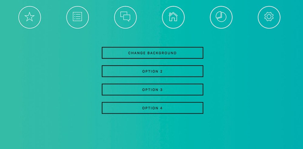
Images and logos have particularly stood out a lot more over the last few years. How often do we use emojis rather than text? Mobile navigations seem to use icons rather than text and over time users come to know where each will take us. We are going to start by creating an animated navigation bar just using logos. When you hover over each one, it will animate to the final state, which will look similar to this screenshot.

We have the six navigation icons and one of them shows off what the hover state will look like once the animation is completed
Build the navigation
First of all, we will create a new index.html file and set up our navigation area along with six links. Each link will be made up of an icon taken from Ionicons. We will need to assign a class to each.
We won't be covering the full HTML or CSS document in detail but you can get the full code listing from GitHub.
Next, we will need to create a CSS file that's called style.css and then insert the following line of code to import Ionicons:
We will now set up the class navlogo for our navigation images inside the stylesheet. Here we will set up the position, height, font size etc.
Next, we need to set up the animation for our .navlogo element. Here we will create the rotation and transition effects, as well as changing the element colour on hover.
Finally, we will need to add an event that removes the hover class when the mouse is no longer hovering over our logos. This is to make sure that our logo comes out of its animation. Create a new JavaScript file called main.js and then enter the following code:
Our navigation is now ready to go, apart from adding some hyperlinks. We have managed to achieve this just by using CSS3.
Create and animate buttons on load
The buttons will appear one by one with a one-second delay in-between. GreenSock enables you to do this with any HTML element
We will now add four buttons to our page and use the GreenSock library to slowly bring in each button, one after the other with a one-second delay. This will create a nice transition effect.
First, we will need to reopen the index.html file and create our button section using the code below:
We then need to set up a reference to the GreenSock library inside the <head> section.
Finally, we need to set up our animation. This will only take one line of code. StaggerFrom is a function that will stagger the start time of our element. In our brackets, we specify the name of the element. In this case it would be .anibutton. We also need to set a duration and in this case it is set to one second between each anibutton element.
Background and element colour transition
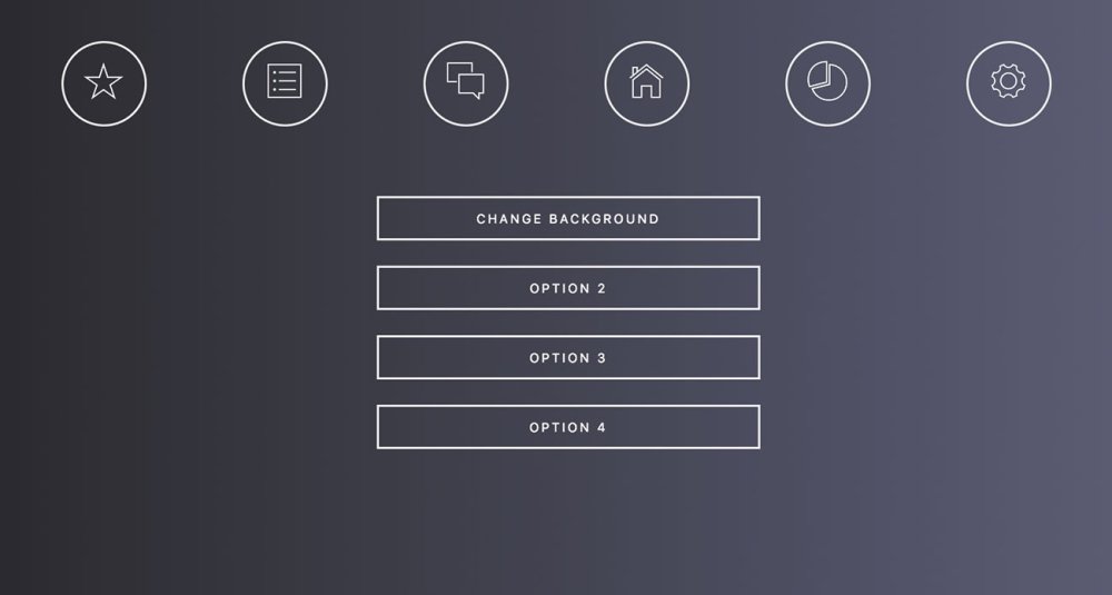
This is how the UI will look after the background and button transition from one colour to another
The next thing we are going to look at is transitioning the website background and buttons from one colour to another. We don't often come across this feature on websites, although it would definitely be interesting for things like accessibility or for web app preferences when the user might want to set their own colour scheme.
Make sure that you have a background colour and a border and text colour set up for your page in the style.css file.
Next, we will create a JavaScript function to set up our various GreenSock colour transitions.
We are going for more of a dark mode look here, so the background will be dark but the buttons will appear light. The first line of code will change the background colour to a darker variation over a period of three seconds. The second and third line will change the colour and border of the text to white over a period of three seconds.
Finally, we will need to call the changeBackground() function from one of our buttons found in the index.html file.
The project is now ready to run. Of course, you can go a lot further by adding new elements and changing the colour style for those, too.
This article was originally published in issue 309 of net, the world's best-selling magazine for web designers and developers. Buy issue 309 here or subscribe here.
Related articles:
Secunia: SCUP Catalogs vs. Software Vulnerability Manager
in Hosting security alert
Posted · Report reply
Systems Center Updates Publisher (SCUP) has been around with limited success since 2011, but is getting the spotlight thanks to integration in the latest releases of System Center Configuration Manager (SCCM). It allows you to push patches right from within SCCM, but with many limitations:
If you have a catalog of 50 applications that match your needs and manage to get them all patched, you are left with a very false sense of security because you do not know about anything else. On the contrary, Software Vulnerability Manager offers the ability to detect over 20,000 applications and and helps you measure your device’s vulnerability status against them all.
Free SCUP catalogs will not get you more than a handful of patches that overlap with your organization’s software portfolio. If you pay for a third-party SCUP catalog, you can get more but it will never be more than a small fraction of the applications that affect your environment. Software Vulnerability Manager for example, provides dozens of out-of-the-box, tested and easily configurable patches but does not expose them via SCUP due to the many limitations listed above.
It can be compelling to think you might just get out of having to create your own patches if only you had a big catalog. If you are willing to live with the inability to customize such patches, you can indeed get to a place where you may create less packages. But there simply isn’t such a thing as a patch catalog that will provide enough coverage to get you out of creating patches of your own. Flexera offers the industry leading AdminStudio solution to help you create custom patches quickly, easily and with the least amount of risk.
The key issue with the catalog approach is that the catalog is all you know about– you only get awareness of your patch status against what is in the catalog. Without a comprehensive solution like Software Vulnerability Manager, getting insight into what applications need to be patched can be an insurmountable challenge. Having access to a database several times larger than the largest catalog with details about the vulnerabilities in question (like attack vector or criticality rating) so you can prioritize effectively (and even automate remediation) can help you to address what is most important quickly and dramatically reduce the risk of unpatched software in your organization.
Source
View the full article