

Rss Bot
-
Content Count
19,651 -
Joined
-
Last visited
Never -
Feedback
N/A
Posts posted by Rss Bot
-
-
Mid-century modernism enjoyed its heyday between the 1940s and 1960s. However, the influential design movement never dropped out of favour, and today continues to confound critics by remaining on-trend in a big way.
Interest in the aesthetic is fuelled by the success of cult dramas such as Mad Men, driving demand for mid-century modern items at vintage stores, furniture fairs and online marketplaces such as Etsy.
What is mid-century modernism?
Mid-century modernism is a practical, clean-lined design movement spanning architecture, interior design, furniture, product and graphic design created during the middle of the 20th century. The exact dates are open to debate: some place mid-century modernism between 1933 and 1965, while others claim the time period was smaller – from 1947 to 1957.
What is the mid-century modern style?
Mid-century modernism is as functional, simple and straightforward as its rather literal name. Mid century modern design is full of clean, sculptural lines, simple, organic shapes and neat proportions, as well as vibrant colour palettes – an evolution of earlier Modernist styles such as Bauhaus.
Read on to discover 15 iconic examples of mid-century modernism across furniture, architecture, products and graphics...
01. Eames Lounge Chair

An icon of mid-century modern design, the Eames Lounge Chair has been in constant production since 1956
Many mid-century modern designers opted for a deliberately artificial aesthetic, rather than trying to imitate wood grain or other more traditional materials. Metal, glass, vinyl and plywood were commonly used.
Perhaps the most famous example of mid-century modern furniture is the Eames Lounge Chair and Ottoman, designed for Herman Miller in 1956, which combine curved outer shells in moulded, veneered plywood with soft leather.
Up until this point, Charles and Ray Eames had designed affordable products for mass-production, and this was their first attempt at high-end luxury. It has been in production continuously ever since, and is part of MoMA's permanent collection.
02. Helsinki University of Technology

Alvar Aalto's mid-century modern style of architecture is beautifully realised on the campus of Helsinki University of Technology
Finnish designer Alvar Aalto was hugely versatile and multi-skilled. His work encompassed architecture, furniture, textiles and glassware, as well as sculptures and paintings.
Aalto's so-called 'redbrick period' of architecture began with a student dormitory called Baker House at Massachusetts Institute of Technology, completed in 1949. Its undulating form gave each resident the best possible view of the Charles River.
On his return to Finland, Aalto applied a similar mid-century modern approach to the striking Helsinki University of Technology campus in 1950, as well as Säynätsalo Town Hall (1952) and Helsinki House of Culture (1958).
03. Linen Type postcards

Chicago-based Curt Teich was a pioneer of lithographic printing, and produced many Linen Type postcards for Stanley A. Piltz
In the USA, mid-century modernism was reflected in the design of Linen Type postcards, which largely comprised national view-cards of American cities, buildings and monuments.
Curt Teich in Chicago was the most prolific publisher of these postcards, and pioneered lithographic printing in the process. Produced on paper with a high rag content, they had a fabric-like feel.
One of Teich's clients was California-based photographer Stanley A. Piltz, whose Linen Type postcards depicted scenic views of the San Francisco Bay Area, as well as the 1939 Golden Gate International Exposition.
04. Coupe pottery

The Coupe line of ceramic tableware by Heath Ceramics has been in constant demand since it was designed in the late 1940s
American pottery designer Edith Heath founded Heath Ceramics in 1948, which went on to produce an extensive range of mid-century modern ceramic tableware, as well as architectural tiles.
Like the Eames Lounge Chair, Heath Ceramics' most famous 'Coupe' line has stayed in constant demand since it was released, with only occasional changes to the texture and colour of the glazes used.
05. Farnsworth House

Designed by mid-century modern architect Ludwig Mies van der Rohe, Farnsworth House was designated a National Historic Landmark in 2006
Another icon of mid-century modern architecture is Ludwig Mies van der Rohe's Farnsworth House, completed in 1951.
A one-room weekend retreat commissioned by prominent Chicago nephrologist Dr. Edith Farnsworth, the 1,500 square-foot steel and glass construction can be found 50 miles outside of Chicago, just south of Plano, Illinois.
Having joined the National Register of Historic Places in 2004, the Farnsworth House was designated a National Historic Landmark in 2006 and is currently operated as a historic house museum.
06. Paul Rand's logo designs

With geometric sans serif type set inside a simple circle, Paul Rand's logo for ABC is a key example of mid-century modern graphic design
Something of a legend in graphic design circles, Paul Rand is also a pioneer of mid-century modern graphic design, applying the principles of bold geometric shapes, clean lines and graphic symbolism to his logos for the likes of IBM, UPS and ABC.
Modern-day revivals of this aesthetic include the 'flat design' movement, and minimalism in general: mid-century modern graphic design was all about distilling complex concepts into the simplest visual forms.
07. Egg chair

Arne Jacobsen's highly distinctive Egg chair may be familiar to UK fans of hit reality show Big Brother
Designed by Arne Jacobsen in 1958 for the Radisson SAS hotel in Copenhagen, the Egg chair is an iconic example of mid-century modernism. Making use of state-of-the-art materials at the time, it was thought to be inspired by Eero Saarinen's Womb chair.
Jacobsen was fond of naming her creations, and her chair portfolio includes the Swan, the Ant, the Cigar, the Pot, the Drop and the Giraffe.
The Egg in particular enjoyed a return to the limelight in 2000: it was used as the diary room chair in the first UK series of Big Brother.
08. Palacio da Alvorada

The Palacio da Alvorada, designed by Oscar Niemeyer in the mid-century modern style, has played host to Brazil's presidents since the 1950s
Located in Brasília, Oscar Niemeyer's design for the Palacio da Alvorada - the official residence of the President of Brazil – is another stand-out example of mid-century modernist architecture.
Completed in 1958, it has been the residence of every Brazilian president since Juscelino Kubitschek and is a National Historic Heritage Site.
09. Lucienne Day's pattern work

Calyx is one of Lucienne Day's most famous textiles.
Mid-century modern colour palettes are distinctive. They often include light, bright and vivid hues such as sunshine yellow, mint and fuchsia, as well as warm, rich and earthy hues such as gold, paprika red and olive green.
Lucienne Day's graphic pattern work was hugely influential on the mid-century moderism aesthetic, and was applied to everything from wallpapers and carpets to ceramics and mosaics.
One of Day's best-known pieces, Japanese-influenced design Sunrise uses a sophisticated palette of gold, pumpkin and petal pink.
10. PH Artichoke Pendant

Poul Henningsen's striking Artichoke Pendant is so heavy, it needs to be hung from sturdy stainless steel cables
Danish architect and designer Poul Henningsen is perhaps best-known for his contribution to lighting design, with one stand-out example in the mid-century modern style being the PH Artichoke Pendant.
Constructed from interlocking geometric 'leaves', the distinctive fixture features a chrome inner diffuser, and is available in copper, white or brushed stainless steel. It's so heavy, it needs steel aircraft cables to support it.
11. MIT Chapel

This chapel on the MIT campus was designed by leading mid-century modern architect Eero Saarinen
Eero Saarinen's design for the non-denominational chapel on the campus of Massachusetts Institute of Technology (MIT) can be found next to the Kresge Auditorium and Kresge Oval – which Saarinen also designed.
A striking windowless brick cylinder set inside a shallow concrete moat, topped by an aluminium spire, the chapel is widely celebrated as a successful example of architectural mid-century modernism. Saarinen created texture by deliberately selecting bricks that were rough and imperfect.
12. Rudolph de Harak book covers

This cover for Modern Nuclear Technology by Rudolph de Harak features overlapping geometric shapes, a distinguishing mid-century modern design feature
Rudolph de Harak was another leading exponent of mid-century modernism in graphic design. Like Lucienne Day, he combined distinctive colour palettes with simple geometric shapes to communicate a message in a stylised, graphic way.
His book cover designs for McGraw-Hill Paperbacks are stand-out examples of this style, communicating diverse and complex topics. His illustrations for Modern Nuclear Technology, for example, and Personality and Psychotherapy, use simple, graphic, overlapping shapes – a characteristically mid-century modern technique.
13. Tulip chair

Eero Saarinen's space age Tulip chair is constructed from moulded fibreglass and cast aluminium
As well as architecture, Eero Saarinen was also a talented industrial designer. Designed in 1955 to completed his Tulip dining table, the classic Tulip chair has an unmistakably 'space age' vibe, and features the distinctive smooth curves and experimental materials characteristic of mid-century modern design.
Although Saarinen had originally planned to produce the chair from a single piece of moulded fibreglass, the material proved unable to support the weight and so the base was constructed from cast aluminium instead, painted to match the upper shell perfectly.
14. Stahl House

Built in 1959, Pierre Koenig's Stahl House was made famous around the world by numerous fashion shoots, films and ad campaigns
Many mid-century modern houses were designed as private residences, and Pierre Koenig's iconic Stahl House is one such example. It was built in 1959 as part of the Case Study Houses program – and is also known as Case Study House #22.
Located in Hollywood Hills, Los Angeles, the house was made famous by a Julius Shulman photograph showing two women sitting in one corner, with an awe-inspiring panoramic view behind them through its floor-to-ceiling glass walls. It has since been used in numerous fashion shoots, films, and advertising campaigns. It was listed as a Los Angeles Historic-Cultural Monument in 1999.
15. Saul Bass title sequences

Saul Bass created incredible title sequences in the mid-century modern style for the likes of Alfred Hitchcock, Stanley Kubrick and Otto Preminger
Like Paul Rand, Saul Bass is an undisputed icon of mid-century modernism in graphic design – and his corporate identity work for clients such as Bell System and Continental Airlines was some of the most memorable of the era. His movie title sequences and film posters were arguably even more groundbreaking, however, using simple, graphic visuals to evoke the essence of the subject.
Bass worked for all the greats of the time, including Stanley Kubrick, Martin Scorsese and Alfred Hitchcock – his title sequences for North by Northwest and Psycho are amongst his most famous – as well as Otto Preminger, whose 1959 film Anatomy of a Murder featured a title sequence that used hand-cut type and rough, cut-out shapes to communicate the message in true mid-century modern design style.
Related articles:
-
In the lead-up to the release of Rian Johnson’s much-anticipated The Last Jedi, the filmmakers were tight-lipped on what secrets were in store from the newest Star Wars film. But 3D World managed to get access to visual effects supervisor Ben Morris from Industrial Light & Magic (ILM), who shared his experience of overseeing the film’s massive VFX effort.
Here, Morris breaks down how ILM’s visual effects crew helped realise The Last Jedi’s beloved porgs, what went into the motion capture and CG for Andy Serkis’ evil Snoke, powering up the Millennium Falcon, generating lightsaber effects, and dealing with Luke Skywalker’s mechanical hand.
The Falcon takes flight

ILM’s CG Millennium Falcon takes flight. The visual effects studio drew on years of knowledge about how the ship should fly, informed by the ship’s original incarnations via miniature, motion control and optical compositing effects
One of the ‘characters’ featured in The Last Jedi is of course the iconic Millennium Falcon, this time piloted by Chewbacca and Rey (sometimes with a little help, or distraction, from the adorable porgs). In the original Star Wars trilogy, the Millennium Falcon was of course a miniature ship shot via motion control on bluescreen and optically composited into star fields and space battles. Now it is a completely digital creation, although cockpit interiors did rely on a partial set filmed at Pinewood Studios near London.
Because the Falcon has seen so much screen time in the Star Wars films, Morris was always able to find some kind of suitable reference when it came to depicting the flying scenes for The Last Jedi. “We would always reference what’s happened in the previous films,” he says. “Actually, per ship, when we’re doing these films we’ve got the best of every shot with an X-wing, and then Star Destroyers and the Falcon. When the artists start these sequences they actually sit and review those endlessly and talk about what’s good and bad, because you’ve just got to learn how to do it.”

Director Rian Johnson with Chewbacca (a role shared by Peter Mayhew and Joonas Suotamo) in the Millennium Falcon cockpit set
ILM also had the benefit of hearing directly from those who had worked on the original trilogy, including senior visual effects supervisor Dennis Muren. “Periodically Dennis would sit in on reviews because he’s got an overview of the whole franchise,” says Morris. “He would tell us some old stories and give us some advice on how he shot things in certain ways.”
This actually provided the team with some interesting lessons about the manoeuvrability of the Falcon, despite the then primitive controls available from the model movers and motion control cameras back in the day. “The thing that I always take away from the Falcon is that, even in space, it flies as if it has air dynamics on it,” observes Morris. “There’s banking and skidding and swerving. It’s like a huge skimming stone. As long as you play it that way with the sculpt of the ship and its trajectories, then your animation will be right.”
Indeed, the Millennium Falcon shots were among the most sought-after at ILM. It was, according to Morris, “like a rugby scrum, a punch-up” in terms of artists from the visual effects studio’s various offices requesting to work on Falcon shots (the fi lm was shared amongst ILM’s facilities in London, San Francisco, Vancouver and Singapore, with contributions from other VFX studios as well). “Everybody wanted their hands on the Falcon,” says Morris.
How to make a porg

Chewbacca is joined by a porg in the cockpit of the Millennium Falcon. Neal Scanlan’s animatronic porgs were used hand-in-hand with ILM’s digital creations
Months before The Last Jedi hit the screens, one kind of character was already an audience favourite: the porgs. These birds from the island of Ahch-To, where Luke Skywalker has been in seclusion, captured the imagination of many. Interestingly, the birds were originally intended to be only physical puppets crafted by creature effects supervisor Neal Scanlan, but ultimately were also built in CG.
“We had animatronics capable of specialist actions, like flying on cables or others that were radio controlled for background scenes,” says Morris. “We went through the whole live action shoot and then when we got into the edit there were a few shots where we thought we could do some more actions.”
To build a 3D version, ILM photographed and scanned Scanlan’s practical porgs, taking care to represent every single detail right down to the feathers. “There’s a very specific way around the back of their heads that the feathers look and all of that was completely copied in the CG version,” says Morris. “The things that we took beyond what the animatronic had were mouth interiors with tiny little teeth and being able to articulate the tongue.

The inquisitive porgs make their lives on the island that Luke Skywalker has secluded himself on, but then find their way onto the Millennium Falcon
“We also controlled the eyelids,” adds Morris. “The balls of the eyes were so huge and so cute that Neal and the guys didn’t even attempt to do an eye close. They did do a very slight eye direction movement but it was more like a bevelling of the outer rim. So in some of the shots we managed to work out how to make them blink. It was actually incredibly hard, because it’s such a huge ball that you actually have to stretch and ease the falloff of the feathers all the way down as you get a blink.”
Despite the obvious flexibility that digital porgs could bring to the shots, Morris notes that the director still wanted to ensure the ‘puppet’ feel of the creatures remained. “Rian loves puppets and so although we had the opportunity to make these guys do the cancan and dance and do anything we wanted, he wanted us to stay grounded in the animation. He wanted it to look and feel and have the limitations of a practical puppet but he also wanted just that bit more movement range. Any time we went too far he’d say, ‘This isn’t a cartoon.’”
Snoke re-surfaces
In The Force Awakens, Supreme Leader Snoke appeared only as a projected CG hologram, 25 feet tall. But in The Last Jedi, he is a living breathing character, which required a re-working by ILM of its digital model and approach to capturing Andy Serkis, who lent his motion capture expertise and voice to Snoke.
In fact, this time around Snoke would be brought to life via multiple methods. First, Scanlan’s team provided a maquette of the character to be used on set as reference. After determining that Snoke’s height would reach eight feet, stand-in actors were also relied upon during filming, one wearing a golden kimonolike costume that ILM eventually reproduced digitally.
An older actor with appropriately wrinkled skin also served as lighting and skin reference. Then Serkis himself, wearing an ILM iMocap suit fitted with active LED markers and a facial capture four-camera headset, also performed the role, occasionally standing on a platform when necessary. Three RED witness cameras were also aimed at the actor for some extra additional coverage.
ILM re-worked its original Snoke model for extra detail, also placing Serkis inside a Medusa Performance Capture Rig, which had been developed by Disney Research for high-res scans. As shots progressed, the VFX team ran into a unique dilemma brought on by a combination of the voice Serkis had provided and the character’s facial features, as Morris explains.

A battle on the planet of Crait takes place amidst a salt flat that reveals a red crystal under the surface
“Rian came to me one day, he’d been watching Andy in the editorial cutting rooms for three or four months and had grown very accustomed to Andy’s voice, which was incredibly deep and resonant and quite powerful. But we had this very wasted, slightly thin gaunt sculpt in the maquette which we had replicated in CG. And it just didn’t add up. You hear this voice and you see this face, and you even look at the voice box and the structure of the chest anatomy and it just felt like it should be a little more raspy – it was such a tiny creature and yet here was this bombastic bad guy."
“So,” continues Morris, “Rian came to me and said, ‘What are we going to do about this?’ And I said, ‘Okay, we’ll have to think about how we re-design him slightly.’ And so we looked at some other actors who have got quite striking faces, people like Michael Fassbender, Terence Stamp and Ben Kingsley.“
“What we decided was that the overall structure was okay but we made Snoke’s jaw far heavier-set and broadened him out. We gave his shoulders a far broader setting with an inflated sternum in his chest. And almost immediately Rian got far more comfortable with it.”
The visual effects artists also had to simulate Snoke’s clothing, made up of a long fl owing coat, and then deal with his wrinkly skin and disfigurement. “We looked at how men’s faces can change as they get older and have things like weeping eyeballs and lower lids,” describes Morris. “Then we had that dried skin and sticky lips. We even showed Rian this old show called Steptoe and Son which had this hideous old character with some spiky stubble and Rian basically said, ‘Go for it.’”
A Star Wars experience

A scene from one of The Last Jedi’s impressive space battles
For Morris and the rest of the ILM team, The Last Jedi experience was an incredible one. The visual effects supervisor, in particular, says he owes his career to seeing the Star Wars films as a child. “If someone says to me, ‘Cite the films that have influenced you and inspired you to get into the industry,’ Star Wars is always at the top. I knew as soon as the opening scroll rolled and the Star Destroyer went over the top - I knew that that was what I wanted to do.”
Morris originally got into model and puppet making with the Jim Henson Creature Shop (where he also first met Neal Scanlan), then worked for several years in digital visual effects at Framestore before moving to ILM. He told 3D World he is particularly excited that the aesthetic in these new Star Wars films, including on The Last Jedi, was to introduce a ‘retro’ feel to the spaceships, worlds and creatures, while still relying on years of advances in visual effects.

Finn (John Boyega) takes on Captain Phasma (Gwendoline Christie) in an intensive battle that was augmented with background action and reflection enhancement by the visual effects team
“There’s no way on Earth anyone could have made something like Snoke or the space battles that we’re achieving now,” suggests Morris. “We would have needed five years of post-production to achieve the layers and complexity that we achieve now. But I think what it always balances down to is we’re pushing the frontiers. We’re really channelling what’s so loved about Star Wars on the visual effects side.”
This article was originally published in issue 230 of 3D World, the world's best-selling magazine for CG artists. Buy issue 230 here or subscribe to 3D World here.
Related articles:
-
Plenty of people dream of designing their own game, but just don't have the tools or knowledge necessary to make it happen. Thanks to the Zero to Hero Game Developer Bundle, it's never been easier to get your start as a game maker. You can get it on sale now for 96 per cent off the retail price.
This is the bundle you need if you want to make this the year you learn to craft your own games. With more than 83 hours of actionable content that will train you on industry standards, this collection of courses is the perfect place to get your start. You'll pick up the programming languages you need to know to code your creation and learn the tools that make it possible to design and develop your dream game.
The Zero to Hero Game Developer Bundle is valued at $1,477 (around £1,055) but you can get it on sale now for 96 per cent off the retail price. That's a great deal for a bundle that could set you down the path to your dream job, so grab it today.
Related articles:
-
Freelancing and working from home can offer immense creative and professional satisfaction, but there are plenty of challenges too. From the stress of juggling multiple projects and knowing you're 100 per cent responsible for them, to clearing your schedule for work that never materialises, freelancing can be as distressing and infuriating as it can be brilliant.
We've already bought you the ultimate 10 steps to freelance success – here are six common mistakes to avoid…
01. Small claims
Are you claiming every tax-deductible expense to which you're entitled? Have you checked? You'd be surprised what's eligible, including pot plants for your home workspace and some parking fees (but not penalties).
02. Double jeopardy
It's all too easy to spend your money twice. You've completed a project, invoiced the client and mentally added the fee to your earnings, so you spend that amount. Then you actually receive the fee and spend it again. There's barely a freelancer alive who's never done this. You probably shouldn't do it again, though.
03. Time out
Illustration: Emmanuel Pajon
Are you leaving yourself any time to stare out of windows, slump on sofas, fiddle, faff and waste time, or are you allocating every hour in your carefully timetabled working week to doing something specific? Clear some space to take time out and rest your brain. You should find it boosts your creativity in the long run.
04. Web history
It looks deeply unprofessional if your website portfolio lists broken links or out-of-date contact information. It's also less than impressive if you keep linking to a blog that has no entries, or a portfolio that hasn't been updated in three years. Make sure your website is relevant, functioning and up-to-date.
05. Pay check
Do you know how much you earned last week, last month or even last year? How are things going now – are they better or worse? How much more work do you need to do to break even this month? If you can't answer, it's time to stop making like an ostrich and take a look at your accounts.
06. Self-care
Such trivial matters as eating, sleeping and changing clothes can fall by the wayside when you're close to a deadline, especially if you happen to work in the building where you keep your pyjamas. Take care of yourself and you'll function better in the long run.
The full version of this article first appeared in issue 249 of best-selling graphic design magazine Computer Arts. Subscribe to Computer Arts here.
Related articles:
- 25 tips for staying sane as a freelancer
- 20 tools that make freelancing easy
- Free graphic design software available to you right now!
-
Entries are now being taken for the Comedy Wildlife Photography Awards, an annual contest that combines humorous animal photography with a serious conservation message. Capturing animals is no easy task, so if you want to be in with a shot of winning, read on for some top tips from photography pros.
This year, sponsors include Affinity Photo – the award-winning professional photo editing app for Mac, Windows an iOS (it’s even Apple’s current iPad App of the Year). A new category, the Affinity Photo People’s Choice Award, will allow users to select their favourite image.
Paul Joynson-Hicks and Tom Sullam are the co-founders of the awards, and users of Affinity Photo. Here, they give their top tips for taking great wildlife photography…
01. Figure out your gear first
Before you get out into the wild, make sure you know how your kit works. I know it sounds obvious, but you need to understand how and why to change shutter speeds and ISOs so that you can respond to changes quickly.
If the perfect photo suddenly presents itself, you need to go with the flow. A cheetah can go from lounging around under a tree to 90kmph in a jiffy, and you need to know what to do! Also, make sure you can change lenses quickly if needs be.
02. Make the most of good light

Great natural light just cannot be replicated
Always know what the light is doing, where it is coming from and how it’s going to affect your image. This is pretty much the same for all photography but in wildlife photography you can’t control it. If it’s sunny, make sure you are out and about before the dawn so you can find yourself something to shoot as the sun rises.
If you get lucky and find some glorious animal sat there with its face bathed in that early morning glow, you can capture some fantastic shots. The eyes will light up (no big black holes), and the light will bring a wonderful warmth that you just can’t replicate any other way. Your ISO, aperture and shutter speeds can all work magnificently together to get some great images.
03. Leave space for movement
You may well know about the basics of composition, including the theory of thirds (if not, look it up!) but remember when shooting wildlife you need to allow for movement. If the creature is walking, running or flying from right to left, leave more space in your composition on the left hand side so it has room to move into.
04. Put the focus on the face
Another important compositional mistake we all make from time to time is to include too much foreground, if in doubt leave the empty space on the top of the picture. For wildlife portraits remember that you want to focus on the face of the creature. This means you really want to try and blow out the background with a shallow depth of field – i.e. a big, wide-open aperture. Depending on your lens, something like F4 or F5.6 should do the trick.
05. Catch some action

Capture movement with a super-fast shutter speed
If you want to catch wildlife in action, such as lion cubs jumping around, cheetahs charging about, or birds in flight, remember you need a super-fast shutter speed. Use your ISO to achieve that – don't be afraid to pump up the ISO to 3200 / 6400 and above depending on your camera body. You can’t make blurry, soft pictures sharp, but you can reduce noise in images.
06. Explore different compositions

Explore different ways to capture your animal
Always remember that there is more than one way to photograph any particular scene; so shoot it the way you feel instinctively first, and then shoot it the other way. For example, let's say you're trying to photograph a lion in a tree. Shoot a fun close up and then perhaps a wide option with the whole tree in.
07. Have fun with panning
I absolutely, totally and utterly love this technique, it’s all about having fun, trying something a little different and creating a sensation of movement. The trick is to move the camera in the same direction and at the same speed as a walking or running animal, whilst taking pictures with a slow shutter speed.
I tend to start at 10the of a second and work from there. That would be too slow for a running cheetah and all you’d get is a blur, but it would work for a trotting elephant for example. Try it out – it’s great fun and broadens your photographic scope.
08. Know your wildlife

Being able to predict your subject’s movements is key
OK, so you're out there in the wild and you have established the best light and a fantastic composition, but do you know what’s going to happen next? In order to maximise your photographic potential and opportunities, you want to understand your subjects' behaviour as much as possible.
Talk as much as you can to your guide, read books, and research online so you can try and predict (ok, so let’s say ‘guess’) what’s going to happen next, where certain animals are going to be at what times of day and so on. Knowledge is power.
09. Try different points of view
Remember when photographing wildlife that ideally, you want to be as low as possible to the animal. In a perfect world we would all be on our stomachs in the grass (but rather you than me if it's facing up to a grumpy buffalo!).
If you are in a safari car, shoot from the roof hatch, but also the window. You could even try holding your camera out of the window, if it’s safe to do. Shooting jaguars in Brazil we were lucky enough to be in a boat, so we had a wonderful low point of view.
10. Edit your work with Affinity Photo

Affinity Photo is a sponsor of the Comedy Wildlife Photography Awards
Faster, smoother and more powerful than ever, Affinity Photo continues to push the boundaries for professional photo editing software. It offers a huge toolset specifically engineered for creative and photography professionals. So whether you are editing and retouching images or creating full-blown multi-layered compositions, it has all the power and performance you will ever need.
-
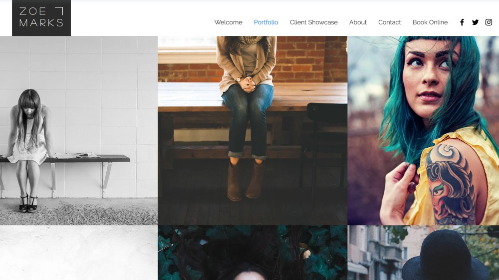
An online portfolio is an essential self-promotion tool for any freelance designer. Often the first thing a potential client sees, it's a shop window to show off your work, as well as yourself – and you need to get it right.
A professional-looking layout is a must. If front-end web design is one of your skills then you should practice what you preach here and create something bespoke. But illustrators, graphic designers and photographers have a wide array of off-the-shelf portfolio website themes to choose from, which can be customised with a little CSS tinkering.
Read on for our pick of 10 of the very best portfolio website themes to choose from, representing five of the most popular portfolio website platforms...
01. Adobe Portfolio: Andreas
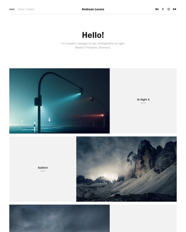
One of a fine selection of portfolio website themes for Adobe Portfolio designed by big-name creatives, this template by Andreas Levers really lets your work shine.
Its minimal layout is ideal for photography as each piece of work is shown large, and alternates between being left- and right-aligned, giving each image space to breathe.
Given that Adobe Portfolio is bundled with Creative Cloud, existing subscribers may well find the option attractive. But there are many other platforms out there...
02. Squarespace: Flatiron
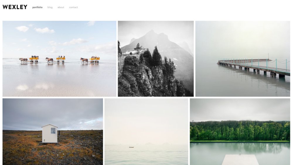
Flatiron is a Squarespace template with a particularly eye-catching gallery display, which locks together images of different aspect ratios in a visually pleasing grid.
The site navigation is simple and unobtrusive at the top left of the page, making sure your work is the star of the show.
03. Wordpress: Helium
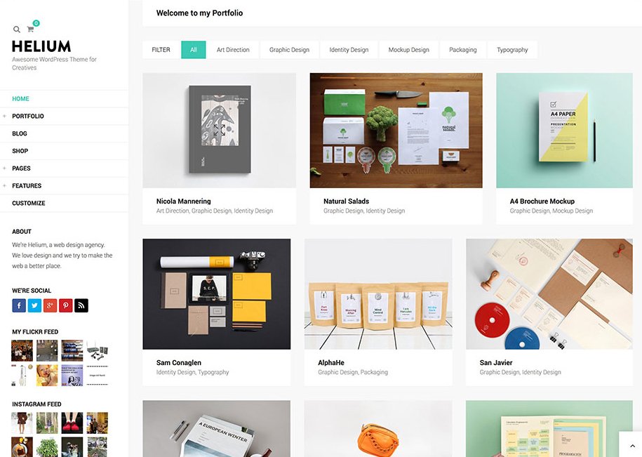
As a platform, Wordpress gives you plenty of versatility when it comes to customisation – particularly if you have some coding skills. Helium is a strong choice for a portfolio website, as it's much richer in features than many of the other examples on this list.
The theme costs $48 (around £34) for a regular license, but the developers have thrown in various premium-rate plugins as part of the package. It includes a built-in blog, as well as the option to add a fully functional online store if you choose.
04. Cargo Collective: Betelgeuse
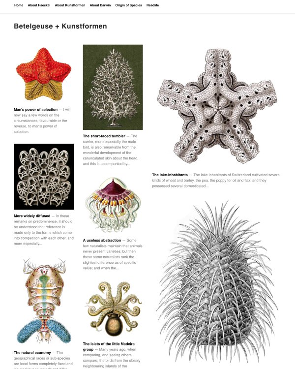
A common problem when presenting images of your work in a simple grid format is how to tackle different aspect ratios, as well as how to create hierarchy.
The Betelgeuse template for Cargo Collective enables you to make individual thumbnails double the size, to vary the layout and emphasise particular projects.
Inside each project page, images and videos automatically scale down to fit the template, but never scale larger than their original size.
05. Wix: Urban Photography
Another stylishly designed gallery-style homepage, the Urban Photography template for Wix is minimal and elegant, giving most of the screen real estate over to large imagery.
While it's particularly effective for showcasing photography, this theme is versatile enough to display any kind of creative work, particularly illustration, and has built-in social sharing.
06. Adobe Portfolio: Marta
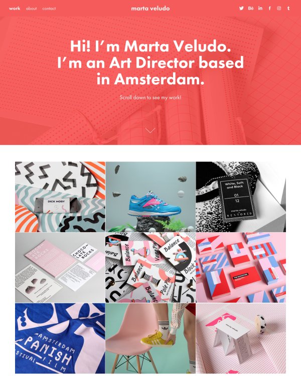
Another Adobe Portfolio offering by a well-known designer, this stylish theme comes courtesy of Amsterdam-based art director Marta Veludo.
Its fixed navigation can change colour when you scroll, and keeps your core details visible while visitors browse the site.
Your logo is centred, with navigation options to the left-hand side – and the whole site is built on a responsive grid with fixed gutters. It's a slick, colourful and eye-catching option for any creative.
07. Squarespace: York
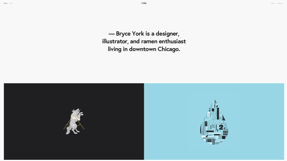
Created specifically with designers in mind, the York template for Squarespace is refreshingly minimal compared to more thumbnail-led approaches.
The main area above the fold is reserved for a large, punchy introductory statement, while large project images are either full-width or half-width.
It's a simple layout that exudes confidence, and you need the work to support it. It's all about picking a handful of killer projects and letting them shine.
08. Wordpress: Throne
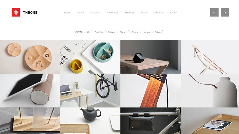
Another ultra-versatile Wordpress template, Throne is as suitable for a freelance creative as it is for a fully fledged design studio. It's particularly well suited to those with a deep and broad portfolio across multiple disciplines, as the navigation filters your work by category.
Like Helium, it'll set you back $49 (around £43) – but it comes equipped with plenty of widgets, CSS3 animations, video support and a wide range of page layout options.
09. Cargo Collective: Cassiopeia
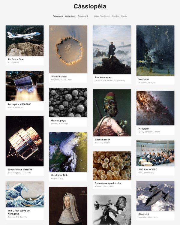
Cassiopeia is a responsive portfolio template for Cargo Collective that fills the width of your browser window with columns of thumbnails. Like its Cargo stablemate Betelgeuse, Cassiopeia automatically scales project images by width, and you can also opt to do so vertically to fit a browser window.
The template supports Sets, as well. The function enables you to easily organise your projects by category, discipline or type of client, for instance.
10. Wix: Emma Brewer
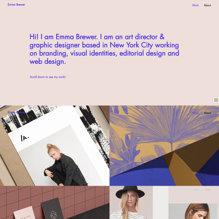
Many of the portfolios themes available for the Wix platform are pretty versatile in terms of end use, but there's usually a suggested discipline that each would suit best.
Pitched at art directors and graphic designers, this Emma Brewer theme features large, half-page-width thumbnails on the homepage, which click through to expansive project galleries.
Each has a killer screen-filling hero image at the top, a paragraph of info, and a selection of secondary images beneath – an ideal way to show branding and design projects with multiple touchpoints.
Related articles:
-
You're reading What in the World Are Microinteractions?, originally posted on Designmodo. If you've enjoyed this post, be sure to follow on Twitter, Facebook, Google+!

Microinteractions are all around us. Simply put, it’s a specific moment of interaction with a user interface. Let me give you a common example: When a user taps on a button in a mobile app, and the button pulls down …
-
An online portfolio is an essential self-promotion tool for any freelance designer. Often the first thing a potential client sees, it's a shop window to show off your work, as well as yourself – and you need to get it right.
A professional-looking layout is a must. If front-end web design is one of your skills then you should practice what you preach here and create something bespoke. But illustrators, graphic designers and photographers have a wide array of off-the-shelf designs to choose from that can be customised with a little CSS tinkering.
Read on for our pick of 10 of the very best portfolio themes to choose from, representing five of the most popular portfolio website platforms...
01. Adobe Portfolio: Andreas portfolio website theme
One of a fine selection of portfolio website themes for Adobe Portfolio designed by big-name creatives, this template by Andreas Levers really lets your work shine.
Its minimal layout is ideal for photography as each piece of work is shown large, and alternates between being left- and right-aligned, giving each image space to breathe.
Given that Adobe Portfolio is bundled with Creative Cloud, existing subscribers may well find the option attractive. But there are many other platforms out there...
02. Squarespace: Flatiron portfolio website theme
Flatiron is a Squarespace template with a particularly eye-catching gallery display, which locks together images of different aspect ratios in a visually pleasing grid.
The site navigation is simple and unobtrusive at the top left of the page, making sure your work is the star of the show.
03. Wordpress: Helium portfolio website theme
As a platform, Wordpress gives you plenty of versatility when it comes to customisation – particularly if you have some coding skills. Helium is a strong choice for a portfolio website, as it's much richer in features than many of the other examples on this list.
The theme costs $48 (around £34) for a regular license, but the developers have thrown in various premium-rate plugins as part of the package. It includes a built-in blog, as well as the option to add a fully functional online store if you choose.
04. Cargo Collective: Betelgeuse portfolio website theme
A common problem when presenting images of your work in a simple grid format is how to tackle different aspect ratios, as well as how to create hierarchy.
The Betelgeuse template for Cargo Collective enables you to make individual thumbnails double the size, to vary the layout and emphasise particular projects.
Inside each project page, images and videos automatically scale down to fit the template, but never scale larger than their original size.
05. Wix: Urban Photography portfolio website theme
Another stylishly designed gallery-style homepage, the Urban Photography template for Wix is minimal and elegant, giving most of the screen real estate over to large imagery.
While it's particularly effective for showcasing photography, this theme is versatile enough to display any kind of creative work, particularly illustration, and has built-in social sharing.
06. Adobe Portfolio: Marta portfolio website theme
Another Adobe Portfolio offering by a well-known designer, this stylish theme comes courtesy of Amsterdam-based art director Marta Veludo.
Its fixed navigation can change colour when you scroll, and keeps your core details visible while visitors browse the site.
Your logo is centred, with navigation options to the left-hand side – and the whole site is built on a responsive grid with fixed gutters. It's a slick, colourful and eye-catching option for any creative.
07. Squarespace: York portfolio website theme
Created specifically with designers in mind, the York template for Squarespace is refreshingly minimal compared to more thumbnail-led approaches.
The main area above the fold is reserved for a large, punchy introductory statement, while large project images are either full-width or half-width.
It's a simple layout that exudes confidence, and you need the work to support it. It's all about picking a handful of killer projects and letting them shine.
08. Wordpress: Throne portfolio website theme
Another ultra-versatile Wordpress template, Throne is as suitable for a freelance creative as it is for a fully fledged design studio. It's particularly well suited to those with a deep and broad portfolio across multiple disciplines, as the navigation filters your work by category.
Like Helium, it'll set you back $49 (around £43) – but it comes equipped with plenty of widgets, CSS3 animations, video support and a wide range of page layout options.
09. Cargo Collective: Cassiopeia portfolio website theme
Cassiopeia is a responsive portfolio template for Cargo Collective that fills the width of your browser window with columns of thumbnails. Like its Cargo stablemate Betelgeuse, Cassiopeia automatically scales project images by width, and you can also opt to do so vertically to fit a browser window.
The template supports Sets, as well. The function enables you to easily organise your projects by category, discipline or type of client, for instance.
10. Wix: Emma Brewer portfolio website theme
Many of the portfolios themes available for the Wix platform are pretty versatile in terms of end use, but there's usually a suggested discipline that each would suit best.
Pitched at art directors and graphic designers, this Emma Brewer theme features large, half-page-width thumbnails on the homepage, which click through to expansive project galleries.
Each has a killer screen-filling hero image at the top, a paragraph of info, and a selection of secondary images beneath – an ideal way to show branding and design projects with multiple touchpoints.
Related articles:
-
Modern browsers and design tools offer a lot in terms of creative power. Mobile devices have turned into pocket powerhouses with enough oomph to push all those Retina screen pixels without breaking a sweat.
It should therefore come as no surprise that dynamic websites, which tap into all this power, are emerging on a daily basis. In fact, you would be hard-pressed to find a modern website that doesn’t make use of animation in some way, be it in the form of simple hover transitions or in full-blown pieces of animated pixel art.
Why CSS animation?
Compared to script-driven animations, CSS animations are easier to learn and can be used without having to know JavaScript. They can be made responsive as they can be modified through CSS media queries. Despite having a relatively simple syntax, we can create quite complex animations with it, especially with the help of CSS preprocessors.
CSS animation consists of a style describing the animation and a @keyframes block that defines intermediate steps in an animation sequence. All aspects of the animation are controlled via a set of easily understandable properties: animation-name, animation-duration, animation-timing-function, animation-delay, animation-iteration-count, animation-direction, animation-fill-mode and animation-play-state. There is also the animation property, a shorthand syntax that combines all of the others.
This is what the CSS animation code looks like in its simplest form:
Using the same syntax, it is possible to animate SVG the same way as any other HTML element.
We will explore various aspects of CSS animation and how we can use it to enhance the overall user experience.
Animate functions
Animations can be applied to perform various functions in the interface. They can successfully guide users through a certain process, improve orientation and also provide visual feedback. Such animations play an extremely important role in designing a high-quality, brand-based user experience. Let’s look at some examples of functional animation.
Polish page transitions
Clicking the website navigation links usually results in a sudden change in user interface. A page is requested, and when the browser receives a response from the server, a blank screen will flash briefly before the new page is shown. This interrupts the user’s workflow and can be disorienting. Page transitions help minimise the distracting effect.
Instead of letting the browser handle this for us, we can intercept the request, load the new content asynchronously in the background, and then use CSS animation to create a smooth transition to another page when it is ready. This helps to promote a sense of continuity while keeping the context.
Provide progress bars
An important aspect of good interaction design is providing visual feedback. We should never leave users wondering what is happening or whether the result of an interaction has been successful or not.
When using page transitions, for example, we should let the user know not only that the page is being loaded but also that it will be displayed shortly. One way to achieve this would be to show an animated loader indicating that the operation is underway.
If it is possible to measure the duration, we could instead show a progress bar. This method provides useful information about how long it will take for the page to load completely.
Show skeleton screens
The alternative solution to loaders are skeleton screens, which can greatly improve perceived performance. A skeleton screen is a simplified graphic representation of the UI to be displayed while the content is loading in the background. The UI is divided into smaller blocks of skeleton images, which are then swapped with real content as soon as it is ready. We can use CSS animation to indicate that the content is loading as well as to ensure that the change appears gradually.
Master micro-interactions
Micro-interactions are small tasks we perform almost automatically. Liking a tweet, adding an item to the shopping cart, sharing links – these are all micro-interactions. We can use CSS animation to provide visual cues and make the result of an action easily understandable. One example is making CTAs or various UI buttons appear tangible.
We can also use CSS animation to create a meaningful transition between states, for example, morphing a menu button from its original shape to an ‘X’ icon, hinting that the navigation can be closed by clicking the same button again. Such design is both pleasing as well as being informative.
Animation can also be used to direct users’ attention by highlighting the changes in the UI, like adding a new item to the shopping cart.
Choreograph your CSS
Don’t animate too many elements all at once or you may end up with a slideshow instead of the animation. If you find yourself in a position where you need to animate lots of objects, coordinate their motion. Plan in advance what elements you will animate and how and when you will animate them.
Animation delays are super-useful in that regard. Well timed, they can also be used to create a neat staggered motion effect. Offsetting animation start times decreases the strain on the browser, as animations won’t be starting at the same time. This is much easier with the help of CSS preprocessors or JavaScript, as they support loop functions.
Here is how to stagger an animation-delay property in SCSS:
It may take a bit of experimenting in order to fully master the choreography but the effort will be rewarded with better performance.
Get animating
The days of designing for static screens are long gone, as are the days when animation meant Flash banners and popups. We should welcome the interactive nature of modern web and start thinking about animation in early stages rather than as an afterthought.
If you haven’t already done so, now is the perfect time to dive into the exciting world of CSS animation. With a bit of creativity, careful planning and modern tooling, there is almost nothing that can’t be achieved.
This article was originally published in issue 304 of net, the world's best-selling magazine for web designers and developers. Buy issue 304 or subscribe to net.
Learn more about web animation

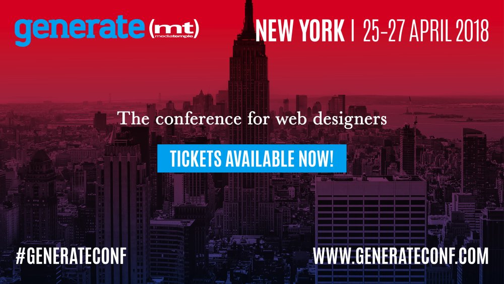
If you're into web animation, make sure you've picked up your ticket for Generate New York from 25-27 April 2018. Web animation expert, author and design evangelist at Adobe, Val Head, will be delivering a talk – Choose Your Animation Adventure – in which she will break down the long list of choices for making things move on screen.
She'll also show you which tools are best suited for things like state transitions, showing data, animating illustrations, and making animations responsive.
Generate New York takes place from 25-27 April 2018. Get your ticket now.
Related articles:
-
This image of Brunel's Great Eastern steamship from 1858 is on permanent display at a new £7 million museum in Bristol, which opened its doors in the spring of 2018. 'Being Brunel' is part of the National Brunel Institute and the SS Great Britain Trust.
The model in this image has been organised into multiple layers and was built primarily using 3ds Max and V-Ray. The characters were clothed with Marvellous Designer and Phoenix FD was used to generate a realistic light emitting from the ship's furnaces.
Coal piles are generated from a single object instanced many times with Particle Array, and Displacement modifiers have been used to create the gnarly rope textures. The model is lit by a blue-coloured GI environment, one VRaySun, five V-Ray Disc lights and 30 VRayIES accent lights.
For this exercise we will concentrate on the boiler room in the scene and build up one of the boiler unit 'lids'. There is of course more than one way to approach this, and with this tutorial I have broken down the process into a number of my own preferred individual steps.
Finally, I'll share how to create and easily manipulate a length of chain link into any position using a bones system.
01. Cut out a hole

Use Slice modifiers and VRayClippers to cut away chunks of your model
The cut-away effects in this scene were achieved by using combinations of Slice modifiers and VRayClippers.
VRayClippers can cut multiple objects, in any form and all at once, by adding them to the list inside a single 'cutter'. However, these objects will remain whole in the viewport and the cut-away section will only disappear at render time.
Slice is a modifier attached to individual objects but can only 'slice' in a straight line. Once applied, the sliced area will disappear from the viewport. This has the advantage of opening up the view to objects that might otherwise be hidden, making it easier to then continue modelling in that area.
02. ShapeMerge

ShapeMerge makes it easy to cut irregular polygon shapes into a simple plane
Cutting irregular polygon shapes into a simple plane can be quickly achieved using ShapeMerge. I like using AutoCAD to create a reference shape for a template. This can be imported and converted into a spline. However, shapes can also be drawn in 3ds Max using line tools and Edit Spline modifiers.
We will only need to build one quadrant of the final 'lid' object. To start, draw a rectangle with its top-left corner positioned at the centre of the template shape and its bottom-right corner to the bottom right of the shape. Detach the spline segments from the template shape that sit directly over the new rectangle and name that as 'cutter'.
Select the rectangle again and from Compound Objects select ShapeMerge. Then pick the 'cutter' as the target shape. Finally add an Edit Poly modifier to the rectangle. You have now created a flat plane object which has been divided into selectable polygon areas, the same as the template pattern.
03. Remove stranded vertices and raise rims

Clean up any vertices that get stranded
Stranded vertices need to be cleaned away from the long edges, otherwise when the top-left corner is lifted up those lengths would buckle around interrupting vertices. Groups of stranded vertices along a single edge can be grabbed in a selection and then Collapsed down to one. Using Target Weld that single vertex can then be welded to another vertex at the top or bottom of the length.
Once tidied, we can grab all the vertices and lift them up with the move tool. With the 'polygon' selection active in PolyEdit, select the rim areas in the object and click Extrude Polygons.
04. Selection tools on the Ribbon

3ds Max has some useful tools to help you select multiple edges
To chamfer off these newly raised rims we first need to select the appropriate edges. This can be a bit laborious when there are many small edges to pick one by one. Fortunately there are some very useful selection tools in the Ribbon menu to help with this. Here you will find a tab named Modify Selection.
Select two edges lying opposite each other on a loop, change the Dot Gap to 0 and click on Dot Loop Cylinder and the whole loop will be selected in one go. Once selected choose Chamfer in the EditPoly modifier and choose an Amount value with a single Segment.
05. Build by copying and mirroring

Use the Symmetry tool to quickly build objects
At this point in the process the single Quadrant that we have been building can now be copied and mirrored over using a Symmetry tool.
Expand the Symmetry tool down to find the mirror plane. This operates as a gizmo and can be moved and rotated until the object has assumed the correct position, while still using the line template from Tip 2 as your guide.
A second Symmetry modifier can be applied to mirror once again to complete the whole form.
06. Add detail to a polygon object

Create extra details by adding a PolyEdit modifier
There is an additional lump along one end of our object that can be built by adding a new PolyEdit modifier. Expand the modifier down, choose Polygon and select the polygons that come within the area we wish to build in. Cut these down using Slice Plane, Slice, QuickSlice or Cut. Delete the polygons that sit inside the area, leaving an empty hole.
With edge selection activated and Shift held, drag an edge from the hole over into a new position. This will build a new polygon. Position the free edge of this correctly with the help of Snap, and seal vertices together using Collapse and/or Target Weld.
07. Round off edges

Smooth and round off your edges using TurboSmooth
Use TurboSmooth to efficiently smooth and round off all the edges. To ensure the overall form is retained this must be done using Smoothing Groups. Select the Polygon option inside the EditPoly modifier and select groups of polygons that are to remain separate from each other. Each group of selected polygons is given a different number from the table of numbers under Polygon: Smoothing Groups.
Add a TurboSmooth modifier to the list. The object will deform out of shape until you expand and scroll down to click on Smoothing Groups under Surface Parameters. Switching up the iterations to 2 or 3 only should be fine, but be careful not to put in a very large number, or else the computer will likely hang whilst trying to calculate.
08. Add a handmade look

With VRayDisplacementMod you can give your surfaces a realistic dimpled look
Add a VRayDisplacementMod modifier to the object and in the Texmap slot choose Composite from Standard Maps. Drag the Composite Map from the displacement modifier and drop it as an instanced copy over into an empty slot in the material editor. I have added two layers inside the Composite texture.
The first layer contains a black and white bitmap image of speckles and the second (top) layer is a Noise Map with the blend mode set to Darken. With a small displacement Amount typed in (such as 10mm) the two textures will deform the lid with dimples and dips.
09. Use a grid helper

Create a new UCS Grid helper to copy objects along angled lines
To copy objects along a line angled differently to the default X,Y,Z we can create a new UCS Grid helper. From the Helpers menu select Grid and drag the square form into a viewport. Rotate and move the Grid to the angle and position in which you would like the new UCS to operate. You have to make the UCS active by right-clicking it and selecting Activate Grid.
Finally, the viewport you wish to work in must also be activated. Click on the active view name at the top left of the viewport and from the dropdown go to Extended Viewports>Grid and then whichever view you require.
10. Build and position a simple chain link

By starting with a simple circle you can build up a chain with relative ease
First create a single link in the chain by drawing a circle. Add a EditSpline modifier, expand down and select as a spline, then drag an Outline in the viewport. Add an extrude modifier. Drag a copy of this object and rotate it along its X axis by 90 degrees. Add an EditPoly modifier and attach the two objects together.
Under the Tools tab from the main top menu, open Array. Switch on preview and drag the X figure in the Move column so the links sit correctly. Adjust the Count figure as required, select Copy and then OK.
Select the first link in the chain, expand down EditPoly and then, beside the Attach button, select the icon named Attach List. Select all the links in the list and Attach them.
In order to manipulate and move the chain so it appears to hang, we will attach a bones system. Select the Systems button and click Bones. In the viewport click the beginning of the chain. Move along the chain, clicking at approximately every three links, then right-click to finish. You should now have a long chain of bones. Move the bone chain into position by selecting the first bone in the link, and move it around with the move and rotate tools until the whole bone system is centrally positioned over the chain. If any bones are out of place they can be individually manipulated in the same way.
Add a Skin modifier to the chain object and add all of the bones into the Bones list. Now when you move or rotate the bones around their axes, the chain will follow. The shorter the bone links are, the less deformation there will be in the chain.
Finally, drop a VRayEdgesTex in the Bump Map material slot and adjust the World width to half the extrusion depth given to the circle object in the beginning. This will round the sharp chain link edges when rendered.
This article was originally published in issue 232 of 3D World, the world's best-selling magazine for CG artists. Buy issue 232 here or subscribe to 3D World here.
Related articles:
-
Finding the right font pairing is an artform – in this article, we offer some tips and tricks for getting it right. Let's say you've hunted through all the great paid and free fonts you can find, and picked the perfect typeface to suit your project.
Great fonts don't live in isolation – you need something to go with it that will complement it and help it shine. Then you need to figure out how to use your choices effectively within your design. Here are the golden rules of matching fonts to help get you started.
01. Don't use too many fonts

Wired comes with a typeface designed for web usage: Exchange Web
First things first: don’t go mad with fonts. You want to pick a couple that work together and set the tone and mood you want to portray. Too many fonts will create a jarring experience.
02. Consider context

The Independent's bespoke typeface, Indy Serif, is well suited to delivering news content
Where is your typography being displayed and who is going to read it? Consider this when deciding which font is right for your project. Striking the right visual direction and tone is important when it comes to making sure your messages are relatable.
03. Don’t be afraid of space
Clarity and breathing space is important when making a message noticeable. Ensure your textual elements aren't fighting for prominence within a tight space – in this situation nobody wins. Space helps keep focus.
04. Introduce hierarchy
Sizing is a great way to introduce hierarchy within a design and help guide the user through the content. However, for this to be effective it’s important there’s not a huge variety of text sizes on a page. Consistency, hierarchy and readability are key.
05. Keep styles consistent

The Great Discontent uses Leitura News for its body text, in a large ba
Consistency is key to ensure a good UX. Are you using uppercase or letter spacing for your headlines? Pick an approach and don’t deviate. Similarly, ensure your fonts follow set size rules and don’t vary from them. Stick to a pattern.
06. Apply colour with accessibility in mind
Legibility is essential when choosing a colour for the type elements on your site, so be mindful of accessibility. Make sure contrast between text and background is high enough to remain clear to users with visual impairments. A great tool to check this is WebAIM's Color Contrast Checker.
07. Mix your styles

The Economist offers generously sized body text, topped with a crisp, slightly lighter typeface – Milo Serif Pro
There needs to be enough contrast between your choices to create variety within your design – but go for the wrong combination and you'll have a clash on your hands. Use contrasting styles like sans-serif and serif to achieve more varied looks.
08. Watch your weight
Most fonts come in variety of options and weights. When pairing with other fonts, you can use variations from families but be mindful not to overdo it – mixing and matching too many of these can be just as jarring as using too many fonts. Use one or two weights to add variety and hierarchy. As a rule of thumb, don’t deviate from 'normal' on body text, to ensure you keep text readable.
09. Try something new
Everyone has tried-and-tested font pairings they know work well together, and it's tempting to return to them again and again. While it's good to have some go-to fonts, be wary of getting stuck in a rut. There are so many different fonts out there to experiment with, so if you can find the time it's always worth having a play with new and interesting offerings.
Web design event Generate New York returns on 25-27 April 2018, offering a packed schedule of industry-leading speakers, a full day of workshops and valuable networking opportunities – don’t miss it. Get your Generate ticket now.
This article was published in issue 271 of Web Designer magazine. Subscribe here.
Read more:
-
The familiar little flicks that help lettering flow together as you read have been falling out of favour over recent years, as brands have been trying harder and harder to make a bold impact with their logo designs. In fact last year we noticed that big brands were going one step further and resorting to an all-caps approach to their typography.
But are serifs really on the way out? Earlier this year we predicted the opposite, as our typography trends for 2018 forecast that serifs would be an important tool that brands would use to establish a sense of personality and uncorporateness (take that, The Man, we're making up words now).
Despite all of this, big brands seem to be pruning the serifs from their beloved logos and letters. Does this rob them of a personality, or does it reinforce an aspect of their identity? Let's take a look at five big brands who have ditched serifs to find out.
01. HSBC
In a rebrand that could be dismissed as 'same same but different', HSBC has snuck out a sans-serif logo. It's a rebrand that's largely flown under the radar, possibly because it's so inoffensive. As well as straightening out the lettering, HSBC has also swapped around the logo and the brand name, and deepened the colour of its hexagonal logo.
So why did this rebrand pique our interest? Well, it's mainly because HSBC was one of the last banking bastions of serif lettering. With a serifed font, HSBC set itself apart from the pack as a traditional, established brand, which is especially reassuring when you're handling people's cash in a choppy economic climate.
The new lettering is perfectly acceptable, if a little uninspiring. To get an idea of how a bank can drop the serifs and still retain a personality, check out the Natwest rebrand, which packs in colour and heritage.
02. Santander
Hang on a minute, haven't we just seen a banking group drop the serifs and adopt a darker shade? Isn't that always the way though, you wait forever for a subtle bank rebrand and then two come along at once...
Jokes aside, the new Santander identity was built to be more legible on digital devices. The evolution of the logo sees embellishments clipped from both the lettering and the flame icon, resulting in a straightened out and balanced design.
Much like the HSBC rebrand, the new Santander graphics have been met with a 'great, I guess...' reaction. While the new lettering matches the weight of the flame (ticking off the more legible and simpler mission statement in the process), the icon consequently loses its 'S' shape, which was a pleasant and playful nod to the bank's name.
03. Google
You know serifs are in trouble when a company as big as Google is sending them packing. Launched back back in 2015, the new sans-serif logo coincided with the reveal of Google's new parent company, Alphabet.
This new logo retained the colour elements from the previous, instantly recognisable design, however the letter shapes got a complete overhaul. Gone were the slender, almost calligraphic letters. In their place are the solid weight, sans-serif forms that are better suited to a change in internet browsing habits as people interact with Google on a variety of devices.
At the time of the announcement, Google said on a blog post that it wanted to create "a new logo and identity family that reflects this reality and shows you when the Google magic is working for you, even on the tiniest screens." Given that serifs have a history of being difficult to read on small digital displays, this was a canny move on Google's part.
04. Yahoo!
Before Google came along and blew everyone away with its sans-serif logo, Yahoo had already been there and done that way back in 2013. Yahoo might not have the same clout as Google any more, but that doesn't mean that its redesign failed to cause shockwaves in the design community.
Created in-house by Yahoo's design team headed up by then-CEO and president Marissa Mayer, the new logo hoped to exhume the company's popularity. It certainly garnered attention as Yahoo took a 29-day run-up the the launch with an event called 30 days of change, which saw the tech behemoth reveal a different logo every day before the official one was unveiled.
While it ramped up the anticipation, 30 days of change also exhausted and annoyed viewers. So was the new logo worth the wait? Well, it certainly dragged Yahoo away from the goofy serif logo that summed up some of the naivety of the early internet, but ultimately the design caused disappointment thanks to its lack of imagination.
05. Diet Coke
Coca-Cola has been shaking things up this year in terms of design. As well as launching a heritage bespoke typeface, it also rebranded Diet Coke along with redesigned packaging.
The reason? Millennials. Or, to be more specific, how market researchers imagine Millennials. "Millennials are now thirstier than ever for adventures and new experiences, and we want to be right by their side," said Rafael Acevedo, Coca-Cola North America’s group director for Diet Coke. "We’re contemporising the Diet Coke brand and portfolio with sleek packaging and new flavours that are appealing to new audiences."
So are Millennials responsible for killing serifs along with everything else? Not really. If anything, it's the slimline cans that have forced the logo into a cramped space and squeezed out the serifs.
Related articles:
-
Can bug bounty programs be designed to protect consumer privacy and how do programs balance white hat disclosure versus companies sitting on vulnerabilities until they are fixed?
-
The internet is full of web design inspiration for people learning how to start a blog or website. There are also a number of web themes available for different content management systems, such as open source platform Drupal.
There are over one million sites in more than 180 languages currently using the Drupal CMS. That might not be as many as WordPress. But with a massive online community, and more than 26,000 developers constantly building and offering themes and resources, it's safe to say that Drupal is a viable option for building your website on an open source CMS platform.
Here is a comprehensive list of the best Drupal themes to be found on the web. Happily, those on page one are completely free...
01. Drupal8 W3CSS Theme
This theme uses the lightweight w3.css framework
- Price: Free
Claiming to be the first Drupal 8 theme that uses the smaller and easier-to-learn w3.css framework, Drupal8 W3CSS is designed to be simple to use, with fast loading times. It's responsive by default and provides CSS equality across all browsers and devices. It also comes with 22 predefined themes, and has 22 regions and 26 sections with changeable colours.
02. Showcase Lite
Showcase Lite supports fancy Superfish menus
- Price: Free
Based on the popular Showcase+ premium theme, Showcase Lite is a free mobile-first theme built on the Bootstrap 3 framework. Created to help you make great-looking business and portfolio sites, it supports one, two and three-column layouts, as well as swish Superfish menus.
03. Awesome Zymphonies

Avoid website infamy by using Awesome Zymphonies
- Price: Free
Designed by FreeBiezz and developed by Zymphonies, Awesome Zymphonies is a fully customisable responsive theme for Drupal 8. Built using Bootstrap 3, it's suitable for all manner of business websites and offers assorted sidebars, custom sliders and one, two or three-column pages, plus plenty of other options.
04. MAYO

MAYO is all about the colour scheme
- Price: Free
If you want a really colourful website, MAYO should be right up your street. Using Drupal's colour module and advanced theme settings, it makes it easy for you to colour most of the theme elements, such as base, page, header, sidebar, node and footer. And in many cases, it also lets you specify the text colour, link colour, background colour and border colour of each element. Just don't go too psychedelic.
05. Marinelli
Marinelli has a three-column design plus a rotating banner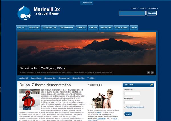
- Price: Free
Marinelli is a flexible three-column design with eight extra collapsible regions and a slider. It also comes with integrated rotating banners at the top where you can highlight your most relevant content. This is a very attractive design that will work well for corporate websites.
06. Day and Night
Day and Night is perfect for a blog or events site
- Price: Free
Day and Night is a wonderful responsive design that uses the Zen base theme. It features a tile layout, a clean drop-down menu and support for Sassy Cascading Style Sheets (Scass) and Sass. A great choice for an events website or a blog.
07. Business Responsive Theme
If you have a business and you want a responsive site, this theme has your back
- Price: Free
This is a fantastic free responsive theme developed by Zymphonies. It has a clean and minimal design that features a one and two-column layout, Nivo Slider and custom front page. Check out the live demo.
08. Corporate Clean
Corporate Clean is packed with more features than you'd expect from a free theme
- Price: Free
This minimalist responsive Drupal theme is specifically designed with businesses in mind and features a plethora of options. The theme offers multiple column layouts, an adjustable slider and is also webform ready. With so many features on offer, it’s amazing that this theme is free.
09. Likable
Likable is perfect for online publications, and has a slideshow
- Price: Free
Likable is an elegant theme that would be perfect for an online magazine or blog. It features a slideshow to showcase recent posts, a choice of columns, and multi-level drop-down menus.
10. SimpleCorp
Get creative with the CSS3 effects in this responsive theme
- Price: Free
SimpleCorp is a stunning free Drupal theme that you will want to use. The theme is fully responsive and uses some fancy CSS3 effects for the portfolio section. The design is minimalistic and available in various colour schemes. It features social icons, a multi-column layout and a slider. It's absolutely amazing for a free theme.
11. Professional Responsive Theme
Professional Responsive Theme is a responsive theme that is, er, professional
- Price: Free
Another great theme from Zymphonies, this responsive theme includes one and two-column layout support, multi-level drop-down menus and a custom front page. A professional looking theme for any business.
12. Corked Screwer
Corked Screwer is one of the best-looking Drupal themes you'll see
- Price: Free
One of the most beautiful free Drupal themes available, Corked Screwer is a responsive design so you can be sure it'll work across a number of devices. It features a slideshow and multi-column layouts. This would be perfect for people who want to show off their work. Definitely worth checking out.
13. Blue Masters
Wendell Fernandes' responsive theme is great for businesses and freelancers
- Price: Free
Designed by Wendell Fernandes, and released for Smashing Magazine and its readers, this is a responsive theme featuring a responsive slideshow. A great theme for a small business or freelancer.
14. TouchPro
TouchPro is a simple two-column theme, optimised for touchscreens
- Price: Free
Originally a premium theme, the Drupal community voted that TouchPro should be released for free, and you should be glad they did. It's a simple, two-column layout and features a slider that would work well for a blog or online magazine.
15. Business
This minimal Drupal theme is literally the Business
- Price: Free
This minimal and elegant Drupal theme features a fixed-width, customisable slideshow, multiple column layouts and is highly customisable. It also supports Google Fonts and is great for any blogger or business.
16. Openchurch
You don't have to be a church to use this theme, but it helps
- Price: Free
Open Church is an impressive free Drupal theme that offers social and multimedia integration. It uses the 960 grid system and would suit any events-based site.
17. Responsive Blog
Need a responsive blog? Nah, we ain't seen one. Sorry.
- Price: Free
Every company should have a blog. And having a good-looking blog is a must if you want your readers to spend more time reading your content. Responsive Blog is a simple yet eye-catching theme that features social icons, mobile support and a slideshow. So grab it while it’s still free.
18. Journal Crunch
Journal Crunch: perfect for a blog or news site
- Price: Free
This theme is based on WordPress's JournalCrunch theme, which was designed for Smashing Magazine. This eye-catching, free Drupal theme would be perfect for a blog, news or magazine website. Features include a one-column layout for the homepage and special rendering for sticky posts.
19. FontFolio
FontFolio: comes with a liquid layout
- Price: Free
FontFolio is a great-looking responsive Drupal theme that's perfect for web designers, artists and photographers. It comes with a liquid grid layout for the homepage and category pages, and a two-column layout for the internal pages. You can also set it up in multiple languages.
20. Selecta
Selecta: the best theme we've seen for video sharing
- Price: Free
We haven't seen many slick Drupal themes for video blogs, but if you're into video sharing then this theme is definitely worth checking out. You can also include your top five favourite videos and allow users to share them on social networks.
Next page: More fantastic Drupal themes
The following Drupal themes will cost you, but in each case we believe that it's worth shelling out for the additional features, customisation options and aesthetic. In some cases there's a trial version or period, so you can test the theme before handing over your card details.
21. Porto
Porto comes in both light and dark styles
- Price: Regular licence $59
Enabling you to build fully responsive sites that look stunning on any device, Porto is a multi-purpose Drupal theme suitable for creating portfolio or business sites. It offers boxed and wide layouts in both light and dark styles, and it includes template and view support for Drupal Commerce.
22. Enar
Enar comes with ready-made templates and plenty of theme settings
- Price: Regular licence $50
Created using the Twitter Bootstrap 3.x framework, Enar is a responsive Drupal 8 framework that'll build sites suitable for pretty much any device you care to mention. It comes with over 10 ready-to-use homepage templates and features a simple drag-and-drop interface, with powerful shortcodes and theme settings.
23. TheMAG
TheMAG offers four header styles and a drag-and-drop page builder
- Price: Regular licence $54
A highly customisable, responsive Drupal blog and magazine theme, TheMAG is packed with features to help you build amazing-looking, content-rich news sites. Its drag-and-drop page builder makes it easy to put things together without any HTML knowledge, it offers unlimited page and colour variations, and it comes with four header styles to choose from.
24. Mistix
Mistix: a good choice for a portfolio site
- Price: Regular licence $48
If you're a freelancer looking to showcase your portfolio online, this could be the perfect theme for you. It includes a big slider at the top where you can promote your latest work and it come in eight different colours. This one is perfect for photographers and web designers.
25. Cenus
Cenus: attention-grabbing
- Price: Regular licence $39
This template is available in light and dark versions, and come with a unique circle image style that's bound to grab visitors' attention. It's easy to install and comes with a custom panel allowing you to create a gallery for your images. Perfect for freelance designers who want to showcase their work.
26. Proma
Proma: responsive and colourful
- Price: Regular licence $48
Proma is a responsive Drupal theme that features 15 colour variations and nine different backgrounds. The slider and the effects make it engaging, and you also have the option to embed a video on the homepage. Definitely worth checking out, even if you're just looking for some inspiration.
27. News Center
News Center: good for an online magazine
- Price: Regular licence $59
News Center is perfect for blogs or online magazines. This fully responsive theme works in both landscape and portrait mode on smartphones, and comes with 27 fancy jQuery effects for the homepage slider.
28. Grider
Grider: comes with seven colour variations
- Price: Regular licence $48
This is one elegant Drupal theme that would be perfect for businesses. Created using HTML5, this responsive theme is available in seven different colour variations and is easy to customise.
29. Spotlight
Spotlight: perfect for portfolios
- Price: Regular licence $39
This Drupal theme would be ideal for portfolios or even an organisation promoting a cause. You have to admit it, it's one good-looking theme with a unique layout.
30. Antoni Photographer
Antoni Photographer: great for building an online portfolio
- Price: Single site licence $66
The last one on our list features a one-column layout and is truly stunning. Perfect for photographers and designers who want to show off their work.
Related articles:
- The very best WordPress tutorials
- Master digital marketing with these newsletter templates
- We reveal the best web fonts for your site
-
WordPress makes the web go round. The platform is extremely customisable and ready to be crafted into the perfect website. Learn to make the most of WordPress with the WordPress Essentials Lifetime Bundle. You can get it on sale now for 97 per cent off the retail price.
By the time you're finished with the WordPress Essentials Lifetime Bundle, you'll be building amazing websites that will provide you with a web presence that people won't be able to ignore. These courses cover everything from the basics of building a fundamentally sound site to how to market your site and products with professional-level copywriting. It hits on all essentials for any upstart web designer who is hosting their site on WordPress.
The WordPress Essentials Lifetime Bundle is packed with $880 worth of WordPress content, but you can get it now for 97 per cent off the retail price. That's a great deal of savings for these must-have courses, so grab this deal today.
Related articles:
-
Technology is a crucial part of our day-to-day lives. We already know that coding knowledge is going to become increasingly important over the coming years. But how do we equip children with the necessary skills to becoming coding literate?
The secret lies in engaging their creativity and imagination – which is exactly what these amazing toys and tools do.
01. Botley

Botley can be programmed to move around and avoid objects
Aimed at children aged five to nine, Botley is a screen-free coding robot. Using logic and step coding, children can easily programme him to perform a range of basic movements, detect and avoid objects, and make sounds. Children can lay out the coding cards to plan and visualise Botley's path before coding his movements. He also comes with detachable robot arms he can use to move objects.
02. Coding Jam
Here's something a bit different: with Osmo's Coding Jam, kids use code to create their own unique musical jams. Each coding block is a programming command – combine them in different patterns to create music. Sounds range from prehistoric cave beats, to interplanetary pings and science-lab techno grooves.
03. Cubetto
Friendly wooden robot Cubetto offers a screenless introduction to coding. Children arrange the tactile wooden blocks in different sequences on the control board to tell Cubetto where to go. Each colour or shape indicates a different action. The toy can be expanded using additional maps, challenges and storybooks.
04. Hello Ruby

Ruby is a little girl who solves problems with with her friends
Aiming to turn technology and coding into a whimsical, playful experience, Hello Ruby is packed with amusing downloads to engage children's imaginations. The project started with a book (Adventures in Coding – now available in over 22 languages) funded by a hugely successful Kickstarter campaign.
Now, Hello Ruby offers a wide range of fun activities to get kids engaged with coding, such as building your own computer out of cardboard, or designing your own board game.
The aim of the project is to make STE(A)M education more approachable, colourful and diverse.
- Get Hello Ruby: Adventures in Coding from Amazon: $9.60 / £10.95
- Get Hello Ruby: Journey Inside the Computer from Amazon: $10.98 £11.98
05. Code-a-Pillar

Rearrange the segments to control the Code-a-Pillar's movements
The cute Code-a-Pillar from Fisher Price can be programmed to turn, light up and make sounds. Preschoolers are encouraged to rearrange the colourful segments to change the Code-a-Pillar's path.
The set contains a motorised head and eight easy to connect segments, and there are expansion packs to encourage further exploration. As well as improving motor skills, this coding toy is designed to help develop children improve their understanding of sequencing, critical thinking, reasoning and problem solving.
06. Ozobot Evo

Young coders can teach the Evo tricks
Evo is Ozobot's award-winning coding robot. Aspiring coders can interact with it, teach it tricks, or programme it to do new things – either on-screen, or screen-free using markers and stickers provided in the experience pack. There's also an accompanying iOS/Android add where users can play, explore, and get creative ideas from the community. The Ozobot Evo is aimed at fledgling coders aged eight and over, and has some enthusiastic reviews.
07. Puzzlets

Help Rus and his friends save Pear Island in this coding game
Combining a physical Play Tray with tablet devices, Puzzlet lets children programme their way through an adventure game and develop their STEAM skills in the process. Children aged six and over can help Rus and his friends save Pear Island from the evil King Kaldera and his minions.
With millions of possible solutions, Puzzlets has been tested and approved by gamers as a way of getting young people to think like programmers. Not only that, it gets a thumbs up from teachers, and has snagged a couple of awards, too.
08. Hackaball
Hackaball takes ball games to a whole new level. This smart ball teaches the basics of coding in an active way. Children can programme it to light up, change colour and make noises, then have fun playing unique games. Originally funded via a Kickstarter campaign, the Hackaball has attracted a host of awards and positive reviews.
Liked this? Read these:
-
Master the techniques of famous surrealist painters with the latest issue of ImagineFX magazine - on sale today. Inside the pages of issue 161 you'll discover how to turn abstract ideas into strong character art, plus you'll learn how surrealist artists whipped up a strong sense of atmosphere. There's more to it than painting melting clocks!
Buy issue 161 of ImagineFX here!
Elsewhere in issue 161 we pay a visit to Jake Parker's studio, celebrate 25 years of Magic: The Gathering, and reveal how to build up a ghostly scene with paints in our traditional artist workshop. On top of this there's the usual news, reviews, and reader art that you've come to expect from the world's leading digital art magazine.
Take a look at this issue's lead features below.
Click here to subscribe to ImagineFX
Staying smart on social

Time to log out?
Getting distracted by social media is a problem for everyone, but artists in particular struggle to manage their time online. We talk to artists from all walks of life to discover how they strike a work and social media balance, and hear how the online platforms can be used in a proactive way.
Inside the mind of Allen Williams

Pay a visit to the illustrator's subconscious in our interview
American illustrator Allen Williams' fascination for drawing started at a young age as his family moved around the country. We talk to the artist about how he teases imagery from his subconscious using prose and poetry.
Sketchbook insights

Get a behind the scenes look at the work of top artists
Few things are more tantalising than taking a look inside the pages of an artist's sketchbook. Here you get to see them at work as they figure out various drawing challenges. In this issue we take a peek into the sketchbooks of Tobias Kwan and Daria Theodora and discover what makes them tick.
Revisit a surreal master

This workshop pays tribute to one of the most inspiring surreal artists
The work of Zdzislaw Beksinski has been revered as some of the best surrealist art of the 20th century thanks to its haunting atmospheres and sinister, baroque characters. In this workshop we revisit this master and learn how we can emulate his style in our own digital and traditional paintings.
Storytelling art

Learn how a single image can take you on a complete journey
They say a picture's worth a thousand words, which means that artists can spin entire stories from one single well-crafted image. In this in-depth workshop we explore how a carefully curated mix of character design and world building details can say more than pages and pages of text ever could. Are you sitting comfortably? Then we'll begin...
Related articles:
-
Editorial work is a staple for many illustrators. While it's rarely as well-paid as branding or advertising commissions, it's a chance to stretch the creative muscles and tackle a broad range of subject matters.
Illustration can visualise the most abstract, surreal and complex themes and concepts that photography would struggle with. It can fill any available space, interact with the copy, grab readers' attention and draw people into the story.
As our illustrator hotlist 2018 attests, the global illustration scene is booming – and editorial is no exception. Read on for our pick of eight particularly inspiring editorial illustrations from around the world.
01. Calum Heath: Cyber Bullying

To represent cyber bullying, Calum Heath turned Facebook Likes into shark fins circling an isolated girl
Editorial illustration can represent powerful, emotional and also quite abstract concepts, as this piece by London-based illustrator Calum Heath demonstrates.
Heath specialises in editorial work, with clients including The New Yorker, the Guardian and MixMag. This piece for VICE, one of his favourites to date, accompanied an article about cyber bullying.
In a clever symbolic twist, it transforms familiar Facebook 'Like' icons into foreboding shark fins, circling a girl. "The drawing was originally from life – an observational sketch of my younger sister on her phone," he explains. "I re-contextualised the drawing to make her seem isolated and in danger."
02. A. Richard Allen: Trump Wave

Donald Trump's election victory sparked a flurry of political illustrations, including A. Richard Allen's Trump Wave
Political satire has always been a fertile breeding ground for illustration, and Donald Trump's shock victory in the 2016 Presidential Election gave plenty of ammunition to creatives around the world.
One particularly memorable example is A. Richard Allen's Trump Wave, for The Sunday Telegraph's Money section. Inspired by Katsushika Hokusai’s iconic painting Great Wave Off Kanagawa, the award-winning editorial illustration expresses the world's financial markets bracing themselves for potential impact.
“Hokusai’s Great Wave is such a beautiful and iconic image – it even has its own emoji – and it seemed apt to reference it when seeking a metaphor for a frozen moment of dramatic anticipation," explains Allen.
“The Trump coiffeur as the breaking wave was a neat piece of serendipity. I had to make an oblique reference to the man himself, and chose his inimitable hairstyle.”
03. Helen Musselwhite: 10 Myths of Creativity

Helen Musselwhite's intricate papercraft illustration added extra depth and colour to this Dance Gazette article
Papercraft illustration has enjoyed a huge resurgence over the last decade or so, with leading proponents such as Owen Gildersleeve, Yulia Brodskaya, Helen Friel and Helen Musselwhite flying the flag with style.
Used in an editorial capacity, papercraft can add an incredible amount of depth to an article, although commissioners need to be clear and confident with their feedback at an early stage, and sign off roughs before the build begins, as even the smallest tweaks at the end can be a real challenge.

Musselwhite created two skulls to represent the joy of a great idea, and the disappointment when one doesn't come
One of Musselwhite's standout pieces, 10 Myths of Creativity, illustrated an article in the Royal Academy of Dance’s magazine Dance Gazette that explored popular myths surrounding the creative process.
She created a series of intricate paper skulls, using various weights of paper, to represent two extremes: “That lightbulb moment when you know you’ve nailed it, versus the crushing feeling of despair and insecurity when the creative juices aren’t flowing and you feel you’re on the edge.”
04. Simon Pemberton: The Blackest Isles

Simon Pemberton captured the bleak, moody, stormy seas around the Shetland Isles for the Financial Times
Sometimes editorial illustration is as much about capturing the mood or emotion of a particular scene or place described in the copy, as it is about depicting it faithfully – which a photograph could do.
A winner at the V&A Illustration Awards 2015, Simon Pemberton's stormy, evocative illustration for the FT Weekend magazine accompanied a feature about the Shetland Isles, and perfectly captures the icy cold and thunderous skies during a stormy boat journey.
This extract from the article sums up what Pemberton was trying to achieve: “Last night… the ship bucked and tossed as if we were on a fairground ride... the gale has dropped outside and it has started to freeze. Weather is everything in Shetland… we always know which way the wind is blowing.”
05. Eva Bee: The Day My Brother Was Taken

A book review in The Observer for The Day My Brother Was Taken was brought to life in style by Eva Bee's illustration
As well as communicating abstract concepts, editorial illustration is also fantastic for telling stories – there's a reason why the best children's books feature a collaboration between author and illustrator.
Eva Bee specialises in editorial work, with clients including The Boston Globe, Financial Times, the Guardian and Reader's Digest. This particular piece accompanied a book review in The Observer's Sunday magazine: the story of a young boy who leaves home on his bike, and is abducted and killed in the woods.
Filled with dark, foreboding menace, Bee's illustration draws you in, in classic horror style, communicating the eerie horror of the story without gratuitous violence.
06. Izhar Cohen: Burnout

Izhar Cohen visualised the risk of burnout using a sea of metaphorical matches for this article in The Economist
Certain publications rely on illustration to add colour and personality to topics that can be quite wordy, theoretical and not always immediately visual in scope.
Izhar Cohen created three illustrations to accompany an article about 'burnout' in The Economist's 1843 magazine, in which the author argues that the root of the problem lies much deeper than people simply working too hard.
Using a field of matches with subtle human faces as a visual metaphor, Cohen created a powerful image of what happens to the human mind if it's pushed too far.
His full-page opener features a man chopping a lone matchstick with an axe in the outline of an human mind, and risking setting the whole place ablaze when it falls.
07. Tom Dilly Littleson: Undead

The terrifying nature of the rabies disease became a blood-red wolf in Tom Dilly Littleson's illustration for US WIRED
WIRED is famed for its stylish use of commissioned illustration, and work for the magazine is a portfolio highlight for many top creatives around the world.
To illustrate a 2012 story in the US edition about a girl with rabies who benefited from a pioneering course of medical treatment, the creative director at the time, Brandon Kavulla, turned to Australian-Spanish artist Tom 'Dilly' Littleson.

Littleson's two illustrations were strikingly overlaid for the feature opener, representing the conflict inside the girl
Known for his realistic pencil drawings, and often visceral, gruesome and unsettling subject matter, Littleson represented the disease as a snarling wolf on a blood-red background, juxtaposed with a calm, sleeping image of the girl on pale cream.
Dramatically entitled 'UNDEAD', the article opens with a split version of the two images as alternating stripes, to symbolise the crossroads that the girl faced between recovery and descent into rabid madness.
08. Weapons of Reason

Weapons of Reason is published biannually
Picking up the prize for best use of illustration at the Stack Awards 2017, Weapons of Reason is the brainchild of London-based creative agency Human After All. Published "roughly biannually", the title aims to tackle the biggest questions of our time.
While many of the examples above are stand-out examples of particular articles that editorial illustration has brought to life, here we're featuring Weapons of Reason in its entirety, as illustration is such as fundamental part of how the magazine tells stories, from the cover inwards.

Halfway through its ambitious run, Weapons of Reason has mastered the use of illustration to explain complex topics
The first four issues explore climate change, the ageing population, the growth of megacities and the balance of power in the world – with four more to come over the next couple of years.
Such huge topics require a deft touch to make them accessible and interesting, and the magazine's skilful approach to illustration helps translate even the most complex subject matter into bold, simple visuals.
Related articles:
-

The number of vulnerabilities continues to grow. In the past year, it increased by 14 percent, reaching an all-time high of nearly 20,000, according to the Flexera Vulnerability Review 2018. This figure alone is clear evidence that the challenge of reducing the risk of exploitation of unattended vulnerabilities is not getting easier. On the contrary, things keep getting more complicated with costly consequences for businesses around the globe…
Let me exemplify:
Story one: a vulnerability on an operating system (OS) is disclosed – let’s say Windows Server. Patching servers’ OS can be tricky. No one wants to disrupt the business by taking down a system outside regular maintenance windows or by breaking something. The vulnerability is critical, but it has no exploit. The conclusion is not to patch now. The issue is forgotten and that patch is never applied. Then one day you get to work and you’re a victim of a ransomware attack like WannaCry.
Story two: a vulnerability on an open source software (OSS) is disclosed. You build internal systems using that OSS but you do not document the use properly. That system parses customer data. Because you do not know you use that OSS, you don’t know you’re vulnerable. One day your business is making the cybersecurity headlines, like in the case of Equifax.
WannaCry and Equifax were cases that made it to the news, but the fact is that those are not isolated cases. The exploitation of unpatched vulnerabilities remains one of the main vectors for incidents and breaches. According to a recent study by the Ponemon Institute nearly 60% of organizations that suffered data breaches in the past two years cite unpatched vulnerabilities as the culprit in the attack. In a different study by analyst firm Forrester, IT security professionals place exploitation software vulnerabilities as the most common mean for external attacks leading to incidents.
But how can you improve your practices to manage software vulnerabilities? Here are three points to take into consideration:
You don’t know what you don’t know
I continue to be surprised by how many organizations simply don’t know a large portion of the software they use.
You can’t expect to protect your systems if you just don’t know what’s in there.
Knowing what you have and where is the critical first step in the quest to stay on top of vulnerable applications.
Policies and processes
Doesn’t matter if it is about applying patches or mitigating the risk of exploitation of a vulnerability which can’t be patched. Policies and processes that enforce those policies are the only way to get control over software vulnerabilities and report on risk reduction.
It’s a relatively simple principle: Most incidents occur long after the vulnerability is publicly known. So, processes that support a regular cadence of assessment and mitigation should do the trick and effectively reduce risk.
Intelligence and prioritization
It’s clear that not all vulnerabilities can be fixed as they become public. The only way is to prioritize. But do you even know when a vulnerability is disclosed for a piece of software you use? Do you have trusted information on vulnerabilities affecting your systems? Can you connect that information with your policies to determine what to do first?
Without timely, accurate information on vulnerabilities – intelligence – prioritizing is simply not possible.
All of this is easier said than done. But there is hope. Organizations are becoming more aware of the problem and understanding that detection systems and security teams are overwhelmed with the incidents and consequently failing to stop breaches that could have been prevented with optimized processes to regularly patch applications and systems.
Flexera’s customers report that our vulnerability intelligence and our technology help them achieve visibility, prioritize efforts and remediate vulnerabilities faster and without operational overhead. They remediate the right things and reduce the risk of exploitation for their businesses effectively.
Download Vulnerability Review 2018 – Global Trends today and learn more about the vulnerability landscape and our vision for mitigating risk.
Learn more about our solutions for managing software vulnerabilities.
-
Getting the typography right in your web designs is a vital skill, but one that's difficult to master. These top typography tools for web designers will help you on your way. Here we've included tools to help you find the perfect font pairing and great places to download fonts, but also some handy tools to help you make your font choices work well in situ.
01. Gridlover
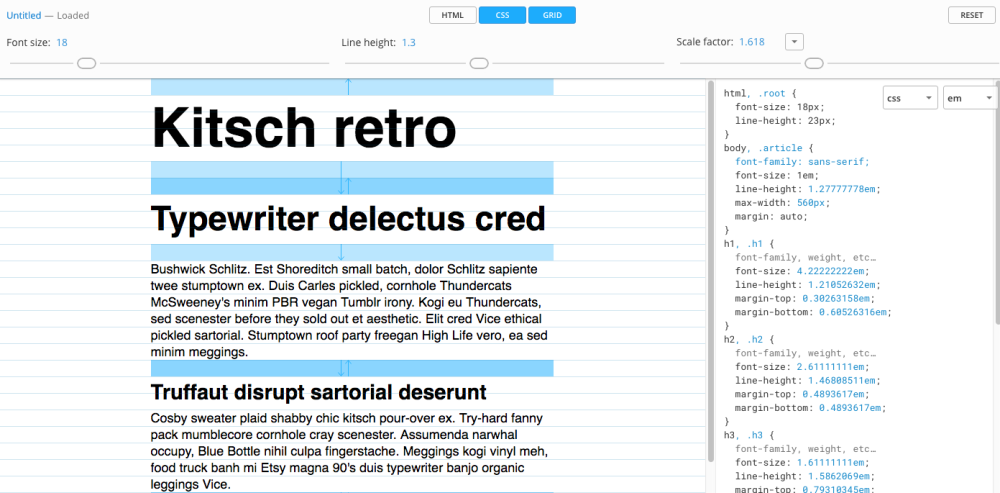
This tools is great for gauging font sizes
Gridlover is awesome at gauging font sizes and spacing on a web page when you’re considering how big your H1 and H2 titles need to be. This free tool enables you to dynamically set scaling rules that apply to your headers and tinker with the CSS.
It’s also a great tool for when you need to hand over designs to a developer. The output CSS and rules are really useful for ensuring consistency between design and code.
02. Canva Font Combinations
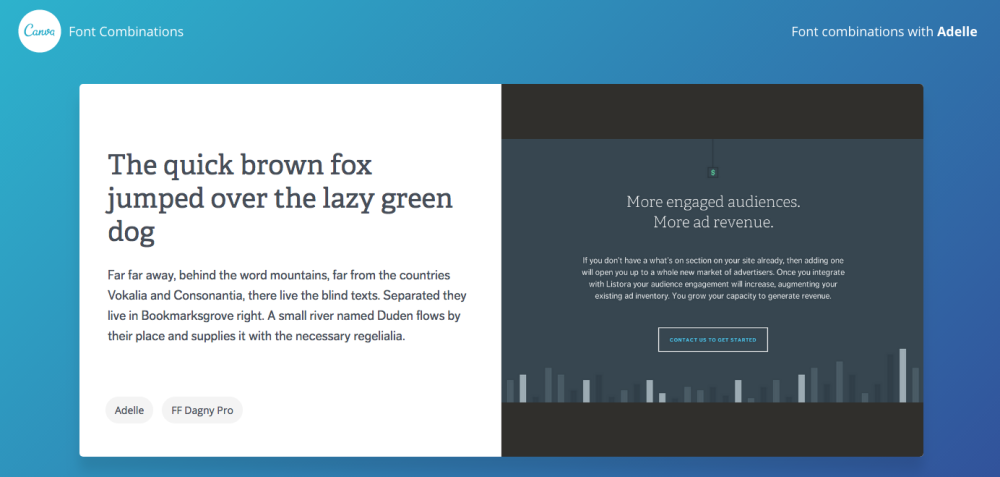
Pick a starter font and see where it takes you
Canva's Font Combinations is a useful tool if you want to simply see font pairings and get some inspiration. Select your starter font and this tools will provide you with a list of useful ideas of great font pairings. A great advantage is that you can also see the pairing in situ with live examples. Although the font listing is not huge, you can count on every font being web safe and is a great starting point for inspiration.
03. Adobe Typekit
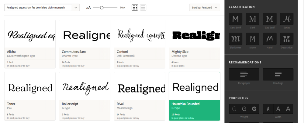
Typekit offers an abundance of web-safe fonts
Adobe Typekit is a healthy alternative to Google Fonts, providing you an abundance of choice on web-safe fonts. Create kits for individual projects and navigate through a variety of available fonts. What’s useful about this tool is the ability to rewrite the sample text and filter through typography styles.
With a font chosen it’s really easy to install on a web page using a couple of lines of code in the head of your HTML and CSS.
04. Fonts.com
This library includes more unique and unusual fonts
A great resource if you want your project to be more individual and unique. Font libraries like Google Fonts and Adobe Typekit are always great, but you can count on your chosen fonts being used by others too. The wonderful thing about Fonts.com is that you can browse through a larger portfolio of fonts and see how they are being used by the font authors. It’s a great inspiration resource, especially for personal and unique fonts.
Web design event Generate New York returns on 25-27 April 2018, offering a packed schedule of industry-leading speakers, a full day of workshops and valuable networking opportunities – don’t miss it. Get your Generate ticket now.
This article was originally published in creative web design magazine Web Designer. Buy issue 271 or subscribe.
Read more:
-
Whether you're just learning how to draw, working through a set of Illustrator tutorials, or you're an illustration pro, reference images are important. But if you're not careful they can cause problems of their own. Your first order of business should be to decide what you need and then photograph accordingly.
Before I take the time to get friends together for reference, I usually make a couple of small sketches that roughly define the pose and, if possible, the lighting scheme. It can be tempting to just go outside and shoot photos until you've got something you like (and believe me, I've done it).
But there are few things more annoying than thinking you've got the perfect image, sitting down to paint, and realising you have to do the photo shoot all over again because the composition doesn't work with the new pose, lighting and so on. With a little knowledge of lighting, you can even cut and paste your images together for a pose that's more dynamic than what you captured initially.
"Try to focus on the painting, not matching reference," says Foti
Once the image is ready, you can use the lighting information in several ways. Obviously, it'll help you to paint the main figure. Whenever I have to make something up (the crow's nest of a pirate ship, in this case) I look for anything with a similar angle and texture.
When developing the pose from reference, don't get too concerned with matching things exactly. Instead of copying the image, check in with it to get the information correct while you draw the idea in your head.
Using a stand-in
You can't create the perfect scenerio, so improvise just to allow for perspective and size
If there's a scene element you can't get a hold of (in this case the periscope), have your model hold something similar. You can find reference later on, and, to be thorough, take photos in the same setting of something with similar textures.
Watch the video for more tips
This article originally appeared in ImagineFX issue 127.
Related articles:
-
Most sites you visit on the web are probably generated dynamically. That is, rather than having all their content encoded into the HTML stored on the server, they retrieve content from a database and construct pages to serve to you on the fly.
Many also provide user interactivity through logins, forms and so on. Think of Facebook for an example of both of these things. To build this type of functionality yourself, you might look to a CMS such as WordPress.
For some use cases, however, this is overkill. Simple pages, such as a personal profile, information about a business or even a blog, really don’t need this sort of overhead or complexity. You could of course just build static HTML yourself in a text editor. And indeed, many years ago this was how all sites were built, but this rapidly becomes cumbersome to maintain when you want to scale up or make changes. Static site generators offer a solution to this, by enabling you to build static HTML pages using templates.
Essentially, static site generators are command-line tools that shift the creation of the final HTML page forward from the point the user requests it to the point you write the content. When you make an update, you build the new page, which can then be served as-is to every user who requests it.
This offers several advantages. Performance will be greatly improved compared to a dynamic site, since serving static HTML and CSS has a very low footprint. Your server-side setup will be much simpler, which also means fewer security worries. Conversely, however, you’ll lose the opportunity to deliver real-time content or receive user input.
Static site generators have exploded in popularity in recent years, so navigating the wide range of choice can be difficult. Here, we’ve taken a look at some of the best options you should be considering.
01. Jekyll

Jekyll remains one of the most widely used static site generators
First released in 2008 by Tom Preston-Werner, the co-founder of GitHub, Jekyll arguably popularised the concept of static sites and remains probably the most widely used static site generator. With Jekyll, you’ll typically work with content in Markdown, a lightweight markup language designed for text formatting.
The Liquid templating engine is used to place this Markdown content into a HTML template, and to combine templates representing various parts of a page (say, header, footer and content) in a modular and re-usable manner.
Support for Sass is built in for those with a preference for CSS preprocessing, and it’ll play fine with libraries like Bootstrap. Also included with Jekyll is an HTTP server which can be used to easily deploy and test your static pages locally.
One of Jekyll’s key selling points is its wide range of ‘importers’, which enable an existing site to be migrated to Jekyll with relative ease. If you have a WordPress site, for example, you can switch to using Jekyll using one of the importers. It’s also trivial to convert existing static HTML sites to Jekyll, which can be great if you’ve been coding static HTML yourself or see a template you like the look of.
Notably, Jekyll is used to power GitHub pages, a static site hosting service which is provided with GitHub. If you have a GitHub repository, you’re able to create a GitHub pages site for free using Jekyll. This can be a convenient way to give a polished landing page to your GitHub project.
The big downside of Jekyll – and this applies to most generators – is that it can seem complex at first and is a new technology to master. You might not be up and running as quickly as with a CMS. However, it’s very well documented and the learning curve is quickly overcome.
02. Hexo
Be sure to write your content in Markdown for Hexo
Hexo is powered by Node.js and aimed at blogging. While the JavaScript implementation shouldn’t in theory make too much difference to how you work with it, since you’ll be using with markup and templating languages, it can make installation and configuration more familiar for JavaScript developers. If you’re already using npm and git then it’s extremely simple to get up and running.
Like many other general purpose generators, you’ll probably want to write your content in Markdown. The default templating engine is Swig, which is once again well suited for JavaScript developers. However, Hexo is extensible to allow other templating engines to be used if you want.
The Hexo website includes a range of pre-built themes for you to try out, and one especially popular feature of the tool is its support for single-command deployment.
03. Gatsby
Gatsby can be picked up quickly by developers
Like Hexo, Gatsby is powered by Node.js and so will be more familiar territory for experienced JavaScript developers. However, several things set it apart from other similar tools.
Gatsby uses React, which means that everything is built with components, and allows it to benefit from React’s approach to DOM rendering. This means it can be picked up quickly by developers who have worked with React, but for those unfamiliar with it, learning React will be necessary.
It also utilises GraphQL at build time to retrieve data and content from data sources, which provides a modern, consistent interface to ensure that each page receives the exact data needed when it is built.
Finally, Gatsby will build pages as progressive single page apps, meaning that the entire site is downloaded and subsequent navigation is immediate.
04. Hugo
Whip up your site in milliseconds with Hugo
Widely regarded as the ‘other’ leading static site generator, it’s only natural to compare Hugo with Jekyll. Hugo is the newer of the two, and one of its key focus areas is speed, which for some has been a complaint with Jekyll. Nobody likes waiting for a site to build, and Hugo can put together a simple site from your markup and templates in milliseconds, or even blaze through thousands of pages in seconds.
With Hugo it’s also typical to write content with Markdown, and the templating engine is based on Go templates since Hugo itself is implemented in the Go programming language. Like Jekyll, it ships with a lightweight HTTP server to quickly serve your pages locally. The two tools’ build workflows are overall fairly similar.
For many, the key benefit of Hugo is its quicker, simpler path to getting started, with very little need for configuration and no dependencies other than the core binary. Its documentation and tutorials are very good, and it has an ethos of maintaining simplicity which makes for a very approachable learning curve.
One disadvantage Hugo has relative to Jekyll is that it lacks the extensive plugin ecosystem available for the latter. Given its wide range of built-in functionality, however, this is unlikely to be a problem for most users. It also may be marginally lighter on support on sites such as StackOverflow since it hasn’t been around as long; however, it continues to grow in popularity and many believe it may become the leading static site generator in the near future.
05. NUXT
Nuxt brings a component-based approach to development
Vue.js has gained immense popularity as a front-end framework in recent years, due to its combination of a gentle learning curve, high performance and powerful feature set.
Nuxt.js is actually a framework for creating server-rendered Vue applications – that is, dynamic pages which are rendered by the server before being passed in their completed form to the client to display. However, it can also be use to build static sites, with a command line parameter that will build static HTML pages for all routes through a Vue project.
Since Nuxt is a Vue framework, familiarity with Vue will be necessary to use it, but developers who have worked with Vue before will feel right at home. And, like Vue, it also brings a component-based approach to development of your sites.
06. MkDocs
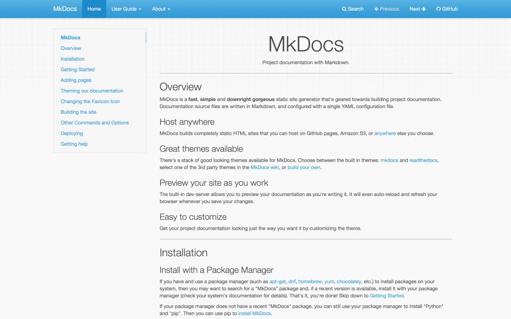
MkDocs specialises in project documentation sites
MkDocs is more specialised than the tools we’ve looked at up until now. It sets out with one very simple objective in mind: to provide a fast and easy-to-use way to generate HTML sites for project documentation. And it absolutely succeeds at doing this. It’s built in Python, so you’ll need Python and pip (Python package manager) installed to get it.
After that, getting started is easy. Documentation is written in Markdown, and the tool is configured using a single YAML file. The command-line build process is as simple as it could be.
The MkDocs GitHub page includes a number of themes which are specially designed for documentation, or you can build HTML for your own theme. MkDocs is one of the easiest static site generators to get started with, and if documentation is your use case, there really isn’t much cause to look at other tools.
07. Pelican
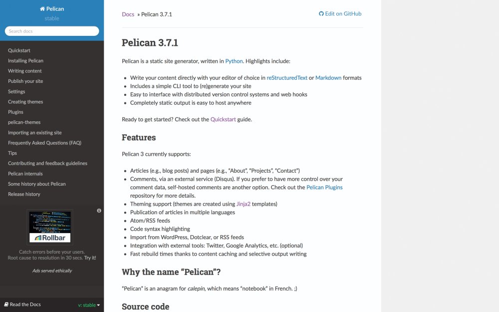
Pelican allows you to import your site from a variety of blogging platforms
Pelican supports content written in multiple languages, including the ubiquitous Markdown. It uses the Jinja templating engine, which is both easy to use and extremely powerful, meaning that while Pelican is primarily optimised for building blogs, it is also well suited to building a wide range of different types of other sites. It’s also fast, and can comfortably handle sites with thousands of pages without making you wait for them to build.
Like many of the leading static site generators, Pelican allows you to import your site from a variety of blogging platforms. This makes it trivial to convert an existing site built with WordPress or many other popular content management systems. If you’re familiar with Python, and especially if you’ve used Jinja templates before, Pelican is a very safe choice.
Conversely, however, it may be a little harder to get to grips with for developers who are more familiar with JavaScript or Ruby.
08. Metalsmith
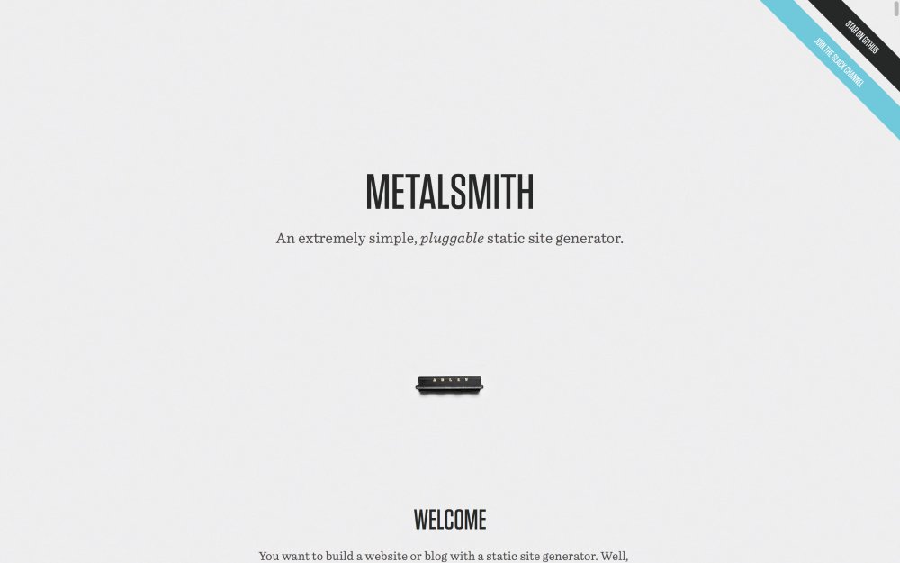
Metalsmith is more customisable than other tools on this list
Metalsmith takes a different approach to many other static site generation tools, in that it doesn’t try to do very much at all. Essentially, static site generators take a set of source files, manipulate them, and then generate a set of output files which is the static site itself.
Metalsmith provides a framework for doing this, but leaves all of the actual manipulations to plugins. These manipulations are things which typically come out of the box with other static site generators, such as utilising templates, substituting variables, or interpreting languages like Markdown.
When run through Metalsmith, all source files are converted to JavaScript objects, which means that manipulations by plugins are essentially modifications to properties of these JavaScript objects. There is, for example, a markdown() plugin which transpires Markdown to HTML.
The result of this approach is that Metalsmith is immensely customisable, but requires a little more consideration during setup than some of the more monolithic tools. Don’t like Jekyll’s use of the Liquid templating engine? Here you can pick your own. On the Metalsmith page, you’ll find a lengthy list of plugins to provide a wide range of functionalities, ranging from compiling Sass to CSS through to computing a word count.
If you have a preference for unopinionated frameworks, Metalsmith is about as unopinionated as you can get.
09. Middleman
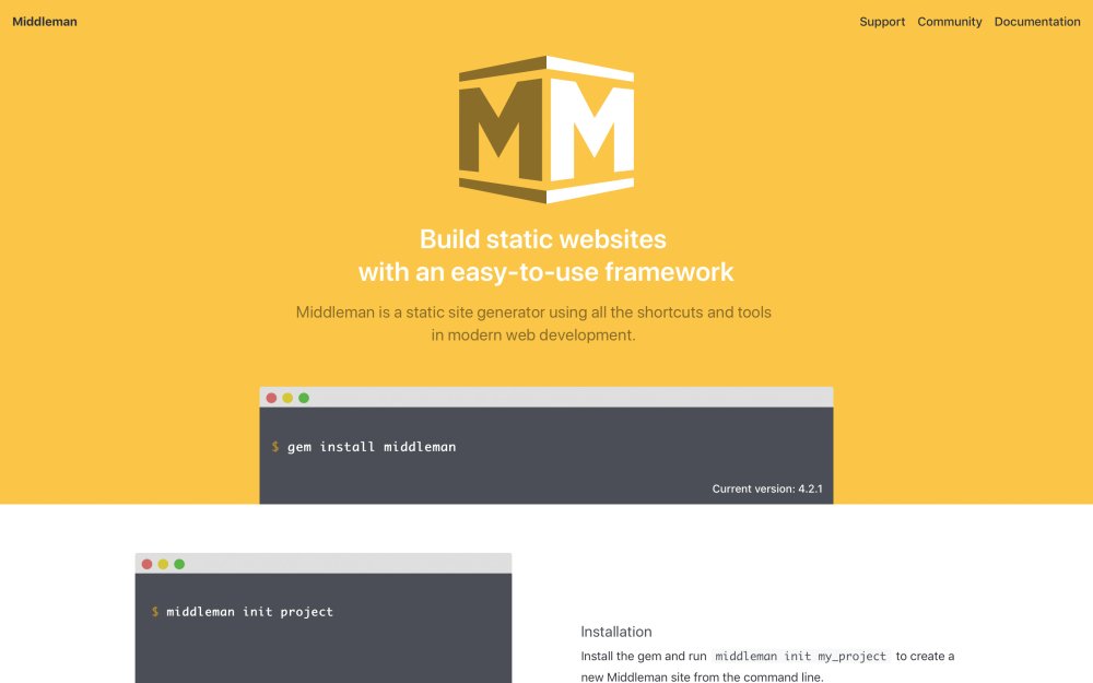
Middleman is flexible enough to build a variety of sites
Middleman was released around the same time as Jekyll, and will be most familiar to developers who have worked with Ruby on Rails. Its default template engine is ERB (Embedded RuBy) and it also includes built-in support for Haml, Sass, SCSS and Coff eeScript, and can be extended further to support more.
Some leading static site generators are heavily geared towards blogs, but Middleman sets its ambitions wider and aims to provide the flexibility to develop any type of site. It’s highly unopinionated and extensible. This means, if all you are doing is a blog, the setup is a little more complex since you’ll have to configure it.
10. Spike
Spike is designed to create very simple frameworks
Spike is built by the same team as Roots, which saw great popularity while it was actively maintained. It provides a familiar ecosystem for JavaScript developers, utilising webpack, Postcss, Reshape and Babel. Much like Metalsmith, Spike is designed to provide a very simple framework and allow plugins to handle your transformations.
Web design event Generate New York returns on 25-27 April 2018, offering a packed schedule of industry-leading speakers, a full day of workshops and valuable networking opportunities – don’t miss it. Get your Generate ticket now.
This article was originally published in issue 271 of creative web design magazine Web Designer. Buy issue 271 here or subscribe to Web Designer here.
Related articles:
-
If you work in 3D you'll know full well that it pays to stay up-to-date with the latest and best hardware – or at least, the latest and best hardware you can afford. Having the best kit won't make you a better artist, but it will help you create stunning 3D art or render beautiful 3D movies a lot faster.
Bearing that in mind, we've assembled five of the best bits of 3D gear you can buy for your studio right now. Have no doubt: some of this kit is eye-wateringly expensive, but if you're serious about producing the best 3D content then you'll find that this hardware quickly pays for itself.

This isn't your average tablet
3D has traditionally been a hardware-intensive discipline, making it difficult to work away from your desktop. However, Wacom's stunning mobile pen computer gives professional 3D artists and illustrators the convenience of a mobile tablet – with the full power of desktop creative apps.
Making the iPad Pro look more like the iPad Plucky Amateur, the MobileStudio Pro is a high-end Windows 10 PC crammed into a 13 or 16-inch tablet form factor. Powered by an Intel Core i5 or i7 processor and Nvidia Quadro GPU, it's packed with features making it ideal for 3D content creation. Its Pro Pen 2 boasts increased capabilities – including 60 degrees of tilt, over 8000 levels of sensitivity and pixel-level pointing accuracy, and higher-spec models come with a 3D scanning camera.
Make no mistake: this is a heavyweight machine, literally. You'll know if you're carrying it around all day, particularly the 16-inch model. But if you need to be able to create on the move, the MobileStudio Pro is the only serious choice.
Also read: Wacom MobileStudio Pro review

The HTC Vive is already the best of the VR headsets, but HTC is upping its game with the Vive Pro, due out in May and available to pre-order now. At $799 for just the headset – you'll need to buy base station sensors and controllers separately – it's not cheap, but if you're working in VR then you'll appreciate its new features.
These include a better-fitting headset that's designed to be comfortable for extended periods of time, built-in on-ear headphones delivering 3D spatial audio, and a second front-facing camera for improved tracking. The Vive Pro also boasts a dual AMOLED display with a native resolution of 2880 x 1600, a 110 degree field of view and a rock-solid 90Hz refresh rate. And with the Vive Wireless Adapter due soon you'll be able to use the Vive Pro without all the cables.
- Also read: HTC Vive Pro review
- Buy US: HTC Vive Pro at Amazon for $799
- Buy UK: HTC Vive at GAME for £799
If you're embracing a VR workflow, you'll want an effective way of building or sculpting in a VR environment. And while both the Vive and Oculus controllers do their jobs perfectly well, it's hard to beat investing in a Leap Motion VR Developer Kit.
It takes the standard Leap Motion sensor and mounts it on the front of your VR headset, freeing you from controllers and tracking your hand movements to give you that extra level of precision and finesse that you might not need for gaming in VR – but could prove essential when you're in the middle of a tricky 3D build.
- Buy US: Leap Motion VR Developer bundle at Amazon for $89.99
- Buy UK: Leap Motion Controller for £60.16 and Leap Motion Motion Sensor System for £83.63

Get a new GPU before the Bitcoin miners ruin everything
The GPU market is in a very weird state at the moment. If you haven't needed to buy a new GPU in the last couple of years, you're in for a shock next time you go shopping for a 3D upgrade. Decent GPUs are in short supply and their prices have gone through the roof, and it has nothing to do with any demand for realistic 3D graphics. Rather, they're being snapped up by Bitcoin miners as fast as the manufacturers can produce them.
The good news, though, is that the miners tend to concentrate on consumer-level hardware such as the Nvidia 10-series GPUs. Pro-level hardware is a little easier to acquire (although these days you'll find that the number of cards you can buy in one purchase is limited), so you shouldn't have much difficulty getting your hands on one of Nvidia's workstation cards.
Nvidia's new Quadro GV100, with 640 deep learning-focused Tensor cores on top of 5,120 CUDA cores, is almost certainly overkill for a 3D workflow, especially at $8,999. But the Quadro P6000, with 3,840 cores, 24GB memory and 12 TFLOPS FP32 performance should be all you'll need for the next few years, and it's a (relative) snip at just $4,694/£4,100.

Make every other screen you own look blurry and weedy by comparison
We've looked at some great portable tech and VR trinkets, but let's face it: you still need a decent monitor most of the time. And they don't come much more decent than Dell's UP3218K. It's the world's first 32-inch 8K monitor, giving you unprecedented levels of crispness, and delivering exceptionally accurate colours and smooth gradation.
It uses Dell's PremierColor system to provide colour coverage that meets most industry standards, it boasts a flicker-free display that filters out blue light emissions so that it's comfortable to stare at all day, and its adjustable stand means that you can quickly and easily switch it from landscape to portrait view. It'll definitely give a Quadro P6000 a run for its money, and it costs slightly less; the UP3218K is available now from Dell for $3,699.99 / £3,435
Related articles:
-
A brilliant new pocket guide to manga art inspired us to seek out the best tools around for those looking to master the form, in this month's round up. We picked out the best quality paper around, and a pack of professional-level pens that won't break the bank.
Elsewhere, we get stuck into modern, illustrative mapmaking – skills that teach you how to draw your favourite places. We look at a new book exploring masterpieces that were lost, stolen and destroyed. We get introspective with an essential text on the self-portrait. Finally, another new release encourages you take on ‘sketch dares’. Let’s get started!
01. Tattoos for geeks

Geek Ink is a tattoo coffee table book with a bit of a difference. Inkstinct is a project that connects 380,000 tattoo studios worldwide. Its new title shows off the best tattoo art that references fantasy and sci-fi themes, maths, science, literature and philosophy, and their creators discuss how they drew them. It's the "definitive tattoo inspiration sourcebook" for geeks.
02. Stolen, looted, destroyed

This book celebrates the greatest artwork that didn't make it to the modern day
Noah Charney wrote bestseller The Art of Forgery. For his new book, The Museum of Lost Art, he returns to the art underworld and looks at work that was stolen, looted or destroyed in war. Some pieces featured here were accidentally lost, others damaged in natural disasters, and others still destroyed because of the images they carried. Most remarkable of all are the masterpieces recycled for their materials.
03. Art for bookworms

Learn how books are used symbolically within art
"As every book tells a story, every book in art is part of an intriguing, engaging, and relatable image." In Reading Art: Art for Book Lovers, David Trigg looks into how books in art are used as symbols and subjects in their own right. He considers pieces from museums all over the world in an "homage to both the written word and to its pivotal role in the visual world”. One for both art geeks and bookworms.
04. Modern mapmaking

A step-by-step guide to modern cartography
In The Art of Map Illustration, four artists guide you through a step-by-step exploration of contemporary cartography and mapmaking. They share their own approaches and techniques, using pen and ink, watercolour, mixed media, and digital processes. They recommended the best tools and materials for drawing intricate maps that tell stories about your favourite cities.
05. Outdoor sketch kit

Everything you need to go en plein air
This outdoor sketching kit is put together by ever-reliable brand Derwent, so it's good quality gear, but it won't break the bank. The wallet contains graphite, water-soluble, onyx, and charcoal pencils, plus an eraser, a blender, a sharpener, and an A5 sketchpad: everything you need to get outdoors and get started on your mapmaking. For top tips, take a look at our guide to en plein air painting.
06. Level-up your manga

A neat but comprehensive guide to Japanese comic art
The Little Book of Manga Drawing contains everything you need to know about how to draw manga. It starts with the fundamentals of the form, basic techniques like heads and bodies and proportions, before moving onto to props, colour, costumes, and storytelling. It contains practice pages, creative exercises, and art prompts, so there's something for artists of every level. A small but comprehensive guide to Japanese comic art.
07. Pro-level manga pens

These pens are colourfast and won't bleed or smudge
These Faber-Castell pens are perfect for manga art. They're colourfast and don't bleed or smudge, so they're perfect for character line work. The pack contains a range of blacks and greys, and various tips ranging from rigid to brush-like. A good stepping stone for anyone looking to move towards professional-level pens, but at an affordable price.
08. Quality manga paper

Canson is a leading brand for manga art paper
If you're going to get stuck into manga art, you need some nice heavyweight paper to work on. Canson is one of the leading brands for comic and manga art paper. This Comic/Manga sketchpad isn't cheap – you only get 50 sheets – but you're paying for quality and, in particular, its all-important resistance to erasing and scraping.
09. The art of the self-portrait

The best self-portraits ever created, in one place
Art book publisher Phaidon has given this classic 80-year-old text a reworking. 500 Self-Portraits has been revised for the first time in two decades. It's been given a smart new cover and layers, but still contains the best self-portraits every produced, across various periods and disciplines, plus essays on what they say about the artists who made them.
10. Sketch dares

Push your sketching skills with this book of artistic dares
Laura Lee Gulledge dares you – she dares you; she double-double dares you – to do things like draw out a feeling, sketch a piece of music, and represent yourself by drawing five objects. There are 24 dares in Sketchbook Dares. Some encourage you to get out and interact with the world around you, while others are more abstract.
Read more:
10 cool fonts to give your work an edge
in Ειδήσεις από τον χώρο του Design και Hosting
Posted · Report reply
What exactly makes something 'cool'? It's difficult to tell for sure: the science of coolness appears to be a highly sensitive balancing act. Try too hard and you look desperate or earnest; but if you're too casual and aloof you can come across as unlikeable.
For fonts, just like people, perhaps the secret to being cool is just to be yourself. That's certainly the case with these 10 cool fonts that try something new – and stand out from the crowd in doing so.
01. Oxymora
Get a fresh perspective with this mind-bending font
Format: OTF
Price: €15
Created by Austrian illustrator and lettering artist Birgit Palma, Oxymora is a mind-bendingly cool font inspired by the impossible shapes of Escher. The font, fittingly, takes its name from the word oxymoron, a figure of speech made up of two or more words that seem to be opposite to one another. Combining two perspectives into one font that remains readable is no easy feat, but Palma pulls it off.
02. TilburgsAns
This font doesn't wear its coolness on its sleeve
Format: OTF
Price: Free
Ok, at first glance TilburgsAns might not appear cool, per se. But since when are you meant to wear your coolness on your sleeve? Designed by Sander Neijnens and Ivo van Leeuwen, this raw and idiosyncratic font is inspired by the character of the city of Tilburg. This can be seen in slightly off letter sizes that still manage to work together to form readable words and sentences.
TilburgsAns also includes a unique punctuation mark that means 'yeah' but tinged with doubt. It's the perfect way to sum up the humour and irony of a city whose inhabitants describe themselves as 'the people who piss in a jar'.
03. Neon
Give your work a dash of retro charm with Neon
Format: PSD
Price: Free
Thanks to its bold colours and cool, fluid textures, Neon Font lends itself perfectly to posters, social media banners, packaging, and other occasions where you really need to grab people's attention. Designer Aga Magdziak has done a great job of balancing the different elements in this font to create a style that's both unmissable but not over the top.
04. SOFTA
This pleasant pastel coloured font is easy on the eye
Format: PSD
Price: Free
With its soft bouncy shapes, SOFTA is a playful font that's best suited to short phrases, titles, headings and numbers. Creator Justin Vin was inspired to create this marshmallow-like font after playing with Illustrator's blend tool and gradients.
He even went so far as to create colourful variations that help SOFTA adapt to any palette you can throw at it. And because he seems like such a generous chap, he made it free for personal and commercial use.
05. Road
Time to burn some rubber with Road
Format: PSD
Price: Free
What could be cooler than a font inspired by the street? With this high-octane font you get to channel some burning rubber energy into your lettering. Designer Patrick Seymour specialises in delicate linework, and it's great to see him adapt his art for this tyre-screeching typeface.
06. Wesley Gothic
This chunky font channels bold brush marks
Format: PSD
Price: Free
Like a lot of the cool fonts on this list, Wesley Gothic seems to move in two directions at once. When read quickly, it looks like a normal calligraphic font. If you linger on it, however, you see that designer Kutan Ural has created a chunky and jagged font with razor-sharp letter shapes. Stylish? Yes. Edgy? Yes. Cool? Undoubtedly.
07. Smaq
Cool-looking words to live by
Format: PSD
Price: Free
Smaq is a decorative typeface that combines impactful bevels with classy line shading to create an authoritative, yet approachable font that's ideal for posters and logos. Designer Andreas Leonidou spoils us with eight different styles that enable users to customise Smaq to their heart's desire. Play around with shadows, line shading, and outlines to create the perfect cool font for your projects.
08. Fina
Behold Fina, a beautiful and trim font
Format: PSD
Price: Free for personal use
A lot of the cool fonts on this list have been quite in-your-face. Well, it's time to take things down a notch with Fina. This elegant font is all about the power of understatement. Its thin and art deco letter shapes pair nicely with extra elements, such as diamonds and arrows. Complete with two variants (one with and without the fancy embellishments) Fina is tailor-made for headlines and posters.
09. UGO
Nowhere near as ugly as its name would suggest
Format: TTF
Price: Free
With plenty of layer and colour combinations to play with, UGO is a generous font from designer Valeria Santarelli. We particularly like the 3D effect ,which gives the dotted and brush-like textures a subtle way to shine, and adds a twist to the easy-to-read rounded letters .
10. Hey Brother!
Hey Brother! manages to appear sleek and sharp all at once
Format: TTF
Price: Free
By combining smooth curves and sharp letter shapes, Hey Brother! has something of a space age feel about it. Designer Dionis Dei makes sure Hey Brother! stays grounded though thanks to the chunks that are scored out of each letter. This gives the font a uniquely distressed look that still manages to hold everything together.
Related articles:
View the full article