

Rss Bot
-
Content Count
19,562 -
Joined
-
Last visited
Never -
Feedback
N/A
Posts posted by Rss Bot
-
-
Big companies – those with millions (if not billions) of users – tend to have complex problems that attract some of the best talent the market has to offer. The bigger the company, the bigger the challenge. But bringing together so many brilliant minds also provides an opportunity to do great things.
When it comes to shaping our online experiences, big companies have proven to be very influential in recent years, offering disruptive user experiences, new ways of loading and displaying content, and elegant approaches to getting the users where they want to go. That’s what happens when your teams are at the top of their game.
We spoke to designers from these brands to explore how they present their products to users, and the processes that have led them to design success.
01. Be humble
Cap Watkins, BuzzFeed
"Be humble about your work. That’s really what it all comes down to. A lot of designers do a project and try to keep it to themselves until it’s perfect, or reject feedback because it’s not what they had in their mind.
The goal of the BuzzFeed design team is to let the content shine through
"Being humble allows for the possibility that your design choices may be wrong, and opens you up to receiving feedback and information from your coworkers, users, people in other departments, and so on. It’s probably one of the most important traits for anyone – designer or not – when it comes to producing great work."
02. Create a community
Nick Myers, Fitbit
"Our organisational structure helps designers have more impact and be more efficient. Many internal design teams are centralised, but the Fitbit UX team’s designers are integrated across product development. This means, typically, that members of the design team sit with members of product and engineering to collaborate directly on a specific feature or platform element.
Designers and engineers sit together at Fitbit
"This means designers can be more focused, as opposed to multitasking in a centralised agency-like model. They also have more input on product strategy and can see the work through to launch, so it’s generally a lot more rewarding. We work hard to help designers feel like part of the community by assigning design managers to support teams in clusters."
03. Share early and often
Sam Horner, Netflix
"The Netflix design team starts by ideating concepts, and uses a blend of speaking with users and live data to develop them. These insights allow us to build stronger ideas, unbounded by opinion or bias, and design wholly focused on our users.
In Netflix’s 2015 redesign, major alterations were made to the UX, based on years of research
"We share early and share often, encouraging everyone on our team to have a voice. No single person has control over what gets created, empowering designers with ownership over their work. Our flat team structure means designers are consulted by others based on their skills, not their title. Netflix doesn’t impose any processes on our designers, we simply give them access to the resources they need to create great TV experiences."
04. Learn to improve
Garlon Cheung, BBC
"At the BBC the audience is at our core, so gaining insights and testing is important. Because of diverse audience needs, every team works in different ways to achieve this, but the overall mentality is learning to improve. This means making design decisions backed by evidence. It’s vital we use both quantitative and qualitative research to understand what people do and why they do it.
BBC sites such as the iPlayer are the result of thorough research into audience needs
"New methods appear frequently and teams experiment to see what is effective and what isn’t. We’re constantly improving how we collaborate and broadening our skillset. A big organisation like ours needs great communication and great people, so we give them the freedom to be the best at what they do."
05. Be inclusive
Ashleigh Axios, Automattic
"Automattic is a distributed company, with people in 51 countries around the globe unifying around the single goal of making the web a better, more equitable place. We believe that open source is one of the most powerful ideas of our generation and that collaboration leads to innovation. We share as many of our ideas, resources and code with the world as we can, priding ourselves on our inclusiveness.
With employees all over the world – in 51 countries – communication is key at Automattic
"We Automatticians also have a hunger to learn from our peers, products and users. We’re an incredibly flat company – we believe ideas can come from anywhere and recognise that our results are better when we treat each individual as a catalyst for much-needed change."
06. Mix it up
Netta Marshall, Airbnb
"We have a team dedicated to creating tools for designers, as well as an expansive Design Language System, and an internal tool called Airshots that allows us to quickly and easily see what everyone else is designing. Since designers are embedded into sub-teams and sit with cross-functional members, this tool gives us visibility into what designers on other teams are focusing on.
AIrbnb’s Design Language System is just one of a suite of tools created for the designers at the homestay network
"Being in close proximity to non-designers is useful for picking up new skills as well. If you want to learn to code, prototype, analyse data or research, there’s someone who’s more than happy to sit down and share their knowledge with you. As a designer, being open to different perspectives as a default is great when you’re designing for such an international audience."
07. Understand the problem
Fiona Yeung, Google
"UX design is an iterative, collaborative and ongoing process that involves many different people along the way. My first step in any design project is to understand the problem as well as who the target users are and what they want. It’s our responsibility to understand why we are designing something first, before we can jump right in.
Design staff at the search giant share work often
"On my team at Google, we like to create use cases and personas, starting off with low-fidelity mockups in the early stages before moving on to hi-fi designs to demonstrate and test our ideas, catching any gaps in our solutions."
08. Open up your processes
Nick Myers, Fitbit
"One critical stage in our process is the group design critique. Each week, two design teams share work with the rest of the designers and researchers. The session is carefully facilitated to get the most out of the time together.
The Fitbit team are very open with each other when solving design problems
"A team shares the problem they’re trying to solve, the design solution, the users they’re designing for and where they are in the process. They also share the feedback they’re looking for from the rest of the team. After any clarifying questions have been asked, the team offers silent feedback via Post-It notes. The presenting team reviews the notes and open discussion happens around the bigger topics. We’ve evolved the process over many years and continue to refine it as the team has grown.
"The session helps the larger team participate in projects across Fitbit. Any system inconsistencies that may arise can be resolved. A lot of productive discourse happens in this session in a way that challenges the team. Most of all, the feedback is additive and helps the team push their work further than they would have on their own."
Next page: Top insights from designers at Twitter, Shopify and Etsy
09. Rethink critique
Kurt Varner, Dropbox
"Design critique. Such a loaded term, and one that is filled with nuance and sits differently in the mind of almost every designer. At Dropbox, we recently revamped our feedback process to align expectations and increase its effectiveness. While seemingly obvious, each piece was thoughtfully crafted to meet the needs of our team.
At Dropbox, critique meetings are referred to as ‘design sessions’, to remove negative connotations
"First, we’ve relabelled them ‘design sessions’ to remove negative connotations. We problem-solve together to increase idea generation and reduce the expectation that a single designer can create the perfect solution. We don’t anchor things to a TV: designers use printed flows, Post-Its, sketches, whiteboarding and so on.
"There are three one-hour sessions per week, and this helps to keep the time between feedback loops short. We also keep the team size small, inviting only the people with the right context, and ensure there’s a low barrier to entry – no presentation needed – to encourage feedback early and often."
10. Focus on feedback
Alexander Mayes, Facebook
"For me, the single most important part about being a designer in any design process is knowing how to give and receive feedback. Yeah, yeah, in my head I say it too – ‘That’s so clichéd, we get it: Pick your battles, have thick skin, don’t be attached to your work…’ But even at a place like Instagram and Facebook, it’s something that is valued above most things.
Feedback is key at Facebook
"It’s something that is so ingrained in our design process that there’s literally no way to not be excellent at it. To move ahead you have to be great with relationships and there’s nothing more challenging to your relationships, as a designer than your ability to give and receive feedback. Honestly, it’s something that – even after typing all that – I can say I still struggle with at times."
11. Know your customers
Randy Hunt, Etsy
"It’s not about you; it’s about someone else. Call them user, customer, prospect, audience, or simply person. When they are similar to you, it’s reasonable to think it’s about you. Either you’re wrong, or you’re right but won’t continue to be as your audience grows. If you don’t know who ‘they’ are, what their motivations are, and what’s important to them, what are you doing to learn and continue learning?"
Imagine your customer as someone different to you, says Hunt
12. Encourage ownership
Serena Ngai, Shopify
"I lead a design team at Shopify focused on our third-party partner and developer ecosystem. At the beginning of the year, I realised that our usual process wasn’t working any more. Our ecosystem was rapidly growing and our UX team was trying to accomplish too much. We weren’t achieving the quality we expect at Shopify, and we didn’t have time to go deep into finding solutions.
At Shopify, each designer becomes an expert in their domain
"Our new process focuses on product themes: bringing together teams and projects that share similar goals and technical stacks so that each designer becomes an expert on a certain domain. This inspires a sense of ownership within the team, and empowers us to influence priority and scope of project. Most importantly, it also gives us time to focus so we can create experiences and quality we are truly proud of."
13. Don’t design alone
Malthe Sigurdsson, Stripe
"You should almost never design for or by yourself – you’re a sample size of one, you’re biased, and it’s a big world out there. This is doubly true for a product like Stripe, which is used by hundreds of thousands of businesses of all shapes and sizes, from cattle companies in Nebraska to app developers in Cairo.
Stripe serves so many diverse clients, talking to others is key
"The solution is – as is often the case in life – communication. Talk early, talk often, and talk to a lot of your users. Obtaining a deep understanding of what they’re really trying to do will help you design a truly helpful product."
14. Adapt your approach
Nick Myers, Fitbit
"It’s hard to use just one approach across hardware and software with such a diverse set of features as at Fitbit. Designing for hardware requires rigorous planning and up-front design exploration over a long timeframe. If we’re designing feature updates or clearly defined new features, the process tends to be simple and straightforward and work within a standard agile approach.
Designing for hardware requires rigorous planning and up-front design exploration
"Most fascinating are the features we design that are completely new and push us into the unknown. In these cases, I advocate we build-to-learn, as it’s very difficult to predict how design solutions will fare when people interact with them over a long period of time.
"Ultimately, we’re trying to help people live healthier, more active lives. Changing behaviour is complex, so the effectiveness of a design often doesn’t become clear until we see outcomes in the real world."
15. Keep consistent
Ashlie Ford, Twitter
"When a large group of designers is solving disparate challenges for an array of products, it’s no surprise that consistency becomes a challenge itself. To solve this, we’ve established a design system of reusable styles, components and patterns.
A consistent design system makes life easier for everyone
"The design system provides a shared vocabulary that helps teams seamlessly develop within the same product ecosystem and at a much more rapid pace than before. Since design and engineering develop system elements once, this lets teams spend more time on the user problem, rather than on the building blocks of the system."
Illustration: Elly Walton
This article originally appeared in net magazine issue 290; buy it here!
Related articles:
-
Coming up with a great product is a skill, but knowing how to sell it is a totally different talent. Marketing your product online is an entirely different beast than working with old media. Luckily, the Digital Marketing Foundations Mega Bundle is here to help. Get it on sale now for 96 per cent off the retail price.
Being successful requires some luck, but it requires even more know-how. In order to optimise everything about your website and grow your online presence to a size bigger than you could have ever imagined, you need the Digital Marketing Foundations Mega Bundle. This eight-course collection will teach you how to master every aspect of online marketing, from search engine optimisation to how to make the most of platforms like Facebook, Twitter, YouTube, and Pinterest.
You can improve your website and brand with the Digital Marketing Foundations Mega Bundle, on sale right now for 96 per cent off the retail price. That's a huge saving for a bundle that will help make you money, so grab this deal today.
-
Photography’s greatest gift to the artist is that it freezes motion – perfect for reference. So when I started learning how to draw outside and got into en plein air painting, I had to contend with the fact that reality doesn’t hold still.
What is plein air painting?
Painting en plain air is the practice of painting outdoors, capturing people, landscapes and scenes in natural light – rather than painting indoors from reference sketches, photographs, life models and so on.
Painting outside became popular with the French Impressionists. It was made possible with the invention of transportable paint tubes and the plein air easel, and involves a unique set of challenges, skills and techniques, which we’ll walk through here.
Painting moving objects en plein air
When you're plein air painting, the sun moves across the sky, dragging every shadow around with it. It ducks behind clouds. It changes colour. And that’s not all.
People and animals come and go. Trees move. Waves roll in and roll out. Boats swing around as the wind shifts. You don’t realise how fluid reality is until you try to paint it.
Sometimes the movement is slight, and it’s easy to adjust your drawing or painting to match. Other times, say when you’re trying to capture someone walking along eating an ice cream cone, you have seconds to capture the entire thing: posture, clothing, hair, lighting, dripping ice cream... It’s enough to make anyone hyperventilate.
So take a deep breath and grab your best pencils. Everything is going to change while you work, yes, but the answer isn’t to rush to get it all in before that happens. You can’t win that battle. Instead, start by looking...
01. Think of your eye as the camera

The world isn’t a photograph. It moves and changes all the time. Keeping up requires observation combined with a deep visual vocabulary.
Take a “snapshot” with your eyes, trying to pull in as much information as possible: the angle of her shoulders, the hunch of his back, the way the water catches the light. Calm down, and get as much information in as you can in the moments you have.
02. Organise what you see
Sketching is how artists take notes. So part of your opening snapshot should include a sketch. Make some choices about how to organise what you see into an artistic composition. When things change and you get distracted, your sketch will help bring you back to your idea.
03. Draw what you see

Keep your sketches where you can see them as you paint
The beauty of plein air painting, and working from life versus a photo, is that life offers perfect information. The colours are 100 per cent accurate. The resolution is infinite. Now is the time to give your close observation muscles a workout. Really work to see what’s there, as we so rarely do.
04. Draw what you know
Because you only have a moment to capture things that are moving and changing, you need a broad visual understanding to fill in the blanks. There’s no shortcut to developing this, just lots and lots of drawing. Take notes with your eyes, then fill in the gaps with your understanding.
05. Lots and lots of drawing

Coffee shops and retirement homes are prime sketching locations. People tend to stay still.
Next time, I’ll get into what sort of gear you need to begin your plein air adventure, but here’s tool number one: a sketchbook. Keep one on you at all times. Pull it out instead of your mobile phone when you’re at the doctor’s office or coffee shop. Deepen your visual understanding.
This article was originally published in issue 157 of ImagineFX, the world's best-selling magazine for digital artists. Buy issue 157 or subscribe to ImagineFX here.
Related articles:
-
The best art is created within limitations. There is joy to arranging the bare minimum of elements for the maximum impact. Here, I’ll aim to create an impactful piece using a limited colour palette.
While attending art college I dabbled in almost every medium, but nothing quite clicked until I picked up ink. Inspired by comics artists and cartoonists, I found pleasure in creating mood and atmosphere using just a jar of black ink.
Recently, I’ve been trying to incorporate colour back into my work, while retaining what I love about ink. Digital tools have enabled me to experiment and develop my sense of colour, while still working in the traditional medium I love most.
01. Explore ideas
Concepts are quickly scribbled down
I work from my sketchbook or scratch paper, knocking out thumbnail sketches as quickly as possible, just to get something down on paper. This is often the most difficult stage for me as I figure out what the point of the piece is. I like to write down keywords to help anchor the sketching with concept, narrative or mood.
02. Lock down a concept
Details decide if the concept is good to go
Once I settle on a thumbnail, I’ll make a more detailed and clearer version to test out basic light and dark shapes, and to make sure the concept has enough depth to be taken to finish or presented to the client. Clarity is key.
03. Draw the final form
A larger version of the idea is drawn
I take the drawing to its final form. I sometimes blow up the thumbnail, print it very lightly and sketch over it. Or I might start from scratch, depending how much I liked the thumbnail sketch. For this design, I started over and drew the larger to give me greater cropping flexibility later, while still adhering to the client’s requested format.
04. Try different lighting schemes
Copies are made to experiment on
Once I have my final drawing, I scan and print out multiple copies of it, to try out different lighting schemes and compositions. When I find one I like I render it in pencil as a roadmap for the painting. Ink is unforgiving, so it pays to know where you’re putting down your dark shapes before you start.
05. Move onto watercolour paper
Be careful you don't get sucked into mindless tracing
I transfer the final drawing on to watercolour paper using a lightbox. I make a conscious effort to turn the light on and off as I draw, checking the drawing as I go. This is because mindless tracing can lead to a drawing that lacks that extra bit of life or magic.
06. Lay down ink
Tones are built up from dark to light
Finally: painting! Working in ink wash, I take Sumi ink and dilute it into different concentrations with water. I start with the darkest area of the painting. This anchors the piece – I refer back to this area as I build up the painting, always knowing that I can’t go darker than this starting point.
07. Block in the piece
It's important to build the piece up as a whole
As I paint I jump around the canvas a lot, building up one area before moving to another, making sure I don’t spend too much time on certain elements. It’s important that the whole piece gets an initial pass because it’s very easy to fall in love with working on one area, inevitably overworking it.
08. Build up depth
It's as if the painting is being unearthed...
I really enjoy watching a piece emerge from the white paper. In my mind I’m using the brushes to push away the white, revealing the dimensional piece in relief underneath. I tuck ink into the nooks and crannies of the drawing, adding depth as I go, while bouncing back and forth between different areas.
09. Explore texture
Time to realise the battered steel armour
In the final tonal study I also think about what textures I’m trying to achieve, which is battered steel in this case. There’s only so far you can take it in the pencil sketch – when painting, the ink will begin to do the work of creating surface texture. Brush strokes find their marks naturally when you trust the medium.
10. Dive into colour
Time to tackle the scary part
The majority of the piece is now painted. I’ve left the central area bare so far, because it scares me. The whole piece pivots around getting a convincing glow from this area. I decide to break out the watercolours and try a new effect, because recently I’ve been attempting to incorporate colour back into my work.
11. Hide the evidence
Sometimes things just don't go your way
I hate what I’ve just painted in watercolour. I placed too much trust in my understanding of the medium to get the effect I wanted, when I should have worked on it more in the sketch and done colour studies. To fix it, I slather black ink over the mistake. Black hides all sins and can be a reset.
12. Try Plan B
Time to change things up with a new medium
I lean back on to white gouache, a medium that I’m much more comfortable with, and paint the lights back in. I’ll have to add colour to the piece later in Photoshop. I noodle around and paint details. This is the endless polish stage and I could live here forever, but deadlines are calling, so it’s time to scan and finish digitally.
13. Move into Photoshop
A hi-res scan lets you print the image larger
I scan the piece at 600dpi for archival purposes. This will also enable me to print the image larger if there’s ever a need to. Next I adjust Contrast and Levels, to bring the scan more in line with how I feel the piece looks in life, because something is always lost during scanning.
14. Add layers
Dodge and Burn perfects the value structure
I tune some of the value structure using the Dodge and Burn tool, then add layers for each colour element in the piece. Because there’s a fully rendered ink wash painting already, all I need to do at this stage is colourise using Photoshop’s Blending modes. Soft light and Overlay are my go-to modes.
15. Finish the piece
Lighting and composition are locked down to finish the image
I experiment with different colour combinations using the Hue and Color Balance sliders. Once I decide on the final colours, I hone in the initially loose digital brush marks and add hot edges to the lights, to better sell the illusion of the light source. I finish the piece by cropping the larger painting to the final trim size.
This article was originally published in ImagineFX magazine issue 143. Buy it here.
Related articles:
-
Intel said it is lights out for its Remote Keyboard app just as security researchers find three vulnerabilities that let local attackers inject keystrokes in sessions.
-
Intel has halted patches for older chips addressing the Spectre vulnerability, according to a recent microcode update.
-
In this tutorial, I'm going to share the techniques and methods I use to create hard-surface models in 3ds Max. I'm going to create a 3D version of US Space Patrol, a sci-fi drop ship concept, made by designer and illustrator Virnard Magpantay.
The main goal of this tutorial is to show you how you can create any hard-surface piece using simple tools in 3ds Max (although some of the techniques can be applied to other modelling software). We'll also look at how to create a clean and organised model to fit into a production pipeline.
I hope you find my tricks and tips useful for making your own models. You can download a video walkthrough of the entire process here, and the files you'll need are here.
01. Evaluate and interpret the concept
Decide how you'll break your model down into different meshes
Before starting to do any modelling, I always make sure to evaluate the concept, so let's first decide how we are going to break down the model into the different meshes. It is extremely helpful to start the modelling with a good plan of what you are going to do, it will save a lot of time and effort. It is also a good idea to do some research and gather reference images to help in the development of the shapes.
02. Create the base mesh
Make sure you establish initial proportions and gesture
The first thing to do is to create the base mesh of every piece on the model. At this point we are not going to add any detail. Instead, we're paying attention to the silhouette. Establishing initial proportions and gesture is crucial.
It is true that the model's proportions are going to change a lot from the start to finish, but having a solid initial base mesh is a good idea. At this point, we don't have any details on the model so it is easier to play around with proportions.
03. Avoid triangles
When creating a high-resolution model, avoid using triangles as they are likely to give you a terrible result in some areas when a smoothing is applied. If you really must use them, then hide them in areas that can't be seen. As a general rule, using four-sided polys (quads) – even Ngons are better than tris.
04. Create the cockpit
Cut the glass area away from the cockpit frame
We need to separate the glass from the metal frame area, so let's take the base mesh and make some cuts that suggest the shape of the glass. Once we have the desired shape we can detach the glass object. Now we just need to apply a Shell modifier to the metal frame, and finally we can make some adjustments to the shapes and add supporting loops for the final smoothing.
05. Use connections and bevels
Create edge connections to make modelling easier
Now take the base mesh and start by making some connections, and move the vertices from one side to fit the shape of the cylinder. Make some edge connections along all the long geometry; this will help make it easier to select different polygons, add bevels, select one loop of edges over another and make extrusions to suggest some paneling. Take the polygons at the bottom, make a bevel and detach them, and add more details to that area.
06. Make vents
Follow these steps to make your vents
Take the base mesh, add some loops and select some edges to apply an extrusion. To give a more bevelled finish to this piece, select all the edges of the borders and make a big chamfer. Using the same Bevel/Detach technique as before, we can build the front area of the vents. Now take the detached polygons and make some connections, then select the polygons and extrude them to create the vents. Finally, add the corresponding supporting loops.
07. Add edge loops to support the smoothing
Use edge loops to avoid stretching the geometry
Use the same method of edge connect, cuts and bevels to add more details. Once this is done, it's time to add some extra loops to support the final smoothing. We need to add loops very close to the edges we want to be sharp. After this first group of loops is done, add another set of loops, this time not as close as the first ones; these will be an extra support to avoid the feeling that the geometry is stretched.
08. Cleaning up unnecessary vertices
Go through and get rid of unnecessary edges
After adding all the supporting loops, we may end up with a lot of edges around the model that we don't actually need. It is a good idea to make a cleaning pass and remove these so we will have a better smoothing result of the geometry at the end. To do this, check the model and start collapsing all the vertices that don't contribute on the support task and in no time at all you'll have cleaner geometry.
09. Model the bottom wing
Start fleshing out your wing with extra detail
So far, we have suggested a very simple geometry for the bottom wing, now go on and add extra loops to give it a more rounded shape. Add one loop, select some of the resulting polygons and apply a bevel.
Now repeat the same process in the rear area of the model. Select some edges and extrude them to suggest some panel shapes. Once this is done, it is time to add the supporting loops and finally execute the vertices cleaning pass.
10. Make holes in a cylinder
Don't follow the obvious route to making holes in a cylinder
When we want to add holes in a cylinder, people typically think of taking the cylinder and making the holes on it, but this will ultimately result in bad smoothing. Instead, here is a simple technique I like to use: take a cylinder, make a hole, duplicate it (collapse the vertices between holes) and apply a 360-angle Bend modifier. Apply a Shell modifier to add some thickness, and add the support loops. Now if you smooth it, you will have a perfect cylinder with perfect holes.
11. Add geometries on intersections
Suggest a point of attachment at your intersections
Details matter when creating an imaginary vehicle that needs to feel authentic and workable. For example, in the areas where two meshes intersect, it is a good idea to add extra geometry to suggest a point of attachment and a more realistic finish: I attached a bevelled inset section to suggest a connecting point.
12. Small pieces
When creating small details like joints or bolts, duplicate them around the model rather than making a new one each time.
This will for help bring consistency to your model, and it will save you precious time. Also, when duplicating elements, make them instances so all of them will take any changes you make.
13. Make cables
Use Beziers to finish off the model with some cables
Once the model is done, it is time to add some cables. Make a simple line of three vertices (for small cables) and add a Bezier. Now start moving the vertices and the Beziers until we have the shape we want. An easier way to work with Beziers in this case is to set up the Reference Coordinate System to Screen.
This article originally appeared in 3D World issue 217; buy it here!
Related articles:
-
For anyone working professionally in character design, a character bible is one of the most essential elements of your workflow. A character bible is the document that gathers the subject's design, turnaround, biography, hero poses, colour schemes, props and worlds in a precise, easily understood package. It's used in numerous fields of work, including animation, game development and book creation.
A well-crafted character bible is the key to opening new doors, and is something you can hold in your hand to help you communicate your ideas to any potential collaborator or producer.
In Pictoplasma Academy workshops, tutors Rilla Alexander and Nathan Jurevicius pay a lot of attention to all of the different aspects of the character bible, with the aim of encouraging attendees to take their ideas and concepts to the next level. Here, Pictoplasma shares some tips from the character bible workshop, to help you learn how to make your own character bible document.
Workshopping characters
An attendee's character drawn in the group pose
The very first thing our tutors get the students to do is obsessively draw their character over and over. Despite having drawn a character for years, attendees are challenged to look at new ways of seeing their design. The idea of this exercise is to break away from old habits and open up possibilities of what could be revealed if pushed.
Some of the most enjoyable and fruitful exercises involve mirroring facial expressions, human puppetry and a mind-bending fan art session. In this last exercise, everyone comes together for an intense speed-drawing event, interpreting the entire group's characters. You learn a lot from the interpretation and exaggeration of others!
Character poses
Working on the silhouette of a character
Alexander and Jurevicius also ask attendees to work just on the silhouette of their character and cut it out from board paper. When it comes to the silhouette of your character and its most characteristic poses, it is good to reflect on basic psychological rules, such as a triangular shape standing for danger, a circle for friendliness and a rectangular form for strength.
Stressing one or combining two in your design will influence how your character appears to others. The fun part is when they take this to the next step and ask students to create paper masks of their characters. Students then act out and embody their creation through a number of interactive exercises.
Workshop attendees pose in a group situation
This leads directly to exposing the personality of your character. As much as you work on the outer qualities, you should also think about the inner ones. We have found it practical to do a lot of brainstorming and free association – for example, filling in lists of things you like to draw, writing short biographies for your character and reading them to fellow attendees, putting your characters in a defined situation and deciding how they will react.
The more you can imagine your character as a being that is independent from your creation, the more you will instinctively find out about its personality.
Material world
A collection of material gathered for one character in the workshop
All this is done without a computer – attendees will just need a pencil or pen and paper, and occasionally some board paper, scissors, glue and staples. Next is plasticine, as you need to put your character in front of you to get a 360° vision of it. As you hold your creation in your hands, touch it and take a look at it from all sides, it's a great moment that feels like you've created a new life. You will find out a lot at this stage. Things that look great in 2D don't necessarily translate well or easily into the third dimension.
If the medium you want to take your character into will remain flat, you might feel you don't need this information, but even if you aim for a two-dimensional illustration, it's good to know about your creation's volume and corporeality. Working with your own plasticine model will often give you a new understanding.
It is also essential for you to draw the turnaround – six views that show your character from front and back, both sides, bottom and top. Again, you might never want to feature your character from these perspectives, but it helps to understand how it could look from different angles early on.
Alexander and Jurevicius encourage attendees to document all this material on the wall, gradually building up a collection that tells the story of their character. It's at this point that we get students to transform their sketches into vector graphics, doing clean up, deciding on the most important poses, and making turnaround views precise.
Background stories
Jurevicius' characters with colour references
At this stage, the character bible is finessed and polished by adding short biographies of your main character(s), a synopsis of the project and a definition of colour schemes in precise values (such as CMYK, RGB or Pantone). This process could potentially also include sidekicks, props that are important to the character or a map of the world the project is set in.
Even if you never reveal these aspects of your character to the wider world, doing these exercises will better inform you of your character and the world it inhabits, and in the long-term, help you to create a more personal and rewarding final project.
Once you start pitching, communicating to others or passing your character on for production, the character bible will be an essential tool for any collaboration.
Book a Pictoplasma Academy workshop here
This article originally appeared in Computer Arts issue 264; buy it here!
Related articles:
-
While it's true that attackers are developing more complex viruses and malware all the time, increasingly and often forgotten, the biggest security threat to businesses does not actually come from software, but from human beings themselves.
Companies can build the most secure infrastructure in the world to protect their data from external threats, with solutions such as firewalls, VPNs and secure gateways, but that doesn't mitigate the risk of threats, malicious or otherwise, from within the organisation itself. This low-tech way of hacking has become increasingly popular in recent years, with well-known brands falling victim to fraudsters contacting junior finance administrators requesting funds after doing a little LinkedIn investigating.
Additionally, with the internet forming so much of most people's daily routine, and many employees logging into personal accounts at the workplace, it's important to remember that there is also a crossover between personal details and your business information when it comes to online safety. If a hacker obtains your personal details, they can access your professional ones too.
Here, then, are four ways that hackers can bypass your security and steal your data.
01. Social engineering
The genesis of any human-led cyber security threat is social engineering; the act of manipulating confidential data from an individual. Sure, hackers could infect a network with malware and go in through the back door, or better still, they could just trick an employee into giving out a password and stroll right in through the front without raising any alarm bells. Once a hacker has an individual's password, there is little you can do to stop them, since their activity will appear to be authorised.
Social engineering techniques have had to become more sophisticated over the years as the average user has become savvier to the traditional methods hackers use. So hackers are now having to be smarter in the ways that they obtain data. In a business sense, something as simple as tricking a user into clicking a malicious link can give the attacker access to the entire network. People know to ignore emails from pleading strangers who are in desperate need of bank details, but when that email comes from someone you know, you are much less likely to click 'Mark as spam'.
Hackers can easily scroll through a potential target's Facebook account to find the name of a friend of the victim. Then they can send the victim an email pretending to be that friend, and the victim will be more likely to fall for it if they think it's come from someone they know.
TIP: On the topic of social media, be careful with the personal details that you give out. What may seem like a harmless game where 'Your rap name is the name of your first pet plus your mother's maiden name', could actually be a phishing scam used to find out the answers to common account recovery questions.

Illustration: Kym Winters
02. The low-tech internal threat
Instead of a faceless enemy, most internal cyber security threats actually come from current or ex-employees. These employees can gain unauthorised access to confidential data, or infect the network with something malicious. These internal threats can take many forms:
-
Shoulder surfing
'Shoulder surfing' is the simple act of one person observing someone typing their password. There is precedent of this happening. A disgruntled or soon-to-be-leaving employee could casually stand behind a desk and observe other employees typing their passwords. This simple act might lead to unauthorised access, which could be disastrous to a business.
-
Passwords on Post-it notes
Even easier than memorising a password observed over a shoulder, internal threats can come from employees writing down passwords and sticking them to their computer monitors – yes, that actually happens. Obviously this makes it incredibly easy for someone to obtain login details that could then be used to defraud or infect a company. The good news is that this carelessness is easy to rectify.
-
Thumb drives inserted into computers
Employee machines can be infected with keylogging software loaded onto a simple USB drive. An attacker would just have to sneak the USB drive into the back of a computer, and they'd have access to the personal details and passwords of the user.
TIP: To avoid these internal threats, businesses should educate their employees with security courses and communications on the importance of being vigilant with their passwords. Password manager software like KeePass or Dashlane can securely store passwords, so you don't have to remember all of them. Alternatively, you can also lock down the USB ports of your workstations to prevent unauthorised devices from being accessed via USB altogether. This approach does need to be considered carefully however, because it makes every workstation much less flexible and increases the workload for the IT department, since every new USB device will require approval before it can be used.
03. Baiting
Similar to social engineering, baiting methods trick users using information obtained about the person. For example, a hacker could check social media sites and learn that the target has an interest in Game of Thrones. That knowledge gives the attacker some bait. Instead of a generic email, the attacker could send the target an email that says 'Click here to watch the latest Game of Thrones episode'. The user is more likely to click the button which, of course, is actually a malware link, and not the most recent episode of Game of Thrones.
Similarly, with so much information listed publicly on LinkedIn, it can also be easy for attackers to research a reporting structure, target a junior pretending to be the CEO and request a transfer of funds to a particular account. As farfetched as that may seem, there are well known incidents of this taking place. Eavesdropping is a similar method, with attackers listening to business conversations in coffee shops, on public transport and even as a supplier in an office environment.
04. Unsubscribe buttons
Another way attackers are tricking users into downloading malware from emails is through unsubscribe buttons. By law, every marketing email must contain an unsubscribe link so that consumers can opt out of receiving communications. An attacker could send repeated emails to a user that look like special marketing offers from a clothing company (or similar). The emails looks harmless enough, but if the user is not interested in the company, or thinks the emails are too frequent, they can press the unsubscribe button to stop receiving emails. Except in this hacker's phishing email, clicking the unsubscribe button actually downloads the malware.
TIP: A properly configured anti-spam filter should stop these emails, but again, it's best to stay alert.
The key take-away is to stay vigilant and up-to-date on the array of methods that hackers may use to steal your data. Educate your employees so they are aware of the techniques listed in this article that may be used to acquire content, such as their login details or personal data. Encourage employees to question anyone they don't recognise, and to be aware of anyone listening to conversations or shoulder surfing.
Taking all this aside however, it is worth remembering that the internet remains an overwhelmingly positive and creative place to be, and the world is significantly richer for it. Providing you're vigilant, we can all continue to enjoy its benefits.
This article was originally published in issue 303 of net, the world's best-selling magazine for web designers and developers. Buy issue 303 or subscribe here.
Get your ticket for Generate New York now

The industry's best web design event Generate New York is back. Taking place between 25-27 April 2018, headline speakers include SuperFriendly’s Dan Mall, web animation consultant Val Head, full-stack JavaScript developer Wes Bos and more.
There’s also a full day of workshops and valuable networking opportunities – don’t miss it. Get your Generate ticket now.
Related articles:
-
Shoulder surfing
-
It can be a real challenge to balance a whole team trying to get a project done. Without proper management, important tasks can fall through before you ever get to them. Keep your plans on schedule and get things done ahead of schedule with Aeon Timeline 2, on sale for just $19.99 (approx. £14).
One person can't keep track of every element of a major project. That's where Aeon Timeline 2 comes in handy. This timeline building app for Mac and Windows will handle the organisation for you, making it easy for anyone to manage a workload efficiently and get everything done on time. With this app, all the information you need is right at your fingertips, exactly when you need it. Keep your team on task and get the job done right.
Aeon Timeline 2 usually retails for $50, but you can save 60 per cent right now. That means you pay just $19.99 (approx. £14) for this tool that will help you get more done, so grab this deal today!
Related articles:
-
Using an HTML boilerplate saves you from starting from scratch every time you build a site
Though websites are all unique from a content and design perspective, the underlying foundations of the vast majority of sites are very similar. So why start each one from scratch when you can use a reliable boilerplate for the initial work?
Typically, people creating sites want to deal with the quirks of individual browsers, stripping out any proprietary styling that such software might add to specific web page elements. Additionally, they may use scripts for dealing with the shortcomings of older browsers, and might also drop in basic default styles, for horizontal rules and elements that are supposed to be hidden.
Doing this again and again for every project is a massive waste of time and energy. Not only will you mostly be repeating yourself, you might also make unique errors during every attempt to start afresh.
Furthermore, for some people there will be the horror of a blank document that leaves them simply not sure where to start. If you're smart, you won't attempt to reinvent the wheel when others have done the work for you, and you'll use an HTML boilerplate.
What is an HTML boilerplate?
Boilerplates are similar to templates, but more helpful, in that they often contain text and graphics to start you off rather than just layouts for these elements.
An HTML boilerplate is a set of files that you can download, which provide a foundation for any website you create. Typically, they have been built by industry professionals but freely released to the community, so you can use them as the basis for your own projects. This speeds things up and ensures that the basics of your site are sound.
Note that the term 'HTML boilerplate' doesn't mean you just get an HTML document or even a bunch of them. Boilerplates may contain a range of file types, including HTML documents, but also add CSS, JavaScript, placeholder images, and documentation on how to use what you've just downloaded.
Popular boilerplates
HTML5 Boilerplate is a good place to start. The self-described "web's most popular front-end template", is a sleek and simple HTML5 template that's the result of the pooled knowledge of many dozens of developers. It provides the basic scaffolding or framework for building an entire website.
There are alternative methods, which happen to provide more assistance. Bootstrap, Web Starter Kit and Skeleton add things like a typography base and responsive grid, giving you a further head-start when working on your design.
However, they do so at the expense of additional default code, which you may find yourself having to edit or override. There are also arguments that rather too many designers in recent years have relied heavily on Bootstrap, thereby resulting in many sites looking alike.
Using a simpler HTML5 Boilerplate foundation and going your own way could therefore be a better choice, depending on your level of ability, confidence and needs.
Using HTML5 Boilerplate
When downloaded, this free, open-source boilerplate provides you with documentation and licensing in Markdown format, some CSS, two placeholder images, two HTML files, some JavaScript, and some server config files.
You can click on your favourite option for each filter!
On downloading the archive, make a copy and keep it clean and untouched. It can then serve as reference for any changes you make.
For your new site, you can ditch all of the .md documents. First, replace the two .png files with your logo, which will appear as your site's favicon and the icon when your site is saved to someone's iOS Home screen. An online generator can help you create new images.
In the HTML, there might be some things that you're not familiar with. The majority of these additions deal with issues relating to legacy browsers. The final script element is for Google Analytics and can be removed entirely if you don't use that. Leave the other script elements that are found towards the end of the file, because they load jQuery.
Add content to the body of the document after the 'Add your site or application content here' comment. You'll also need to give the page a title and fill the 'content' value in the 'description' meta tag.
Note also that all links are relative in this document, and so you may need to change them to root-relative or absolute links if you start nesting web pages in folders.
You can add comments if you make any major changes to the HTML, to remind yourself later.
CSS edits
HTML5 Boilerplate is a great way to save time when creating new websites
Of the two CSS documents included with HTML5 Boilerplate, there's no need to touch normalize.css. This is the reset document that ensures all browsers start on a level playing field when it comes to your website. By contrast, main.css includes what the document terms "opinionated defaults", including some basic styles for selections, horizontal rules, images, and forms, helpers for item visibility, and @media rules for responsive web design and print.
Everything here is fair game for updating, although carefully consider whether you should do so. There's an area set aside for the author's custom styles (ie, yours) or you could create an entirely separate CSS document and attach that to your HTML as well.
Whatever your choice, be mindful of how you'll deal with subsequent updates to HTML5 Boilerplate itself. If you edit any of the default main.css styles, changes made in future versions of HTML5 Boilerplate (which would either be added by replacing files, or replacing parts of files) won't necessarily come across to your site, or will override your own edits. Therefore, again make use of comments for any changes, thereby making later comparisons much easier.
Advanced boilerplates
Based on HTLM5 Boilerplate, Initializr generates a clean customizable template for you
Once you gain experience, it's worth considering a custom build using Initializr, retaining the components you need and ditching those you don't. Also, if you're creating a WordPress site, explore a WordPress-specific blank theme, such as HTML5 Blank.
These downloads and services are all free, so you can check out and experiment with them at your leisure.
Still, whatever you do, a little work and investigation now should save you a whole lot of time later, when you just pull out your boilerplate to get cracking on a new website.
Get your ticket for Generate New York now
Three-day web design event Generate New York is back. Taking place between 25-27 April 2018, headline speakers include SuperFriendly’s Dan Mall, web animation consultant Val Head, full-stack JavaScript developer Wes Bos and more.
There’s also a full day of workshops and valuable networking opportunities – don’t miss it. Get your Generate ticket now.
Liked this? Read these:
-
A strong, memorable, self-contained marque just isn't enough in our increasingly multi-channel world. While logo design remains important, brands also need to develop a toolkit of equally distinctive parts.
Colour in branding can have a strong impact, and a truly 'ownable' palette is the holy grail. A bespoke branded typeface can also work wonders, as can a distinctive brand voice, or unique approach to art direction or illustration.
With all this in mind, read on for five examples of brands whose assets make them recognisable even when the logo is removed...
01. O2: bubbles and blue gradients

O2 has built such a strong brand association with bubbles on a blue gradient, that no logo is needed here
Provided you're already familiar with the O2 brand, air bubbles rising through a simple vertical gradient of sky blue to royal blue will be enough to distinguish the brand from its competitors. And that's a powerful position to be in.
Oxygen bubbles say 'O2' in more ways than one, and their use in the telco firm's branding has symbolic significance too: a breath of fresh air. Their size and position is variable, so they're not a brand marque in any conventional sense.
The 'bubble' motif translates into any kind of circular application, such as the enormous O2 Arena in London, formerly known as the Millennium Dome.
O2's long-running 'Be More Dog' campaign by VCCP added a playful, life-affirming twist to its marketing. And its more recent Follow The Rabbit ads keep that quirky, character-driven edge alive, but the bubbles and blue gradient remain constant.
02. Virgin: scarlet red and cheeky wit

Cheeky and playful copywriting and scarlet red combine in Virgin's many diverse brand communications
For a vast holding company like Virgin Group, whose diverse ventures span the globe and include gyms, airlines, trains, holidays, telecommunications, media, banking, retail and even space travel, brand coherence is an interesting challenge.
Although the scrawled Virgin logo ties all of these organisations together, its distinctive scarlet is a powerful element that helps make the brand, in its own words, "sophisticated yet playful, glamorous yet cheeky, stylish yet flirty".
That brand voice cuts through the competition wherever it appears. According to Virgin Mobile's guidelines, it's about cheeky wit, being friendly and natural, and keeping it fresh, simple and positive.
"Our humour should be based on honest, insightful observations of human behaviour, not cheesy gags of randomness just for the sake of standing out," explain the guidelines. "We want to be witty, not weird." Combine that tone of voice with Virgin's distinctive red, and the logo becomes almost secondary.
03. IKEA: pure Swedish simplicity

You don't need an IKEA logo to know instantly where these bookcase assembly instructions come from
When your packaging and communications are as brutally simple as IKEA's, you need a distinctive brand toolkit to tie it all together. Its logo is distinctive, but the proudly Swedish blue-and-yellow palette is much more so.
If you see a blue bag with yellow handles – or while in-store, a yellow bag with blue handles – it's pretty unmistakable which brand you're dealing with. Its choice of typeface alone is never going to punch through. For 50 years IKEA used Futura, before controversially switching to the even more ubiquitous Verdana in 2010.
But a bold, all-caps treatment of a quirky, distinctively Swedish-sounding name – next to a simple line drawing of the product it describes, and step-by-step infographic instructions – doesn't need an IKEA logo next to it. It's a gloriously pared-back aesthetic that has been much aped, but never bettered.
04. Coca-Cola: blend of shape, colour and form

Jonathan Mak's 'Coke Hands' poster unmistakably conveys the Coca-Cola brand without any need to show a logo
That Spencerian script logo, which has remained relatively unchanged since the 19th century, is unmistakably Coca-Cola – and it's one of the most iconic American logos.
But Coke has also laid claim to a handful of equally strong brand assets, as demonstrated by its recent CokexAdobexYou campaign, which invited the public to reinterpret those assets in new ways.
They include the iconic glass bottle silhouette, the dynamic wave shape, and of course the red-and-white colour palette. Any combination of two or more of those assets screams Coca-Cola with no logo in sight.
A strong demonstration of this was Ogilvy & Mather Shanghai's 2012 poster, designed by Jonathan Mak – who had previously risen to global fame for his 'Steve Jobs silhouette' Apple logo. Mak combined the red-and-white palette, bottle shape and wave form to create a strikingly simple graphic of two hands sharing a Coke.
05. Macmillan: distinctive type and intimate tone
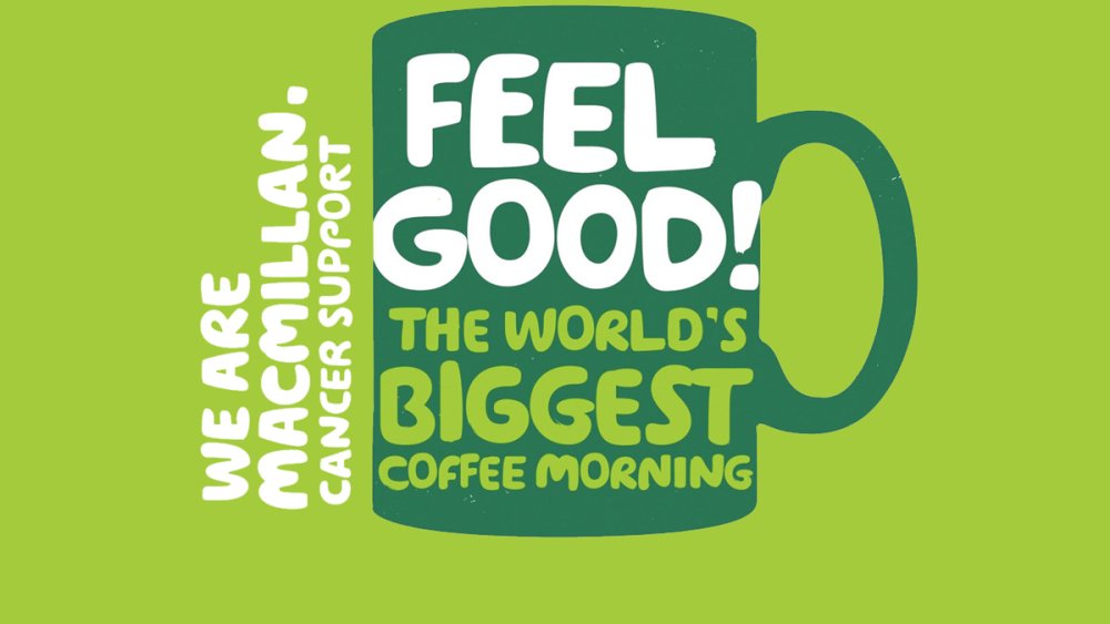
A five-word phrase stacked over three lines, Macmillan's brand identity feels like part of the conversation rather than a logo
Sometimes a typeface and smart use of language can be enough to define a brand. When Wolff Olins rebranded cancer charity Macmillan, the agency embraced a much more personal approach that reversed its formerly 'institutional' vibe.
Rather than a corporate stamp, the new branding – 'We are Macmillan. Cancer support' – felt like the start of a conversation. The accompanying communications, set in the irregular, handmade-looking typeface in two distinctive shades of green, continued in that vein by using the 'We...' construct to feel inclusive and friendly.
The highly distinctive combination of type and colour does all the heavy lifting in terms of brand recognition, to the extent that the logo could easily be removed without any doubt of what brand is represented.
Related articles:
- 5 times brands shook up their logo to create a powerful message
- These big-brand logos all pass the silhouette test
- 5 small-business rebrands that got big attention
- Empty list
-
Google updates its Android OS to address its own OS and component partners Qualcomm and Broadcom.
-
Here is the definitive guide to the best photo apps around, covering iOS (that's iPhone and iPad) and Android apps. Some you won't have heard of, others you'll be more familiar with.
None are going to replace a great DSLR, mirrorless or compact camera (see our guide to the best cameras for creatives) and a couple of hours with a photo editor such as Photoshop CC, but they're all great at what they do.
Let's start off with apps to transform your current photo collection: photo editing apps. You'll also find apps for taking photos and artistic photo apps on the other pages of this article, so click through to those if that's what you're after.
01. Photoshop Lightroom CC for mobile
Adobe makes a number of photo apps but if you’re serious about photo editing on your device, you only need one: Photoshop Lightroom CC for mobile. It's a free app that gives you a powerful yet simple solution for capturing, editing and sharing your photos.
You can shoot raw photos (on compatible phones), or transfer from your camera onto your device, and easily organise and tweak them, then automatically upload them to the cloud so they don’t take up space on your device. It has presets to keep your edits quick and simple, but you can also go deeper and fine-tune images to perfection.
Signing up to a Creative Cloud account - including the Lightroom CC plan, adds the ability to work across phone, tablet and desktop with instant synchronisation.
02. Photoshop Express

Photoshop Express offers the sort of professionalism you'd expect from Adobe
As you would expect from Adobe, the interface and user experience of the Photoshop Express photo app for Apple and Android devices is faultless. It fulfils all the functions you need for picture editing and will probably be the one you turn to for sheer convenience. 'Straighten' and 'Flip' are two useful functions not included in many other apps.
However, none of the filters really jump out, and some are surprisingly naff for an app that comes from the developer for designers. Ultimately, if you are looking for a more professional tool, look towards Lightroom CC for mobile, but the cut-down feel and familiarity of PS Express will suit some.
03. Photoshop Mix
Photoshop Mix is an app that caters more for those looking to make big statements than those making subtle adjustments, and it’s none the worse for it. PS Mix enables you to cut out and combine elements from different images, blend layers and make adjustments to your creations on your device, and it majors in ease-of-use.
Usefully, it live-syncs with Photoshop CC, meaning that when you make a change on your phone, it’ll show up instantly on your desktop – and you can take advantage of Creative Cloud benefits with an Adobe Photography Plan, which saves a fair bit of cash over a full subscription.
04. Photoshop Fix
With Photoshop Fix, you can make the most common image adjustments very easily, right on your smart device, without having to transfer your photos to a desktop computer and use expensive photo editing software. At your fingertips are the tools to liquify, heal, lighten, colour and adjust your images to perfection, plus you can experiment with painting tools and vignettes, control exposure, contrast, saturation and focus.
As with all Adobe mobile apps, having a Creative Cloud account opens up the ability to instantly share your work with other CC apps on desktop or mobile, but Photoshop Fix is probably best Adobe app for those just looking to make their smartphone photos better without requiring deep knowledge of editing tools.
05. Photo Editor by Aviary
Aviary strikes a balance between serious and playful
Aviary is a pleasantly designed app that strikes the perfect balance between serious photo editing and playful photo decoration functions, without looking bland or childish. Since it was first launched, the number of tools has exploded from 20 to 1500, giving you plenty of room to play.
The 'Strato' filter creates one of the most convincing vintage effects from all the apps tested.
06. Google PhotoScan
It's all very well being able edit photos on your phone or computer, but what about those old pre-digital prints you have lying around? If putting them all through a scanner's too much for you, there's an app that makes digitising your ancient snaps much easier.
Google's PhotoScan enables you to scan photos with your phone in seconds, without unsightly glare and shadows; head this way for some great tips on how to get the best out of it.
07. Pixlr

Pixlr has such a huge array of effects and tools that you can get lost in it for hours
Boasting over two million combinations of effects, overlays and filters, Pixlr contains enough tools to keep you busy for hours. You can also layer your images, add text captions, and it is also an excellent collage maker. Plus you'll also find an eraser to auto fix the colour and automatically adjust contrast. Not bad for a free app.
08. Fotor
Looking for a flexible photo editing app that's easy to pick up and produces quality results? Fotor delivers all of this, and best of all you can download it for free. This versatile app enables you to edit, collage and share images, plus you can discover masterpieces snapped by other users.
Fotor also offers a focus feature, enabling you to control depth of field and clarity to simulate DSLR effects. Simply select a focal point, adjust the emulator to your preference, and create a high definition finish.
09. Qwik
Qwik is crammed with filters, fonts and frames
Qwik describes itself as 'the fastest and easiest way to make pretty photos,' and with over 50 filters, plus tons of fonts and frames, it's hard to argue with it.
Edit your images in seconds with straightforward hands-on tools, and share them with Qwik's online community. With new filters and features being added every week, Qwik is constantly keeping itself fresh and exciting.
10. PicLab
Use the photo editor to quickly create trendy infographic images with this photo app
PicLab is a nifty app for creating those inspiring images that you get all over the internet these days. You know, the ones featuring a photo – probably with at least one retro filter applied – with a helpful aphorism layered over the top in an attractive, friendly typeface. Yeah, those – like the silly AI-generated ones we've featured, but better. PicLab HD makes them an absolute doddle to create, enabling you to either snap a photo or grab one from your photo library, then go to town on it.
As well as adding typography – lots of fonts and full control over size, positioning, opacity, rotation, and colour – you can also layer illustrations, ornamentation and other design elements on top of your image.
PicLab features full layer-based editing and also packs plenty of tools for making your original photo look its best, with loads of lighting and film effects to choose from as well as preset photo filters and adjustment tools for fine tuning the brightness, contrast, exposure, saturation, and the blur level of your photos.
11. Handy Photo
The selling point of photo editor Handy Photo is its interface, which uses the corners of the screen to cater for rotating menu options. It's all designed to keep the central area of the screen clear, allowing you to use swipe gestures to tone your effects up or down.
It's a powerful photo editor; the UI isn't for everyone, but this is an amazing price for the effects you get. The 'Move Me' tool enables you to clip out objects and move, resize or flip them.
12. Facetune
Hide your blemishes, wrinkles and more with Facetune's photo editor
- Platform: iPhone, iPad, Android
- Developer: Lightricks
- Price: $3.99/£3.99 (iPhone), $5.99/£5.99 (iPad), $5.99/£3.99 (Android)
Embarrassed about your laughter lines? Feeling blue about those blemishes? Fear not, Facetune is here! Grab a photo from your Camera Roll and start your makeover; you can remove unwanted freckles, blemished skin or hide bags under the eyes with Smooth; reshape that wonky nose or misshapen jawline with, er, Reshape; and make subtle tweaks of colour using Tone.
The results of this photo editor are truly impressive. You can share results over Facebook, Twitter and Tumblr – if you dare.
13. PhotoWonder

Photo Wonder has a good collage feature with multiple layouts and photo booth effects
Excellent user interface makes Photo Wonder one of the speediest smartphone photo apps to use. It also has a good collage feature with multiple layouts and photo booth effects. The filter selection isn’t huge, but many are so well-designed that you’ll find them far more valuable than sheer quantity from a lesser app. The 'Vintage' filter works magic on photos of buildings or scenery. Combine with 'Sweety' for a dreamy retro effect.
14. Rakuga Cute
Look beyond the cuteness and Rakuga Cute has some interesting features
- Platform: iOS
- Developer: Tatsumi Electronics
- Price: Free
At first glance this iPhone photo app seems aimed at Japanese schoolgirls rather than discerning designers, but Rakuga Cute actually contains some unusual editing functions which makes it an interesting addition to your photo repertoire.
The 'Mosaic' option lets you selectively pixelate any part of a photo, quite useful for blurring out license-plates, identities or should you feel so inclined, body parts as well.
15. Halide
Halide puts pro camera controls at your fingertips
- Platform: iOS
- Developer: Chroma Noir
- Price: £4.99/$4.99
If you love the convenience of mobile photography but miss the control you get with a full-on SLR, Halide is well worth snapping up. It'll work as a simple point and shoot, but with a swipe you can open up a whole load of lovely manual options, giving you tactile control over focus, ISO and shutter speed, as well as a live histogram to help you get the right exposure.
You can review your photos Tinder-style, with a right swipe to add them to your favourites, and a left swipe to trash them, and Halide can even export as RAW to give you more flexibility when you edit your shots.
16. Camera MX
- Platform: Android
- Developer: Appic Labs Corp
- Price: Free
The Android exclusive photo app Camera MX combines powerful enhancement tools with a beautifully simple user interface. Thanks to intelligent image prcoessing you can take visibly sharper snaps, as well as cutting and trimming them to perfection in the edit.
In the latest version you can create dynamic photos with the 'Live Shot' feature. By saving the last seconds before you actually take the photo, this app lets users capture moving snaps that can be relived and shared.
17. Lensical
- Platform: iOS (iPhone)
- Developer: Apptly, LLC
- Price: Free
Lensical makes creating face effects as simple as adding photo filters. Lensical is designed for larger displays and utilises one-handed gesture-based controls making it the perfect complement to the iPhone 6 and iPhone 6S Plus's cameras.
18. Camera+
Camera+ is adored by iPad users and has subsequently arrived on iPhone - hooray!
- Platform: iOS (iPhone and iPad)
- Developer: tap tap tap
- Price: $2.99/£2.99 (iPhone), $4.99/£4.99 (iPad)
The Camera app that comes on the iPhone by default is not brilliant: yes, you can use it to take some decent shots, but it doesn't offer you much creative control. This is where Camera+ excels. The app has two parts: a camera and a photo editor, and it truly excels at the latter, with a huge range of advanced features.
Camera+ doesn't just limit you to editing new pics – you can quickly import your existing photos into the Lightbox so that you can breathe new life into them.
19. Clone Camera Pro
Double up your images with Clone Camera Pro
- Platform: iOS (iPhone)
- Developer: Peta Vision
- Price: $1.99/£1.99
A smart photo-compositing app that allows you to double up on your images. Clone Camera lets you produce a 'photo' of a scene with the same person in it multiple times. It's simply a case of taking up to four photos of the same person in a different location, and then selecting the areas you want to stitch together into the final photo. The app works best if you have a tripod, or can otherwise keep your device still.
20. Camera360
Camera360 offers a huge range of functions and no ads
Camera360 is a remarkable smartphone photo app. It's perfectly self-contained with a huge range of functions, no ads and no insistence in promoting paid content.
Touching the photo after applying a filter produces a nifty quick comparison of the 'before' and 'after' versions. One drawback is that the process of importing photos is slightly tedious, with one too many clicks involved. Tip: go to Enhancement>Night for a great filter to correct slightly dark or underexposed photos.
21. LINE Camera
You can add text to your pictures in over 100 fonts and 20 colours
Sleek and easy-to-use, LINE Camera comes with a solid range of filters, borders, icons and stamps. You can also add text to your pictures in over 100 fonts and 20 colours, making this free smartphone photo app one of the best for typography. Check out Stamp>Heart Symbol>Shine for a nice selection of kitschy sparkle brushes.
22. Paper Camera
Paper Camera's interface is quirky to say the least
- Platform: iOS (iPhone and iPad)
- Developer: JFDP Labs
- Price: $2.99/£2.99 (iOS), £2.39 (Android)
Filter effects aren't exactly a new thing, but Paper Camera takes a different approach to the post effects found in the likes of Instagram. What does it do? Well, it displays effects in real time on your camera as you're using it. There are some neat effects on offer – including cartoon, half tone and sketch.
23. Lifecake
- Platform: iOS (iPhone and iPad), Android
- Developer: Lifecake
- Price: Free
Save and organise pictures of your children growing up with Lifecake. In a timeline free from the adverts and noise that clutter most social media channels, you can easily look back over fond memories and share them with family and friends.
Touted as 'a time machine of your child's life', you can skip to select stages and compare different dates. You decide who can see your images, and because Lifecake is now a Canon company you can order a printed album of your precious photos.
24. VSCO Cam
- Platform: iOS (iPhone and iPad), Android
- Developer: Visual Supply Company
- Price: Free
Connect with amazing photographers from around the world, and create your own stunning photography with VSCO Cam. Create your own VSCO Journal to join in with the community and find inspiration form other users. Unlike other social platforms, your followers and clout are not displayed, giving everyone an equal creative playing field.
VSCO Cam comes packed with top performance features, including high resolution imports, and before and after comparisons to show how you built up your edit. Introduce yourself to the community by downloading it for free.
Next page: Artistic photo apps
25. Prisma
Prisma uses AI to turn your snaps into works of art
Better than any filter-based photo app, Prisma can transform your photos into masterpieces in the style of famous artists such as Van Gogh, Munch, Mondrian and Picasso. It uses an AI technique called style transfer to do its artistic magic, and it's no longer restricted to still images; it now works on video as well.
26. Instagram
With a few simple edits, Instagram transforms photos into works of art
Even if you're new to the world of photo apps chances are you've heard of Instagram. Capable of turning the most everyday photo into something glamorous thanks to its range of custom-designed filters and editing tools, Instagram has won over a legion of fans and dedicated users.
Put simply, there is a reason Instagram is so popular. It's powerful, versatile, and best of all it's free. Thanks in part to its ownership by Facebook, Instagram has also become a social media platform in itself. Instagram Stories let you communicate a diary of images to your followers, and offshoot apps Boomerang, Hyperlapse and Layout help you create striking video and collages.
And – praise be! – Instagram has finally tweaked its feed to make newer posts more likely to appear near the top. But please just make it chronological again!
27. PixelWakker
PixelWakker transforms your pics into pointillist art
- Platform: iOS (iPhone and iPad)
- Developer: PixelWakker
- Price: £2.99
If you're a fan of pointillism then this is the photo app for you. PixelWakker breaks down your images into their component pixels and that's where the fun begins. You can apply one of four great effects – pixel image, dots, line, or colour rain – to your pics and watch in wonder as dot art unfolds before your eyes.
28. Sktchy
You'll either love or hate sketch-based community photo editor app Sktchy
- Platform: iOS (iPhone and iPad)
- Developer: Sktchy LLC
- Price: Free
Connecting with people around the world in a new way, here you can choose from a selection of photographs, uploaded by the Sktchy community and create a portrait from that image.
Sktchy co-founder Jordan Melnick comments: "Our community of artists is growing every day because Sktchy is the perfect place for them to find inspiration and share their art with the world, in part because of the neat way we layer portraits over the photos that inspired them."
29. Photochop
Photochop - Chop Up and Distort Your Photos does exactly what it says on the tin
- Platform: iOS (iPhone and iPad)
- Developer: Big Bucket Software
- Price: $0.99/£0.99
We probably like this app for its name (in full: Photochop – Chop Up and Distort Your Photos) as much as for its function. It's a cheap and cheerful little photo editor tool for mucking about with pictures. Simply pick a snap from your iPhone's photo library, chop it up into a set of tiles and then go crazy.
You can either work directly with the tiles, dragging them around, rotating and resizing them to create a collage effect, or there's a warp mode that works in the same way but results in a distorted image rather than a collage. Obviously it's nothing you can't easily do in any image editing app in a couple of minutes and you'll be hard pushed to find a serious application for it, but it's a fun graphical toy to have in your pocket.
30. Path On
Add images to your text with Path On
- Platform: iOS (iPhone and iPad)
- Developer: Peta Vision
- Price: $1.99/£1.99
Path On lets you add funky text to photos in unique ways. You draw the path you'd like the words to take, then type in your message – the text then flows along the path. The custom options are the real killer feature here, with you being able to adjust the font, the letter space, and the alignment. Although it's a little fiddly, Path On is probably the best adding-text-to-photos tool around.
31. Geló
Persevere with Geló and the results will speak for themselves
- Platform: iOS (iPhone)
- Developer: James Moore
- Price: Free
A splash of colour can alter the look of an photo dramatically. Give your iPhone shots some extra oomph with this cool app for the iPhone. Gradients have become a lost art in iPhone photography, but Geló fills that gap in the market well. It needs a little more patience than your average photo app, but persevere and the results are excellent.
Once you've taken or imported an image, you see a carousel of 'gels'. Cycle through to choose a colour, tap it, and then it’s applied to your shot. Using the sliders you can tweak how the filter affects your shot, and you can easily apply specific RGB values though, that might mimic your favourite tints in iPhoto or Photoshop, say.
32. Retromatic
Retromatic can be frustrating at times but it portrays a great vintage feel
- Platform: iOS (iPhone and iPad)
- Developer: Peta Vision
- Price: $1.99/£1.99
1950s-inspired photo app Retromatic enables you to import your photos, cut them out using an instant alpha tool, and then apply vintage effects to them. It's quick and easy to use, and looks great, although expect frustration if you want to do anything more than the basics. The instant alpha tool works well, but you have to hold down on the screen to make it switch between a brush and pinching to zoom.
33. Tadaa
Tadaa is great for fine-tuning photos
- Platform: iOS (iPhone)
- Developer: Menschmaschine
- Price: Free
Tadaa lets you adjust the strength of all its filters, which is ideal for people who like fine-tuning their photos with subtle effects. This iPhone photo app tries to get you to use its own social network, but you can still use all features without a login.
Click on the frame icon to access a nice range of photo film borders. Unlike Instagram and Magic Hour, you're not limited to a square and can apply the film border to a photo of any size.
Related articles:
-
Panera is in hot water after sitting on a massive data leak for eight months on its website - and then trying to downplay the amount of customers impacted by the leak.
-
They might be taking people's jobs and threatening to overthrow us one day, but robots aren't all bad. If there's one thing robots are good for, it's sparking the imagination of talented artists during the illustration challenge March of Robots.
Created by self-taught illustrator DaCosta!, March of Robots tasks you with sketching a new robot every day during March. As with similar illustration challenges, such as MerMay and InkTober, March of Robots is all about having fun. So if you can't create a new picture every single day, that's no problem either. It's all about setting goals and sticking to them.
It wouldn't be a month-long drawing challenge without a hashtag though. And thanks to #marchofrobots you can easily sift through Twitter and Instagram to find marvellous mechanical creations. We've rounded up some of our favourites, which you can explore below.
01. Jarlan Perez

We thought robots couldn't feel emotions, but this one looks happy
When he isn't busy working for Google and Lockheed Martin, 3D artist Jarlan Perez loves to make digital illustrations of robots. And while he hasn't quite been able to keep up with the daily grind of the challenge, Perez has managed a steady output of colourful droids and drones.
We particularly like how Perez experiments with shape and form to create robots that have both a distinctive appearance and an individual personality. His illustrations showcase how robots give artists freedom to experiment with character concepts in a way that isn't always possible with organic creatures. Be sure to check out his profile for more one-of-a-kind robots.
02. Pascal Blanché

Where does the human end and the robot begin?
In a case of quality over quantity, senior art director at Ubisoft Montreal, Pascal Blanché, has created three images over the course of the month. Knocked up with the help of box mapping, the Bot hunter Bot – pictured above – gives you a taste of Blanché's stylistic take on robots.
With a blend of slender human shapes and bulky sections usually found on your more hardy mechs, Blanché's robots are at once slightly creepy yet also elegant. What's more, you can also buy his March of Robots creations as prints.
03. L0reon

Let's hope these robots are water-resistant
Another artist who takes robots in a new and imaginative direction is a 16-year-old German illustrator on Twitter who goes by the username L0reon. While L0reon's Twitter and Instagram feeds have been taken over by Transformers art during March of Robots, the illustrator has also experimented with mechanical versions of marine life.
Take the robotic shark and leviathan in the illustration above. We love how the imbricated metal plates give the impression of scales, it's a clever way of meeting halfway between the animal kingdom and the world of robotics.
04. Jack Viant

An umbrella hat sounds like a must-have for a robot on a rainy day
Plymouth-based illustrator Jack Viant brings his doodle-like art style to the March for Robots challenge. His droids have a child-like goofiness to them, with some wearing pants on the outside of their metal casings, and others appearing to have mohawks and moustaches.
Despite having their own little quirks, Viant's robots all have a uniform colour scheme which leads us to wonder how they're all connected. With so many distinctive characters in this set, we'd love to see them all interact in a book or comic.
05. Alan Blackwell

Blackwell's robots are sometimes inspired by the human form
Freelance concept artist and illustrator Alan Blackwell has truly taken up the March of Robots challenge and run with it. For the majority of the month he's been uploading sketches and sculpts of imaginative robots.
Some of Blackwell's mechs have a human shape (two arms, two legs, and some rocket launchers here and there for for good luck) while others have more bizarre forms. On days where he hasn't been able to upload a finished piece, Blackwell has been generous enough to share some work in progress images that give us a glimpse into his creative process.
06. Mihailo

This rodential robot looks set for a life of scavenging
This robot rat by an illustrator who goes by the name of MihailoML on Twitter is indicative of the unusual directions in which the artist has taken the sketch challenge. As well as a robotic rodent, Mihailo has also created wooden mechs and droids with a soft spot for bouquets of flowers.
Despite taking the opportunity to push the boundaries of the challenge, Mihailo's robots have a realistic bulk to them. We love, for example, how there are lots of exposed wires and gears, which help to make a strange concept feel all the more believable.
07. Sylvian Boussiron

That doesn't look like fish food...
Just like Pascal Blanché, Sylvian Boussiron hasn't managed to upload art regularly throughout the March of Robots challenge, but the images he has had the time to complete have a certain level of sophistication about them.
Made with free digital painting app Krita Painting, the image above, titled "Robot's Initiative", gives you an idea of the calibre of his work. As well as creating a distinctive character design and a beautifully lit environment, Boussiron has also managed to sneak some humour into his art as the robot feeds its eel a handful of batteries. Maybe that robot uprising isn't as close as we feared.
Related articles:
-
Branding, logo design and advertising have always had the potential to stir up strong reactions, both in the design community itself and the general public. And the reach of social media means that, nowadays, the news can spread across the globe in no time at all.
Whether it's a rebrand that causes outrage because it undermines an already much-loved brand, an advert that offends or just a widespread dislike for the creative work itself – there are plenty of examples to choose from. Here are some of the most notable logo and branding designs that split opinion across the board.
01. Formula 1 gets in hot water

W+K's rebrand of Formula 1 had its haters, but the controversy escalated when lawyers got involved
You know a project is controversial once the lawyers get involved, and that's exactly what happened with Wieden+Kennedy's much-discussed rebrand of Formula 1.
W+K's work split opinion from the start, with many fervent F1 fans lamenting the loss of its predecessor by Carter Wong, which cleverly nestled the '1' inside the 'F'.
However, the aesthetics of the new logo soon became the least of its problems, when its similarities to a brand of compression tights sold by 3M, maker of Post-It Notes and Scotch sellotape, came to light.
Thanks to the existence of F1-branded clothing, the two trademarks in seemingly unrelated sectors came head-to-head in a storm of controversy.
- Read our news story about it: Formula 1 logo sparks similarity backlash
02. Leeds United angers its fans

Leeds United's universally hated rebrand was hastily withdrawn in the face of fan derision
Ostensibly all about celebrating the fans, Leeds United's short-lived rebrand instead incurred their quite considerable, merciless wrath.
Leeds' new crest was launched with the proud claim that it had six months of research behind it, and the team had apparently consulted 10,000 people. It soon became abundantly clear that they'd asked all the wrong people.
Taking a gesture used by Leeds FC fans – the fist across the chest – and converting it into an almost clip-art-like vector really didn't resonate. With anyone. After a storm of controversy that went far beyond the fanbase, the new logo was canned.
03. Premier League doesn't kill its lion

Much of the controversy around DesignStudio's Premier League rebrand was unfounded, as cutting the lion was never on the cards
Having already courted its fair share of controversy a couple of years before, thanks to Airbnb (number 8 on this list), DesignStudio was publicly in the firing line again in 2016 with its Premier League rebrand.
Premier League commands an engaged, passionate global fanbase, and they were not a bit happy when they heard – as it turned out, entirely incorrectly – that the much-loved lion was being axed from the new logo.
The 'news' was spread far and wide across the media, and fans went ballistic. In one tweet, DesignStudio was even accused of "mocking the death of Cecil" the dentist-murdered lion by doing so.
When the bold new rebrand launched, of course, the lion was very much front and centre – which had been the plan all along.
04. Uber drops its giant U

Think you'll find that at 2am after a night on the Jägerbombs? You might as well walk
Uber managed to outrage someone other than licensed taxi drivers when it ditched its big 'U' logo – which if nothing else was vital for spelling out icon obscenities on your phone's homescreen – and replaced it with a pair of app icons: one for the 'rider' app, and one for the app used by drivers, or 'partners'.
CEO Travis Kalanick – who worked alongside Uber's design team to create the new logos – has described it as bringing out the company's human side. Others have been less kind, with some pointing out that it's going to be a lot harder to find this new logo on your phone when it's 2am and you're tired and emotional, and others noting its resemblance to a sperm.
05. Instagram goes flat

At the height of the 'flat design' trend, Instagram's rebrand was widely mocked at first - but is now well established
When Instagram changed its logo in 2016, the rebrand was something of a milestone in the shift from skeuomorphism to flat design. The carefully crafted, realistic depiction of a retro camera became a simple, graphic shape filled with a neon rainbow gradient.
Simplicity and minimalism was the goal, but for many Insta fans, it went too far. Like Gap before it (example 13 on this list), it spawned an outcry of derision from 'I could have done that' critics.
Some people called it garish, some said it could have been made using MS Paint in 1995. Others argued that Instagram was desperately trying to be cool, and had thrown the baby out with the bathwater to do so.
Unlike Gap, however, the logo stuck. The brand stuck to its guns, and as it began to grow on people, the fury ultimately died down.
06. The Met kerns with enthusiasm
Don't stare at it for too long, it'll make your eyes go funny
Wolff Olins stirred up another pot of designer fury with its logo for New York's Metropolitan Museum of Art.
A bold – some might say brave – typographic treatment that merges flare serifs together while playing fast and loose with leading, it was described by Wolff Olins as, "a crafted mark that looks to the past and to the future, or any place in between," while Justin Davidson of Vulture thought it looked more like, "a red double-decker bus that has stopped short, shoving the passengers into each other’s backs."
07. Hillary Clinton's logo misses the mark

Nobody's talking about how appallingly the red and blue clash
When Hillary Clinton revealed her presidential election campaign logo in 2015, people were lining up to criticise its design. Some reckoned it looked like a hospital sign, many believed that its big red arrow symbolised a shift to the right, and many disliked the simple design on the grounds that it just looked amateurish.
Meanwhile WikiLeaks claimed that it had ripped off its own logo, and others with an even slenderer grasp on reality were convinced it contained hidden messages about Hillary sliding into the White House or moving the country sideways.
08. Airbnb makes people snigger

People took to the internet to poke fun at the Airbnb logo
In 2014, accommodation listings website Airbnb launched an entirely new look. The 'Bêlo' logo aimed to symbolise a new era for the business but instead, it got a whole lot of fun poked at it.
Consumers weren't shy in saying what they thought of the look, with some claiming it to be a copy of Automation Anywhere's logo, as well as a few interesting anatomical comparisons (you can read DesignStudio's response to the criticism here).
09. Dirty Bird lives up to its name
Does this controversial logo depend on how you look at it?
Dirty Bird is a catering company that attends music festivals in and around Wales. While its food is popular, its logo is anything but. The owner has stated that it's "just a clever way for the 'd' and 'b' to go together", but customers have complained about its phallic aesthetics.
Designer Mark James said: "We were given the name Dirty Bird as the brief, and started working on ideas. We looked at the initials, DB. Then worked with the lowercase 'db' linking them to form the shape of a rooster. It's graphic representation of a rooster incorporating the initials. It depends on how you look at it."
The company has also produced posters asking customers to 'Touch My Thigh' and 'Touch My Breast', and recently 'Get some cock in', so we're guessing it's not entirely innocent.
10. BP attempts a greenwash
The BP rebranding initially caused controversy but has become a familiar sight
British Petroleum’s $200m rebrand in 2000 was part of a concerted effort to bring 'green' credentials to the global oil giant.
Thereafter known simply as BP, the company adopted the tagline ‘Beyond Petroleum’ and a green-tinged 'Helios' mark, but it was met with considerable public skepticism at the time, with many parodies springing up.
11. London 2012 stokes debate
It seems like an age ago that this logo was causing heated debate
This one went through the mill for sure. Wolff Olins' £400k logo was unveiled in June 2007 to an almost unanimous global chorus of derision – with 80 per cent of people in a BBC poll giving it the lowest score.
Of course, WO stuck to its guns and in the patriotic haze of the British Olympic summer it all paid off. Learn about how the logo was originally put together in our piece Typography in Olympics logo design, and read a spirited defence of the much-maligned design in our article Celebrating the majesty of the 2012 Olympics logo.
12. Yves St Laurent goes nude
Who knew a nude Sophie Dahl would cause controversy?
Sporting a provocative, completely nude portrait of fashion model Sophie Dahl, Yves St Laurent's 2000 ad campaign set switchboards alight at the Advertising Standards Authority (ASA), with 948 complaints. The ASA ruled that it was "sexually suggestive" and "likely to cause serious or widespread offence".
13. Gap tries to go vanilla
Gap's attempt at a logo redesign was hastily withdrawn
Arguably one of the most famous design-based PR disasters in recent years - and a strong listing in our piece on Classic logos that should never have been changed - Gap's woeful attempt to rethink its iconic navy blue box in 2010 sent ripples around the world. There was universal damnation of its suggested replacement, which combined vanilla Helvetica with a simple gradient. The new logo was withdrawn after a week.
14. Ashley Madison gets banned from Superbowl
Designed to encourage and facilitate 'discreet' extra-marital affairs, AshleyMadison.com is a controversial proposition in its own right. So it's little surprise that its ads (including this one, in which a betrayed wife rips off her clothes and promptly joins the site to get her own back) have been banned from the coveted Superbowl slot several times.
15. Starbucks pares things back

Starbucks' rebrand was more successful than Gap's, but still drew complaints
January 2011 brought the coffee giant's decision to drop 'coffee' and even the word 'Starbucks' from its primary logo, bringing the iconic mermaid to the fore instead. Dubbed a "natural evolution", it also heralded the company’s move into different product ranges – but over 500 complaints were left on the company's blog. The logo is widely recognised now, and even made it onto our list of the Top 10 big-brand logos.
16. KFC encourages bad manners
Nudity and sexual provocation is one thing, but this 2005 spot for Kentucky Fried Chicken attracted 1,671 complaints in total. Why? Because the call centre operatives in the ad were singing with mouths stuffed with chicken – which according to enraged parents, encouraged bad manners.
17. University of California gets flushed

Another logo redesign that received universal condemnation and was withdrawn
Finally, the University of California's very own 'Gap' moment came in 2012, during which its modernised logo was dubbed a 'toilet bowl' and soundly panned. Created by an in-house design team, it was designed for communications materials and never intended to replace the official seal – but the damage was done, and it was withdrawn from use.
Related articles:
-
Looking for the best new monitor for your creative work? Here, we review the BenQ PD2710QC…
High-quality IPS LCD panel? Check. Generous 27-inch proportions? All present and accounted for. Expansive 2560 x 1440 native resolution? Affirmative. One hundred per cent sRGB colour space support? You've got it.
From the get-go, then, BenQ’s PD2710QC is an appealing LCD panel packed with features to please graphics professionals. But then there are plenty of other similarly equipped monitors to choose from. Happily, however, the PD2710QC has one or two additional tricks up its sleek, minimalist sleeves.
Top-class connectivity
For starters, it packs a USB Type-C dock with full support for DisplayPort alternate mode plus charging. The upshot, importantly, is that you can connect this monitor to a laptop computer via a single USB Type-C cable and both drive the screen at full native resolution and charge the laptop at the same time. You can also connect and use peripherals via the monitor’s multi-port USB hub.

The display base of the BenQ PD2710QC includes a USB hub, video out and even an option for ethernet network connectivity
USB Type-C is popping up on all manner of portable computers. But the PD2710QC’s capabilities will be of particular appeal to owners of Apple’s 12-inch MacBook. That laptop has a single USB Type-C port for everything: video out, charging, attaching peripherals, the works. So the PD2710QC’s solves all your MacBook connectivity problems in one fell swoop.
As for anyone who isn’t planning to make use of the fancy new USB Type-C interface, the PD2710QC also sports a pair of conventional DisplayPort sockets, a Mini DisplayPort input and an HDMI port.
It’s also a very simple screen to set up thanks to the full range of tilt, height, rotate and swivel adjustments, and a particularly user-friendly on-screen menu.
BenQ PD2710QC: image quality
It’s no slouch in the looks department, thanks to a slim-bezel minimalist design and high-quality construction.

BenQ’s latest LCD monitor boasts a slick, slim-bezel design with a base unit that incorporates a range of inputs
All of which just leaves the not-so-minor matter of image quality. Out of the box and without any calibration, the BenQ PD2710QC is distinctly usable, with nearly perfect contrast, little to no evidence of colour compression together with all the usual benefits of an IPS panel, which include superb viewing angles, decent response and vibrant colours.
It’s even better after calibration and achieves low deltas to target values in terms of gamma, colour space and colour temperature. All of which means the PD2710QC makes for an extremely appealing overall LCD panel package.
Not a truly high-end professional display
The downsides are two-fold. First, this isn’t a truly high-end professional display. Its colours are eight-bit per channel, not 10-bit per channel, and it doesn’t fully support the latest super-sized colour spaces. And yet it’s a serious financial investment, even if that’s broadly in line with similar semi professional-grade monitors.
Alternative monitors to the BenQ PD2710QC
Should you buy the BenQ PD2710QC monitor?

The 27-inch screen comes with an anti-glare, matte finish that helps to reduce distracting reflections
- Also read: The best 4K monitors for designers
For sure, you can get more screen inches and pixels to work with for the same money if you’re willing to give up further colour accuracy. But if you’re after a production-quality display with top-notch connectivity, the new BenQ PD2710QC is well worth a look.
This article was originally published in issue 157 of ImagineFX, the world's best-selling magazine for digital artists. Buy issue 157 or subscribe to ImagineFX.
-
Coding is an incredibly valuable skill in the modern workplace. Whether you're looking to launch a career as a programmer or just want to bolster your resume, you can pick up the skills you need with the help of the Complete 2018 Learn to Code Bundle. It's on sale now for just $34.99 (approx. £25).
The Complete 2018 Learn to Code Bundle has everything you need to get started with the art of coding. No matter your starting skill level, this bundle is designed to give you the knowhow you need to become a talented developer with the skills to succeed.
You'll find more than 210 hours of actionable content in these nine professionally-taught courses on the most important programming languages, from Java to Ruby on Rails and Python.
The Learn to Code 2018 Bundle usually retails for $1,357, but you can get it on sale now for just $34.99 (approx. £25). That's an unbeatable saving for a must-have learning bundle, so grab this deal today.
Related articles:
-
Whether you are new to the world of programming or an old hand, you need a great code editor to help you perform your magic. The best code editors will make you more efficient at coding and writing, assist you in examining and editing your code, and be customisable to meet your needs. They will also create a more comfortable user experience, which should not be underestimated, as you’ll be looking at your code editor for potentially hours every day.
There are dozens of text editors, code editors, IDEs, and more out there for you to choose from. So how do you pick? You really only want to have to make the switch to a new editor once in a while, as you'll lose some efficiency while you’re adjusting to the different software. Read on to discover five of the best code editors for developers and designers, and find the best-in-class tool for you to use every day. At the bottom of the post, you'll also find information on what is a code editor, and how to pick the right code editor.

Sublime Text is the editor that really changed the way code editors worked. It is lightweight, open and ready to edit your file almost as soon as you have managed to click the button. This responsiveness is something that sets Sublime Text apart from other editors in its class. If you want to open a file and make a quick edit, waiting for a few seconds for loading may not sound like much, but the delay can grow tedious.
Another of Sublime Text’s best points is that it is also crazily extensible, with a huge and ever-growing list of plugins available to install. The package manager makes a variety of things available, including themes with which to customise the editor’s appearance, code linters (which can assist with more quickly locating any errors in your code), Git plugins, colour pickers, and all kinds of other useful things.
Sublime Text is free to download and use, but will remind you fairly regularly about payment until you do so. If you decide to pay, the same license key can be used by you for any computer that you use, so you can enter the same code on all your machines to make the payment reminder popup go away. The paid license, however, is perhaps Sublime Text’s greatest negative feature, with so many competitive products that are available to developers for no cost.

Visual Studio Code is a code editor developed by Microsoft, and surprisingly, as an open-source software. VS Code is perhaps the closest code editor in this list to being an IDE. It is very robust, and is also one of the slower programs when starting up. However, while using it, VS Code is quick and able to handle quite a few interesting tasks, such as quick Git commits or opening and sorting through multiple folders’ worth of content.
VS Code is perhaps the most meteoric editor, popularity-wise, on this list, as it is continually growing its user base and attracting more developers away from other editors. VS Code has a built-in terminal, as well as built-in Git support, both of which are big winners for fans of this program. It also has a feature that it has dubbed ‘IntelliSense’, which helps with autocompletion of code as well as information on the parameters of functions and known variable names.

Atom is open source and developed by GitHub. Its initial development made it apparent that it was heavily influenced by the new style of editor that Sublime Text made prominent, but its key differences are the free, open-source nature of this editor, as well as the easy out-of-box integration with Git and GitHub.
Atom has historically had performance and stability problems, but those have diminished significantly as it has become a more mature software. It’s true that it still launches slower than some editors, but it’s just as reliable and quick to use as any of the rest after that.

Brackets is Adobe’s open-source editor offering. To get started, Brackets was faster to start up than Atom, but not as fast as Sublime Text. Brackets was only introduced a few years ago, and is still maturing, but seems to be a very well rounded software. It doesn’t come with as many languages natively supported for syntax highlighting as some of the others, but it still has quite a few. Because of its focus on front-end technologies, it also supports CSS preprocessors like LESS and Sass. Brackets doesn’t come out the winner on many of the usual speed and reliability metrics, but it does have several unique features worth investigating.
Brackets is easier to use to some degree because it is mostly configurable via its menus, whereas most of the other editors in this list require configuration files to be edited to do much configuration (but you can also edit the configuration file in Brackets if this makes you more comfortable). The program also has a very interesting feature for quick CSS editing. You can use a hotkey to pop out a small section on an HTML page that will let you edit any CSS rules that are currently affecting the element that you have selected, enabling you to quickly locate a styling problem and then fix it without having to embark on a lot of searching around.
An interesting design decision is that Brackets doesn’t use tabs at all for showing open files. Rather, there is an open files menu in the top left, above the file tree. If you’re using the split-window view, this open tabs list also splits ‘Left’ and ‘Right’ for easier location of the file you’re looking for. VS Code uses a similar open files menu, for example, but also uses tabs. In Brackets, this enables maximum screen real estate, but could be a jarring experience if you’re used to tab navigation.

Vim is perhaps the most contentious code editor in this list. Vim is a command line software, included natively with Linux operating systems and macOS, and available for download for Windows. Vim is a favourite option for many old school programmers, and keyboard enthusiasts. The program is navigated entirely with the keyboard, making it much faster and more efficient – but only if sufficient time is spent learning how to operate it. It is also extremely customisable (to the extent that a command line program can be customised).
Vim gives you the ability to use many keyboard shortcuts to speed the editing of your code, and even better, enables you to create customised commands to fit your own editing processes.
Vim earns the award for the steepest learning experience and perhaps one of the worst user experiences overall, due to its utter lack of UI. Learning how to navigate Vim isn’t all that challenging, given just a small amount of time, but building the muscle memory of shortcuts and figuring out how best to customise the editor takes a much more substantial amount of time, in order to truly realise the benefits of this powerful program.
Vim is incredibly stable, fast, and a real joy to use for veteran command line aficionados and new, interested users alike. If you have the time to learn it, Vim can really increase your coding productivity, and it’s a nearly seamless cross-platform experience, with so little UI to consider.
What is a code editor?
Code editors are the bread and butter software of many developers, designers, and even writers. Complex integrated development environments (IDEs) are often too bloated and heavy for smaller tasks, such as working on a single project or file. On the other hand, basic text editors such as Notepad on Windows or TextEdit on macOS are underpowered for the tasks of editing code – too many necessary features are missing, making code editing cumbersome.
The interim type of software is the code editor. They shine at just this task, editing single files or single projects, managing a folder’s worth of content. Crucially, the slowest of the editors in this list are still much faster and more responsive than dealing with a fully-fledged IDE.
Code editors shine whether editing single files or managing a folder’s worth of content
Code editors often used to be very different on each operating system, but the editors in this list are cross-platform and many work to ensure that the experience on different operating systems is very similar. This enables programmers to shift between work and personal computers, or even shared devices, and still get things done without having to adjust to a different environment.
In addition, many of the code editors here can have their behaviour modified via configuration option files (things like setting tab lengths, line lengths and wrapping, autocompletion, syntax highlighting, and more). This ability to dictate the program’s appearance and behaviour lets the programmer maximise the usefulness of the software, while the defaults enable a casual user to have a pleasant and useful ‘out of box’ experience.
How do you pick a code editor?
Picking a code editor can be a challenging task. Perhaps the most important thing to remember is that you know what you need. What features are most important to you? Keyboard shortcuts? Appearance? Speed? Stability? Cross-platform experience? Open source? Syntax highlighting options?
Consider what you would like your editor to do for you. Do you enjoy autocompletion of function names, or automatic closing brackets or tags? Or do you find those things frustrating? Do you put a lot of stock in the ability to change the colour scheme of your UI often and easily, or are you a big fan of a simple light or dark mode? Do you wish to perform Git operations directly from your editor?
The list of potential features is endless, so figure out which are most important to you
The list of potential features is absolutely endless, and only you can say which are the ones that are the most important to you. Which make you more comfortable, efficient, and productive? Decide on your priorities, and then take a look around and find the editor software that ticks off all the boxes.
Another important note about choosing a code editor is to allow time to invest yourself in the software. Take a moment to look through the available settings, plugins, or other extensions. Find out which things you can change or set up to ensure that the experience is the best that it can possibly be for you. Getting your editor customised to your needs and spending some time with it will give you a real taste for whether it is to your liking or not.
This article was originally published in issue 303 of net, the world's best-selling magazine for web designers and developers. Subscribe now.
Read more:
-
The U.S. Department of Defense is the latest government entity to double down on vulnerabilities, on Monday announcing a new bug bounty program.
-
Hackers have stolen the credit card information of millions of shoppers who have frequented Saks Fifth Avenue and Lord & Taylor stores.
-
I've been a big fan of Houdini for the past few years. It has very much changed my life and how I approach my 3D art, all the way down to final production and dealing with changes. It’s quickly becoming known as one of the best 3D modelling softwares in the VFX industry, increasingly popular in both games and motion graphics.
I've been working almost exclusively with Houdini for the past three years or so. What made me transition over to Houdini was how much more flexible my workflow became. Houdini is a node-based program, meaning that each action you do is represented with a node. These nodes are functions or tools that can be stringed together to form node trees that will perform various actions. Examples can be extruding surfaces, bevelling corners or deforming geometry – but really it can be anything.
Of course, Houdini still isn’t for everyone and the learning curve is quite steep. Thankfully SideFX has a free Apprentice version available for learning purposes, so you don’t have to pay rental of $199 per year or buy Houdini FX for $4,495 and then decide that it’s not for you.

This tunnel was modelled exclusively using Houdini 16’s new boolean operator. This was a frame from the Logitech Powerplay film and was one of the shots I worked on
Houdini works in similar ways to other 3D programs. In the end the same principles apply regardless of what tool you use, but what makes Houdini stand out from the crowd is how non-destructive (aka procedural) it is. If you are a Nuke or Fusion user you already know what I’m talking about.
I like to compare the Houdini workflow to time travel; every action you do is represented in the node tree and you can at any time go back in ‘time’ and change the parameters of anything done previously, or you can branch the tree and create an alternative version of any given design you’re working on. You can then access data from other branches and create highly complex and sophisticated systems.
In Cinema 4D for example you would take an object, extrude a couple of polygons, add bevels, add UVs and so on. But if you wanted to change the object, it would in many cases require that you go back to step one and redo the process in a linear fashion. In Houdini on the other hand you build pipelines for a set of actions and each operation is represented by nodes.
You can go back at any point in time and change the parameters of anything in the history of the event, including the source object. This is the core principle of Houdini and why it has had such success in the VFX industry. This also makes Houdini great for dealing with feedback from clients, as you very rarely have to start over from scratch when changes get thrown your way.
Also, it’s great because once you have built a function or tool that you like, you can package it up into an asset so that you can use it again in other projects or be distributed to other people on your team. These can also be used together with the Houdini Engine inside of other 3D programs as well, basically letting you run your Houdini asset as a plugin inside of your current 3D program, such as Cinema 4D, Maya, Unreal, Unity and so on. Very powerful stuff.

Flyknit superstructure. This was an early concept for the Nike Flyknit X; this structure was entirely made in Houdini using VEX to create a recursive subdivision surface and then treated as lines to create this fractal
This being said, this flexibility comes at a price. There are so many ways of achieving what you want in Houdini that it can be very easy to get lost in the system and lose track of what’s truly important to the design of what you’re building. Also, it generally takes a lot more time to build stuff, because many of the tools are much more granular – so in some cases it’s just easier to use a more traditional 3D package.
So, would I recommend Houdini? Yes and no, it depends. It’s a big time commitment making the switch over to Houdini. For me, the way I used Cinema 4D in the past was not really the way the tool was intended to be used. Cinema has a lot of high-level tools that gives you a result quickly, but it’s lacking the flexibility I required.
I found myself working against the program very often, building small Python scripts and stuff to work around some of the limitations there. So for me, coming to Houdini was like a dream. Information can be stored anywhere onto polygons’ points or vertices and used to drive anything that you like. It’s like playing God, and it’s really inspiring to think of new ways of manipulating data to make interesting creations.

Creating controlled scenes, even with huge amounts of seemingly chaotic elements, is Houdini’s strength
I know a lot of incredible designers that use Cinema 4D (or other programs for that matter) and their current tools do exactly what they need. If this is you, then stick with your current tool. It depends on how you approach problems. When faced with a task, ask yourself where you mind goes.
Do you start by thinking of the end visual, and you can’t wait to get it done quickly by whatever means necessary? Or, do you have a more technical approach to design where you want to automate parts of the process, even if that means it might take a longer time upfront, but leaves you with reusable assets and a workflow that can adapt to changes? Or maybe you’re an FX artist, in which case this is not even worth discussing: you have to use Houdini.
Consider this a love letter from me to the team at SideFX for offering one of the most capable and versatile tools on the market.
This article was originally published in issue 231 of 3D World, the world's best-selling magazine for CG artists – packed with expert tutorials, inspiration and reviews. Buy issue 231 here or subscribe to 3D World here.
-
This workshop will introduce you to the basics of Corel Painter, and I'll be using Painter 2017. I'll also guide you through my painting techniques and process.
The workshop is intended for all skill levels. The brushes I use are default brushes that I've tweaked slightly, and I also makes use of custom brushes from other artists such as Dan Milligan, Craig Mullins and Jaime Jones. These are Photoshop brushes that I've brought into Painter using its import feature. Let's get going!
01. Adjust the settings
Get things in order before you start
One of the most important things you should do before painting is to adjust some of Painter's settings: click 'Edit > Preferences > General'. On the General tab I check Create Backup on Save. This will create an additional backup file in case you experience a crash or decide to revert to an older version of your work.
On the Interface tab you can configure the Cursor Type; I set it to Enhanced brush ghost. I establish a darker interface via the Color Theme option, and adjust Default View Mode to Single Document View, which removes the additional scroll bar at the bottom. On the Performance tab, I set the number of processor cores used by Painter. I'd advise leaving the Undo levels at their default setting, though.
02. Set a colour profile
Using a colour profile will make your images more portable
The default Color Profile I use for my work is RGB IEC61966-2.1. I have my screens calibrated using third-party hardware, but I always save my work in this default profile. This means my files can be opened in different programs without noticeable changes in the original colour values. This is important, especially if you send your files to your clients or export them for the web across various devices.
03. Customise your workspace
Get your workspace set up how you like it
Painter enables you to save your interface layout, settings, brushes and paper textures library as a Workspace. It can be accessed from 'Window > Workspace', where you can Create New, Delete, Import or Export your Workspace and share it between devices or with other artists. You can also save your layouts and switch when necessary.
Windows and toolbars can be moved and repositioned; I prefer to remove the bars and menus I don't use often, but which you can open using shortcuts. My core tools are the Color wheel, Color Set Libraries, Layers and Channels and Reference Image window, with my brushes and settings on top, leaving a large area to work on.
04. Set up the canvas
A simple white canvas provides a good base
For this workshop I've decided to do a portrait, so I'm going to use A3 size and 300ppi resolution. If you prefer to work on a smaller-sized canvas, you can always go A4 or A5, and lower the resolution to 72ppi. The smaller file size will suit posting online.
In the File menu you can also select the colour of the canvas and the paper texture. I'll start in greyscale, which I'll turn into colour later using a glazing-like technique. For this, it's best to start with a simple white canvas, without any gradients or shade of colours. I find it's easier to build light and shadows using greys.
05. Produce rough sketches
The Real 6B Soft Pencil Grainy gives the lines a natural look
I've found that the easiest way to throw my raw ideas down on to paper is by creating quick sketches or thumbnails. Whether you do concept work, illustrations or storyboarding, the approach is the same. I always start with simple sketches, and prefer working with line – just creating hints of what I have in mind. I don't go into details because they belong in the painting process, which follows.
Imagine these sketches as small copies of what you'll have in your final painting. The Painter brush I use is called Real 6B Soft Pencil Grainy – it interacts with the paper texture to give the lines a more natural look. I also activate the Tilt function so it's easier for me to switch between thin and wide lines, just like a traditional pencil would do.
06. Go big
Place the thumbnail in the reference window
Once I settle on a character that I want to push further I take the thumbnail and place it in the Reference window. This is a great tool, which can be used either for references or picking colours. The purpose of this step is to paint the portrait as close as possible to the original idea and composition, although changes are possible further down the road, of course.
Working fast and rough at this point enables me to maintain the freshness and dynamism of the painting. I'm using a big brush and a grainy paper texture for blocking the first shapes of what is going to be a portrait of a pirate with a very fine beard.
07. Start in greyscale
A good greyscale painting gives you the flexibility to make changes
I'm not all that confident when combining colours in a specific palette. On the other hand I love greyscale, black and white: it's enough to create a good range of contrast and express my ideas. I believe that a good greyscale painting gives you the flexibility to make changes – and if you work in the game or film industry then changes are inevitable! This approach enables me to experiment with colours as much an I want once the final design is fixed.
08. Apply paper texture and brushes
Use brushes based on the Pastel brushes category
In Corel Painter, the texture of brush strokes comes from the brush interacting with the texture of the canvas. I can easily switch between the default and any custom-made textures using the Paper libraries or Paper Menu (ctrl+9). The brushes I use in this workshop are based on the Pastel brushes category. They're customised to suit my painting style, but also have two important features: they reveal the texture based on the pen pressure; and they blend colours perfectly.
Next page: Learn how to add colour and refine your portrait
09. Build up the figure
Create a new layer every time you are happy with something
I block the basic shapes of the face and outfit with very wide strokes, adding spots here and there, and defining the pirate's facial features. I also set the mood and lighting, letting the texture and brush strokes help with those little happy accidents.
At this point I'm trying to stay in the middle of the grey spectrum; I never use 100 per cent white or black. It does look a bit flat, but this is just the first step: it's the foundation on which I'm building on. I create new layers whenever I'm happy with the result – this enables me to make changes if subsequent work doesn't quite go to plan.
10. Keep on rendering… but don't overdo it
I use the Undo function a lot, looking for that perfect stroke
This is still the sketching phase, so I continue working loose and experimenting. I use the Undo function a lot, looking for that perfect stroke. I add a bit more detail to parts of the portrait that are focal points – the face and beard – and leave the rest up to the imagination of the viewer (his hat and coat).
I always imagine a vertical line going through the focal point and place all the detailing there, while I leave the edges rough and unfinished. Remember, the painting is finished when you decide it's finished.
11. Explore digital glazing
The whole work is done in greyscale with attention to values
Let me explain a bit about the digital glazing technique. The whole work is done in greyscale with attention to values. Afterwards I use layers and different blending modes – Multiply, Overlay, Color, Soft Light and so on – to add colour on top. In other words, I'm colouring the image.
First, I flatten all the layers. Then, using the Correct colors tool (select 'Effects > Tonal Control > Correct colors') I choose the red channel and adjust the curve until I achieve some reddish/brown values.
12. Experiment with colours
Your pastel brush will pick up and blend some of the colours from the underpainting
I create a Multiply layer and lay down some colours. And here's why I get rid of the greys: when starting to add colours, your pastel brush will pick up and blend some of the colours from the underpainting. And you don't want to mix grey and get muddy colours. I use a very desaturated subtle green colour as the base, which mixes with the red, creating some interesting effects. Some parts of the face – like the nose, cheeks and ears – need additional colour to make the face pop out of the canvas.
13. Refine the image
Try to keep some of the original strokes while refining the image
Once I have the basic colours down and I'm happy with the result, I create a default layer on top and start painting. I use the same Oil Pastel brush for some hard edges and My Chunky Pastel brush for smoothing and blending. I'm trying to keep some of the original strokes that I like while refining the image, adding contrast and details.
I try not to pick the colours from the painting, but rather from the colour wheel, otherwise things gets muddy. I also experiment with different paper textures at this point and different brushes: a smoother texture for some parts of the face, bristle brushes for the hair, and so on.
14. Make some final touches
Turn layers on and off to make sure you're not overworking the image
I keep on rendering until I'm happy, turning layers on and off to check that I'm on the right path and not overworking the image. I reserve the final top layer for blending some parts of the painting and detailing others. Once I think I'm done, I usually resize the image – in this case it's 18 per cent of its original size – then sharpen it so that the details and textures will pop out, and do some colour and contrast corrections. The tools can be found by selecting 'Effects > Tonal Control > Brightness/Contrast' (ctrl+shift+B) or 'Effects > Focus > Sharpen'. One final tip: always keep the original file in case you decide to print it.
This article was originally featured in ImagineFX magazine issue 143; buy it here!
Related articles:
How to become design royalty
in Ειδήσεις από τον χώρο του Design και Hosting
Posted · Report reply
Making a name for yourself in the design industry takes time, skill and patience. It's not just about having a show-stopping design portfolio: this fast-paced industry means creative folk need to continually look for ways to upskill so you can lead from the front.
Tobias van Schneider was born in Germany, raised in Austria, and now lives and works in New York City. He's gone from self-taught beginnings to lead product designer and art director at Spotify, and is currently the co-founder of Semplice, a portfolio tool for designers.
He describes himself as a "designer and maker", and he possesses a spectacular beard. Here, he imparts five simple maxims to help you raise your design game.
01. Forget the idea of overnight success
"We love to celebrate success stories and put people we admire on a pedestal," says van Schneider. "But we forget even the most successful people had to start somewhere and worked hard to get where they are today. There's no such thing as an overnight success."
02. Remember any project can change your life
"Look at every task or project that comes your way, even the seemingly small and insignificant ones, as an opportunity," he advises. "You never know where an article you write, a video you make or a design you create might take you. Say yes until you can afford to say no."
Every project that comes your way, even a side project, could bring with it a life-altering opportunity
03. Be stupid
"The greatest ideas never make it into the world because we’re too afraid of what other people think. We fear failure and come up with excuses. We overcomplicate and our idea dies before we’ve even begun. Keep it simple, be stupid."
04. Trust your gut
"With all the information in the world at our fingertips, we can easily talk ourselves in circles," says says van Schneider. "Information often fails us, but intuition almost never does. Your intuition is the sum of your experiences, learnings and a little magic. Do what feels right."
05. Don’t do it for money
"Of course we need money to live, but it shouldn’t be our main motivator," he adds. "Aim to make what you need to get by. This will open up opportunities and relationships you wouldn’t otherwise consider, and work that actually excites you. Money usually ruins the fun, but fun brings the money."
This article was originally published in issue 270 of creative web design magazine Web Designer. Buy issue 270 here or subscribe to Web Designer here.
Related articles:
View the full article