

Rss Bot
-
Content Count
19,562 -
Joined
-
Last visited
Never -
Feedback
N/A
Posts posted by Rss Bot
-
-
'Don't touch the logo'. It's a common phrase in many design agency briefs. Sometimes it even makes its way into rebranding projects, when all the other brand touchpoints are up for grabs except that one.
The role of logo design may have diminished in the age of multi-channel, experiential branding, but that doesn't stop companies being rather attached to their carefully crafted marks. After all, brand recognition is built on coherence and consistency.
All of this means that when a well-known brand does, temporarily, shake up its logo – people take notice. In recent years, several household names have done exactly that, to raise awareness of a particular cause.
Read on to discover how five big brands successfully changed their logos for all the right reasons...
01. Lacoste

Lacoste partnered with IUCN to raise awareness, by changing its iconic crocodile logo into 10 different endangered species
In February this year, French fashion brand Lacoste caused a media stir by changing its iconic logo for the first time in its 85-year history, to raise awareness for endangered species.
The project was the brainchild of BETC, and saw the world-famous crocodile emblem stepping aside for a limited time to make way for 10 more threatened animals, on a set of (fittingly) limited-edition polo shirts.
Lacoste partnered with the International Union for Conservation of Nature (IUCN) to produce one polo shirt for each of the corresponding animals left in the wild. That equates to 1,775 in total, including 350 Sumatran Tigers, 231 California Condors, and 67 Javan Rhinos, 50 Northern Sportive Lemurs and 40 Burmese Roofed Turtles.
Launched at Paris Fashion Week, the shirts retail for $183 apiece, with profits donated to IUCN. It's a bold move that raises awareness as well as cash, but the fact that the French sportswear brand messed with its long-established logo to do so added even more spice to the story.
02. PRODUCT(RED)

Just seven of the global brands that agreed to have their logos "multiplied to the power of (RED)"
Founded in 2006 by U2 frontman Bono and Bobby Shriver of the ONE Campaign, PRODUCT(RED) seeks to engage well-known private-sector brands to help fight HIV/AIDS in eight different African countries.
Over the past 12 years, it has proved fantastically successful in doing so – convincing global brands such as Nike, American Express, Apple, Coca-Cola, Starbucks and Gap to shrink down their world-famous logos into brackets as part of the (RED) branding construct created by Wolff Olins.

Apple has been one of PRODUCT(RED)'s major partners for over a decade
Like the Lacoste example, the impact of these partnerships goes far beyond raising awareness, as the project leverages the enormous commercial power of its partner network to generate charitable funding on a global scale.
Each partner company was tasked with creating a product, or range of products, featuring the PRODUCT(RED) logo and colour scheme, with up to 50 per cent of profits donated to the Global Fund to Fight AIDS, Tuberculosis and Malaria.
03. Google Doodles

Google worked with several illustrators to produce this recent Doodle to mark International Women's Day 2018
Google has been playing with its logo since the early days. Back in 1998, founders Larry Page and Sergey Brin added a stick figure drawing to the second 'o' in 'Google' to indicate that they were out of the office at Burning Man Festival. It was the first Google Doodle.
Ever since, the idea of decorating, redrawing and manipulating the company logo to celebrate notable events, and raise awareness of particular causes, has been a familiar sight on the tech giant's homepage. Google has its own in-house team of 'doodlers' to meet demand.

Sophie Diao's doodles for Earth Day 2016 highlighted the planet's major biomes
Google Doodles often mark public holidays and anniversaries, as well as the lives of famous artists, pioneers, and scientists. And the team invite suggestions from the public.
They're a colourful, quirky way to make the branding more playful, as well as reflecting popular culture – and can also convey a more serious, awareness-raising message. For Earth Day 2016, for instance, Google doodler Sophie Diao was tasked with representing each of Earth's five major biomes: the tundra, forest, grasslands, desert and coral reefs.
Each singles out a particular animal worthy of celebration and conservation, including a polar bear, red fox, elephant, tortoise and finally a coral reef with an octopus.
04. CokexAdobexYou

Illustrator Birgit Palma was one of a group of 'influencers' invited to remix Coca-Cola's brand assets
Lacoste was fronted by BETC, PRODUCT(RED) by Wolff Olins, and Google handles its doodles in-house. But it takes a particular kind of confidence to throw your brand open to the public, as Coca-Cola did in 2017.
To celebrate the Tokyo 2020 Olympics, Coca-Cola worked with Adobe to run a global contest, CokexAdobexYou – inviting people to use Creative Cloud to remix Coke's iconic brand assets into artworks that celebrate sport, movement and strength.
These assets included the Red Disc, Spencerian Script, Contour Bottle Icon, Dynamic Ribbon and the Coca-Cola Red (Hex E41E2B or R:228 G:30 B:43). Part of the brief was to base the composition on a circle, and use Coke's distinctive red-and-white colour scheme.

Of course, Coca-Cola never actually modified its official branding as part of the initiative. But it remains a bold move to throw such carefully protected brand assets open to the public to play around with.
While cynical onlookers may argue that Coke was primarily raising awareness of itself in the process, the project included a $35,000 donation to support the Special Olympics, a non-profit organisation that gets children and adults with intellectual disabilities involved in sport.
05. McDonalds

McDonalds flipped its iconic 'M' to mark International Women's Day 2018, but not everyone was impressed
In an attempt to mark International Women's Day 2018 and "honour of the extraordinary accomplishments of women everywhere", McDonalds flipped its iconic Golden Arches logo on its head to make a 'W' for 'women'.
As well as updating its brand on social channels, including Twitter and Instagram, the fast-food chain also supplied 100 of its US restaurants with rebranded clothing, and even physically flipped a giant sign above a branch in Lynwood, California.
While it successfully garnered plenty of global publicity, the stunt backfired in some circles in terms of actually raising awareness of the real issues. Many drew attention to issues with living wages and zero-hours contracts, and the effort was disdainfully branded "McFeminism" by British left-wing group Momentum – which goes to show, once again, that a brand's values and message extend far beyond its logo.
Read more:
-
You're reading Deal of the Week! Two Products for the Price of One!, originally posted on Designmodo. If you've enjoyed this post, be sure to follow on Twitter, Facebook, Google+!

Start the spring with a good deal! This month only you can purchase two of Designmodo’s most popular website builders for the price of one! Purchase Slides Framework and Startup Framework for only $249 and create unlimited websites for your clients. Click here to add both products to your cart and activate the discount code. […]
-
User engagement expert Donna Lichaw helps startups, non-profits and global brands optimise their digital products and services. She’ll be sharing pro insight into how to build your brand at Generate New York 2018. Get your ticket now.
As the old philosophical conundrum states: if a tree falls in a forest and no one is around to hear it, does it make a sound? You might be creating the best product or service you could imagine, but if you have no audience the chances are that falling tree, when you launch, makes very little sound.
When launching something new, it’s important to have an interested audience in place. One way to do that is to share your story as you confront the challenges of building your brand head-on.
Don’t wait until everything’s finished to start sharing your story. The end is only the beginning: the journey to that end point is an interesting and overlooked part of the story. Share that story, and you can start to build an interested audience while you work on putting the finishing touches in place.
One way to do this is to build a mailing list. Email newsletters are incredibly effective and, according to Campaign Monitor, email marketing is the king of the marketing kingdom, with a 3,800 per cent ROI generating $38 for every dollar spent. Even better, dedicated tools like MailChimp, Campaign Monitor and others are incredibly easy to use with very shallow learning curves.
When I launched Start! Stop Procrastinating and Pursue Your Passion, it was my email newsletter that drove the most traffic, by quite a substantial margin. Twitter was useful, but it paled in comparison when connecting with others through their inboxes.
Tell, don’t sell
In a world where we’re constantly bombarded with content, it can be incredibly hard to keep up. Rivers of content, including Facebook, Instagram and Twitter, all too quickly become overwhelming. Stepping outside of the flow, through a carefully considered journal or email newsletter, offers a way to connect with other like-minded individuals who‚ contrary to what you might have been led to believe‚ are hungry for useful information.
Don’t just sell; tell. People buy stories by people, so spend some time developing your brand’s story. What are you focused on? What might you share that others might find useful? Great newsletters focus on sharing ideas that are thought-provoking and helpful. There’s a world of information on the web; what’s sorely missing are ways to filter all of that information. Distil down your discoveries and your audience will thank you.
Newsletters like Hiut Denim’s Chicken Shed Chronicles attract an audience because it’s the product of hard work and intense focus. It’s also light on the hard sell, instead focusing on helping others. It’s critical to value your readers’ time; put the effort in and create value and your audience will thank you.
Build a list and, when your product’s ready to launch, you’ll have a group of like-minded individuals that are bought into your vision and values. Many will happily repay your efforts by supporting you in return for all the hard work you put in along the way.
This article originally appeared in net magazine issue 293. Buy it here.
Want to learn more about how to engage users?

Donna Lichaw helps startups, non-profits, and global brands optimise their digital products and services by providing them with a simplified way to drive user engagement.
In her talk at Generate New York from 25-27 April 2018, Lichaw will discuss how we often overlook one of the oldest, leanest, most effective tools out there: the structurally sound story.
Whether you realise it or not in the moment, you experience everything as if it was a story. The better the story, the more likely you are to want to use a product, continue to use it, pay to use it, and recommend it to others. Find out how to drive user engagement through story at Generate.
Get your Generate New York ticket now.
Related articles
-
AMD on Tuesday acknowledged several vulnerabilities that had been reported in its Ryzen and EPYC chips, and said that it would roll out PSP firmware patches in the coming week.
-
Selecting a beautiful typeface is useless if it looks ugly on your screen. To avoid hideous – or worse – illegible text, you should always test if the font works well on the devices your visitors are using. You might be surprised; most of your visitors are probably not using the same device you use to design and develop. In fact, the vast majority of people surfing the internet are using Android and Windows machines.
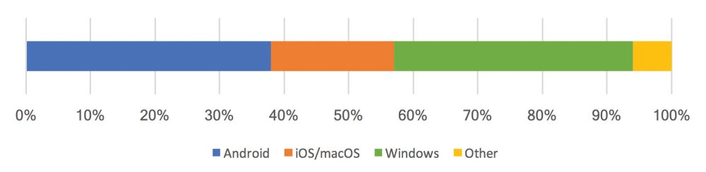
Worldwide operating system usage, according to StatCounter Global Stats (April 2017). Apple’s devices represent a small fraction of global usage, while Android and Windows dominate.
The best way to test how a font behaves is to set a sample text in the font and try it out on all devices that you target. Bad rendering is especially noticeable on thin weights.
For example, a font that renders well on macOS may appear fragile on Windows (see image below). It’s important to use real devices, because online browser-testing tools and virtual machines are often inaccurate (more on that later).
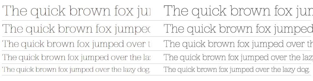
Jubilat Thin on Windows 7 (left) and macOS (right). Note that on macOS the text looks ‘heavier’ than on Windows 7.
If you don’t have your site’s content yet (tsk!), give Tim Brown’s Web Font Specimen a spin. It sets content at several text sizes and with different background colours. It’s no replacement for real content, but it’ll do in a pinch.
Sometimes you get lucky, and the font you have chosen is designed explicitly for screens: Hoefler & Co’s ScreenSmart, Monotype’s eText, and Font Bureau’s Reading Edge are examples of collections specifically designed with screens in mind and should look beautiful everywhere. Of course, it pays to double-check the text rendering, regardless of the origins of the font.
But exactly why does text look different from one browser to the next? To answer that question, we’re going to have to take a quick detour into the nitty gritty details of text rendering.
Rasterizing and antialiasing
The process of transforming font outlines into pixels is called rasterization. The operating system’s text-rendering engine places the outline (ie the shape) of each character at the desired font size on a pixel grid. Next, it colours all the pixels whose centre is inside the outline (see image below).
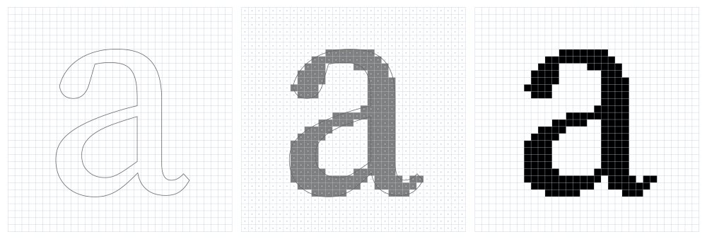
From Bézier curve to pixels. On the left is the outline of the character ‘a’. In the middle that outline is superimposed on a pixel grid; any pixel whose centre is inside the outline is turned on. On the right is the resulting rasterization.
In this example, a pixel is either on or off, no matter how much of the outline is present in the pixel. This approximation of mathematically perfect outlines is called aliasing; antialiasing attempts to mitigate the coarse staircase-like appearances caused by the limited resolution of screens.
The idea behind antialiasing is to figure out how much of the outline is present in each pixel and represent that with a greyscale value. In other words, if the outline covers 50 per cent of a pixel, it uses 50 per cent of black to colour that pixel. If the pixel is entirely within the outline, 100 per cent black is used, and so on. This leads to an antialiased rendering that reduces the aliasing (see image below). You’ll often see the term ‘greyscale antialiasing’ used to describe this effect.
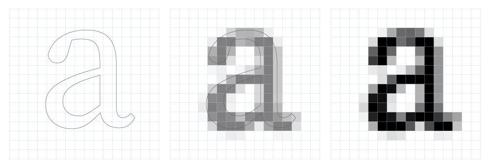
Antialiasing using greyscale values to represent the outline coverage of each pixel produces better results.
While antialiasing improves the quality of text rendering, it’s possible to improve the result further using subpixel antialiasing. Subpixel antialiasing makes use of the characteristics of screens to increase the resolution of rasterized text. Each pixel in a display is made up of three oblong subpixels: red, green, and blue (other configurations exist, but the same principles apply). The operating system can control these subpixels individually; subpixel antialiasing exploits that by applying the coverage calculation to each subpixel (see image below).
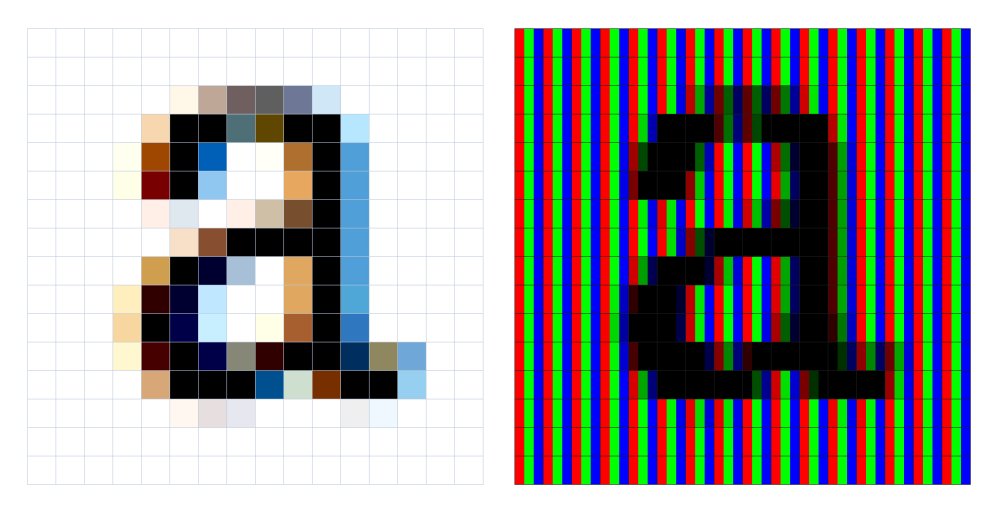
By targeting individual subpixels, subpixel antialiasing effectively increases the resolution of rendered text. The colours the naked eye perceives (left) are the result of setting individual coverage values for each subpixel (right); the subpixels for red, green, and blue combine to form a single perceptible colour.
The difference between these text-rendering options becomes evident when you start working at smaller text sizes. Without antialiasing, characters quickly lose their distinctive outlines. Greyscale antialiasing makes characters blurry but maintains their shape. Subpixel antialiasing renders sharp characters but also introduces some colour fringing around the character’s edges.
Antialiasing tips
You can change antialiasing settings through the non-standard -webkit-font-smoothing and -moz-osx-font-smoothing CSS properties. Unfortunately, many CSS frameworks and libraries use the antialiased and grayscale values to make the text appear lighter on macOS. However, most developers and designers don’t realise this disables subpixel antialiasing and makes text appear blurrier, thereby hurting legibility.
Changing someone else’s preferred text rendering to be less legible is very inconsiderate. If you must have lighter text, use a lighter weight instead of disabling subpixel rendering.
Text-rendering engines
Most operating systems use their own proprietary text-rendering engine, while others use the same open-source engine (though not necessarily with the same configuration). However, all of them support antialiasing and subpixel antialiasing but differ slightly in their implementation. In many operating systems, the choice of antialiasing method is user-selectable. On Windows, for example, subpixel antialiasing is called ClearType; on macOS, it is called LCD Font Smoothing.
There are currently four major text-rendering engines: the Graphics Device Interface (also known as GDI) and DirectWrite on Windows; Core Graphics on macOS and iOS; and the open-source FreeType on Linux, Chrome OS, and Android.
Generally speaking, a browser will use the text-rendering engine that’s native to the operating system it is running on. Chrome, for example, uses DirectWrite on Windows, Core Graphics on macOS, and FreeType on Android. Windows is unique in that it offers two text rendering engines: GDI and the newer DirectWrite.
All modern browsers use DirectWrite, so you don’t need to worry about GDI save for one exception: some browsers fall back on the inferior GDI rendering if the machine has no dedicated graphics hardware. Online browser-testing tools and virtual machines often do not have dedicated graphics hardware, so text-rendering on these tools is not accurate.
Ideally, all text is rendered using subpixel antialiasing because it creates the most legible text. Unfortunately, that is not always possible – for example, subpixel antialiasing is often disabled on devices that can be rotated, such as tablets and phones. When you turn the screen of these devices, the subpixels are no longer arranged in the pattern expected by the rasterizer and will cause subpixel antialiasing to look ugly.
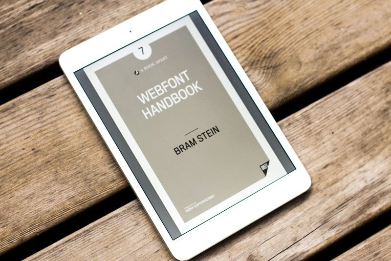
Further reading: from selection to optimisation, the Webfont Handbook shows you how webfonts can make the web a more visually diverse, efficient, and readable environment.
Browsers also disable subpixel antialiasing in similar situations, for example when text is rotated or animated. In this case, the rasterized text no longer matches the subpixel layout of the text’s original position and would need to be rasterized again. This is expensive, especially for animations, so most browsers fall back on greyscale antialiasing, which doesn’t suffer from the same problem and works in any orientation.
Some browsers – Chrome on macOS, for instance – also disable subpixel antialiasing on high-resolution screens to provide a more consistent user experience. Other browsers only enable subpixel antialiasing on small text, because minor changes in text rendering are less visible at larger sizes.
There are several other cases where browsers disable subpixel antialiasing. The rules browsers use to select the antialiasing method are constantly updated as new corner cases, and problems, are found. These frequent changes make it very hard to keep track of what is going on with your text rendering. What once used subpixel antialiasing may fall back to greyscale with the next browser update. The only way to know for sure how your text renders is to test on actual devices.
You’re probably used to testing your site in several browsers. Testing text rendering increases the amount of testing you need to do manifold. Not only do you need to check all combinations of operating systems and browsers, but also all common text rendering settings.
Some devices may be preconfigured to use greyscale antialiasing while others use a mix of greyscale and subpixel antialiasing. To make it even harder, it is not possible to use online-browser testing tools or virtual machines, because the text rendering often differs from that of real devices.
When testing, always use a representative sample of your content. A pattern library is ideally suited for testing type rendering because it includes a broad sample of your content: headers, body text, labels, background colours, and animation. Having examples of your content on a single page enables you to check all combinations of styles and background colours quickly.
Be on the lookout for text that is not legible or appears thin on some operating systems. If you find an issue, change to a different weight in the same font family, make the text darker, or pick a different typeface. Good luck.
This article was originally published in issue 301 of net, the world's best-selling magazine for web designers and developers. Buy issue 301 or subscribe to net.
Related articles:
-
The first visual identity for the Houses of Parliament was unveiled earlier this week. As with all political matters, the news, in particular the logo design (above), has been met with a divided reaction.
Created in collaboration between the House of Commons and the House of Lords with brand and digital design studio SomeOne, the new identity aims to make UK Parliament (as it's now referred to as a brand) fit for purpose on digital platforms.
As part of the identity, SomeOne created a wordmark, typefaces, website guidelines, icon suites, digital guidelines and responsive templates. Logos created for digital optimisation were also included, and it's here where the project's £50,000 budget has started to bite.
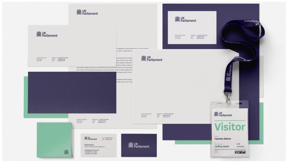
The new palette features high contrast shades including purples, greens, and whites
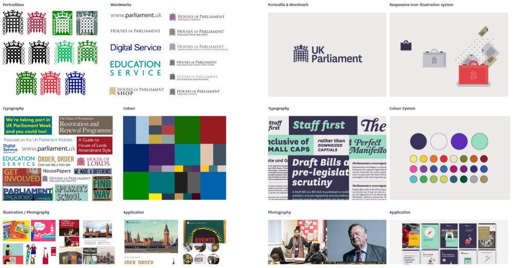
At first glance, the new logos appear remarkably similar. The main differences seem to be a tidying up of an existing portcullis design, which includes the removal of a few dots and a uniform shape applied to the chain links.
To onlookers eager to lay into government spending the apparently barely altered logo is a perfect target, especially when you factor in what looks like an exorbitant price tag.
However this subtle smartening up was at the heart of the new identity, rather than a complete overhaul. "Clarity, Simplicity and Efficiency all drive the new design work, so that anyone can get to the information they want, when they want and how they want it," explains SomeOne co-founder Simon Manchipp on the studio's site.
The new identity (on the right next to the old branding) provides long overdue uniformity
Furthermore, the new identity extends well beyond the fine tuning of a logo. With more people interacting with government services digitally, it was time for Parliament to make navigation easier across these channels. This is where the new responsive iconography and palette of purples, greens and whites come into play.
"Rather than repetitively stamping a single symbol on all communications, we’ve developed a more in-depth design system to accommodate any kind of application," says Cosmo Jameson, senior designer at SomeOne.
And with UK Parliament's new identity hosted and managed on Cloudlines, anyone designing a new communication can access the brand's principles.
New communications and icons have been made in the house style
Spending public money on design frequently comes under fire, especially if the changes are as understated as they are here. Only last year another governmental hot potato, the NHS, came under scrutiny when it launched a strict new set of brandling guidelines.
As far as rebrands go though, UK Parliament's is far from the most costly. We've already looked at expensive logos and what they teach us, and if we apply these lessons to the government's new identity you can see where the money went.
First of all, this identity has been years in the making, with consultations held throughout the entire process. Secondly, does it work? The success of a rebrand and a logo lies in how well at works as much as how good it looks. If the consistent identity makes it easier for users to access government services, we're inclined to give it a pass.
Only recently we've seen companies make minor changes to improve functionality. so why shouldn't politics follow suit? Take Ericsson, which tweaked its 'three sausages' logo ever so slightly in February so that it aligns with pixel grids better. This decision was made to promote simplicity and enhance productivity, which sounds like a manifesto pledge in itself.
So is the UK Parliament identity a successful design that's worth the money? Well, we've seen politicians claim worse things on expenses.
Related articles:
-
Dewan Chowdhury, founder of MalCrawler, talks at SAS about the risks that companies face when securing their industrial control systems and robotics.
-
Whether you’re a freelance creative pitching for work, or an ambitious designer looking to take the next step in your career, your business cards have the power to propel you to the next level.
- Also read: 10 steps to go freelance this year
Not only are they a key opportunity to leave a lasting impression with a prospective client, employer or collaborator, a cleverly designed and well-printed business card offers a unique opportunity to distinguish your brand from the competition. But where’s the best, easiest and fastest way to get them printed?
For talented freelance illustrator James Boast, the answer was moo.com. The digital print and design company not only offers a wide range of premium paper stock and printing options for your business cards and promotional print materials (plus the opportunity to print up to 50 different designs for no extra cost) – it’s also incredibly easy to use. And you can have your new business cards delivered the next day, too.
In the short video below, Boast demonstrates how easy it is to use moo.com to create stunning, tactile business cards in less than five minutes. From uploading your designs to choosing the right paper stock and special finishes, as well as how to get more from moo.com’s unique printing features, Blunt shares his pro tips and tricks for creating better business cards.
3 tips for printing better business cards
As you'll see in the video above, it's incredibly easy to quickly create memorable business cards using moo.com. Here are some of our favourite tips from illustrator James Boast…
01. Choose your premium paper stock in one click
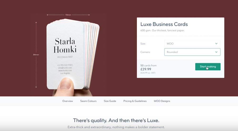
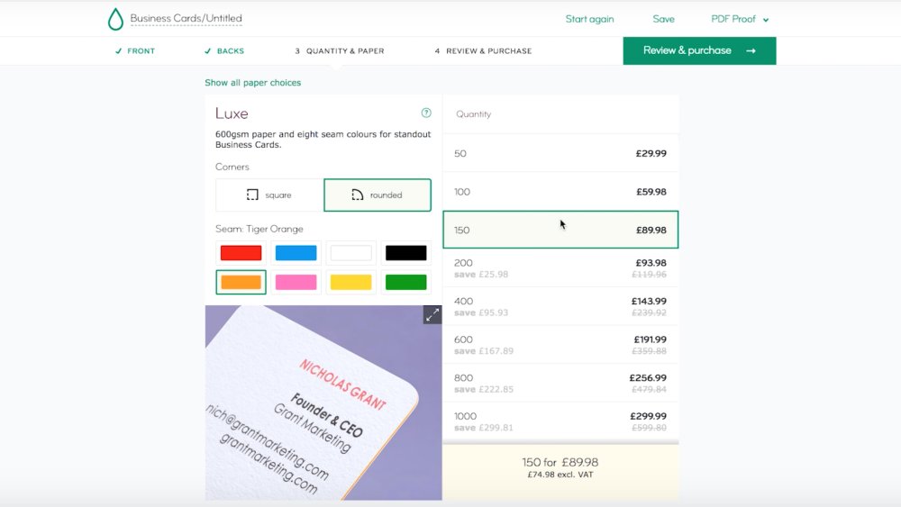
moo.com gives you the choice of four high-quality paper stocks: Original (350 GSM), Cotton (298 GSM), Super (400 GSM) and Luxe (600 GSM).
Selecting the option you want is as easy as clicking on your stock of choice. Then simply select the size you want from the drop-down menu, and choose whether you want square or rounded corners. If the price looks good, hit Start Making.
02. Print different designs with Printfinity
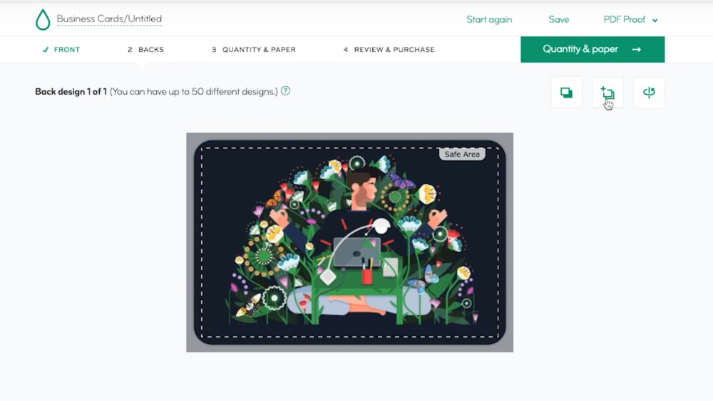
For no extra cost, moo.com lets you print up to 50 different images on the back of your business cards with its exclusive Printfinity feature. It’s a bit like having your portfolio in your pocket: you can select different pieces of work for different prospective clients or employers.
Alternatively, you can get creative with your designs and highlight different elements of your practice – after all, different projects require different skills.
To use Printfinity, all you have to do is choose your photos, illustrations or designs, and hit Upload until your pack is full. It’s that easy.
03. Personalise with subtle design choices
Before ordering your business cards, moo.com gives you the opportunity to further differentiate your cards. As well as confirming whether you want square or rounded corners, you can also choose whether you want to have a coloured seam.
Matching or contrasting the seam of your business cards with your existing colour palette is a fantastic way to add extra personality to your designs.
You'll find a host of fantastic tools on the MOO website for creating better business cards. Head over to moo.com to try them out for yourself.
Also read:
-
With spring on its way, we're rounding up some of the best tools to take your art outdoors. There are a load of cool new books that focus on nature drawing. We've had a look at titles that teach you how to draw birds, trees, plants and woodland animals (our pick of the bunch, however, is Tom Kidd's firey monograph on how to draw a dragon).
We've also picked out our favourite posh pencils: one brand that's earned a cult following among artists and writers and another that's been called the Rolls Royce of coloured pencils. Plus, we look at the coolest pencil sharpener you've ever seen. And, to keep them all in, a smart bag for 'urban creatives'. It looks much better than it sounds.
01. Drawing birds
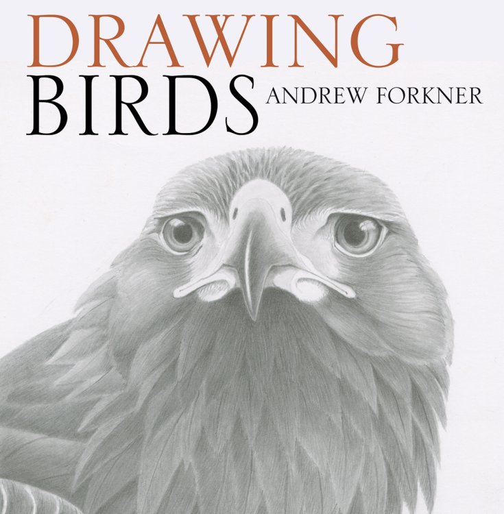
A recent study found watching birds is a good way to de-stress. Andrew Forkner's new book has step-by-step guides on how to capture them in your artwork, focusing on anatomy before working all the way up to birds in flight. Chapters are split into the various families of birds. Instead of colour, Forkner uses shapes, patterns, and shading to make his work pop.
02. Paint in 30 minutes: Trees & Woodlands
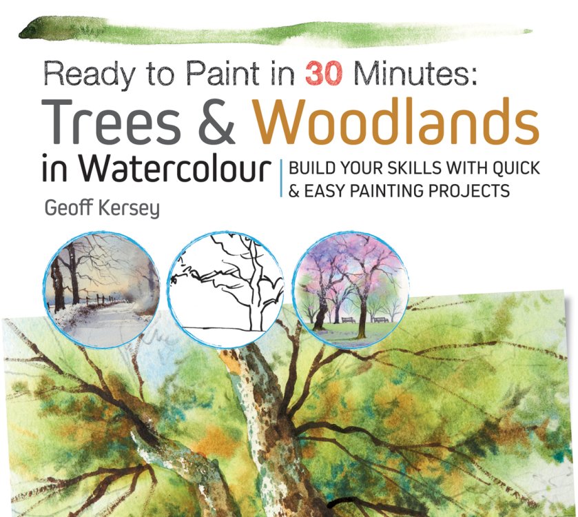
Geoff Kersey's new book is a good excuse to take your art outdoors. It offers artists – at any level – 30 exercises that teach how to paint woodlands and trees. Each exercises takes about 30 minutes and focuses on a specific subject or technique, including outline drawings on tracing paper for absolute beginner. The British watercolorist Geoff Kersey is your teacher.
03. How to draw woodland animals
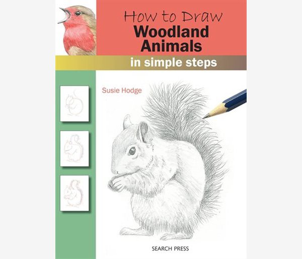
Woodland trees tend to be more willing subjects than woodland animals. In artist and art historian Susie Hodge's new book, step-by-step lessons teach you how to capture all kinds of creatures. She starts off explaining how to draw basic shapes, which she develops into everything from birds and rabbits to badgers and chipmunks. Good luck trying to get a chipmunk to sit for a portrait.
04. Botanical drawing
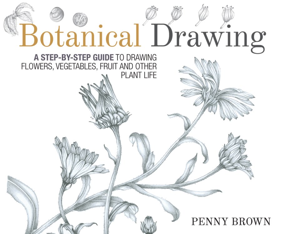
Spring is when indoor plants come back to life too, and Penny Brown's book shows you how to master the traditional art of botanical drawing. The book starts with simple line drawings and works up to more complex compositions. It also teaches botany for beginners and the history of botanical drawing. Finally, you can learn how to immortalise your favourite monstera with its very own portrait.
05. Fantastic dragons and how to draw them
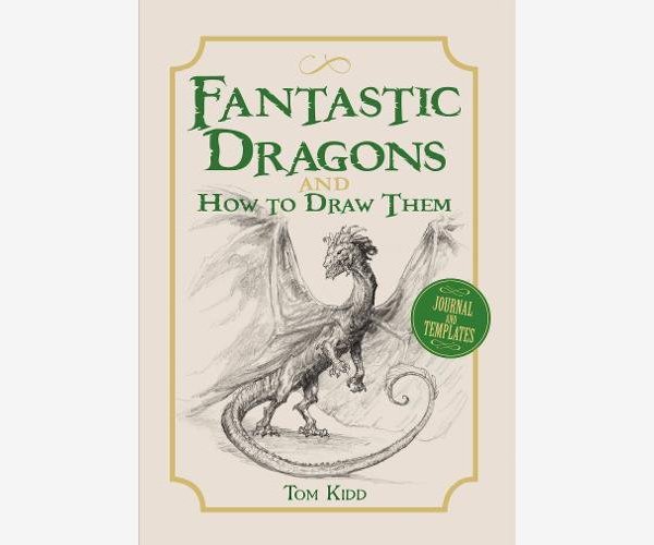
The dragon is not, strictly speaking, a traditional harbinger of spring, but nonetheless, Tom Kidd's new book is a must for fantasy artists. Kidd breaks down the basic outlines and features of dragon anatomy – scales, wings, talons, teeth – then book becomes a kind of sketchbook-journal in which you record the development of your dragon designs.
06. Leda premium sketchbook

Leda isn't as well known as some of its competitors, but the brand stakes a good claim for making the best sketchbook around. It comes with 160 tear and bleed-resistant pages of 120-gram paper, which will work well with pencil, pen, and ink, but also pastel, charcoal, and a light watercolour wash. It's stitch-thread bound too, so it lies flat when open.
07. Palomino Blackwing Pearl pencils

Blackwing is to pencils what Moleskine is to notebooks: they have a cult following. Famous fans include writer John Steinbeck, composer Leonard Bernstein, and Looney Tunes animator Chuck Jones. They're pretty much the best pencils ever made. The pearl is most recent edition to the range (read our review here). It's all an-rounder, perfect for sketching and laying down lines, but good for writing too.
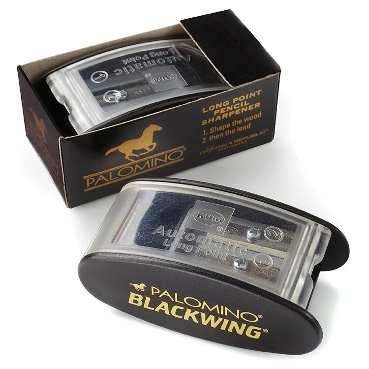
08. Blackwing long point sharpener
You might be reluctant to drop $11 (or £14) on a pencil sharpener. But, as with all the Blackwing stuff, this isn't your average bit of stationery. It has a "two-step sharpening process" (the first sharpens the pencil's wood case, the second the graphite core) and comes with two replacement blades. It gives noticeably longer, sharper point than most sharpeners. And, this being Blackwing, it looks dead cool.
09. Caran d'Ache Swisscolour pencils
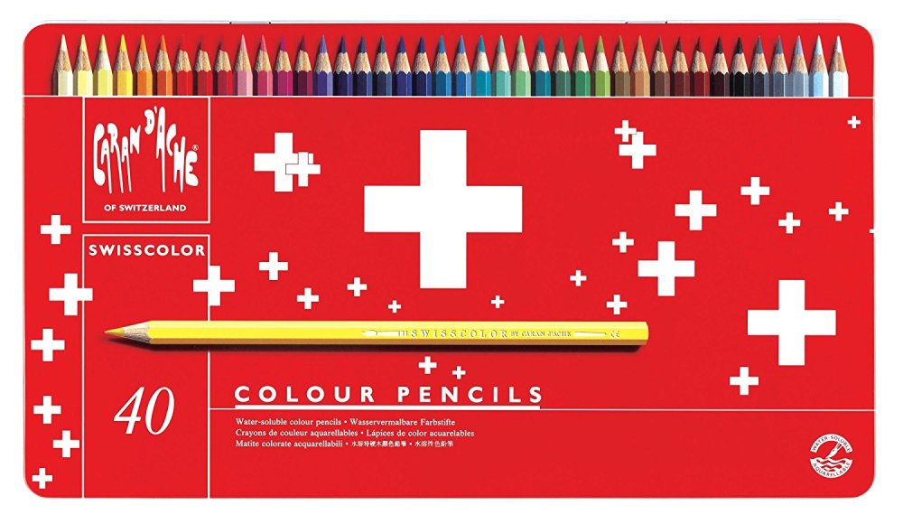
One reviewer called Caran d'Ache "the Rolls Royce of pencils." They usually carry a Rolls Royce price tag too, but this range is reasonably priced. You get 40 pencils in a mental tin, and they have a smooth feel and blend well. Materials come from responsible sources and everything's made the to Swiss brand's usually high standards.
10. Bellroy slim backpack

Bellroy makes smart, practical bags for the artists and designers. This 16-litre backpack has loads of nice features: padded laptop pocket, internal storage to keep your art supplies or gadgets safe and secure, and a two-panel construction that means there are no seams running down the sides and the rain can't damage anything inside. It can be expanded too. One of the nicest work bags around … in spite of the brand using the term "urban creative".
Read more:
-
Your content is going nowhere unless people can search for and find it, so content should be written with an understanding of factors such as SEO and aimed at the right audience groups. The steps below will highlight how to drive more traffic to your site, building a connection between your brand and your audience.
By the time you have finished reading this tutorial you will have a better understanding of how you can ultimately improve your rankings amongst the competition, boost your visibility and capitalise on the right audience through your content.
01. Get organised
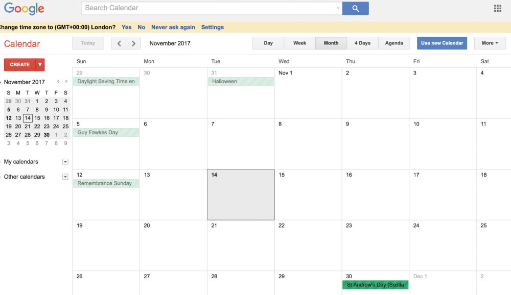
Google Calendar is a great place to start when looking to create an editorial plan.
Creating an editorial calendar enables you to prioritise your content tasks, getting into a cadence with your blog-publishing and social activity. More importantly, it keeps your audience engaged by preventing your content from stagnating or being repetitive.
Organisation is absolutely crucial for success, although your content plan won’t always be easy to stick to.
Start by setting up a calendar, then brainstorm ideas: what questions can you answer? What themes are relevant? How can you inspire?
Break down your content into social posts, blog posts, onsite copy, referrals, video and so on. And layer on top of this your promotion, since content rarely succeeds on its own, and plan your frequency: daily, weekly, monthly.
02. Buyer personas – understand who your audience is

Personas and user stories will help with content and, in turn, SEO.
The focus of your content should be aimed at the audience group that contributes to the success of your business. Content will therefore be different based upon where the user is along their journey.
A first-time visitor, for example, has no loyalty to the brand; hence the focus should be on inspirational content to convert – content and metas – and brand values to nurture.
Existing clients, meanwhile, have a different set of priorities and needs, so content needs to be served differently. Nurturing them, encouraging advocacy and facilitating the ability to upsell are the keys in driving both customer satisfaction and further sales.
03. Learn from the competition
Look at your competition and take inspiration from it.
By reviewing the top performing organic content around your targeted keywords, you can take advantage of what works and then replicate it. Understanding the competition’s focus on content and keyword terminology will also help you to close the gap between those terms you're not taking advantage of, and ultimately increase the amount of traffic coming to your own domain.
04. Make sure you follow the 70:20:10 content rule
Spend some time on Quora since it will highlight how people speak in their niche communities.
Google's 'hero, hub, hygiene' approach is based on three types of content and offers a useful framework for an effective content strategy. Here's how it works.
70 per cent of your content should be specific to your business vertical and services (hygiene) because your audience needs that information to convert. It’s your day-to-day, always-on messaging and includes industry news, reviews and offers.
20 per cent of your content should be inspirational (hub) so that your visitors share it. It aims to develop a shared passion between you and your audience, keeping them coming back for more. You can do that by creating unique content that exceeds your visitors’ expectations. Think of inspiring solutions, solving problems and answering the ‘what’, ‘why’ and ‘how’ of your business, and how it can best serve your visitors.
10 per cent of your content should be risky enough that it scares you a little (hero). It can attract enormous numbers of visitors, and you'll need to invest a lot of time and effort into it. This may be content related to the most important event or product launch of the year.
05. The content and SEO overlap
There is no point in creating content if no one can find it.
An easy way to ensure the success of your content marketing efforts and improve the search ranking of a particular post is to optimise the on-page elements by applying key SEO techniques.
None of your content is going anywhere unless people can search for it and find it, therefore content should be written with an understanding of SEO goals. This includes a healthy solid foundation, content on the website targeting the right keywords and relevancy within the metas, such as: title tags, headers, meta descriptions, image alts and a good URL structure.
With these working together you will be able to rank for the right keywords, with visitors that actively convert, since the success of each depends on the other.
06. Internal links and backlinks
Link building has always been key to climbing that Google rank.
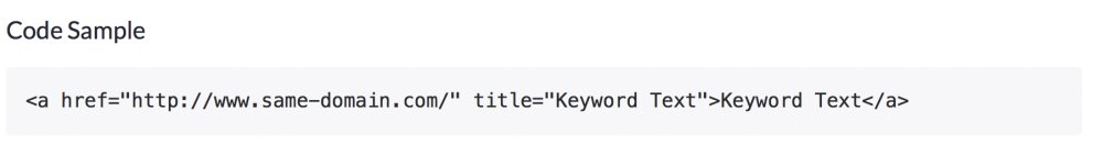
Internal links help search engines identify the site’s most important content, provide context and help your audience by directing them to the most relevant pages. Make the most of anchor text within your links, with variations of your target keywords to boost rankings.
The number of backlinks (incoming links, directed at your website) is another positive indicator to search, in particular websites that carry similar content (topical relevance). Start link-building both internally and externally with your best content to improve ranking.
07. The impact of a blog
Blog pages are a great opportunity to create keyword-rich content.
Incorporating a blog into a website can have a huge impact on the overall website’s search engine rankings. Not only does it add keyword-rich pages, but it also increases the potential for incoming links from high-quality websites, as well as advocacy from your audience as they share that content with their networks.
Aim for original and high quality content, since this will go a long way towards satisfying both the needs of your audience and the search engines.
And remember, given the number of distractions that your audience faces daily, strong headlines are key to encouraging their inspiration to click within a crowded marketplace.
You can achieve this by understanding your audience’s pain points. Solve their problems in a way that seems tailored to them, and give them both actionable insights and inspiration.
08. Remember visual content

Images and video are now a mainstay of any reputable website.
Visual content – such as images, video and infographics – can be a very powerful tool for any brand looking to communicate more effectively with its readers; especially since it can have a very positive impact on your brand’s reach, engagement and sales.
Start by splitting up body text with compelling imagery (include image Alts) to encourage your audience to finish reading and boost your search engine ranking. Infographics also help to collate content into compelling and easily intelligible visual displays.
Your site visitors will also expect you to offer video content. Show your personality as you connect with them while providing information that meets their needs. How-to videos, demonstrations and customer testimonials are all opportunities to consider.
09. Create a promotion plan
Social promotion is one way to reach audiences and engage with them.
Place a promotion plan behind your best content to improve audience engagement. This includes:
- Paid traffic that offers immediate results: Focus on the content synergy between advertising text, landing page copy and SEO metas. This will improve placement, by improving the quality score.
- Social media that offers great brand awareness: Review your brand guidelines, tone of voice, targeted demographic reach and audience needs and wants.
- Influencers who can share your content and increase your outreach to engaged communities: Understand where your audience is and let them know you exist.
10. Measuring the success of your content is crucial
Learn from your successes and failures with careful analysis.
Assess both the positive and negative metrics within Google Analytics, continually evaluating your content’s appearance in search and how users ultimately interact with it. Build on the positives; learn from the negatives.
This includes ‘soft’ metrics that are focused on measuring engagement, interaction and brand awareness. Look for bounce rates (high and low), time on page (high and low averages) and page views (in particular, redirection).
And ‘hard’ metrics, such as lead generation, shares, the number of people added to your list and sales impact. The aim is to continuously learn from each content creation, setting and reviewing goals for each, and remaining agile.
This article was originally published in issue 269 of creative web design magazine Web Designer. Buy issue 269 or subscribe to Web Designer.
Related articles:
-
Some people just know how to get things done. If you want to be that person, you need to grab the Project Management Professional Certification Training Bundle. You can get it on sale now for 98 per cent off the retail price.
Dive into the 10 in-depth courses of the Project Management Professional Certification Training Bundle. You'll quickly find everything you need to prove your skills as a project manager and to make sure you’re learning all the skills you need for this career. It will provide you with over 110 hours of knowledge about project management. This bundle is built to prepare you to manage your way to success regardless of your field, and will make sure you’re ready to prove your skills with industry-recognised certifications.
The Project Management Professional Certification Training Bundle is valued at $2,990 but you can save a whopping 98 per cent off the retail price right now. That means you pay just $49 (approx. £35) for a bundle that will help you climb the ladder in the career you want, so grab it today.
About Creative Bloq deals
This great deal comes courtesy of the Creative Bloq Deals store – a creative marketplace that's dedicated to ensuring you save money on the items that improve your design life.
We all like a special offer or two, particularly with creative tools and design assets often being eye-wateringly expensive. That's why the Creative Bloq Deals store is committed to bringing you useful deals, freebies and giveaways on design assets (logos, templates, icons, fonts, vectors and more), tutorials, e-learning, inspirational items, hardware and more.
Every day of the working week we feature a new offer, freebie or contest – if you miss one, you can easily find past deals posts on the Deals Staff author page or Offer tag page. Plus, you can get in touch with any feedback at:deals@creativebloq.com.
Related articles:
-
This article was originally published in March 2017.
During my time as a graphic designer, I've experienced nearly everything – short of physical violence – that working life can throw at you: recessions, legal disputes, defaulting clients, and of course, the thrill that comes with completing a successful project.
But two events – both of which turned the practice of graphic design on its head – stand out as life changing. The first was the arrival of the Macintosh computer. For all practising designers at the time, computerisation necessitated an extensive rethink of the craft: no more mechanical artwork, no more paste-up, no more typesetters, no more expensive retouchers.
Many of the tasks previously done by repro houses were taken over by designers sitting in front of computer screens. It was the beginning of a new age of digital self-reliance and a period of massive reorientation.
The second event was the arrival of the internet. Here was a new way of thinking about, and making design. Suddenly, designers no longer had complete control over how their work was received. The inability to control browser use, screen ratios and fonts had a decisive impact and old rules such as the number of characters per line length rule became redundant.
Even the users themselves could mess with the appearance in ways unthinkable to designers trained in print design, where layouts were fixed once they left the designer's hand.
These two events threatened to shrink the role of the designer, but the opposite happened. There are now more graphic designers and students than ever before. Design is a global industry embedded in, and inseparable from, business and culture. For many, graphic design is as much a lifestyle choice as a career choice. We do it because we love it.
The rise of automation
If design and designers can be said to have benefited from these two shocks in the long run, there are concerns that the craft and the profession might not survive quite so well. Is design about to meet its Uber moment? Is AI about to take on the role of the designer? Is the surge towards a fully automated world about to engulf design?
It might seem that automating the design process is impossible. You might assume that the creative imagination is the least likely arena to be taken over by machines, that bots are for routine production, not conceptual thinking. In reality, the process is already underway.
"It might seem that automating the design process is impossible... In reality, the process is already underway"
Social media has usurped many of the roles previously done by designers. You can start a business with a Facebook page (or as one expert calls them "Facebook pages … the new small-business homepage"). For many, access to a Twitter or Instagram account is all the design they need.
The automation of countless realms of everyday life is already at an advanced level: entire factories are operated by robots; legal contracts and stock market trading are routinely done by bots; automated warehouses, ATMs, and user operated supermarket tills mean fewer jobs in industries once regarded as high volume employers; driverless vehicles signal the end for the millions of people who drive for a living. Why should design be any different?
Robots are probably going to take your job. Deal with it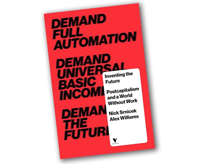
In the book, Inventing the Future, Nick Srnicek and Alex Williams state that: "anything from 47 to 80 per cent of jobs are likely to be automatable in the next two decades." They also note that the "roboticisation of services is now gathering steam, with over 150,000 professional service robots sold in the past 15 years. Under particular threat have been routine jobs – jobs that can be codified into a series of steps."
The demise of web design
Surely this lets design off the hook? We can't expect machines to make the irrational, gravity-defying leaps of imagination that designers make, can we? What about the designer's ability to capitalise on accidents and unforeseen coincidences? Surely this sort of cognition is beyond the bot?
Not so. We live under the dictum that anything that can be automated will be automated. And nowhere in the design world is this idea more advanced than in web design. In a post titled Why Web Design is Dead, on the website UX Magazine, designer Sergio Nouvel notes the following.
"Most of the content you see on the web today is run by some framework or service – WordPress, Blogger, Drupal, you name it. Frameworks provide you a foundation and shortcuts so you spend less time struggling with the creation of a website, and more time creating content. As a consequence of the ubiquity of these frameworks, a world of free and paid templates lets you start with a professional-looking design in minutes. Why hire a web designer if you can achieve a fairly acceptable design for a fraction of the cost using a template?"
The Grid, a San Francisco and Berlin-based startup, was the first to announce that it has created a website builder that uses artificial intelligence. It enables users to upload images and text or make use of its library of colour combinations and images, and then, using AI, it performs all the key design functions: positioning of images, placement of text, selecting colours and sculpting a unique, customised website. The Grid says it doesn't use templates, but 'layout systems', which it claims offers greater flexibility.
With The Grid, if you don't like what you see, you hit the Redesign button and in seconds a different layout appears. The Grid's promotional video gives the impression of effortless, nearly instant success. It's a seductive pitch. But not everyone is impressed.
Various webinars offer a less convincing glimpse into The Grid's AI approach to web design. Watching these critical takedowns, I was reminded of the early days of DTP design – gap-toothed typography and bitmapped images. But the painful DTP birthing phase didn't last long. Designers mastered the software, the software improved, and so did computing power. You wouldn't lose money betting on AI websites becoming much better in the future.
A grit-free process
It's easy to see why clients would be attracted to this grit-free process. There's no more time spent listening to pesky designers defending their design decisions, no more waiting around for new designs to arrive. And here's the clincher: no more redesign fees. Instead, clients inhabit a fragrant world of endless iteration and seemingly limitless choice.
The Grid is not alone in its quest. In September 2016, the website Tech Crunch reported that Canva, a design platform for web and mobile, had announced a new infusion of $15 million in funding and a doubling of its valuation in 12 months. This added capital was reported to have brought Canva's valuation up to a whopping $345 million.
What makes Canva so attractive to the guys with the money is the fact that it can be used by non-designers. Canva claims it only takes 23 seconds to become a proficient user of its software. 10 million people are allegedly using it to design business cards, posters, presentations, and graphics for social media.
Looking at the formulaic design featured on the site, it's hard to take seriously claims that 'anyone can become a designer' with Canva. It's easy to laugh at some of the work these sites post as examples – most of it looks as if it has been designed by someone on autopilot. But will we be mocking in five years' time? When we look at what is happening in AI, it seems foolish to dismiss attempts to automate design.
AI-driven design
When I talk to designers about the likelihood of AI taking over the tasks of designers, I'm met with scepticism. But this strikes me as short-sighted. In a detailed account of Google's work in AI, published in the New York Times Magazine, the journalist Gideon Lewis-Kraus writes about the company's use of artificial intelligence to transform Google Translate. Anyone who has used the translation service will know that its results are hit and miss, always require correction, and are rarely idiomatically correct.
All that is changing. In its new AI-driven version, Google Translate is producing astonishing results. Developed by the Google Brain team, 'artificial neural networks' (much like those in our skulls) are offering an alternative to traditional computer programming and represent a move towards self-learning machines. Using these networks, robots can then acquaint themselves with the world via trial and error in the same way that children do, giving machines "something like human flexibility."
Lewis-Kraus reminds us of Alan Turing's famous test for an artificial general intelligence: "A computer that could, over the course of five minutes of text exchange, successfully deceive a real human interlocutor. Once a machine can translate fluently between two natural languages, the foundation has been laid for a machine that might one day 'understand' human language well enough to engage in plausible conversation."
Google Translate has been transformed by AI
If Google's new translation service is close to fulfilling Turing's criterion, then it's not much of a stretch to imagine AI tackling more sophisticated design problems than shifting elements around on a webpage.
Most of the everyday design we encounter can be broken down into a simple set of principles that can be codified, and it seems highly probable that a machine can learn the rules of typography, the golden ratio and the rule of three. And it's no gamble to assume that cost-culling businesses will latch onto the money saving benefits of AI design.
Adapt to survive
What should designers do? AI-driven design already has the potential to remove some, or most of the production based tasks that designers do. Need 100 web banners for a global ad campaign, all with different information and numerous different languages? No problem. Robots capable of handling such routine tasks will result in fewer design production people.
But will the sharp end of design be affected? Eventually, yes, and just as human beings have learned to do since the introduction of industrialisation, we must adapt. It's my belief that designers are well equipped to do this. Teaching flexibility and a willingness to learn may be the biggest challenge facing the world's design schools.
In the information age, we may be looking at a world without paid work
Of course, this doesn't only apply to design. In the information age, we may be looking at a world without paid work. This takes us into the political realm, and subjects that governments are avoiding. It poses questions such as adopting a basic income, and the relearning that will be needed when the post-industrial world is replaced by one of unlimited leisure. These topics are discussed in academia and future-gazing think tanks, but we all need to be thinking about them sooner rather than later.
Halfway through writing this, I had a sudden, sobering glimpse into a machine-driven world. My five-year-old iMac died. The screen went black, none of the usual remedies helped and it was Christmas, so there was no chance of emergency repairs. It was a personal mini-disaster. But this is what happens to machines: they break. Perhaps their fallibility is the only thing between us and an AI future.
This article originally appeared in Computer Arts issue 263; buy it here!
Related articles:
-
There are constantly new and unique developments in the fast-moving CG industry. With software updates arriving all the time and fresh techniques to hone, it’s important to stay on top of your game.
As head of motion graphics at Escape Studios, and an independent director and motion designer, I have more than 15 years of experience working on advertising, films, TV, video games and multimedia.
Here, I've pulled together some top tips to offer advice on how to really hone your motion graphic skills, and take them to the next level.
01. Don't be afraid to make mistakes
The creative process is all about trial and error. It’s important to brainstorm your ideas and sketch them out on paper to really work through each element.
Breaking things down and perfecting your skills will enable you to really see what might need changing, ultimately speeding up the process. It will also help you save time working on it in later with the software.
02. It's not just about one set of skills
This may be obvious but it’s really important: throughout your motion graphic work you will need to have a strong knowledge of graphic design and as much knowledge of filmmaking as you can get. Arming yourself with this knowledge will ensure you are ready for any challenge that may come through.
03. Become an expert in typography
Blay created the title sequence templates for the final Hobbit film – in 15 different languages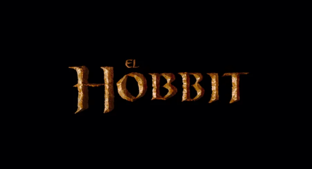
A motion graphics artist should have a strong understanding of typography and typography terms. Type is widely used as a form across motion graphics, and in some cases it may be that this is all that’s used to convey the product to the audience. So it’s important to understand what the audience will engage with, ensuring that the graphic stays with them. Thankfully, there are plenty of typography tutorials to help you get started.
04. Experiment with 3D
As well as 2D, it is now more important than ever that artists really build their knowledge in 3D and learn how this can be used in the design process. With the industry constantly changing, it's key to offer a wide range of options and ensure you can constantly deliver new and exciting work.
05. Inspiration is everywhere
Remember to focus time on exploring new trends and techniques to draw inspiration from; know the industry and understand what game and film studios are delivering. Digest other media, books, films and TV to draw on trends in order to ensure your work stays at the top of the game.
This article was originally published in 3D World magazine issue 216. Buy it here.
Related articles:
-
Security risk in extensible text editors enable hackers to abuse plugins and escalate privileges.
-
Threatpost's Tom Spring sits down with Flashpoint and Akamai to discuss how the two companies worked together to address the 2016 Mirai DDoS attacks.
-
In the web industry, things change quickly. As technologies progress and processes change, new job roles pop up. The current hot role is user experience design, but is that job title set to disappear as quickly as it emerged? Here, we look at the brand new job specialisms set to rise in popularity and shape the way we approach web design and development in the future.
01. Full-stack designer
Similar to full-stack web developers who code for both front- and backend technologies, full-stack designers will have skills in multiple design disciplines. The emergence of this role is already motivated by employers needing to become more efficient with their budgets, whether it’s to be more price competitive or deal with budget cuts (as in public sector organisations).
Full-stack designers will offer better value to employers. Being able to tackle several specialisms means there's no need to employ a different person for each role, which inn turn means a more efficient workflow. There's less time wasted waiting around for other team members to complete a task; a full-stack designer can simply switch between roles depending on what's required at the time.
02. Scientific designer
Turning data into something understandable is a particular skill
They say knowledge is power – whether that’s for PR communications, making business decisions or helping people live a healthy lifestyle. With the rise of digital technology and the internet we can now capture more data than ever before.
The problem with data is that it’s just data. While some have no problem making sense of data through statistical analysis techniques, the average person can only see nonsense. This is where the role of scientific designer emerges: to turn data into knowledge through easy-to-understand visuals or infographics.
03. Intelligent content author

Our devices are getting more and more intelligent
The opposite of a scientific designer, an intelligent content author will produce content that either captures or reacts to data. AI is set to change the face of UX design, and intelligent authors are the ones who'll be tasked with helping content adapt itself to what it knows about users.
Data will come from multiple sources, including popular digital assistant technologies such as Alexa, Siri and Google Assistant. Design content will be hosted either independently or as part of an external platform – for example the chatbots for Facebook’s Messenger service. For more on this phenomenon, take a look at our article on UX design trends for 2018.
04. Instructional designer
Instructional design is a combination of graphic and UX design, but with a primary focus on delivering content for learning. This type of design can be applied to all forms of digital media, from web pages to ebooks and apps. The obvious role for instructional designers is in supporting education organisations such as universities, who may want to create custom content for their courses. Additional demand for instructional design is likely to emerge as more businesses embrace technology – for example, with self-service supermarket checkouts – hence needing content to instruct their customers.
05. AR/VR designer

Affordable headsets have brought VR into the mainstream
The emergence of smartphones and the availability of affordable AR/VR headsets has opened up these technologies into the mainstream. Programmes for marketing, education and other activities have an opportunity to benefit from this medium through providing memorable experiences that engage their audiences. But a medium is only useful if content is available to grow its potential – hence the role of AR/VR design as a specific design specialism.
This article was originally published in creative web design magazine Web Designer. Buy issue 270 or subscribe.
Related articles:
-
“Good artists copy, great artists steal.” It’s a quote that's often attributed to Pablo Picasso, and has famously inspired the likes of Steve Jobs. But while it’s a memorable zinger, the line touches on a prevalent issue in the design industry: where do we draw the line between a coincidence, or imitation, and outright plagiarism?
Plagiarism isn’t a new problem for designers, but already this year we've seen a new spate of high profile brands become tagged as creative copycats.
With even the most obscure source material being dredged up on social media, and rightfully defended if a new piece of work emerges that bears more than a passing resemblance, there's more pressure than ever for creatives and brands to play fair.
Do your research
More than a coincidence?
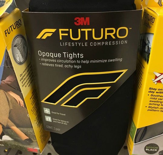
One of the most notable and bizarre incidents of uncanny design similarity occurred in January, when a keen-eyed Reddit user noticed a resemblance between the new Formula 1 logo and a pack of 3M compression tights. Both feature an 'F' logo with a comparable curve, but is this an example of big brand plagiarism or something more innocent?
The story spread like wildfire at the start of the year, with industry-leading names including Johnson Banks' own Michael Johnson weighing in to discuss the perils of trademarking logos. We caught up with Johnson to hear how coincidences can arise, despite a designer’s best intentions.
“It’s very easy to have a knee-jerk reaction to an example like this,” says Johnson of the brouhaha between Formula 1 and 3M. “Yes, they look similar. Yes, they both use a lined ‘F’, both are italic. But, technically speaking, even though 3M filed their registration early last year, their registration itself is buried very deep in the US trademarking machinery – and is for medical clothing. It only seems to exist in one picture of some point of sale, and isn’t even on 3M’s website.”
Start off trying to do something new, rather than something that seems familiar
Michael Johnson“Now, Wieden + Kennedy [the independent advertising agency behind the Formula 1 rebrand] tell me that they did thorough trademark checks in all their relevant categories – but imagine for a moment the enormity of that task."
"There are 45 different classes of goods and services, and 29 image classifications – and that’s just in Europe. The US system is slightly different, and in some countries registration is still done on paper and fax! So, factor all that in, and it’s easy to see how one single application for medical clothing slipped past the eyes of the checkers.”
Johnson adds that a delay between registrations being applied for and granted also allows for clashes to be spotted.
Research, then, is plays an important part in the design process as it prevents headaches further down the line, but where do designers start?
Five-pronged approach
When it comes to checking whether or not a potential piece of branding has been done before, Johnson has a five-pronged approach up his sleeve.
- Try to do something new, rather than something that seems familiar.
- Scour logo and symbol books for designs that have been done before, and try to mentally ‘log’ them (but don’t copy them).
- Do basic logo searches online – but bear in mind these are not definitive and only give you a broad indication.
- Train yourself to use trademark databases that are publicly available. (Watch out, they're tough to use).
- Or, employ a professional.
Damage control
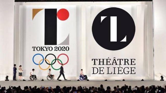
The Tokyo 2020 logo was scrapped and redesigned
Sometimes, despite a designer’s best efforts and intentions, a design can be released that appears similar, if not practically identical, to another piece of creative work. Cue a barrage of social media outrage.
Practically speaking though, what options to designers and studios have? Should you lick their wounds and start all over again, or do both parties enter stalemate and wait for the other to budge?
“You have to look at this from two directions,” says Johnson. “Obviously, from a creative point of view, it’s embarrassing if a design looks uncannily similar to something that already exists. But – if they genuinely hadn’t seen it – and the original wasn’t registered, we then get into muddy water.”
“As far as I understand, you have a genuine copyright claim if your design has been seen and used for seven years, and then you have a degree of legal ‘claim’ if something appears that’s too similar,” Johnson adds.
“But if your design has lain buried in a portfolio website, unseen really by anyone but your mum and your auntie, it gets much harder.”
You have a genuine copyright claim if your design has been seen and used for seven years
Michael JohnsonA notable example of the difficulties two designs have run into trouble due to their similarity is the fiasco surrounding the Tokyo Olympics logo. Unveiled in 2015, the design of a stylised, seriffed letter ‘T’ was binned after a plagiarism row when Belgian designer Olivier Debie flagged up its similarity to his logo for Theatre De Liege.
As with the Formula 1 logo, the internet descended into a witch-hunt as people decided whether or not the two designs were more than just a coincidence.
“Now, ask yourself,” says Johnson, “how was a designer in Japan to have known of a symbol in Belgium, that was only two years old, in a different sector, that probably wasn’t registered anyway? That would have meant doing a worldwide symbol search for every ’T’ logo ever designed, in every class and category?”
“As it happens, the proposed design was withdrawn and Debie has dropped his lawsuit, doubtless realising that he was on sticky, and expensive, legal ground. He may feel that his was a moral victory though.”
Keep your cool
Social media shed light on these startling similarities
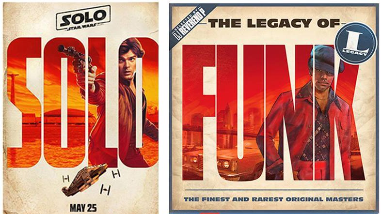
Looking at the situation from a different angle, what’s the best course of action to take if a piece of design for, say, a huge movie franchise, is released and it looks like it’s borrowed a lot of elements from a piece of work you did years ago? That’s exactly what happened earlier this year when the typographic posters for Solo: A Star Wars Story were unveiled.
Initially designers were quick to praise the posters, which were an original spin on an established franchise. It wasn’t long though until designer Hachim Bahous took to Facebook to point out the similarities between the posters and a series of album covers he created for Sony Music France in 2015.
It’s an understandable course of action to take in the heat of the moment, but given that the internet makes it blindingly fast to share your outrage, you might want to think twice before posting a status update.
Posting ‘your design’ into the comment string of a blog doesn’t achieve anything
Michael Johnson“Be careful before you plaster your ‘original’ all over social media,” warns Johnson. “Posting ‘your design’ into the comment string of a blog doesn’t achieve anything. First of all – is your design registered and trademarked? If so, is it trademarked in the same categories? If not, this will be an issue.”
“If it isn’t trademarked, you may be able to make an ‘infringement of copyright’ claim, but the design has to be either seven years old, or have been done for a world-famous company. Failing all of this, you could try to simply embarrass those you feel have ripped you off – but you will end up coming across as essentially naive and possibly a bit desperate.”
When to take action
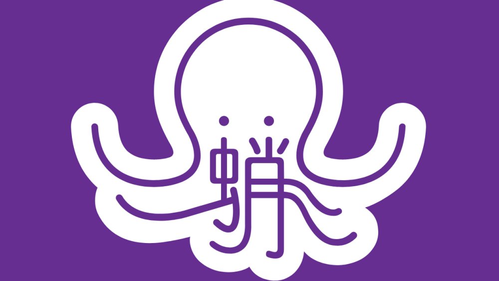
Johnson Banks encountered a design that resembled their Mandagrams project
One of the biggest difficulties with plagiarism is knowing when to take legal action. It’s a dilemma that affects everyone from small designers to the biggest studios, and it’s made all the worse by the blurred boundary between what’s merely similar and what’s outright theft.
Even a studio like Johnson Banks can struggle to know how to proceed in the face of imitation. “When we did our ‘Mandagrams’ research project in 2009/2010, we took certain Mandarin characters and expressed their pictogrammic roots,” Johnson explains.
“The work was shared online, and was part of an exhibition in Shanghai – so it was ‘seen’ but possibly not outside a design and education audience. We didn’t think to register the design – but two years later, ‘Chineasy’ launched with essentially the same idea.”
“Did they know of our work? Almost certainly. Do they answer our emails/tweets? No. Is it worth us making a legal claim? Well, it would rest on us being able to prove that our idea was unique, and had been ubiquitous for years – both tricky to argue, and very expensive.”
Trademark registration seems to beats copyright
Michael JohnsonTo compound the issue, Johnson adds that there is a huge amount of disinformation around the whole topic of plagiarism. “Designers of all ages don’t really realise the issues faced in this area,” he says.
“Yes, it’s annoying when something comes up that seems to have ripped you off – but take care before you start any form of legal action. I think it all comes down to the fact that, whilst ‘copyright’ does lie with whoever has created a particular logo, trademark registration seems to beats copyright.”
“The two big lessons for all of us are that, one: you should start off trying to design something that hasn’t been done before – it’s much easier to protect. And two: however great you think that logo is, there’s a chance that it’s been done before.”
“For our big identity projects, once we're down to our final two or three favoured designs, we’ll always recommend doing trademark searches at that stage – prior to final decisions. Yes, it might knock out a favourite. But better to know early than late, don’t you think?”
Related articles:
-
We all have dreams and goals, but what’s stopping you from achieving them? Well, for many people, quite a lot actually. the mortgage. Self-doubt. Low energy. The seeming unavailability of hours in a day. The demands of children, or parents. Lack of skills or experience. Feeling that you’re too old, or too young.
But while these are all genuine, real-world issues, they shouldn’t be the death knell for your creative ambitions. Here, we’ll walk you through some of the most common challenges in pursuing your dreams, suggest ways to overcome them, and hear from creatives who’ve done just that.
Challenge 01: Finding the time
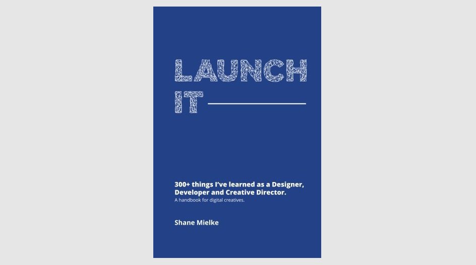
In his book Launch It, Shane Mielke says your time isn’t as limited as you think.
Let’s deal with the most common issue first: finding the time. Whenever you want to achieve something outside your main working hours, the clock always seems to be against you. Between the office, your commute and daily household life, there never seems to be a spare minute.
Are things that bad, though? Shane Mielke, creative director and author of Launch It – a book of career advice for creatives – suggests your time might not be as limited as you think.
“Take an honest look at your day,” he advises. “Find things you might be wasting time on that are less important than your goal, or that you could be doing more efficiently. Things like social media, video games, commuting and inefficient work habits can all suck bits of time from our lives. If you can free up 30 minutes every day, that adds up to 180 plus hours in a year. Excuses are just excuses.”
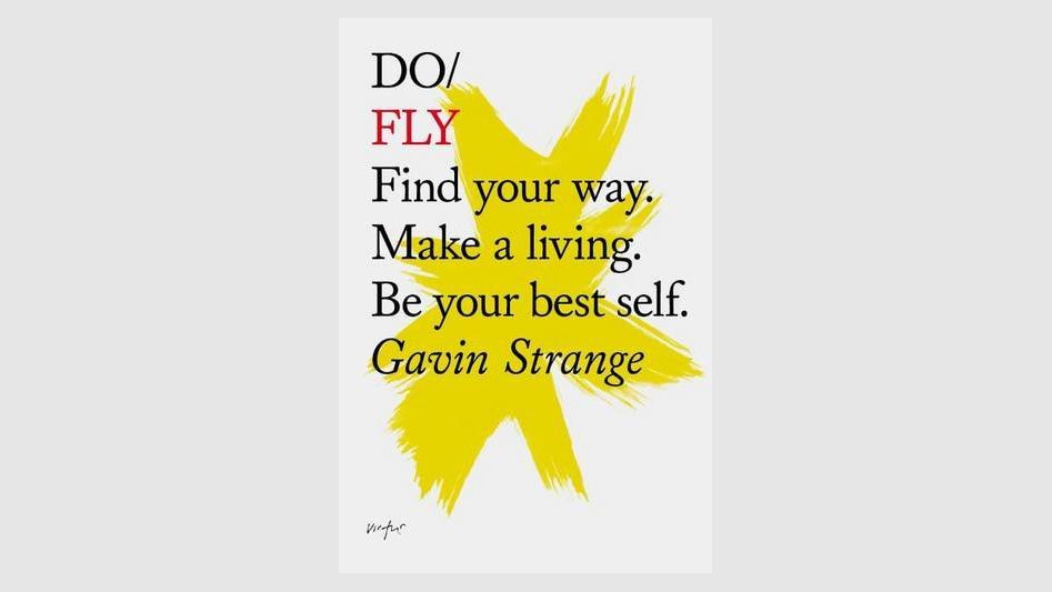
In Do Fly, Gavin Strange explains that it’s all about create good habits
Gavin Strange, who works at Aardman in Bristol by day and pursues multiple fascinating side projects by night, offers an example of how that might look in practice. “For me, I find a routine that I try and stick to during the weekdays,” he explains.
“I finish work at 6pm and then come home, eat dinner with my wife, watch a 30-minute TV episode – anything longer eats into the night too much – and then get cracking on ‘round two’, as I call it. Sometimes, when things get really busy, I get up an hour early before work to squeeze in extra passion projects, or get cracking on my lunch hour.”
That might sound like a tough regime, But Strange – whose self-published book Do Fly serves as a motivational tract for creatives – sees it more as a matter of creating good habits. “It’s about finding the right pattern for you, or adapting how you already work,” he explains. “There’s no right or wrong way to do it. The hardest part is starting, but once you’ve got a tiny bit of momentum, it gets better and better.”
Challenge 02: Finding the energy
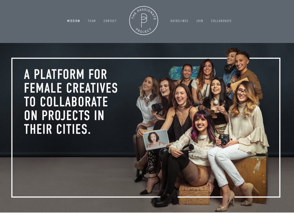
Ariana DeLuca finds the energy to reach her goals from the passion that she has about her projects.
But what if you do manage to eke out some extra hours, only to find you don’t have sufficient energy to use them productively?
“I think the amount of energy you have – or you think you have – relates to the amount of passion you have invested in your goals,” says Ariana DeLuca, a New York-based art director.
“This is why I called my side project The Passionate Project, because making it was like falling in love. I was so excited, I had great energy, I had butterflies. I was getting home from work and I was staying up till 3am. To get on the computer and create this, and know I was doing something I absolutely loved, gave me that extra shot of energy.”
Carolyn Porter, a graphic designer from Minnesota, tells a similar tale. Her love of old-time handwriting propelled her to create her own font, which mimicked the script of a real-life wartime letter.
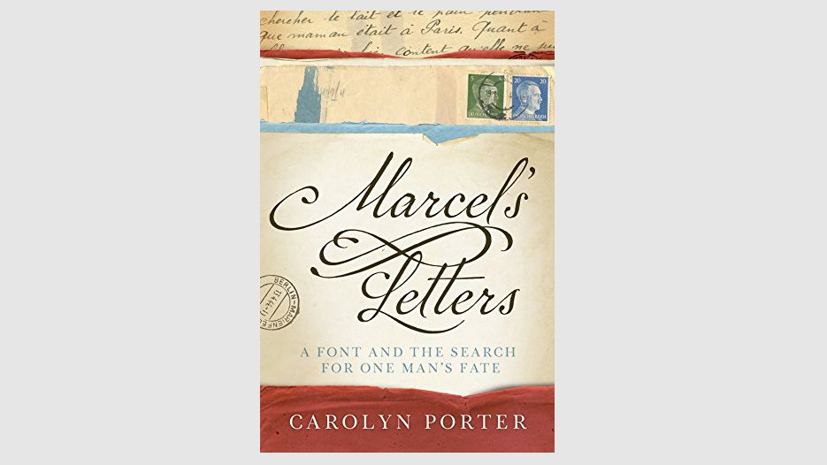
Carolyn Porter, author of Marcel's Letters, advocates tenacity as a tool to find creative energy.
That project subsequently spun into a book, Marcel’s Letters: A Font And The Search for One Man’s Fate, which she based on the research she’d done into the letter’s original author. “I think if you find a project that you’re passionate about, you just have to be relentless and tenacious about bringing that project to life,” says Porter.
“It may not be fast, it’s not going to be easy. But it’s ultimately worth it, and you just need to be tenacious.”
Challenge 03: Life getting in the way
All this can be easier said than done, of course, as life has a habit of getting in the way. A child or family member gets sick. The roof starts leaking. You’re handed a huge project at work and have to work later hours than usual.
The solution? Accept that life is not perfect, sure… but don’t give up, and try to find new ways to hang on to your goals.
"Sometimes life or other projects are more important,” says Mielke. “In life, you have to go where the fires are at. But that doesn’t mean you can’t still play mental Tetris with, say, the logistics of a side project, in those moments of the day that don’t have your complete attention: when you’re working out, in the bathroom, on your commute. The organisation and planning of a project or goal is the foundation and support of the physical action of the idea."
A motivational quote from Shane Mielke’s Launch It experience
And when things get sticky, Strange stresses one key word: positivity. “Just approaching everything you do with a positive mind state can work wonders,” he enthuses.
“It presents obstacles as opportunities, which helps immensely when it’s 1.30am and you’re not sure if you can succeed. You need all these little boosts to help you through all of your creative endeavours.”
Challenge 04: Finding the money
Sometimes, your dreams don’t just demand your time and energy; they need a bit of seed money too. You might need some cash, for example, to pay for that course, print your own book or magazine, or to get you through the first few months of going freelance.
The most obvious approach is to start watching the pennies and save up a nest egg. That’s not a particularly fun prospect, but make a few lifestyle sacrifices and keep a careful eye on your budget, and it should be achievable. Plus of course, if you’re foregoing that nice bottle of wine or subscription to Sky, it’s only going to help you find that extra time you need to pursue your creative goals.
But what if you’re impatient to get started right now? That shouldn’t be a problem, says Mielke, it’s just a case of which part of your plan you get started on. “Google is free, and so research and planning costs you nothing other than time,” he points out. “So switch gears to a part of your plan that might be more organisational and can be done during free time at night or on weekends.
“For example, if you’re wanting to self-publish a book about your favourite design topic, there’s nothing stopping you from researching how to get your book on Amazon, or making a list of possible printers who might print your physical book.”
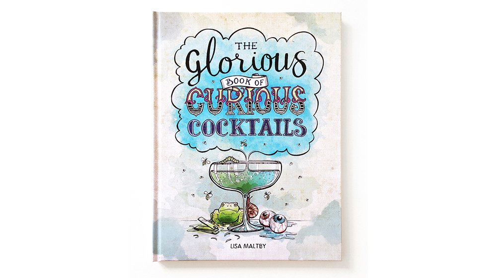
Lisa Maltby funded her children's book via Kickstarter, but it was "quite a challenge".
Of course, saving is not the only solution to money issues. Alternatively, you could visit the bank and see whether they can offer you a loan, or equity release on your home. If they say no, try another bank or building society. We’re still in an era of quantitative easing, and you might be surprised how willing financial institutions are to lend to anybody with a track record of having a regular income and good credit score.
Another source of potential cash might be crowdfunding. Lisa Maltby, a Sheffield-based illustrator, used Kickstarter to finance her ‘disgustingly distinguished recipe book’ for children, The Glorious Book of Curious Cocktails. (She's also the illustrator behind this article's opening image, High Hopes.)
She managed to raise £5,600, although creatives commonly ask for, and often get, larger sums. Be warned, though: even free money doesn’t come for free, and you’ll probably have to do a lot of hustling in order to meet your target.
Running a Kickstarter was like having another child; it was quite a challenge.
Lisa Maltby“Running a Kickstarter was like having another child; it was quite a challenge,” recalls Maltby. “I have a wide network of people I’m connected with, so I was able to push for a few things, pull a few strings."
"But even then it was really tricky to get articles about the campaign published, to get people to share it on social media. You are your own campaign, so you’ve got to fully drive it all the time. I got the funding, which is amazing, but this sort of campaign is not to be taken lightly. It’s really hard work.”
Challenge 05: Building a strong network
Even if you consider yourself a self-starter, the success of your creative dream often lies in the hands of other people. So having a strong network of contacts will help enormously, whether you’re seeking work as a new freelancer, looking for the right partner for a collaboration, or searching for a mentor as you develop your skills in a new creative field.
Building up a decent list of contacts you can rely on doesn’t just happen by accident, though. Getting out there and introducing yourself to people, both on social media and in the real world, at things like creative events and meetups, is essential.
Kate Moorhouse, a graphic designer from Manchester, very quickly learned the importance of networking when she went freelance. “I heard about a meetup group based in Sheffield and Manchester called Freelance Folk and popped down to see what it was all about,” she explains.
Freelance Folk branding by Kate Moorhouse
“I immediately got a friendly response from everyone. It felt like we were all in the same boat: finding our way, making the same mistakes. And it was nice to chat to like-minded people from different industries. Everyone had different disciplines, but the freelance side was common to us all.”
It wasn’t just a psychological boost: the group helped her find work, too, she adds. “I met the founder, Katy Carlisle, at one of her Squarespace workshops and she asked me to redesign the logo for the group. In return, she helped me with some Squarespace support. Since then, whenever I go to the group, I meet someone new who I can either work for or work with. I’ve also collaborated with other freelancers from there, and I feel it’s a really natural way for us to work together.”

Shanti Sparrow advocates social media as a method of getting your work known internationally.
Challenge 06: Finding collaborators
If your creative dream for 2018 involves collaboration, then its success will live and die on whether you choose the right partner. Tennessee illustrator Tammy Coron, who recently teamed up with Apple game developer Chris Language to create game design resource DayOfTheIndie.com, offers some pointers.
“Finding someone you trust and being honest with each other are vital,” she says. “One of the reasons Chris and I work so well together is because we speak our minds: we’re honest and open with each other.
“We also share responsibilities and understand situations where one of us needs more time to focus on something else, without guilt from the other. And the best thing about our partnership is that we encourage and push each other to reach just past our abilities, in order to level-up our skills.”
Challenge 07: Promoting yourself
Whether it’s launching a passion project or your services as a freelancer, promoting yourself is key. That means not just networking with other creatives, but sharing your work more widely, on platforms such as Instagram, Pinterest, Behance and Dribbble. This may sound obvious, but New York-based designer and lecturer Shanti Sparrow has seen the positive effects first-hand.
“I’ve been a designer for nine years, but my freelancing outside of my main job has actually only kicked off in the last two,” explains Sparrow. “It was only when I started releasing my work onto social media channels that it happened. I was started to get contacted internationally, whereas before it tended to be people I knew through people I knew. But now it’s anybody who Googled a magazine and my thing came up, and they’re in China and want me to make them something.”

Amy Kilner launched an Instagram channel to assist other creatives, @thedesignfix.
There’s a lot of noise online, of course, and just posting stuff doesn’t necessarily mean you’ll get attention, so it pays to get creative. For example, Rotherham-based designer Amy Kilner launched an Instagram feed called @thedesignfix this year, and it’s become a roaring success.
“The way you get followers on Instagram is by getting your work featured on other pages,” she explains. So she essentially took the same idea and reversed it. “I launched my own page to help other creatives, and it just blew up,” she explains. “There are now around 40,000 posts on Instagram using the hashtag and I’ve got more than 18,000 followers on it. I’ve got these brand ambassadors promoting it, and it’s just growing. It’s still a work in progress but I’m doing something right.”
Challenge 08: Accepting it’s not linear
As the saying goes, ‘Man plans, God laughs’. In other words: whatever scheme you have to boost your career and achieve your dreams in 2018 may very well go astray. But that’s not a reason to not bother trying at all, more a realisation that you’re going to have to stay nimble, accept challenges head on and hope to enjoy as much of the ride as possible.
“There’s this assumption that when you’re an adult you get everything locked down and sorted,” says Strange. “No way! I think these times are the most exciting; you’re more wise to the world and can make changes even more easily. It’s about being open and receptive to change, and eager to identify when something isn’t working for you and then making a change. It’s a never-ending process of analysis, assessment and action!”
Related articles:
-
How many times have you thought about the things you wished you learned earlier in life? Here’s your chance to stop thinking about it and start doing it. The eduCBA Design and Multimedia Lifetime Subscription Bundle has the courses you need to pick up new skills, and you can get a lifetime subscription on sale now for 97 per cent off.
When you login to eduCBA Design and Multimedia Lifetime Subscription Bundle, you’ll find hundreds of courses with actionable lessons waiting for you – and new ones are being added all the time. You’ll have unlimited access to more than 200 courses that will take you through tons of media and design essentials. Learn how to work with Photoshop, InDesign, Maya, Flash and much more. You'll have the ability to learn at your own speed and gain new skills.
The eduCBA Design and Multimedia Lifetime Subscription Bundle usually retails for $797, but you’ll pay just $19 (approx. £14). That’s a saving of 97 per cent – a great deal for unlimited access to skills that could change your career!
About Creative Bloq deals
This great deal comes courtesy of the Creative Bloq Deals store – a creative marketplace that's dedicated to ensuring you save money on the items that improve your design life.
We all like a special offer or two, particularly with creative tools and design assets often being eye-wateringly expensive. That's why the Creative Bloq Deals store is committed to bringing you useful deals, freebies and giveaways on design assets (logos, templates, icons, fonts, vectors and more), tutorials, e-learning, inspirational items, hardware and more.
Every day of the working week we feature a new offer, freebie or contest – if you miss one, you can easily find past deals posts on the Deals Staff author page or Offer tag page. Plus, you can get in touch with any feedback at:deals@creativebloq.com.
Related articles:
-
My obsession with film has had a strong influence on the work I do nowadays. I learned most of what I know about visual language, atmosphere and composition from film.
Pan's Labyrinth director Guillermo del Toro, with his world of eerily beautiful monsters, haunting atmosphere and poetry in both image and narration, showed me what it can look like when you weave your own web of personal mythology and symbolism. So you can imagine my excitement when I was asked to create an homage to his work.
I decided to create a collage of four of del Toro's films: Cronos, The Devil's Backbone, Pan's Labyrinth and Crimson Peak. I'll be working with a mix of acrylic paint, coloured pencils and charcoal, to create an almost monochromatic picture.
Download the resources for this tutorial.
01. Start with research
Kick things off with a DVD binge and plenty of notes
I watch the films, and take notes on recurrent and defining imagery and ideas. This leads to a messy array of words, phrases and scribbles – the foundation of my concepts. I also take screenshots of scenes that I might need for reference later on.
02. Create thumbnail sketches
Sketch out some digital thumbnails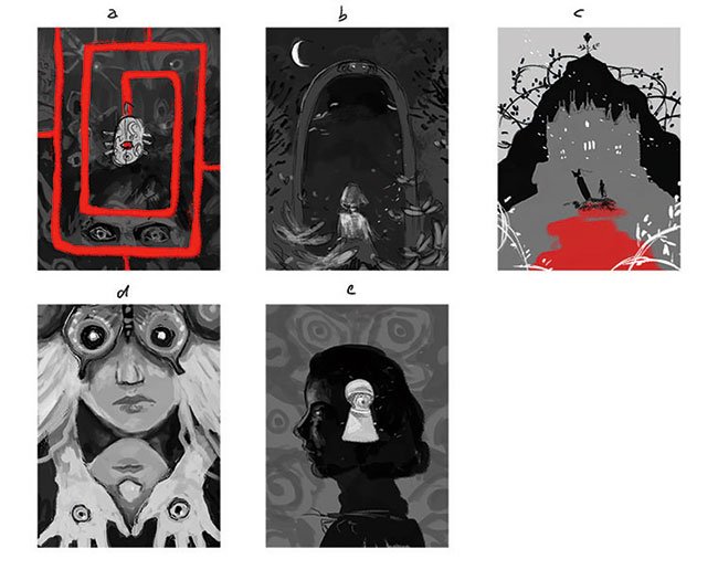
I condense my notes into compositions, aiming to include elements from several films and to keep the dark atmosphere. Working digitally at this stage makes it easy for me to get a good idea of the overall shapes and tonal values I need to create a strong image.
03. Lay out your drawing
Rough your ideas out and put them together in Photoshop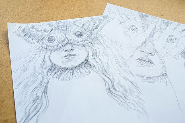
Before I start working on the final artwork I want to make sure I won't run into any unexpected problems. By sketching both portraits separately and combining them in Photoshop, I get a good idea of how the artwork will look. Additionally, I can adjust proportions and add a few details to the concept.
04. Transfer the drawing
Print the layout and transfer it to watercolour paper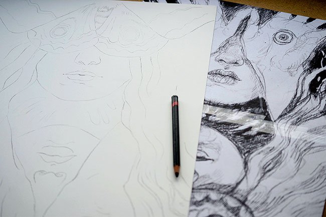
I print the final layout and roughly transfer it to watercolour paper using an old lightbox. For this I'm using a charcoal pencil that will blend in nicely with the later painting. I also make sure not to apply too much pressure to the paper, so this initial drawing can be reworked easily.
05. Complete the underdrawing
Establish the painting's foundation with a black pastel pencil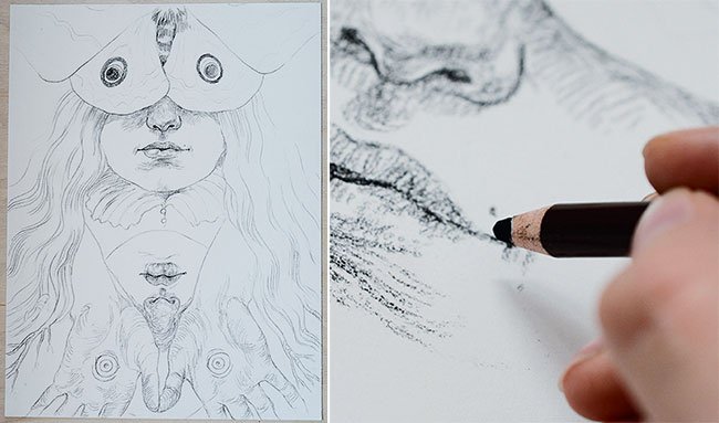
At this stage I establish the foundation for my painting by creating a detailed drawing with a black pastel pencil. To avoid mistakes that would be difficult to correct afterwards, I use screenshots of the film, photos of hands and faces in the required poses and lighting, and the print of my layout drawing for reference.
06. Start painting
Use diluted black acrylic paint to build up depth and volume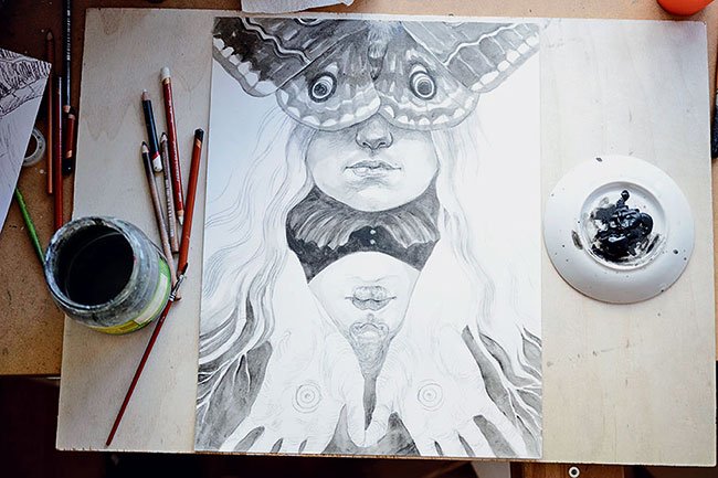
I roughly block in the tonal values and continue to build up depth and volume using black acrylic paint that's been diluted with water. During this stage accidental splashes or smudges can and should happen. My goal is to create an organic, loose texture – precision will come later in the process.
07. Push contrasts
Be careful with your use of black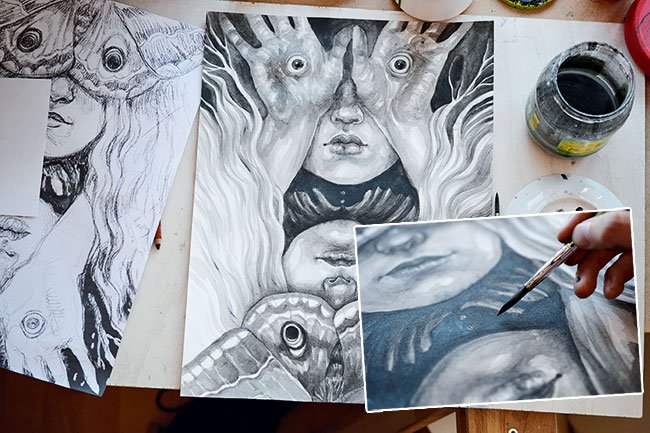
Getting the contrasts right is a key part of making my illustration work. Because pitch black can quickly seem dead and boring, it's important to be sure about where it's needed.
08. Focus on the details
Switch to a smaller brush to paint in details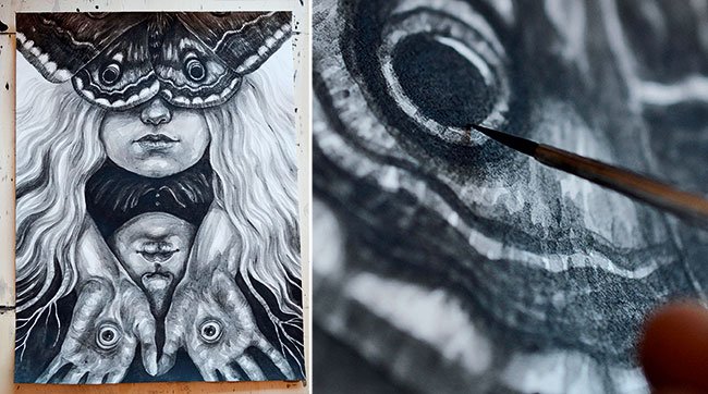
Now is the time for precise brush work. For this I switch to a smaller-sized brush (0) and use it to introduce details to faces and hair, and texture the wings of the moth. I also define edges where necessary and work over pastel and charcoal markings to make them blend in more evenly with my painting.
Next page: how to finish your design with shadows, splashes and highlights
09. Bring in charcoal shadows
Wait for the paint to dry before reaching for the charcoal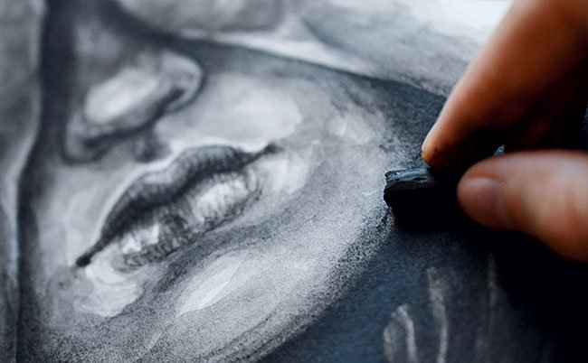
Before I switch to dry media I make sure the paint has dried completely to avoid nasty surprises. I like using charcoal to deepen dark areas even further without adding new marks or distorting the existing textures. I also use it to smooth the edges, in this case around the faces. For smudging I use my fingers.
10. Get splashy
Add texture with splashes of acrylic paint
I add splashes of acrylic paint to areas I want to gain more texture, whipping my brush around like a wand. If too many droplets accumulate in one spot, I use my fingers to wipe them off before they can dry. Areas I want to remain untouched by the paint can be covered with scrap paper.
11. Add some white
Use gesso rather than acrylic for bringing in some white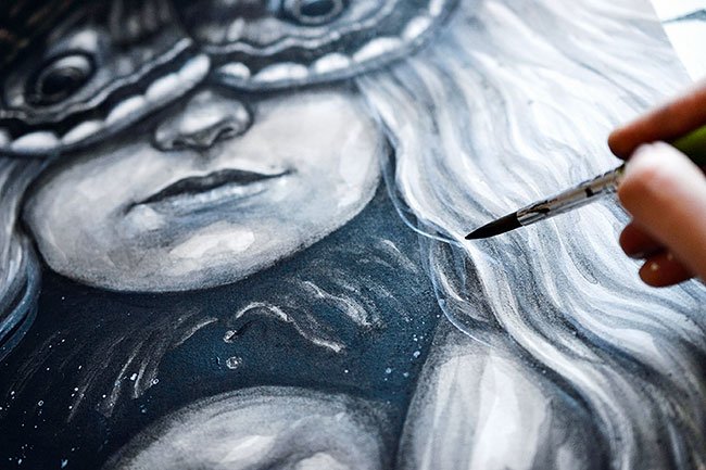
I use gesso to paint thin layers over faces, hands and hair to soften the underlying textures and lighten these areas. I work on details such as the eyes using opaque paint. I prefer using gesso over white acrylic paint because its chalky nature leads to a surface that takes dry media very well.
12. Introduce white noise
White charcoal is perfect for adding texture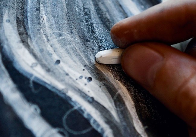
I use white charcoal sticks to create broad textures that add some noise to darker parts of the artwork. I want the hair of the blonde figure (Edith) to fade to white towards the background, forming a contrast to the blackness behind the second figure (Ofelia). To achieve this I use the charcoal to lighten this area.
13. Draw in highlights
Stick with the white charcoal for highlights and details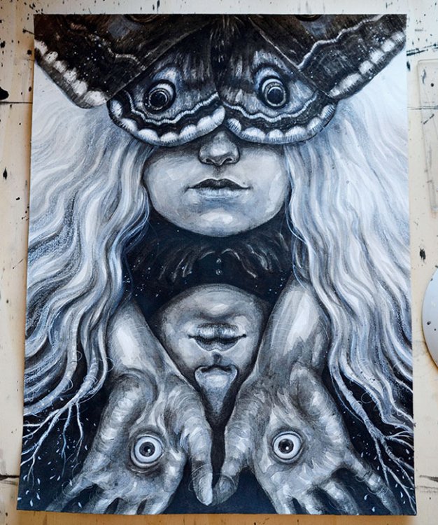
I draw in highlights, the final details and dynamic lines with a white charcoal pencil. For extreme highlights I use a white coloured pencil by Derwent, which is very soft and creates brighter lines than the charcoal, but can't be revised or drawn over as easily because of its oily composition.
14. Keep the eyes engaged
A handful of subtle colours will help keep things interesting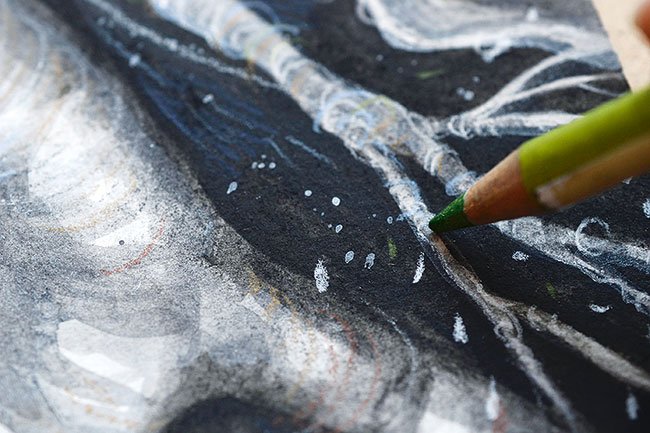
To make the otherwise monochromatic image more engaging I use pencils to add a few colours, while keeping it subtle so I don't mess up my tonal values and contrasts. This makes the picture seem much more alive and interesting. Mostly, I use clay tones, but also add blue to light areas and green to contrast the reddish lines.
15. Check it on screen
Finish things off in Photoshop
After scanning the artwork into Photoshop CC I use Levels and Selective Colour to achieve the right contrasts. I also play around with the saturation of the image, to amplify the subtle colours of not only the pencil lines, but the different hues of the black and white paints.
This article originally appeared in ImagineFX issue 142; buy it here!
Related articles:
-
A well-designed business card is more than just an extension of your brand. It’s an opportunity to make a lasting impression with prospective clients, drive new conversations, and attract exciting new career possibilities.
Get it right, and your business card is a powerful self-promotion tool. But get it wrong and it doesn’t matter how much time you put into the design: your card will likely be taking a one-way trip to the bin.
So what’s the secret to creating a memorable business card? How can you make sure yours stands out for the right reasons? And what are the common creative pitfalls to avoid?
From essential information to include, to best-practice design rules and pro tips for preparing for print, we bring you everything you need to know to craft the perfect business card.
01. Choose the right size
ordered five different business card designs from on square, round-cornered cotton card
Before you jump into designing your business card, you need to choose your canvas. The most common business card size is 3.5 x 2 inches (89 x 51mm) if you’re in the US, or 3.37 x 2.12 (85 x 55 mm) in the UK. That’s roughly the size of a debit or credit card – which means it’ll fit into a wallet or purse.
A more unusual shape can be a good way to differentiate your business card from others, but just remember that if it doesn’t fit into someone's pocket, it’s more likely to end up in the bin.
02. Business card design dos and don’ts
created these bold business cards using ’s 100 recycled cotton option
Once you know what size business card you’re designing, it’s time for the fun part: the creative. A brilliant business card will delight and engage viewers – but there are some classic design pitfalls you need to avoid. Follow these best-practice tips to make your business cards sing…
Do: start the creative process with your key information
You want to get the most out of your canvas, so always start with the core information you want to communicate – usually your name, job title, phone number, email address and website – and design out from there.
Think about how you can use the space creatively to best communicate these details, as well as showcase your design skills or signature style.
Don’t: over share
Don't put your personal Facebook or Instagram accounts on your business cards – prospective clients don’t care what you had for breakfast, or that you went hiking at the weekend. Only include social accounts if they’re professional.
Do: tailor your business cards
Economies of scale might suggest you should design and print one business card for everyone, but think about your client base. If you’re pitching for typographic work, your business card shouldn’t look the same as a business card you’d give to a web design client, for example.
One handy service to look into is Printfinity from print and design company moo.com, which lets you print a different design on every card – for no extra cost. Think of it as a portfolio in your pocket: you can showcase your best work in different fields to different prospective clients.
Do: print on both sides
Never be tempted to save money by only printing on one side. Whether you opt to run your logo, showcase a piece of work from your portfolio or create a custom design that highlights your style, the other side of your business card plays a crucial role in attracting attention – so don’t neglect it.
To that end, always make sure full-colour printing on both sides of your business cards is included in any quote you get from a printer.
Don’t: include borders
It might look slick on a screen, but it's best to avoid having a border on your business cards. If the card isn't perfectly cut, any misalignment in the trim will be instantly shown up.
Do customise
Subtle design decisions – such as choosing between square or rounded corners, or adding a coloured seam – offer an effective way to make your business cards stand out for the right reasons, and help prospective clients remember you.
Don’t rely on gimmicks
When it comes to customisation, remember that less is nearly always more. Business cards are designed to go in wallets, purses or pockets, as we've already said. Unusual shapes or materials might seem like an easy win for standing out from the crowd, but they can be difficult to store – which makes them more likely to be thrown out.
In addition, gimmicky cards run the risk of distracting viewers from the important part: who you are and what you do. Unless you're confident that your unusual idea is really good – and we mean really, really good – don't do it.
03. Choose the right stock
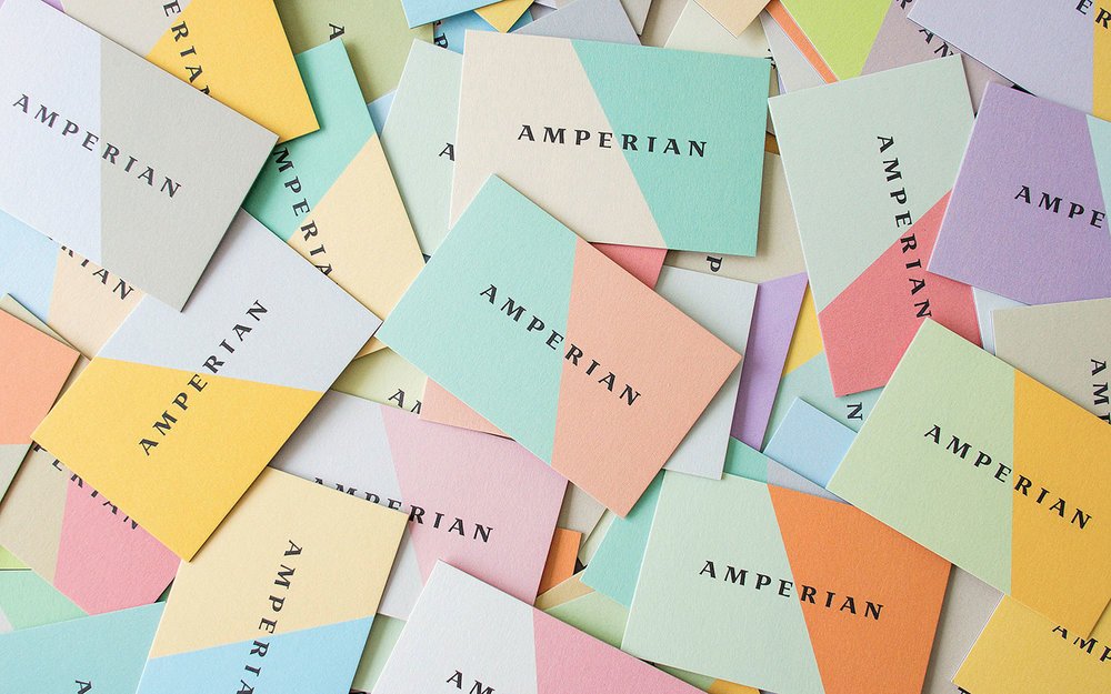
used 's Printfinity on Luxe Business Cards to create an eye-catching brand for Amperian
While there's a huge variety of paper stock to pick from, your decision should be influenced by your colour palette, the impression you want to make and your budget. So what stock should you go for? Here's what you need to know...
Thick card stock denotes quality and feels professional, so always aim for 300 gsm/14 point and above. Silk and gloss finishes feel polished and contemporary, and work particularly well for portfolio-style business cards that show examples of your work on one side.
Colours look brighter on silk or gloss than they do on matte stock, too, because the ink doesn’t absorb into the fibres. However, matte stock can lend sophistication and elegance to your brand, and textured stock can bring an upscale feel.
04. Stand out with a special finish
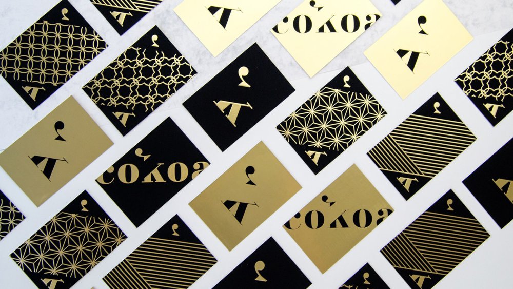
’s luxury Cokoa project, printed at , shows the power of a special finish
Gold foils, spot gloss and other special finishes aren’t just a smart move if you’re pitching to luxury or high-end clients. Used correctly, they’ll elevate your brand – and make your business card more memorable.
Our best advice is to treat foil as its own colour: remember that it will be printed on top of your design, obscuring anything beneath it. Also, make sure your design includes some tolerance for mis-registration – the printing process requires heat and pressure, and registration can vary by around 1mm.
Gloss, meanwhile, is a fantastic way to accent subtle details or enhance certain colours in your design (apart from dark, solid colour).
Whatever you do, don’t go wild. The most effective business cards exercise restraint with special finishes – less is always more. And always make sure the finish reflects your brand. Never use a special finish for the sake of it.
05. Print checklist: essential rules to follow
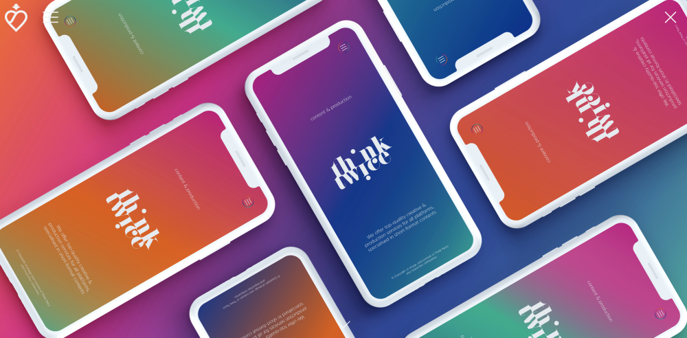
-printed business cards by for Think Twice Media
Designing your own business cards is the ultimate brief. But it’s surprisingly easy to lose sight of the finer details when you’re your own client, so before you go to print, ask yourself whether you’ve covered the points below.
(And yes, we know some of these sound obvious. You'd be amazed at how many times even the most professional designer forgets to include their website details or email address.)
Here's your essential business card print checklist.
- Ensure your name, email address and phone number are clearly displayed
- Include your website, and add your logo if you have one
- Is it legible? Main text should be above 8pt
- Use a clean typeface; avoid thin or light fonts
- Go easy on decorative or script fonts
- Triple-check your spelling and grammar
- Is your kerning perfect?
- Keep important text 5mm from the trim
- Provide a 3mm-5mm bleed – check with your printer
- Work at 300dpi for best image reproduction
- Stick to CMYK unless you’re working only with spot colours
Want to simplify the printing process even more? Try print and design company moo.com: you’ll find a host of fun, affordable, easy-to-use tools for transforming your designs into premium business cards that will turn heads – for the right reasons.
MOO also offers a unique 'MOO promise', which means the team will do everything they can to make sure you love your business cards. If they spot a design error, they’ll let you know and fix the issue for free. And if you aren’t completely satisfied when your order arrives, they’ll fix the problem or give your money back.
Don't forget: you’ll also find a wealth of stunning business card inspiration from professional creatives on MOO’s blog and Instagram space, both of which are over-flowing with first-class examples of business card brilliance.
Related articles:
-
You're reading How To Create and Send Amazing Email Newsletters, originally posted on Designmodo. If you've enjoyed this post, be sure to follow on Twitter, Facebook, Google+!

When you’re sending email newsletters to grow your business, you need well-designed emails which will capture readers’ attention. An excellent design will encourage readers to view your site and can result in higher conversion rates. But how do you do it? We’ve gathered some tools and resources for building engaging emails. Tools for Designing Email […]
-
Cynthia Savard Saucier, director of design at Shopify and author of Tragic Design, will be sharing pro insight into how to keep your users safe at Generate New York 2018. Get your ticket now.
In 2007, Cynthia Savard Saucier was backpacking across a remote area of Guatemala when her friend suffered a severe allergic reaction after eating a cereal that contained nuts. He always travelled with his dual injector, but as his muscles started to spasm, he was unable to inject himself.
Cynthia managed to administer the first injection, but when they were on the boat speeding to the closest clinic, she tried to inject the second dose – and the device didn’t work. Cynthia read the very long instructions, but couldn’t work them out. Out of desperation she stabbed her friend’s leg 11 times, and finally it worked, probably because the syringe simply broke in his leg, saving his life.
Later she found out that she had only needed to remove a little yellow piece at the end of the syringe but, in the crisis situation, she missed this ninth step on the double-sided sheet. “I realised that good design saves lives, and this is what I wanted to do,” Cynthia says. “As designers we are never really confronted with the consequences of our decisions, but we shouldn’t underestimate the impact we have on everyone’s life.”
Cynthia’s experience eventually led her to co-author a book with fellow designer Jonathan Shariat. They started looking into other case studies of how certain design decisions have angered, saddened, excluded, injured, and even killed people. The result is Tragic Design, which explores the impact of bad design and what can be done to fix it.
01. Ask: ‘What’s the harm?’
The first step in avoiding such mistakes is to just ask yourself if you could kill someone. “Whenever we design as a group and discuss a feature that seems irrelevant – like shipping updates – we ask, ‘Can we kill someone with this?’” Cynthia, now director of user experience at Shopify in Montreal, explains.
“It’s quite funny initially, but it really turns into a very productive design session. If someone is ordering medication and they don’t get it on time, what could happen? If someone is ordering something that is deeply sentimental and they have a deadline to receive it, what could happen if we can’t offer that deadline?”
The second step is to work with product managers to make sure they understand that if a person could get hurt or killed, even if it’s just a small percentage and only in certain conditions, this needs to be prioritised. “It’s sometimes a little hard to make a case for it if maybe just one per cent could get impacted,” Cynthia admits. “But it’s worth making the process slightly longer for everyone if it’s benefitting a few people.”

Generate speaker Cynthia Savard Saucier gives a talk on preventing tragic design
02. Make use of quasimodes
There are a lot of tools and approaches you can use to avoid harming someone. Modes, for example, are always bad strategies for user interfaces.
In the book, Cynthia and Jonathan tell a story of how a plane crashed, killing most people on board, because the pilot confused the flight path angle mode with the vertical speed mode in the interface. Instead you should use quasimodes with more than one visual feedback to show you that you’re in a certain mode.
“When you want to erase an app on your phone and you hold it down, it starts wiggling or dancing,” Cynthia explains. “This is a really good example of a quasimode: you need to do something physical in order to change the mode. And then there are two feedbacks. There’s the ‘x’ and the wiggling, so that you’re sure that something is different.
"Another good example of a quasimode is when you’re driving a car," says Cynthia. "If you want to go backwards, you need to change gears. Your hand is on something, so that you don’t go backwards all of a sudden without knowing and injuring or even killing someone.”03. Anticipate user errors
When critiquing any design, one simple but very useful technique is the user error chart. “Think of an information architecture tree with every type of user but the ‘happy path’ is only a small subset of users,” Cynthia suggests.
“The other parts are all misuse and the errors and people trying to take advantage of – or even steal from – your product. You can print this chart and leave it on your wall for your team to see and make sure that every single piece of this tree gets considered. It’s not about designing everything – we don’t have unlimited resources – but it’s about making informed decisions as to what you’re ignoring.”
Related to this is the fault tree analysis. You list all the errors that could happen and work your way back through all of the potential causes. “At the end of the analysis, not only do you have an amazing FAQ, but it also highlights all the potential downfalls that you should take into consideration and design safeguards for,” Cynthia enthuses.
“If you know that someone could stab their fingers with the injector instead of the leg, make sure you have more than one visual cue. Use another sense and, for example, design the handle in a shape that teaches you how to hold it.”
This article originally appeared in net magazine issue 304. Buy it here.
Get your ticket for Generate New York now
If you're interested in learning more about avoiding harmful errors in your web design, make sure you grab a ticket for Generate New York. Cynthia Savard Saucier, director of design at Shopify and author of Tragic Design, will be offering more insight into the harm bad design can bring and giving guidance on how to keep your users safe in her talk Tragic Design: The Impact of Bad Product Design.
Generate New York takes place from 25-27 April 2018. Get your ticket now.
Related articles: -
Catching people on social media can be equal parts art and science. Attention spans are short, with users often scrolling quickly through their feeds, and dipping in and out of multiple conversations.
Classic pitfalls when trying to engage people through social media campaigns include being too dry and corporate, or conversely, trying too hard to be 'cool' and missing the point entirely. Some campaigns hit the mark in some places, but might be culturally tone-deaf in others and face a backlash as a result.
Brands such as Wendy's, Innocent and Oreo are all famously on-point when it comes to their social interactions across multiple platforms. And much of that comes down to brand voice and personality.
Images can be hugely effective to grab attention and encourage social sharing, if you get them right. Read on for our five-step guide to using images more effectively on social media...
01. Tailor images to different platforms
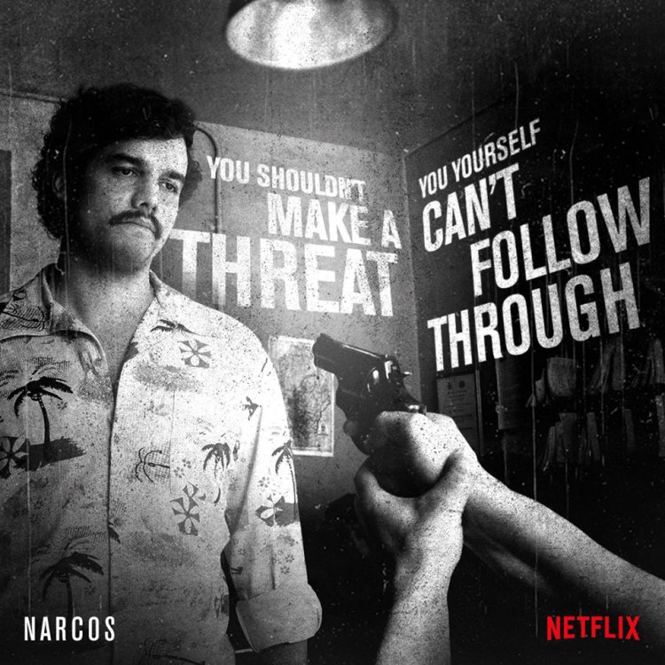
Netflix has run social campaigns for its shows that lay catchy quotes over engaging visuals, such as this example for Narcos
First up, it's important to understand that an image that flies on one social network won't necessarily gain any traction on another. So it pays to tailor the images to the right platform.
Beautiful, striking and evocative images tend to fare well on Instagram, particularly if they're simple and dynamic in composition. Conversely, Pinterest users respond better to pictures that have lots of detail and visual interest to explore, such as collections of handcrafted objects or inspiring interiors.
Facebook users tend to share funny and entertaining images that have some kind of emotional resonance within their friend group. Twitter is much more fast-paced, and images that offer interesting information quickly fare better – such as Netflix's awareness-raising campaigns for its shows, which combine compelling quotes with striking promotional stills.
As well as content, each social network also has its own guidelines for image dimensions, so take the time to optimise your campaign accordingly. Don't just crop and resize to try and squeeze a square peg into a round hole.
02. Have a clear goal for each image
Reese's owned the criticisms about the misshapen chocolates in its 2015 range with a tongue-in-cheek social campaign
Consider what the end-goal of your social campaign should be, and tailor the imagery and messaging accordingly. If its about general brand awareness, you can afford to be more abstract, but a coherent brand voice is still crucial.
If you're selling a product, overtly promotional posts are unlikely to fare as well as humorous, clever or entertaining images that have shareable value in their own right - even if the product is prominently featured.
One great example is Reese's Webby Award-winning 'All Trees Are Beautiful' campaign, which was an inspired tongue-in-cheek response to complaints about the misshapen nature of its Christmas Tree-shaped chocolates.
Amusing 'love your body' inspired social media images were shared around the #AllTreesAreBeautiful hashtag, cleverly turning a negative online conversation into a selling point for the brand.
03. Consider why people will share it
Another Webby Award winner, National Geographic's Friday Fact campaign employed the simple power of a beautiful image
In a feed cluttered with noise, both welcome and unwelcome, people will only click on, share or like your campaign image if it genuinely resonates with them - so understanding the motivations of your target audience is essential.
If you've run similar campaigns before, study all the data you have available to determine what images fared best with which demographics – Facebook Insights is particularly useful here. Or study the competition's most successful efforts, and why they worked.
As a rule of thumb, shareable images are simple and manageable, and visually convey a message or piece of information that is easy to digest and recognise - something universal.
They could be amusing, such as the Reese's example above – but not all brands can pull off humour, nor is it always appropriate. Useful or thought-provoking images, or images that make a canny observation on our everyday lives, can all touch a nerve if pitched right.
Sometimes, it's enough just to have an image that's beautiful enough for people to want to spread around the internet. National Geographic's Friday Fact campaign on Facebook, for instance, combined a snippet of interesting information with a stunning photo – the perfect combination for that audience.
04. Pick images that tell a story quickly
Oreo is a master of telling stories in a simple, quick and quirky way, always using its distinctive creme cookies as the star
Appealing, shareable social images manage to combine a visually appealing subject with a layer of context as quickly and simply as possible. Visual shorthand can help tell more complex stories: it needs to be immediately clear which brand it belongs to, and quick and easy for a viewer to understand.
As mentioned above, Oreo is well-known for its mastery of social imagery - producing a constant stream of fresh, original, relevant visual content for its various social platforms. These have included cookie-themed graphics for everything from Pride to the Mars Rover landings, and even a whole series of Vine videos spoofing classic horror films for Halloween.
Different types of imagery can cater to different needs. For instance, photography is ideal when there's a powerful, unusual image that speaks for itself, whereas bold text over a bright, simple background puts all the onus on a particular message or quote. Illustrations, meanwhile, can help stimulate the audience's imagination, and give you more scope for abstract, surreal or unusual subject matter.
05. Design for short attention spans
Famed for its quirky, mischievous social activity, Denny's used a simple 'zoom in' meme to create one of the most successful branded posts in Twitter history
When attention spans are short, you need a way to hook people in – and sometimes a killer image alone isn't enough. Like any creative campaign, the ultimate goal on social is to create something compelling enough to stop people in their tracks, and spread it to their friends.
Diner chain Denny's has built a reputation for being playful, silly and weird in its social campaigns - often poking fun at other brand, such as the Apple-baiting 'Pancake. Always available in golden' that accompanied a stack of mouth-watering syrup-drizzled pancakes.
In that case, a quality stock image could theoretically have done the job - but the simple, playful spoof of a well-known ad was what hooked people in. Once of Denny's most successful social images to date was also pancake-themed, and was accompanied simply by "Zoom in on the syrup."
Related articles:
How to make and use a mahlstick for painting
in Ειδήσεις από τον χώρο του Design και Hosting
Posted · Report reply
The mahlstick (or maulstick, as it's sometimes known) is a stabilising support tool used by painters when working at an easel on a canvas or a large board. If you've never used a mahlstick before, you could find that it revolutionises your painting technique.
They are one of those iconic artistic props, akin to a floppy beret and painter's smock (both I blushingly admit to owning myself). But don't underestimate this ubiquitous little branch of cliché. It's a very handy tool to have at your disposal, for a multitude of applications. Here are some tips for getting started.
01. Component parts of a mahlstick
Mahlsticks are made of three elements
Mahlsticks are typically made up of three main elements. One: a long, thin shaft, resembling a walking cane, that you lean your hand or wrist on while painting. Two: a cork ball, about the size of a ping-pong ball, fixed at the top end of the shaft, that leans on the canvas or board or hooks over the top of the easel. And three: a piece of protective chamois leather wrapped around the ball to stop the mahlstick from scratching, dragging or otherwise damaging your beautifully painted surface.
02. How to make your own mahlstick
Making your own mahlstick is easy and funMake your own DIY mahlstick by using a length of dowelling for the shaft, fitted with a cork ball at the end. Then fit the chamois leather around the cork ball and tie on a length of cord to hold it in place. When building your own, make sure you use a straight piece of dowelling for the shaft. This is crucial to ensuring you can use the mahlstick to its full potential.
If you prefer, you can buy a quality mahlstick on Amazon or at other major retailers like eBay.
03. Hook up your mahlstick

Hooking the mahlstick on the easel means you can position it at different anglesYou can rest the mahlstick directly on the canvas, or hook the ball over the top of a small support or the easel. Hooking the mahlstick on the easel enables you to position it at different angles, and to perform tricky tasks. Remember not to lean on the mahlstick too much as you could disturb your painting.
04. Mahlstick painting techniques
A mahlstick doubles up as a straightedge toolUse your mahlstick as a handy straightedge tool as well as a rest. Hook the ball over the top of the canvas or board so you can use your non-painting hand to manoeuvre the stick to get a straight vertical line.
Then simply run your brush or charcoal down the length of the shaft to create your straight line. You can do this from any angle to also create horizontal or diagonal lines.
This article originally appeared in Paint & Draw issue 03; buy it here!
Related articles:
View the full article