

Rss Bot
-
Content Count
19,562 -
Joined
-
Last visited
Never -
Feedback
N/A
Posts posted by Rss Bot
-
-
When Thor’s father dies, his murderous elder sister Hela, Goddess of Death, is released from the ancient prison that has prevented her from wreaking havoc until now. She wastes no time with her new freedom and seeks to take her place as ruler of Asgard by bringing about Ragnarok; a process which necessitates thousands of hours of CG work and 3D art to successfully enact.
One of the biggest 3D movies of last year, this is your typical big-action blockbuster from Marvel, except in many ways it’s not. Director Taika Waititi, known for comedies such as Hunt for the Wilderpeople and What We Do in the Shadows, has brought his special brand of humour and put his own unique spin on things. So while there’s plenty of the elaborate set pieces and high-octane frisson we’re used to, there’s an element of personality to this film that’s new.
Vivid visual effects
Unsurprisingly for a Marvel superhero adventure, visual effects were a core part of the production: whole worlds are constructed entirely as CG, as are several characters, and Cate Blanchett’s entire Hela costume is computer generated. Even director Taika Waititi was spotted wearing a motion capture suit during shooting.
As a visual effects vendor from the start of production, the team at Framestore were on board to deliver challenging sequences at very short notice. In the climactic battle of the film, the Hulk fights Hela’s giant wolf Fenris, both on a narrow bridge and also down in the waters beneath, before returning at the end of the sequence to jump on the fire demon Surtur and rescue Thor and Valkyrie.
A team at Framestore led by VFX supervisor Alexis Wajsbrot was tasked with bringing this action to life. They received previz of the whole action by The Third Floor, which was constantly being updated throughout the editing process, and started with shots of Fenris and Hulk both roaring and fighting on the bridge.
“It was the first time that Framestore got to work on the Hulk, so the whole team was incredibly motivated to get the best possible version of him; we did a lot of work on the asset, in terms of the muscles rig and shader,” explains Wajsbrot.

Some of Framestore’s best animators worked on the posing of the Hulk
Some of Framestore’s best animators worked on the posing of both Hulk and Fenris to get the strongest position and angle, and they produced a range of options which were proposed to Marvel visual effects supervisor Jake Morrison and director Taika Waititi. The team even proposed some new shots; “One close-up of Hulk fighting Fenris in the water did make the final cut!” says Wajsbrot.
As ever, capturing facial expressions and likenesses requires a thorough process. “We paid particular attention to Hulk’s facial and muscle structure, working very closely with Ryan Meinerding (head of visual development at Marvel) to nail all the subtlety of his face.“
“We actually re-designed our shot-sculpt pipeline in order to have maximum control and be able to be very reactive to feedback,” explains Wajsbrot. “We did a lot of work in Creature FX to simulate the muscles and the fur simulation, especially when Fenris is wet which used a groom variant, in order not to completely lose Fenris’ main shape.”

A lot of work went into creature effects, Fenris wolf in particular
A camera positioned very close to rapidly moving water and two huge creatures splashing around meant that the interaction between the water and the characters was one of the most challenging aspects.
“It was really hard to clear the camera but still make it feel like a natural water simulation,” says Wajsbrot. “For Hulk and Fenris, the first simulations very quickly obscured our heroes, so it was all about finding the right balance between making the water sim big, but still showing the performances. We did push the limit of both our internal water solver fLush and our rendering engine Arnold to get the best water sim.”
Battling deadlines
As is typically the case on big blockbuster productions, visual effects teams on Thor: Ragnarok were required to produce complex work on tight timescales. During the final month of production the team managed to deliver two very challenging close-up waterfall shots depicting the Hulk falling and grabbing onto a cliff – “[It] was really an achievement in terms of efficiency,” Wajsbrot says.
Alexis Wajsbrot’s crew wasn’t alone in this: Framestore’s capture lab was also put through its paces when they were called upon to deliver some crowd scenes on a particularly short deadline. The battle in the third act of the film takes place on the narrow Rainbow Bridge when Hela’s undead army attacks Thor’s homeworld of Asgard, and Framestore were assigned the task of populating the scene with crowds of both zombie soldiers and terrified citizens.
It’s a difficult scene because dozens of characters need to be on screen at once, and they all need to be reactive to the battle going on around them. In addition, the undead soldiers move like warriors, but have the animated attributes of corpses.

To create soldiers and citizens who would react in their own individual ways, two motion capture actors performed a multitude of actions
Crowd simulation software would have created too much work for the animators,
so instead Framestore used just two actors and their in-house capture lab to generate the members of the crowds. The capture lab is kitted out with 16 Vicon T40 cameras, and capture software Shogun Live and Post, also produced by Vicon. It is set up in one of the London offices semi permanently and gets taken out to a bigger stage occasionally for shoots that need more space.To create soldiers and citizens who would react in their own individual ways to the events unfolding around them, two motion capture actors performed a multitude of actions such as running away, jumping off things, getting shot and dying. “One of [the actors] is actually an animator at Framestore – so he really understands the whole process and performance requirement,” capture lab studio manager Richard Graham says.
Mocap mayhem
Some of the characters in Thor are much larger than others, which presents some challenges for mocap teams and animators. Graham explained it’s handled “by spending more effort on the re-targeting and working with the performer to make sure their motions impart the right sense of scale”. With the motion laid down as well as possible, muscle and skin sims are used to sell the final animation.
With the animators under pressure to deliver on a very tight timescale, the capture lab team were able to take some of the weight. “We had to help the animation department deal with some late-breaking notes, so we did three shoots all at about one day’s notice, then delivered the cleaned, solved data back in 24 to 48hrs,” says Graham. “There wasn’t time for much mo-edit, so we shot actions specific to shots that could be placed into animators’ scenes with minimal need for any intervention.”

Framestore often use dancers and gymnasts for motion capture work as they have the ability level required for stunts
Much of the mocap team’s efficiency can be put down to the data processing workflow that takes place after the shoot. “It all starts with Shogun Post,” Graham adds. “We ensure that the captured data is clean and consistent, then we use MotionBuilder plus IKinema Action to solve directly onto our in-house character rigs – this way we have full control over how the performance looks and feels on the assets. Finally, from within MoBu, we manage any additional re-targeting or edits.”
Following this, a data package is sent to the animation or crowd departments. “The pipeline is mostly automated, which allows us to hit some remarkable turnaround times, for Thor particularly – we processed 120 takes in two days.”
This article was originally published in issue 231 of 3D World, the world's best-selling magazine for CG artists. Buy issue 231 or subscribe to 3D World.
Related articles:
-
The city of Atlanta is being extorted for $51,000 in a ransomware attack that occurred early Thursday that impacted several local government departments.
-
I really like working in colour, whether it's in Photoshop CC or painting traditionally with watercolours. Vibrant colour will often make an illustration more decorative, but there's also a danger of it becoming flat. However, you can counteract this by adding a sense of volume in the right places throughout the composition.
In this tutorial, I'll share the art techniques I use to create a bright, light portrait in Photoshop. Watch the video below to see my screencast for this tutorial, or scroll down to read the step-by-step guide. For more portraiture advice, take a look at our article on how to draw people.
For inspiration I often study classic artists. You can learn a lot from them, such as how to guide the viewer's eye with help of the light, shadows and colour. I particularly like the art of Klimt, Mucha and Van Gogh.
Klimt was able to capture a strong sense of character and nature with brush strokes and colours. I adore Mucha's line art. He depicted feminine beauty perfectly, and had an eye for decorative details, brilliant composition and gorgeous colours. And Van Gogh was just a genius.
01. Find some inspiration

The first thing I do before starting an illustration is to browse through my folder of inspiration. Inside are plenty of sub-folders, containing images of lighting, faces, human figures, clothing, illustrations from my favourite artists, animals, caterpillars, flowers and plenty more besides.
I quickly look through some folders, keeping in mind my theme or work brief. I notice what makes a particular image look good, what emotion it brings out in me, or what's actually beautiful in it. My own idea comes from studying these images. When working with colour the most inspiring thing is nature: flowers, butterflies, caterpillars, especially tropical species.
02. Produce a rough sketch

Click the icon in the top right to enlarge the image
Next, I need to visualise my idea, so I produce a series of small sketches, which are made up of flowing lines. This acts as both a warm-up exercise and a way of focusing on the task in hand. After I've finished drawing, I narrow down the options and continue to refine them, until the best one is ready to be used as a base.
03. Start refining the line art

Click the icon in the top right to enlarge the image
I create a new layer, then reduce the Opacity of the sketch layer and select an opaque brush. Then on a new layer I create the line art. I try to do this as cleanly as possible, so that there are no unnecessary lines, and every stroke and dot serves a purpose. I lay down flowing, soft lines for this portrait of a pretty young woman, because they help to create the correct mood in the piece.
04. Pick a colour palette

Click the icon in the top right to enlarge the image
As I said earlier, nature is a great source of inspiration, especially for developing colour combinations. Look how bold the colours are on insect and fishes, for example. So follow nature's lead: pick a vibrant colour, select a big Soft brush and start to draw. I select colours that I know work together well, and bear in mind that every colour has its tone. It's best not to rush this stage.
05. Colour the line art

Click the icon in the top right to enlarge the image
I want to retain some of my line art in my final image. There's an interesting way to do this: I lock transparent layer pixels on the line art layer, select the big Soft brush and paint in my colours. The results vary – sometimes they’re the same tone, sometimes they’re darker and sometimes they’re lighter and brighter. Whatever the outcome, it’ll add interest to your artwork.
06. Develop the facial details

Click the icon in the top right to enlarge the image
My favourite part of illustration is painting the face. Because I've chosen to keep the line art on show in the finished piece, I sense this illustration will become more decorative and graphic. I try to add volumetric shading only in a few spots, and at the same time, work on shaping a nose, lips and eyes. Most of the time I work with a big Soft brush, but I use a textured brush for the highlights. It's always exciting to paint!
07. Colour the face

Click the icon in the top right to enlarge the image
I refine the colours of the face using the principles of warm colour theory. In this image I paint with bright, vibrant colours: the shadows are orange and the light is colder. Sometimes it's hard to do all at once. One solution is to first paint the face with a neutral skin colour using shading techniques, rather than simply filling in the face with a single tone, then create a new layer, set it to either Hard Light or Soft Light, and add orange in the shadows and a light purple to the brighter areas.
08. Make use of blending modes

Click the icon in the top right to enlarge the image
I often use a range of blending modes: Soft Light, Hard Light, Overlay, Multiply and Color. All of them (except Multiply) help me to create bright, saturated colours. Try creating a new layer and setting the blending mode to Soft Light. Then pick a big Soft brush, choose a light colour and experiment here and there on your canvas.
09. Don't forget the shadows

Click the icon in the top right to enlarge the image
I always like to experiment with colour. It's easier to do this in light areas on the canvas, but don't forget the shadows − try to paint with bright and saturated colours. There's no need to do this with all your shadows; it can just be in a small part of your illustration. Here, I've selected a bright red. This will add variety to my overall colour palette, and ensures my shadows won't look dull and boring.
10. Add hair and wings

Click the icon in the top right to enlarge the image
I leave the face as it is and turn my attention to the hair. I paint it in purple with bluish highlights, then decide to add pink in the shadow. I like this effect because it enables me to get rid of the strong dark shadow on the bottom, which otherwise might prove distracting for the viewer.
11. Take time to set up an efficient workspace

Click the icon in the top right to enlarge the image
I keep three windows open during my painting process. I paint in the main window, but also have up a smaller version of my WIP so I can see how the image is developing and spot any mistakes, and a black and white version that enables me to check my values.
To set up your workspace, go to 'Window > Arrange > New window for…(name of your file)', once for small version and second time for black and white. To set up the black and white window go to 'View > Proof Setup > Custom > Device to Simulate > sGrey'. Then press ctrl+Y when the black and white window is active.
12. Understand how the face works

Click the icon in the top right to enlarge the image
As an artist, it's vital to be able to draw a face. You need to know the anatomy and be able to imagine it as a simplified geometrical form. I often sculpt faces in clay, which is a great way to break down a face into basic structures such as a sphere (an eye) or two cylinders (the lips). And every shape has its own shadow, light and highlight.
13. Construct an outfit

Click the icon in the top right to enlarge the image
Because this is a stylised illustration, I don't need to draw the leaves of the figure's clothing realistically. This is why I create soft transitions of colour using light, subtle strokes. In just a few places I add contrasting shadows, which helps to boost volume. Placing a branch on one shoulder helps to add visual interest to the right-hand side.
14. Make final tweaks

Click the icon in the top right to enlarge the image
I review areas that need polishing, and adjust colours using the Levels tool. The Selective Color tool enables me to adjust individual colours during this review stage. Finally, I add a layer of noise to my image, sit back and call it done.
This article was originally published in ImagineFX, the world's best-selling magazine for digital artists. Buy issue 156 or subscribe.
Read more:
-
Over recent years Node.js has become more and more popular. It is now often used for developing the server side of web applications, or in general during the development process. At the time of writing, the homepage of npm – the package manager for Node.js – lists over a quarter of a million modules.
I've put together a list of the ones I find useful in my daily work as a web and software developer, from image manipulation, string validation and PDF generation to minification, logging and the creation of command line applications.
Working with images
01. Manipulate images
GraphicsMagick and ImageMagick are two popular tools for creating, editing, composing and converting images. Thanks to the Node.js module gm you can use both tools directly from within your JavaScript code. The module supports all the typical image operations – resizing, clipping and encoding to name just a few.
02. Process images
Sharp is based on the ultra-fast libvips image processing library, and claims to be four to five times faster than ImageMagick or GraphicsMagick when it comes to compressing and resizing images. It supports JPEG, PNG, WebP, TIFF, GIF and SVG images, and outputs data into either JPEG, PNG, WebP or uncompressed raw pixel streams.
03. Generate sprite sheets
Sprite sheets are bitmap files that contain many different small images (for example icons), and they are often used to reduce the overhead of downloading images and speed up overall page load. Generating sprite sheets manually is very cumbersome, but with spritesmith you can automate the process. This module takes a folder as input and combines all the images in it into one sprite sheet. It also generates a JSON file that contains all the coordinates for each of the images in the resulting image, which you can directly copy in your CSS code.
Dates, strings, colours
04. Format dates
Moment.js is a great alternative to JavaScript's Date object
The standard JavaScript API already comes with the Date object for working with dates and times. However, this object is not very user-friendly when it comes to printing and formatting dates. On the other hand, Moment.js offers a clean and fluid API, and the resulting code is very readable and easy to understand.
In addition, there is an add-on available for parsing and formatting dates in different time zones.
05. Validate strings
When providing forms on a web page, you always should validate the values the user inputs – not only on the client-side, but also on the server-side to prevent malicious data. A module that can help you here is validator.js. It provides several methods for validating strings, from isEmail() and isURL() to isMobilePhone() or isCreditCard(), plus you can use it on the server- and the client-side.
06. Work with colour values
Converting colour values from one format into another is one of the tasks every frontend developer needs to do once in a while. TinyColor2 takes care of this programmatically, and it's available for Node.js as well as for browsers. It provides a set of conversion methods (e.g. toHexString(), toRGBString()), as well as methods for all sorts of colour operations (e.g. lighten(), saturate(), complement()).
Working with different formats
07. Generate PDF files
You want to dynamically generate PDF files? Then PDFKit is the module you are looking for. It supports embedding font types, embedding images and the definition of vector graphics, either programmatically (using a Canvas-like API) or by specifying SVG paths. Furthermore, you can define links, include notes, highlight text and more. The best way to start is the interactive browser demo, which is available here.
08. Process HTML files
Cheerio makes processing HTML on the server side much easier
Ever wanted to process HTML code on the server side and missed the jQuery utility methods? ThenCheerio is the answer. Although it implements only a subset of the core jQuery library, it makes processing HTML on the server side much easier. It is built on top of the htmlparser2 module, an HTML, XML and RSS parser. Plus, according to benchmarks, it's eight times faster than jsdom, another module for working with the DOM on the server side.
09. Process CSV files
Node-cvg simplifies the process of working with CSV data
The CSV (comma-separated values) format is often used when interchanging table-based data. For example, Microsoft Excel allows you to export or import your data in that format. node-cvg simplifies the process of working with CSV data in JavaScript, and provides functionalities for generating, parsing, transforming and stringifying CSV. It comes with a callback API, a stream API and a synchronous API, so you can choose the style you prefer.
10. Process markdown files
Markdown is a popular format when creating content for the web. If you ever wanted to process markdown content programmatically (i.e. write your own markdown editor), marked is worth a look. It takes a string of markdown code as input and outputs the appropriate HTML code. It is even possible to further customise that HTML output by providing custom renderers.
Next page: Explore the best minifiers and utility modules
Minification
11. Minify images
Imagemin is a brilliant module for minifying and optimising images
A very good module for minifying and optimising images is imagemin, which can be used programmatically (via the command line), as a gulp or Grunt plugin, or through imagemin-app (a graphical application available for all of the three big OSs). Its plugin-based architecture means it is also very flexible, and can be extended to support new image formats.
12. Minify HTML
This claims to be the best HTML minifier available
After minifying images you should consider minifying your web app's HTML. The module HTMLMinifier can be used via the command line, but is also available for gulp and Grunt. On top of that, there are middleware solutions for integrating it into web frameworks like Koa and Express, so you can minify the HTML directly at runtime before serving it to the client via HTTP. According to benchmarks on the module's homepage, it is the best HTML minifier available.
13. Minify CSS
As well as images and HTML, you should consider minifying the CSS you send the user. A very fast module in this regard is clean-css, which can be used both from the command line and programmatically. It comes with support for source maps and also provides different compatibility modes to ensure the minified CSS is compatible with older versions of IE.
14. Minify JavaScript
UglifyJS2 isn't just for minifying code, but it's very good at it
The popular module UglifyJS2 is often used for minifying JavaScript code, but because of its parsing features, in principle you can use it to do anything related to processing JavaScript code. UglifyJS2 parses JavaScript code into an abstract syntax tree (an object model that represents the code) and provides a tree walker component that can be used to traverse that tree. Ever wanted to write your own JavaScript optimiser? Then UglifyJS2 is for you.
15. Minify SVG
Last but not least when it comes to minification, don't forget to minify the SVG content. This format has made a great comeback in the past few years, thanks to its great browser and tool support. Unfortunately, the SVG content that is generated by editors often contains redundant and useless information like comments and metadata.
With SVGO you can easily remove such information and create a minified version of your SVG content. The module has a plugin-based architecture, with (almost) every optimisation implemented as a separate plugin. As with all the other modules regarding minification, SVGO can be used either via the command line or programmatically.
Utilities
16. Log application output
When you are dealing with complex web applications a proper logging library can be very useful to help you find runtime problems, both during development and in production. A very popular module in this regard is the winston library. It supports multiple transports, meaning you can tell winston to simply log to the console, but also to store logs in files or in databases (like CouchDB, MongoDB or Redis) or even stream them to an HTTP endpoint for further processing.
17. Generate fake data
When implementing or testing user interfaces you often need dummy data such as email addresses, user names, street addresses and phone numbers. That is where faker.js comes into play. This can be used either on the server side (as a module for Node.js) or on the client side, and provides a set of methods for generating fake data. Need a user name? Just call faker.internet.userName() and you get a random one. Need a fake company name? Call faker.company.companyName() and you get one. And there are a lot more methods for all types of data.
18. Send emails
Nodemailer supports text and HTML content, embedded images and SSL/STARTTLS
Programmatically sending emails is one of the features you need often when implementing websites. From registration confirmation, to notifying users of special events or sending newsletters, there are a lot of use cases that require you to get in touch with users.
The standard Node.js API does not offer such a feature, but fortunately the module Nodemailer fills this gap. It supports both text and HTML content, embedded images and – most importantly – it uses the secure SSL/STARTTLS protocol.
19. Create REST APIs
REST is the de facto standard when implementing web applications that make use of web services. Frameworks like Express facilitate the creation of such web services, but often come with a lot of features such as templating and rendering that – depending on the use case – you may not need. On the other hand, the Node.js module restify focuses on the creation and the debugging of REST APIs. It has a very similar API to the Connect middleware (which is the base for Express) but gives you more control over HTTP interactions and also supports DTrace for troubleshooting applications in real time.
20. Create CLI applications
There are already tons of command line applications (CLI applications) written in Node.js to address different use cases (see, for example, the aforementioned modules for minification). If you want to write your own CLI application, the module Commander.js is a very good starting point. It provides a fluent API for defining various aspects of CLI applications like the commands, options, aliases, help and many more, and it really simplifies the process of creating applications for the command line.
Conclusion
We've only scratched the surface of the huge number of Node.js modules out there. JavaScript is more popular than ever before and there are new modules popping up every week. A good place to stay up to date is the 'most starred packages' section of the npm homepage or Github's list of trending repositories.
Related articles:
-
Knowing how to follow brand guidelines can be a bit of a mystery. It's a practice that isn't taught much at design schools, so students can sometimes emerge into the workforce with no experience of how to process a brief.
Fortunately, though, the concept is simple enough. Designers are provided with an outline by their client, along with assets and how they are intended to be used. However, keeping work consistent with a client's existing branding is a whole other challenge in itself. To help designers get the right look, we spoke to branding guideline geniuses.
01. Do your research
“Some big brands make their guidelines available on Issuu,” says Jess Dutton, junior designer at Mobas. “Look for a brand you know and like, and read their style sheet. You’ll change your perspective, gain an understanding of the design process, and realise what goes into creating something.”
02. Stay creative
“Don’t let brand guidelines hold you back on your creativity,” says Joe Bembridge, junior designer at Brandon. “These guides are put in place not to limit creativity, but to help a brand stay recognisable and consistent,” he points out. “But if you do go against the guidelines, make sure you have a valid reason for doing so.”
03. Make suggestions
“If you feel something could be improved, suggest that to the client, or even make a concept variation to show how a brand could look with your improvements,” says Andrius Petravicius, digital designer at Superrb. “Yet if the client insists you follow their guidelines, don’t ignore them.”
04. Harness software
“To make sure I follow the guidelines carefully, I’ll take a screengrab of the most important parts: the colour references, font, and point sizes,” says Tom Tennant, motion graphics designer at Gramercy Park Studios. “I also find it helps to copy the brand colours into whichever software you’re using so you have a palette that’s easily accessible.”
05. Ask questions
“Raise any questions you have as soon as possible, rather than when you’re midway through the work,” advises Laura Wynn-Owen, junior designer at Nelson Bostock Group. “If there’s anything you’re unsure about, ask. Even senior designers need guidance. There are no stupid questions when it comes to brand guidelines.”
Related articles:
-
While the best films may look effortless, they take an incredible amount of work. It's a matter of having the right tools and knowing how to get the most out of them. You can learn how to make the most of your resources by studying the Videography Bootcamp, on sale now for just $39 (approx. £28).
The Videography Bootcamp will give you the advice that industry experts took years to learn. From making the most of your DSLR camera to making use of tools like drones, utilising green screens and cinematographic tricks, and even editing your film like a pro – there are lessons in this bundle for every level of film maker. Work your way through 33.5 hours of content spread over eight professionally taught courses and you'll see your work improve right in front of your eyes.
You can get the Videography Bootcamp on sale now for just $39 (approx. £28). That's a saving of 97 per cent off the retail price for a course packed with valuable filmmaking lessons, so grab this deal today.
Related articles:
-
Public speaking – done well, and for the right reasons – can be one of the most effective tools for self-promotion in a designer's armoury.
As a creative, it can give you credibility as an expert in your field and supercharge word-of-mouth about your services. Instead of fighting for a voice, suddenly everyone wants to talk to you.
But the skills involved in public speaking are just as valuable off-stage. Being able to talk confidently about your work in any situation – while pitching, during an interview, over a beer – is a fundamental design skill that differentiates the good from the exceptional, and is crucial if you want to elevate your practice to the next level.
Of course, being invited to talk at an event is the first hurdle. The speaker circuit is highly competitive, and without the weight of experience it can be tricky to bag your first speaking gig.
How to break onto the speaker circuit
John Davey, founder of award-winning UK conference Reasons to be Creative, travels the world to source new speakers for his three-day celebration of design and technology. He rarely ask speakers to talk at Reasons unless he's seen them first and has chalked up thousands of hours at design events in his quest to secure the best possible creatives.
Here, Davey shares his top tips for breaking onto the circuit and making it as a speaker. From persuading a conference curator to take a chance on you, to what makes an outstanding presentation and what not to do, read on for his expert advice…
01. Watch the pros in action
Aardman senior designer Gavin Strange, aka Jam Factory, on stage at Reasons to be Creative 2014 in sunny Brighton, UK
"I would encourage everyone to go to as many conferences as they can afford. Why? To see the presentation styles of as many speakers as possible," says Davey.
"I've seen so many wonderful presenters that it would be unfair to single one out alone. However, I can give you a few names who are absolutely terrific: Stefan Sagmeister, Eric Spiekermann, Brendan Dawes, Mr Bingo, Paula Scher – they're just a few."
02. Nail your proposal
"The best proposals are the ones where the speaker is going to show work, demonstrate something or teach something. Of course, you want them to be entertaining, but content is key."
"I can often predict the style of a session by semantics. If the proposal says 'lecture' then it's usually delivered differently to proposals that mention 'talks' or 'sessions'. I know it sounds picky, but it's worked for me for the past 10-plus years."
03. Don't tell designers how to design
Dutch studio From Form designed the stage furniture and opening titles for 2014's Reasons to be Creative conference. Photo: Marc Thiele
"Proposals that say the session is going to talk about how to be a better designer, and then show hardly any work, or bland slides, often fall flat. An attendee has paid to go to an event – often they themselves are designers. I've seen first-hand the audience turn off when told how they themselves should design."
"It's as if they're saying to themselves: 'What qualifies you, speaker, to tell me that I should do it a certain way?' Of course, if the speaker has an impressive body of work, it immediately qualifies them."
04. Apply for The Elevator Pitch
"How do you get onto the circuit? Well, that's exactly the reason we run The Elevator Pitch – 20 newbies get three minutes to pitch their presentation. We have a dedicated AV team who deal with bringing laptops to the stage, plugging in and getting them ready so that when you step on stage, your mic is working and visuals are on screen."
"There are no gaps, it's extremely tightly run and I'm very proud to say that The Elevator Pitch is one of the most popular sessions at Reasons. It's produced more than 20 new speakers who I now see regularly on the international circuit."
05. Good news spreads
"Apart from opportunities like The Elevator Pitch, it's down to leg work. Start with local events [like Glug and Blab in the UK], meet-ups and user groups. If you're good, the word will get around."
Next page: five more tips for breaking onto the speaker circuit
06. Give 'something extra'
Hvass & Hannibal addressing the crowd at OFFF 2014 in Barcelona
"I have a theory, which sounds like a joke – but actually I think it's true. I believe there are a lot of people in the audience who are waiting with baited breath as the speaker waves their arms around, hoping that some of the speaker's talent is going to waft over them."
"I know it sounds silly, but who of us has never wanted to be as good a footballer as Pele, or as good a singer as Elton John? Maybe it's a juvenile idea, but I think the child in us would always hope that something good rubs off."
"I also think that the 'something extra' is a speaker who talks about their failures as well as their successes. How did they overcome hurdles? Who do they admire? Where do they draw inspiration from? All of these are of interest."
06. Delivery is key
"I've seen hundreds of talks, many fantastic and some quite poor. What makes the difference? Delivery. I've seen the most incredible work by artists and designers but their delivery was terrible, and equally, I've seen brilliant stage craft, but dull work. So, obviously, the work is important, but equally important is the way you deliver on stage."
07. Engage with your audience
Jon Burgerman is an experienced speaker. Here he talks to 3,000 people at OFFSET in Dublin
"Does the speaker engage? Do they feel relaxed? Do they know what they're talking about and appear passionate about it? These are all things that are whizzing around my head whilst watching presentations."
08. Don't panic if it goes wrong
"Thankfully, I've not seen many real problems. Things like microphones failing, or 'clicks' that the speaker seems to be the only person unaware of, I've seen a few times."
"How to overcome that? The event should have someone dedicated to AV; someone who's prepared to run on stage and swap mics. How does a speaker deal with it? The best speakers are the ones that deal with it naturally, relaxed and without panic."
09. Never cut it short
"The worst thing I've seen is someone 'short' their presentation by a lot. I've seen a 60-minute presentation shortened to 20 minutes. That's a nightmare."
Liked this? Try these...
-
Learn how to create eye-popping comic art in the latest issue of ImagineFX magazine - on sale today. Inside issue 160 you'll hear from some of the biggest artists in the comics industry about how they got to where they are today. Perhaps their words of wisdom will help you on your own path to artistic greatness?
Buy issue 160 of ImagineFX here!
Besides all the news, reviews and amazing art from readers that you've come to expect from ImagineFX, there's an added treat this issue as we're giving away a free 148-page Comic Artist ebook worth £7.99. With over 10 hours of professional videos packed into its digital pages, you won't want to miss it.
Take a look at this issue's headline features below.
Click here to subscribe to ImagineFX
Explore Tony S Daniel's glittering portfolio

Tony S Daniel is regarded as one of the leading Batman illustrators
Famous for his loose and spontaneous art style, Tony S Daniel has become regarded as one of the greats of the Batman illustrators, up there with the likes of Frank Miller and Neal Adams. We talk to the artist about how he learnt from the best and how he balances art and writing.
Tell your story through comic colours

Dave McCaig was the colour supervisor on the Batman animated series
Colour is one of the more creative ways comic artists can tell their story through their illustrations. As well as establishing the tone of a story, colour can flesh out character details and set the pace of the action. Award-winning artist Dave McCaig shows you how to add extra layers to your story with these colour tips.
Capture a character's facial expressions

Neil Edwards has created comic art for titles such as Spider-Man, Justice League, and Doctor Who
Drawing a comic character's facial expressions is a tricky balancing act. On the one hand each one has their own distinctive look, while on the other there are certain anatomical rules to keep in mind. Neil Edwards shows you how to make the most of both to create emotional characters in this workshop.
Painting watercolour comic covers

Dustin Nguyen was drawn to watercolours from an early age
When it comes to creating a piece of comic cover art, artist Dustin Nguyen believes the medium should compliment the finished piece. In his workshop, Dustin shares how to create an emotional comic scene using the sensitive medium of watercolours.
Thinking positive

Even the best artists struggle with self-worth
It's a sad fact of the industry that plenty of artists are plagued by self-doubt. In this feature leading artists share how they cope with negative thoughts and combat the dreaded imposter syndrome.
Buy issue 160 of ImagineFX now!
Related articles:
-
Effective self-promotion can be notoriously difficult to get right. Whether you're a freelancer trying to make a name for yourself or a design studio fishing for new clients, the goal is always to stand out – but for the right reasons.
Extravagant, over-designed self-promo mailers aren't always the right approach. It goes without saying that your work needs to speak for itself. A pack of treats in a cool conceptual box might be a talking point, but if the recipient clicks through to your portfolio and finds nothing to inspire them, you won't get very far.
Don't be lured by style over substance. The best self-promo materials are beautifully designed, of course – it's all about practicing what you preach – but also demonstrate how you think. They sell how you solve a design problem, rather than just a flash-in-the-pan 'look at me' gimmick.
So read on to be inspired by five design agencies whose innovative self promotion ideas hit the mark perfectly...
01. BLOCD: Edible Pantone and movable type

Barcelona agency BLOCD created edible 'lead' type in homage to Gutenberg
As above, very few clients or commissioners don't appreciate receiving some sweet treats in the post - and it can certainly make you or your studio a talking point. But if you can make that edible calling card directly relevant to what you offer, you're on to a winner.
Barcelona-based BLOCD has absolutely nailed this approach not once, but twice. First, the agency drew inspiration from the lead movable type pioneered by J. Gutenberg to create edible type spelling out its name and promoting its typesetting skills in one savvy sweep.
More recently, BLOCD translated the edible promo concept from typesetting into another familiar design tool, the Pantone colour chart – creating a chocolate 'swatch book' as a Christmas mailer.

BLOCD's chocolate Pantone swatch book shows great attention to detail
Like the movable type reference, the Chocolate Pantone showed impeccable attention to detail, with each delicious chunk labelled with an accompanying colour description – demonstrating BLOCD's attention to detail in its work.
Neither of them were over-designed or fussy, but just a really smart idea, confidently and stylishly executed.
02. Vasava: Work Your Socks Off

Vasava's beautifully patterned socks are a great showcase of the studio's illustrative work
There must be something in the water in Barcelona that inspires beautiful, smart approaches to self promotion, as BLOCD's neighbour Vasava also has a fantastic example up its sleeve.
In 2016, Vasava created a beautifully patterned, colourful pair of limited-edition socks to send to a selected few commissioners and potential clients, showing off the studio's illustrative style.

The packaging challenged recipients to 'work your socks off' to find the words hidden in the design
They were delivered in a slick, black, personalised package adorned with illustrated type - 'It's time to work your socks off!' - on one side. The other featured a spot-varnished challenge: 'Can you spot the hidden words?'
As part of a clever 'interactive game', recipients had to find six hidden keywords inside the pattern, as well as an emoji - and then share then using the hashtag #vasavasocks. As well as getting people engaged and encouraging them to study the intricate work closely, it also spread awareness far beyond the recipients themselves.
03. RRDCreative: Christmas Card

Sometimes a tiny budget can be turned to your advantage if you have a smart, witty idea that can stand alone
Both BLOCD and Vasava clearly had a handsome budget to spend on their carefully crafted, luxurious promo mailouts - and you may be gazing at them enviously and thinking you could never stretch to such heights.
Worry not. As RRDCreative skilfully demonstrated with its multi-award-winning Christmas card (including a D&AD Graphite Pencil), a lack of budget needn't hold you back.
The concept was simple: the budget was buttons, so that's what they had to work with. Literally. Using two sizes of white button, the team constructed a brutally simple but nonetheless characterful snowman.
The wit of the line inside: 'Brief: Christmas Card. Budget' Buttons' completes the effect perfectly, and showcases the smart thinking of the agency perfectly.
04. The Clearing: Wild Cards

The Clearing worked with The School of Life to create Wild Cards, a box of 100 provocative questions about brands
Shortlisted for a Brand Impact Award in 2017, The Clearing's ongoing Wild Cards project is a fantastic example of how self-promotion can be a byproduct of something much bigger.
Working with The School of Life, the London-based branding consultancy developed 100 provocative questions, designed to help explore a brand from new perspectives. Packaged in a stylish collectable box, the Wild Cards are a genuinely useful tool in the branding process.

The questions are split into categories, and illustrated with visual puns such as 'Top dog', 'Moral compass' and 'Think tank'.
"We think the best businesses have a distinct point of view. They’re singular in their opinion but express it in many different creative ways – allowing them to own a space that’s distinctly theirs," is The Clearing's rationale behind creating the cards.
The agency has since gone on to organise a series of panel-based events with big-name brands, structured around some of the questions - to get to the heart of how they tick. It's a smart, savvy way to challenge new and existing clients to rethink their brands, and show off The Clearing's probing, thorough methodology in the process.
05. TBWA\Hunt\Lascaris: We Sent Their Briefs Back
The newly-formed design department at TBWA\Hunt\Lascaris Johannesburg had an issue: all the big client briefs were landing with the well-established above-the-line (ATL) team, and they needed to get on the radar.
In South Africa, client briefs are delivered in brown envelopes known as job bags. The design team decided to intercept the in-tray of their ATL colleagues, and send them back to the clients as intricate pieces of three-dimensional paper art - proving, very literally, that they can "do amazing things with their briefs".

One of the inspired works of paper-cut art turned a client brief into an intricate ship in a bottle
The campaign won a D&AD Pencil, but more importantly, was astonishingly successful at bringing in work. The design studio received its first new brief from a client just five days later, and within the first six weeks new work rose by 450 per cent.
What's more, the lucky client recipients exhibited the intricate paper artworks in their offices, as a permanent reminder of the craft and conceptual thinking found at TBWA\Hunt\Lascaris. The goal of most self promo campaigns is to stay out of the bin: not many end up framed on the wall.
Related articles:
-
Drupal is giving developers ample time to prepare for an update that patches a “highly critical” flaw because exploits might be developed within hours or days of disclosure.
-
When done right, brilliant uses of typography on a book cover can encourage readers to reach for the shelves and get nose deep in a novel. And with so many different type designs to choose from – retro fonts, script fonts and tattoo fonts, for example – designers all over the globe are producing some cracking covers.
They say you should never judge a book by its cover, but these brilliant designs make it very hard not to...
01. Cormac McCarthy – No Country for Old Men
No Country for Old Men cover by David Pearson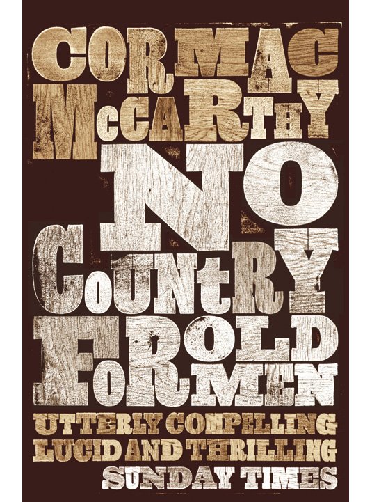
Designer David Pearson has designed the covers for nearly all of Cormac McCarthy's novels, including the infamous titles No Country for Old Men and The Road. Using an old style slab serif typeface, imitating the raw look of letterpress printing, Pearson has created a bold, handcrafted feel.
02. Mario Puzo – The Godfather
The Godfather cover by S Neil Fujita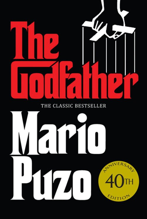
Originally published in 1969, American graphic designer S Neil Fujita created a heavy, Gothic-looking typeface for The Godfather. The design was also used in the opening credits of Coppola's movie trilogy and remains iconic to this day.
03. Chuck Palahniuk – Snuff
Snuff cover by Rodrigo Corral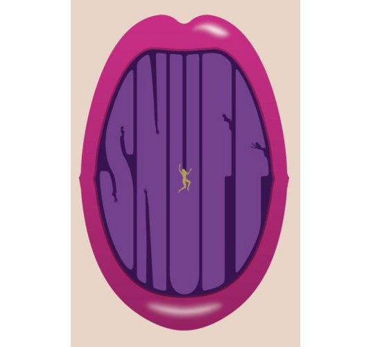
Chuck Palahniuk, famous author of Fight Club, turned to established designer Rodrigo Corral, who's also created covers for authors John Green and Daniel Kahneman, to create the cover for his book Snuff. First published in 2008, Corral has hand-drawn a font to create a provocative cover that fits well with Palahniuk's image.
04. Jonathon Safron Foer – Everything is Illuminated
Everything is Illuminated cover by Gray318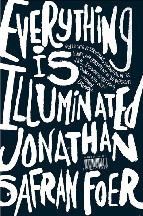
John Gray, otherwise known as Gray318, is another of the biggest book cover designers out there and has designed for the likes of Joe Dunthorne, AM Holmes, and Zadie Smith. His hand-drawn fonts for the covers of Safran Foer's first two books, Everything is Illuminated and Extremely Loud and Incredibly Close, create an energetic and fluid design.
05. Ian Fleming – The Spy who Loved Me
The Spy Who Loved Me cover by Michael Gillette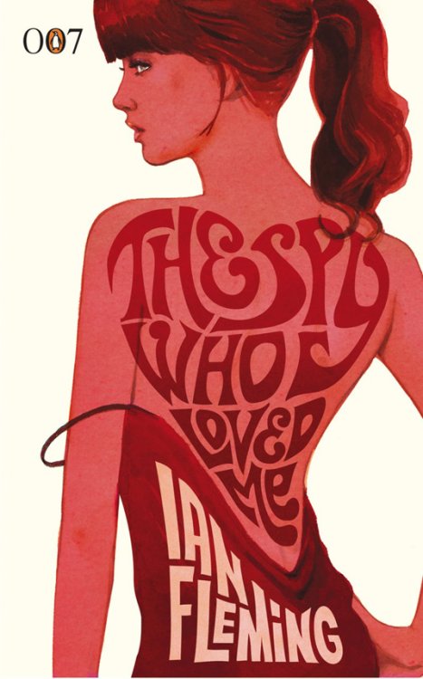
To celebrate Ian Fleming's birthday in 2008, Penguin commissioned designer Michael Gillette to create 14 new covers for the Bond series. Each book uses a different font but the retro-style remains the same, painted alongside forms of the iconic Bond girls.
06. Jesse Ball – The Way Through Doors
The Way Through Doors cover by Jason Booher and Helen Yentus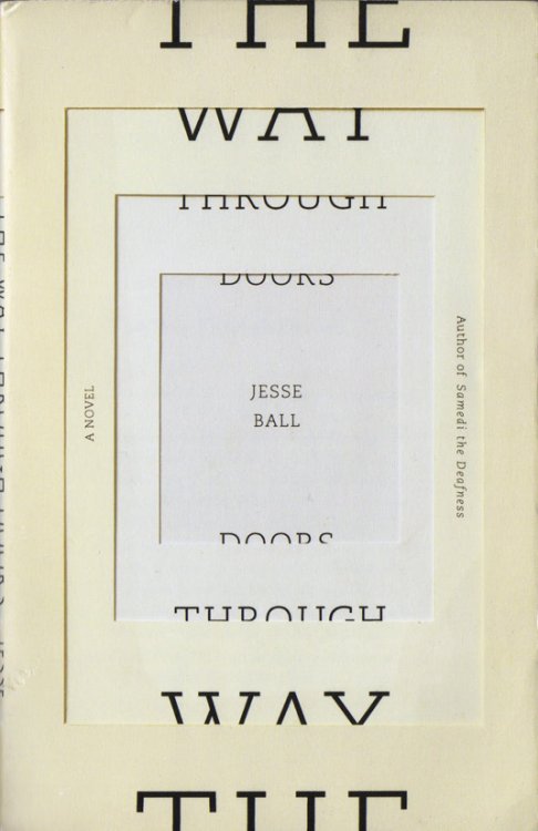
Designed by two of the best cover creators Jason Booher and Helen Yentus, Ball's highly acclaimed novel uses a striking illusion of layered paper and a slab serif typeface to create clean lines and almost clinical feel to reflect the story of a hospital patient's attempt to remember the truth after a car accident.
07. Phillip Pullman – Tales from the Brothers Grimm
Ohio-based designer Cheong-ah Hwang also used an illusion of layered paper to create Pullman's reworking of The Fairy Tales of the Brothers Grimm, and was released alongside a beautifully illustrated trailer.
08. Robert Lowell – For the Union Dead
For the Union Dead cover by Berthold Wolpe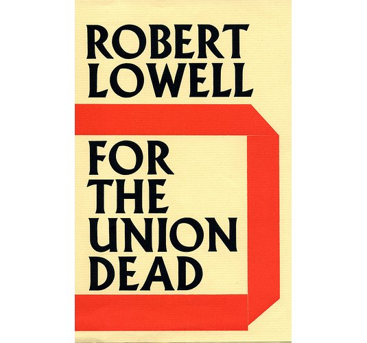
Faber's art director and designer of the Albertus typeface Berthold Wolpe designed a number of covers for the famous publisher, including Lowell's For the Union Dead. His bold cover designs were said to have been created in response to the typical illustrated covers of the time.
09. JK Rowling – The Casual Vacancy
The Casual Vacancy cover by Joel Holland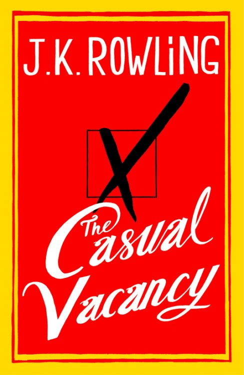
Her first since the Harry Potter series, Rowling's book featured illustration and hand lettering by Joel Holland on the cover. Unsuprisingly given Rowling's fame, the cover design caused some controversy but as Jon Gray told The Telegraph: "As a designer I'm left non-plussed and envious and as a reader I'm left intrigued. That means another copy sold, so: job done."
10. Chad Harbach – The Art of Fielding
The Art of Fielding cover by Dana Tanamachi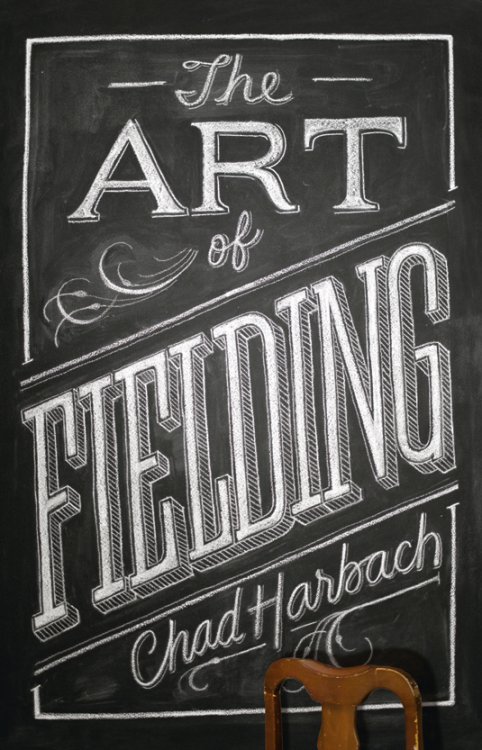
Brooklyn-based artist Dana Tanamachi used her custom chalk lettering style to design the UK version of Harbach's novel, using the chair to create a 3D element to the cover whereas the US version, designed by artist Keith Hayes, has more of a baseball feel for the American audience.
Related articles:
-
Magical lands, swashbuckling adventures, tall tales conjured with wonderful breaches of logic… The lure of children’s book illustration is clear. Who wouldn’t want to spend their days crafting stories of courage, loyalty and bravery?
Children’s book publishing is booming. In the UK, the market grew more than 7 per cent in the first quarter of 2016, according to Nielsen Books, following a 5.1 per cent growth in 2015. Unsurprisingly, it’s competitive, and for many artists a tough field to crack.
Even Dr. Seuss creator Theodor Seuss Geisel was rejected by over 30 publishers before releasing his first book. So what does it take to make it in the wild world of children’s book illustration?
01. Mine your imagination
“I illustrate with lots of colour and detail because that’s what I loved when I was six,” says Jonny Duddle
For author and illustrator Jonny Duddle, the first key attribute is an active imagination. “Whether you’re writing and illustrating your own books or illustrating another author’s text, you need to create original, inspired artwork to capture a child’s imagination,” he explains. “You need to be passionate about your vision, and make sure you have the style and technique to pull it off.”
02. Build up your stamina
Duddle estimates that he spends almost 1,000 hours creating the artwork for each of his picture books
Fresh from creating the covers of two new JK Rowling books, The Tales of Beedle the Bard and Quidditch Through the Ages, Duddle – who in 2014 also illustrated the jackets of Bloomberg’s refreshed Harry Potter series – has a unique insight into the highs and lows of the field.
“Stamina is just as important,” he adds. “Finishing the artwork for a picture book always takes longer than you think. Sustaining your vision, passion and imagination over several months is probably the greatest challenge an artist can face.”
03. Don't expect it to be simple
A promotional image by Kiri Østergaard Leonard for Montague Mouse
Danish illustrator Kiri Østergaard Leonard agrees. “Many people go into children’s illustration thinking it’s really easy to do, but it isn’t. Not only is it a difficult and competitive market to break into, it’s also a difficult language to learn – especially because it isn’t always about drawing well. It’s more about relying on story, emotion and strong colours than making something pretty.”
From both a technical and practical perspective, learning how to draw children’s book illustrations can be deceptively challenging. There’s a dizzying variety of genres on offer – from folklore to fairy tales; for babies to young adults – and often the simpler a style, the harder it is to create.
Don’t be fooled into thinking fewer words means an easier job, either. “Some picture books have characters and items evolving from page to page that are never mentioned in the text,” points out English illustrator Nick Harris. “You might show the moment just before or just after the scene described in the text, which can have an implication or pathos that adds weight to the words.”
04. Embrace your inner child
“With picture books, the words and pictures must work together," says Duddle, "Neither should tell the full story”
There can be more restrictions involved when creating imagery for children, too. “There’s a level of censorship that isn’t present in artwork for adults,” says Leonard. “What’s great, though, is how vivid children’s imaginations are. They won’t ask why the dog is green – because of course the dog is green.”
“If you still love to draw the kinds of things that excited you as a child or teenager, then you’re halfway there,” adds Harris. “I still laugh at fart jokes and pratfalls. Just never condescend. Children are inexperienced, not stupid.”
05. Marry up subject and style
Duddle visualised the Harry Potter universe as he read through the books
Like many children’s book illustrators, Harris works collaboratively with authors and publishers to bring existing stories to life, rather than illustrating his own. For him, creating imagery that perfectly captures and adds to the narrative is one of the most exciting parts of the job. “How you interpret the mood – using eye-line, lighting and body language for characters – affords a ton of ways you can present a scene in your own particular style,” he explains.
Other artists, however, prefer to illustrate their own books. As Leonard admits, trying to bring someone else’s vision to life can be a struggle. “Although then you have to worry about writing, which is a whole different challenge.”
For Duddle, the key is to develop story and visuals at the same time. “I don’t write the story first, or plot out all of the pictures,” he says. “Sometimes a book begins with a casual doodle in my sketchbook, or a rhyming couplet that I think is funny. But each book develops over months or years as a back-and-forth between words and pictures.”
06. Make an emotional connection
“I enjoy illustrating for middle grade and young adults, more than early readers,” says Leonard
So what do you need to make it from a professional standpoint? According to Helen Wicks – creative director at Kings Road Publishing, part of Bonnier Publishing – no prior experience is necessary. She frequently hires graduates fresh from college, looking for technical accomplishment, a distinct style and unique perspective.
“Just as important is the ability to tell and sustain a story visually, and to communicate emotionally with the reader,” she explains. “Our illustrators create pictures with a purpose: to tell a story, convey emotions or illuminate facts.”
She’s happy to work with illustrators who write, or to match writers with partners. “If the talent is there, we’ll find a way to make it work,” she says, adding that if you’re interested in getting into children’s publishing, don’t be afraid to market yourself. “Some pitch fully formed concepts; others send in simple portfolios of illustration that manage to catch our eye. Talk to as many other illustrators and publishers as possible,” she advises.
08. Be on time
Nick Harris’ cover art went through a number of iterations before arriving at the bright, final version
Whatever you do, don’t be unreliable. The cardinal sin of children’s book illustration is over-promising and not delivering on time. “We can cope with almost everything else,” Helen warns, “but the ramifications of lateness are profound and very stressful for all.”
Like any career, says Harris, children’s book illustration can be tough. But when the perfect image brings life to the text, it’s incredibly rewarding. “Aim for the magic,” he says. “It’s there. When the right words find the right illustrator, it really ignites.”
This article was originally published in ImagineFX magazine issue 143. Buy it here.
Related articles:
-
Struggling to give your work a strong sense of perspective? There are perspective tools built into both Photoshop and Illustrator that will help (for example, click Edit>Perspective Warp in Photoshop).
When you’re first experimenting with perspective I’d strongly suggest using these tools as a guide to help you with your compositions. Once you feel more confident and understand which is the right perspective for your composition, then you can start to create your own perspective grid for more flexibility.
Having a strong perspective in your work helps the image feel more realistic, and it also enables you to convey the power you want the image to have. For example, picking a lowangle perspective, like in my racing car piece here, gives a real sense of speed and power, whereas picking a higher perspective angle (imagine looking down from a tall building) can give a sense of height and fear.
Once you’ve decided on a perspective and angle for your composition, you can start to bend the rules slightly and exaggerate your perspective for a more dramatic effect. However, don’t go too far because it will begin to feel unrealistic!
01. Create a horizon line

It all starts with a horizon line
It all starts with your horizon line. Once you have this you can then pick your primary vanishing point and begin to create your guides from the point. Keep your angles simple to make your life easier – you can always rotate your artwork later.
02. Place your object

Take a couple of passes to settle on a good shape
Once you’re happy with your perspective, sketch some loose shapes to see where and how you want your objects to sit. I often have multiple sketches with different angles and perspectives before I decide on the one I feel works best.
03. Add details

Add a secondary vanishing point if needs be
When your angles and perspective are working well together, start to add detail and flesh your drawing out. You can also add a secondary vanishing point if necessary. For my piece here I added a secondary vanishing point for the buildings.
This article was originally published in issue 156 of ImagineFX, the world's best-selling magazine for digital artists. Buy issue 156 or subscribe to ImagineFX here.
Related articles:
-
Nobody's perfect. Design fails happen all the time – even the most thorough creative director is allowed to trip once in a while. The most important part is how you get back up again. Recognise your mistakes, don't be afraid to embrace your human side, engage in the conversation, and – if you can – try to turn it around into a positive.
Remember that consumers aren't necessarily looking for perfection; rather, for honesty and decency. When brands don't break trust by trying to be deceitful or hurtful, most of us are willing to laugh, forgive and forget.
Here are some of the most embarrassing examples from recent times of where branding went wrong.
01. Pepsi
You almost have to admire Pepsi for getting this campaign so spectacularly wrong. It seems to have looked into what The Young People are into and decided that mass protest is the latest thing, and created this saccharine abomination featuring the most anodyne demonstration ever, a ruthlessly diverse assembly of cheerful, well-scrubbed youngsters waving blandly meaningless placards.
Kendall Jenner making everything all right by handing a can of Pepsi to a riot cop, as a female Muslim photographer catches the perfect shot, is the sugary icing on an already syrupy cake; Pepsi apologised and pulled the ad within days.
02. BrewDog

"Pink IPA for girls! It's a joke, yeah? Like Ricky Gervais!"
Glasgow brewery BrewDog has form when it comes to provocative marketing with a tendency to wind people up, and its recent effort for International Women's Day is no exception. While you can't really fault its intention to help end gender pay equality and donate to charities that fight inequality and support women, rebadging its Punk IPA as Pink IPA and calling it 'Beer for girls' is a bit of a misfire, whichever way you look at it.
BrewDog was unapologetic, insisting that it was satirically exposing sexist marketing practices and that people didn't get the joke, but later admitted that next time it would try to be funnier.
03. Guinness

This four-leaf shamrock was unlucky for Guinness
For some, Guinness and St Patrick's Day are virtually synonymous, but in 2016 Guinness make a bit of a blunder when its Canadian St Paddy's Day promotional billboard advertising contained a shamrock with one too many leaves.
Social media was not slow to inform Guinness of its error, which then spread to traditional media around the world, causing major embarrassment for the renowned Irish stout-maker which will take some time for it to get cl-over.
04. Sainsbury's
Sainsbury's internal staff message ended up facing the public
In 2014, Sainsbury's was left red-cheeked after a poster, which was intended for internal audiences only, accidentally appeared in the window of one of the supermarket's east London stores.
The poster said: "Let's encourage every customer to spend an additional 50p during each shopping trip between now and the year end" and was meant as a staff incentive to boost the retailer's profits.
Lidl was quick to pounce on Sainsbury's blunder
Sainsbury's admitted this was a mistake and quickly took down the poster but the actual star of this blunder turned out to be Lidl, who spotted the opportunity for mischief and came up with its own fifty pence challenge.
05. The American Red Cross
There have been a few instances of personal tweets coming from corporate accounts
Mixing up the corporate Twitter account with your personal one – this must be one of the biggest fears of people working with social media. It also is the cause of many – often quite entertaining – brand blunders. One example is the rogue #gettingslizzered tweet by the American Red Cross, which stayed up for about an hour, enough to be picked up by various blogs and sites.
The American Red Cross cleverly turned the error around
However, much more interesting than the tweet itself was the way the Red Cross responded to the incident – with a good-humoured tweet that acknowledged this as a very human mistake. This misstep was then turned around to using #gettingslizzerd and the newly gained attention to inspire a wave of support for the Red Cross and increase donations.
06. Schweppes
Schweppes fell foul of the classic foreign language translation gaffe
Failing the linguistic check – another popular cause of funny (and sometimes quite creepy) brand blunders. When Swiss company, Schweppes, launched a promotional campaign in Italy for its Indian tonic they decided to go for the name "il water". Sounds pretty Italian, right? But what they did not take into account was that "il water" means "the toilet" in Italian.
Naturally, the company did not want to sell toilet water and so it changed the name to Schweppes Tonica. Luckily for Schweppes, the Italian market gave them a second chance but a simple check on Google Translate could have spared them the embarrassment.
07. Labour's Pink Bus
"What do women like?" "Pink things." "Perfect. Paint the van pink and let's go to lunch."
When Labour launched the Women to Women campaign their aim was to treat women as equals, listen to their concerns and encourage progress in women's lives. But in complete contrast the campaign used a pretty pink, which felt very patronising the women they were there to help. Dressing in pink to attract 'women' as a collective suggested that women would only be interested in politics if the information were packaged with a pink bow.
08. Tropicana
Destroy a much-loved brand and prepare to see your profits collapse
Pictures speak louder than words. Tropicana is made from 100% Orange Juice – pure and natural. It says so on the pack. More to the point the packs got a real orange on it with a straw sticking out of it – genius! It's an iconic piece of design as relevant today as the day it was created.
An ill-considered and short lived redesign in 2008 binned the orange and the straw and the familiar characterful logo in favour of a bland stripped back geometric sans serif makeover. Overnight it had lost its identity and PepsiCo lost in excess of $100m dollars as sales fell by 20%. The original branding was immediately reinstated.
09. Electrolux
Electrolux didn't understand that "sucks" has two meanings. Or did it?
"Nothing sucks like an Electrolux". This tagline by the Swedish appliance manufacturer has become something like an urban myth of brand blunders, the joke being that the Swedish failed to recognise the dual meaning of "sucks". But was that really the case? This is so bad, it's almost cool. And the attention this controversy generated was enormous.
So although this has gone down as a fail moment, it might actually have been intentional. This in turn raises a very interesting question: how thin is the line between failing and winning? (See also John McCarthy's post on Penguin Books and the #YourMum hashtag).
Related articles:
-
3D software Houdini from Toronto-based firm SideFX utilises a node-based, procedural approach to provide digital artists with a remarkable level of power, flexibility and control. It’s some of the best 3D modelling software around.
While many Houdini users utilise the software to carry out very specific tasks for their 3D art, it has a highly extensive toolset and capabilities – and in recent times has become more artist friendly. So now’s the time to jump right in.
Whether you’re completely new to Houdini or just want to hone your skills on its many features, going back to basics is a great way to master tools you might not already be hugely familiar with, and speed up your workflow. Here, you'll find some expert Houdini tips, which include specifics on enhancing your workflow, character creation and rigging, terrain generation and creating a robot with personality.
01. Cut wires mode hotkey

This hotkey is an excellent time saver when disconnecting nodes
"This hotkey is an excellent time saver when disconnecting nodes," says Blue Sky Studios' FX technical director Chris Rydalch. "By default, Y is set up as the key, so hold down Y and drag across network wires to disconnect the nodes. You can edit this to another letter of your choice, though.
"I've found that when I add X as a hotkey for Cut Wires Mode, I use it much more often. To do this, go to Edit > Hotkeys, then search for Cut Wires Mode. When you click to add X, it will warn you that X is assigned to Visualize Output, so click Remove Other. Only do this if you are happy with this change; since I disconnect nodes much more frequently than I put down visualizers, this works much better for me."
02. Use automatic and manual update modes

Manual cook mode will let you make changes to parameters and nodes without having to wait
"By default, Houdini is set to update (cook) automatically," Rydalch explains. "For small to medium scenes, this is fine. But often production work involves lots of very heavy graphs and simulations. In these cases, it is valuable to switch to Manual cook mode. This will let you make changes to parameters and nodes without having to wait for the nodes to cook and the viewport to refresh. Click the Refresh button to see any changes you've made.
"Also, you can add hotkey shortcuts to pick which mode. To do this, go to Edit > Hotkeys and search for Update Mode 'Always' and Update Mode 'Never', which are the commands for Automatic and Manual modes, respectively."
03. UVs along curves

The UV Texture SOP (Surface Operator) is great for adding UVs along a curve
"The UV Texture SOP (Surface Operator) is great for adding UVs along a curve," says Rydalch. "To do this, set the Texture Type to Rows & Columns and the Attribute Class to Point. Now you can access this in a wrangle using v@uv.x to get the UV value of a point along a curve. This works with multiple curves, and not just one at a time."
04. Compound bullet shapes

Houdini Bullet Solver is very fast
"Houdini Bullet Solver is very fast, and in most cases, the default collision shapes are good enough," Rydalch explains. "When you find you have a lot of concave pieces, and the concave collision shape isn't working, you can generate a special compound collision shape. Compound collision shapes are several distinct pieces, but they are permanently glued together and treated as a single shape.
"The way this works is you toggle on Create Convex Hull per Set of Connected Primitives under Collisions > Bullet Data on an RBD (rigid body dynamics) Object or RBD Fractured Object DOP node. This will tell Houdini to look for the s@name primitive attribute, and all primitive shapes that share the same name attribute will be treated as a single shape."
05. Emit particles from fast-moving geometry

"Often, particles need to be emitted from fast-moving geometry, and it’s not uncommon to find stepping in these cases," says Rydalch. "Thankfully, the POP Source DOP has some built-in features for these cases under the Birth tab.
"By default, Jitter Birth Time is set to Positive. I find I get better results by setting it to Negative and setting Interpolate Source to Back. This will interpolate the source geometry backwards in time, and birth the particles along that trajectory. This requires unchanging topology; your source geometry can be translating and deforming, but you can’t have varying point counts."
06. Bone capture biharmonic tool
"Bone Capture Biharmonic is a fantastic tool for a quick character setup," says Red Ring Entertainment's Kalin Stoyanov. "When rigging the amarok werewolf for the Houdini 16 presentation, we decided to use it and were amazed by how well it handled all the usual suspect spots – elbows and knees. The deformations were extremely smooth and behaved properly. It did not need much more weight painting (the most boring type of work in rigging). We just did some final touches and voila!
07. GATOR

GATOR is a great tool for transferring weights and shapes from one object to another
"GATOR is a great tool for transferring weights and shapes from one object to another, and makes it really easy to add clothes, shoes and additional objects to an already rigged character," Stoyanov continues. "In Houdini, such a concept exists in the very core of the software and transferring the attributes was easy as it updates on the fly."
08. CHOPS

Channel operators are a really powerful tool to help with animation
"The biggest reason for me to choose Houdini as a rigging software is CHOPS (channel operators)," Stoyanov says. "For those who do not know about CHOPS – imagine the Animation Mixer (XSI) and Animation Tracks (Maya), but better and much more powerful!
09. Work with the erosion node

"When working with the erosion node, I always start with a low terrain resolution for the first erosion step," 3D artist Aron Kamolz explains. "I do this to get strong, succinct details. Then I increase the terrain erosion, mixing in other details and do another erosion. This way you can get some exponent strong flow/erosion details for basic shaping of your terrain, and then you can add the smaller details on top.
"This workflow applies not only to the erosion node, but is also valid for the whole terrain generation process. Start low res for the bigger, dominant details and gradually increase the resolution while adding smaller details on top."
10. Use terraces

Houdini has a wide selection of geometry nodes for generating and shaping terrain
"Since the erosion washes details away, it's always good to add some terraces before the erosion process, even if you’re aiming for a terrain without a terracing effect," Kamolz adds. "If you use it right you won't see the terracing anymore after the erosion. Instead, your terrain profits from a bit more variety in details, since the terraces slow down the erosion process and give more space for sediments to settle down."
11. Mix-terrain fractals

To get a more interesting-looking terrain, try mixing different HeightField Noise functions
To get a more interesting-looking terrain, you should try and mix different HeightField Noise function," Kamolz suggests. "Simply using only a HeightField node and then carrying out an erosion on top looks boring and uninteresting most of the time."
12. Make use of masks

Masks are really helpful when working with height field terrains
"Masks are your friend when working with height field terrains," says Kamolz. "You have several functions to choose from, such as mask to slope or mask to height. Use them to combine multiple height fields to get interesting-looking terrains. Some nodes also output masks, like the flow mask you get from the erosion node. Use them to texture your terrain."
13. Experiment with Houdini's features

"After my beloved Softimage had been EOL-ed I was looking for a new ‘home’, and I found it in Houdini," says 3D freelancer Philipp Von Preuschen. "In order to get used to the new concepts that Houdini is based on, I started by modelling a few robot busts. I prefer to create robots with some personality.
"I started off with some sketches; as I knew from the get-go that the robots won’t need to move, I didn’t particularly care about mechanical correctness. The main rule for me in most cases is: it has to look functional, but it does not have to be.
"One thing I discovered in Houdini is that it can make a big difference which part of a model gets split into its own Houdini object. Each Houdini object has its own SRT in the scene context. One could, for example, model a piston and then rotate it within its Houdini object, but the piston could also be rotated by the Houdini object that it is located in. Each method has its own pros and cons, and by experimenting and figuring out what to use I found it key when it came to successful mechanical modelling in Houdini."
14. Utilise plugins

Direct Modeling HDA plugin is great for efficient hard-surface modelling
"I have recently discovered a great modelling plugin for Houdini: Direct Modeling HDA by Alexey Vanzhula," Von Preuschen says. "I used it a lot for my projects as it provides a functionality that is similar to Modo’s MeshFusion. It’s great for efficient hard-surface modelling."
15. Texturing

Houdini's curvature shader is a killer texturing aid
"I didn’t assign any UVs to my creation, and I used Redshift to render the robots," Von Preuschen adds. "Its triplanar projection is a superb way to texture almost anything super fast. The other killer texturing aid is the curvature shader, as it makes it easy to give metal some edgewear."
This article was originally published in issue 231 of 3D World, the world's best-selling magazine for CG artists. Buy issue 231 or subscribe to 3D World.
Related articles:
-
You might see smartphones everywhere, but they're still a growing market. This means they offer the perfect platform for developers and designers looking to get their apps in front of as many potential users as possible. Learn how to build your own apps with Design+Code2 iOS Design and Xcode Training, on sale for just $39 (approx. £28).
Mobile apps are the perfect medium for the creative mind. It’s a platform that rewards unique and innovative ways of doing things. Pick up Design+Code2 iOS Design and Xcode Training and you'll find the tools you need to take your out-of-the-box ideas and bring them to life on mobile. With over 44 hours of video lessons, you’ll learn everything you need to know about the languages and tools that define Apple’s iOS platform, including Swift, Xcode, Sketch and more.
You can get Design+Code2 iOS Design and Xcode Training for just $39 (approx. £28). That’s 74 per cent off the retail price. It’s a great price for a training course that could pay for itself, so grab this must-have deal today.
About Creative Bloq deals
This great deal comes courtesy of the Creative Bloq Deals store – a creative marketplace that's dedicated to ensuring you save money on the items that improve your design life.
We all like a special offer or two, particularly with creative tools and design assets often being eye-wateringly expensive. That's why the Creative Bloq Deals store is committed to bringing you useful deals, freebies and giveaways on design assets (logos, templates, icons, fonts, vectors and more), tutorials, e-learning, inspirational items, hardware and more.
Every day of the working week we feature a new offer, freebie or contest – if you miss one, you can easily find past deals posts on the Deals Staff author page or Offer tag page. Plus, you can get in touch with any feedback at:deals@creativebloq.com.
Related articles:
-
You've probably heard that you should use relative units for font size. This is a good rule for accessible web design; if the user changes their browser's default font size, this enables your page's text to resize accordingly. You may have taken this advice and made the switch. Perhaps you got out your calculator and converted your site's font sizes from absolute px units to ems or, more likely, rems.
But if that's where you stopped, you are missing out on a lot of the flexibility and power that ems bring to the browser. The em unit is not simply a replacement for the familiar px; you can use it for more properties than just font-size. If you do, some of its other benefits begin to emerge.
By consistently using ems, you can design components on the page that respond automatically should the font size change. Then, with a clever trick for a responsive font size, you can produce an entire page that adjusts dynamically based on the viewport width of the browser. Let me show you how to leverage the 'relative' behaviour of ems to create designs that are scalable and responsive.
Font size units
Using ems for font size can be tricky. The exact value is determined by the element's inherited font size (i.e. the font size of the parent element). This gets complicated when you start nesting elements more deeply. If an element has a font size in ems, its parent has a font size in ems, and its parent has yet another. You will have to multiply all these values to determine the actual computed value of the child element.
This means that placing the same module in different containers might change the meaning of em. The module will be unpredictable.
To avoid this, we typically use a different relative unit for font size: rems. A rem (or 'root em') is based not on the inherited font size, but on the font size of the page's root element, <html>. This means its value is the same throughout the page. It is more predictable than, and often preferable to, regular ems.
Building a module with ems
Let's use relative units to build a module. However, we're not going to follow the common approach. Instead of using rem for everything, we will use it only once: on the top-most element of the module. This will establish a known font size for the module, rather than it being based on an unpredictable chain of em values above it in the DOM. It means we can easily scale the size of the module by overriding a single value.
Use rems on the outermost element to establish a known font size, then use ems to build based on that value
After we establish this known font size, we are safe to use regular ems throughout the module. Use it not only for any font sizes on the sub-elements, but also for most other properties, including padding, margin and border-radius.
We'll build a panel with a heading and a body. The markup looks like this:
Let's style the outer container. We'll set the font size at 1rem to establish our local em value. We'll then define the border-radius using ems. I typically like to use px for border, though, to get a nice fine line.
Next, style the inner elements. We'll use ems for padding. Then we'll increase the font size of the heading to 1.25 times our local em value, producing a 20px computed size.
You can multiply the padding values by their font size to determine their computed values (9.6px vertical and 19.2px horizontal). Truthfully, though, it doesn't matter. Try to not get bogged down with pixel-perfect measurements. This may feel awkward, but press on. The more you use ems, the more you will become familiar with them as a unit in their own respect.
Dynamically scaling the design
When we create reusable modules like this, we often find we need a few variations. Say we wanted to create a larger version. If we were using px for everything, this would mean increasing the font size, the padding, the border-radius and so on. However, because we have defined everything in relation to one rem-based font size, we need only to change that value, and the entire module will respond:
We simply add this class to a panel to make it larger: <div class="panel panel--large">. This will change the local definition of an em, and thus the border radius and padding change as well, along with the font size of its child elements. With a single declaration, we've resized every part of the module.
A panel module, with paddings and border radius defined using ems
Likewise, we could create a small version:
By grounding the module using a top-level font size in rems, we've made it stable and predictable. By defining everything else within using ems, we've made all of its component parts scalable.
It is possible to base the size of everything inside the module on one value, then change that value to scale it all
This is a powerful pattern. You can use this approach for anything on your page, from drop-down menus to social media buttons. Ground the module with a rem value, then use em for virtually everything else from paddings to positioning to icon sizes.
Making it responsive
Let's push the principle one level further. We've sized the module (and theoretically all other modules on the page) using rems and ems. This ultimately means their size is based on the root element's font size. Then, we can adjust this single value to make the entire page respond in turn.
Let's bring in another relative unit: vh. This unit's computed value is derived from the user's screen size; it is equal to 1 per cent of the width of the viewport. If we use the vh unit to define the root font size, it will automatically scale responsively, sans media queries. Set the font size on the root to 2vw:
Unfortunately, the effect is a bit too strong. On an iPhone 6, for instance, this will compute to 5.5px, which is too small. Likewise, it's unreasonably large on bigger screens. To soften the effect, we can make use of CSS's calc() function:
Now the font size is derived partly from a stable value, and partly from a responsive one. This produces a much better effect. The 0.6em behaves as a sort of minimum font size. Now the root em will scale fluidly from about 13px on smartphone to 21px on an average desktop screen.
With your page made up of scalable modules, each grounded to the rem value, and they too will scale with the viewport. The page is structured with a three-tier hierarchy; you can change the size of the entire page, an individual module, or a single element by making a simple edit to the font size. Trust the ems and rems, and the browser will take care of the work for you.
You may still need to add the occasional media query to control line wrapping and some other responsive concerns. But this small bit of code combined with a habit of using ems and rems will get you a lot of the way there.
This article was originally featured in net magazine issue 288; buy it here
Related articles:
-
Netflix opens up bug bounty program to all white hat hackers and ups the ante for bugs to as much as $15,000.
-
Birmingham is a UK city with plenty going for it – more canals than Venice, some amazing architecture and a young, multicultural population. But unless you lived there, it's not somewhere you might automatically associate with design.
However that's about to change with the launch of the Birmingham Design Festival. Taking place from 7-10 June at venues across the city, it's planned as a celebration of the local, national and international design industry. And it's lined up an incredible collection of speakers to inspire you, no matter which part of the wide world of design you're from, or whether you're a junior designer or an art director.

The first Birmingham Design Festival kicks off in June
Around 80 speakers are expected to be sharing their wisdom and insights, and the festival has already announced some big names. Heading up the bill are graphic artist and printmaker Anthony Burrill, Pentagram partner Marina Willer, Hat-trick and Studio Sutherl& founder Jim Sutherland, award-winning creative director Jack Renwick and Draplin Design Co. founder Aaron Draplin. And a quick look through the rest of the speakers lined up should tell you that you're never going to be stuck for a session.
It's not all design celebrities, though. The festival's organisers have taken care to involve local studios and individuals in a carefully curated programme based around the theme 'Forward'. And if you have a great idea for a talk or workshop, they'd like to hear from you; download the festival submissions pack and send in your proposal by 27 April.
The Birmingham Design Festival is taking a clever approach to organising its many workshops, talks, exhibitions, demonstrations and screenings so that you're a lot less likely to miss out on something relevant to your interests.
It's gathering everything into three distinct Design Districts – Graphic, Digital and Product – so no matter what your place in the design industry may be, you'll have no trouble seeking out inspiration over the festival's four days.

Other great names lined up for the festival include Trevor Beattie, Made by many, Craig Oldham and Dan Mumford
It's all adds up to a compelling design destination for the summer. "Our beloved city is currently undergoing an exciting period of evolution and development," says organiser Daniel Alcorn, "and over the last few years these changes have also been evident in the creative industries. Brum is starting to act and feel like the creative powerhouse it has always had the potential to become."
You can find out more about the Birmingham Design Festival here, and keep up to date by following its Twitter account.
Related articles:
-
Want to understand UX design? Then go to the toilet. A place that provides insights into how to design goal-oriented, task-based, time-critical user interactions and interfaces.
Many public toilets are a catalogue of catastrophic design failings. No wonder the internet has usability issues when we still struggle to create elegant solutions for the everyday activities we have been doing for millennia. But we can learn from the good and bad of toilet design. Here’s some tips to take into your next digital project.
01. Don't create problems
Good design is meant to solve problems, yet sometimes the design inadvertently creates the problem. In the gents’ toilet at Brighton’s Dome Theatre a notice reads ‘This is a sink’. Unfortunately, in the hurry before a show you often see men mistaking the long, metal trough-shaped fitting for a urinal.
I’m sure when it was displayed in the designer’s studio it looked fantastic, but in situ, the height, colour, material, position and shape disguise its purpose. Avoid that sinking feeling. Always design for the people who will use your products and consider the context in which they will encounter them.
02. Put humans first
Mobile-first and content-first have their place, but I’d suggest the best designs are created human-first. Observing human behaviour helps you create surprising and innovative solutions.
An example of this is an experiment set up by the cleaning staff at Schiphol airport over 25 years ago. By simply adding an image of a fly into the porcelain to aim at, they managed overnight to reduce ‘spillage rates’ in the men’s toilets by 80 per cent, which translates into major savings in cleaning costs.
This fly printed on the urinals at Schiphol airport helped seriously reduce cleaning costs
The experiment has been replicated across the world. It turns out men are rather predictable; make the task a competition and you’ll get their concentration.
03. Make simple interactions
Train toilets are a big source of design crime. In many cases, to simply lock the door requires you to read reams of instructions and select the correct combination of flashing buttons. I’ve been on trains where a sign is needed to point to the flush, as it becomes hidden when the seat is lifted up. This poor design is made worse when the only visible button is a non-labelled and easy to reach emergency stop.
Clues on how to use a product should be baked into the interface. The need for instructions is a strong indication your design is not instinctive to use.
04. Communicate, don't confuse
We’ve all been there: bursting for the loo (often after a few drinks) with rising anxiety as we try to decipher the sign on the door. Is it a merman or mermaid? Are berets gender-specific? Remind me, is the XY chromosome an indication of male or female sex-determination?
I don’t want to solve a puzzle, I just want to go through the correct door. What can seem like a playful extension of your brand personality can quickly end up in user frustration. However pretty your wayfinding symbols or icons are, if they don’t communicate what you intend at a glance, they are an example of bad design.
05. Tame the technology
Just because you can build it doesn’t mean you should. Japanese toilets provide a sanitary lesson in the perils of over-engineering and feature creep. On top-end toilets, flushing, raising and lowering the lid, and even keeping a personal ‘performance’ record is all done via a smartphone app. This means that at night, before you can go to the toilet, you need to find your phone (and hope the battery is charged).
This Japanese toilet is a lesson in the perils of over-engineering
Sometimes the minimum viable product should be the extent of the product. In design less is more; and even less is even more.
06. Find space to think
The toilet provides the perfect perch for contemplation and encouraging curiosity. So if you want to understand human behaviour, get inspiration for interaction patterns, or just need the room to think, you know where to go. Become a better designer today by going to the toilet.
This article was originally published in net magazine issue 289. Buy it here.
Related articles:
-
The idea of following brand guidelines is something that doesn’t get a lot of attention on most design courses. “I’ve never come across an intern or graduate who understands the fundamentals of brand guidelines,” says Ellie Pearson, senior designer and studio manager at Cambridge-based agency Mobas. “But it’s not their fault: they weren’t told about it, and neither was I.”
The concept itself, though, is quite simple. Brand guidelines are a set of rules that dictate how all elements of a brand should be applied. Designers are given a detailed outline of a brand's preferred colours, fonts, logos and so on, and how each are to be used. But what students are often taken aback by is the sheer range of things covered by brand guidelines.
“I was surprised at first by the complexity and depth of brand guidelines,” recalls Jess Dutton, junior designer at Mobas. “For some larger clients, they’re incredibly extensive. You think of brands having one or two primary colours, but I didn’t know they could have secondary colours too.”
Dutton was also surprised by the distinctions between internal and external colours for collateral that will be used for staff and for customers. “It’s a lot more complex than meets the eye,” she says.
If you're new to working with brand guidelines, here are some pro tips for making sure you get the most out of them – without stifling your creativity...
01. Read the brand guidelines before you start

Brandon design consultancy experimented with branding guidelines for Vlerick Business School
It sounds obvious, but the complexity of some brand guidelines means it's good practice to spend time digesting them – before you start a project.
“I always make sure I’ve gone through the brand guidelines from start to finish, and that I have a clear understanding of the look and feel of the existing brand, before I start a project,” says Joe Bembridge, junior designer at Macclesfield design consultancy Brandon.
Tom Tennant, a motion graphics designer at Gramercy Park Studios in London, tells a similar tale. “I spend as much time as possible studying the guidelines, as it’s really helpful to be on the same page as your client,” he says. “Even reading the parts that aren’t relevant to what you’re doing can give you more insight into the brand. After all, it’s there to help.”
02. Know when to push back – and when not to
Laura Wynn-Owen, junior designer at Nelson Bostock Group in London, notes that guidelines are usually handed over without being talked through, so they can be open to your own interpretation. “But in our case, there are usually brand teams on hand to answer any questions,” she says. “There may also be brand sites that give access to assets, guidelines and best practice examples.”
As the word ‘guidelines’ suggests, these are not immutable rules. But pushing back on them should be a last resort, not a default, believes Andrius Petravicius, digital designer at Hampshire design agency Superrb.
“I usually wouldn’t push back on brand guidelines, as in most cases, you can still be creative and work around them,” he reasons. “I’ve done so on occasions, though, when I felt like the guidelines weren’t working well visually and I knew they could be improved upon.”
03. Make suggestions
Karl Doran of Manchester design agency Flow Creative concurs. “We did some work recently for Arts Council England,” he says. “They had a fairly detailed brand guidelines document, but we did try to push it a bit, and bring in some extra tints and colours, plus we created a kind of illustrative classic style that they’d not really used before.“
“It fitted in with their branding but it moved it on a little bit, and they were happy with it. If you can do that, that’s ideal, although it does obviously depend on the client and the brief.”
04. Don’t limit your creativity

Illustrator MegaMunden’s site needed to incorporate his signature style, so Superb studio asked him to illustrate a lot of the incidental elements
“Don’t let brand guidelines hold you back on your creativity,” agrees Joe Bembridge at Brandon. “These guides are put in place not to limit creativity, but to help a brand stay recognisable and consistent,” he points out. “If you do go against the guidelines, make sure you have a valid reason for doing so.”
05. Work within a reliable system
Normally, your job is simply to understand and internalise the brand guidelines, as well as work within a reliable system to ensure they’re adhered to. Such systems will vary from studio to studio, but will normally be largely based on common sense.
“At Moras, we have a huge printed folder with details of all brand guidelines that we work on in the studio, which is also accessible on our server,” explains Dutton. “I go through and manually double-check colours, as well as doing an InDesign check that shows all the typefaces used, so you can easily weed out any that shouldn’t be there. Plus, we have an internal artworker in the team who checks everything against guidelines and specs before it’s sent back to the client.”
06. Use the right tools
Adherence to brand guidelines may also be integrated into the software itself. “At Superrb we use Sketch, which allows us to set up reusable colour palettes and typography styles,” says Petravicius.
“I’ve also been using InVision’s Craft plugin for Sketch quite a lot lately; this lets you create branding libraries with all brand assets, styles and symbols. I’m also really excited about a new tool from InVision called Design System Manager, which seems like a powerful system for creating, managing and scaling design libraries.”
07. Harness the software
“To make sure I follow the guidelines carefully, I’ll take a screengrab of the most important parts: the colour references, font, and point sizes,” says Gramercy Park Studios' Tom Tennant. “I also find it helps to copy the brand colours into whichever software you’re using so you have a palette that’s easily accessible.”
08. Ask if you don’t understand
The most important thing, adds Ellie Pearson, is that if there’s something you don’t understand – and there probably will be – ask. “Brand guidelines can be incredibly technical,” she says.
“One of our animal health clients has a lock up at the bottom of all designs that requires a mathematical formula to work out the right height and width for the exact document you’re working on. A junior or intern has little hope of understanding that, so they should always seek help if they’re unsure.”
“Raise any questions you have as soon as possible, rather than when you’re midway through the work,” advises Laura Wynn-Owen, junior designer at Nelson Bostock Group. “If there’s anything you’re unsure about, ask. Even senior designers need guidance. There are no stupid questions when it comes to brand guidelines.”
Related articles:
-
2018 looks set to be a massive year for film – and 3D movies in particular. With long-awaited sequels and thrilling adaptations in the pipeline, now might just be the time to renew your cinema subscription. Because if you're going to see a film laced with CGI – to fully appreciate the show-stopping 3D art – it's got to be on the big screen, right? Here's the best of what's yet to come this year...
01. Rampage
Yes, it’s based on a not terribly interesting video game, and yes it stars The Rock, but who doesn’t want to see three genetically engineered animals tearing into the skyscrapers of Chicago? True to the 1986 coin-op, Rampage stars George, an albino gorilla, Ralph the wolf and Lizzie the crocodile in a fight to see who can become the top apex predator.
By the same team that brought you San Andreas, we’re pretty sure this 3D movie will be short on plot, but long on scenes of city-wide destruction. The movie calls on the skills of Weta Digital for the oversized creatures and Scanline VFX for scenes of devastation – so it should at least be a treat for the eyes.
02. Avengers Infinity War
The 19th film in the Marvel Cinematic Universe series see the Avengers joining forces with the Guardians of the Galaxy to defeat Thanos, the murky villain in search of the Infinity Stones. It’s the first of a two-part series, with a direct sequel appearing in 2019, and both films being shot back-to-back.
Infinity War will undoubtedly be a tour-de-force of computer graphics, with big-hitters Framestore and ILM on VFX duties. Indeed, with the entire team in full flight, at least six of the lead characters are all-CG entities, so there’s very little real footage these days.
03. Solo: A Star Wars Story
The Star Wars film no-one really asked for has suffered a troubled production, with a change of directors, reshoots mere weeks before launch, and a lead actor who neither looks nor sounds like Harrison Ford and needed a dialogue coach on set. Recent rumours even suggest that Disney have written the film off and expect it to bomb at the box office. Ouch.
Still, the trailer is pretty engaging and the Star Wars brand seems to be a bulletproof cash-cow. And if the thought of a pristine Millennium Falcon being chased by TIE fighters and a proper Star Destroyer doesn’t lure you in, then this probably wasn’t the film for you anyway.
04. Jurassic World: Fallen Kingdom
When the sequel to one of the most beloved franchises earns $1.67 billion worldwide, you can bet your ass there’ll be another one – and here it is. The action returns to Isla Nublar, home of the original doomed theme park, where an impending volcano threatens to wipe out the remaining dinosaurs. Chris Pratt is back as the velociraptor wrangler, and Jeff Goldblum makes a welcome return as chaotician Dr. Ian Malcolm.
The 3D movie promises more dinosaurs than ever, with lots of full-size animatronics, but don’t worry, there’ll be plenty of giant CG reptiles rampaging across the island, and some tasty volcanic effects too, courtesy of ILM.
05. Incredibles 2
The long-awaited sequel to one of Pixar’s best movies is finally here. Even though there’s a 14-year gap between productions, the film takes place immediately after the events of the original. The superheroic Parr family is struggling to lead a normal life while fighting The Underminer and dealing with their latest member, Jack-Jack, who has a host of dangerously uncontrolled powers. And when a new super villain enters the fray, things just get worse…
In terms of visuals, we pretty much know what to expect, with Pixar’s usual honed skills teamed with the stylised retro-look of the first Incredibles film. After a long schedule of kid-friendly fare it’ll be good to get something with little more edge. But how we long for Pixar to break free of Disney’s controlling influence and do something truly ground-breaking.
06. Ant-Man and the Wasp
And the Marvel Studios movies just keep comin’. This time it’s a sequel to the 2015 flick Ant-Man. Paul Rudd reprises his role and gains some back-up in the shape of Hope van Dyne, played by Evangeline Lilly.
This 3D movie riffs on the whole shrinking/enlarging conceit, with a series of gags that include a wheelable office block and giant Pez dispenser. And, having revealed Ant-Man’s ability to become oversized in Captain America: Civil War, there’s bit of that too.
With numerous CG shots, including another trip into the quantum realm, the effects workload has been split across Double Negative, Scanline VFX, Luma Pictures and Rodeo FX.
07. Pacific Rim Uprising
Guillermo del Toro’s 2013 outing was bombastic nonsense, but clearly left enough of an impression to warrant a follow-up. The film stars John Boyega, doing his best Idris Elba impersonation, and Scott Eastwood, doing a passable version of his dad, as pilots of humanity’s giant mechanoid fighting machines, the Jaegers.
Earth is once again under threat when some mysterious organisation opens the Breach, releasing Kaiju monsters back into the world. Shots of citywide destruction channel the Toho monster movies of old, and, thanks to a rogue Jaeger, there’s enough metal-on-metal action to keep Michael Bay happy. For fans of VFX, it’s a veritable green screen CG-fest.
08. Fantastic Beasts: The Crimes of Grindelwald
Despite the original Fantastic Beasts being a rather tame affair, worldwide box office takings north of $800 million pretty much guaranteed a sequel. Having escaped custody from the Magical Congress of the United States of America, the dark wizard Gellert Grindelwald (Johnny Depp) continues his plan to build an army of pure-blood wizards to rule over the world’s non-magical inhabitants. And it’s Potter fans’ chance to see a young Albus Dumbledore, played by Jude Law.
With an array of magical effects, wizardly apparitions, period set extensions and, of course, fantastic beasts, you can expect host of CG in this 3D movie. The bulk of the work is being handled by London-based FX houses, most notably Double Negative and Framestore, which have enjoyed long associations with the Harry Potter franchise.
09. Alita: Battle Angel
Based on Yukito Kishiro’s 1990 manga series Battle Angel Alita, this 3D movie adaptation is directed by Robert Rodriquez, under the production auspices of James Cameron and Jon Landau (Cameron had stated his intent to direct, but the little matter of two Avatar sequels prevented that). The bulk of the VFX work – which looks substantial – is being handled by Weta Digital.
The story centres on Alita, an amnesiac cyborg discovered by Christoph Waltz, who – in the comics at least – becomes a Hunter-Warrior in pursuit of killer cyborgs. The trailer does little to expand upon that, but you spend most of the time looking at Alita’s curiously oversized eyes. With a whopping $200 million budget, this feels like a sizeable gamble for Cameron and 20th Century Fox.
10. Mortal Engines
Based on the novels by Philip Reeve, Mortal Engines is set in a post-apocalyptic steampunk world in which London and other major cities have been mechanised and roam the planet preying on smaller ‘traction towns’. These are dragged on board and stripped of their resources – as revealed in the impressive trailer (which is also rather bewildering if you’re unaware of the books).
With four novels in the series – plus the words ‘Peter Jackson’ and ‘an epic new saga’ – we're pretty sure this is intended as the first in a line of 3D movies, assuming the first is successful. Unsurprisingly, Jackson’s chums at Weta Digital are in charge of the CG work, which should be substantial given the theme of the movie.
Related articles:
-
If you're looking for the best illustration books, you're in the right place. Whether you're a beginner or more established artist, we've rounded up 10 must-read books for illustrators in this essential list.
These books don't just explore how to draw. You'll also find titles that give an overview of the history of illustration; instructional books to help you master the fundamentals of the craft; and books that'll help when you're struggling for inspiration. Whether you're a hobbyist, art student, freelancer or a studio professional, every book here is essential reading.
Read on for our 10 must-read illustration books.
Let's start at the beginning. In Fifty Years of Illustration, Lawrence Zeegen and Caroline Roberts plot the evolution of illustration – "the rampant idealism of the 1960s, the bleak realism of the 1970s, the over-blown consumerism of the 1980s, the digital explosion of the 1990s" – and how the craft has changed over of the years. Zeegen looks at the socioeconomic factors that effect illustration and vice versa. He also uses essays and artist profiles to investigate contemporary illustration's impact on popular culture. This is an illustration book to keep on your bookshelf, and go back to again and again.

What is visual language and how do you develop it? Mark Wigan's Thinking Visually for Illustrators asks you to "take a step back from your own work and explore the approaches of contemporary illustrators". He looks at work from students, recent graduates, and the people who teach them. The book is a little more academic than others on this list, but it's also one of the most thorough. The visual library will get your ideas going, but it's in the analysis of the processes behind each image that the book comes into its own.
First published in 1991, Molly Bang's short, beautiful, slightly strange book is one of the best ever written on composition for illustrators. Picture This: How Pictures Work explores the mechanics; the nuts and bolt of picture design. But she also asks abstract questions too: Why are diagonals dramatic? Why are curves calming? Why does red feel hot and blue feel cold? And at just 96 pages, you could easily read this in a oner.
We had to include the legendary artist James Gurney in our list of essential books for illustrators. We could easily have picked his first book, Imaginative Realism, in which he tells you how to paint what doesn't exist. But his second book, Color and Light: A Guide for the Realist Painter, is arguably the best, most exhaustive book ever written on colour and light.
In it, Gurney looks at artists who were experts at using of colour and light, how light reveals form, the properties of colour and pigments, and a variety of atmospheric effects. But he does it without using jargon or overly scientific terms. This book shows Gurney is not only a master artist, but a master teacher too.
Andrew Loomis is one of those artists who transcends art. If you don't know the name, you will know the work – he is the master of figure drawing. In Figure Drawing for all it's Worth, Loomis encourages you not to imitate his very distinct style, but instead to understand the principles that prop it up. If you're starting out, this is as good a place as any to master on of the fundamental building blocks of illustration, but there's more than enough here for old pros to learn a thing a two.
The realities of being a working artist mean that as well as being able to draw, you need to know how the industry works. A good one for beginners, How to be an Illustrator covers the basics of the business of being a professional illustrator, including putting together a portfolio, approaching clients, preparing for contract meetings, managing your time and money. It also includes valuable interviews with nine industry professionals. Rees has worked with big clients in the UK and the US, so he knows what he's talking about. His book looks smart too.
Many artists shy away from terms like marketing and strategy. But understanding how these things work is the difference between a hobbyist and a successful professional. Marshall Arisman and Steven Heller's Inside the Business of Illustration 'tells budding illustrators everything that their teacher didn't know or their art director didn't tell them'. And it succeeds in doing so without sucking the fun out of drawing. This book includes interviews with illustrators, art directors, and art buyers (the current edition has an afterword with Milton Glaser) but is thoughtfully structured to avoid ever feeling too academic.
Austin Kleon's Steal Like An Artist is a modern classic for anyone who wants to do anything creative. But once you've started making things, what next? You have to show what you've made. And this is often the most terrifying, frustrating part. In Show Your Work: 10 Ways to Share your Creativity and get Discovered, Kleon – 'a writer who draws', in his own words – explains the difference between networking and using the network, how you become 'findable'. Chapter titles include You Don't Have to Be a Genius, Share Something Small Every Day, and Stick Around – which pretty much describes the whole arc of the book. 'It's not self-promotion,' Kleon says. 'It's self-discovery.'
'I failed my GSCE art,' writes Ben Tallon early his brilliantly titled book Champagne and Wax Crayons: Riding the Madness of the Creative Industry. The memoir proves he's a bit like Hunter S. Thomson and Ralph Steadman rolled into one. He tells you how he made it as freelance illustrator, from that failed exam, through art college, the early days of freelancing, all the way up to the top clients he works for today. He writes in clear, funny prose, and it's all illustrated with his trademark scratchy drawings. A useful book for anyone setting out on a freelance career of any kind.
After all those books about business and self-promotion, here's a title that helps you remember why you love to draw in the first place. Lost in Translation: An Illustrated Compendium of Untranslatable Words from Around the World has tips on illustration. But it also features 50 drawings about words in various languages that have no direct translation into English. Author Ella Frances Sanders explains that the Japanese language have a word for the way sunlight filters through the leaves of trees, and in Finnish there's word for the distance a reindeer can travel before needing to rest. Those written definitions are cumbersome. Her illustrated definitions aren't.
Read more:
-
Arch Hosting Web Hosting is the web host of choice for web developers when they need to get their sites online with the assurance that all their designs will work as expected. This reliable web hosting service can get your site up and running in a snap. You can get a lifetime subscription to this powerful service for just $24.99 (approx. £18).
Arch Hosting Web Hosting has everything you could possibly need to get your website up and running at its peak performance. This performance-oriented web host understands the importance of having no downtime and quick load times and will optimize your site with its lightning-fast network. You'll get 2GB of storage space and 500GB of bandwidth for your domain, which you'll get free for a full year. It's the perfect web hosting bundle for any web developer.
You can get get a lifetime subscription to Arch Hosting Web Hosting plus one year of domain registry for just $24.99 (approx. £18). That's a saving of 95 per cent off the retail price for a deal that will get your site up and running, so grab this deal today!
About Creative Bloq deals
This great deal comes courtesy of the Creative Bloq Deals store – a creative marketplace that's dedicated to ensuring you save money on the items that improve your design life.
We all like a special offer or two, particularly with creative tools and design assets often being eye-wateringly expensive. That's why the Creative Bloq Deals store is committed to bringing you useful deals, freebies and giveaways on design assets (logos, templates, icons, fonts, vectors and more), tutorials, e-learning, inspirational items, hardware and more.
Every day of the working week we feature a new offer, freebie or contest – if you miss one, you can easily find past deals posts on the Deals Staff author page or Offer tag page. Plus, you can get in touch with any feedback at:deals@creativebloq.com.
Related articles:
5 ad campaigns that embraced a stupid idea
in Ειδήσεις από τον χώρο του Design και Hosting
Posted · Report reply
adam&eveDDB's Richard Brim dropped a pretty incredible statistic into his talk at Offset Dublin: apparently, the UK spends £18.3 billion on advertising each year. Of that 4 per cent is remembered positively, 7 per cent is remembered negatively, and 89 per cent isn’t noticed of remembered at all.
So how do you create work that is part of the 11 per cent that makes an impact? adam&eveDDB, where Brim is chief creative officer, has built a reputation on crafting adverts that make people sit up and take notice, and at Offset, Brim took to the stage to share how the studio found its success.
"The fear of generic people laughing at you: That is where we will all fall down," he says. "Sometimes the most stupid ideas are the ones where the magic happens." It takes someone – and often it’s not the most senior or experienced person in the room, he says – to pluck up the courage to share an idea that makes everyone else go, ‘What the fuck?’ And then someone else to take a chance on it and champion it.
In this article we look at some of the studio’s biggest ads in recent years, and how they all started out with someone suggesting something that was either ridiculously good or just ridiculous. Here's adam&eveDBB's rules for crafting an ad that people will remember.
01. Don’t start with an advert at all
With its Love/Hate campaign, adam&eveDDB hit on something great. But it was starting to get tired. Cue a big brainstorming meeting where everyone had something to say on how to breathe new life into the idea. Mid-discussion, a junior planner piped up, ‘It must be genetic, right?’
Long story short, the studio ended up sponsoring a bone fide research campaign into whether the taste for Marmite was indeed genetically predisposed: the Marmite Gene Project. It ended up in the New Scientist, and had already started gaining serious traction when the studio ran its first TV ad for the campaign.
In the midst of Brexit rows and Tesco threatening to delist the product, the ad prompted a massive uplift in sales. Tesco backed down.
02. Trust in a bonkers idea
The concept behind a recent H&M campaign wasn’t too cohesive when it was first pitched to Brim. “Someone came into my office and just said: We want to shoot in Tokyo, we want Grace Jones, and we want a Wham! track.” While Brim didn’t quite know what to make of the idea, he decided to trust his team were on to something magical. While Grace Jones said ‘no’, Naomi Campbell and a host of other famous models did not.
03. Ignore the brief
Skittles came to the studio wanting an ad that would appeal to millennials. One brave (or stupid) designer decided to ignore the brief entirely, instead pitching a campaign centred around Pride: during the festival, there was only one rainbow that mattered, they argued. So how about Skittles got rid of its rainbow for the weekend?
The idea won over the studio, but when it came to getting the “very, very conservative” Mars on board, things got trickier. At first, they got a hard ‘no’. The idea was reshaped into an open letter from Skittles to Pride, to be published in the Evening Standard and Pride’s own magazine.
Then Mars was offered a colour-drained Skittles float for the Pride parade, and someone looked into getting special white packs printed to go alongside it. The following year, the campaign took off for good, with Tesco adopting the campaign as its support of the Pride festival. Totally off brief, but hugely successful.
04. Lead, don't follow
Typically, FIFA trends follow what’s going on in the real-world game, but for its FIFA 18 ad campaign, adam&eveDDB decided it would try and do things the other way round.
It developed a brand new move dubbed ‘el tornado’ – a seamless dragback, flick, and spinning volley, and against the odds, managed to get EA Sports to introduce it into the computer game. The twist was that the real-would players would have to prove they could land 'el tornado' before their in-game avatars would be able to do it. And the pro footballers really went for it, with the studio even issuing FIFA certificates to those who proved their skills.
05. Take a risk with your biggest client
The work that has gained the studio the most acclaim has been its long running relationship with John Lewis. Each year, adam&eveDDB is in charge of its hugely high-profile Christmas campaign, and as you’d expect, each year the pressure ramps up. 2017's ad started, much like the H&M campaign, with a not entirely complete concept.
Someone pitched the idea of a load of rabbits on a trampoline, with a snowy backdrop. It would make a nice visual, they said. Then someone suggested that rabbits were’t quite right, but what about foxes? Eventually Buster the Boxer was born.
“I stood back and looked at what we were filming for our biggest, most important client… and it was a load of woodland animals bouncing on a trampoline,” Brim smiles. “That was a definite ‘what the fuck’ moment.”
Read more:
View the full article