

Rss Bot
-
Content Count
15,133 -
Joined
-
Last visited
Never -
Feedback
N/A
Posts posted by Rss Bot
-
-
Trying to work on public transport can be taxing, particularly when signal is bad, you feel like a sardine crammed into a small space, or are surrounded by loud or obnoxious people. But it is possible, and not every way of working involves being tethered to your laptop or an internet connection.
We asked designers and developers how they manage to avoid spending their entire journey staring at 404 pages in frustration, and are able to make the most of their commute or travel time.
01. Plan ahead
"I always feel great when I get work done on the train or at the airport because it’s like my time wasn’t wasted," says Michael Vestergaard, a freelance creative developer and interaction designer. "But it can be a challenge.
"I normally plan ahead specific animations, prototypes or code snippets I need for new or ongoing projects. These might be micro interactions, text and image transitions or even drone formations, such as our most recent launch for Verity Studios. This kind of work is easier to pick up after a distraction or a longer break and distractions such as noise, slow Wi-Fi, small screen and so on aren’t such a big deal."
"It’s about tailoring your work to your situation," agrees digital transformation consultant Sally Lait. "If I know I’m going have a patchy connection, I’ll save up writing tasks, use it as distraction-free time to read or learn something new. It’s important to set yourself up right and download what you need in advance."
02. Make sure you have the right equipment
"I sometimes work during my 90-minute commute from Hertfordshire to London Bridge," says web developer at Zopa, Ben Read. "I’m currently working on a project that ties in many different services to one single static site using Gatsby.js. I carry a backup battery pack and typically use data tethering from my phone but it’s tricky when you’re pulling data from an API and suddenly the train goes into a tunnel.
As well as having the right equipment, you may also need to make sure it's set up properly for your needs. "I’ve run out of data twice this month because I forgot to disconnect the tether, then later ran ‘npm install’," says Read. "When you’ve got over 300 dependencies to download that can hurt your allowance. I should probably invest in an unlimited data plan."
03. Use the time for something else
Working on your commute doesn't always mean doing actual work. "I have RSI so I can’t (or shouldn’t!) do laptop-based work on public transport," says Inayaili de León Persson, lead web designer at Canonical.
"Because of that, I use the time I spend travelling listening to podcasts and articles. I follow lots of both work and non-work-related podcasts and I tend to listen to the former while commuting and on work trips. I also use Instapaper’s text-to-speech iPhone app so I don’t hurt my neck reading on my phone. It’s made me appreciate how important it is to have well-written semantic markup when creating content online!"
Freelance digital designer John Taylor says, "I often work in Manchester and it’s impossible to work on public transport whilst travelling to and from the city centre during rush hour, although it can lend itself to doing research like reading, listening to podcasts and watching videos.
"On quieter journeys, I sometimes do admin work like correspondence, bookkeeping and invoicing but this is rare. I can’t imagine trying to do any serious design or dev work whilst travelling, unless it was something simple like an amendment or minor update. There are too many distractions and the problems caused by overcrowding are not conducive to an effective working environment."
This article was originally published in net, the magazine for web designers and developers. Buy issue 312 or subscribe here.
Read more:
-
If there’s one thing that people who work in the 3D art industry agree on, it’s that there are some base-level qualities needed to succeed as any kind of digital creative. It all boils down to passion and determination, but there are numerous tips and tricks that can help you build on these foundations and become the best of the best.
To assemble these words of wisdom, 3D World spoke to freelance creative director Antony Ward, SouthernGFX director Glen Southern, and self-taught freelancer Rico Cilliers.
So what qualities are necessary in order to become a successful professional in this industry? According to Ward, flexibility with your skill set and how you apply it is key. “It’s like being a joiner who only fits doors,” he says.
“Eventually work will dry up, whereas if you can build shelves, fit decking or create bespoke things with wood you will always be busy. The same can be said for polygons. Don’t just be a sculptor when there are so many other services that you can offer to a client when there’s no sculpting available.”

This image is from a series of stylised studies undertaken by Antony Ward to improve his traditional art skills
For Cilliers, the devil is in the details: “I recommend developing an eye for detail and a sense of perfectionism. You don’t want to be too nit-picky about things, but clients generally appreciate attentiveness and an ability to spot problems and then solve them.”
Southern maintains that the qualities that really make a difference aren’t creative at all: “The ability to communicate, take feedback, be a team player and finish a project that isn’t the most enjoyable are all skills that will get you hired. Being a kick-ass concept artist is one thing, but if you can’t take direction from your art director, it’ll prevent you from being an effective part of that team. Spend as much time crafting your interpersonal skills as you do working on your art skills.”
Knowing how to deal with clients is one of the crucial ingredients needed to make a perfect professional. The trio have some sage advice when it comes to this: “Effective communication on the job is the most important thing I’ve learned,” says Cilliers.
“My clients need to know exactly what they’ll get and how fast they’ll get it, as well as the costs involved. In this line of work, it’s often difficult to predict those things, but you need to be as clear as possible.”

Rico Cilliers has eight years’ experience in sculpting, character creation, high- and low-poly modelling, and texturing
Experience is crucial to approaching your clients, as Southern explains: “The only way to get experience in this area is to do it. Every customer is different and will treat you differently. Whoever the client is, they always want great art at a reasonable price.”
He also agrees with Cilliers’ assertion that communication is key: “If time is tight or something has to give, that’s where the ability to communicate and be honest is absolutely essential. Be honest about your skill level and experience, be honest about how long the project is going to take, and be honest to yourself about your ability.”
He continues: “Something I hear artists say all the time is: ‘say yes, then worry about how to do it later.’ That’s fine until you are knee-deep in a project and realise that it’s not going to work out. Being honest early on can prevent sleepless nights or anguish over a project.”
Ask any digital artist, freelance or otherwise, for the most essential skill they’ve picked up along the way and there’s a strong chance that they’ll say time management.
Cilliers has some very simple tips where this is concerned. “I’ve found that using an app like Google Calendar is really helpful when it comes to time management, as it’s so easy to use. I break tasks into small chunks, then I set personal deadlines for each chunk of work. I also try to take breaks regularly to avoid burning out.”

Rico Cilliers warns that freelancers should be prepared to do a lot of admin work between artistic endeavours
Ward keeps his days varied as a means of staying on track, “I tend to start work at around 7:30am. Rather than jumping straight into work, I use the first hour or two to work on personal projects, learn new skills, and catch up on emails. The rest of the day is then dedicated to client work.”
He continues: “If I’m juggling a couple of projects, I make sure I divide the day and dedicate an equal amount of time to each, so I don’t get too focused on one and let the other slide. I also make sure to go to the gym a few times a week. If you’re sat at home all the time, you will soon see your health decline and if you’re not well, you’re not earning.”
Southern is willing to admit that honing his time management is an ongoing process, and one he hasn’t fully mastered yet. “I have to be careful to not say ‘yes’ to everything; taking on too much leads to poor-quality work and bad decision making."
"Get that wrong at a high level and it can really damage your reputation. I find being really structured with a diary is a great help – I put everything I do in mine, including fitting things around my personal life."
Creators are likely to already know how important community is in the world of 3D art. Maintaining a presence in this community can do wonders for any professional’s career, as Ward explains.
“Meeting new people in the industry is essential in building a potential client base, so I try to attend networking events like Ga- Ma-Yo (Game Makers of Yorkshire) or Vertex whenever possible. Having a healthy online presence is great too, as it means people all around the world can see what you’re doing and contact you.”

This image is from a series of stylised studies undertaken by Antony Ward to improve his traditional art skills
According to Southern, you don’t even need to leave the house to maintain a presence in the community. “Social media is a blessing and a curse, but it’s here to stay so if you want to grow a following you have to accept social media as your key delivery method. Find like-minded artists who do what you want to do and join in."
"Push yourself to share work and try new ideas within a safe group environment. Do competitions and challenges to see where things lead and get people interested in what you do along the way.”
Cilliers builds a community through collaboration with his fellow artists. “For me it’s always been effective to involve other people in my personal creative projects,” he explains.
“Typically I like to post ‘work in progress’ screenshots of my art, and I ask people online to give feedback. People love contributing ideas, and this generally leads to a pleasant community interaction. You also get valuable advice. It’s a win-win situation. Also, get on ArtStation, it’s the best place to be for any and all digital artists.”
So you have the basic qualities needed to succeed, an idea of how to deal with your clients, and a decent footing in the community, but how do you know what to charge for your services?
If you do good work, and your pricing is honest, you will find clients
Rico Cilliers“It’s really quite simple,” asserts Cilliers. “Add up all your monthly expenses, account for the possibility of unforeseen costs, as well as profit, then divide that amount by the number of hours you work per month. This will give you a basic hourly rate."
"There’s really no right or wrong way to do it, as long as you’re not underpricing your work. Don’t be afraid that your prices might be too high either. If you do good work, and your pricing is honest, you will find clients.”
To Ward pricing is something of a minefield. “It’s difficult because if your rates are too high people won’t hire you, but set them too low and you won’t get time to sleep. With that said, if your prices are low a client won’t have confidence in your work."
"I would suggest deciding on a day rate that you’re comfortable with, one which means you’re making enough money to pay the bills. With that in mind I always try to work to a client’s budget. If the budget is smaller I see if the schedule is more flexible, so I can take longer to do the work whilst doing something else to top up my earnings for the month.”

Antony Ward produces both 2D and 3D work for a wide range of clients including Electronic Arts, Infogrames, Sumo Digital, Ragdoll Productions and Jellyfish Productions
Even after everything covered in this article, there are still many factors that people forget to consider when setting out as a digital creative. For freelancers in particular there is the constant pressure of running your business and making sure that the work is coming in.
There are however considerations that apply to anyone, as Southern lays out: “You have to get used to the fact that you won’t get to work on what you want for 90 per cent of the time. You could get lucky and work on things you love, but bear in mind that’s harder for freelancers than employees.”
He concludes: “You will get harsh criticism, critique and feedback sometimes. You will produce work that you may consider your best and it can be dropped in a heartbeat. Don’t get too emotionally attached to a piece of work, it’ll always sting a little at first but that wears off."
"One thing I always say about being a creative is that the lows are low but the highs are higher. There’s no better feeling than getting a piece of art right and your client loving it."
This article was originally published in issue 240 of 3D World, the world's best-selling magazine for CG artists. Buy issue 240 or subscribe to 3D World here.
Related articles:
-
If you love playing video games but find you're beating more and more of them, why not learn to design your own? You'd be doing what you love, while also opening up a lucrative new career path for yourself.
With School of Game Design: Lifetime Membership, you'll take developer courses led by industry experts. You'll gain access to a huge collection of training videos, you'll learn how to execute advanced techniques using Unity 3D, you'll get your hands on royalty-free game art and textures, and a whole lot more.
Best of all, all these skills and features can be yours for only $59 – that's 99 per cent off the regular price.
Related articles
-
Laptops are a staple of a creative person's toolkit, and it's important that you look after your laptop by keeping it in a high-quality laptop bag.
If you take your laptop into the office each day, or to meetings with client and stake holders via public transport, you'll want a laptop hard case or padded laptop backpack.
If your commute is less prone to getting up and close and personal with other people and your meetings require smart presentation, opt for a swanky and professional laptop briefcase.
If you're happy carrying your laptop in a bag you already own but want added protection, take a look at our best laptop sleeves and hard cases.
Right now we think the best laptop bag is the OMOTON Anti-theft Laptop Backpack, because it's water-proof, comfortable and practical. That said, whether this is also the best laptop bag for you depends on what you're looking for, which is why we've compiled this ultimate list.
How to buy the best laptop bag for you
The best laptop bags will be strong and durable, but also comfortable and stylish. It's also important that they are secure, so you can take your laptop from A to B without the worry of it getting stolen or damaged.
Key features to look out for include easy access laptop compartments so there's no need for opening up the main compartment that houses everything else, or zips on the back for extra security. As well as these, you'll want high-quality design that's durable, but stylish too.
The style of bag that you choose will influence the material. Laptop bags will more often than not be fabric or canvas, but this doesn't mean they're not watertight. Several of the best laptop bags and backpacks in this list, including the OMOTON, Sosoon, WIWU and Knomo, are waterproof.
Leather and neoprene are great options for waterproof protection, and we have briefcase and shell style laptop bags to suit.
Of course, the material you choose will also influence the cost of your new laptop bag, so think about how much you're looking to spend. That said, we think it's well worth investing in a laptop bag that's going to stand the test of time. After all, the thing it's protecting will cost you a lot more to replace.
The trickiest part of buying a laptop bag is getting the size right. Often laptop bags, especially sleeves, will be named for specific brands or models, most commonly the Macbook Pro, but this doesn't mean they will only fit that model.
You'll have to be most careful with hard cases as they'll be made to fit, but other than that laptop bags are pretty flexible. To help though, we have included details of what sizes each of the best laptop bags in this list are available in.
We have arrange our best laptops buying guide by bag type – backpack, bag, briefcase and sleeve – and we've included a best overall, budget, high-end and most stylish options for most categories.
Here's our pick of the best laptop cases from the many available right now.

Looking for a laptop backpack that does it all? This multi-functional rucksack from OMOTON is an excellent all-rounder.
The laptop compartment is at the back of the rucksack, opening underneath the shoulder straps and making it impossible for your gadgets to be stolen while on your person. There's also a separate compartment at the lower back of the rucksack for your passport or wallet, meaning you can keep them to hand but still safe from wandering hands.
Once you're zipped in, the zips can withstand a sharp knife too. Not that you'll need that kind of protection on an average commute.
This laptop backpack tops our list because it's water resistant and designed with the wearer in mind: ergonomically designed straps give ultimate comfort, and the S-shape shoulder straps and padded both provide support.
We recommend this if you're a commuter who needs to know they can grab and go and that their laptop will be safe.


If you're all about security with little care for aesthetics, save yourself a few pounds and opt for the Sosoon anti-theft laptop backpack instead.
Going one step further than the OMOTON, this backpack has fully hidden zips. The zips for the main pocket are hidden underneath the fabric at the top of the backpack meaning this bag is secure even when it's not on your back.
Your laptop will be protected in more ways than one thanks to shockproof internal padded sleeves and elastic belts you can use to fasten in your laptop. That said, it's a visually unexciting choice compared to some of the best laptop bags on this list.

The HotStyle City Outdoor College Backpack adds a splash of colour to the backpack portion of this best laptop bag guide.
There are four colour options: grey, navy, camo green and light sea green – our favourite – which is pictured above.
It's a cheap and cheerful laptop backbag that does the job without too many frills. If you're likely to want to work on the train (or watch Netflix, we won't tell), getting your laptop in and out of this backpack is tricky as there's no easy-access compartment.
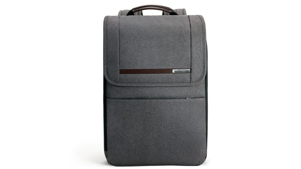
Created for city living, this Kinzie Street expandable backpack from Briggs & Riley is as cool as laptop backpacks come.
The slimline look doesn't compromise of padding for your laptop, and there are also RFID blocking panels to protect your wallet or purse from RFID theft. Leather accents add a touch of style and sophistication to the streamlined, minimal design.
Yes it's expensive, but it comes with a lifetime guarantee and can even be paid for in instalments. If you're looking for the functionality and security of a backpack with the professional style of a briefcase, we'd recommend this Kinzie Street backpack for you.
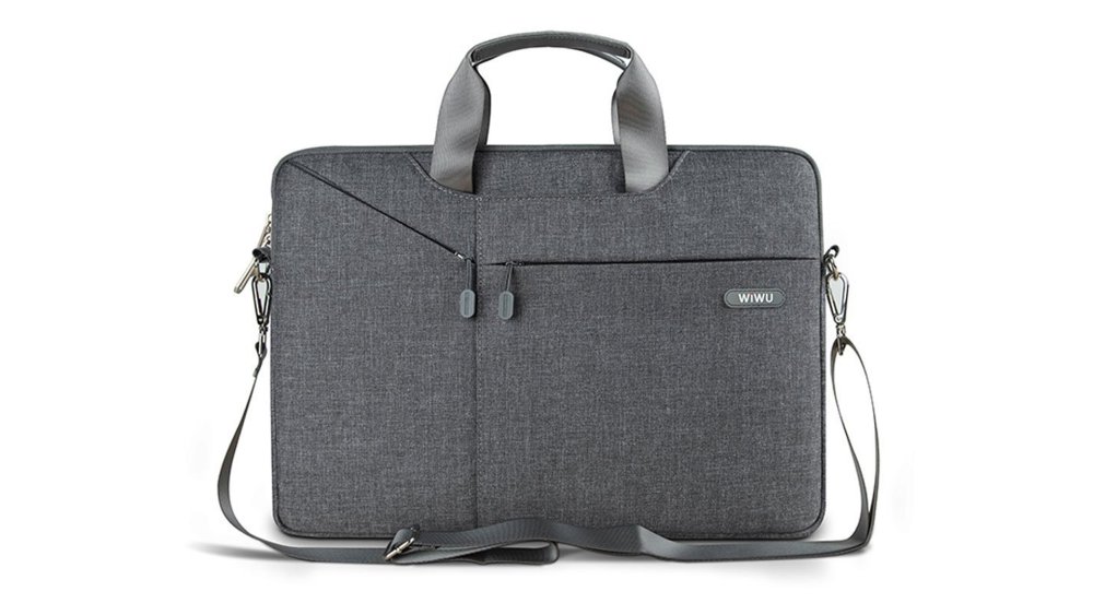
Built with five layers of material, this WIWU laptop shoulder bag is a great way to protect your device if you don't need the extra space a backpack provides.
The bag features a shock-absorbing bubble foam padding layer, as well as water-resistant neoprene layer underneath a fabric outer. Despite the multiple layers, the bag is very streamlined.
The main compartment is suitable for your laptop only, but there is a smaller, zipped compartment on the front with three small pockets.

Although we've included this Ropch laptop bag as our budget option, we think it looks far more expensive than it is.
The main compartment will hold your laptop (11.6" up to 17.3" options are available), and there's an additional zipped, front compartment for your accessories: chargers, headphones, or mouse etc.
This lightweight, professional-looking bag is perfect for the dashing to and from meetings, working on the move and everything in between. It's sleek enough that you won't look out of place in a client's glass-walled office, but equally it's quirky enough to be by your side in your local coffee shop.
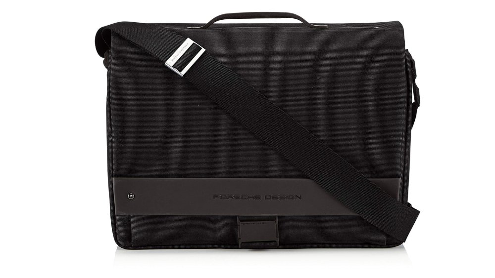
There's no denying that the Porsche name tag adds some extra pennies to this laptop bag, but we think the build and style quality are worth it.
Made from nylon but coated with Teflon, this bag is both strong and stain resistant. The double-handle system means it can be carried like a briefcase, or over the shoulder when mobility is your priority.
Ideal for on-the-go professionals, this bag features a padded laptop pocket as well as room for your charger and documents.
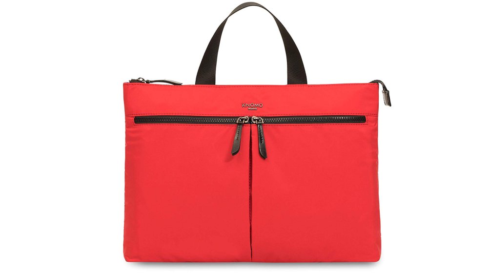
Inject some fun and colour to your day with the Copenhagan briefcase from Knomo. This is without a doubt the most stylish laptop bag you can buy today. The stunning red colour is bold and bright, so you'll always be able to spot your luggage among the crowd, but it still looks smart.
The downside is that the Knomo Copenhagan only fits laptops, Macbooks or notebooks up to 14 inches, but for many of us that's the largest device we need when working remotely.
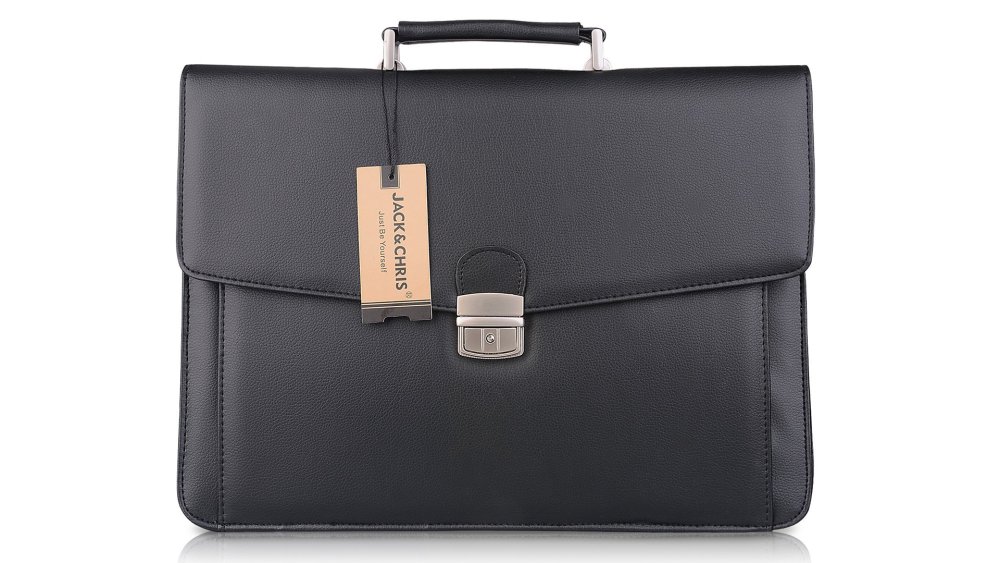
If a traditional briefcase is closer to what you're looking for, look no further. PU leather that has the look and feel of real leather helps this laptop briefcase punch far above its weight in the style stakes.
The briefcase features two main compartments for carrying your laptop, tablet and organiser, as well as separate area to keep documents need and holders for credit cards, keys and even pens. The bag locks securely with a flap buckle and key-lock, and offers the choice of a traditional top-carry handle, or adjustable shoulder straps.
For some though, this bag possibly says more 'suited and booted' than 'creative professional'.
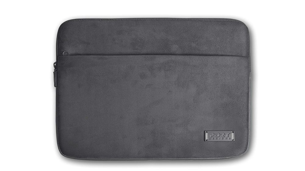
Available to fit 12, 14.5 and 15.6 inch notebooks and Macbooks, this faux suede laptop sleeve is a crowd pleaser.
It's super soft and padded so your device will be well protected, and there's an external pocket that's big enough to fit key accessories like headphones or charging cable, and an additional interior pocket for valuables.
This is a good middle ground when it comes to laptop sleeves as it's more stylish than our budget neoprene option, but more neutral than our high end and patterned picks.
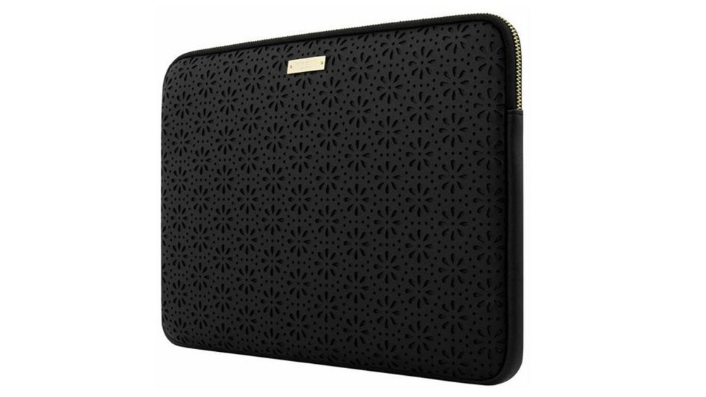
A real winner when it comes to high-end laptop cases, this gorgeous leather sleeve by Kate Spade combines functionality with simple, classy design.
The perforated flower print adds texture and personality to the simple black case without losing the professional look. If you're carrying a sleeve designed this well, your clients are going to trust your eye for quality design.
This case certainly adds style to your tech, but protection is also key. The durable, real-leather outer will protect from knocks, and the soft inner lining with prevent scratches. Unfortunately this case is only available for screen sizes up to 13 inches at the moment.
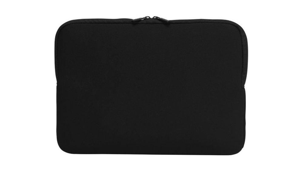
If you're looking for a cheap, unfussy laptop sleeve then this neoprene number from LOGIK is the one for you.
Neoprene is a tough yet cushioning material so your device is in good hands when it comes to light knocks and bumps, and it's also waterproof. This sleeve comes with a handle – not always a given with neoprene sleeves like this – meaning it's easy to transport. No frills and no fuss means you can pick up a durable, protective case for just over £10.
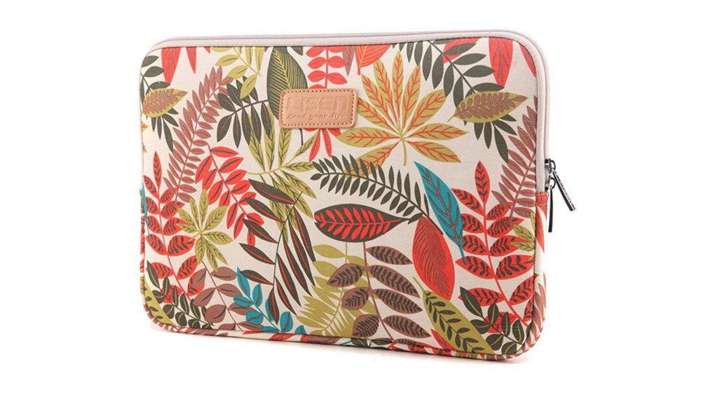
If you like the simplicity of the LOGIK neoprene case but are looking for something a little more funky, then check out this protective neoprene sleeve from Dr.Sosmonki.
Perfect for creatives who don't want anything dull or simple, this slim sleeve is lightweight and waterproof, making it an essential for transporting your laptop.
Shown above is our favourite of the four patterns, but it was a tough choice between this and the blue and red pattern. There are four striking designs to choose from in total, as well as three sizes: to fit 13, 14 or 15.6 inch devices.

If you like to keep things simple, or are a huge fan of the natural look of your Macbook, then this hard case offers protection without changing the design of your device.
Although designed for the 13" Macbook Pro, this laptop hard case can be used on other 13" devices. It's designed to stay on your laptop at all times, rather than just when you're on the go, and so help keeps your laptop ventilated, as well as allowing access to all ports and charging points.
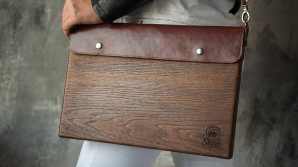
If you want a laptop hard case that's unlikely to be owned by anyone else you work with, we think we've found your perfect match.
This modern and elegant wooden laptop case is available in light or dark oak, complemented by a brown leather flap. Adding custom measurements is an option so that laptops and notebooks of all sizes can be catered for, as is a custom engraving.
If you're a graphic designer or illustrator, then a customised hard case featuring one of your own designs is the perfect way to showcase some of your work in an unusual way.
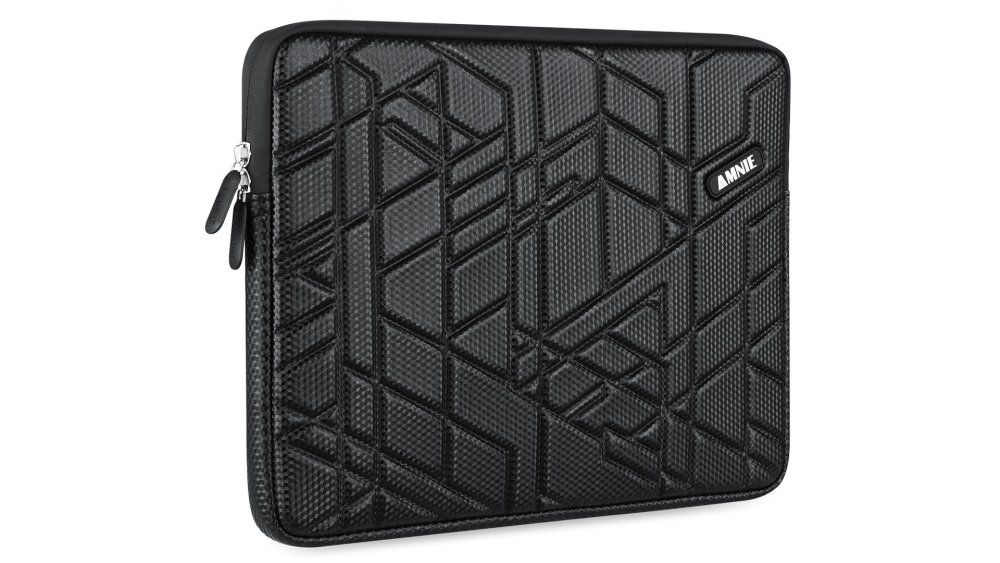
Comprised four different materials, this AMNIE laptop hard case will protect your device from knocks, bumps and dust, as well as scratches and spills.
Working from the inside out, your laptop is protected by soft velvet cushioning for the screen, and 6mm high-density, slow-recovery foam that absorbs shock and reduces its impact. The water-resistant polyester surface protects against spills and fits snugly, whether you go for the 11 to 11.6 or 15 to 15.6 inch case.
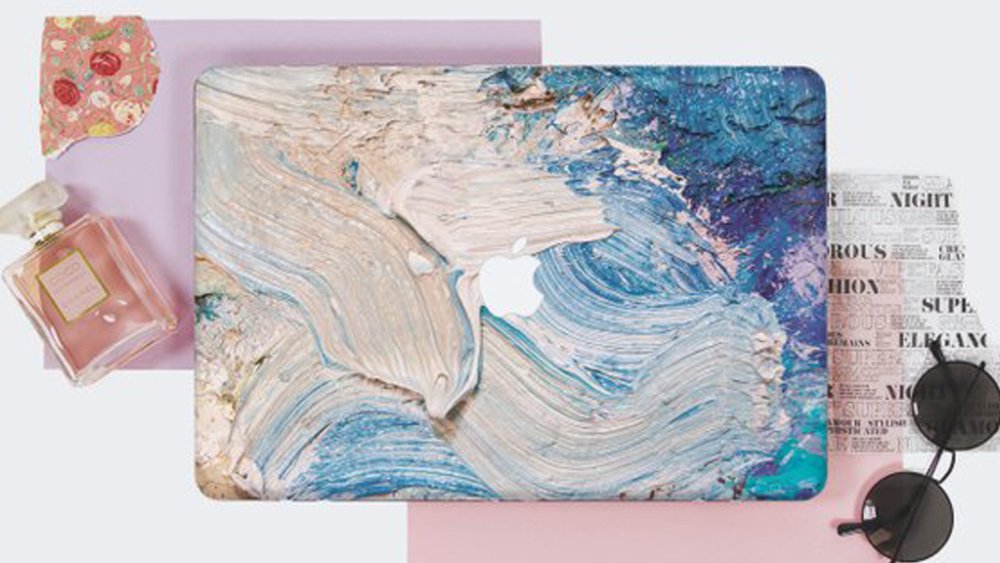
Etsy offers a world of customisable designs, but our favourite right now is this handmade Paints hard case by DesignerEmpireCo.
Cleverly designed to mimic oil paint, this laptop hard case will help you make a statement when it comes to your creativity. It's a natural choice for traditional artists, but will give a nod to anyone's creative profession or hobby. Multiple sizes are available, from 11 to 15 inches.
Read more:
-
You're reading Microsoft Redesigns Office App Icons, originally posted on Designmodo. If you've enjoyed this post, be sure to follow on Twitter, Facebook, Google+!

Changes in the digital world are happening rapidly and every industry is affected. That is why great companies keep up with trends, so they don’t become part of the past. Microsoft revealed new, modern Office App Icons. But did they …
-
Stepping up to running your own agency is the dream for many designers, however once you find yourself in charge you might find that it's all too easy to make mistakes that can result in chaos, inefficiency, overstretched and stressed staff, and ultimately missed deadlines and unhappy clients.
One way to keep things on track is by understanding the importance of good resource management. Float is a visual team planner that makes managing your team incredibly easy. It's designed intentionally for agencies, studios, and firms, and eases the vital business of keeping your projects on track.
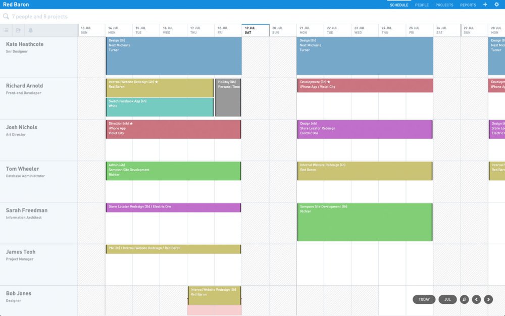
Float takes the pain out of resource management with a straightforward and beautiful UI
With Float, project management becomes a lot less stressful and you'll find it easier to deliver on time and to spec with fewer unpleasant surprises along the way. You can't mitigate for every eventuality, but with solid project planning in place you'll be much better prepared for the inevitable obstacles.
Thanks to Float's beautiful UI you can plan projects in seconds, and with features like real-time updates and live notifications you can ensure that your teams have all the information they need to plan their time well.
But there's more to running an effective business than simply having the right tools. Read on for eight pitfalls you need to avoid if you want your agency to thrive.
01. Don't say yes to everything
Turning down work never feels good, especially in the early days of an agency when you're going all-out to build your profile, but if you want things to run smoothly then you're going to have to recognise when your plate's full.
It can be tempting to squeeze in an extra job in a rush of enthusiasm, but if the end result is having to juggle your teams across multiple projects while trying to keep assorted stakeholders happy, sooner or later you're going to hit a brick wall. Your employees will be over-stretched, deadlines will slip by and the end results are likely to be below par. Don't risk your team's moral and your agency's reputation; learn when to say no
02. Don't be inflexible
No project ever runs completely to plan, and no business ever runs entirely by the book. If you keep these two facts in mind and ensure that you're ready to adapt when things go wrong, then you'll be in a much better position to cope when you run into the inevitable hiccups that will crop up along the way. Good project management skills aren't about sticking rigidly to the original plans and specifications; if something's not working then you might need to refocus and reorganise.
03. Don't interrupt
The modern work environment is packed with all manner of ways to distract people from their work; even if you set aside the ever-present lure of social media, there's also the constant pinging of email and Slack notifications. And while it's tempting to keep people updated with a judicious @here message on Slack, you should ask yourself whether it's really necessary.
If you interrupt someone while they're deep in their work, it's going to take them time to settle back into their flow, and constantly shifting between work mode and comms mode can be draining. Giving your team time to ignore emails, set 'Do Not Disturb' on Slack and work uninterrupted can be a real productivity boon, and it's also a positive influence on their mental health.
04. Don't go overboard on meetings
Love them or hate them (we know, you probably hate them), meetings are essential, just so long as they're tightly planned and don't end up rambling completely off-topic. Meeting that start late and run overtime don't just waste precious work time, they also cost you money. Keep meetings to the point by using Google Calendar's 'Speedy Meeting' option; it'll end 30-minute meetings five minutes earlier, or 10 minutes for one-hour meetings, helping you to stay focused on the agenda and make everyone happy that they're getting out early.
05. Don't overload
As mentioned earlier, it's beneficial to know when to turn work down, but even so you'll almost always be in a situation where you have numerous projects on the go and you're relying on your staff to prioritise work effectively. This, of course, is the sort of situation where a team planner such as Float is invaluable, but you'll need to apply a bit of old-fashioned common sense on top of this.
Asking people to switch back and forth between a number of projects might hit those daily goals, but it can be a struggle for your staff. If you can break your team down into groups with responsibility just one project, they'll be able to focus better without having to shift mental gears every few hours and feel overloaded.
06. Don't micro-manage
No-one likes a manager who's constantly looking over their shoulder and suggesting ways they could work better; it's bad for team morale and it's not an effective use of your time. However a laissez-faire approach will often lead to bad habits becoming ingrained, so you need to find a good middle ground.
Set time aside every day to analyse and optimise the way your team works, and figure out improved working practices to take forward; by approaching management in this way rather than constantly being on everyone's case, you should find plenty of ways to boost productivity (and of course, profitability).
07. Don't avoid decisions
Sometimes the biggest hold-up on a project can be the business of waiting for someone to make a decision, especially if it's one with a lot of stakeholders. You can tackle this at your end by ensuring that you don't put decision-making off; if you've done with your research and you're communicating effectively with your team then it really shouldn't be difficult to bite the bullet, and make even the hardest decisions quickly.
Waiting on decisions from clients can be a different matter, especially if your point of contact has to refer to a manager, who may in turn prefer to kick the decision upstairs rather than take responsibility themselves. You can ease this process by employing a responsibility assignment matrix, which lays out exactly who across the project is responsible and accountable for all decisions, as well as indicating who should be consulted or informed about decisions.
08. Don't ever think you know it all
Finally, no matter how much you've learned over the course of your career, don't fool yourself into thinking that there's nothing left for you to learn; this kind of mindset leads to complacency and suddenly finding yourself completely overtaken and outclassed by a bunch of hungry new kids on the block.
There's always something new to discover, whether it's figuring out fresh tricks for finding more work, new methodologies to apply to projects or great ways to motivate your team. The best bosses are the ones who know this and keep pushing themselves to learn, no matter how long they've been in the business.
Find out more about how Float can transform your agency's project management, and get a free 30-day trial, here.
-
The browser comes with a new set of protections to block pop-ups that could lead to 'abusive experiences.'
-
-
If you want to give your designs a human touch, and be massively on trend at the same time, then some illustrated people are a must-have. However if you don't know how to draw people or can't afford to commission an illustrator to create bespoke designs, then you might have to resort to stock art, and you might not manage to find exactly the look you want.
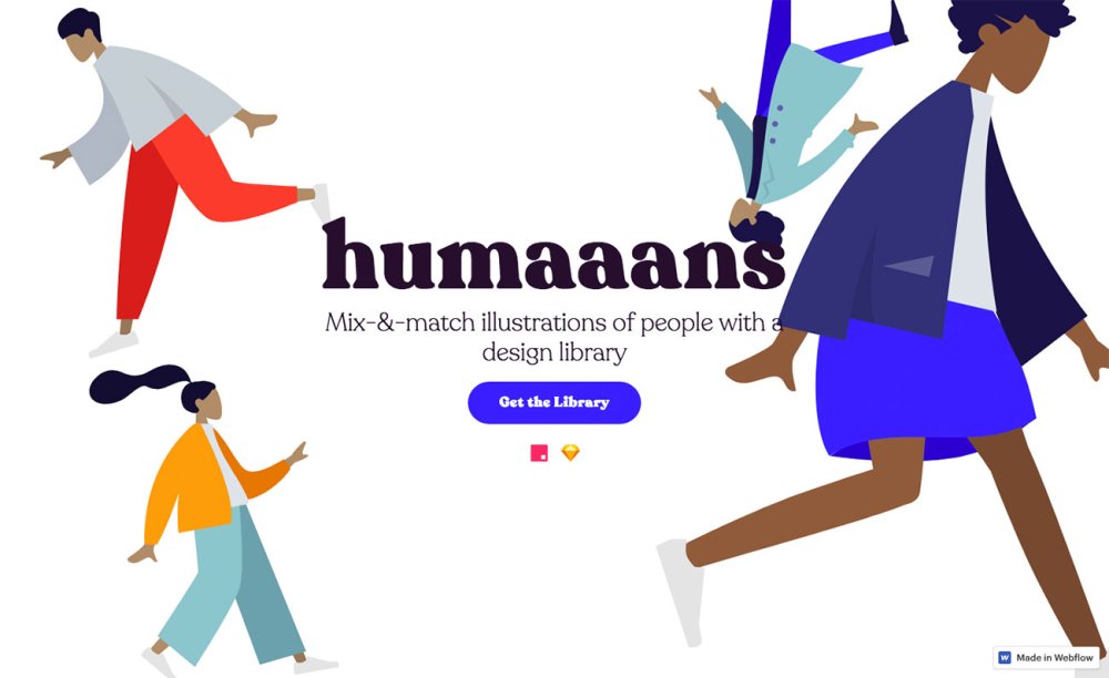
Humaaans is the work of Pablo Stanley
Now, however, there's a great way to create beautiful illustrated people to use in your designs. Humaaans is the work of Pablo Stanley, a designer at Invision, and with it you can quickly and easily build vector art illustrations, regardless of your artistic skills, or lack thereof. Best of all, it's free.
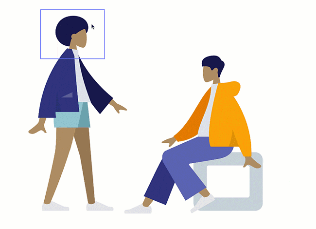
Building up your illustrations with InVision is incredibly easy
Basically, it's a library for Invision Studio, designed to help you create mix-and-match illustrations and animations of people. Pablo has designed a massive selection of fully posable bodies as well as clothing, hairstyles and backgrounds, ready for you to fit together. Everything can be scaled and rotated in order to create the perfect look, and to help you get started there are templates included.
If you want to customise the designs then that's straightforward, too; Pablo has made it easy to import the Humaaans library to Sketch so that you can tweak existing designs or add your own creations.
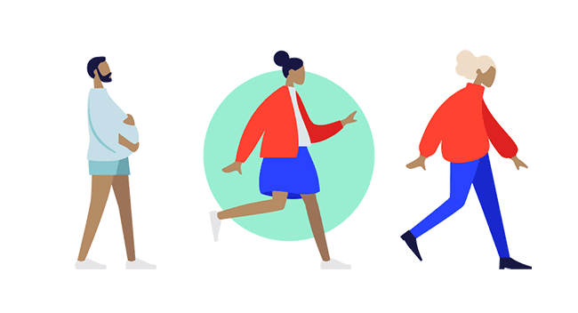
There's no end to Humaaans' options, and you can even customise the designs in Sketch
Head over to the Humaaans site to download the library and see a load of great examples of what you can do with it. And if you're not an InVision user but fancy playing with the Humaaans library, someone's already made a web app that enables you to do just that; it's not as sophisticated as working in InVision, so you can't rotate things, but you can move, resize and move to back/front and then download your design as a JPG or a PNG with a transparent background.
Related articles:
-
Adobe Stock has announced the visual trends it's forecasting for 2019, and it's not surprising that these trends are closely linked to some of the social and political trends we've seen this year, such as an increasing appreciation for nature, activism and an ethical conscience when it comes to brands.
These trends were curated by Adobe Stock, which looked at areas such as fashion, art and business to discover the emerging visuals that will be taking a more central role in 2019. The report outlines four visual trends we can expect to see a lot more of next year and beyond, so don't be surprised if you see them crop up on your next mood board.
01. Natural instincts
In our digital world, people are longing to connect with nature
As we spend more and more of our days online or staring at a screen, people are feeling further and further away from nature. This trend sees creatives being drawn into the natural world, and using it as their inspiration.
Consumers are also increasingly tuned in to nature, with nearly half of US consumers looking for natural ingredients in products. Consumers are now also looking for products that are ethical, sustainable and transparent: with "clean beauty" the fastest growing section of the wellness and beauty industry.
The other growing area is "spirituality", with brands looking to satisfy consumer's spiritual needs.
Of course, what consumers are looking for affects what brands seek to deliver, and brands all around the globe will continue to look to the natural world to engage their customers. In terms of visuals, expect to see "aspirational images with natural elements and celebrations of physical, emotional, and spiritual wellness." That means yoga poses on top of a mountain are still very much in.
02. Creative democracy

Bright colours and "unstudied images" make up this visual trend
The ubiquity of mobile means that it's no longer just creatives who are shaping our visual worlds. According to the report, 95 million photos are uploaded to Instagram, and people watch 100 million hours of content on Facebook every single day.
Brands are tapping into this trend by capitalising on user-generated content, for example, furniture companies such as Wayfair are inviting customers to post images of their new furniture.
"Diversity rules in Creative Democracy, both in front of the lens and behind it," says the report. "Visually, creative democracy is all about unstudied images, bright colours, diverse subjects and video that moves people."
03. Disruptive expression

Brands are borrowing the visual language of protest to create powerful visuals
According to Adobe's report, "People are ready to have their voices heard." And Brands are harnessing this by borrowing the visual language of protest for shop windows and clothing lines.
This new form of self-expression isn't necessarily about politics, and the visuals surrounding it are inclusive, unapologetic and eye-catching. "The images range from haunting and hypnotising, like luxury fashion house Balenciaga’s jaw-droppingly bendable models, to shiny and playful, like the boom of Instagram posts bedazzled with the KiraKira app," says the report.
Expect powerful and intense images that cover a wide range of identities and experiences.
04. Brand stand

Good-looking branding is no longer enough – consumers expect their brands to be ethical too
These days, branding isn't just about products. Gen Z and millennials in particular are loyal to brands that have "stated values and a commitment to transparency." This means that brands need to incorporate the brand values into their messaging, and communicate this appropriately.
"Other brands are helping consumers become more ethically aware themselves," says the report. "The innovative financial firm Aspiration, for example, created a program to help consumers match their day-to-day spending to their ethical beliefs."
What does this mean for visual trends? We'll be seeing more powerful images of popular causes and issues, and these images are likely to have a big impact.
Read more:
-
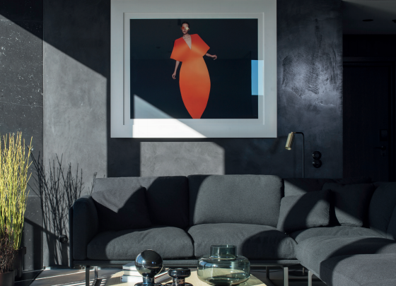
Boutique hotels are booming. Every month, we see stunning identity and interior projects for new design-led hotels. For creatives, there’s plenty of work in this sector: but what about when it comes to staying at a design hotel? Where are the world’s best?
Maybe you’re looking for a weekend getaway. Perhaps you want an inspiring spot for some remote working; or an impressively creative environment to host a crucial business meeting. Whatever your reasons, a good design hotel can be a powerfully inspiring choice. But finding an affordable option isn’t always easy. That’s why we’ve put together this list of the world’s best boutique hotels – plus some advice on what to look for when booking a room.
As creative professionals, we want to be inspired by our surroundings. We want to visit or stay somewhere that's been thoughtfully and beautifully conceived, in ways that our own perspective as artists, illustrators and designers makes us especially appreciative of.
In practical terms, we also want decent, reliable and free Wi-Fi. If we're meeting clients or collaborators, we need to be close to the centre of town, or at least easily accessible from it; and we're looking for an impressively styled lobby, restaurant or bar to help the meeting go with a swing.
With all this in mind, we've picked our 10 favourite design hotels from around the world. Whether you're looking to do some remote work, hold a meeting or just be inspired creatively, these boutique hotels hit the mark.
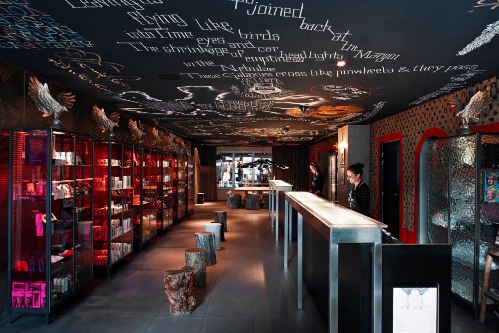
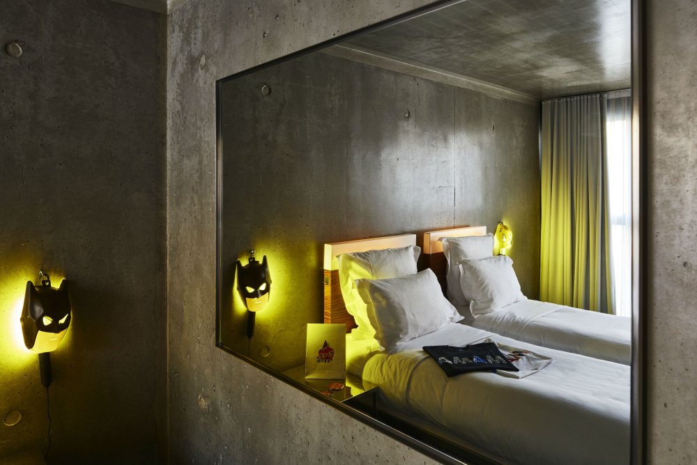
Situated in the east of Paris, in the historic Bagnolet district, Mama Shelter Paris is a pretty reasonably priced boutique hotel for the (generally expensive) French capital. But its quirky sense of style is very high-end.
There's a real sense of individuality and creativity to the Philippe Starck-designed interiors, which mark it out clearly as a design hotel rather than just a 'nicely designed hotel'. The colourful and evocative reception area, particularly, makes an immediate impression. This is an urban refuge for the spirit, in contrast to the kind of bright, bland functionality of most similarly priced chains.
The rooms are anything but bland
Evocative lettering, a darkly expressive colour scheme, offbeat furniture and objets d'art, glowing neon and gaudy masks all flow throughout the building, in beautiful combinations that wholly avoid cliché and add up to something quite special.
These entrancing visuals, combined with the buzzy atmosphere and super-friendly staff, all makes you feel a little like you're entering another world. This is a great place for any creative seeking to get away from it all and muse on a new project, or meet up with collaborators and clients with an artsy side.

Enjoy homemade meals and cocktails on the rooftop terrace
What's more, the air-conditioned guestrooms come with iMacs, the restaurant has a Michelin-starred chef, the stunning rooftop offers inspiring views of the city, there are charging stations for electric cars, and babysitting is even available on request.
If you want to be in the heart of the tourist sightseeing areas, this isn't right for you. But what you experience instead is the day-to-day Paris of authentic working people, plus you're only a few Metro stops away from the centre of town.
Opened in 2009, the Mama Shelter brand has since become a chain that's spread around the world, but this remains the original and best, and a must-stay for creatives heading to The City of Lights.
Brutalism has its appeal, but it's not something you initially think of when it comes to the aesthetics of a design hotel. Yet a couple of years ago, London-based firm Universal Design Studio was asked to 'humanise' a bank building created in the unforgiving architectural style, on Stockholm's Brunkebergstorg Square.
The team did a terrific job in combining the dramatic and imposing elements of Brutalism with attractive contemporary styles, to create something quite incredible.
Locally produced furniture and art provide a real sense of personality to the interiors
Elements such as custom lighting by Rubn, handmade glass pieces by Carina Seth Andersson and bespoke furniture by local makers add extra dimension and depth to the concrete austerity of the building, in delightfully surprising ways.
The lobby's white granite staircase, for example, is handwrapped in Swedish leather by a local saddle maker; the wine bar boasts a communal table carved from a single Swedish elm by Lies-Marie Hoffmann; and there's original art from the likes of Jaume Plensa, Tacita Dean and Richard Long within the public areas.

Rooms are tastefully styled and impressively spacious
It also benefits from a great location in Norrmalm, the heart of Stockholm’s shopping, restaurant and nightlife. Plus it's just a few minutes from the central station, so would be a great place for meeting collaborators and clients.
The 343-room hotel also has its own high-quality restaurant with international cuisine, plus a wine bar with outdoor terrace, a listening lounge, a gym, and a coffee machine in every room. The friendly staff speak a wide range of languages, and overall this hotel offers exceptional value for quite reasonable prices.
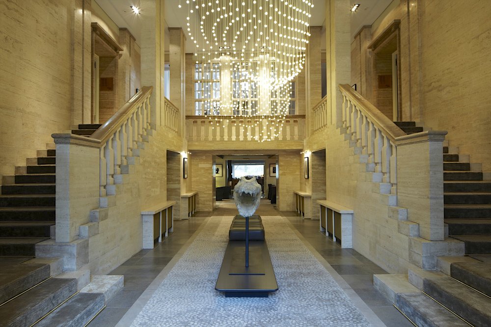
Another luxury design hotel that's very reasonably priced, Das Stue Berlin is most notable for the way it fuses old-world charm with sophisticated modern design.
Housed in a palatial building that was once the Danish embassy, the lobby is grand and imposing, with its dramatic staircases. But venture further inside and everything is cool and contemporary.
The Michelin-starred restaurant offers Paco Pérez’s avant-garde, molecular-leaning Mediterranean cuisine
Interiors by Patricia Urquiola in the public areas feature whimsical shapes and experimental uses of colour and texture. The guestrooms conceived by LVG Arquitectura are characterised by muted colour palettes, bespoke furnishing and carefully selected photographic artworks.
What's more, fun sculptures like the crocodile’s head of French artist Quentin Garel or Benedetta Mori’s meshwire animals appear throughout, reflecting that the hotel is adjacent to Berlin Zoo, which you can enter through the bar's terrace.
The owners' love of art is evident throughout the building
On the edge of Berlin's largest park, the Tiergarten (most rooms come with views), this design hotel is in a quiet area surrounded by greenery, but is still well connected to the centre and major attractions. There's also a Michelin-starred restaurant and a Susanne Kaufmann Spa, which includes treatment rooms, a sauna and a 16m indoor swimming pool.
It all adds up to a high-end experience at very reasonable prices, and for art, design and architecture enthusiasts visiting Germany's capital, this hotel is a no-brainer.

Even if you'd never heard the term 'design hotel' before, a quick wander around Archer Hotel New York would be all you needed to grasp it. This boutique Midtown hotel simply oozes style and panache.
Enter the glass entrance and the tall ceilinged-lobby immediately makes an impression, with its wood panelling Chesterfield sofas, colourful artwork and dramatic print of the Empire State Building.
Art and design elements appear everywhere throughout the hotel
This sense of classic elegance pervades throughout, but is brought up to date by elements such as exposed brick and black metal, blending a sense of the industrial in with the drawing room vibe.
No hotel room in Midtown Manhattan is ever going to be cavernous, but here New York designer Glen Coben has made skilful and creative use of what space is available. And the result is cosily inviting, with bespoke colours, fabrics and artworks in each room, and floor-to-ceiling windows providing masses of natural light.

Floor-to-ceiling windows maximise natural light
Archers Hotel New York also offers Nespresso machines in every room, is canine-friendly, and sits at a great central location, whether you're meeting clients or heading out sightseeing.
The rooftop bar provides stunning views of the Chrysler and Empire State buildings, the Charlie Palmer Steak restaurant serves high-class cuisine, at the table or as room service, and there's even an overnight shoe shine service on request.

Photo: Justin Namon
It's not just expensive hotels that are beautifully designed. It's even possible to find gorgeously stylish hostels – and Freehand Miami is one of our big recommendations for anyone staying in the Sunshine State.
Designed by Roman & Williams, the team behind New York's Ace Hotel, and owned by the same people as the NoMad Hotel, Freehand doesn't go the lowest-common denominator route but aims at providing a 'luxury hostel' experience. And this is backed that up with a gorgeous interior design that would give many pricier establishments a run for their money.
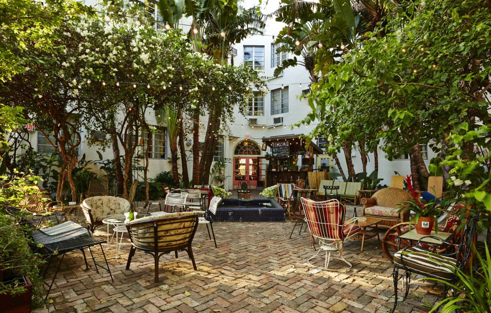
The outdoor patio is a marvellous place to relax. Photo: Adrian Gaut
The visual theme is somewhere between rustic, nautical and summer camp, with bright colours, chic furniture and a feel of air, light and space that stands head and shoulders above the usual hostel aesthetics.
There's a great outdoor area too, with a herb garden, bocce court, ping-pong tables and swimming pool. There are also two bars and a restaurant using locally sourced ingredients.

Dorms are light, bright and effortlessly chic. Photo: Adrian Gaut
Offering such great value for money in a pricey area (it's just five minutes' walk to the beach), it's not surprising that this hostel is always full and buzzing. So don't wait too long to book, or you may well end up disappointed.

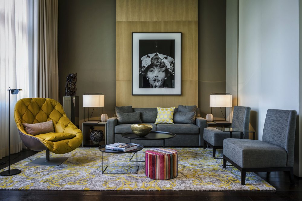
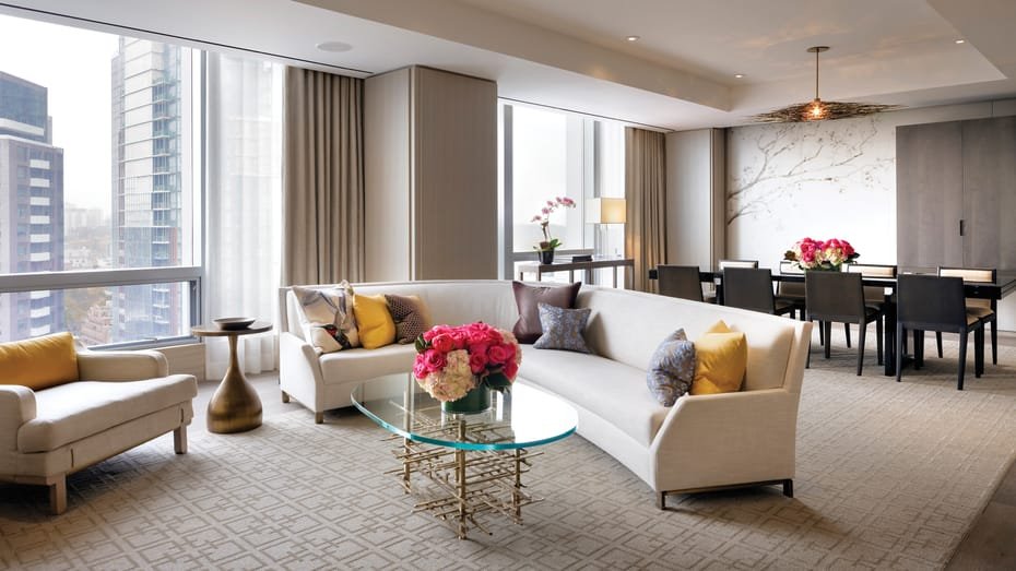
One of our favourite London hotels, this small establishment, set in a converted Victorian townhouse, features 10 bedrooms that are each lovingly unique.
Each showcases work by a different contemporary artist, while quirky furnishings, exposed brick, and vintage and modern furniture throughout add up to create a decidedly stylish boutique hotel experience.
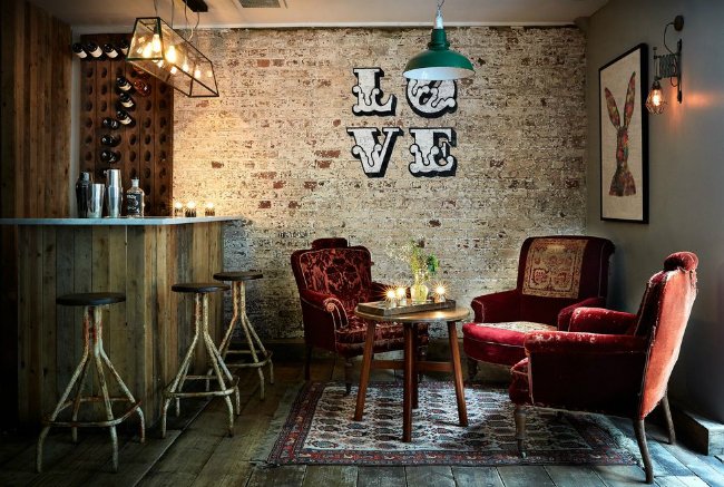
Artistic touches and a retro vibe permeate the property
Mixing vintage and modern styles is nothing new in itself of course. It's just that Artist Residence London – an offshoot from the original Brighton hotel – does it so perfectly, it feels effortless; and that's not an easy trick to pull off.
This clever mix of styles extends also to its downstairs restaurant, the Cambridge Cafe, which is all Pop Art neon and shabby chic, while there’s a ping pong room and a buzzing cellar bar for visitors to enjoy too.

This beloved boutique hotel offers the kind of charm and personality a big chain can never match
Artist Residence is not to be found in the city centre, but a few miles away in the West London area of Pimlico. That's no bad thing, though; the streets here are far quieter and more upmarket; and anyway Buckingham Palace, Tate Britain and Victoria's Tube, railway and coach station are all in walking distance.
The hotel aspires to be your "home from home in London" and we think it succeeds magnificently, whether we're talking about the comfiness of the beds, the friendliness of the staff, or the genial, cosy atmosphere the place engenders in its guests. And when the surroundings are so beautifully stylish, what's not to like?

You might have heard of The Four Seasons chain of luxury accommodation, but were you aware that it's headquarted in Canada? This might explain why the chain's flagship building in Toronto makes such a powerful visual statement.
Designed by Peter Clewes of architect firm Alliance, the complex, consisting of a 204m, 55-storey residential condominium tower and a 125m, 30-storey hotel tower, is dramatically imposing. And inside, Yabu Pushelberg's interior design continues the sense of wonder, with its palatial lobby, black and gold panelling and floor to ceiling windows.
The bold, palatial lobby is a thing of wonder
But there's also a modern sensibility to the styling here that's richly layered; with careful use of muted hues, artistanal elements, Asian influences and work by local artists to add a refined air of sophistication and modernity.
Situated in the fashionable Yorkville area of the city, the Four Seasons Toronto offers a first-class spa, gym, and yoga studio, a Michelin starred restaurant, and a buzzy bar. Rooms come with thick terry bathrobes, iPads, Bose sound systems and Nespresso machines.
The suites are spacious and opulent
Staying here, inevitably, doesn't come cheap. But if you can afford it, your Instagram cred will skyrocket, and you may well rub shoulders with a celeb or two. And if you can't...?
Well, it's worth wandering into the lobby just to gawp at the awe-inspiring magnificence of its design anyway.
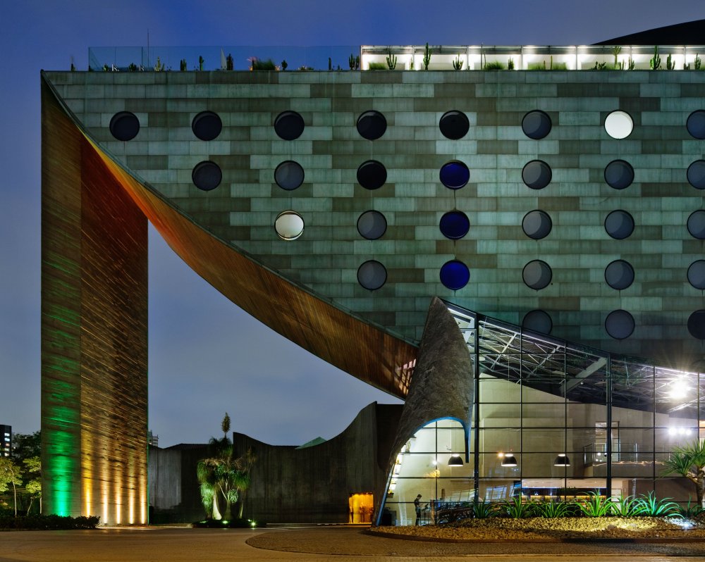
'Unique' sounds like a claim that's difficult for any establishment to live up to. But Hotel Unique Sao Paulo, designed by local architect Ruy Ohtake, really does put its money where its mouth is.
Looking like a cruise ship that's run aground, the exterior of this design hotel is truly something to behold. But the visual delights don't end there.
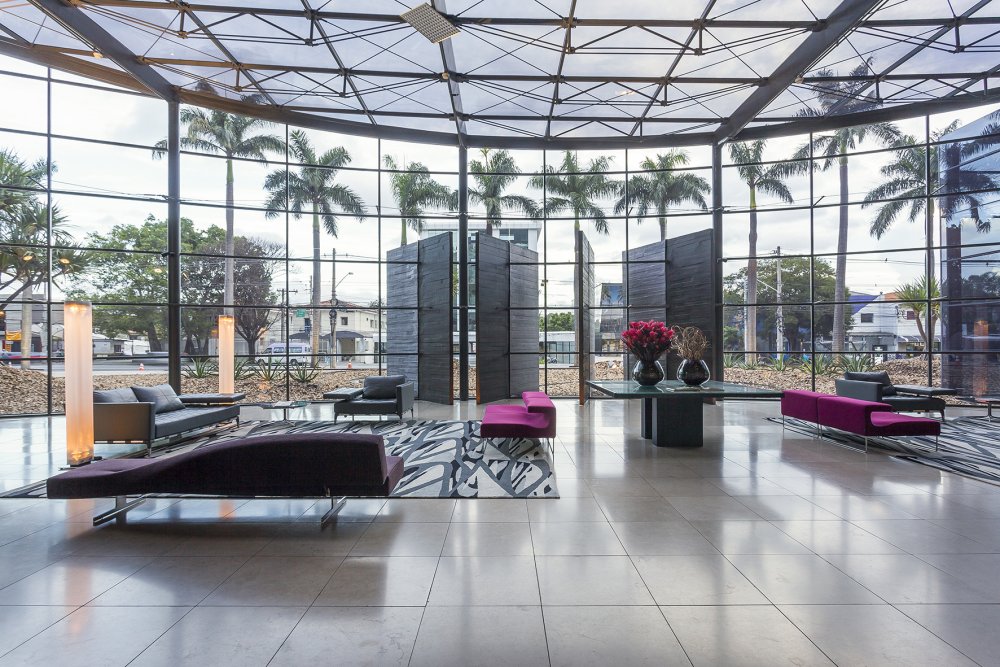
The amount of glass and light in the lobby is truly breathtaking
Enter the lobby and your eyes will continue to widen, as you marvel at the expansive, high-ceiling space with a simply enormous glass frontage. Wander throughout this hotel and the aesthetic treats continue, with huge porthole windows messing with your sense of perspective, and dimmed corridors contrasting with rooms that burst with white and light.
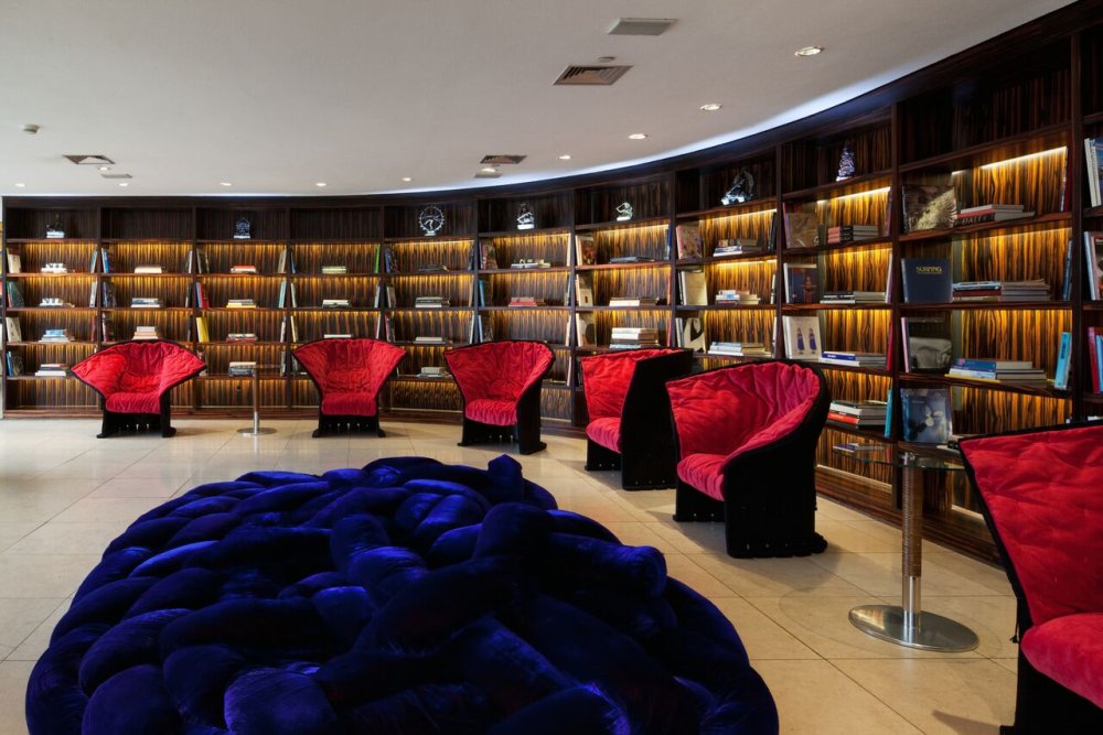
The library is as lavishly styled as elsewhere in the hotel
With stunning views of the city and nearby Ibirapuera Park (home to the Museum of Modern Art), this luxurious design hotel's rooftop boasts a pool, restaurant and bar, while the air-conditioned rooms come with LCD TV, DVD player, MP3 dock station and Nespresso machine.
A stay here won't be cheap, but it's certainly an aesthetic vision you'll never find elsewhere, and you'll be experiencing pure luxury all the while you're admiring it.
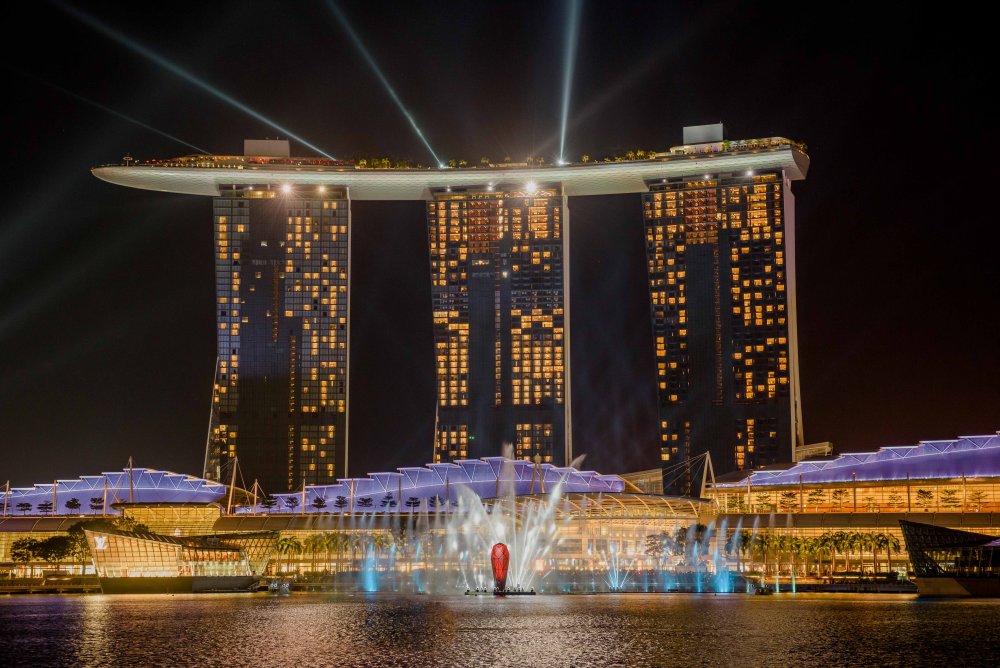
Another unique hotel design that takes its inspiration from a ship, Hotel Sands by the Bay dominates the skyline of Singapore's high-end, glamourous tourist hub, Marina Bay.
The 55-storey, three-tower property designed by Moshe Safdie is integrated into a larger resort, which includes restaurants, shops and a casino, and its scale truly has to be seen to be believed. The jaw-dropping inspiration doesn't stop once you get inside either.

With floor to ceiling windows, the rooms offer impressive views
The super-high ceilings and huge walls of glass of the foyer are unlike anything you've ever seen, although you'll have to battle the crowds to get a good view, and certainly a good photograph.
The 2,000+ rooms are pretty impressive too. Although the interior design is fairly standard, the floor-to-ceiling windows give you bucketloads of natural light and fantastic views across the city.
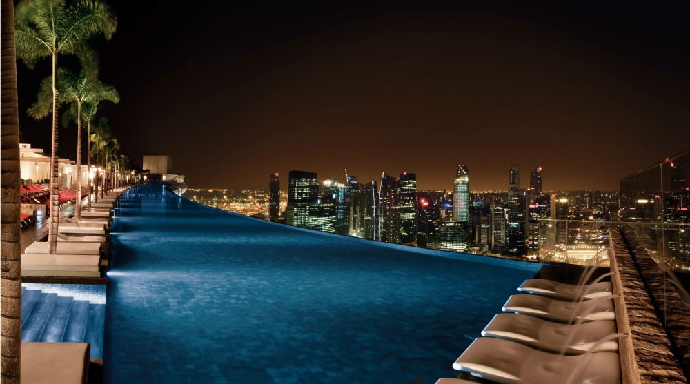
The rooftop infinity pool has to be seen to be believed
That said, for truly spectacular views, you have to head up to the rooftop on the 57th floor, which offers the most incredible panoramas of the city and the sea that surrounds it.
Non-residents can come here too, for a small fee, but are restricted to a few small areas. If you're staying here, though, you can enjoy the whole roof, including the best photo spots, the sun loungers and the awe-inspiring infinity pool. And believe us, the views truly are to die for.
You can also enjoy the first-class spa, not to mention fine dining from celebrity chefs. None of this will come cheap, but for a luxury experience in beautifully designed surroundings, Singapore offers no better.
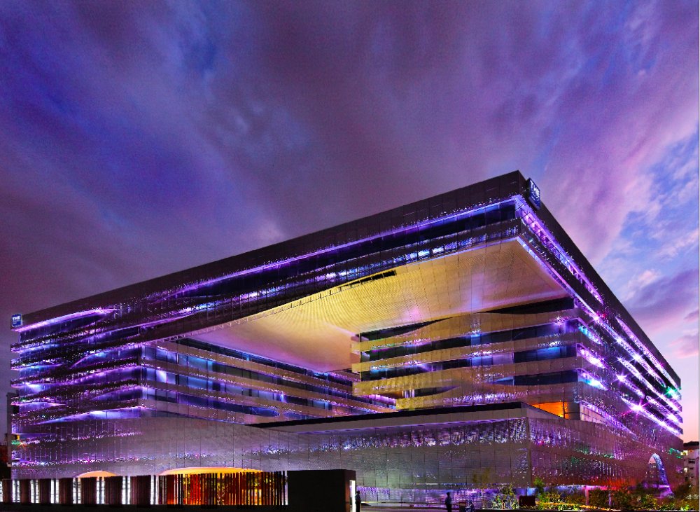
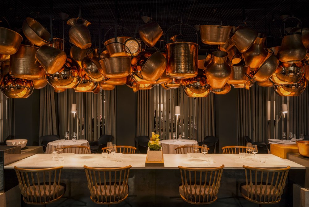
The Indian city of Hyderabad is a major centre for the tech industries. And its Park Hotel is a great showcase for the area's forward thinking, modernising ethos, not least in its revolutionary design.
With sharp, crystalline edges, the building shines with a purple glow at night like a polished gem (not co-incidentally, as it is inspired by the Nizam jewels that are symbolic of the area).
The interiors combine traditional aesthetics with contemporary styles
This bold and imaginative architecture is complemented beautifully by a three-dimensional horizon pool that fills the building with light and rippling reflections.
The interior, meanwhile, is full of colours, shapes and bold forms that represent a virtual masterclass in how to integrate traditional aesthetics and local craftsmanship into contemporary, international design themes.

The Luxury Room King features ambient enhanced lighting, white marble flooring and a panoramic view of the city
Located in the heart of the city’s business and entertainment centre, this luxurious 263-room design hotel offers incredible value at current prices. If you're visiting the city for either business or pleasure, we'd highly recommend you stay at this imaginatively designed hotel.
Read more:
-
Last week, we attended Adobe Creative Meetup London: Best from MAX 2018 to learn more about innovations to the latest Creative Cloud apps. And we – and the thousands of artists, designers and content creators who watched the live stream around the world – weren’t disappointed.
Principal Manager of Creative Cloud Evangelism at Adobe, Rufus Deuchler, kicked off the evening with some of the most exciting news from Adobe MAX, Adobe's annual creativity conference. He was swiftly followed by three stellar speakers, who took to the stage to share their experiences and advice for making it in the creative industry.
First up was graphic design duo, Miraphora Mina and Eduardo Lima, aka MinaLima, who wowed the crowd with their awe-inspiring work on the Harry Potter™ film series. Next, Patricia Bright, one of the fastest-growing lifestyle content creators in the UK, with a following of 2.6 million people on YouTube, shared some insight into the life of a successful videographer.
If you couldn't make it, fear not. You can watch what happened at the Meetup right here.
So what did we learn during this epic evening of creative inspiration, we hear you ask? A lot. Here are our top insights from Adobe Creative Meetup London: Best from MAX 2018.
01. Adobe Sensei is even more mind-blowing than we thought
Adobe Sensei has well and truly arrived. Adobe’s mind-blowing artificial intelligence and machine learning platform has now transformed almost all of Adobe's apps, making the creative process faster, smarter and more intuitive. Take the all-new selection tool in Photoshop, for instance, or the way that Sensei understands the best way to light a scene in augmented reality app Project Aero, enabling it to blend seamlessly in the real world and add realism to AR objects.
Don't believe us? Watch this video and, trust us, within a few minutes you'll have changed your mind. Helping creatives go from concept to completion much faster, to succeed much faster, this advanced technology is already revolutionising the creative process.
02. Next year could be a creative game-changer...
...at least, in terms of creative workflow. As well as Sensei accelerating the creative process, 2019 will see the arrival of three brand new Adobe applications: drawing and painting tool Project Gemini (see above), Adobe's augmented reality app, Project Aero and Photoshop for iPad.
If the jaw-dropping demonstrations shown at Adobe MAX are anything to go by – like when Kyle T Webster, above, revealed the new ultra-realistic watercolour and oil painting brushes in Gemini – we're not surprised artists and designers feel hugely excited by the opportunities and creative freedom these new apps look set to offer next year.
03. The film industry needs graphic designers
Miraphora Mina and Eduardo Lima wowed the audience with their experiences off designing for the wizarding world of Harry Potter™
After almost two decades working in the film industry, graphic design duo Miraphora Mina and Eduardo Lima, aka MinaLima, were keen to share not only their passion for film, but the opportunities the field offers too.
"I don't think many people realise that graphic design in film is a career option," Miraphora Mina said. "It's true that the film industry can be impenetrable, but there is still a lot of opportunity for doing graphic design in film."
"Don't be frightened. Find what you want to do, even if it's a bit weird, like creating worlds that don't exist, and go for it."
04. You don't have to be an expert to succeed
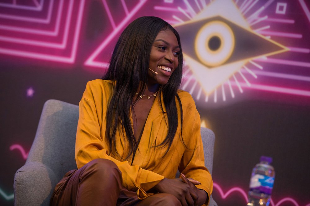
With over three million followers, Patricia Bright is one of the fastest-growing lifestyle content creators in the UK
UK Content Creator Patricia Bright took part in a insightful interview, hosted by Adobe Senior Director of Campaign Marketing Simon Morris, in which she shared the story of how she made it to the top. "I had no idea what I was doing when I was making videos in the beginning," she said. "I had a camera propped up on shoe boxes at the start!"
Bright's success came after years of self-teaching and a whole lot of hard work. "I learnt via social media platforms, I didn’t go to classes or school," Bright said. "Friends and other creatives reached out to help edit my videos. But nowadays there's so much information out there to help you learn, and it's affordable."
05. Video editing just got a whole lot easier
One of the biggest things to come from MAX was Adobe's all-new video editing app Premiere Rush CC. Available now as a standalone app, Rush promises an intuitive, all-in-one experience that will make it easier than ever to create professional-looking video content (even if you're not a video expert yourself).
06. Typekit is now Adobe Fonts
Creative Cloud now includes Adobe Fonts (formerly Typekit). That means CC subscribers now have access to a huge selection of typefaces, with no more sync limits, no more web font pageview and domain limits, and no more 'web-only' fonts. Unsurprisingly, this was quite a crowd-pleaser on the night.
07. Voice prototyping in Adobe XD
The next generation of Adobe XD comes complete with all-new voice prototyping features – and Adobe says it's the only UX/UI platform to enable designers to create prototypes for voice-activated devices. Using Adobe XD's voice trigger and speech playback capabilities, designers can move seamlessly between voice and screen prototyping. As voice starts to play an increasingly important role in our digital experiences, XD now offers a way for users to design and share prototypes that extend beyond the screen. Exciting stuff.
08. Adobe Bridge is back
Among Deuchler's Creative Cloud announcements came the news that Adobe has invested in Adobe Bridge for 2019. "Adobe Bridge is rising from the ashes!" Deuchler said. "That's something I never thought I'd say in 2018." He went on to explain how the new Bridge can work as the perfect hub for all creative work, sporting a modern new UI and the ability to support bulk uploads of CC libraries.
09. Creative Cloud enables creativity for all
Adobe's vision is to enable creativity for all, and the innovations announced for Creative Cloud 2019 look set to facilitate exactly that. Whether you're a seasoned pro, or just starting out in your chosen creative field, Creative Cloud is your one-stop-shop for every creative tool you could ever want, wherever you want. And the apps are more intuitive and faster than ever before.
-
Adobe has created some powerful tools over the years, and if you're a graphic designer, content creator, or artist of any kind, you can gain a whole lot from knowing how to use them. With The Complete Adobe CC Training Bundle, you'll learn how to use Photoshop, one of the most popular and widely used photo-editing tools in the world.
You'll also find out the strategies that will allow you to get the most out of Illustrator, a design software that will help you bring your creative visions to life in a powerful way. You'll discover the magic of video-editing with Adobe Premiere Pro – this software is so widely trusted that many big-budget movies are edited using this very tool.
Get The Complete Adobe CC Training Bundle today, while it's price-dropped to just $24.99.
Related articles:
-
The group's skimmer has added some capabilities that steals credentials from admins.
-
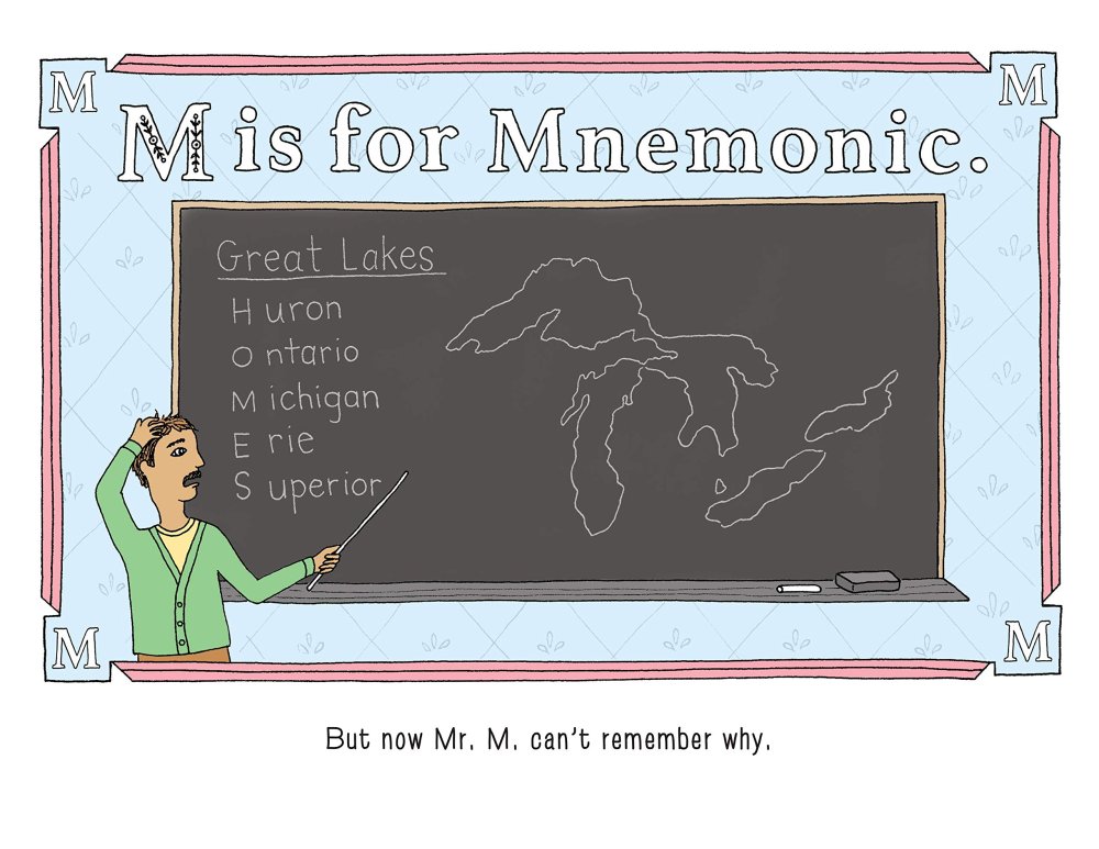
Silent letters are celebrated in P is for Pterodactyl, a funny new picture book that describes itself as 'the worst alphabet book ever'. Instead of relying on the traditional 'a is for apple', this book explores "all the words that misbehave and make words nearly impossible to pronounce," so expect to find lots of Czars, tsunamis, and mnemonics.
Given that the English language is notorious for its contrary rules and counter-productive etiquettes, it's amazing that a mischievous book like P is for Pterodactyl hasn't appeared before. And even though the words it uses to represent letters have a very limited use, they aren't technically wrong.
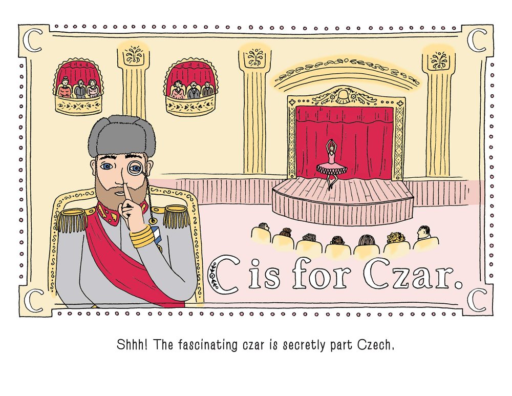
Learn the A, B, Czs with this book
The brainchild of Raj Haldar, AKA rapper Lushlife, and computer programmer Chris Carpenter, P is for Pterodactyl features illustrations by Maria Tina. Published by Sourcebooks, the book has become a surprise runaway success with the first print run of 10,000 selling almost immediately.
This didn't do anything to slow down the book's popularity though as it was soon picked up and shared by Facebook group Imagination Soup. At the time of writing, Sourcebooks reports that more than 100,000 orders for the book have gone unfulfilled, but the good news is that it's busy working on reprinting another 210,000 copies.
Although not technically wrong, this alphabet book has comparatively limited use
P is for Pterodactyl is currently sitting pretty at number 8 on the New York Times bestseller list, not bad for a book that started out as a joke about a Q is for Quinoa flashcard.
Want a copy of Pis for Pterodactyl to call your own? More copies are expected to become available this month.
Related articles:
-
If you’re new to CGI, you may feel that there are far too many 3D art tools to choose from in a dizzying array of software. In this article I'll aim to break everything in CGI down to the very basics, so that every artist can be armed with the knowledge of which tool is best. Let’s explore materials and shaders by looking at luminous surfaces.
Lighting is one of the key skills to master in CG, and learning what each of the light types can do really helps artists mimic the real world in their CG scenes. The issue is, not all lights are… lights. A lot of objects emit light, a classic example being the rear of a firefly. So how do CG artists re-create emissive objects? They do it through the use of luminous effects within the material itself.
The luminance properties of a shader/material are some of the most fun elements of texture work, as they can bring a scene to life instantly, whether it’s lava from a volcano or the screen of an old TV set. As the luminance channel is usually interacting with a wide range of colours from the shader, it really adds pop to a scene.
Clever use of luminance properties can bring big improvements to a scene
Mike GriggsDepending on the render software being used, the luminance properties of a material can have a lot, if not all, of the same properties as a light object, making them truly powerful and a key part of a compositing workflow. Clever use of luminance properties can bring big improvements to a scene, especially for effects that would be quite difficult to create with light objects alone. Motion graphic UI elements, for example, are really enhanced by the use of emissive properties.
As luminance materials are embedded within a material, they can use the same sources as other parts of the material, for example animations for the screen of a TV can be played through a luminance channel, creating realistic interactive lighting.
In fact, luminous materials can also be used as actual lighting, for example when lighting a product shot. The full range of modelling tools from the application can be used to create easy-to-preview light shapes to enhance the reflections in a scene.
01. Add luminance

Balance your lighting for a realistic result
Look for a group of settings that may be called Luminance, Incandescent or Emission. These usually tend to be the same options as found in a diffuse colour or similar channel.
The major difference is with the intensity option, which can quickly blow out image-based textures in the emission channel to the predominant colour. If this is the case, look to balance the lighting in the scene in order to achieve a much more realistic-looking result.
02. Make use of animated textures for screens

Certain textures can interactively light a scene
One of the best uses for emissive textures is in creating animated screens, as these can bring in texture sequences which can then interactively light a scene. As everything is being calculated in the render, complex effects such as refraction and subsurface scattering will react properly to the emissive texture.
These kind of effects would be difficult to match in compositing. It is always best to render emissive textures ‘in-camera’ if supported, and if it doesn’t impact on your project time.
03. Use the luminance channel for compositing
A coloured matte speeds up compositing
A great use of the luminance channel is to make coloured mattes of a scene if the render engine in question has limited matte support. Once a scene has been rendered normally, make a new version and switch off settings such as Global Illumination and apply new shader materials to the objects.
Using pure red, green and blue is a great way to start, as these colours can then be used by keying software in the compositing application, to create a variety of mattes from one image pass. This speeds up the compositing process and saves disk space.
04. Emissive textures for highlighting objects
Emission textures can bring an image together
Using emissive textures can be a great way to bring objects in a scene to life, whether this is by using them as highlights on an edge of a motion graphic UI element, or to add an extra bit of colour to an object in a scene.
If a scene isn’t looking exactly how you want it or an object isn’t clearly defined for its purpose, do not be afraid to add a touch of emission colour (usually the same as the diffuse colour) in order to help the material pop in the scene.
05. Create bespoke lighting rigs

Bespoke lighting can make a product shine
One of the hardest things to do is create exciting lighting. This is where emissive textures can come into their own, as they can be combined with a 3D application’s modelling toolset to create bespoke lighting setups, for product shots for example.
Many 3D applications have controls regarding visibility of objects. Use the visibility tools if they are available to control whether a lighting object is seen in the render, creating an easy-to-understand lighting setup.
This article was originally published in issue 238 of 3D World, the world's best-selling magazine for CG artists. Buy issue 239 or subscribe to 3D World here.
Related articles:
-
The laptop giant will settle a 32-state class-action lawsuit stemming from pre-installing vulnerable ad-targeting software.
-
You're reading Free Mockups for Design Presentations, originally posted on Designmodo. If you've enjoyed this post, be sure to follow on Twitter, Facebook, Google+!
In the world of 3D mockups, the presentation comes in all shapes and sizes. While we are accustomed to associating 3D objects with brand identities such as Modern Branding Identity Mockup Vol.2 or Coffee Branding Scene, they can be used …
-
More play means more imagination. That's the thinking behind Toyi, a creative play kit that sees children become toy designers. Created by Ögeday Uçurum and Elif Atmaca, Toyi encourages kids to develop their design thinking by upcycling everyday objects and transforming them into creatures, rockets, and anything their imaginations can come up with.
Designer Atmaca came up for the idea of Toyi based on her experiences as a child of moving from city to city and not having traditional toys of her own to play with. This experience tuned her in to the needs of children, which she's brought to the design of Toyi.
Each Toyi kit includes seven different parts, including flexible connectors, eyes and hands, which are designed to wrap around objects and turn them into creative toys. As Atmaca puts it, "play is the most natural and powerful tool to develop children's creativity".
Whereas 'traditional' toys have a shelf-life and limited use, Toyi follows in the footsteps of open-ended, multipurpose toys like LEGO in that the imagination of the user is key to getting the most out of it. Toyi's reliance on everyday objects is a great added touch, though, as it prompts children of all ages to see the world around them anew.
Check Toyi out in action with the video below.
Like the look of Toyi? There's still time to back the development of the kit over on Kickstarter, with perks including a bespoke playbook and an Ambassador Pin.
What's more, Toyi believes that every child has the right to play. To this end, Uçurum and Atmaca have teamed up several civil society organisations around the world to send a Toyi kit to disadvantaged children. So even though the project has already smashed its funding target with time to spare, your donation could still go a long way and change the life of a child.
Related articles:
-
Search engine optimisation is an essential skill for any blogger, entrepreneur, or content creator. That's because we all rely so heavily on search engines nowadays. In fact, the top three spots on any Google search receive nearly 60 per cent of all search engine traffic for that keyword.
To better understand your site's SEO, try out SEOPop Pro: Lifetime Subscription. This tool analyses your site and gives you a report card, showing you how well you're doing when compared to the competition. You can then identify mistakes that are lowering your search engine ranking, and check out breakdowns of your social media impact.
Take a look at your page load times and mobile performance for an even more well-rounded understanding of your site. Get SEOPop Pro: Lifetime Subscription for only $24.99.
Related articles:
-
As editing tools and plugins make the creation of high quality video faster and easier for editing teams, the time spent reviewing video with clients, collecting feedback and getting work approved is still proving costly.
For many, the video review process involves countless emails, ineffective reviews, untold amendments and, in turn, a lot of frustration. Collaboration is, of course, important, but if there are not methods in place to receive clear feedback, misunderstandings can arise and projects can be delayed unnecessarily.
Thankfully, this bottleneck in the video production process is one that’s easily solved. Simply follow these tips and you’ll be delivering videos that meet your client’s needs, without requiring multiple rounds of revision, in no time.
01. A new kind of feedback
A faster, better kind. Emails have a time and a place, but receiving feedback on a video is not one of them. If you want to get your videos reviewed quickly, you need to offer a way that makes it easy to do so. Using a collaboration tool like OpenText Hightail removes the delay that emails bring, and instead offers fast, specific feedback via timestamped comments alongside the video footage. In fact, Hightail’s precise commenting service allows users to mark the exact second where they want to leave feedback, and, even more precisely, highlight the specific part of the screen they are referring to.
The precision Hightail offers means neither creator or reviewer are ever in doubt as to what needs to be done. And this extends to audio too. Hightail also allows users to leave feedback on audio streams in exactly the same way, with timestamped comments, as the video footage. Want to see it in action? Sign up for a free 14-day trial Hightail today.
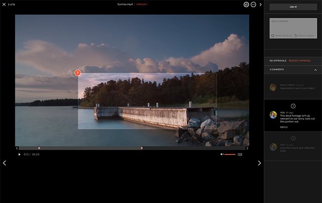
Get specific, fast feedback on your video footage with collaboration tool Hightail
02. Set expectations early
Sounds obvious, right? But you’d be surprised how often creative frictions arise off the back of not clearly outlining the number of video reviews in advance. Make sure everyone knows where they stand from the off by defining when a cut will be ready for review and when feedback on that cut is due.
How many reviews needed will be determined by each project, however, it is typical for a video process with a rough, fine and final cut to have between five and six reviews. The start of a project is also the best time to determine how your reviews will take place, be that face-to-face, in a virtual meeting or using a collaboration tool like Hightail.
03. Educate your reviewers
It’s easy to assume, because you’re the expert, that everyone else understands the video editing process too. However, that’s simply not the case. In many instances, delays and frustrations are caused by a simple lack of understanding that could easily be avoided. By educating your clients about the process, not only are you making life easier for everyone overall, you are also building trust and your reputation as someone who others will want to work with.
An easy way to educate your reviewers is to create a document that outlines the stages of your video production process, including how many review rounds there will be, what the reviewer should be looking at and breaking down any jargon. The more a reviewer knows about what goes on in the editing suite and what’s expected at each stage, the easier it will be for them to meet your expectations and collaborate in a meaningful and cooperative manner.
-
Trends are easy to identify a few years after they've happened. But they're notoriously difficult to spot at the time. For its new issue (#287), Computer Arts spoke to a wide range of creatives, from diverse disciplines and at different levels, at creative studios across the world, to hear their takes on the trends heading our way in 2019.
Read on to discover some of the standout themes they picked up on. For the full article, which is packed with plenty more trends to discover, pick up a copy of Computer Arts #287 from Friday 7 December, available in our online magazine store or from good newsagents.
01. Smashing stereotypes
Kelly Anna's She Stole the Show exhibition celebrated women's inner champions
In illustration, there's been one standout trend in 2018: the varied ways in which women are being represented through illustration. "From gender issues to body politics, what it's like to be a woman today is being explored in a more unapologetic way than ever before," says Alex Thursby-Pelham, lead designer at Wieden+Kennedy London.
Galvanised by #MeToo and similar movements, illustrators are feeling encouraged to break away from caricature and explore more nuanced and multi-dimensional portrayals of women that confront the status quo. "Scrolling through Instagram, Matisse-inspired nudes follow politically charged illustrations of female solidarity and resistance," Thursby-Pelham enthuses. "Empowered, angry, joyful, funny, flawed, opinionated… they're all here.
And it's not just about what is being produced but what isn't, the designer continues. "The furore caused by the recent cartoon of Serena Williams in Melbourne's Herald Sun – deemed sexist and racist – goes to prove that in 2018, gendered stereotypes aren't met with a shrug, but with fiery backlash."
"This year feels like a time where these varying perspectives aren't just 'nice to have', but absolutely necessary," she concludes. "Fingers crossed that this trend will long outlive 2018."
02. Colour gradients
2018 was the year of the gradient
Advancements in screen and display technology have led many to dub 2018 the 'year of the gradient'. "HTML5 enables people to code gradients rather than having to manually make graphics for them," explains Mitchell Nelson, lead creative at Jazzbones. "And this year, there's been a big focus on duotone gradients as opposed to flat colours, which are more limited. A lot of websites are now using brighter gradients with dark schemes, to give a slick, almost tech feel."
Helen Baker, a freelance brand identity designer based in Wiltshire, concurs. "Gradients are now recognised as colours in their own right, and are seen in an increasing number of logo designs," she says. "The Brit Awards, for example, has moved from the use of flat colours in previous years to a rich 'red carpet' gradient."
Rachel Brandon, graphic designer at PLMR, posits that this trend may be a reaction against digital design in general. "With a sense of movement and 3D to it, a gradient appears as though it has life and weight to it," she says. "As screens take over from physical, print-based mediums, the lifelike look these elements create could be one reason for their sudden surge in popularity."
03. Striving for simplicity
A pared-back look from Bond for Anton&Anton Kioski
There's been a broad trend towards simplicity in design for some years now, and it shows no signs of slowing down. In fact, as we live more of our lives on apps and websites, it seems only to be accelerating.
"Consumers are now used to seeing a flatter, cleaner, uncluttered design aesthetic in the apps and sites they use," says Alastair Holmes, associate creative director at This Place. "So it makes sense that companies should want to reflect this in their overall branding."
Examples abound. "Burberry recently turned heads with a bold step in typographic simplicity, cutting ties with the elegant graphic ornament of the past and adopting a timeless, grotesque approach to its new identity," notes Lee Hoddy, creative partner at Conran Design Group.
04. Super-functional logos
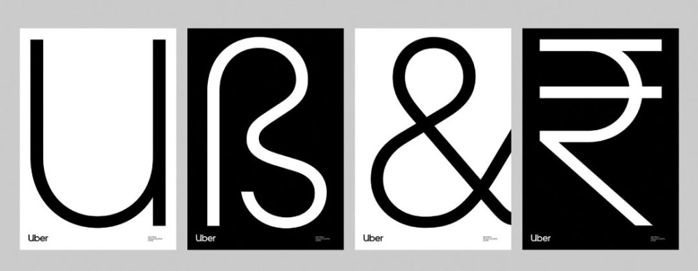
Wolff Olins created a new wordmark for Uber in 2018
"This year has seen more and more corporates adopting the 'lowercase sans serif' model, with a reductionist, one-colour symbol floating nearby," says Michael Johnson, founder of Johnson Banks. "So now we see virtually the same typography used by everyone – from BT to the Premier League, to Airbnb, to Spotify, to Uber, to you-name-it."
He's not sure whether we've seen this trend peak. "At first this approach seemed more interesting, more stripped down, more 'less' if you like," says Johnson. "But I'm really starting to wonder quite how long this kind of corporate me-too-ism can continue."
Chris Maclean, creative director of Wolff Olins, is among the optimists though. "We're losing those glossy sheens and skeuomorphic embellishments that are a hangover from the UI design 10 years ago," he points out. "We're witnessing a return to classic logo design, where less is more, and anything that doesn't express the core essence of the brand is discarded."
Furthermore, he believes that the simplicity of the logos themselves is being balanced out elsewhere. "While some might argue that logo design has become more conservative, exciting things are happening in the expressions that surround the logo," he argues. "More and more brands are recognising that a cohesive brand identity can be a much more expressive palette than the logo alone. This means the identity can evolve while the logo remains consistent over time."
05. Disruptive typography
Future London academy branding by ONY
We're experiencing a noticeable trend towards more sophisticated typography in web design," says Alex Blattmann, senior designer at Dalton Maag. "Serif styles are, once again, taking centre stage, after years of avoidance in the pursuit of simpler, sans serif forms."
Rick Banks, director of Face37, takes a similar view. "Last year I predicted in Computer Arts we'd see a reaction to the geometric sans-serifs that dominated 2016, and I think I've been right," he says. "Wolff Olins' Chobani rebrand is a prime example. Pentagram's Vroom and Mother's Debenhams rebrands are other highlights. I see this trend continuing over the next few years, with brands and designers wanting more personality in their type and logos."
In terms of 'more personality', there's been mini-trend for what Riccardo De Franceschi, senior designer at Dalton Maag, describes as a 'brutalist' approach. "This is where type gets compressed or expanded to the extreme, as well as being outlined or even mechanically slanted," he explains.
A more mainstream way that designers have been adding extra personality to their typography, meanwhile, has been through the rise of custom fonts. "Brands are asking themselves: how can I be myself if I'm using the same font as a hundred other brands, especially when that other brand is a real asshole?" says Chris Harmon, art director at Loyalkaspar. "In response, more and more brands are making custom fonts that honestly feel like themselves, and no one can copy them."
06. Motion graphics in branding
2018 has seen a major change in what motion designers are being asked to produce, with a seismic shift in 2018 towards social content. Creative agency DMS has seen a 60 per cent increase in this area, reveals head of motion graphics Nico Varga.
"In today's world, our clients need to engage with their audiences faster," he says. "So we're using bumpers – a five-second teaser before a promotion trailer – that incorporate engaging dynamic subtitles to entice the audience to click and view the promotional content."
Designing for social means rethinking your approach, says Katie Cadwallader, senior designer at Supple Studio Ltd. "Twitter and Instagram now loop videos, encouraging our films to be more like GIFs and less like stories with a beginning and end," she says. "The length of animations is adapting too. Anything between 30 seconds and five minutes is now a no man's land: you're either designing for likes or for a lunch break viewing."
This is just a part of a larger trend, which is seeing motion design become better integrated into the branding mix, according to Wouter Sel, co-founder and animation director at Volstok. "More than ever, video is part of the brand instead of merely being a billboard for it," he says. "Motion design is now deeply embedded in the customer journey."
The full version of this article, including more trends to watch out for and an in-depth look at what's on the cards in the design world, can be found in issue #287 of Computer Arts. You can buy a copy from Friday 7 December, or subscribe to Computer Arts.
Read more:
-
After identifying the official VLC media download page as "unsafe" with its Bing search engine, Microsoft now suggests it was done in error.
-
Even designers with the keenest eye for detail and an inside-out understanding of colour theory will have struggled to identify the right hue at some point of their careers. To make the process of finding swatches and their equivalent colour values easier, Pantone has updated its Color Finder tool.
With controls that enable users to pick, search and convert colours, the new and free Color Finder is a comprehensive and intuitive way to sift through Pantone's chips. Wave goodbye to using a gradient bar to hazard a guess as to the right colour, simply start clicking samples and narrowing down the search fields.
These parameters include Pantone Matching Systems for graphics, interiors, skin tones and much more. Colours can also be narrowed down by hue groups and smooth orders. Thanks to the search bar and convert fields, users can find colours by their name, sRGB, HEX, and CMYK codes as well.
Once you've settled on a colour, you can click on the swatch to find its exact RGB, HEX and CMYK values. Pantone will also helpfully recommend which samples you should purchase from its collection.
Check out the tool in action with this handy video posted on Pantone's Instagram:
With an in-depth array of search options now bundled into one place, Pantone's Color Finder promises to be a real time-saver, and judging by its enthusiastic reception on social media (check out those Instagram comments), it looks like this is the tool a lot of designers have been waiting for.
Related articles:
How an iPhone filmmaker won Britain's biggest art prize
in Ειδήσεις από τον χώρο του Design και Hosting
Posted · Report reply
Now that smartphones have become commonplace, it’s easy to take their capabilities for granted. And while plenty of us use the best iPhone apps to refine our digital art, play around with typography and enhance our photos, Glasgow-based artist Charlotte Prodger has used her iPhone to shoot a personal film that yesterday won the prestigious Turner Prize.
Named after the great and controversial painter J.M.W. Turner, the annual prize has become famous with both art critics and the general public for celebrating visual work that pushes boundaries. Prodger’s two short films are the latest to scoop the £25,000 prize, past winners include Simon Starling’s converted shed and Mark Leckey’s found footage exhibition Industrial Light and Magic.
One of Prodger’s films in particular, the intimate 32-minute film, Bridgit, has made headlines this year due to it being filmed entirely on her iPhone. Featuring painterly clips of her home life, views from train windows and the Aberdeenshire countryside, the film explores themes of gender and identity with spoken narration that lifts excerpts from her diaries.
But why has this film, and not the accompanying piece, Stoneymollan Trail, caught everyone’s attention? Perhaps it’s because the idea that something so ordinary as an iPhone can create prize-winning art makes creatives reevaluate the world and tools around them.
For Prodger, though, using an iPhone taps into traditional filmmaking techniques. Speaking to the Tate, she explains that she wanted to honour filmmakers who could judge the length of a film by weighing a reel of celluloid by hand. "I'm very excited about the intertwining relationship between the body and technology."
And given how tactile smartphones are, with their touchscreens and rotating cameras, Prodger argues that an iPhone is a hybrid of technological wizardry and analogue art tools. "It becomes very material, almost sculptural."
See for yourself how an iPhone can create art with this clip from Bridgit.
Related articles:
View the full article