

Rss Bot
-
Content Count
15,134 -
Joined
-
Last visited
Never -
Feedback
N/A
Posts posted by Rss Bot
-
-
The bug bounty "queen" Katie Moussouris discusses the biggest mistakes that companies launching these programs are making.
-
Digital sculpting tool ZBrush has long been a contributor to the world of television and 3D movies. Prior to ZBrush, figures were sculpted in clay before being scanned to produce 3D assets, in a process that was as time-consuming as it was costly. Such was its game-changing nature that in 2014 Pixologic co-founder Ofer Alon received an Academy Award for his design and implementation of the software.
CG modeller Jose Limon retells his first encounter with the tool: "ZBrush was first introduced to me while I was attending The Art Institute of California-Inland Empire, somewhere between 2007 and 2011." Currently lending his talents to the teams at A52 VFX and Elastic, Limon has seven years' experience in crafting characters for TV, film and animation, primarily using ZBrush.
"I started getting a glimpse of what ZBrush was capable of through the art that other students were creating," he continues. "Eventually I took an introduction to ZBrush course that focused on character and prop creation, I fell in love with the software there and then." Since then Limon has worked on the main title sequences for The Man in the High Castle, Westworld, Daredevil, Luke Cage, and Fantastic Beasts and Where to Find Them, among others. His TV work has earned him three Emmy nominations and one win.
Building Westworld

Limon was able to translate his understanding of anatomy into the digital realm for Westworld's title sequence
Recently Limon utilised ZBrush on the main title sequence for season two of HBO's science-fiction series, Westworld. The software helped him to realise the complex visuals of a mother and newborn baby that appear throughout the sequence. "I knew that we would reveal some portions of their underlying anatomy in the sequence," he explains. "But we were unsure where exactly that would be. I had to approach it in a way where I could easily go back and swap things around.
"The first stage consisted of setting up a ZBrush master file for the anatomy of the models: it consisted of a T-posed human body with as much anatomical and skeletal detail as possible. At this early stage, the file was put together from various sources, some recycled models and newly sculpted pieces to fill in the gaps."
ZBrush should be used in a non-linear workflow
Jose LimonHe continues: "One of the challenges on my end was posing the mother and newborn in a way that felt natural. There was no rigging involved so everything had to be done by hand in ZBrush. With the pose approved, the next thing to do was to mask areas of the model where the underlying anatomy would come through. Going back to the ZBrush master file, I took the portions that would be revealed and fitted them into place on the posed model."
Finally Limon was responsible for merging the model's anatomy with the outer skin, creating a hollow shell. He explains: "Using the remesh feature in ZBrush, a rough shell was created. From there it was DynaMeshed and re-projected back to the original details. No displacement information was used for the final renders. In order to keep all the high fidelity detail, I optimised the final sculpt using ZBrush's decimation features. This mesh could then be passed on to the artist working on the final model."
It's clear that ZBrush was a crucial part of the creative process behind this acclaimed sequence; according to Limon it's all down to the flexibility that the software provides, but that's also what can make it one of the trickier 3D software to master. "As a beginner, it might seem overwhelming at first, perhaps due to the way the UI is set up or where the navigation controls are placed," says Limon.
"ZBrush should be used in a non-linear workflow, this is a software where one can achieve the same result in a multitude of different ways and half the time those are radically different from one another in terms of motive or mindset. It's a very improvise-friendly software and one that helped me find the right approach to this sequence. All it took was some willingness to try new things and not being afraid of failure."
Concepts and sculptures
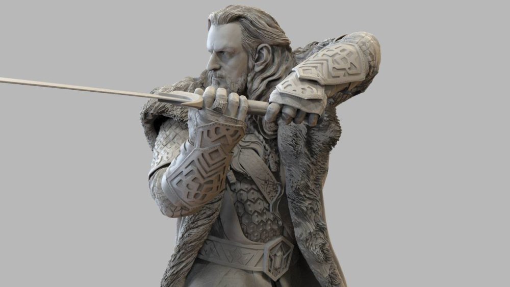
Madeleine Scott-Spencer's Thorin sculpt as part of Weta's The Hobbit collection
For Double Negative's creature and character designer, Madeleine Scott-Spencer, ZBrush has been a part of everyday work since 2003. She adds: "I use ZBrush every day to generate concept images and digital sculptures that will serve as the beginning of the modelling process." With a background in make-up effects, prosthetics and physical sculpting, Scott-Spencer previously worked with New Zealand-based Weta Workshop and Weta Digital. Since making the jump to ZBrush she has never looked back, authoring several books on the software and creating the Introduction to ZBrush training videos for The Gnomon Workshop.
Scott-Spencer has also become adept at using ZBrush to create fine art and commercial figurines, having used the software to create many of Weta's Hobbit collectibles. "At Gentle Giant Studios back in 2006 we were the first to create a commercial collectable figure using ZBrush, it was a Grindylow from Harry Potter," she adds. "We sculpted it in ZBrush and then had to work out decimating in other software as there was no Decimation Master yet. We then printed and recast it in wax to part it for moulding. Today the decimation is much easier and I would do all that parting in ZBrush."
Nothing else comes close to ZBrush
Madeleine Scott-SpencerAccording to Scott- Spencer there is no alternative to ZBrush when it comes to digital sculpting: "Nothing else comes close and it has tools specifically designed to assist the artist going to 3D print, such as Decimation Master and 3D Print Hub."
Early adoption
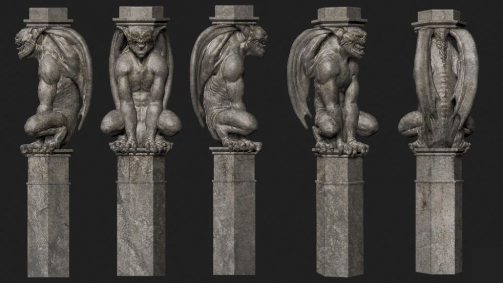
Gargoyles modelled by Southern before output in polystyrene and used to dress the set on Penny Dreadful
Digital sculptor Glen Southern was an early adopter of ZBrush, "I've been using it since 1999, which sounds crazy to me when I say it out loud," he admits. "I picked it up on the cover of a magazine and instantly fell in love with it. It was different to the other tools I was using and wasn't used in any production environments back then. There was no DynaMesh, ZSpheres and only a limited amount of brushes. It really became popular once artists started using the high-resolution data for normal maps in games and in displacement maps for other programs."
Southern, who also runs his own studio, has been helping to meet the ever-growing demand for training in digital sculpting for over a decade. Such is his proficiency with the software that Southern was asked to help the art department on season two of the horror series Penny Dreadful. Ordinarily ZBrush would be employed in post-production, but the demands of this project called for a different approach.
"They wanted to build a witch's castle and the production designer wanted complex architectural pieces made in ZBrush and then carved in polystyrene on a five-axis machine," he explains. "The blocks were 2.4 metres high and the final item was sent off to a department for hard coating, which made the piece feel like concrete. I was making gargoyles, bats, ram heads, columns and a host of sculpts that you might see in an ancient castle."
When asked what made ZBrush the right tool for the job, Southern puts it down to its compatibility with other software. "I was working with files from SketchUp delivered from the main draftsman working on the project. They could be as simple as a cube scaled correctly, a piece of wall, or sometimes an arch or a window. Those files gave me the dimensions and I would deliver low- and highpoly versions back to him. The low poly went back into the main SketchUp scene and the high poly was sent to the five-axis machines. ZBrush is perfect for those kinds of jobs – you can make insanely complex organic shapes and deliver them back decimated and usable for several tasks."
How to master ZBrush
Limon and Southern highlight DynaMesh as their favourite feature in ZBrush, as it allows them to sculpt from a primitive shape with speed and ease
Though ZBrush has become an industry-standard tool, its ever-evolving nature can make it a daunting proposition for beginners. Scott-Spencer has some advice for those looking to get stuck into a career in sculpting for film and television: "Look at artists outside the digital world for inspiration and sketch in ZBrush every day. I encourage my students to do a daily sphere sketch, just a head or a face on a poly sphere using DynaMesh or Sculptris Pro mode. This will help build your confidence."
Focus on just a few brushes rather than trying to understand the hundreds that are available
Glen SouthernAccording to Southern, tutelage is crucial for getting to grips with ZBrush quickly: "Once someone has taught you how to work with the interface and configure it to your needs it is no longer a barrier to you. If you try that on your own with tutorials you can end up taking ages to get to grips with things. Just learn the basics and the rest will come over time. Focus on just a few brushes rather than trying to understand the hundreds that are available."
Limon also urges beginners to gradually embrace the freedom that the software provides: "Even though ZBrush is a very robust software, it's best to stick with the defaults and progressively integrate features as you start to expand your knowledge and technique."
He concludes: "I recommend to strictly focus on the sculpting side and limit your tools to a few default brushes. This will force you to work loosely, make mistakes, and improvise solutions. This is the way to see and create as an artist, sculptor and visual storyteller. It's going to take time and effort, so get on with it."
This article was originally published in issue 239 of 3D World, the world's best-selling magazine for CG artists. Buy issue 239 here or subscribe to 3D World here.
Related articles:
-
December is nearly upon as and as we prepare to deck the halls with boughs of holly, we're also counting down the days until the big day. And where's the fun in counting down to Christmas without an advent calendar?
While we are fans of traditional paper art advent calendars – the ones that you open to reveal a quaint nativity scene, bit by bit – as well as the classic chocolate ones, this year we thought we'd see what else is out there. So here are our favourite alternative advent calendars in 2018 for those who love web design, animals, print, beautiful products and err...naked people.
01. Mr Bingo's naked advent calendar
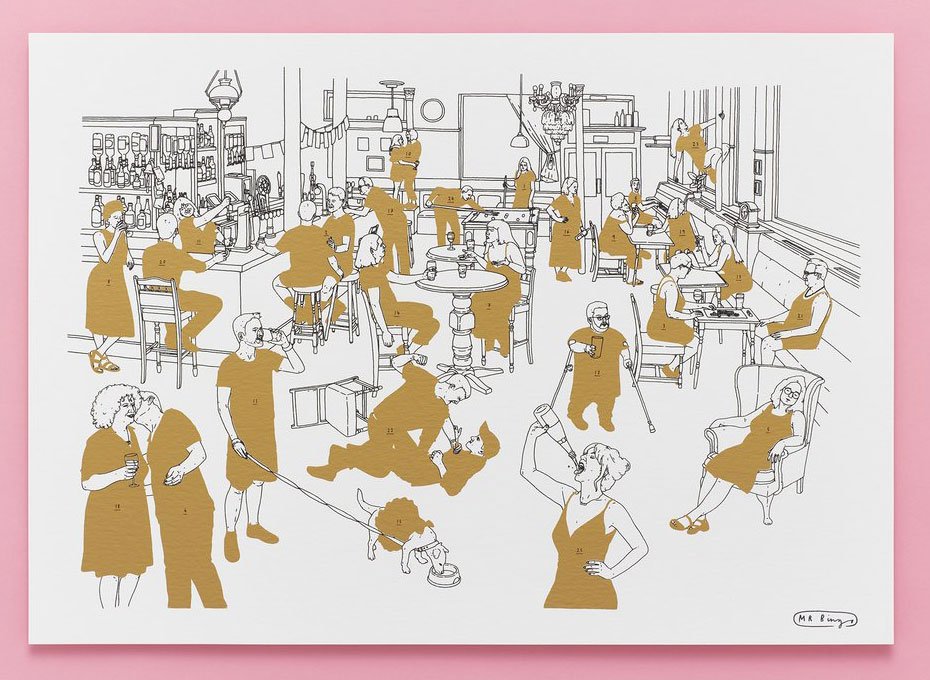
Find out what's underneath the gold ink in a tantalising Christmas countdown from Mr Bingo
What more festive than naked people in a pub? Well... quite a lot of things, but that doesn't make this naked calendar from Mr Bingo any less fun.
Count down the days by scratching off the gold ink to reveal a naked body underneath, and then you get to tell your friends you've seen 25 naked people in December. They may or may not be impressed.
The people featured in the calendar are ordinary folk who applied to be part of the project, and you can see more about the making of the project via the video below.
02. Here Design's advent calendar shop
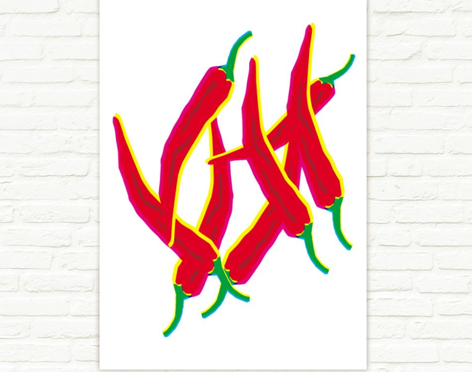
An Anarchy of Chillies poster is one of the products available in December from the Here Design shop, but which day will it be on?
In another alternative advent calendar project, Here Design is revealing a new item on its online shop each day. Products include tote bags designed by Here for the Tate and notebooks from the Nigella cookbook collection. This is a great way to combine your Christmas shopping with some festive counting, or just drool over Here Design's beautifully crafted work.
03. 24 ways' advent calendar for web geeks
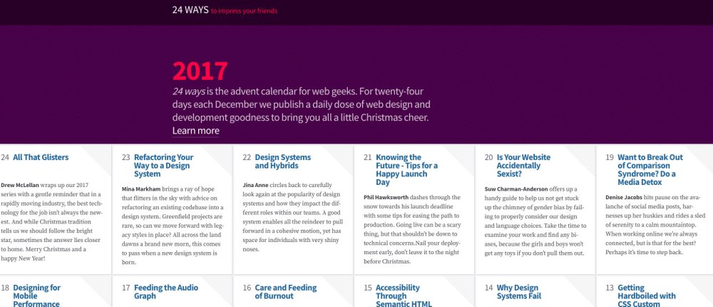
Last year's 24 ways provided plenty of insight
If you're looking to improve your web design and development skills, then 24 ways is the advent calendar for you. This website posts a different web article for each day in December in the run up to Christmas, and this curated list is a fantastic way to improve your skills. This advent calendar also lasts post-Christmas as the site stays live, meaning you can binge in the new year if you miss some articles.
04. Junique's the animal kingdom
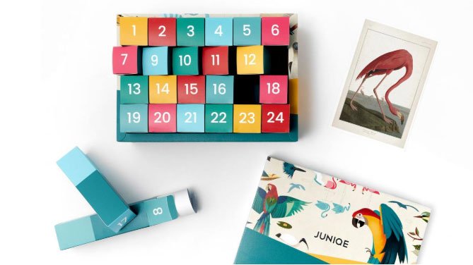
This advent calendar features a rolled up print by a different artist each day
One for print lovers: get a new print every day with this advent calendar in a box by Junique. Various themed calendars are available – including black and white, motivating mantras and botanical beautie – but there's something about getting a box full of flamingos, owls and penguins that pleases us.
Read more:
-
If you want to be a graphic designer, you'll have to master certain essential creative tools first. Luckily, you can learn how to use a whole bunch of them with one streamlined course – The Ultimate Graphic Design Bundle: Lifetime Access.
You'll learn how to create awesome concept art by drawing with Photoshop (get Adobe Creative Cloud here). You'll discover aspects of real-world graphic design using Illustrator, even creating your very own flat design spaceships, practise typography, logo design, and a whole lot more to gain some hands-on experience before you launch your career.
Try it out for just $29 – down 98% from the regular price of $1592.
Related articles:
-
Learn how to break into the games industry and revolutionise your character and creature concept art with the latest issue of ImagineFX magazine – which goes on sale in the UK today. Packed inside the pages of issue 169 you'll hear from top creatives and art directors in the industry, who are all raring to share their career-shaping insights. So if you've always dreamt of designing worlds and characters for AAA titles, be sure to pick it up!
Buy issue 169 of ImagineFX here
Elsewhere in issue 169, Patrick J Jones continues his detailed figure drawing workshop. This time he reveals how compression and gravity effects can be used to create more realistic looking bodies. Meanwhile, Shedworks co-founder Gregorios Kythreotis shares how to use Unity, Photoshop, Procreate and Maya LT to create a fresh approach to video game art in our cover art feature. There's also the latest news from the digital art world, plus reviews of books and tools that you need to check out. Make sure you don't miss it!
Never miss an issue: Subscribe to ImagineFX here
Explore what's on offer by taking a peek at the lead features, below.
Break into the games industry
Top artists spill industry secrets
Plenty of artists want to break into the world of designing for games, but fewer turn that ambition into a reality. We hear from recruiters in the field about what they're looking for in a portfolio and how you should go about grabbing their attention. From how to go about making yourself known online to good convention etiquette, this feature gives you the low-down.
Inside studio CD Projekt Red
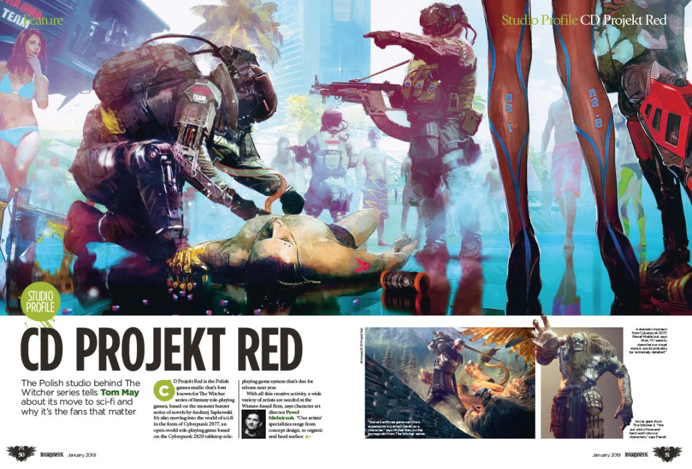
Say hello to the organised chaos of CD Projekt Red
Polish games studio CD Projekt Red is perhaps best known for its fantasy RPG, The Witcher. As with lots of fantasy properties, the success of this series is built by the investment of the fans. We visit the studio to hear how it works and creates products that keeps its players happy, as well as how it runs on a pinch of creative chaos.
Explore the work of Darren Bacon
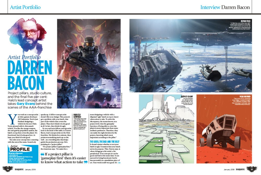
This month we're bringing home the bacon... Darren Bacon that is
Halo's lead concept artist Darren Bacon shares his story this month in our artist's portfolio. He talks about the principals of good game design, the make or break moment that defined his career, and how he achieves the final five per cent that separates the good art from the great.
Create a portrait with oils
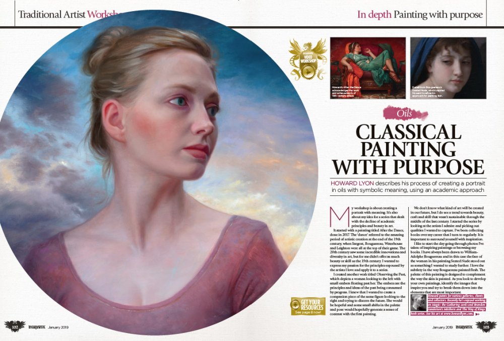
Master oil painting with this straightforward workshop
Oils paints can be an intimidating medium to work with, but thanks to this tutorial by Howard Lyon you'll learn how to harness oils to produce a portrait with an academic approach. Covering everything from tools to painting techniques, you'll be creating portraits worthy of the masters in no time.
How to flesh out a conecpt
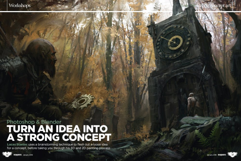
Train your brain with this in-depth workshop
Got an idea for a piece of concept art but don't know how to take it to the next level? Lucas Staniec syas that it's all about having the right mindset, not the right artistic skills. Learn how to hone this elusive mindset with his in-depth tutorial for developing elements of a piece of concept art.
Related articles:
-
Hackers can spoof messages, hijack screen controls and kick others out of meetings.
-
-
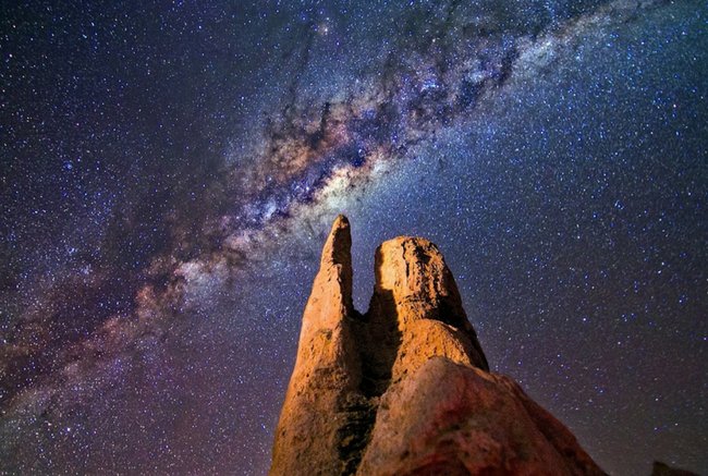
Creating jaw-dropping images of the Milky Way screaming down towards the horizon is the preserve of professional photographers, right? They might like you to think that, but once you’ve got a handle on what's required and the settings you need, you will soon discover that night sky photography – like any form of landscape photography – is mostly about you, not your camera equipment (that said, even the best camera phone isn't going to cut it here, we're afraid).
Finding Dark Sky Parks and dark skies around the world, and getting yourself to them, is half the job, but once you're there, you will need a basic level of equipment to take advantage of any clear nights; a DSLR camera, wide-angle (fish-eye) lens, and a tripod. You'll probably also want a good camera bag, too. None of this gear is particularly complicated, and it needn't be expensive, though like any photographic niche, you can spend as little or as much as you want. Here are some tips on great products for beginners to night sky photography, plus a few step-up products so you can see where your future may lie. We've also outlined some tips on how to get started in astrophotography (skip straight to the tips here).

Do you need a really expensive camera to start taking photographs of the night sky? No, you absolutely don't, and this entry-level Canon DSLR is an excellent place to start your experiments. Known in the UK and Europe as the EOS 800D and in the US as the Rebel T7i, this reasonably lightweight camera has a 24.2MP APS-C CMOS sensor and a DIGIC 6 processor, which helps deliver decent high-ISO noise performance during long exposure shots.
Okay so it's not a full-frame sensor, but it does the job if you are starting out, and the vari-angle touchscreen is both easy to manipulate and navigate. Your future may involve having to purchase a full-frame DSLR for its better ISO capabilities, but for now, concentrate on getting outside and taking photographs at night.

If there's one thing that every night sky photographer needs, it's an excellent tripod that's both reliable and quick to set up/collapse. This aluminium tripod from Manfrotto is hefty enough to serve its purpose without being too heavy to carry, and has some nice touches. The ball head is easy to use, allowing quick and precise placement as well as a quick-release for your camera. The three legs use a lever locking mechanism that's easy to lock down and lift, while the central column extends at the touch of a button.

Many astrophotographers and nightscape shooters will tell you that you must have a full frame DSLR, but that's not true. What is true is that by using an entry-level DSLR like the Nikon D5600 you will see more picture noise within long exposure photographs. If you're just starting out, that's not a huge issue.
This entry-level camera's lightweight build makes it easy to travel with, while its tiltable LCD screen makes it simple to frame shots, and makes it possible to rely on a small tripod. Capable of 24.2-megapixel pictures, you'll eventually grow-out of its APS-C-sized CMOS sensor, but the Nikon D5600 is nevertheless a great camera to start getting out and about at night with.
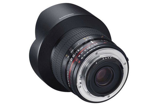
If you're going to take pictures of the night sky, you need a wide-angle lens. That way, you can fit a lot of landscape and sky in each image. However, such lenses often come at a premium price if you stick to buying from the camera manufacturers. So it's worth looking for a third-party lens, one of the best value being this Korean-made 14 mm wide angle lens from Samyang/Rokinon (the brand name changes between Europe and the US).
Not only is this one of the most affordable wide-angle lenses around, but it's also excellent quality, and produced to fit all major brands of camera, such as Canon, Nikon, Pentax, Fujifilm and Sony. However, it is a manual lens, so you have to be comfortable with manual mode to use it away from night photography. A pricier auto-focus version, the Samyang AF 14 f/2.8 lens, is also available, but its auto-focus brings no benefit for night photography.
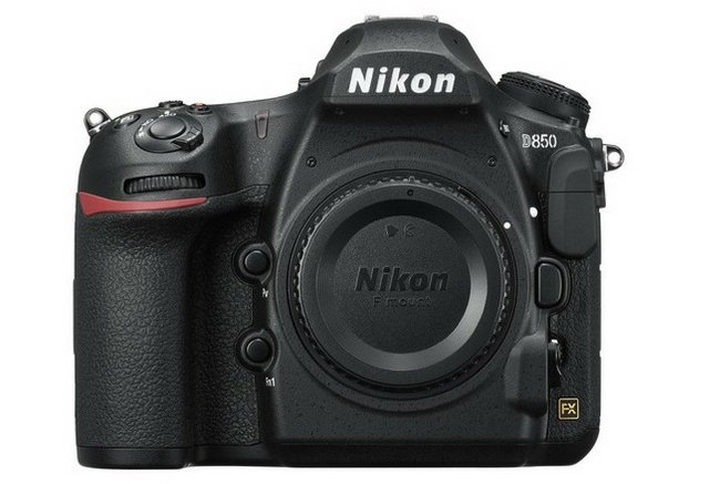
If you're after a DSLR camera with a full frame sensor for astrophotography, it's a three-way fight between Canon (its 5D and 6D cameras), the Sony A7 Mk III, and this, the Nikon D850. At the heart of the D850 is a full-frame CMOS sensor that achieves an incredible 45.7MP, and it also allows 4K video capture. For easily lining-up shots there's a viewfinder and a tilt-angle LCD screen, though at 840g this is a pretty heavy camera. If you want to save some money, but stay with a full-frame sensor, consider finding a cheap deal on the camera the D850 replaces, the Nikon D750, which will serve you almost as well for half the money.

Most photographers use exposure times of around 20 to 30 seconds to capture the night sky. Although that might seem like a long time, it can take much longer than that to gather enough light from distant star clusters and galaxies, and if you want great pictures of galaxies and our own Milky Way, you need to open the shutter for a few minutes. The only problem is that Earth rotates quickly, meaning any exposure time over about 30 seconds will feature visibly blurred stars.
Cue this simple equatorial mount, which is placed between camera and tripod, and moves the camera in-sync with the Earth's rotation. That means you can use both wide-angle and zoom lenses, and expose for a few minutes without trailing stars. This one is relatively simple to use, thought it needs to be aligned to the Northstar, Polaris, using a small built-in polar scope. Another similar product is the iOptron SkyTracker Pro.
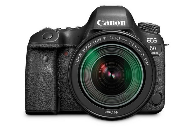
Although any crop sensor DSLR camera can be used to take images of the night sky, only a full frame sensor is sensitive enough to produce images containing a bright Milky Way. The Canon EOS 6D Mark II's 26.2 megapixel dual pixel CMOS AF sensor and a huge range of ISO settings makes it ideal for capturing detailed RAW images of our galaxy – best photographed in summer in the northern hemisphere – as well as faint displays of the Northern Lights.
However, the Canon 6D Mk II is a fine step-up camera for nightscapes for another reason; it weighs just 765g, which makes it much easier to travel with than most full-frame DSLR cameras. This Mk II version also has an articulating touchscreen LCD, which the first incarnation, the Canon 6D, lacks. However, if you want to save some money, go for that first version, which sells for around half the price second-hand.
5 tips on how to get started in astrophotography
01. Choose a camera

Your smartphone is no good here
Your smartphone? Forget it. To get decent pictures of the night sky, you need a large sensor, something you only get with a DSLR or mirrorless camera. There are two types of DSLR; crop sensor, and full frame. The latter has much better ISO capabilities, and produces a much cleaner image from long exposures. That said, full frame cameras are very expensive, and it's fine to start out with a crop-sensor, entry-level DSLR. Some mirrorless cameras are also now being used for nightscapes, such as the Sony A7 III.
02. Get a wide-angle lens

Don't be afraid of choosing a third-party manual lens
To photograph the night sky in all of its glory, you need the widest view possible. This means finding a wide angle lens, most of which are fisheye lenses of some kind. Aperture – how much light the lens lets into your camera – is critical, and the lower the F number of a lens, the better. Although it is possible to get down to F1.8 with some expensive lenses, most wide-angle lenses while get you to about F2.8, which is fine. Don't be afraid of buying third-party manual lenses, which are often cheaper and/or better than big brand lenses.
03. Keep everything stable and still

Heavier tripods are more stable, but you sacrifice portability
A tripod is essential for night sky photography. The bigger your tripod, and the heavier it is, the more stable your setup will be. However, if you are travelling light, a small tripod will just about do as long as you don't mind kneeling on the floor to line up your photo. A shutter release cable is also very useful for opening your camera's shutter without touching the camera, an so introducing a vibration that will cause blur.
04. Get your timing right

The best time for night photography is six days before a new moon
It's pretty obvious that you need a clear night sky to take photographs of stars, so don't bother going outside if it's cloudy or raining. You should always avoid full moon. The best time to go on a night sky shoot is from six days before new moon through until four days after new moon. That's the ‘stargazing window’ when the early evening night skies will always be moonless.
05. Sort your settings

The settings required aren't as complex as you might think
Think this is the magic part? Actually, apart from having to do everything in manual mode – which may be something new for you – the settings required for night sky photography are not complicated. First, put your camera into manual mode. Now turn the focus dial on your lens to infinity focus (if your picture turns out slightly blurred, you can tweak this slightly inwards). Turn the aperture dial (f number) to the lowest setting, probably F2.8, and set the ISO on your camera to 1600. Set the exposure to 25 seconds and … go! Of course, you can play around with a higher ISO, and a shorter exposure, but with these basic settings you will get more or less what you need from the night sky.
06. Compose the shot
Foreground features can add drama to sky scenes
Pictures of stars are boring. The first time you take an image of the Milky Way can be exciting, but any picture of the night sky is more impressive if the photo is properly composed with something in the foreground. Try an old barn, an interesting tree, or something unusual, like a rusty old car. Since you are taking the picture at night, your subject will help produce an ethereal look that the presence of stars will only add to.
Read more:
-
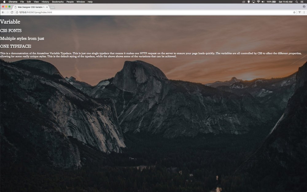
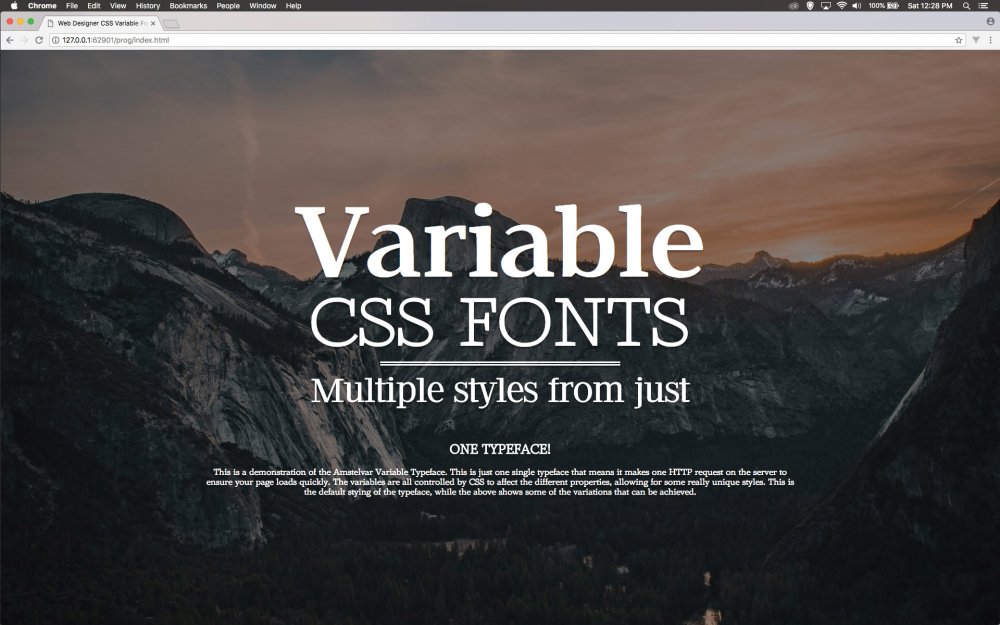
Typography on the web allows for graphic designers to be expressive with their client’s messages. The web has come a long way with typography, from only allowing fonts that are installed on the user's computer, to now having a whole raft of weird typefaces and fun fonts available from online content delivery networks.
If you’ve ever used Google Fonts, then you might notice that when you add a number of weights for the same typeface, because you would like to use it in bold etc, then Google generally warns you that adding these makes the page slow to load. This problem is because a whole typeface of every single character has to be downloaded for each of those weights, regardless of whether you use all the characters.
By contrast, a CSS variable font uses variables in the CSS to manipulate the web font properties. This means that one variable font will have all weights, so as the designer you can become far more expressive in the way that you use typography in your design.
It doesn’t have to end there though, because some typefaces allow the designer to alter more than just the weight of the typeface, and as such a great deal of flexibility can occur. We are using the open source Amstelvar font, which has no less than 17 variables associated with it, so that you can get some really interesting options from just one typeface.
Download this tutorial's files here.
01. Opening the project
Open the ‘start’ folder in your code IDE and open ‘index. html’ for editing. In the body section of the page, add the code below to give some structure and content for us to work with using the CSS variable fonts. You can change the text to suit your own needs.
02. Finish the content
Now add the remaining code shown below. In our example we have a larger paragraph than shown here in order to allow you a description of CSS variable fonts in the example. You can copy that text from the finished folder or add your own as necessary.
03. Link up the style
All of the CSS is going to be placed in its own separate file in the ‘CSS’ folder. As such the link to this is placed anywhere in the ‘head’ section of the code on the page. Save the ‘index.html’ page now as you are done with this and all further code will be in CSS.
04. Load the typeface
From the ‘CSS’ folder, open ‘design.css’, which will be empty. Add the code as shown here at the top of your CSS. As you can see this is identical to how you would load any locally stored typeface with current CSS.
05. Style the page
Remember to choose text that stands out
Now the HTML and body of the page are styled with the margin and padding removed. The font that was loaded in the previous step is now applied as the default font to all text on the page. A background image is added to cover the background and the text is set to white with a slight shadow to help it stand out.
06. Centre the text
The easiest way to centre text both horizontally and vertically is to use the newer CSS grid as the display object. This wrapper, which encapsulates all other tags, is set to take 100% of the vertical height with the ‘vh’ property.
07. Auto centre
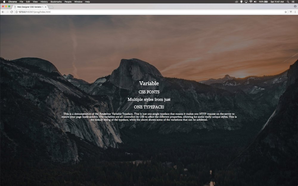
The variable font is applied as a normal font
Now the content inside can make use of the auto for both the margin at the top and bottom as well as left and right. This means we get a text box that is going to take 60% of the screen and centre it. The text is also centred and this will help. As you can see in the browser the variable font is applied as any normal font.
08. Vary the font
Now the font for heading 1 is going to be given some varying properties. The W3C would like us to use font-weight, stretch and optical sizing, but for this typeface the optical sizing doesn’t work. We’ll work around that in the next step but just check your progress in the browser.
09. Customise the font
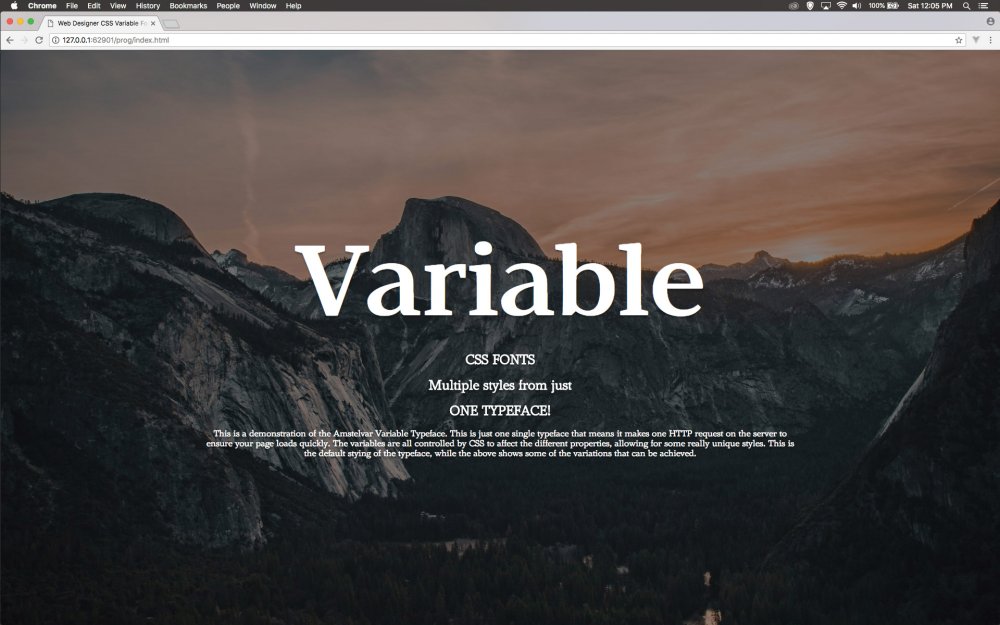
Amstelvar has lots of control options
The Amstelvar font has so many variables that aren’t controlled by W3C commands, but there is a way to access them. Add this line of code that also adds the height of the y-ascender to 700 and the height of the y-upper case. In both instances, they are reduced making the type have a reduced overall height.
10. Make subtle changes
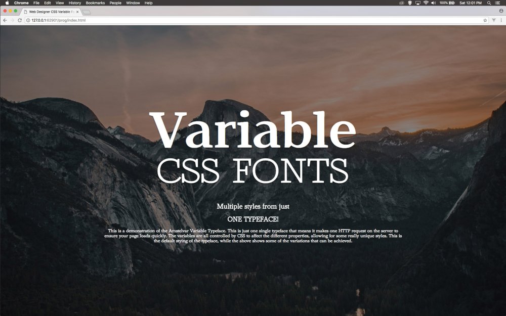
The font is now almost unrecognisable from its source
Now the styling of the subhead will be added. As you look at this you will see that the weight has been reduced as well as the optical sizing. When you look at this in the browser it almost looks like a completely different typeface given the characteristics have changed so much.
11. Create a separator
Now a double line separator will be added between the text. This will only be 40% wide, so slightly less than the text. This is also given a slight shadow behind it. This is just to help aesthetically add a break between the first two lines and the second two lines.
12. The next line
The next styling is added to help make a difference in the text. As it stands now it doesn’t look too different to anything done in the previous step, but in the next few steps more variables will be added to enhance the way this looks with some subtle changes.
13. More variables
The new variables are marked in bold below. XOPQ is the x width of the letter, XTRA is the width of the curve. YOPQ is the y height of the letter, YTLC is the y height of lower case letters. YTSE is the serif height, GRAD is the grading of the letter. YTAS and YTDE is both the ascender and descender y height.
14. Yet more variables
Be sure to save before you refresh
The last few variables shown here in bold are the overall y-height of the letter with the YTRA property and then the paragraph weight and paragraph width. Save this and refresh your browser to see the changes take hold. The changes are subtle, but enough to make it look like a different typeface.
15. All change
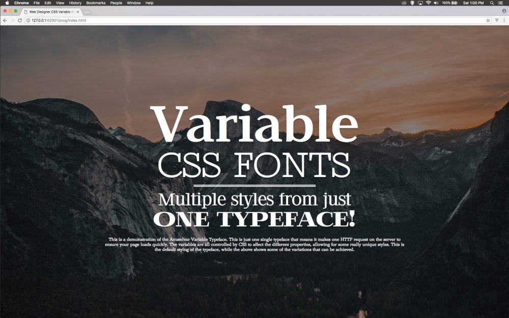
Lots of different styles can be generated with a single HTTP request
The next line of text is styled up with this CSS now. Again the settings are being adjusted to give the appearance of a different typeface. Save this and look at the effect that has been generated in the browser. The payoff here is that you have only made one HTTP request for the typeface but generated a different style.
16. Last text
The final section of text is being left in the default setting for the Amstelvar font. All that is going to happen here is that the line height is adjusted to make it much more readable on the screen. This completes the styling of all the text. Next is to show how to animate some of the properties.
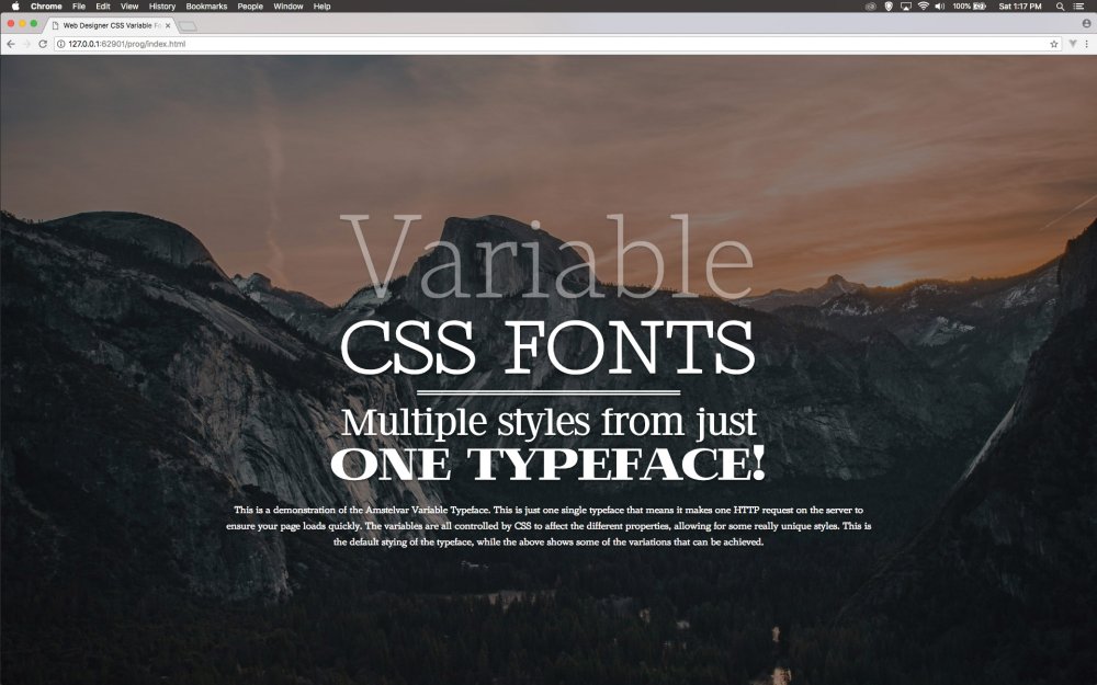
17. Make it animate
Let’s revisit the initial heading tag and add some animation to that. In order to do that, add in the code shown in bold. The animation name refers to the keyframes that will be defined in the next step. It will take four seconds and hold on the last keyframe.
18. Define the start
The keyframes for the ‘anim’ are created. Here the starting keyframes are added. The weight of the typeface is changed to its lowest value of 100 and the paragraph weight is changed to 0 so that it becomes bolder as it animates over the duration of the four seconds.
19. Ending point
The keyframes are animated from one point to another in this example. The final ending point of those keyframes is defined, which as you can see takes it back to the default paragraph weight and the weight of the typeface is set to how it was originally defined earlier in the tutorial. Test this in the browser.
20. Refine the animation
When you test the animation, you will see that it is a little jittery because of the extreme change in the paragraph width. Here this is changed to 50 and the opacity is changed to 0 so that it fades in and makes the transition smoother.
21. Finish off
Have fun playing with typefaces to achieve different results!
The final amendment is to add the opacity of 1 so that it fades in. Refresh the browser and this works much smoother. Experiment by animating any of the properties over time and you will get some interesting results for your type. And this is all from one typeface!
This article was originally published in issue 279 of creative web design magazine Web Designer. Buy issue 279 here or subscribe to Web Designer here.
Related articles:
-
It's hard to believe that we're hurtling towards the end of 2018. It feels like only yesterday that Pantone revealed its enigmatic Colour of the year, and over the last twelve months we've seen the creation of the world's most unignorable colour and a trend for bold and saturated hues. Designers and fans of colour theory are already wondering what 2019 has in store, and now Shutterstock has the answer.
Today, the global marketplace for images has released its 2019 Color Trends report based on pixel data and image download data. By studying the actions of its users, Shutterstock has been able to identify the top three universally popular colours, as well as pin-pointing local favourites from different countries from around the world.
And just as we saw with the rise of vivid hues back in the summer, it looks like people can't get enough of turbo-charged colours if this report is anything to go by. According to Shutterstock's data, a trio of neon colours have surged in popularity year-over-year and look set to shape 2019.
The three colours in question include; Proton Purple, a vivid colour that "represents the palpable positive charge of our daily lives"; UFO Green, which "evokes lush countrysides alongside whirling rows of binary code. It’s both natural and supernatural"; and finally Plastic Pink, a sizzling colour with lots of depth "that captures the electric glow of cities at night".
Check out the colours in the visual report below, along with the most popular colours from countries all over the world.

Click the image to get a better look at 2019's colour trends
"Whether it’s conscious or not, the colours we choose to represent any given occasion reflect more than just current trends in fashion or design – they have a larger cultural significance," said Lou Weiss, CMO of Shutterstock.
"If we look to the ideas influencing culture today, technology stands at the forefront. There's tons of energy driving this movement, so it's no surprise that the top trending colours pack a real digital punch."
Related articles:
-
People across all different industries need to make presentations at some point or another. So why not get your hands on a tool that will help you create presentations more efficiently?
Slideshop: Lifetime Subscription is on sale now for just $29.99, and it features more than 15,000 presentation templates for PowerPoint, Keynote, and Google Slides. The designs are modern, pre-made, and gorgeous, and unlimited downloads are at your fingertips!
Utilise the platform's simple editing tools to create a presentation that's uniquely tailored to your needs. Get Slideshop: Lifetime Subscription for 98% off the regular price right now.
Related articles:
-
It's free delivery week at Amazon! From today (30 Nov) to Wednesday 5 December, all Amazon UK customers can get free standard delivery on all their purchases – all you need to do is pop the code FREEDELIVERY in at the checkout.
There's no catch here, but here are the details anyway. This promotion applies to all items listed as 'dispatched' or 'fulfilled' by Amazon, and there's no minimum spend (that means there's no need to scrabble around bulking out your order in order to reach the free delivery limit – hurrah!). You can also use the code as many times as you like over the course of the week.
Ideal for Christmas shopping
If you – like us – are a little behind on your Christmas shopping, this is the perfect opportunity to make a dent in your list. Stuck for ideas? Take a look at our Christmas gift guides for graphic designers, illustrators, freelancers or kids. There are plenty of items to buy through Amazon on our roundups, so you can take advantage of this sweet delivery deal.
It's also worth noting that Amazon is still running Cyber Monday deals this week. You might be a little sick of it by now, but if you can get over that there are some incredible deals still to be had. Now could be a great time to pick up that Amazon smart device you (or a loved one) have always wanted. For more on that, take a look at our ultimate guide to all Amazon devices.

If this week gets you hooked on the joy of free delivery, you should probably think about signing up to Amazon Prime. Prime membership costs £7.99 per month or £79 annually, and you can test it out with a free 30-day Amazon Prime trial. As well as free delivery, you'll also benefit from super-fast shipping, and access to thousands of free movies and TV shows – plus a few other unexpected perks.
Read more:
-
If you can work on a canvas with paints, then many of the same painting techniques you use will transfer directly over to digitally painting in Photoshop. The good news is that core principles such as composition, colour theory and perspective still apply – so once you're all set up with your Creative Cloud subscription, you just need a little know-how and you're good to go.
This Photoshop tutorial will break down the process of creating a simple digital painting, from start to finish. However, it's important to remember that most artists will develop their own unique workflows.
01. Start with a sketch
Sketching is an essential part of many artists' workflows
Sketching is essential to many artists, both traditional and digital. The benefits of sketching before painting is that it allows for quick iteration of ideas without committing to the longer process of painting. Things can be worked out in rough form ahead of time.
Sketching digitally can take many different forms – it can be a traditional pencil sketch or (as in this case) a quick painting. When working on quick sketches, try to give yourself time limits, both per sketch and for the overall sketching process. This will help you avoid spending too much time on any one idea and get you into painting faster.
02. Establish perspective and set the mood
Every element you paint should recede towards the vanishing point
Once a sketch has been finalised, it’s a good idea to lay down some perspective guides before you paint anything. Perspective is such an important part of painting – even in paintings like this one where there aren’t a lot of visual cues. It’s something I make a habit of doing in every painting, as it helps with the flow of the image.
Every element you paint should recede towards the vanishing point. This is quick and easy to do in Photoshop CC with the Line Tool.
You’ll also note that in this image above I’ve applied a simple gradient behind the perspective lines. This is something I like to do for exterior paintings as it does two things. First, it implies the direction of the primary light source in the image (in this case, the sun). Second, it gives me a bit of direction for the colours I want to start painting with. I’ve opted for cool, muted blue tones.
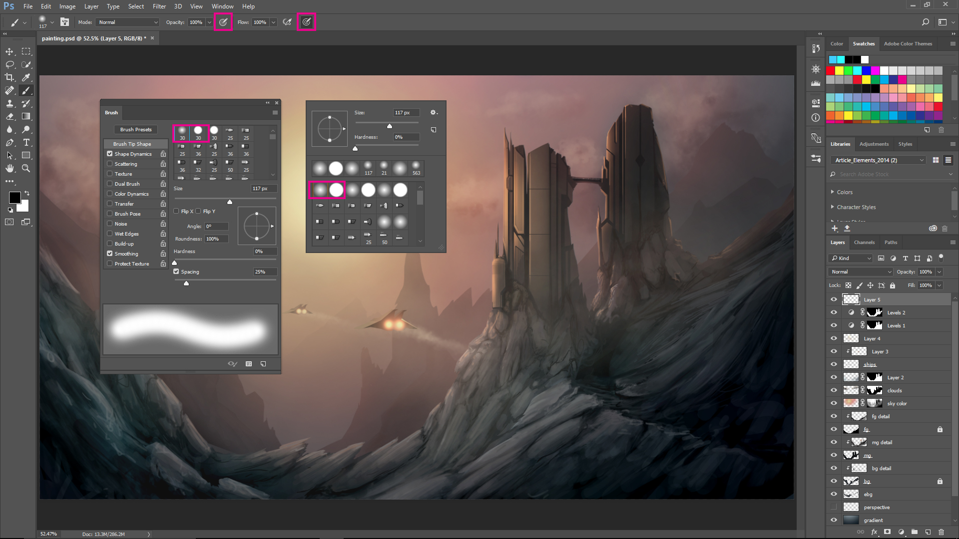
03. Choose your brushes
Click image to enlarge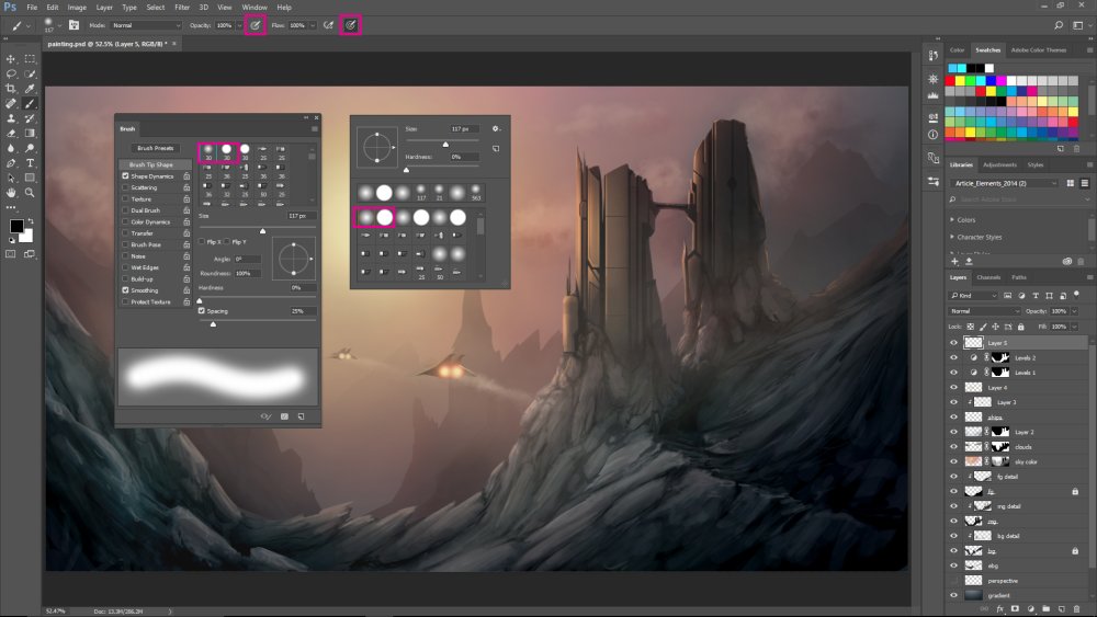
As you start using Photoshop’s Brush tool and Brush panel for the first time you might feel a little overwhelmed. The amount of customisation and control you have over what your brush looks like and the way it behaves can be something that sidetracks you if you're new to digital painting.
My recommendation is to limit yourself when first starting out to two brushes. Here, I’ve highlighted both the Soft Round and the Hard Round brush in both the Brush panel and the Brush pop-up.
It’s also worth mentioning that painting in Photoshop feels infinitely more natural when you use a pressure-sensitive tablet. I use a Wacom Cintiq but can also recommend its Intuos product line. Photoshop actually has tools built in to take advantage of this hardware. The two options marked in the Options bar at the top of the image correspond to pressure control over the brush’s opacity and size.
04. Build the foundations
Shapes and silhouettes allow you to focus on the composition and flow of the image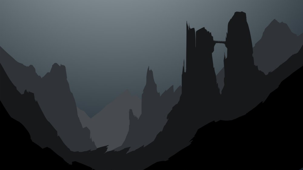
As you start to think about translating your sketch using these two brushes, it’s easiest to start with simple shapes and silhouettes. This allows you to focus on the composition and flow of the image without getting bogged down in the details.
Here, I’ve used the Hard Round brush with pressure-sensitive size control to shape the silhouettes. This can be done rather quickly by applying paint with the Brush tool and subtracting it with the Eraser tool.
It’s also worth noting in this image that I’m breaking the composition apart into layers. In the Layer panel I’ve created layers for background, midground and foreground. When painting silhouettes for these layers, I’ve also considered the effects of atmospheric perspective in the colours I’ve chosen. These silhouettes can serve as a base to build detail upon later.
05. Turn on the lights
With the silhouettes established, it’s a good idea to define your main light source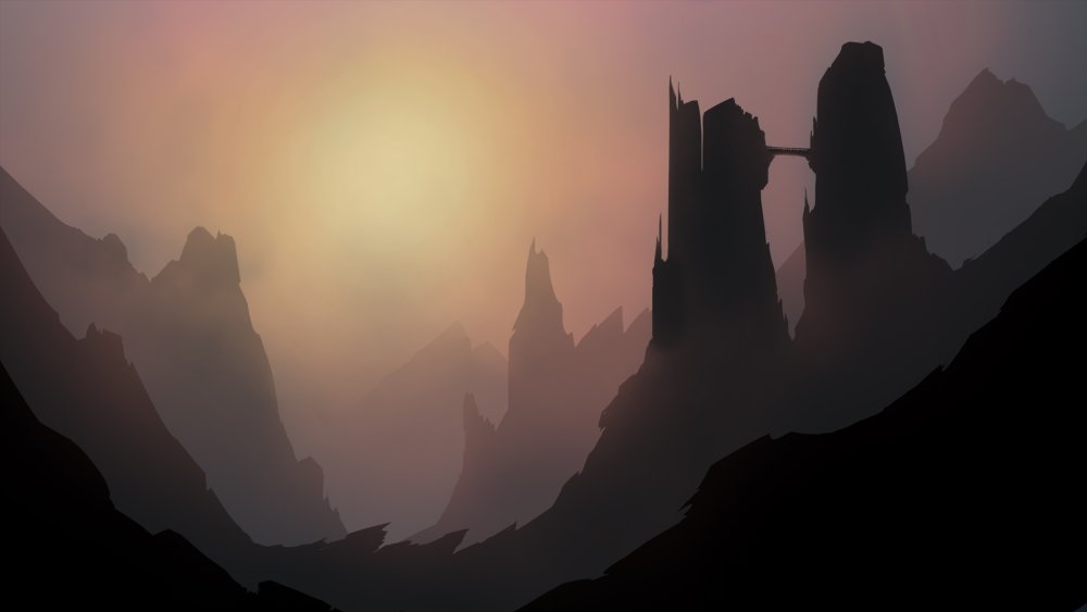
Now it’s a good idea to define your main light source. In an exterior painting like this, the primary source of illumination is typically the sun. It's vital to establish the light source because it will influence the way you render out the details on top of the silhouettes as it will affect colour selection and shadow placement.
For this step, I used a large Soft Round brush, first with red, then orange and finally yellow. I shrunk down the brush as I changed from one colour to another.
06. Find the details
Photoshop’s clipping layers will help find the details in each layer of the composition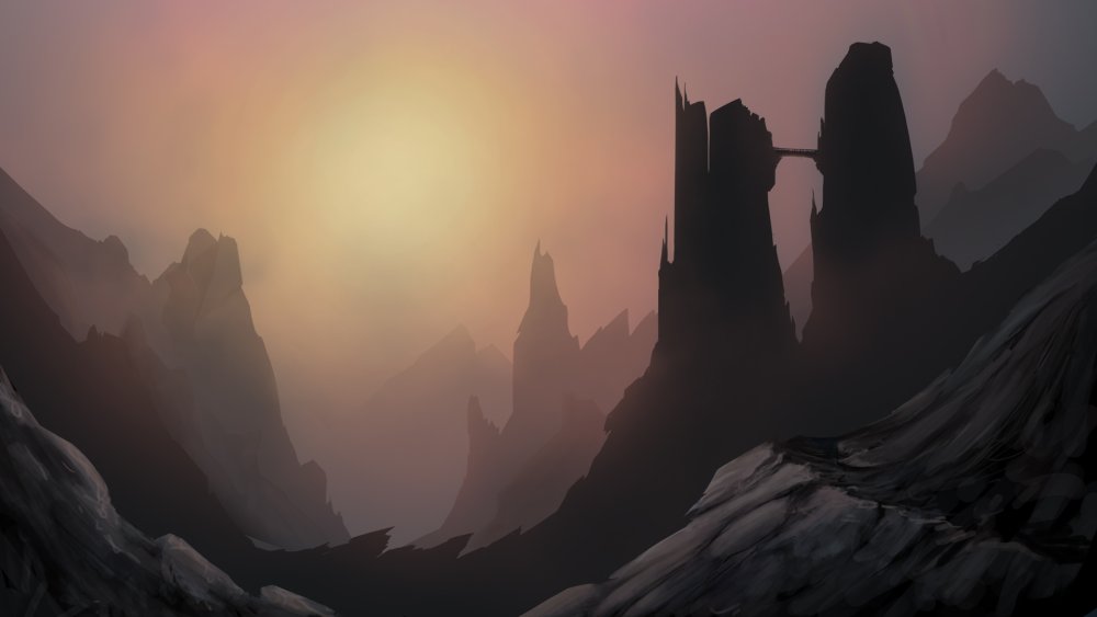
The next step can easily be the most time-consuming: we need to find the details in each layer of the composition. Here, Photoshop's clipping layers will be helpful.
If you create a new layer above the layer with a silhouette on it, you can alt+left click the space between the layers and clip the new layer to the existing layer. Any paint applied to the new layer will now only be visible where the silhouette layer underneath it has opaque pixels. By doing this you can begin to quickly apply paint to the new layer without worrying about cleaning it up later.
Now using the Hard Round brush, start by adding some random organic shapes to define the tops of all the rock faces. These will be the portions of the rocks that the light illuminates the most. If the silhouette layer underneath isn’t dark enough, you can then follow up by painting some shadows between the recesses in the rocks.
Repeat this process for each of the defined layers of the composition. Remember, as you move further back in the composition details should become less and less apparent and colours should desaturate.
07. Polish and distribute details
TThe first thing you should do is to take a hard look at the painting
During this step, the first thing you should do is to take a hard look at the painting and ask yourself what could be better. Maybe a detail you’ve already painted could use a bit more work. Maybe you feel like the image is missing something.
For this painting, I wanted to add some ships flying through the canyon and some clouds to break up the sky a bit. For the ships, use the exact same process you used earlier with the rocks: silhouettes or shapes first, then detail.
For the clouds, start with the Hard Round brush and in the Brush pop-up adjust the Hardness to around 50%. On a new layer begin painting your clouds using the pressure-sensitivity of your tablet to create variation. Don’t forget to define colours for the lightest areas and darkest, shadowed areas of the clouds. If your clouds feel too bold, adjust the opacity of the layer in the Layer panel.
If your painting doesn’t turn out just like this one, don’t be discouraged. Digital painting (just like traditional painting) is something that takes a lot of practice.
Related articles:
-
-
This issue, along with our usual reviews, inspiration and regular Q and A sections, we review Blackmagic Design's eGPU, teach you how to create monstrous machinery with Cinema 4D, and look at Gravity Sketch and GSG Light Kit Pro.
Buy 3D World 242 today
We take a look inside the issue to find out what else is in store...
Feature: Global VFX hotspots!
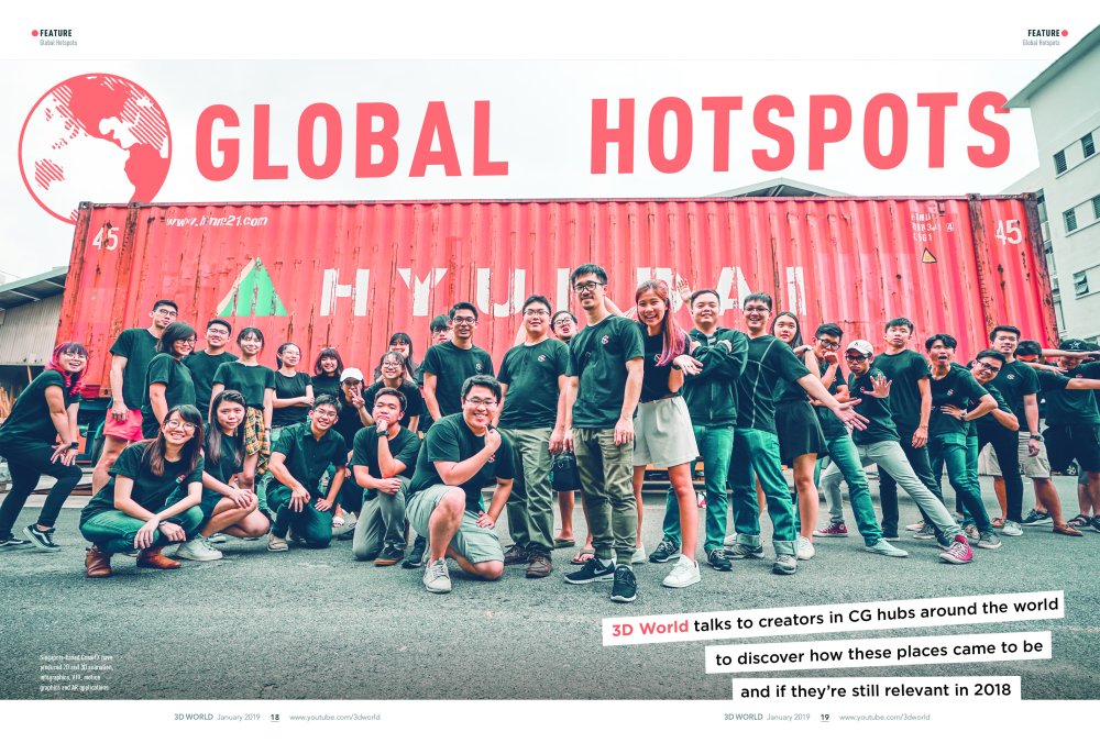
Discover the place to be to work in visual effects
We talk to a group of visual effects artists to discover the most hip and happening places to work in the industry, find out why those hubs sprang up and look at key projects to come out of them.
Feature: VFX of First Man

Take a closer look at the final frontier, with our behind the scenes on First Man
In this feature we talk to the team behind the visual effects of First Man, discovering how they recreated one of mankind's greatest achievements.
Training: Create stunning Keyshot renders
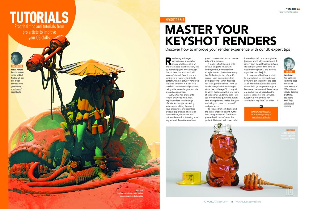
Master Keyshot with our top tips
Take a look at our massive Keyshot tips collection, where our top artists share their secrets to success.
Training: Model an Akira style bike using Gravity Sketch

Make scifi models in VR
Precise modelling can be tricky in VR but in this issue Mike Griggs shows you how to use Gravity Sketch to create a stunning Akira styled scifi motorbike.
Training: Create hard surfaces in VR
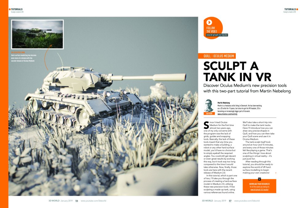
In this tutorial our expert VR artist, Martin Nebelong, shows you how to make hard surface models in a VR project, expanding your skillset.
Buy issue 242 or subscribe to 3D World here.
Read more:
-
Anyone who's ever done any coding knows that it requires a huge amount of concentration. This also means that even if you're using as many web design tools as possible in order to automate or speed up processes, you may still find it hard to switch off after a long coding session.
To find out how you can relax your brain and get to sleep after an intense coding session, we spoke to web designers and developers to see how they do it.
01. Get some exercise
"One of the challenges I have is switching my brain off, either so I can relax or switch gears and work on something new," says experience design strategist at Rochelle Dancel. "So it’s always good to get the blood going again. I took up bouldering [a form of rock climbing] a couple of years ago; I love it because my brain and my muscles have to be in perfect harmony or I’ll literally fall off the wall. I’m not very good at it but it’s the perfect reset button for me. It’s also a great way to spend time with your team that doesn’t involve alcohol."
02. Work on a different creative project
"It’s always difficult to unwind after a code sprint," says front end developer at 50,000ft, Anthony Miroballi. "I usually work on a creative project in a field outside of coding. For me, that’s electronics, video editing or designing 3D models for printing. This helps my brain shake off the stress while leaving me with another thing to feel accomplished on.
The secondary effect is to prevent stress build-up from getting behind on other projects. After this process, I will usually be ready for bed or a quick nap before starting the next sprint."
03. Don't finish the day mid-task
"It can take some hours to snap out of the concentration required for long coding sessions, particularly if you’ve had to leave a problem unsolved or a task unfinished," explains Tim Whitlock, maker of Loco. "It’s not uncommon for me to watch a two-hour film while still thinking about code the whole time. Because of this, I make sure I finish work at least three hours before sleeping but most importantly, I try to finish the day at a satisfactory point. The latter can sometimes be difficult to plan but I find that avoiding new tasks in the late afternoon can really help. If you need to start something big and it’s past 3pm, simply save it for the next day and tackle something smaller or easier instead.
04. Use a sleep sounds app
"When I became a freelance web developer, I promised myself I would keep sensible hours. If I am honest, I still keep longer hours than I should," says Leonie Winson, a freelance web developer for Line and Form. "This results in too many nights awake and thinking very loudly. To relax, I use a sleep sounds app. My favourite ones are river sounds. The knack is to find a sound you can concentrate on. It can’t be too fast and you have to get the volume right. I set my timer for 40 minutes, concentrate on the sound and 95 per cent of the time I’m asleep before the sounds stop."
05. Write down your thoughts
"The evening after finishing a strenuous coding deliverable, your mind is still racing, thinking about code optimisation, best practices and design patterns," says Demetrios Kontizas, director of web development technology at Mirum.
"You lie awake in bed or toss and turn, despite being mentally exhausted. Even if you are able to get some rest, often it’s the case that you struggle to stay asleep. So my strategy is simply to write things down. I feel as though having a brain dump of the code utilised on the project – even if it’s a high level sketch of the design pattern – helps to release the code from my conscious mind and therefore enables me to get a good night’s rest."
06. Embrace your creative time
"It’s hard for me to fall asleep after coding during the day. The catch, though, is my brain feels the most relaxed, creative and free during that 30 minutes or hour it takes me to fall asleep," says Jay Ainsworth, junior developer at FINE.
"In terms of mental stimulation and satisfaction, it’s my favourite time because it feels like a rare opportunity to analyse the thoughts my brain subconsciously has throughout the day. The only downside is that I end up lying there trying to decide if any of the potential solutions to code challenges are worth getting out of bed for.
This article was originally published in net, the world's best-selling magazine for web designers and developers. Buy issue 311 or subscribe to net here.
Read more:
-
The most exciting part of working with watercolours is watching those luminous colours come alive and react to water on paper as you experiment with painting techniques. However, the fun dies down when the watercolours you’re trying to use just aren’t doing what you want them to, and that can happen often.
Every watercolour has different properties for different uses, and so part of understanding what works best for you involves a lot of practice and experimentation. A basic understanding of the colour wheel, colour theory and a starter palette of colours will go a long way.
Colour schemes are like shortcuts for guaranteed colour harmonies or provocative compositions. However, integrating a limited colour palette is my favourite route to a successful painting, using only a few colours to create a wide range of possibilities.
In this article, we’ll be looking at how to combine the properties of watercolour along with colour schemes and palettes to get the results that make watercolour so special, and how to avoid the pitfalls of combining ill-suited watercolours.
01. Not all colours are equal
Watercolours are either transparent, semi-transparent or opaque. With transparent colours, the white of paper will show underneath. With the opposite, the luminosity is diminished and layering becomes difficult.
Another characteristic you’ll see is staining versus non-staining. With staining colours, the watercolour won’t readily be lifted after being applied to the paper, which will make any stray marks a pain to deal with.
Lightfastness determines how well the pigment stands up to sunlight and acids over time, so ratings of I and II are recommended. The properties of watercolour may seem intimidating; however, with practice, you’ll understand which properties in watercolour to look for when formulating a palette.
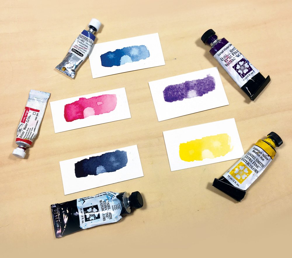
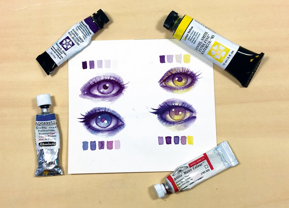
Different colours have different properties
Let's go through the colours and their properties, starting with the Prussian Blue on the top left (above) and working clockwise.
Prussian Blue by Schmincke is a semi-opaque, staining cool blue watercolour. Its flow need a little work to get moving and mixing, but its vibrancy makes up for it. It does well with water blossoms and salt, but layering is limited because it’s not transparent.
Cobalt Violet Deep by Daniel Smith is a transparent, low-staining watercolour. While the colour is gorgeous and its high granulation offers possibilities for achieving texture, the flow is limited, making it difficult to spread. However, because it’s a transparent colour, it’s easy to lift off the paper when needed.
Cadmium Yellow Medium by Daniel Smith is a semi-transparent and low-staining, vibrant, warm yellow watercolour. Its flow is decent and it mixes really well with vibrant, transparent colours. Because this isn’t a transparent yellow, its layering properties are a little hindered, but because it’s so rich, you won’t need to layer it too heavily.
Daniel Smith’s Indigo is one of my favourite colours to mix and add depth to my work without muddying it up. It’s a transparent colour and offers a very high range in value. However, it’s a low-staining colour, so any stray marks with this one and you’ll have to get creative in removing it!
Permanent Rose by Winsor & Newton is a transparent, staining but brilliant colour and one of my favourites to work with. It’s easy to control and its flow is fairly high, which makes it easy to mix. It also reacts with water seamlessly and because it’s transparent, it’s an excellent colour to glaze with.
02. Understand colour
Before choosing your palette, it’s important to develop a basic understanding of colour theory and how colours relate to one another. This will aid you in choosing appropriate colour palettes for your paintings, to evoke a mood or emphasise a concept. This is also essential in choosing the tubes you mix new colours with. Colour temperature, hue and purity are all characteristics to consider when developing your painting.
A colour’s hue is simply the name of the colour in its most basic form and describe its location on the colour wheel: red, orange, yellow, green, blue and violet
The purity, or intensity, of a colour is its saturation. On a colour wheel this is the colour at its purest form. To dull a colour, simply add its complementary colour, or its opposite on the colour wheel. The more vibrant a colour, the more attention it draws – especially when it’s a transparent or semi-transparent colour. Dulling hues will reduce tension and lessen the mood.
Meanwhile, the temperature of a colour is the suggestion of warmth or coolness. Warm hues are inviting, active and come forward in a composition. Cool hues are relaxing, refreshing and tend to fall back. On a colour wheel, reds, oranges and yellows are considered warm hues, while greens, blues and violets are cool hues. However, any colour can be warm or cool in relation to another, such as red violet (cool) versus red orange (warm).
03. Build your palette
A traditional palette comprises a warm and cool version of the primary colours, together with any additional colours that supplement mixing. In general, try not to overload your palette with too many semi-transparent or opaque colours, since these won’t lend themselves well to mixing and layering. For more intense colours, transparent and staining colours will make up most of your palette. For a dull palette, earthier staples such as burnt sienna, indigo and sepia will be prevalent, but expect to dilute to avoid muddiness.
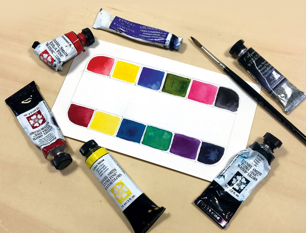
Warm and cool palettes work together
The warm side of the palette can be found at the top. This includes Permanent red, Cadmium yellow, Ultramarine blue, Sap green, Permanent rose and Neutral tint. On the bottom side you can see the cool colours, such as Pyrrol crimson, Lemon yellow, Prussian blue, Viridian green, Quinacridone purple and Indigo.
In the top right corner you can see the Neutral tint. Neutral tint is essentially the perfect mixture of all primaries that complete the full colour spectrum, which when mixed together work to cancel out the light value in each other. To use Neutral tint, try adding it slowly to an intense colour and watch it become a duller shade, without having to add its complement.
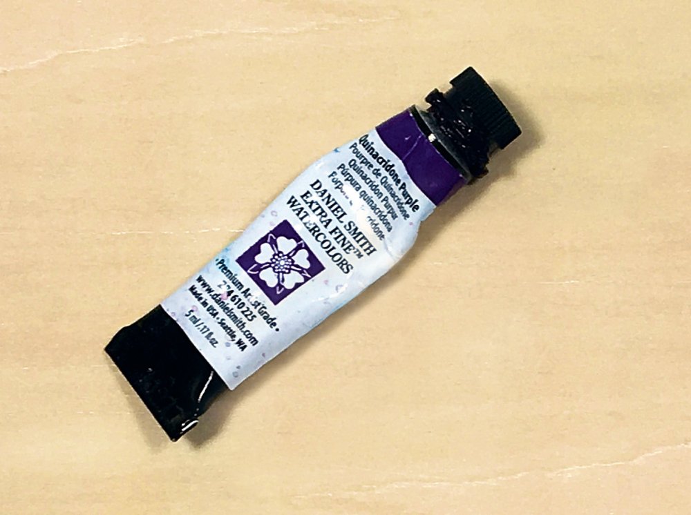
Quinacridone purple is excellent for glazing
I keep Quinacridone purple close by at all times, because it’s become an excellent colour to mix with. I’ve found violets in the past difficult to mix without losing intensity. It’s excellent for glazing because it’s transparent.
04. Colour schemes
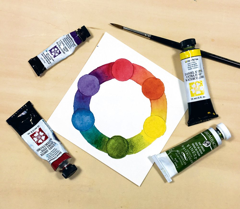
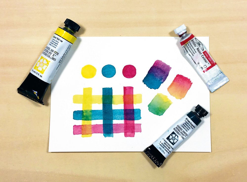
One reason it’s important to understand how the colour wheel works is in using it as a map to help you choose a colour palette. Using a colour scheme is an excellent place to begin that process, with many offering tried-and-true combinations of colours that help determine the mood and assist in expressing the idea. Here are a few of my favourites, working clockwise from the yellow on the top right corner of the image below.
Colour palettes set the mood of a painting
This complementary colour scheme involves two colours that are opposite of one another on the colour wheel. In my example, I’ve added lemon yellow with my Quinacridone violet. These opposites enhance each other and also pack solutions for contrast by mixing the two to create duller colours.
Split complementary colour schemes like the one on the bottom right are ideal for creating an intriguing mood. This is achieved by choosing one colour and then the two colours surrounding its complement, such as yellow, red violet and blue violet.
Analogous is a colour scheme that makes use of three to four colours that are next to each other in the colour wheel. In my example, I’m using Quinacridone purple with Prussian Blue and Permanent Rose to develop Violet, Red violet and Blue violet. Invariably, this results in using the warm and cool versions of a colour and lends itself to bright, harmonious palettes because the mixtures don’t dull or offer contrast. Instead, you have to rely on value range to determine contrast.
Monochromatic is an easy solution for guaranteeing colour harmony in a piece, because it depends entirely on a range of values to offer contrast. When choosing a watercolour to do this with, look for a deep colour that offers a wide range, such as Quinacridone purple.
05. Unify your palette
Now that your palette is set up and you understand how various watercolours interact with one another, let’s choose a limited palette. Often what results in a muddy painting lacking colour harmony is when the artist chooses too many colours to work with. The easiest path to a harmonious use of colours is by limiting it to between two and four colours. A wide range of colours can be created with very little, but pack a huge punch in a final painting.
For the example below, I’m using Lemon yellow, Permanent rose and Pthalo turquoise – a triad of sorts. Together, these create six distinct colours, including a spring green, peach and a moody violet. The potential with this combination is huge!
When I’m choosing a colour palette, I do tests similar to those in the top right, where I practice combining the colours in my palette to see how they react with one another, layer, and blend together.
Keep the number of colours down for a clean palette
If you begin running into problems with colours you’ve chosen, try to figure out what’s causing it. That's what I've done with this lattice of colours. Is one of your colours opaque and mixing it makes the colours muddy? Could one of your colours have high granulation and that’s causing your blending to be funky? Do you have too many unsaturated colours? Try introducing a vibrant, transparent colour.
For better chances at a balanced colour palette, ensure that at least one of your chosen colours has a wide range of value. This is why I often use indigo (on the bottom right) in my colour schemes, because it produces one of the richest deep values I can make without muddying everything up. For mixing purposes, try to keep your darkest valued watercolour either transparent or semi-transparent.
This article was originally published in issue 164 of ImagineFX, the world's best-selling magazine for digital artists. Buy issue 164 here or subscribe to ImagineFX here.
Related articles:
-
Reckon you're a hot-shot designer? Think you've get that keen eye for design that can align images without the need for a grid? Put your sight and design thinking to the test with this quiz from digital service agency Supremo and find out how well you really see.
This fun and frustrating quiz, called 'It's Centred That', sets the deceptively simple task of asking whether a dot is plotted in the middle of a series of 10 shapes. Sounds straightforward, right? Well, thanks to strategically placed shapes and off-putting colour combinations, you'll find that your eyes will be thrown off. Factor in that the dots can be off-centre by a couple of pixels and you'll realise that this friendly looking quiz isn't as forgiving as it first appears.
What's more, get a question wrong and you have to start again from the beginning. And because the quiz generates the questions at random, you won't be able to memorise the right answers and bluff your way to the end.
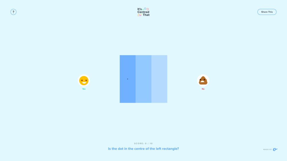
Be warned: this quiz is not as easy as it looks
Players will go through the motions of being amused, frustrated, and doggedly determined in a matter of minutes when playing this game. Answering incorrectly sees a distressed turd emoji fill your screen, which is a sight you're going to see an awful lot on your way to the tenth question.
Note that the triangle ones are the trickiest. Good luck.
Related articles:
-
Editing photos can really up their quality, but it's a time-consuming process that can be hard to master. So why not let software do the work for you? Photolemur 3 is a nifty tool that uses image recognition and artificial intelligence to make photo editing a total breeze.
This automated editing solution enhances your pictures for you, even if you don't have the time to do it yourself. Edit photos with a simple drag and drop, and effortlessly share them directly to your favourite social media platforms.
Get Photolemur 3 for just $19 – that's 45% off the regular price.
Related articles:
-
You're reading Free Responsive HTML Email Newsletter, originally posted on Designmodo. If you've enjoyed this post, be sure to follow on Twitter, Facebook, Google+!

Our free responsive email newsletter is a perfect start for whatever campaign you have in mind. Whether you want to provide new information, promote special offers or reconnect with subscribers, it will do the trick. And most importantly, it will …
-
You're reading Ending soon: 10 great Cyber Monday deals for designers, originally posted on Designmodo. If you've enjoyed this post, be sure to follow on Twitter, Facebook, Google+!

It’s that time of the year again. The time of amazing discounts that will help you get exactly what you need for a lower price. Everybody has heard of the Black Friday, but do you know what Cyber Monday is? …
-
You're reading Codester Has Everything You Need to Start Design Projects Fast, originally posted on Designmodo. If you've enjoyed this post, be sure to follow on Twitter, Facebook, Google+!

No matter what your level of design is – from beginner to master coder – there are times when you need ready-to-use web development assets. Codester is a one-stop-shop for everything from PHP scripts to app templates to themes to …
-
The patch addresses a flaw in Cisco's WebEx platform that lets hackers gain elevated privileges.
-
Got plans tonight? You do now. And they're plans that will well and truly fire up your creativity - right from the comfort of your own sofa.
Tonight at 7PM GMT (8PM CET), you can join some of the UK's most creative minds at the Adobe Creative Meetup London via Adobe's live stream (above). In what's set to be an awe-inspiring night of creativity, Adobe will be celebrating all the latest innovation to its Creative Cloud apps, regaling insights from its recent Adobe MAX conference and welcoming some of the UK's top creative talent to share their expertise.
Stellar line-up
Taking the stage at the beautiful One Marylebone venue in London is Adobe's very own Principal Manager of Creative Cloud Evangelism Rufus Deuchler, who, with a career spanning over 20 years in the industry, is best placed to demonstrate how Adobe's next generation of Creative Cloud tools can take your next project to new creative heights.
Joining Deuchler is one of the fastest-growing lifestyle YouTubers in the UK, with a following of over three million, Patricia Bright. And Bright's accomplishments don't end there. This multi-award winning woman is a self-made entrepreneur, having launched a hugely popular beauty product with MAC Cosmetics, and is gearing up to launch her own book ‘Heart & Hustle’, which shares her secrets to success, early next year. When Bright isn't taking over the world with her creative talents, she also somehow finds the time to be a mum and a wife too. Add all that up and that's one talk anyone - especially working parents - will want to hear.
Last, but by absolutely no means least on the speaker list, is graphic design duo Miraphora Mina and Eduardo Lima aka MinaLima. These guys first started collaborating back in 2002, when they were tasked with imagining and creating the graphic universe of the Harry Potter film series. Yes, you read that right.
Since then, the creative couple has continued their involvement with the Harry Potter franchise through numerous commissions, including designing all the graphic elements for The Wizarding World of Harry Potter - Diagon Alley at Universal Orlando Resort. They now find themselves designing the graphic props for the Fantastic Beasts film series. Tonight MinaLima will be presenting their specialist knowledge in graphic design and illustration, which we have no doubt will include insider insights and advice money simply can't buy.
Need we say more? Join in the creative conversation tonight at 7PM BST (8PM CET) via the Adobe live stream.

Pantone's updated Colour Finder is a designer's dream
in Ειδήσεις από τον χώρο του Design και Hosting
Posted · Report reply
Even designers with the keenest eye for detail and an inside-out understanding of colour theory will have struggled to identify the right hue at some point of their careers. To make the process of finding swatches and their equivalent colour values easier, Pantone has updated its Color Finder tool.
With controls that enable users to pick, search and convert colours, the new and free Color Finder is a comprehensive and intuitive way to sift through Pantone's chips. Wave goodbye to using a gradient bar to hazard a guess as to the right colour, simply start clicking samples and narrowing down the search fields.
These parameters include Pantone Matching Systems for graphics, interiors, skin tones and much more. Colours can also be narrowed down by hue groups and smooth orders. Thanks to the search bar and convert fields, users can find colours by their name, sRGB, HEX, and CMYK codes as well.
Once you've settled on a colour, you can click on the swatch to find its exact RGB, HEX and CMYK values. Pantone will also helpfully recommend which samples you should purchase from its collection.
Check out the tool in action with this handy video posted on Pantone's Instagram:
With an in-depth array of search options now bundled into one place, Pantone's Color Finder promises to be a real time-saver, and judging by its enthusiastic reception on social media (check out those Instagram comments), it looks like this is the tool a lot of designers have been waiting for.
Related articles:
View the full article