

Rss Bot
-
Content Count
15,131 -
Joined
-
Last visited
Never -
Feedback
N/A
Posts posted by Rss Bot
-
-
Adobe has slashed the price of its full Creative Suite of apps by almost half in an unbelievable Adobe Black Friday deal. The software company is offering a 40% discount on its All Apps package. That means you can now pick up Adobe’s entire collection of 20-plus creative desktop and mobile apps, and more, for just £30.34/€36.29/$22.99/month, instead of £49.94/€60.49/$52.99/month – a rare deal indeed.
Unfortunately, the offer isn’t open to everyone worldwide. But if you’re based in Europe, the Middle East, Africa, Brazil or Japan, you can claim the 40% discount.
Save up to 40% on Creative Cloud now
Students and teachers get lucky too, with an additional 20-25% discount – that's on top of the 60% discount already offered.
The offers are all valid until 24 November, so if you’re interested, you'll need to sign up by then…
What’s included in the Creative Cloud All Apps plan?
Adobe's Creative Cloud All Apps plan includes:
- The entire collection of 20+ creative desktop and mobile apps, including Photoshop CC, Illustrator CC, and Adobe XD CC
- 100GB of cloud storage
- Adobe Portfolio
- Adobe Fonts
- Adobe Spark with premium features
- The option of up to 10TB of cloud storage
The programs are fully integrated, so you can work between them (and different devices) seamlessly – whether you’re out and about or in the studio. Built-in templates help you jump-start your designs, while step-by-step tutorials will help you sharpen your skills and get up to speed quickly.
This deal expires on 24 November 2018.
Related articles:
-
The privilege-escalation vulnerability would allow an attacker to inject malware, place ads and load custom code on an impacted website.
-
The flaw in a high-end phones and up-and-coming handsets made by top OEMs allows hackers to bypass handset lock screens in seconds.
-
Agencies and website owners can be slow to adapt to changes in technology, often because the latest fad can fall out of favour as fast as it emerges. We have a tendency to rely on more tried-and-tested solutions, which aren’t always the fastest and therefore don’t always deliver the best user experience. So if you've ended up in a rut with your web design processes, here are some top web design tools and techniques that could help you speed up your sites and apps, and improve UX.
01. Use a JavaScript framework
Using a JavaScript framework is one way to improve the speed of your web apps. This approach has risen in popularity over the last few years in particular and wider industry support exists for most packages. Using a JavaScript framework will often enable you to build the site as a single-page application (SPA), which loads only the minimum content required to your browser.
A word of caution: this will improve speed but (unless you're willing to add a lot of customisation and server work) isn't that SEO-friendly. So keep it to web apps rather than websites.
02. Try progressive web apps
Progressive web apps (PWAs) adapt websites or web apps to make them functional offline when added to mobile home screens. They typically use web browser features to store data offline – perfect for patchy internet connections. If you want users to return to your application often, consider a PWA. You can prompt mobile users to add these sites to their home screens for quick access and immediate loading.
03. Explore AMP
A Google-led working group released AMP in February 2016 to load pages submitted in the correct format instantly from Google’s global network. The technology, like Facebook’s Instant Articles, requires businesses to maintain additional codebases and gives access to fewer design features but offers better search engine visibility and usability. It’s particularly good for media producers with topical content.
04. Consider a CDN
Content delivery networks (CDNs) aren’t new, but plenty of websites still don’t use them. CDNs let you move the job of delivering a website and its assets from the server itself to a global distribution network, which is faster. CDNs enable sites to run much quicker, as the user isn’t waiting for the end server to do all the work. They’re especially helpful for sites built for design over functionality.
05. Add a caching plugin
Caching plugins are offered with many CMSs, but are often ignored. WordPress, for example, offers many. Within the software, your server will store snapshots of pages rather than compiling a new page for every request. This means end users get the same speed impact as if you were serving them a static website. Businesses can couple caching with CDNs to improve site speed significantly.
This article was originally published in net, the world's best-selling magazine for web designers and developers. Buy issue 311 or subscribe.
Read more:
-
When it comes to creative play, you can't get better than LEGO. What started out as a humble little wooden brick in the 1930s, has since grown in to one of the world's most popular and sought-after toys, for kids and adults alike.
And now, with Black Friday just around the corner, there's no better time to get your hands on some of LEGO's most impressive sets. Today Amazon has knocked up to a whopping 40 per cent off various LEGO sets, but you'll need to hurry. These deals are only on today and we don't expect stocks to last long.
Below you'll find some sets now on offer, but there's plenty more where they came from over on Amazon. Prime members can access these deals as soon as they're available, however non-members will have to wait 30 minutes before they too can benefit from any discounts. Don't want t miss out? Sign up for a free 30-day Amazon Prime trial and get every deal as soon as it's available.
Read more:
-
Amazon is fully gearing up for next weekend, with some seriously impressive Black Friday deals set to drop. But for those of you in the US, the wait is over, with the retailer kicking things off earlier than planned, releasing some huge savings ahead of the big shopping event.
So if you've been thinking about investing in an Amazon Fire Tablet, you're in luck. Starting from tomorrow, and in the days leading up to Black Friday, Amazon US is slashing prices on its very own tablet range, information on which you can find below.
Been wanting to get kit your office out with a virtual assistant, or after some new TV channels? Then you're in luck too, with Amazon also offering impressive discounts on its hands-free, voice-controlled Echo devices, and best-selling Fire TV stick, details of which you can also find right here...
Amazon Fire tablet deals
Amazon Echo deals
Amazon Fire TV deals
-
"Our advice is to stop using this watch" as mitigations are not available, researchers told Threatpost.
-
Finding the best email provider isn't a top concern for many designers. It's not something you tend to think about much; most people just use the personal email address you get from your ISPs, with maybe a Gmail account on the side and probably a work account too, and that generally works just fine.
If you're running a creative business, though, at some point you'll need to think a lot harder about email accounts, especially if you need to send large files or set up new addresses for employees. If you've set up web hosting for your company then it almost certainly comes with enough email addresses for your needs, but is the entire package going be enough for your needs? In this article we'll explore some different options, to help you find the best email service for you.
A badly set-up email service can be worse than none at all, especially if it has inadequate spam filters, won't let you organise your inbox, or if you can't access it using your preferred email client. And if you're running a business and you can't get your email service to work with your company's domain then it's not going to give a great impression when you're contacting clients.
With all this and more in mind, here's our rundown of the best email providers around. Choose wisely.
The best email providers of 2018
There are plenty of reasons why you might want to use Gmail for your business. The most compelling of which is that you're probably using it already, so why waste time getting to know a completely new email setup?
There's plenty to recommend Gmail as your business email service; its clean, clutter-free interface makes it easy to organise your messages, with emails arranged into conversations and automatic filtering of messages into tabbed categories that mean you can focus on the stuff that matters. Its heavyweight spam filtering does an admirable job of keeping your inbox junk-free (although sometimes it's a little over-zealous – you'll need to take a regular look in there to make sure it hasn't squirreled any important messages away). And if you have accounts on other services, in most cases you'll be able to manage them from within the Gmail interface.
With 15GB of storage shared across all your Google products you're unlikely to run out of space quickly, but if you need more power then there are some great options to be had from Google's paid G Suite product; with the Basic plan for $5/£3.60 per month you get 30GB, plus unlimited group email addresses, 99.9% guaranteed uptime and 24/7 support. It costs a little more than other companies' email-only deals, but it's worth it for the additional features. You also get custom email addresses and migration tools to help you import old messages from other services. Best of all, you won't see any more adverts.
Gmail's appeal is partly down to the fact that it's grown from an email package into an entire productivity suite that links up seamlessly. Microsoft has had the office stuff nailed for years, so hooking its email offering into that is a no-brainer. If you're already using Office 365 then you can easily switch your email over to Outlook at no extra cost.
The paid version of Outlook with Office 365 is an attractive prospect; with it you'll get an ad-free inbox, plus 50GB of mail storage that you don't have to share with other Office apps as there's also 1TB of OneDrive storage thrown in as well, so you're unlikely to find yourself low on space. You'll also get file recovery from malware attacks, offline working, professional formatting tools and phone- or chat-based support. Prices start at $7/£5 per month for the personal plan.
Even if you don't take up the paid version there's plenty to recommend Outlook. Like Gmail it gives you 15GB of storage as well as the ability to attach files from cloud services such as OneDrive, Dropbox, Google Drive and Box, making it simple to send files to clients. The web interface will be pleasingly familiar to anyone who uses the desktop version of Outlook, with a focused inbox that'll show you only the most important messages, and the option to automatically add scheduled events to your calendar.
The only real downside is that you don't get quite as much control over settings as you do with something like Gmail. But if you're happy with Outlook's default options then you should get on just fine with it.
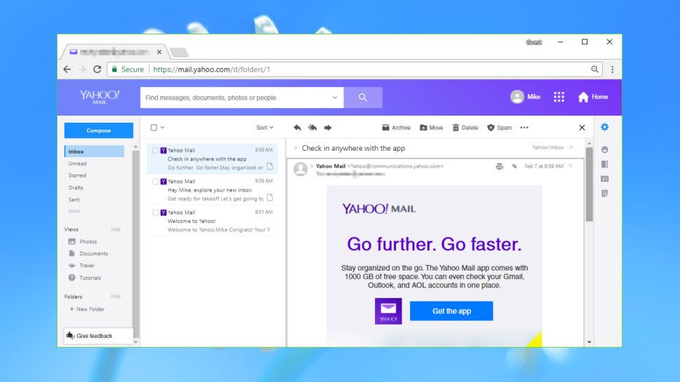
It's been a very long time since Yahoo was one of the biggest names on the internet, and the intervening years haven't been kind to it. So it might be a bit of a surprise to discover that its Yahoo Mail service is a strong, professional offering that's well worth checking out.
Perhaps its most appealing feature from a creative point of view is the amount of storage it gives you: with 1TB you're going to be hard pushed to fill it up, even if you're slinging huge files around regularly. On top of that you get a well-designed interface complete with custom folders and one-click filters to help you organise common messages and content, as well as Facebook integration and the ability to send text messages as well as emails. If you'd rather use your own email client then it's pretty straightforward to set that up too.
Step up to Yahoo Mail's business plan and you'll get more options, including the all-important ability to use a custom domain that'll be auto-renewed for as long as your subscription is active. You'll also get the ability to import contacts from Facebook, Gmail, Outlook and more, plus an assortment of productivity tools and as many mailboxes as you choose to pay for.
Prices start at $3.19 (£2.30) per mailbox per month, with the price coming down as you add more mailboxes – perfect for an expanding company.

Let's be clear about this: if you're a creative then you're likely to run up against the restrictive side of ProtonMail pretty quickly. It only gives you 500MB of online storage, something you could easily burn through in a few days, and it only allows you to send 150 messages per day. On top of that, its online client is severely lacking in options that you'll get from most other email providers, such as folders, labels and smart filters, and you can't set it up to work with your existing email client.
So why would you bother? Basically, ProtonMail's aimed at anyone who takes their privacy seriously, and if you're working on confidential projects then you might find it useful as an additional email service working alongside your primary address. You can sign up anonymously, it provides end-to-end encryption on all the emails you send, and it won't log your IP address. Thanks to address verification you can be certain that the people you're talking to are who they say they are, and it also supports PGP encryption.
If you need more from it then there's a Plus plan for $5/month that gives you 5GB storage, 1,000 messages per day, custom domains and folders, labels and filters, and there's also a Business plan with even more options. If security matters to you then it's worth investigating, but it's almost certainly overkill for most creatives.
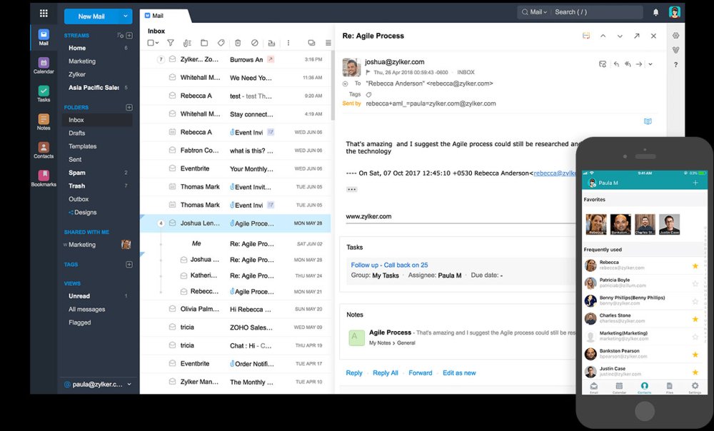
Running a creative business with irregular payments can often mean that funds are short, so any service that won't cost you much – or indeed anything at all – can be well worth investigating, and Zoho Workplace is just that. It's a business-oriented email service that also gives you collaborative tools, document management, an online office suite and other extras for free.
You'll get support for up to 25 users with 5GB of storage each, as well as the use of one custom domain, and a web-only email client with a strong set of features such as folders, tags, filters, smart searches, and more.
As a free offering, it's brilliant, but if you choose to pay some actual money then it gets even better. From $3 per user per month (paid annually) you'll get the ability to use your own mail client, as well as 30GB storage and a 30MB attachment limit, plus plenty of other features such as multiple domain hosting and domain aliases. And if you need more than that there's a Professional plan that give you 100GB storage per user and 40MB attachments, plus video conferencing and more besides.
Related articles:
-
Emojis are the perfect way to grease the wheels of a conversation. The comical faces, gestures and objects help to take the edge off a written message, or communicate feelings that just can't be put into words. And while emojis have come along way since starting out as pixel art, sometimes they don't sum up exactly how we feel. Enter Emoji Builder.
Created by Stripe designer Philipp Antoni, Emoji Builder is a fun tool for graphic designers – or anyone in fact – that enables you to customise your own emoji based on Apple assets. While it might not be the first emoji design platform, Emoji Builder stands apart from the rest thanks to the level of customisation it offers. Check it out in action with the video Antoni tweeted below.
To start building your own emoji, simply click on the element you want to use and play around with the customisation fields until it's looking just right. These fields let you change the placement, height and scale of an element, meaning that you craft your ideal emoji. Once it's perfect, you can save it for future use. Send it to clients, use it on social media, whatever you like (though you might be wise to exercise caution, depending on what you come up with!).
Alternatively, emoji can be generated randomly, resulting in some truly bizarre expressions. We're not sure when you'd need to use a surprised lying face with a wavy mouth, but it's there if you need it.
The batch of assets users can play with are limited to facial expressions, although the drunken wavy mouth that disturbed social media when it made its debut earlier this month is in there, so the selection is pretty up to date. If the Emoji Builder takes off, maybe we can expect to see more icons added to its asset bank in the future? *Makes begging face*
Related articles:
-
You're reading Best Free Sketch Plugins for UX/UI Designers in 2018, originally posted on Designmodo. If you've enjoyed this post, be sure to follow on Twitter, Facebook, Google+!
When it comes to professional design tools, the first thing that comes to mind is products by Adobe such as Photoshop or Illustrator. However, the situation is changing. Newer solutions such as Sketch App are growing in popularity. There are …
-
Time and time again I get asked what’s my process as a concept artist. Truth be told, I don’t have just one process. Instead, I use a tool box that’s full of art techniques. It helps to save time and create a smooth flow of ideas.
Generally, no two assignments are the same. They’re not cookie-cutter tasks. They require different moods, design, creativity, touch and feeling. After a while you figure that out and you pick the best tools for the job.
So, for this article, I'm sharing several tools from my creative box. I’ll show you how I use them individually and in tandem with others. Sometimes one technique works well for something, while other times you’ll need the whole arsenal of tools and tricks to make the image sing and hit the deadlines.
Okay, let’s begin!
01. Paint fast sketches for fun
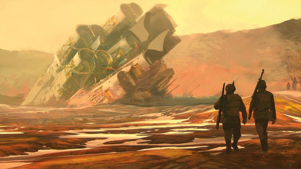
This stunning picture took only 30 minutes to make
I spend about an hour on each one of these guys. Fun, simple sketches like these can be cranked out and help to fill out a portfolio. Try and take some time out of a day or evening, and do a quick colour sketch now and then. You may not always be happy with the final piece, but there’s a good chance that you’ll have learned something new during the image creation process – and you may even produce a decent portfolio piece out of it to boot.
02. Promote yourself online
Stand out from the crowd with social media
As well as having experimental, high-energy pieces interspersed throughout your portfolio, you can use them as a handy calling card for a spot of self-promotion.
After you’ve produced a piece that you’re happy with, add it to your online portfolio. Then roll up your sleeves and get busy on social media. Hit all the outlets: Twitter, Instagram, Facebook and more. Remind people that you’re still making art. Artists can’t always show off their client work because of NDAs. Personal pieces go a long way towards maintaining your online presence.
03. Flesh out a variety of styles and content
Experimental pieces can help you find new work
Here’s another reason to produce some quick sketches. Perhaps you’ve heard from a friend that a project’s coming up and you’d like to show you’re capable of working in that genre or style. Do a sketch to show that you’d be a good fit. It doesn’t need to be on the nose as far as content is concerned – just something that looks like it would fit in that particular world. There’s a chance the art director will see it and think that you’re a good match. If not, no matter – you still have another quality promotional piece to use as you see fit.
04. Learn to become a good storyteller
A story can emerge when you play around with composition
One good thing that these quick sketches force you to do is think about storytelling. For this piece, I didn’t know what I was going to paint before I started. And I’m sure I spent the first 10 minutes going back and forth on what the subject matter was going to be. But eventually I started to illustrate a corridor and some shapes in the background.
Because I was working so fast and loose I began to think about smaller facets of the story. For example, how I do I express these ideas in a very simple visual language? Here, the two characters outside are clearly together, while the character in the foreground is alone. The foreground character represents the viewer and the background figures are the mystery and the action.
As the viewer, you’re forced to walk into that microcosm of mystery. It’s the drama and mystery that really sells this piece. All of this was conceived while I was working. It’s pretty fun and adds a whole other layer to a piece that would otherwise have been pretty generic.
05. Use little design illusions
Large shapes are quickly blocked in to establish a scene...
Previously, I’ve described how I approach my sketch work. Here, I’ve broken down my sketching process into two steps. I kick things off with a basic block-in. I might have a prepared textural background that I pre-paint or I’ll just paint it during this step. Then I add the larger shapes and start to work out the composition and the story in the scene. The textures that I paint give the illusion of more detail present in the image then there really is. Some stuff like the figures are just scribbled blobs at this point.
Now that I have my story planned out, I begin to fully realise it…. or realise it just enough so that it’s clear to the viewer. I add some lighting breaking through the tree foliage. Well, foliage that you really don’t see. You only have the light hitting the ship and the small little clump of tree foliage in the foreground to inform the viewer of the space that’s outside the picture frame.
...before being built up with lighting illusions
Little design tricks such as this add scope to something that, on the surface, is pretty simple. The viewer’s mind then works to fill in those gaps with the little hints and bread crumbs that I leave for them. I let the viewer’s own imagination do some of the heavy lifting. As a result, they also feels more committed to the image and the story that it’s trying to tell.
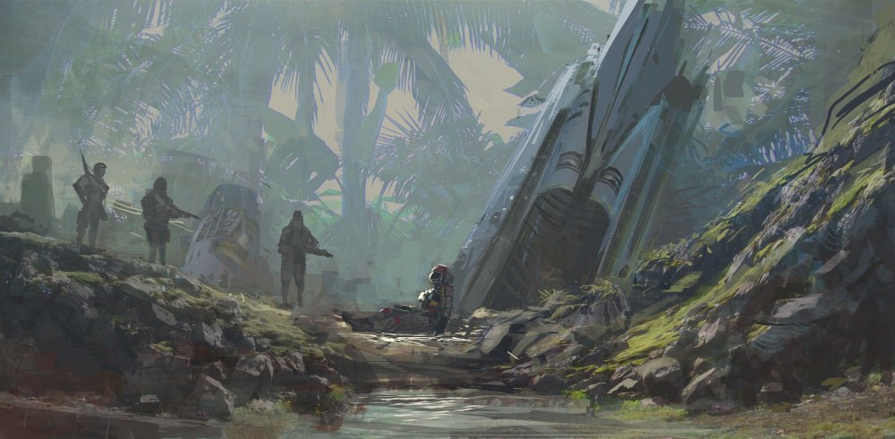
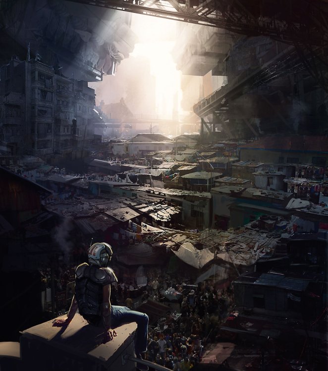
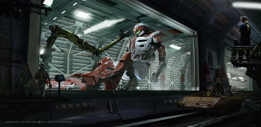
06. Start with a strong silhouette
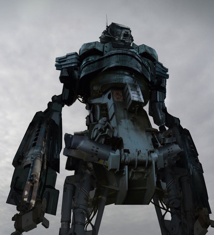
This towering mech is not what it appears
This image of a mech seen at an imposing angle may look like it was modelled and rendered in a 3D program, but it was actually photobashed together. I began by getting hold of a large collection of photographs of mechanical objects – some that I had taken myself. Then I fired up Photoshop CC and sketched out the silhouette of the mech.
Only when I was happy with the general shape and design direction did I reach for the stack of photos. After that, I transformed and colour-matched elements from my photos to fit what I wanted. This image took between three and four hours to create.
07. Use photobashing to create illustrative art
Believe it or not, this is not a fully painted piece
Although it may not look it, there’s a ton of photobash work here – about 80 per cent, I’d say. But it’s heavily painted on. I start by laying in images almost immediately… almost designing with them. While I’m laying in images and bashing them together, I’m also selecting light and dark areas, and painting into them. I’m after the detail and texture: I leave out what I don’t need and push the shapes that support the composition.
For some parts I want lots of detail; elsewhere, I’ll blow out the light values. This image contains dozens of elements from photos. You can see them on close inspection, but at first glance most people think it’s a fully painted piece. I often use photobashing to a lesser degree in my art, towards the end of the painting process. It’s an effective way of introducing a layer of texture to a scene.
This method works for me because I know the basics of painting. Photobashing enables me to expand on my core art skills – it’s not a shortcut to becoming a good artist. It takes a lot of practice to use photos this way.
08. Depict hard surfaces in 3D
3D tools are perfect for a clean look
For spaceships, vehicles, mech designs or in fact anything mechanical, I tend to use 3D tools. They enable me to design from multiple angles, and ensure that the finished work has a clean look. The art will be more precise, with sharper edges compared to the painterly results from using standard 2D tools. In addition, I can design the object from multiple angles, knowing that nothing will end up being fudged. It’s going to be accurate. I like to see that in mechanical designs.
09. Use a repetitive architecture workflow
Plotting in 3D is a great way to save time
Similar-looking buildings or architecture from dramatic angles is another reason for using 3D tools. Even if I’m going to end up painting on the art, it’ll save me time if I model instead of drafting and plotting everything in 2D. Examples include rows of columns in interiors or building blocks in a street scene. 3D tools will boost your workflow in these assignments.
10. Create reusable assets
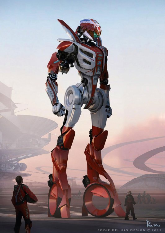
Get an asset right once and you'll save yourself work in the future
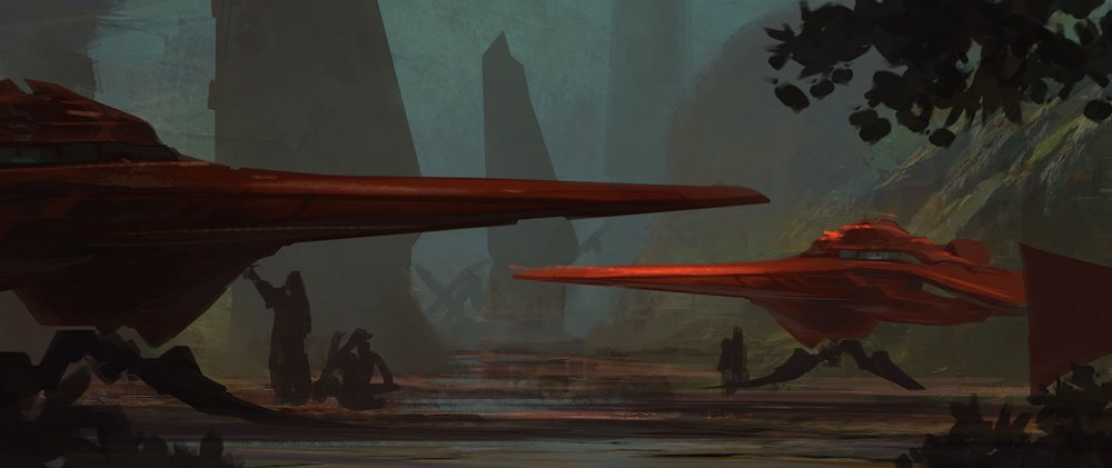
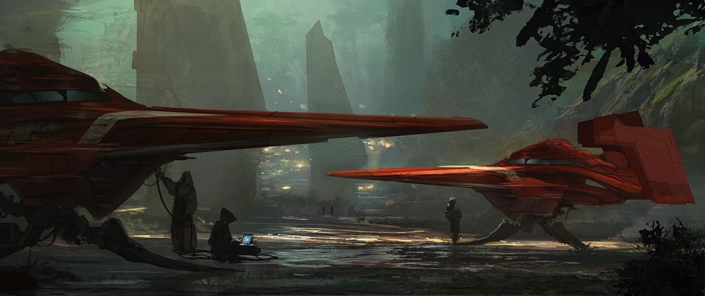
Another reason for using 3D is if an asset is going to be used in a range of images. I spent a week or so designing this racing mech in 3D. I began with some rough 2D sketches, modelled the design, asked for feedback from friends and did multiple revisions. I was happy to spend this time up front because I knew I was going to use this asset across multiple images, and that having a fully formed design at the start would save me time later on. For example, take the reflections on the mech and the decals on the design. Achieving that look with just 2D would be a challenge.
11. Use 3D assets to create key frames
With pre-designed assets, this image was made very quickly
Thanks to the pre-designed mech asset, it took me just under a day to put this scene together. This is one of six key frames that I developed featuring the mech. In the end, it speeds up the creative process – important when it’s your IP and you have to do everything in your own time!
12. Model complex scenes in 3D
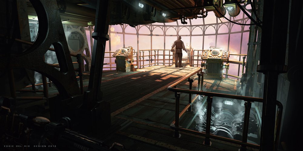
3D tools are ideal for mechanical scenes
This design was going to be pretty complicated with all the pipes and gears in a 3D space. To help save me time I modelled the scene in 3D and even lit and rendered it. All those pipes and railing would have been a pain to replicate in 2D, as well as taking time. But using 3D tools helped me to complete the scene quickly. The room is largely symmetrical so I could just mirror the geometry, and the rest is a lot of duplicated pipes.
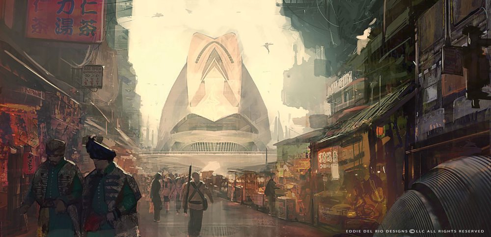
13. Experiment with framing and focal points
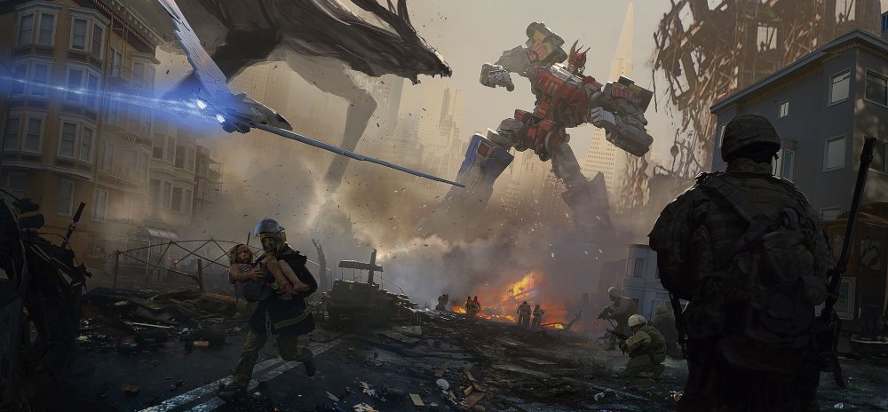
This image is carefully composed to make the viewer's eye travel
Here, I wanted to do some fan art from a sci-fi children’s show. I knew I didn’t want to spend more than a day on it. The piece I had in mind was pretty epic, so I had to think how I could effectively develop the frame.
First, I did a quick sketch that conveyed the energy, the basic story premise, all the big elements and the overall composition. Then I got some photos and began taking out bits and pieces, comping them in while painting and editing the piece. After that I looked at the big mech and Kaiju battling in the background, which was still pretty sketchy. Because it was the focal point I felt I could get a lot of bang for my buck if I modelled the mech. I didn’t spend too much time modelling: it was all blocks and cylinders.
Then I photographed the actual toy of the mech and overlayed that photo on to the front of my model. It wasn’t perfect, but it worked fine for me. I posed it quickly and then rendered it. I must have spent no more than and hour or so on the mech. I decided that the kaiju could be painted up a little more than the sketch I did at the beginning.
I was about to call it quits, but then felt the chaos of the foreground elements was fighting with the flow of the image and distracting from the focal point. So I decided to add the bird fighter flying into the image, which I quickly modelled in my 3D package. I added it to the frame and painted the blue energy thrust. The fighter helped with the flow, directed the viewer into the focal point and framed the action – all at the same time!
14. Leave room for interaction
First things first: establish a focal point
I lay down a fast and quick background, mostly to establish the palette and the general directions I want to go. This step prompts me to ask questions, such as what do I want to accomplish with this piece, and identifying the story I want to tell. Now I begin to answer the question of story. I choose my focal point and begin to build the scene.
Adding details is where the fun begins
I start to think about how people will interact in this world and begin to add smaller details to help define objects in the scene. This is definitely the fun part! You can bring in all kinds of little story moments to help enrich the composition.
Refine the details for a satisfying picture
Now I just finish up the piece and begin to add more details and make sure that the image has a clean read. The viewer’s experience is key!
15. Go light on photos
Photos are ideal for adding the illusion of texture
This piece was done primarily in 3D in the early stages. I then painted some values and some other large-scale details. But for the finer details and texture, I used photos. You can’t really see them, but they’re there. This was done more to add texture, creating the illusion that there’s more detail than there is.
This article was originally published in issue 164 of ImagineFX, the world's best-selling magazine for digital artists. Buy issue 164 here or subscribe to ImagineFX here.
Related articles:
-
The jobs are moving. The people aren't. As migration restrictions hit more socially polarised nations, it's getting harder for talented artists to chase the work around the world. Furthermore, they want to work from home – not uproot families and navigate challenging circumstances to live in the most expensive cities of the world, where you'll often find a concentration of the most desirable jobs.
This issue isn't specific to the post-production industry, of course, but it's where I have the most first-hand experience, having gained it from founding VFX Legion and turning it into a global institution with a remote workforce located from one end of the globe to the other.
Having a global workforce has enabled us to give artists the work-life balance they desire, but it has also pinpointed challenges around efficient global creativity. Here's how we've solved them.
01. Listen
One of the biggest challenges inherent in global creativity is the need to drive a business and operate under singular goals from a central location, all while working with artists spread far and wide. If you do not take into consideration the needs of the artist or workforce, you will inevitably experience problems at some point down the line and things will quickly fall apart. Give your artists a voice and listen to constructive feedback about what could make things smoother.
At VFX Legion we had a global workforce right out of the gate – right from year zero. When we received feedback about how we could communicate more effectively and launch workflows more smoothly, we adapted, and it made the whole process so much more efficient.
02. See
A remote workforce is by definition remote, but it still relies on a face-to-face connection. We want to see people and have those human interactions. Technology is now at a point where this is possible on a daily basis. We use Zoom Conference tools for video, screen sharing and screen control to communicate daily with our artists. A phone call is all well and good, but communication is always clearer when you fully understand the emotions of the person you're speaking with – and for that you need to see who you're talking to.
03. Speak
Being a good manager and leader is about communicating and letting your team know you exist and that you're part of the team. Efficiency is based on being collaborative, and that doesn't mean staying mute in the background. We have a Discord server at Legion with chat rooms for each project we're working on, as well as a general chat room. We can send images, links, humour or creative ideas around very quickly. I make sure I'm always in there talking with the team and both giving and receiving updates – along with sending the occasional funny GIF. It makes everyone feel so much more a part of the team.
04. Ease
Communicating the constant information updates around a show or a project can be relentless. Having a central repository of information like a wiki – or in our case a 'portal' – can solve this. It gives everyone on the team a central information repository, that they can easily go to and receive up-to-the-minute information about tools being used or specifics on a show. There should never be a moment where a team member is sitting at their desk, not knowing what they're doing.
We launched VFX Legion thinking about this from day one, and we've become so smooth in our operations that, by the time an artist has the paperwork done and has come onto a project, they have enough information to start working. At this point, we've cut down our start time by nearly a day from when the company started. This is a huge saving – both in time and money.
05. Pay

Img credit: RawPixel
Artists may be remote, but they still expect to be paid fairly for their services. We've made it easy for artists to get paid for the work they do for VFX Legion. As part of our web platform, we use a 'portal' that gives artists visibility over their work – they can check out their approved shots and automatically create invoices. The whole process shocks a lot of artists that have worked for other remote-style companies – they usually don't get that level of oversight. But it's important.
At the end of the day, people do this for passion, but they also need their paycheck. We want our artists all over the world to concentrate on creativity, not bookkeeping, so it's up to us to ensure they don't need to question or worry about where the next bank balance update is coming.
06. Feedback
Keeping an artist in the loop and providing quality feedback is a challenge we face every day. Visual content is an abstract thing, and notes can be complex and challenging to translate. That's why we use tools like cineSync to keep things collaborative and optical.
Our supervisors will also often write up extremely detailed notes and strategies for achieving a look or a quality that is needed in any particular effect. This keeps the process moving and provides the artist with the insight into the sum total of what they are working on. Just make sure that you're doing this every day, all the time. Keep talking. Keep updating. Keep everyone on the same page.
07. Be happy
One of the biggest challenges of visual effects is that it can have long hours, many notes, and requests from people who don't understand what they're asking for. Despite that, a 'can-do' attitude will take you a long way. This is a client service industry and we're here to service clients, first and foremost. This comes in the form of communication around projects, and that communication must always be positive and aimed at completing something great.
Visual effects can sometimes be a 'grumbling' industry. We've all been in that situation where deadlines are close and final versions are not. At the end of the day, though, how we communicate and how we handle that stress is a key to our success. I try to live this every day and run my company with honesty, integrity and humour – because that is who I am, and that is what VFX Legion is about.
Five years on, we're still learning and growing at Legion. We're creating both local and remote teams to tackle all kinds of VFX work. By following the principles above, I truly believe that Legion has become something of a gold standard for our workforce. Other industries would do well to grow like this, and to find good people, wherever they may be around the globe.
This article was originally published in issue 238 of 3D World, the world's best-selling magazine for CG artists. Buy issue 238 here or subscribe to 3D World here.
Lead image credit: Slava Bowman
Related articles:
-
Social media is becoming a bigger marketing avenue than ever before, and that means more jobs are opening up in this field all the time. Are you interested in becoming a social media marketing manager? Or perhaps you want to leverage the power of social media to boost your own business or brand. Either way, The Social Media Marketing Masterclass Bundle could really come in handy.
This bundle will introduce you to marketing basics, before teaching you how to promote products and brands on platforms like Facebook, Youtube, and Twitter. You'll learn helpful best practices, techniques, and tactics for leveraging these sites to your advantage.
Check out The Social Media Marketing Masterclass Bundle while it's 97 per cent off – it's yours for just $29!
Related articles:
-
The iPad Pro 11-inch is a device that Apple has designed to offer creative users freedom. To allow architects the chance to show their complex ideas without needing to wrestle a cumbersome laptop around. To give digital illustrators a powerful sketchbook on the go, movie makers a screen that can display true colour or photographers the portable studio they’ve been craving. It’s an ultra-thin tablet fighting against the most powerful laptops on the market - and it’s giving as good as it gets.
iPad Pro (2018): price
Let’s not hide it: the iPad Pro is a very expensive machine, especially when it doesn’t offer a desktop-class experience. The base price of £769 isn’t terrible, but you’ll be spending another £300 for the necessary keyboard and Pencil, and you’ll probably want the LTE version you’ll be adding another £150 to the cost - so for the base 64GB storage size you’re already spending £1219 - roughly the price of a Core i5 Macbook Pro.
If you want to up the storage to the maximum 1TB, then you’ll be spending easily over a couple of grand - and this is for a tablet that doesn’t quite have the capability to fully replace a Windows machine or Macbook.
iPad Pro (2018): power and performance
There are very few tablets on the market that can even come close to the raw power of the A12X Bionic chip, an engine developed by Apple for the new iPad Pro specifically. In our benchmarking tests it outstripped the nearest device by nearly double, and thrashed a number of capable Windows laptops too - including the Microsoft Surface Pro 6 and the HP Zbook X360 G5.
This power translates into speed through the machine - combined with 6GB of RAM there’s very little this tablet can’t manage, as long as there’s a dedicated app for it.
We saw a demonstration of the forthcoming Adobe Photoshop for the iPad, and the speed at which it can zoom while managing over a hundred layers was truly impressive. We’ve had no moments of slowdown with the machine so far, and the only real issues we’ve encountered are with apps not quite being optimised for the new machine, such as Gmail slowing down and failing to react to touch on the odd occasion.
However, these are being quickly eradicated now the new iPad is on the market, and we’d expect the raw power to be fully exploited by developers as they get their hands on the new tech.
Display

The 2388x1668 resolution translates to a 264-pixels per inch sharpness, and it looks great for every task we tried
Apple loves to create a more natural look with its screens, with the P3-level color display definitely erring away from the sharper, punchier colours of tablets like the Samsung Galaxy Tab S4.
The result is that things can look more muted on the display in comparison, but for those wanting truer colour reproduction for creative projects, Apple is claiming industry-leading quality in terms of the vibrancy and saturation on screen.
We’re not sold on the idea that the 11-inch screen - which features specially-crafted curves at the edge for a more natural look - is an edge-to-edge display, as the bezel around the edge is still pretty chunky, to make sure you don’t actually tap the wrong thing when zooming through your apps.
The 2388x1668 resolution translates to a 264-pixels per inch sharpness, and it looks great for every task we tried. The peak brightness of 600 nits is a little on the low side these days though, as it means the screen is not HDR-compliant - although it is capable of playing back HDR content, just to confuse things.
Apple Pencil
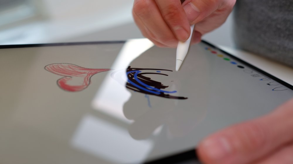
The Apple Pencil has been redesigned, but it’s hard to call it a true upgrade in terms of performance
The Apple Pencil has been redesigned, but it’s hard to call it a true upgrade in terms of performance. The main changes are useful though: it now magnetically clips and charges to the side of the iPad Pro, and there’s a double tap function baked in to allow you to switch between modes in apps.
In the main Notes app, this is easily the best performance we’ve seen from a stylus from Apple, with the Apple-created software taking full use of the Metal 2 framework to give direct access to the GPU. This results in far-reduced latency when sketching or writing, and it’s easily the best experience we’ve had on a iPad.
Variable pressure levels and the capability to use the edge of the tip give a new dimension to input, and the range of apps set up to take advantage of the Pencil (with Pixelmator and Procreate strong favourites) are numerous. Lightroom is also available, and the aforementioned Photoshop is making its way in 2019.
We did have a couple of issues with the Pencil, namely that the Metal framework isn’t used on every app yet, it seems, as we noted a little more latency in some applications. Also, the Pencil just refused to connect when being removed from its magnetic charging on the side of the tablet, which isn’t what you expect for a device of this cost.
Features
Apple has baked in a few new features for the new iPad Pro, with Face ID replacing the home button and fingerprint scanning combo. The facial recognition is swift and far easier to use, and works in any orientation, although we did manage to cover the camera most of the times we picked up the new Pro.
The lack of home button means the interface is navigated with gestures, flicks and swipes moving you through the screens. It’s incredibly intuitive, and allows you to easily jump between apps and multitask across two apps with ease.

USB-C is now the physical connection on offer here
The speakers around the edge of the new iPad Pro, one in each corner, have their own woofer and tweeter, and movie audio in particular is excellent.
One thing to note: USB-C is now the physical connection on offer here, bringing it more in line with the Macbook and allowing for faster data transfer. It’s annoying if you’ve got your life set up around Lightning cables, and you can’t connect flash drives easily either.
Should you buy it?
The iPad Pro, for all its power and precision, is still just an iPad. That means you can’t use it as a full laptop replacement, as there’s just so much it can’t do. It can’t download documents from the web easily. It can’t accept files from all external sources easily. It’s too reliant on developers making great apps to bring it to life.
But as a second machine, one that allows you to be creative on the go and have a portable music studio, AutoCAD platform and photography editing suite in your bag, there’s very little better out there. The bugs in the system still irk, but if you’re after a powerful tablet that lets you get on with your job, the new iPad Pro is certainly worthy of a strong consideration.
- Read more: The best cheap iPad deals in 2018
-
Hacker contest earns participants $325,000 based on the discovery of 18 vulnerabilities.
-
The industrial company on Tuesday released mitigations for eight vulnerabilities overall.
-
For the past 30 years The Designers Republic has been tearing up the graphic communication rulebook. Founded by Ian Anderson, the provocative Sheffield-based studio grew from his design work for bands and clubs, before evolving into a creative-led group of individuals. Often described as "the design group that changed design", it's notable that the story of The Designers Republic (TDR) has never made it into a book. Until now.
A recently launched Kickstarter project will explore the story of the studio's outputs, processes and influences for the first time. In the pages of A to Z of The Designers Republic – which we're sure we'll soon be adding to our 30 books every designer should read post – readers will hear from Ian Anderson himself as he shares why the studio works the way it does.
"If you ask me what we do at Designers Republic, we solve problems and communicate the solution," says Anderson. "That’s my interest. The graphic design aspect is only something that’s there to improve the communication."
"Thirty years of work pushing at the cutting edge, that’s really what we’ve done. [It’s] not like a mission statement, but that is effectively what we do … because of the nature of my personality and therefore the people I choose to work with."
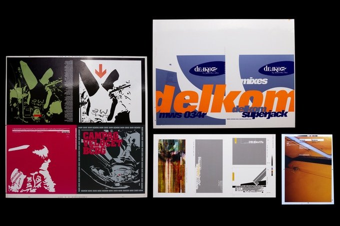
The Designers Republic started out with band poster and club flyer designs
Amongst TDR's most notable works are visual languages for Aphex Twin and Autechre, as well as subversive and experimental design work for Sony, Orange and Coca-Cola. The studio has had its ups and downs over the years, with Anderson putting it into voluntary liquidation in 2009, but its tireless, revolutionary principles have always endured.
A to Z of The Designers Republic has been described as a continuation of the studio's forward momentum. And while it usually looks to the future, the book will be a long overdue chance for the studio to take stock and re-examine its output so far, complete with insights into its working process.
"There’s a big yawning gap in the literature of graphic design," says one of the book's editors, Adrian Shaughnessy. "There aren't many major studios from the past 50 years that haven’t had a monograph published, but there has never been a TDR monograph."
"Unit Editions has made a habit of publishing books on designers and studios that have been neglected by other publishers. And there’s no bigger omission than TDR. But finally, thanks to the people who have pledged via Kickstarter, we can now say that there will be a definitive TDR monograph – one that looks back over 30 years of graphic innovation, disruption, slogannering and rulebreaking."
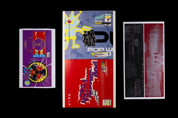
The Designers Republic is renowned for pushing the design envelope
With a couple of weeks until the Kickstarter ends, A to Z of The Designers Republic has already comfortably smashed its funding target.
"Now that we are fully funded, we are preparing to release some more awards – a few gems from the TDR archive that should get TDR fans salivating," adds Shaughnessy.
So if you're after unique perks and the chance of seeing your name printed alongside The Designers Republic story, be sure to head over to the Kickstarter page and pledge what you can.
Related articles:
-
Matte painting and the film industry go together like peaches and cream. Strictly speaking, a matte painting is an image, created using digital or traditional painting techniques, to create a representation of a scene that would be impossible for filmmakers to deliver in real life. This might be because the landscape does not exist in the real world, it's not financially practical to travel to a location, or to extend the set outside of its filmed parameters.
Given its intended use, a matte painting is designed to be a work of photorealism; a landscape or set that can replace reality and trick the viewer's eye into believing it is real.
Photoshop revolutionised matte painting, by offering a digital solution that would speed up creation time. It also gave anyone with the software the chance to try out the high-end techniques themselves at home. The resulting matte paintings are not always intended for use in films, and over time the phrase 'matte painting' has branched out to describe a subset of digital art that we all have the chance to experiment with.
The key elements of matte painting are a good base plate and a photoreal finish; one that transports the viewer to a far-off or imaginary land. In this feature and Photoshop tutorial, we have gathered the advice of experienced matte painters to share their top tips and techniques to help you improve your own matte-painting skills.
Before you start matte painting
Before launching right in and creating your first matte painting, it's important to understand what it is that you are looking to create and the skills involved. "I would first watch a few tutorials and demo reels just to know exactly what it is and how it is done," suggests matte painter and concept artist Steven Cormann.
"Then my main tip would be to pay attention to the real world. Go outside and observe how light and shadows behave; how atmospheric perspective works. It's extremely important to master realistic lighting if you want to be a matte painter. Making a believable and seamless digital environment is the goal."
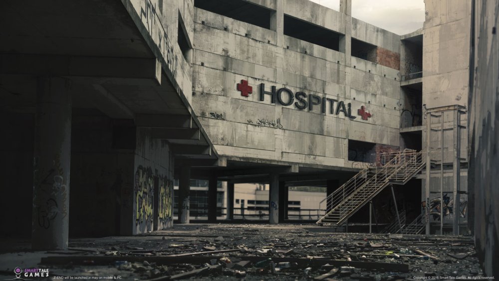
Artwork made by Maxime Delcambre for Smart Tale Games for a zombie game called Z-END
A good matte painter usually has a sound knowledge of art, which helps when it comes to achieving realism. "[It's important to] learn the art fundamentals," says creative retoucher João Marcos Britto. "Grab a good book and start to learn about colour theory, perspective and composition. If you have all those, it doesn't really matter what tool you are using."
This knowledge is vital for realism, as the eye can sense when something is 'off'. "My top tip would be to always keep an eye on scale and lighting," says digital matte painter Doug Winder. "The human eye is very good at knowing when something isn't quite right and you can often find what you think is the perfect image or element to incorporate into your painting and it will throw everything off."
Having a clear concept of what you want to achieve and being organised is a good place to start, especially if you're under a time pressure to create, says concept artist, illustrator and teacher Lina Sidorova: "The main thing that can increase your speed and productivity is the organisation of everything. The order on the desktop, in the layers, in your head, the right order of actions, the preparation stage, etc."
Considerations for matte painting
Next, you need to consider what you are going to use for the base plate of your matte painting. This is the key element you will be building an entire scene from. It's worth creating a bank of photos that you can use both as a reference to help you understand the way that light and shadow works in reality, as well as imagery that can be incorporated into your actual artwork, either as base photography or for textures further down the line.
Your photo references should help to guide you throughout the process of creating, as matte painter, Amine Amahadar says: "It's really important to always put some photo references on your screen while working on a matte painting. It's easier to make mistakes by working only with your mind. When looking at photos, pay attention to the light, how it's affecting the shadows, how the depth is affecting the landscape… Basically, try to study every aspect of reality and try your best to mimic them in your work."
Don't be afraid to experiment with methods of image processing.
Vladimir ManyukhinAs you work, don't be afraid to experiment either, as this can help you develop your skills. "I'm always looking for something new when creating my next job," says Vladimir Manyukhin, who specialises in concept art and matte painting. "Don't be afraid to experiment with methods of image processing. Over time, you will have your own methods of work and it will greatly accelerate the creation of new works."
Matte painting in Photoshop
Now that we understand the basics of what matte painting is all about, it's time to look at how Photoshop can help achieve incredible artwork. There are many essential techniques to master. "Matte painting is a combination of quite a lot of different techniques, 2D and 3D, that can be a little different from one matte painter to another," explains Cormann.
"When it comes to the 2D part of it, it's a lot of extractions and colour corrections, and for those I like to use mostly the Curves tool along with Channels. On top of that, there is of course painting and for that, I mostly use a standard brush with Color Dynamics and Scattering options activated, depending on the situation."
Most of the Photoshop tools used are basic ones, such as selection tools, colour correction and matching tools, and the standard brushes. It's the skill with which you use them that makes the difference.
Build a base

Regular day scene with the grass and the blue sky twisted into an unusual composition by Lina Sidorova
The first step to creating a matte painting is your base, which needs to be of the best quality that you can find. A high-quality base photo or 3D model will give you much more scope to build from. Often, you may have to build your own base plate from a few different elements and seamlessly integrate them together. This is where Photoshop's selection and transformation tools come into play.
"When I'm working on a matte painting, I use tools like the Lasso tool, which allows me to extract elements precisely; masks, as it's really important to work in a non-destructive way; and the Clone Stamp tool, which I use a lot to patch parts of a matte painting and recreate the content," explains Amine Amahadar.
"Parallel to the Clone Stamp tool, a pretty powerful tool doing pretty much the same thing exists in the Fill tool (Edit > Fill or shift+F5). To use it, you only have to select an unwanted area with the Lasso, enter the Fill menu, and be careful to ensure you are in Content-Aware mode. It works more or less, according to the selection."
If you want a more definite selection, typically for hair or fur, use the Refine Edge tool
Maxime DelcambreConcept artist Maxime Delcambre makes use of the full range of selection tools in Photoshop, including the Lasso tool alongside the Refine Edge tool, which makes precise selections on complex subjects: "If you want a more definite selection, typically for hair or fur, use the Refine Edge tool. It's very simple to use: draw your selection with the brush and play with the setting of Smooth, Feather and Contrast to make a perfect selection." You may also need to make use of the Transformation tools to manipulate the photo or 3D elements to create your base scene.
There may be situations where more advanced selection techniques are required to build a good base plate. One of the most common tasks of a matte painter is to replace the sky of a given plate, explains Cormann, which must be tackled delicately to ensure a seamless composition: "I very often use the same keying technique using the Curves tool along with Channels. The idea is to duplicate the channel that has the most contrast, then play with Curves to increase that contrast to the maximum. I also use the Brush tool or Dodge tool to refine and get the sky area completely white, and the rest of the image that I don't want, completely black. I can then do a selection and easily extract and replace the sky [with] another one."
Match the colours

This image, Citadels, by Steven Cormann, is an example of a matte painting done from plate photography
When you have a rough composition in place for your base plate, it's important to work on the colours of your scene. Making sure that all of the photographic elements work together as one is important, so that it's not obvious that different photo references have been stitched together.
Sidorova makes use of the Match Color command, found in the Image > Adjustments menu: "It's funny, but sometimes I am so lazy that I even use Match Color to make a proper tone sketch for my future painting, I just choose a good tone or colour reference and colour match my planes to its planes. Also, it helps to get the good colour variations in the unexpected places in the textures."
I believe Curves is the most powerful tool Photoshop provides
João Marcos BrittoBritto prefers to use the Curves command for colour consistency: "I believe Curves is the most powerful tool Photoshop provides. Nowadays, what I usually do is separate my colour adjustments from my luminosity adjustments. I start by adjusting luminosity values according to what I need to match the scene. This is done in a black-and-white image (Hue/Saturation set on Color mode on top of everything) so I can focus just on the luminosity. Once that is finished, the rest of my adjustments are for colour correcting the subject to match the scene."
The idea of both the composition stage and the colour correction stage is to build a photographic image that is flawless as one scene. You want your photo references (or 3D elements) to carry the artwork and be the main focus. This is because they help you maintain that all-important realism, so the more they show through, the better.
Get painting
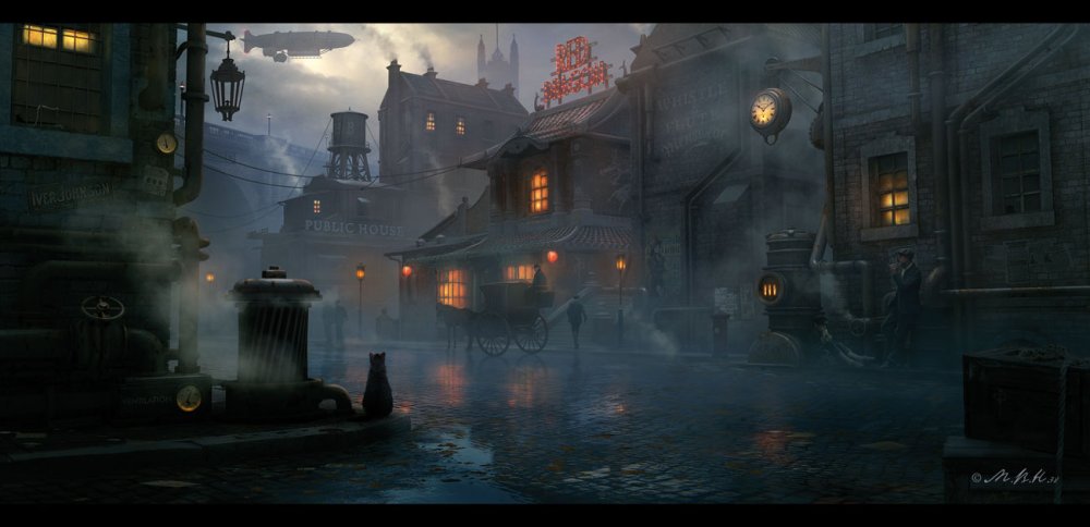
Steampunk Town, Red Dragon, has been created by Vladimir Manyukhin, who specialises in concept art and matte painting
When the base is in place, it's time to start digitally painting in the rest of the scene. This does rely heavily on a good knowledge of art and painting in order to ensure the brush strokes are as photoreal as the photography. The idea of the painting stage is to build up on the base and add in elements, extend the scene and bring in objects that are not possible to photograph.
Most of the matte painters we have spoken to rely on the basic brushes. Delcambre suggests getting to grips with the Brush tool and using it with a stylus for ultimate accuracy. Ensure that the pressure-sensitivity is turned on for Size and Opacity, so you can paint as you would in traditional mediums.
Delcambre also suggests sticking to a few basic Photoshop brushes, as this can improve the consistency of the artwork. No more than three main brushes are usually needed: a main brush for general painting, a Basic Round blur brush and a detail brush for things like vegetation, rocks and clouds.
A matte painting is designed to depict a scene, as part of a larger story, so it's worth spending time on the painting stage to bring in small textures and elements that help to evolve that story and bring out the detail of the photographs underneath. You may need to sharpen the image right at the end to bring the whole piece together, as well as run more colour correction steps.
Practice certainly makes perfect when it comes to matte painting and it's a skill that can be tricky to master, but one that is certainly worth the effort.
This article originally appeared in Photoshop Creative. Buy back issues here.
Related articles:
-
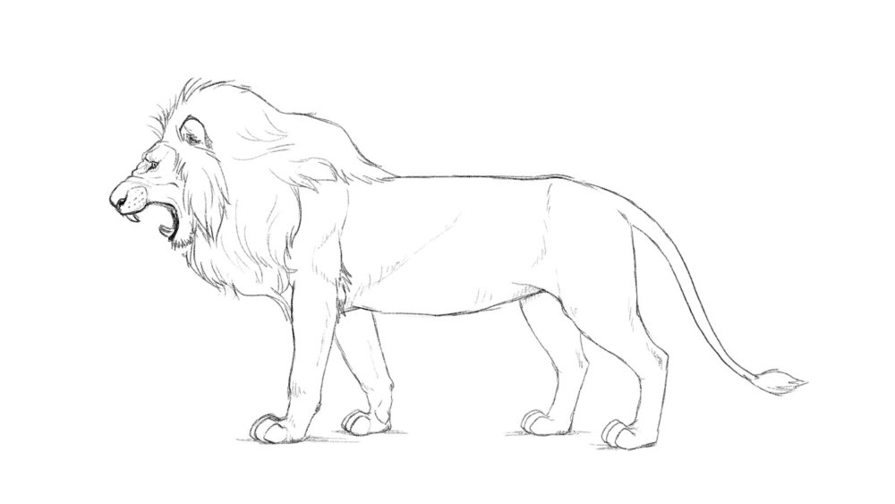
Hear someone say 'King of the jungle' and there's one animal that immediately comes to mind. That's right, the lion. One of the largest, strongest and most powerful felines in the world, lions have earned their status as rulers of the lands in which they inhabit.
In order to convincingly capture these majestic creatures when learning how to draw a lion, it's vital to pay close attention to cat's proportions, muscular definition and facial structure.
This step-by-step tutorial will guide you through how to draw a side view of a male African Lion, starting with the skeletal structure, then sketching in form, and finally adding details to create an accurate representation of a lion. The tutorial will also touch on the best way to depict a lion roaring.
Note: it is highly recommended that you have a photo reference of a lion by your side when following this tutorial to observe subtle angles and details that can be easily missed.
Once you nailed learning how to draw a lion, be sure to check out our brilliant selection of other how to draw tutorials.
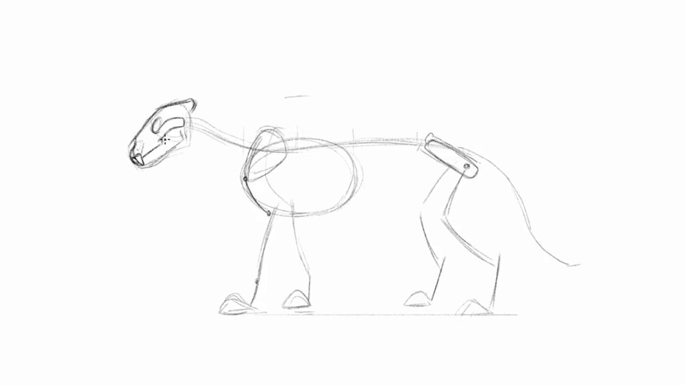
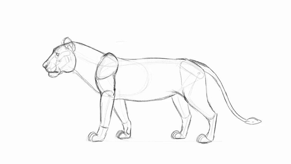
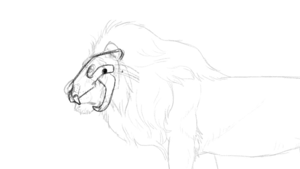
01. Draw in the head and torso
Using the measurements of the torso will help find different body proportions
Draw a big oval for the rib cage, and etch in small marks to divide it in half. Use a circle as the head placed to the left, about half the size of the oval over but not higher than the top of the ribcage. Draw in a thimble like shape angled down to capture the muzzle.
02. Connect the spine and torso
The spine has a slight curve from the ribcage
From the middle of the head, connect the neck to the body with an S curve cutting through the ribcage to the back of the body. Make sure the arch in the back is not too rounded. Take the measurements of half of the oval and draw in the hips to the right of the ribcage as a skinny rectangle tilting forward.
03. Attach the front legs
Stagger the feet so the pose looks less stiff
The lion is two times the height of the body and head combined. Draw small triangles as paws in front of the ribcage and behind the back of the hip bone. The scapulas are big seed like shapes that stick up higher than the spine in the standing pose. From the spine connect the arm back to the elbow, but no lower than the ribcage. Draw the rest of the leg dropping down to its paw, giving it a very subtle S curve.
04. Attach the hind legs and tail
The top of the spine, hip, elbow and heel will be visible boney areas
At the lower half of the hip, draw the leg coming forward down to the knees no further than the hips. The legs should come all the way back past the hips, followed by the foot straight down. The long curled tail droops down to the ankles.
05. Carve out a simplified version of the skull
The simplified skull help find landmarks for the eyes, nose, and mouth
Flatten out the top of the head where the circle and line meets. Just below is where the eye socket sits. At the back of the skull a small part sticking out, where as the front of has a groove carved out for the big nose. Follow the outline of the jaw as it cuts up into the cheek bone which sits directly below the eye socket. Draw in the massive teeth in the front of the skull.
06. Mass out the head and neck
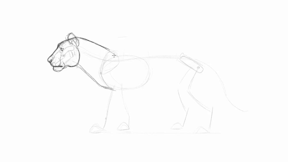
Add volume to the muzzle, cheek and brow area to make the head more dimensional
The lion's neck contains a lot of muscles, so draw a curved line to give it some volume. Place big eyebrows sitting right above the eye to give it that hooded look, and draw the eye as a simple pie shape. The nose should look round and full. Same with the mouth, try to draw the muzzle full containing all of its massive teeth. The front of the chin will stick out to look like it has under bite. The corner of the mouth has lips that droops down to overlap the connection to the jaw. Lions have extremely strong biting strength that all comes from its jaw muscles, so the back of the jaw is rounded. Complete the head by adding in some round ears.
07. Flesh out the front legs
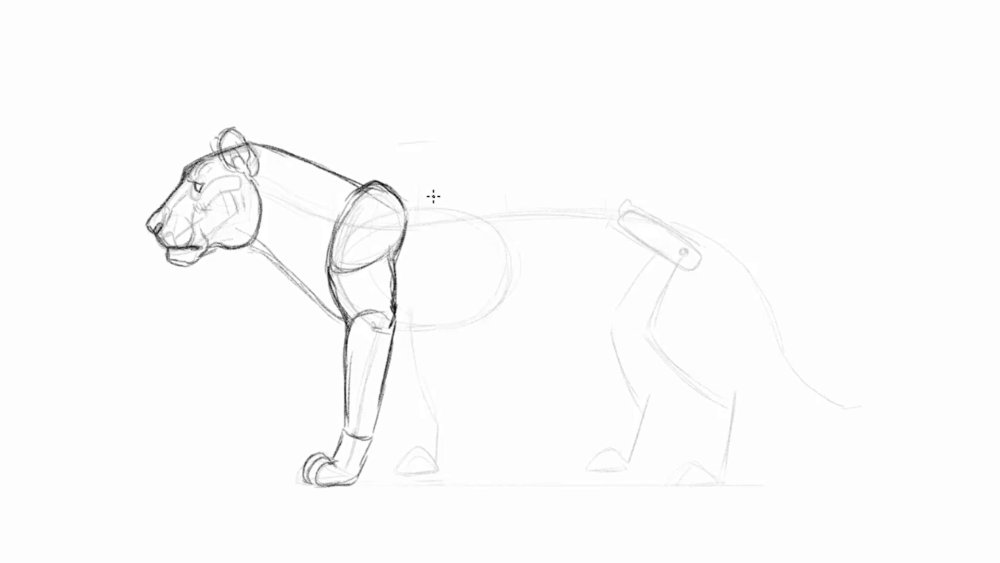
The front leg is built up of a lot of muscles so make them look stronger by drawing the upper section bulky
Draw an overlap of the boney shoulder from the body and neck. The form of the upper arm will swoop from the scapula down to the elbow. Make sure to have the arms look strong and broad. The rest of the leg will taper down to the wrist and paw, reaching down to some rounded finger tips. They shouldn't look pointy like a wolves paw since lion's are able to retract their claws. Watch for overlaps in the arms to make them look more three-dimensional and muscular.
08. Form the hind legs and back
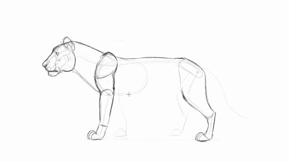
The hind legs will look slimmer relative to the front legs
Follow the skeletal structure as you draw the back arch connecting to the hips, flowing straight into the back of the heel bone. The boney heel isn't covered in muscle so it will have a sharp corner. The top of the hip bone links right to the knee, and follows the rest of the skeletal structure all the way down to the toes.
09. Draw in the belly and remaining limbs
The back legs should look like they're in perspective by placing them higher
To finish off the torso, draw the belly sticking out a bit as it tucks up towards the back of the hip. And right where the torso and legs meets, it's connected by a layer of flexible skin . Don't forget to draw in the rest of the limbs in the back.
10. Design the mane
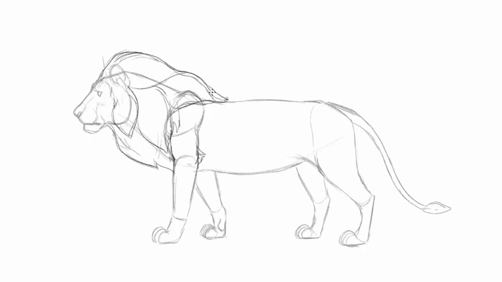
Dividing them in sections will make it easier to draw the flow of the fur
Outline the size and style you want the mane to look. Male lions have these large bushy mane that stretches from the head down to its neck, covering the beginning of the back. This thick furry area not only helps the lion protect its neck in a fight, but also identifies their strength by making themselves appear larger which can intimidate his competitors. Not every lion has the same mane, so drawing out different sizes and style is a great way to bring out personalities in a lion.
11. Detail out the face and mane
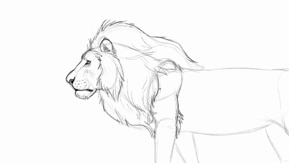
Add in subtle details like the iris, whiskers and chin hair
Now that the mass is formed, let's add some details to the lion. As you draw in the face, filling in areas with darker bolder lines will really make the facial features stick out. Areas like the eye has a dark rim all around, with the inner corner of the eye filled in with black to give it that strong gaze. The nose and lips also are filled in with darker lines to capture the lion's important features. Follow the guide line to draw in the details of the mane, and add some hair to the back of the elbow.
12. Refine the rest of the body
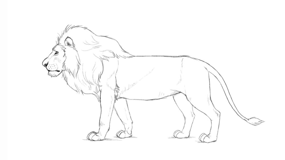
Draw the hatched lines in moderation
Majority of the lion's body is covered in very short fur so there's no need to make the lion look furry. Focus on drawing the muscle definition instead. When you want to add dimension and form to an area, draw a few hatched lines or draw in light lines along the form to imply there is a plane change. This method will help your drawing look more dimensional by applying it to areas like the round muscular arms, the different forms in the face, and the sharp boney areas like the heel and elbow.
13. Open the jaw to make the lion roar
The size and shape of the jaw needs to stay consistent
Bringing back the skull we drew in the beginning of this tutorial, open the lion's jaw. Imagine the jaw hinges where the jaw and cheek meets, and swings back to open its mouth.
14. Squash and stretch the areas of the face
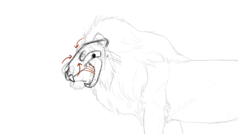
Just like a human face, the areas between the nose and brows scrunch up to show rage
When the lion lets out a big roar and opens its mouth, fleshy areas of the face will stretch and squash. The upper nose and brows scrunch up towards each other to form wrinkles between the eyes. As the mouth opens the upper lips reveal its teeth, and droopy lips and cheek stretches out.
15. Connect the head to the body
The mane covers the chin and cheeks a little as they push back into the neck
When you're done drawing in the face, draw in the rest of the mane to connect the new face to the body.
Read more:
-
There are a lot of things that it takes to make a good photographer or videographer, especially nowadays when there are so many different kinds of equipment. See our buying guides on the best cameras for creatives and the best tripods for more info on getting the right kit.
But you'll also need the right skills. Luckily, the Beginner-To-Expert Photography & Videography Bundle will teach you everything you need to know in this area, making you a master photographer or videographer who can handle all kinds of equipment.
With this bundle, you'll learn how to shoot expert-looking video using a DSLR, you'll learn how to properly operate a drone camera, and you'll learn how to produce a video from beginning to end. With The Beginner-To-Expert Photography & Videography Bundle, you'll be able to snap photos of stunning landscapes, shoot videos of exciting events, and edit them so professionally they'll belong in a magazine or on TV.
Get this set of courses now for only $35.
Related articles:
-
Welcome to our guide to the best cheap Walmart tablet deals in 2018. Walmart is an excellent choice if you're looking for a budget tablet, thanks to its wide selection of tablets, competitive prices and free delivery – and with a host of Walmart Black Friday deals already live, it's safe to say this is the best time of year to buy a tablet from the retailer.
However, due to the wide selection of budget slates on offer, it can be hard to find which one is right for you, which is where this list of the best best cheap Walmart tablet deals comes in. We've scoured the Walmart website to find the very best budget tablets on offer, as well as checking deals for the biggest savings.
When buying a cheap tablet, there are a few things to take into consideration. First of all is size. The smaller the screen, the more easily portable it is, and the lower the price is likely to be as well.
But, smaller screen makes working, drawing and watching media on the tablet more tricky. You'll also want to keep an eye on resolution. Many budget tablets cut corners by offering low resolutions. While this keeps the price low, it also impacts image quality.
The more RAM a tablet has, the better it will be at running multiple apps at once, and you'll want plenty of storage space as well to store photos, apps, videos and music. A microSD slot to expand storage would also be welcome.
So with all that in mind, here's our pick of the best cheap Walmart tablet deals in 2018.

If you don't mind going for a slightly older tablet, then the Samsung Galaxy Tab S2 offers brilliant value for money, making it our pick for the best cheap tablet at Walmart. It offers 32GB of internal storage, which is plenty for most people, and you can even expand it with a microSD card (up to 128GB) for extra space. Its screen is gorgeous as well, with a 2,048 x 1,536 Super AMOLED display and enough powerful innards to keep this tablet running quickly and smoothly despite its age and budget price.

The Lenovo Tab 4 8 is a brilliant cheap tablet often sees excellent deals from Walmart. It's a strong all-rounder that offers you a good screen, very good battery life and a design that wouldn't look out of place on a more expensive tablet. The Lenovo Tab 4 8 is a great showcase for cheap tablets, as it proves that you don't have to have a cheap-feeling tablet that lacks features just because you're on a budget. Sure, it might not get the latest version of Android in the future, but for a cheap tablet that ticks a lot of boxes, this is definitely worth looking into.

iPad mini 4
iPads aren't the first tablet you think of when looking for cheap devices, but Apple's iPad mini 4 is a brilliant little tablet that comes with Apple's renowned build quality and design, but for an affordable and, dare we say it, cheap price. The latest version comes with a screen upgrade and more powerful components. Walmart has a range of great deals on this cheap and small tablet. It's not quite as cheap as other cheap tablets from Walmart on this list, but if you love Apple's products, it's one of the cheapest ways to get that iOS experience.
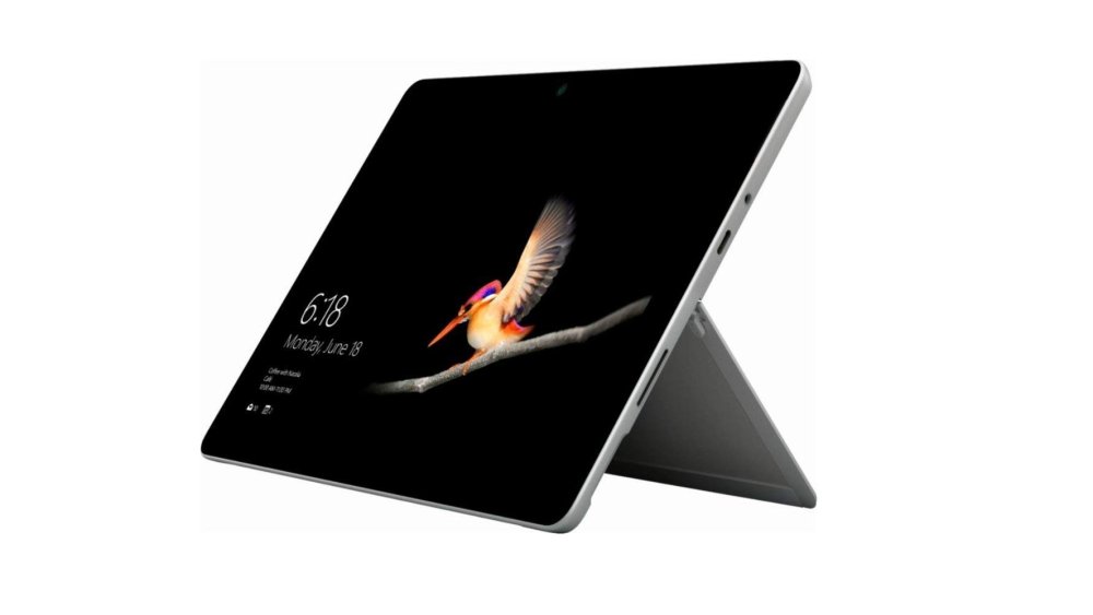
If you're after something a little bit more powerful, then Microsoft's affordable Surface Pro is an excellent choice. It has a brilliant build quality, and Microsoft has packed in powerful components that means it can handle apps and games with ease. Unlike most of the cheap tablets on this list, the Surface Go runs Windows 10 S. You can upgrade this to the full version of Windows 10, which means you can run programs such as Photoshop, making this a versatile cheap tablet from Walmart.
The Samsung Galaxy Tab E Lite is one of the best cheap tablets on sale at Walmart thanks to Samsung's deserved reputation for producing quality budget tablets that pack plenty of features into nicely-designed bodies, while not costing a fortune either. It's small and light enough to be easily carried around, and it comes with a microSD slot, which means you can easily expand its storage capabilities if you want to fill it with videos and music. It comes with an old version of Android, but this can be updated, though it may not get the newest version of Android in future. Still, it's a brilliant cheap tablet that often sees some impressive deals at Walmart.

Here's another brilliant cheap tablet from Samsung, which you can get some great deals on if you shop at Walmart. The Samsung Galaxy Tab A has an excellent battery and impressive specs for the price, and it runs modern Android apps without any issues. With a screen size of 7-inches, this is a small and portable cheap tablet that is easy to carry around with you. It's not going to be that great for watching movies on or for creating digital art, but it's a great little tablet to take with you when you're out and about.

If you're looking for one of the absolute cheapest tablets available at Walmart, then the RCA Voyager 7-inch 16GB Tablet is worth looking into - but with caution. For less than $40, you're getting an Android tablet with a 7-inch screen, so for people who are thinking of getting a cheap tablet from Walmart to use as a spare device that you can carry around with you, then this will fit the bill nicely. However, to get such a low price, it does mean the build quality isn't that great, and it lacks power where it counts. But for the price, these compromises may be worth it for many people.
The Ematic EGQ223BL 10-inch tablet is another very cheap tablet from Walmart which, as long as you don't expect too much from it, is pitched at a very tempting price. You get a large 10-inch screen and 16GB of storage space, which can be expanded with a microSD memory card if you need to store more videos, photos and files on it. Again, like the RCA Voyager above, it's not the fastest or most powerful tablet in the world, but for the price you get a pretty handy tablet that can keep you (or your kids) entertained.
Read more:
-
Node.js bravely enabled JavaScript to go to places its creators never intended the language to go. Many well-liked features seen in new ECMAScript revisions started out as features added to Node.js – sadly, the standardised APIs were often incompatible with the ones thought up by the Node.js developer team.
Thus, one of the recurring topics of the Node.js world revolves around reconciling differences between 'web development' and 'node development'. For example, the module subsystem of Node.js does not work according to ECMAScript standards.
Node.js 10 updates the versions of various core components used in the product, thereby enabling developers to harness speed and security improvements.Furthermore, work on HTTP/2 speeds up delivery of content in bandwidth- and/or latency-constrained scenarios. A change in the native interface will simplify the life of Node.js plugin developers, leading to a more vibrant extension ecosystem.
The highly detailed technical nature of the changes makes providing individual examples difficult. However, in this post we've rounded up 20 short tidbits of information that will help you get to grips with Node.js 10.Should you feel like always staying on top of the latest developments in Node.js, head to this GitHub page. It provides an intimate level of detail on changes in the product.
01. Update your environment
Node.js can be compiled by hand. However, most Linux distros are able to run an automatic installer. The code here shows the installation process on Ubuntu 14.04 LTS. If your operating system shows up in Fig. 1, find a similar process here.
02. Sniff out errors…
Developers have performed string comparisons to find errors ever since Node.js 1.0. Version 9.0 started to shift to easier-to-handle constants, however. The code accompanying this step is immune to spelling mistakes and is resistant to attempts 'to improve usability by reformulating error messages'.
03. …understand them…
Process computer programmers baulk at the idea of using strings to transmit error states – Node.js 10 does not break this tradition. Instead, the framework defines a few dozen strings, which will serve as a 'magic constant' and can be returned in the code field of the 'Error' object.
04. …and describe them properly
The introduction of error codes does not deprecate traditional error messages. Code based on the presence of the '.message' field continues to perform just as it did – should you need to present a message end users can understand, you can trust the field just as you did before.
05. Speed comes with V8 updates
Node.js always used the V8 runtime for JavaScript execution. As with most project collaborations, Node.js usually lags behind V8's progress. Node.js 10 is based on version 6.6 of V8, which brings significant improvements in caching and array-handling performance.
06. Headless try-catch!
Try-catch blocks are the bane of Java programmers: finding one marked with a comment instructing to shut the compiler up is common. V8 6.6 reduces the burden of unwanted try-catches by letting developers omit the exception object from the catch block.
07. Improved detail in function reflection
One little-known detail of JavaScript concerns functions: they can be considered objects, too. So far, the toString() method just returned the method name. In Node.js 10, the program returns the whole first line – as can be seen in the figure, the return value even extends to all kinds of comment
08. Remedy failed updates
Should your workstation be unable to run the new version of Node.js, check the package manager configuration. Yours truly had to delete the two files mentioned in the following code before normal program operation could resume:
09. ECMAScript modules
While Node.js influenced the idea of JavaScript modules, the ECMAScript implementation is not compatible with Common.js. While the --experimental-modules flag has been around for quite some time, Node.js 10 brings along a few new features intended to let ECMAScript-based modules work in Node environments.
10. Understand native module architecture...
While JavaScript can do a lot of things, some jobs require the use of C++. So far, developers seeking tighter integration have usually placed their trust in the V8 API – leading to plugin rewriting whenever the version of V8 used in Node.js was changed.
11. ...and see N-API improvements
Thankfully, N-API solves this problem by providing a new abstraction layer. Any changes made to the underlying platform and tooling are no longer exposed to developers working on plugins, thereby lowering maintenance burdens and, hopefully, making Node.js upgrades smoother.
12. Learn about the API
As far as C APIs go, the N-API is clearly among the better-designed ones. As shown in excruciating detail here, the API comes equipped with methods for handling object creation, callbacks and more. Furthermore, the header contains a 'lock' permitting you to disable features not found in older versions of the NAPI for compatibility reasons.
13. Use ChaCha20 and Poly1305
Cryptography always was of significant importance on the web. Node.js 10 updates the underlying version of OpenSSL to 1.1.0, thereby enabling developers to use new encryption algorithms, which are expected to be more robust. This is especially helpful when seeking to implement AEAD-type encryption schemes.
14. Targeted tracing
Node.js 10 emits a set of additional tracing parameters, thereby letting developers zero in on performance problems. Trace objects can furthermore be enabled and disabled at will via the functions shown in the snippet accompanying this step – pinpoint accuracy is now at every developer's fingertips.
15. Find out more about tracing
As of this writing, Node.js supports a total of eight trace types. In addition to V8 events, developers can also register themselves for bootstrap, async_hook and file system sync information at the command line or via the trace object.
16. HTTP/2 is now official…
While the API stability indicator in the Node.js documentation still shows HTTP/2 support as being experimental, the API can be considered stable.
17. …but do mind the encryption
When implementing a Node.js server which uses HTTP/2, do bear in mind that the unencrypted version of the protocol is not supported by any web browser as the time of writing. Because of this, you should be prepared to deal with significant processor overhead when transmitting and receiving data in proxyless configurations.
18. File system API with promises
Promises are all the rage in JavaScript. So far, developers have usually had to make do without promise-based file system APIs – a problem that's been remedied in Node.js 10. While the module fs/promises is still experimental, it is already providing a nice alternative to 'traditional' file system accesses.
19. More work has been done on async hooks
Node.js is single-threaded by default. Async hooks enable code to keep an eye on asynchronously-executed resources in a more comfortable fashion – while the API is far from stable, Node.js 10 provides significant improvements over the barely-working implementations found in previous versions.
20. Turbo-NPM
While NPM is usually seen as constitutent part of the Node.js distribution, it is actually a standalone product. Current versions of Node.js 10 come with NPM 6, which offers significant speed increases when installing and deploying packages. On this writer's machine, some processes saw tenfold speed increases.
This article was originally published in creative web design magazine Web Designer. Buy issue 279 or subscribe.
Read more:
-
Microsoft’s November Patch Tuesday fixes include mitigation against a zero-day vulnerability leaving Windows 7, Server 2008 and Server 2008 R2 open to attack.
-
Are you familiar with search engine optimisation? If so, you might already know that the top three results on any Google search receive nearly 60 per cent of all search engine traffic for that keyword. That really shows just how important it is for your website to rank high on Google, and that's why SEOPop Pro was created.
This tool analyses a website to generate a report card using weighted SEO factors – this will give you a clear idea of what you can fix or improve to help your site rank higher and gain more exposure. You'll also be able to see how your site's traffic ranks in comparison to competitors, and whether you're making a big enough impact on social media sites such as Facebook and Twitter.
You'll even get a sense of how your site is performing on mobile. Get SEOPop Pro: Lifetime Subscription for just $24.99 – that's 83 per cent off the regular price.
Related articles:
Threatpost: Emoji Attack Can Kill Skype for Business Chat
in Ειδήσεις από τον χώρο του Design και Hosting
Posted · Report reply
The "Kitten of Doom" denial-of-service attack is easy to carry out.
View the full article